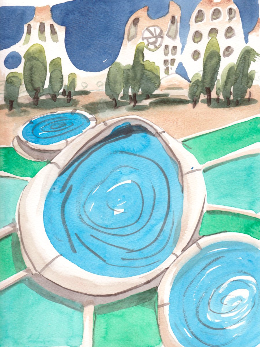
Instead of putting all the colours in one painting, I used the cooler colours including phthalo blue green shade, phthalo green yellow and blue shades, indothrene blue (the dark sky), and perylene green with some benzimida yellow. The names don't matter so much, the main thing is that they all look nice together. That tanned warm sandy colour is my new goethite (PY43) from Daniel Smith Company, it looks exactly like a sandy beach, and in this painting it provided the perfect splash of warm to contrast all the cold. Even though the warm/cold analogy is not accurate or factual, I still like it to describe the relative contrasts between the colours. I really like this whole colour scheme, it will be useful in the future, in real life the sky is a super rich velvety blue (the scan is a little flat). What is this scene? Kids pools in a bouncy castle? Fountains on an alien planet? A bad acid trip? Or D, all of the above. 9 x 12" watercolour paper, watercolour, July 2020
No comments:
Post a Comment