Friday, August 28, 2009
Ronda Valley
In a few days I made a dozen paintings in this town, it was certainly a wealth of material.
I discovered a mixture of colours in Hamilton Ontario of all places, that is very useful for tree covered mountains. The mixture begins with ceurelian blue and rose madder genuine, and then a dark green and a touch of yellow is added...the cool blue base and opacity of the ceurelian gives that blue 'distance' feel, and the other additives tint it with tree colours.
5x7" cold press. 1998
Thursday, August 27, 2009
Molecular Buoancy
I created the shape of the character without any actual lines to define his shape, instead I used the background elements to define his shape. The trees branches end where his head would be, and the bushes in the distance carve out is shoulder and arms. The reflection in the ice give the sense of his legs. To cap off I painted his hands and feet and did a few light washes on his body to give a slight impression of clothing.
5x7" cold press, 2009
Tuesday, August 25, 2009
Question Landmark
In this small abstract I was going for one simple object set against a stark baron landscape, similar to Bottle Sunset posted a few weeks ago. The background was supposed to be a desert but it looks more like a sea. My favorite aspect of the work is the rich blue colour in the Landmark. The object is backlit by a sunset, but the shadow still retains a luminous quality. I kept the shadows warm and luminous by laying down a bright red wash and covering it with a cool green/blue. Directional brush strokes are commonly used in oil painting, best exemplified by Cezanne, Monet, and the more contemporary Canadian painter Tom Thompson. They were all oil painters, and it is a lot easier to make the brush strokes visible in oil painting as compared to watercolour, however in this work I attempted to create some directional brush work in the foreground grass element. To do this I let the colour wash of the grass dry, and then on top I put on fairly wide brush strokes loaded with colours. The colour of the directional brush stroke varied to match the blue shadows or the warmer light. As you can see, the actual direction of the strokes make a sweeping S turn which helps bring the viewers eye from the foreground into the central Landmark object.
Question Landmark, 7.5 x 11" cold press 2009 (No. 1474)
Monday, August 24, 2009
Veggie Time
Here is the last painting I did at the old place on Esplanade, it was actually finished in the new place down in the south Plateau. A mixture of hope and optimism this painting looks forwards (as does the small dog in the bottom left) not backwards, as emphasized by the clock in the sky. The clock is kind of ugly, it was in the Esplanade apartment upon arrival, and it went in the garbage when I left, you can see in the close up that the numbers are replaced with vegtables.
I used a technique here that may be called very wet on wet...(a play on the classic technique name wet on wet). The idea with 'very wet on wet' is to put one layer of paint down (the sky) wait until it is just a little dry, then bombard it with an almost pure water mixture. It works best with staining pigements like Alzarian Crimson or windsor yellow, because these colours have a n attotude and will spread into their neighbor. I did not intend the effect to be so dramatic (look around the clock where I dropped down the wet bomb) but in the end I kind of like it, the clock looks like it is 'emitting' time in some gelatonous physical form.
22x15" cold press, 2009
Friday, August 21, 2009
Brain in a Box
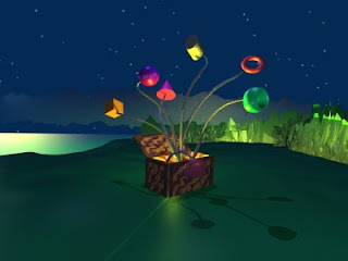
With any medium the basic principles of art still need to apply, to create this 3-D model I used the things I have learned painting landscapes...the sliver of lake, the low clouds, the trees in the distance all come together in one tight composition. I also tried to keep the colours under control, it is easy to make fake, shiny looking colours. Having said that I also wanted the work to look computerized... it kind of added to the feeling of the painting, it is usually good if the viewer senses that it is made by someone, in that way they get to participate in the process that the artist went through.
Brain in a Box, Blender Render, 2009
Tuesday, August 4, 2009
Irreversible Modification
I usually load up the backgroud with lots of detail and colour, but this time I wanted them character to stand out, and so left the background relatively simple. There is a suggestion of a window and a wall, all done with very light watercolour washes. The idea to keep the background simple comes from traditional chinese painting, they often left the backgrounds all white, accentuating the foreground instead. If composed properly the blank space of the background can be very energetic, even in this small work the shape of the background elements is very interesting to look at with the curves and lines formed by the object itself.
5x7" cold press paper, 2009