Tuesday, June 29, 2021

Montreal Island End-to-End: Painting Notes


This blog is an artist's retrospective on the 'end-to-end' bicycle trips I completed recently. Maybe other artists or readers will find this interesting, it is also a way for me to remember and record a few notes while the memories are still fresh. Above is the eastern-most painting at Parc du Bout-de-l'Île.

For the trip out east I used the exact palette set up seen in a previous blog. Here is it is again, note PY43 is yellow ochre from DaVinci, not Raw Sienna as written:


The only changes I made going out west were to remove PG7, shift PBk31 over one slot, and add a big dollop of PY154 yellow in its place. I made this change because I was not using PG7 very much, it is a strong blue-green paint used to use to make dark green and turquoise. Here is what the hue looks like for PG7, although the actual paint is much lower value (darker).

It was just redundant with the perylene green (PBk31)... I used to mix PG7 with PR83 (alizarin crimson) to basically get the same colour as PBk31. Looking back, I think perylene green would have saved me a lot of trouble over the years. If you look at the scene below, which was painted at the western-most park I could find, all of the dark green parts, and some of the distant blue mountains are made with perylene green and indothrone blue.


The other reason for the change was I needed a lot of yellow paint on the palette for Cap St. Jacques park. Since I realized last year that dark yellow makes a greenish colour, it really changed the way I painted. Instead of neutralizing PG7 with burnt sienna (PR101), now I start with yellow, and adjust with phthalo green yellow shade (PG36) and perylene green. I can then neutralize with the benzi orange (PO62) to create olive and army greens. It is flexible and leads to lighter, brighter foliage.

I had fully loaded the palette before the trip so as not to run out. You may wonder why I didn't just bring the tubes, but its because squeezing out fresh paint while traveling can get messy when it wont dry out enough. 

Looking at my palette now, I can tell which paints were used a lot, or not so much, and reflect on what they were good for...

Yellow ochre: moderate use: good for warm clouds, bright earth, shimmering greys. Not good for making greens.

Umber: used a lot: good as a dark warm shadow, tree bark, mud (like in the painting above), sand etc. Not good if used to thickly. 

Raw umber: used a lot:  excellent for neutral browns and slate-greys with indo blue. Can get muddy

iron oxide red: excellent for painting rust (it IS rust!), and neutralizing with blue to make flat browns, and for brick colours. 

caput mortum: moderate use: similar to iron oxide red but makes a lilac with indo blue, and subtle granulation. 

perylene maroon: not used much: good for dark red shadows, and for warming up any grey or shadow mixture. Not so useful on its own.

indo blue: used a lot: excellent for almost everything, mainly for water with a dab of carbon black or umber, darks, violets, neutral greys and browns, desaturated greens. not good for daytime sky (excellent for night sky)

perylene green: used a lot, as mentioned used in greens, also in dark turquoise

benzi yellow (PY154): usage depended: I had two blobs one for making warm colours which I used moderately, the other used for making greens, used it a lot. Also used benzi lemon yellow (PY175) a lot. Greens, highlighted browns, sun effects. 

benzi orange (PO62) moderate use: It makes olives and army green, but can also make the greens heavy, so I tried to not over use it in green mixes. 

isoindo yellow (PY110), moderate use: mainly for sun highlights, or special effects like tiger lilies. 

ferrari red (PR254, PR255), not much use, but important when needed, bright reds. Sometimes mixed with brown or grey for colour adjustments. 

cobalt blue (PB28): not much use, but essential when needed for example pond reflection, wildflowers by highway, water fountain. 

phthalo sapphire, moderate use: almost exclusively used for sky blue. Added touch of PG36 green for the horizon cyan. 

carbon black: moderate use: for creating de-saturated blue, green, reds, and for dark blacks. In the city this paint is used more. try to not use to much can get muddy. 

SO those were my thoughts on the paints I brought along. As for brushes I only brought 7... a variety of sizes and the big hogs hair for cleaning and texturing. It worked well, taking too many brushes is hard to manage from a 'saddle pack studio'. For paper, the 5x7 block continues to be amazing, handles paint so well, I bought most of the stock available in Montreal so sorry for other artists! I also had Winsor and Newton 22x30 inch cut to sizes, unfortunately some had lines of sizing on them which ruined a few paintings, but I could fix them up okay. 

For water, I had 2 x 540mL square plastic bottles and a waste container, with a small glass jar, and several rags. Also a bike water bottle for drinking.

That sums up the painting gear, I would not change much if I did this again. Just more cargo space for food and change of clothes, but that would require a front saddle (bad for style points!). 

Thanks for reading if you got this far! The notes were like a public diary of sorts, I go back and read these from time to time.One more painting, the one where I used 'everything' to do it, a personal favorite: 

"Parc du Bout-de-l'Île Everyone is Invited"

Cloud and Sunset on Somerled Avenue


 Yesterday the sun set on Somerled Avenue, illuminating the clouds in an array of peach, salmon and lilac colours. There is no set formula for painting a scene like this, the buildings were done first as I waited for the light to change colour, then I applied a juicy layer of dilute yellow ochre (PY43) across the sky area. While moist, different mixes of lilac (PB60, caput mortum PR101, and magenta PR122) were dabbed on, and adjusted with glazes of indo yellow (PY110) and ferrari vermilion (PR255). The blue slice on the top right shows the colour of the sky, a greyish cyan. That green box shape on the bottom right is a steel frame box they put on the street to simulate a public park- it has some benches and potted plants inside of it (not seen in painting). I also got the "RO" in for the METRO sign on the grocery store that used to be a Steinberg's. 

Cloud and Sunset on Somerled Avenue, watercolour 5 x 7" cold press, June 2021 (No. 2746)

Sunday, June 27, 2021

Lucien-L'Allier Station, Orange Line Metro


With the Montreal Candiens making their trip to the playoff finals, it seemed fitting to do the next station on the orange line, Lucien-L'Allier which is located next to the Bell Center Arena where they play home games. The arena is seen in the background above the station, although they will not be playing the first two games there, they will be down in Tampa next week. It was incredibly hot and humid today, apparently there is something called a heat dome over USA and parts of Canada. This station was named after the man who designed the early metro in Montreal, they named this station after him and put a small plaque on the wall. 

Go Habs!

Lucien-L'Allier Station, Orange Line Metro, watercolour 5 x 7" cold press, June 2021 (No. 2745)

Overgrown Bleachers

Sitting in the stands, there were plenty of weeds growing, they were waiting to watch a game! These stands, next to the community soccer pitches have not been used or maintained, which is another after effect of the waning COVID lock down. There is a wide variety of greens here, from muted chartreuse in the background, neutral olive greens in the middle ground, and intense yellow and green versions of chartreuse in the foreground. 

To make this painting, I was sitting on the bench looking sideways. There are several ways to set yourself up for painting on location. Some artists have elaborate setups with chairs, easels, umbrellas, containers etc. which provides a whole studio experience on location. For most of my time I painted with a small camping chair and the water containers on the ground. In 2020 I did the metro series using my bike saddle pack to hold the water and gear and standing to do the painting. Finally, I developed the shoulder bag which I could use while walking and paint with everything but my two feet off the ground. To make these methods work you have to hold the palette and the paper with your left (non-dominant) hand which does limit the size of paper, I find up to 8 x 10" is manageable depending on wind. The choice all depends on convenience and comfort, versus flexibility. In the end flexibility wins for me, if you can paint with a bike and standing up, the number of subjects and angles increases tremendously. 

Overgrown Bleachers watercolour 5 x 7" cold press, June 2021 (No. 2744)


Saturday, June 26, 2021

Montreal West: Voyage Home and Gear

Early in the morning of the third day of my cycling and painting trip to the West island I made a painting near the town hall building. The scene was backlit by the rising sun, creating interesting highlights on the water, shadows from the trees, and a park bench in silhouette. The sparkling waves were created with the side-brush technique, where the brush has to have the correct level of moisture and paint. When dry, the different coloured waves are applied in squiggles. The St. Lawrence has a caramel brown colouring from below, and reflected blue on the surface.
Baie D'Urfé Town Hall Park, Peaceful Morning, watercolour 5 x 7" cold press, June 2021 (No. 2741)


After painting a Monet-inspired field of flowers, I had to try painting this manicured water lily pond. The pond had chartreuse algae floating on top, a small patch of lilies in the back, and many rocks above and below the murky water. Blue light wad reflecting from the sky, and the surrounding trees also cast reflections and shadows on the water's surface. To create the realistic reflective water I built up an umber base, then dabbed in a good amount of cobalt blue which has high chroma and opacity. It looked like a putrid mess until it dried, then I was surprised with how well the effect turned out. The algae was created with my 1 inch hog's hair brush, it is mostly for cleaning the palette, but comes in handy to create finely textured surfaces.

Baie D'Urfé Town Hall Park, Water Lily Pond, watercolour 5 x 7" cold press, June 2021 (No. 2742)


In keeping with the Monet theme I discovered these hay bails at the bottom of a small hill probably used for tobogganing in the winter. It was hot, humid, and the mosquitos were buzzing. This was painting number 24, and the last of my trip out West.

Allen's Hill Park, Hay Bales  watercolour 5 x 7" cold press, June 2021 (No. 2743)

Here are a few photos with captions to explain my gear a bit, 

This is a picture of part of the gear I brought along in my bike pack, excluding the food. There are various repair items for the bike, a small first aid kit, night riding equipment, phone charger, water containers, palette, papers, brushes, rags, sun screen and other toiletries. 


Here it is all packed up. You see my hybrid bicycle by Felt with a 3 compartment saddle pack, a U-bolt lock tied to the frame, water bottle, and a helmet. I had the bike tuned up before the trip. One thing missing are foot straps to keep feet on the peddles.


 Most importantly, coffee! I brought some instant coffee which tastes like gold when you are out in the rough, just add some sun-warmed water and voila. I also have these polarized sunglasses that helped reduce eyestrain. I could do paintings with these sunglasses on, just peek at the colour from time to time. Without any sunglasses the eyes will quickly tire and be sore at the end of the day.

That wraps up the blogging for my cycling and painting trip out West. I have more time off in August, and plan to do a hiking trip. In the meantime I will definitely keep up the paintings and blogging. I hope you enjoyed my pictures and stories.


Montreal West: Around the Bend

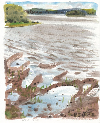
After reaching the Eastern most point on the island of Montreal, it was cool to make a painting on the Western most point that was accessible. This was done from a small unmarked park with a single picnic bench, looking to the West. The rest of the west island shore is blocked by private dwellings, but this scene is pretty close, it was near the Senneville Sailing Club. The wind was blasting up from Lake of Two Mountains almost gale force, which made the painting rather difficult. Regular blotting of my eyes was required! Interesting mud flats were highlighted by the backlit waves, sparkling in the sun.
 

West Island View, Windy Day, watercolour 8 x 10" cold press, June 2021 (No. 2897)


Rounding the big bend in Senneville road, I finally arrived in Saint-Anne de Bellevue, a popular destination for tourists and visitor with restaurant and patio bars. I found this scene underneath the many bridges that exit the West island here, including two train bridges, and the two parts of highway 20. Trains and cars regularly rumbled by, shaking the ground at times. This was another painting that required correct proportions and angles, which I judged by holding up the paint brush. Artists have to do that right? Maybe I need a beret too.

St. Anne-de-Bellevue, Iron Bridge, watercolour 5 x 7" cold press, June 2021 (No. 2737)


After painting a lot of green and brown, I was craving a bit of colour. In the previous painting I made good use of iron oxide red to get the rusty train bridge. Here, I used cobalt blue (PB28) with indo blue (PB60 for shadows for the fountain, and the trusty ferrari red vermilion (PR255) with perylene maroon (PR179) for the shadows for the red wall. The yellow pots were benzi yellow (PY154) and umber (PBr7) for the shadows.

St. Anne-de-Bellevue, Red Yellow Blue, watercolour 5 x 7" cold press, June 2021 (No. 2738)


This was another restaurant in St. Anne's, called Peter's Cape Cod, which I had a meal in afterwards. To capture the variety of blues I used cobalt blue, indo blue, and touches of phthalo blue and green. I felt it important to flex the turquoise/aqua/teal part of the palette to get some experience. There is a neat aqua paint (PG50) but I don't have it yet, its another cobalt paint.

St. Anne-de-Bellevue, Peter's Cape Cod!, watercolour 5 x 7" cold press, June 2021 (No. 2739)


Finally, the last painting of the day, a shadow of me standing with my bike, painting the scene of old rusted railroad ties and yellow flowers. Highway 20 is in the background.

My Shadow, B'aie D'Urfe watercolour 5 x 7" cold press, June 2021 (No. 2922)

Sugar Shack, Cap Saint-Jacques Nature Park


On my recent cycling and painting trip out west I visited Cap Saint-Jacques Park and found this popular sugar shack in the woods. In winter time, the visitors line up and get maple sugar wrapped in snow on a stick. For now, the building was closed up for the season. 

To paint the sugar shack I used Winsor and Newton cold press 140lb paper cut down to 8 x 10" which is a common picture framing size. There was no pre-wetting or stretching of the paper this time. Getting the proportions and angles correct was key to the painting, the height of the main structure was the same as the width, and the top of the aluminum overhang was at the half way point. To judge the angles I held my paint brush up at arms length and then held the same angle to the paper to get it transcribed correctly. The A frame, roof perspective, and slope on the aluminum frame all had different angles. No pencil was used, just dilute carbon black and a No.2 brush to make a pale outline that would disappear in the final painting. 

Next I worked up the dense foliage in the background by first outlining the main tree trunks. I applied blobs of phthalo blue sapphire (PB15 from Holbein) to the sky areas and surrounded them by lemon yellow (PY175 Daniel Smith) with a touch of phthalo green yellow shade (PG36 Schmincke). As it dried I used sideways dry brush technique to apply perylene green (PBk31 Daniel Smith) withe lemon yellow. The last steps were to fill in the tree bark and other trunks which were various earth paints (PBr7 and PR101) with my favorite indothrene blue (PB60 Winsor and Newton). The foreground was created with similar techniques.

This was a longer paint than usual, it was almost 30 minutes and I hadn't even started the sugar shack. The colour of the wood was important to get right. I started with a mix of yellow ochre (PY43 DaVinci), isoindo orange (PY110 Daniel Smith) and Umber (PBr7 ShinHan). As it dried I applied umber (PBr7) with a red iron oxide mix consisting of red brown (PBr7 Sennelier), and red ochre (PR101 Holbein Irodori). Carbon black with umber was used for the final texturing and details. Burnt umber would have worked too, but it was not on my palette this trip.

The stack of wood required raw sienna but I also did not have it on my palette, so I approximated it with yellow ochre and a touch of the umber and iron oxide red. When dry, I detailed the chopped wood with umber and carbon black for the shadows, and various earth paints for the coloured pieces. It was important to leave the top of the log pile just free paper, so I could put on the sun highlight in at the end. For the sun highlight I went with indo yellow and benzi yellow, diluted with a touch of yellow ochre.

The greys were done using a mix of indo blue and caput mortum (PR101 sennelier), which is the same mix I use for cloud shadows. I added a touch of yellow ochre to the greys to keep them warm. Yellow ochre is great for this, it keeps the mix neutral and warms it up. If you add synthetic yellow to a grey mix it turns greenish or yellowish, so the ochre works out perfectly. Variations of grey, blue and magentas were used in the pipes and chimneys. 

Finally, with my derriere aching from sitting on a tree stump, I completed the reflective metal trough used in the winter to serve the maple-snow confectionery. It was done with pale versions of the reflected colours, then over-painted with the curved reflection of the support beams. The dark black elements juxtaposed to the metal were important to give the illusion of a glowing metal.

To complete the finish I went around the painting and filled in little empty spots and a few missing details. The term 'finish' refers to the quality of the product, in the old days this meant a smooth perfect illusion of reality, but now it just means a neat and tidy painting. I don't usually paint like this because the results tend to look wooden (no pun intended) or lifeless. To combat this, I kept the mixes clean, maximized textures, worked fast, and got the angles and proportions right. I hope that whomever looks at this painting can feel the experience, practically hear the birds chirping in the forest, and imagine the taste of maple syrup.

Sugar Shack, Cap Saint-Jacques Nature Park, watercolour 8 x 10" cold press, June 2021 (No. 2740 not labeled yet, framed!)

Montreal West: To the Nature Park

Heading north on Anse a L'Orme Road I noticed these incredible wild flowers lining the shoulder of the bike path. There were pale blue star shapes, white daisies, little yellow ones, and the pinkish flower of milkweed plants. I used cobalt blue (PB28) with a touch of magenta (PR122) to capture the wild flower blue colour. It was early morning but very hot and exposed here, one of the cyclists graciously asked if my bike was okay... cyclists generally help others in need, but I was fine in that respect.  You can see the bike path posts, in fact I was standing on the southbound side to get this view of the flowers.
 

Highway Wild Flowers, watercolour 5 x 7" cold press, June 2021 (No. 2732)


The Nature park is a popular destination for tourists, families and apparently, heavy machinery. But more on that later. I built up the dense green foliage from the brown path, and towards the distant tree line. Luckily I brought along extra yellow paint, this one required a lot. Paths like this a collection of contradictions, they are straight and crooked, brown and green, rough and smooth, up and down, left and right. I stopped here to have a nice coffee, instant mixed with lukewarm water.

Cap Saint-Jacques Nature Park, Path, watercolour 5 x 7" cold press, June 2021 (No. 2733)


On the north shore of the park you can find great views of the Lake of Two mountains and beginnings of the Prairie River which you see here in the painting. A small sailboat was exploring in the distance. The rocky shore line jutted in and out of the cool blue water. The composition brings your eye into the painting and up to the left, then down the shore line to the rocks and grass. The distant blues are something I worked on recently. It is done with indo blue (PB60) neutralized with a touch of carbon black (PBk6) and working in yellow (PY175 or PY154) with a hint of phthalo green (PG36). The trick is to make it darker than you think because it will dry a lot lighter than it looks when wet.

Cap Saint-Jacques Nature Park, north shore, watercolour 5 x 7" cold press, June 2021 (No. 2734)


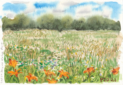
Nearing the end of the hiking/cycling path, there were these great fields of grass and flowers. This scene had wild tiger lilies in the foreground and a variety of other plants and flowers in the mid ground. I had Monet in mind for this one, he painted poppy fields in France to great effect, in fact I copied his painting using acrylics several decades ago. Breaking the idyllic silence were a parade of heavy machinery, apparently there are a lot of noisy maintenance vehicles for the park. Shuffling my bike to the edge of the road as much as possible, a backhoe stopped and the driver leaned out and looked at my painting and said 'nice!'. I will take that as a compliment, at least he didn't say 'move'.

Cap Saint-Jacques Nature Park, Field of Flowers, watercolour 5 x 7" cold press, June 2021 (No. 2735)


Reaching the end of the loop, I wanted to make one more painting but the scenery was a little dense. I found inspiration in the poison ivy growing at the roadside, as indicated by the warning sign you see in the painting. Sumac trees, also known to be poisonous, also lined the embankment. Sitting at a safe distance on a park bench I made this final scene of the park, you see the bike path at bottom right which veers off to the park exit. To make the black part of the warning sign, I mixed all the darks including indo blue (PB60), perylene maroon (PR179), perylene green (PBk31), and a touch of carbon black (PBk6).

Cap Saint-Jacques Nature Park, Pick your Poison, watercolour 5 x 7" cold press, June 2021 (No. 2736)


Friday, June 25, 2021

Montreal West: On the Water


Just past Pine Beach Park is Valois Bay Park, part of an area I am not familiar with called Valois. The park was heavily landscaped and manicured as you can see from the painting where every shrub and flower was tastefully located. As I painted, a team of worker guys showed up in two trucks and a backhoe, there must have been five of them, and their task was to move the port-o-let toilette about 3 meters to the left. It took a bit of extra concentration to finish this one, but I am pleased with how it turned out, the birch bark really shines. I made the texture of the water similar to the birch bark just to add some flow to the scene.

Valois Bay Park, watercolour 5 x 7" cold press, June 2021 (No. 2728)


Sailboats were a plenty on the St. Lawrence, these boats perhaps belong to a sailing club, I thought it was Point Claire Yacht club but looking on the map it seems to be further up river. The colourful boats were zigging and zagging (tacking) around the river, which was an interesting shade of pea-soup and turquoise. I used cobalt blue (PB28) to get the blue reflections on the water. 

Point Claire Sailing Boats, watercolour 5 x 7" cold press, June 2021 (No. 2729a)


It started to get overcast when I found this fancy old estate building turned cultural center and art gallery in Point Claire. It was closed for business, but the port-o-let was a popular destination (not in the painting!). I liked the way the covered veranda framed the blue-green mountains in the distance.  To capture the shadows in the cloud I used indo blue (PB60) and caput mortum (PR101) which is a neutral purplish looking brown. When the clouds were more stormy, I increased the amount of indo blue. If they were closer to the sun, I added a touch of burnt sienna. It may not look like it, but cloud shadows contain the whole spectrum of colours albeit grey versions.

Stewart Hall Cultural Building, watercolour 6 x 7.5" cold press, June 2021 (No. 2921)


Finally I made it to Baie D'Urfe, the location of the hotel was just north at the Highway. The town hall had a lot of good subject matter like river-views and a water lily pond, but the sun was going to be down soon. That was one thing I hadn't thought about before the trips, that the sun sets on the other side of the island of Montreal, putting the south shore in shadow. This row of trees provided a nice composition. I started by doing the background water and distant shore line, then over-painting it with the trees. The grass was textured with green-and-beige grass and plants.

Baie D'Urfe Town Hall Park, Row of Trees, watercolour 5 x 7" cold press, June 2021 (No. 2730)


As I unpacked my stuff in the hotel room and took stock of the day's paintings, I realized I had done 9 paintings. To do just one more I attached the shoulder strap to my bike pack, and walked out to the front of the hotel which had a wonderful view of highway 40 and its off ramps. There were very few cars on the off ramps and I had a wide sidewalk to stand on. The main highway you see on the other side. A thicket of trees was letting in long beams of sunlight as the sunset. I had to paint fast because it would be twilight soon. I managed to get the car and truck headlights, it was reminiscent of the Decarie underpass painting from this March. The asphalt is actually two different colours, the shadow is dark blue-grey (PB60+PR101+PBk6) , while the shadow is a neutral orange (PY110+PBk6).

Highway 40, Sunset west, watercolour 5 x 7" cold press, June 2021 (No. 2731)

With the ride out west complete, I rested up for the next day, which would take me up to Cap Saint-Jacques Nature Park and around to Saint-Anne de Bellevue. The rest of the paintings were fantastic, I will post a few new blogs on them.


Montreal West: Parks, Memory Lane

Day one of my bike ride to the West Island took me past a number of parks some of which I was quite familiar with, others were new experiences. The view of course, was gorgeous wherever you looked... the sparkling water of the St. Lawrence with emerald greens and turquoises, lined with lush foliage and green grass. One surprise was how cold it was, luckily I brought along an extra shirt to stay warm. The warm-up painting was this challenge, one of many sailboats moored at Parch St. Louis in Lachine.  

Parc Saint-Louis, Sailboat, watercolour 5 x 7" cold press, June 2021 (No. 2725)

A dedicated bike path took me farther west to Stoney point park, a popular picnic destination and nice place for a stroll. The cold wind was blasting down the St, Lawrence here, but it did not seem to bother the ducks and the squirrels. I threw some peanuts down to get the creature to pose for a few seconds, luckily I've had some practice painting squirrels at Trenholme park. To create the stoney point, I started with a  flat wash of two types of grey, one warm, one cool, then as it dried I added layers of details. The more it dried, the sharper the details became. The squirrel only sat still for a second or two, I established the outline and finished from memory.

Stoney Point Park, Squirrel and Ducks, watercolour 6 x 7.5" cold press, June 2021 (No. 2920)

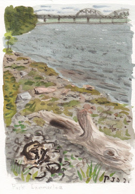
This park I have memories of since childhood, albeit brief memories. Cilei and I have also rode out here, and I have rode out here a few times on my own over the years. The shore line is completely different, they planted foliage to prevent erosion. I found my way to the rocky shore and saw a recently used fire-pit, the driftwood tree trunk was charred black too. The bridge is the Honoré Mercier bridge. For the stoney beach, you will see a few of the stones are brighter than the rest. To do that effect I leave the spot blank until the painting is almost finished, then add a light bright peach or sky blue. The tree trunk needed a lot of layers to give it the sun-bleached and wind-blown textures. Those little sparkles in the water are paper left to show, done with a careful sideways dry-brush technique.

Parc Summerlea, Fire-pit, watercolour 5 x 7" cold press, June 2021 (No. 2726)

Next was Millenium park, which was made for walking and running but had little to inspire an artist. The main feature was a large running track that circled a sun burned field of grass. I composed a semi circle of textured gravel, and filled it with the scorched grass. For this trip I removed phthalo green blue shade (PG7) and replaced with with a giant blob of benzi yellow (PY154), knowing full well that I would use a lot of yellow paint on this trip. Good thing that I did because I used a lot of yellow by the time the trip was over. 

Millenium Park, Running Track, 5 x 7" cold press, June 2021 (No. 2727)


Another popular picnic destination, Pine Beach Park is located in Dorval. Dorval has invested a lot into the waterfront, making it accessible and providing cafes and restaurants for a bit of tourism, I was quite impressed. I rode into this park with high expectations, then had a hard time to find either a beach or some pine trees. I never did find the beach, but I found some pine trees near a War memorial, which you see as the reflective black marble triangle shape in the bottom left. I have not painted a reflection like this before. I started by painting it in colour at the same time I painted the main scene, then took a deep breath and covered it with dilute carbon black. In retrospect I would have done it in the other order, so as to better judge the hues and values.

Pine Beach Park, Memorial and Pine Trees, 8 x 10" cold press, June 2021 (No. 2896)

I will post another blog for the second part of day one of the ride...

Monday, June 21, 2021

Stretch the Legs, Summit M2

On the weekend after my trip out East I decided to hike up to the top of Mount Royal, otherwise known as M2 on this blog. There in winter I did one of the best paintings of the year, the overpass covered in snow with an incredible curved shadow. I was dismayed to find out that the whole thing had been leveled. Dismayed, but not surprised, Montreal has a penchant for the bulldozer. The sky had the most interesting wispy clouds that I created with wet and wet and some lifting techniques. The overpass would have been about in the middle here.

Wispy Clouds Over the Overpass (which is now over), watercolour 5 x 7" cold press, June 2021 (No. 2698)


The main challenge of the day was to see if I could make the 15 km round trip by foot, and if my gear would stay in one piece. Well my shoulder strap broke but I could manage to fix it, and I forgot to bring a sunscreen to do a refresh. But otherwise, I made it to the highest point of the mountain at 233m. This painting is at a classic location around Beaver Lake, a steep hillside where in the winter kids toboggan. I did a more psychedelic interpretation of this scene a few years ago. Oh yeah, I also updated a painting which one of my eagle-eyed readers noticed had a missing boat panel. Good catch Dad.

Beaver Lake Walkers, watercolour 5 x 7" cold press, June 2021 (No. 2699)

Montréal Est: Day 3 the Ride Home

Day 3 of the trip to the East side of the island promised much rain on the return, and a stiff wind. I stopped at one last park to make a painting, it was a lovely cool morning and the sun starting to shine. The locals were showing up here with their coffee to enjoy the view. Having a good nights sleep helped my brush stay true and colours shine. I didn't even realize that there were two boats in the distance, overlapping closely, until I was nearly finished the painting and one started to drift from the other. I used all the knowledge from the previous longest day of painting. I like this painting it is really immersive.

Parc du Fort-De-Pointe-Aux-Trembles, Bench View, watercolour 5 x 7" cold press, June 2021 (No. 2720)


I stopped a few times, and got lost in a labyrinth of bike path detours downtown, but finally emerged dry and unscathed. It had started spitting rain drops, but then abated. I decided to give the new Vendome station entrance a go, you can also see the old station at the right of the painting. It was overcast that day, I should go back when the sun is shining. But tomorrow (Tuesday) I will start my next adventure... to the West island.

Vendome Station Orange Line Metro, New Entrance, watercolour 5 x 7" cold press, June 2021 (No. 2721)


Montréal Est: The Biggest Day Part 2

After reaching the end of the island, I retraced my way back to the nature reserve and rode through its woods which offered a refreshingly cool temperature. A small path caught my eye, at the end of it was a very brown very green swamp with two families of ducks with many ducklings swimming through the dense weeds. You can barely see them in the painting, I used a lifting technique to create their fluffy bodies. Half the scene was in darkness, the other in light. I used plenty of umber (PBr7) for this one.

Parc-Nature Pointe-aux-Prairies Duck Swamp, watercolour 5 x 7" cold press, June 2021 (No. 2716a)

As I headed for the upper parts of the nature reserve, this scene emerged, it is looking down a steep embankment into an algae-filled swamp littered with fallen trees. It was just missing some cobwebs and spiders to be a complete Halloween theme. It was fun to capture the intense chartreuse (lime) green and variety of shapes in the broken trees. Another tourist saw me painting this and then took a picture of it. The black blobs at the top were actually the water showing through, an inky black.
 

Parc-Nature Pointe-aux-Prairies Creepy Swamp, watercolour 5 x 7" cold press, June 2021 (No. 2716b)


Did you know there are two kinds of chartreuse, one greenish like in the swamp, and another yellowish like in this painting of a winding bike and pedestrian path going through the woods. The path itself was caput mortum (PR101) a kind of violet-red earth paint, and the intense yellow was copious amounts of lemon (PY175). I really embellished this painting to convey the feeling of the scene, you can imagine zipping your bike through this path with intense sunlight and a cool breeze.

Parc-Nature Pointe-aux-Prairies Winding Path, watercolour 5 x 7" cold press, June 2021 (No. 2717 not numbered yet, at parents' house)


At this point in the day I was tired and starting to run out of water. Luckily I could use my dirty water for the swamp scenes which left some for a few more paintings. These sumac trees had very interesting shapes colours and textures which contrasted the wavy field of grass and reeds. A train rumbled by in the background. By now I was painting smoothly, just see anything interesting, stop, paint, repeat. I wonder if this was how Van Gogh felt when painting in France.  

Parc-Nature Pointe-aux-Prairies Sumacs, watercolour 5 x 7" cold press, June 2021 (No. 2718)


On my way back to the hotel I crossed one more park, this one was a non-de-script stretch of paths and benches in the heart of the Point-Aux-Trembles neighborhood. It was also coffee time, so I fixed up a little instant coffee with remaining dribbles of water, and thoroughly enjoyed it, you see the small plastic cup of coffee in the painting. I actually dabbed on some coffee to make the coffee in the painting, then finished it with raw umber (on the painting not in my coffee). I was feeling a little loopy at this time, probably mild heat stroke or exhaustion maybe, but my spirits were high. These chess-board tables were interesting, I composed them in a dream-like arrangement. Then I had the idea to include my paint brush painting the painting that I was painting. Like I said, high spirits!

Parc René-Lecavalier, High Spirits, watercolour 8 x 10" cold press, June 2021 (No. 2895)

That had to be it, I was done for the day, or was I?


On my way to pick up some Indian food at a great little spot called Resto Indian, I noticed the industrial area just up on Blvd. St. Jean-Baptiste. Curious, I headed into the stench, a kind of chemical toilette aroma. The road had a steep grass embankment that was not fenced off, so I headed to the top bike in tow. The view was awesome, like not in a nice kind of way. It was extremely windy and smelly up here. The little pond area was sectioned off with giant concrete blocks, and half of the water behind a barrier was greenish. There were little shrubs and vines growing all around the water area. The main feature was a giant chemical drum, which surprisingly had a door on its side. The rest of the facility was a tangle of pipes and metal chimneys. What a shock, this all surrounded by suburbs and shopping areas.

Montreal East, Discount Resort!, watercolour 5 x 7" cold press, June 2021 (No. 2719)

The longest painting day was over with 15 paintings completed. Heading down to the restaurant, I enjoyed my hard earned chicken madras with rice ...  

Eating with the Swiss army knife and fork given to me by Fritz and Cileni last year...I thought I was eating alone.. or was I?


Montréal Est: The Biggest Day Part 1


Last Thursday I woke up to fantastic weather out in Montreal East and gathered together my bicycle and gear. The previous day I had made painting in parks along the St. Lawrence River. To start the biggest day of painting, I made this little watercolour of an old fashioned house now used for tourism. Cobalt blue (PB28) was key in achieving the high chroma blue roof. If you compare closely to when I first blogged about this one, you will see small adjustments to the shadows.

Parc Marcel Leger with Maison Antoine Beaudry, watercolour cold press 5 x 7", June 2021 (No. 2710)


Next up was the sprawling Parc-Nature Pointe-aux-Prairies, a nature reserve that spans most of the width of the island. You are looking at the St. Lawrence river, here the shore line was a little less rocky and more sandy. Tall reeds were abundant, they mirrored the tall condo building being built in the distance. This painting features the interesting contrast between pastel orange and blue at the water's edge.

Parc-Nature Pointe-aux-Prairies Shore Line, watercolour cold press 6 x 7.5", June 2021 (No. 2711)

The central part of the park was mostly sectioned off, with just a few pedestrian and bike paths criss-crossing the forest. I found the most incredible place to stand, on a small trail rising around an old tree, offering a superb view of the seemingly never-ending field of flowers growing under the forest canopy. They looked like Queen Anne lace, and smelled as strong as the perfume you might smell at a department store perfume section, but more pleasant. I wasn't sure how to go about painting this, so I worked up textures from light to dark and kept the trees lively. You can see a photo I took in this area on the blog I linked above.

Parc-Nature Pointe-aux-Prairies Flower Field in Forest, watercolour cold press 5 x 7", June 2021 (No. 2712)


I could have spent all day in the nature park, but my ultimate destination awaited me, the park at the end of the island. On the way I stopped at Pierre-Payet park for lunch and made a few paintings. Usually I avoid painting private property but this house had some incredible colours on the red side of the spectrum. The bright ferrari red down by the fence, the neutral iron red of the tree trunck, the maroon of the tree leaves, and the magenta of the trellis flowers. It felt good to make use of the full palette.

Pierre-Payet Park Colourful Garden, watercolour cold press 5 x 7", June 2021 (No. 2713)

This was the view I had as I ate lunch, seated on the grass towards the end of the park. The grass was awfully dry, and the wind was gusting. The shore line made an interesting shape, it is part of Saint Thérèse Island, which actually is part of Varennes Quebec. There were little shanties and locals boating and kayaking around here. .

Pierre-Payet Park View of Verrenes #1, watercolour cold press 5 x 7", June 2021 (No. 2714a)


And this one from the same spot looking Eastward towards the confluence of the St. Lawrence and Prairie rivers. The big tree in the middle must be a real survivor, a colossus of sorts to stand strong in what must be some difficult winter conditions. Today the tree was just enjoying the sunshine.

Pierre-Payet Park View of Verrenes #2, watercolour cold press 5 x 7", June 2021 (No. 2714b)


And then there were no more parks left on the way, I made it to Parc du Bout-de-l'Île the Eastern most point of the island of Montreal. I tried to translate this but it had something to do with combat, perhaps that is the case, but I thought it meant 'boot' like toe of the boot. If you look closely among the rocks you will find the toe of my left shoe, just to show I was there, at the end of the boot. Half of the painting shows the rampart of large stones there as a breakwater. The water on the left, which is the Prairie river, had an odd purple-brown colour, while the St. Lawrence (top right) had a brilliant turquoise where the two rivers met. I downplayed the condos and other urbanity on the far shore to maximize the great colour contrast with the chartreuse grasses. This was the only 9 x 12" painting I did on the trip, I brought one piece just for this type of scene. I noticed on the map this park was also called  Parc du Fort-De-Pointe-Aux-Trembles, so perhaps it was two parks in one, the central area was filled with interesting statues.

Parc du Bout-de-l'Île The End of the Boot, watercolour cold press 9 x 12", June 2021 (No. 2894)


I walked carefully with my bike along the rocky shore, some of it was a dense sand beach, and arrived at a small triangle of land, literally the tip of the island. A large stately tree that had seen better days was leaning badly due to erosion. I captured the tangle of roots and different textures of bark. In the background you see Notre Dame Hwy 138 bridge going off island, afterwards I rode about halfway across but was not equipped to go much further. As I painted this one, a couple of people drifted by in a motor boat that was not running, the were fishing, and I could tell they were watching me... some guy in a bucket hat with his bike beside him, doing a painting of a dead old tree.

Parc du Bout-de-l'Île Leaning Tree, watercolour cold press 5 x 7", June 2021 (#2714)

 Around the bend I found a dense grassy area with a view of Prairie river in the background, you see that odd purple-brown colour (done with perylene maroon PR179, indo blue PB60, and touches of cobalt blue PB28). I almost walked past this scene, I was tired and knew it would be a tough one. But Van Gogh did a painting like this once so I gave it a go. I also wanted to use every brush and every colour. I started with my 1 inch round hog's hair brush because I only ever use it clean the palette in between paintings, so thought this brush deserved a chance to shine. Then I worked through all the brushes, a No. 8, No. 6, No. 4, No 2, filbert, and small rigger. I also employed each of the 20 paints from my palette. Even the magenta saw some action in the little pink flowers. As I walked about this area, I noticed the remains of campfires and evidence of parties, so this seemed like the kind of place the kids would go to hang out and party at night.

Parc du Bout-de-l'Île Everyone is Invited, watercolour cold press 5 x 7", June 2021 (No. 2715)

So I made it, all the way out to the tip of Montreal island. But my day was only half over, there was plenty of sun and plenty of watercolour paper left!