Small studies can be done a lot faster than large ones in most cases, which can have several advantages. For one the small study provides quick gratification since one like this can be completed in one or two sittings. There is more learned from doing 10 small studies than 1 large one. About two years into my painting 'career' I tried to switch to large format, but it did not go well at first and so I switched to mostly small format paintings. In 2004 I did "Construction at site 22" part of the lab book series which would be one of the largest at 44 inch x 30 inch. This one is about 5 inch by 7 inch. There is another version of the same design on the back of this painting, I was not happy with that version so this was the improved version.
Watercolour 5x7", August 2015
Wednesday, October 28, 2015
Wednesday, August 26, 2015
Church, London Ontario.
Every painting I do is on a piece of 100% rag acid free watercolour paper, usually from Windsor Newton or Arches. It tends to be a little pricey at times so I buy in bulk when possible. Occasionally I paint on the back of the painting but not very often, it is to save paper, and to salvage what would otherwise be a bit of a waste. This was a front-side painting done from a photograph taken in London Ontario. I do not often paint from photos because it is difficult to capture the energy and spirit of the scene, which is after all the essence of painting. I decided to paint on the back of this one, I think Eggs and Mankind is on the back. Notice the bright yellow fire hydrant in the foreground, it is my favorite part.
22x15" cold press watercolour. 2003.
Eggs and Mankind
How many eggs does it take to screw in a lightbulb? 11, because one is scrambled. But seriously, this painting was done from a group of doodles, which were assembled into a complete work of art. The art work contains some typical features of this style, including a tree line and a sunset. The eggs are meant to look like eyes in the sky, and the mankind, well, its hidden behind the trees.
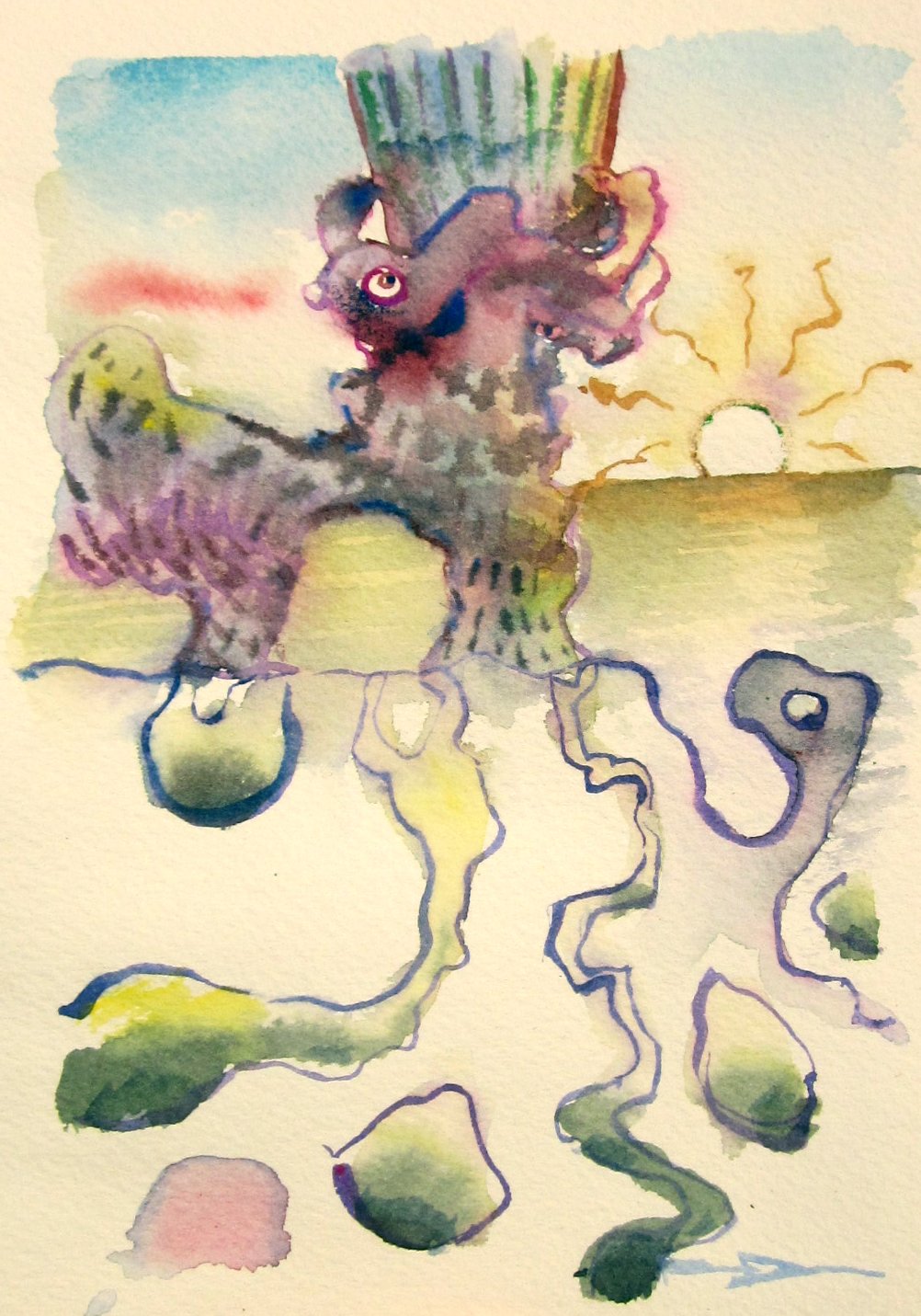
Controlling watercolout paint is possible, with a lot of practice. When I first started painting many years ago the paint was an uncontrollable animal, but over the years the animal was tamed. Look in the top part of this painting, there is a series of grey and red streaks on a yellow background. to achieve this, the yellow wash is applied, and at precisely the right time (about 20-40 seconds later depending on relative humidity in the air) you drop in the redish mix which is altzerian crimson and viridian green. Then when that is just about dry you drop in a stronger mix of the same colours with more of the green, and a touch of ultramarine blue. If the timing is perfect then the colours bleed into each other. If too wet it all mixes, if too dry it looks choppy. This whole painting is filled with the same technique, I guess you would call it a triple wet-in-wet. As they say in the e-sports world, good luck and have fun.
Eggs and Mankind, 11 1/4 x 14.5", cold press watercolour, 2015 (No.1759)
Controlling watercolout paint is possible, with a lot of practice. When I first started painting many years ago the paint was an uncontrollable animal, but over the years the animal was tamed. Look in the top part of this painting, there is a series of grey and red streaks on a yellow background. to achieve this, the yellow wash is applied, and at precisely the right time (about 20-40 seconds later depending on relative humidity in the air) you drop in the redish mix which is altzerian crimson and viridian green. Then when that is just about dry you drop in a stronger mix of the same colours with more of the green, and a touch of ultramarine blue. If the timing is perfect then the colours bleed into each other. If too wet it all mixes, if too dry it looks choppy. This whole painting is filled with the same technique, I guess you would call it a triple wet-in-wet. As they say in the e-sports world, good luck and have fun.
Eggs and Mankind, 11 1/4 x 14.5", cold press watercolour, 2015 (No.1759)
Thursday, August 20, 2015
Gas Pump, NDG, Montreal
Here is a small landscape painting done on location in the neighborhood of NDG, in fact, this is the view from the front of my building! The red-green complimentary colours caught my attention, and so did the strong blue shadow cutting across the foreground towards the left bottom. Painting landscapes on location is tricky, you want to catch all the details, but time constraints mean that you have to pick and choose where to put the details. In this example I spent most of the time on the gas station pump and the light post, and much less time on the surrounding elements. Unfortunately a giant SUV parked in front of the pump during the painting, so I had to make up a few details. That's called artistic license!
5x7" watercolour, 2015
Wednesday, August 19, 2015
Atmosfear
This is a recent painting called Atmosfear, which is a word play on atmosphere. The sky is a twisting mass of forms and figures, culminating in an outstretched hand nearly touching the apex of the long house. The structure looks religious in some ways, but it was not meant to be. I have always enjoyed stained glass as a motif, it appears in dozens of paintings, the most memorable perhaps being 'Escape Route' an old painting about the relationship of art and science (in my brain?).
I am a watercolour painter but I was always inspired by oil painters such as Monet, Degas, and Dali. The two medias are quite different. Oil paint is generally very bright and 'juicy' with clear lines and definition, watercolour tends to be less intense and more free-flowing. Because I was inspired by oil painters I tried to copy the look and feel of their work using watercolours, which explains part of my style, that is, bright colours and fairly well defined details. But still, I do try to bring in the power of watercolour, which is seen for example in the sky, and in the shimmering reflections on the grassy field in this painting. I tried oil painting once, and produced but one oil painting which I sold to a friend, then gave away the oil paints!
22x15 cold press, watercolour, 2015
The Fish Catchers
An older painting done in the doodleism style, this one depicts fish falling from the sky and some curious onlookers. Instead of signing it where I normally would in the bottom right, the signature is incorporated into a graffiti on the wall, front center. There is a haunting castle in the background, and some marshy areas around. The painting has a futuristic look to it, like the flying fish have taken over or something like that.
The colour palette for this one was pastel, with a difficult purple-yellow complimentary colour scheme. In a few spots there is red-green, just above the heads of the two characters, and some blue-orange, in the characters themselves. Purple-yellow schemes are difficult because the yellow is easily over-done, one has to blend it carefully. It also helped to have the cold greens throughout. I do not think consciously about colour very much, when the colours are off, you feel it, when the colours are on, it gives a kind of subliminal satisfaction. Now that would make a good name for a painting!
15x15" cold press, watercolour, 2007
The colour palette for this one was pastel, with a difficult purple-yellow complimentary colour scheme. In a few spots there is red-green, just above the heads of the two characters, and some blue-orange, in the characters themselves. Purple-yellow schemes are difficult because the yellow is easily over-done, one has to blend it carefully. It also helped to have the cold greens throughout. I do not think consciously about colour very much, when the colours are off, you feel it, when the colours are on, it gives a kind of subliminal satisfaction. Now that would make a good name for a painting!
15x15" cold press, watercolour, 2007
Thursday, August 6, 2015
New Thoughts and Human Adaptations
Depicting objects underwater is tricky in any media, including watercolour. I started with the outlines of the underwater creatures, making the outlines squiggly and not complete was key in creating the illusion that their shapes are being bent by the rippling water. Then I overlayed the reflections in the rippling river using wet-in-wet techniques. Finally I put on the colours of the creatures, and some light shadowing to indicate that they are sitting on the bottom of a riverbed.
22x30" cold press, watercolour, 2015
Subscribe to:
Posts (Atom)


