Saturday, August 5, 2023

Scenes from Bolton Summer

Under the back deck of my parent's house there is a lush clematis vine with purple flowers, along with a bunch of rhubarb and a red canoe in the background. To paint the clematis I applied the green foliage first, then coloured it in with variations of purple. When painting, there are many ways to make purple. First of all, you can think of what is purple? In a colourful sense, purple is actually a low value (dark) magenta, replicated almost perfectly by a pigment called dioxazine violet (PV23). Instead, I used a mix of indo blue (PB60) with violet magenta (PV19), although it works better with purple magenta (PV55). All of the paints sold under the name magenta are actually halfway between red and magenta, making them a rose-red. When mixed with a blue-violet paint they will become dark muted purples. 

Clematis under Deck, watercolour 5 x 7" cold press, July 2023 (No. 3519)


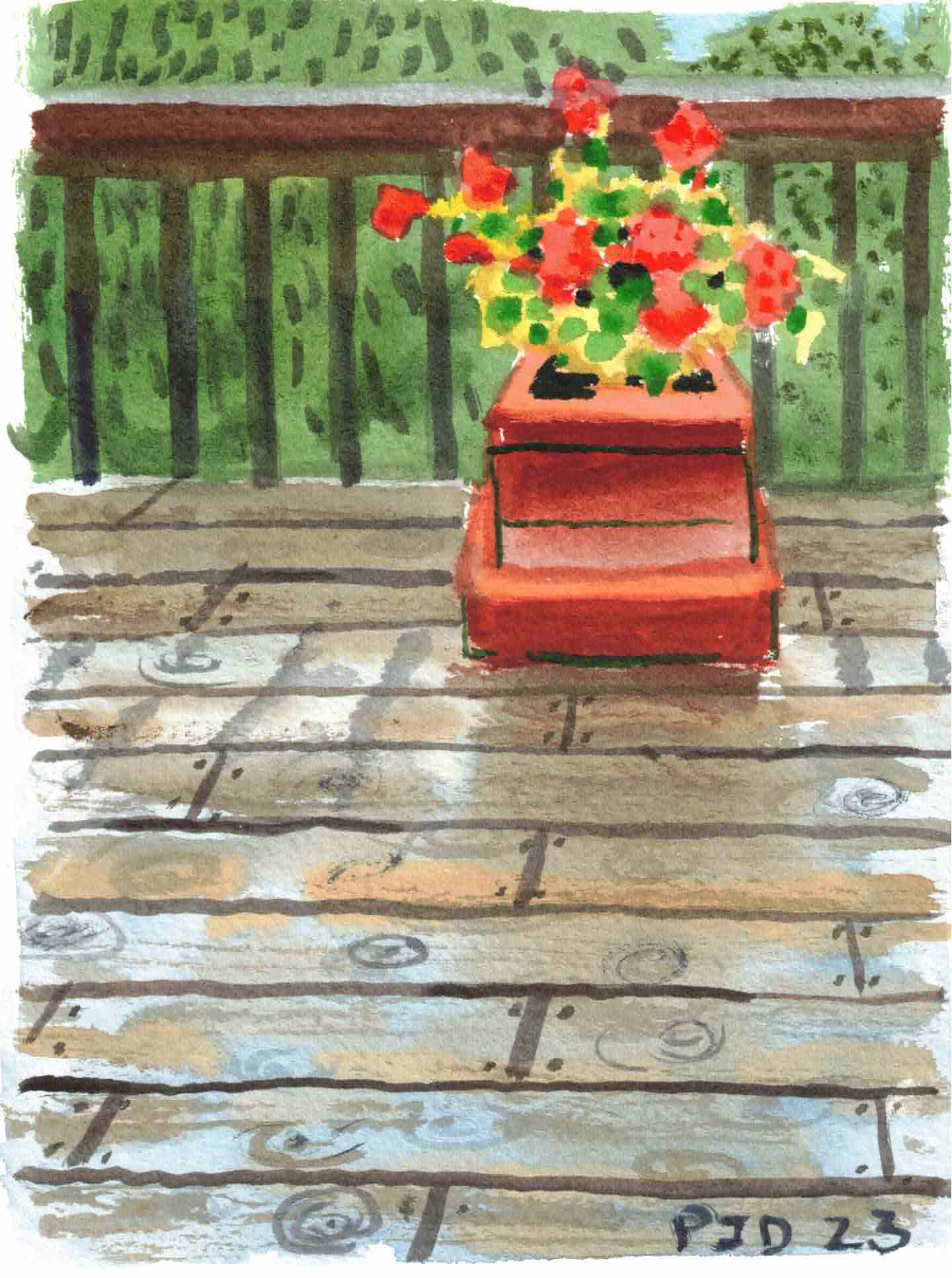
Down in the valley there is a historical area called mill park where the mill used to be. Last century the valley flooded taking with it all the homes, which is why no new construction is allowed downtown. There were some invasive vines on the trees which I pulled down. The painting is much sharper in real life, I will be replacing my scanner soon with a newer and better one after seeing the scan of the rainy day deck painting.  

Mill Park Greens, watercolour 5 x 7" cold press, July 2023 (No. 3520a)


These rapids are exactly where the old dam used to be before it was made obsolete and then demolished. For years there was a wide concrete wall with a gash in it which let the water through but about 20 years ago the town renovated the river and removed the remnants of the concrete structures. Now the water flows freely over the rocks and down stream. These are tough paintings to execute because the water is constantly moving which changes the reflections and textures. I used a combination of techniques to build up the sense of motion and sparkling highlights.

Humber River rapids, watercolour 5 x 7" cold press, July 2023 (No. 3521a)

Tour of Montreal

On the way out to Anatol I stopped at Parc and Laurier to make a painting of the cafe on the corner, which used to be a Starbucks but now it seems to be an independent brand. I made a fairly detailed outline with light grey paint (PBk6 plus water) then filled in the brick shades, the awning, the road and the sky. As it dried I over layered the tree and added other small details like the hydrant and the people in the store. It was very noisy, one sports car revved its engine right in front of me as it sped past and my heart skipped a beat! 


Mile End cafe yellow awning, watercolour 5 x 7" cold press, August 2023 (No. 3508a)

There was a sidewalk sale and road closure on most of st Laurent street in Little Italy. After picking up the items at Anatol bulk store I made a painting while sitting in a shady little park, with a view of a prominent tree and two trash cans. To paint the tree I mixed yellow ochre (PY43) with a purple mix of dark blue PB60 and purple magenta PV55. As the paint dried I added successive layers, each gaining a bit more definition as the paint dried. I actually developed that technique painting snow piles in the winter. It is a modification of wet-in-wet, where the texture can be varied depending on moisture. 

Little Italy Park Shady Trees, watercolour 5 x 7" cold press, August 2023 (No. 3507b)

Riding south down Berri bike path I turned right on Champs de Mars I found this interesting arrangement of a yellow house next to an elegant duplex. It was pleasantly overcast when I started, then the sun came out and roasted me for the rest of the paint. Luckily I was prepared with a sun had and plenty of sunscreen. Several people went in and out of the door, maybe it was one of those short term rentals.           

Yellow and Blue houses, watercolour 5 x 7" cold press, August 2023 (No. 3509a)

Friday, August 4, 2023

Walk around Westhaven Neighborhood

A walk around the Westhaven neighborhood, centered on Harley street south of the train tracks, yielded several interesting scenes to paint. This scene shows the front of the strip mall which contains a cultural center focused on activities of the west indies such as dominoes. I tried to capture the bright reflections underneath the shadowed facade. The pale orange brick colour was with yellow ochre (PY43) and red ochre (PR101), water, and some neutralization with purple (PB60 + PV19). 

Harley Street Mall, watercolour 5 x 7" cold press, August 2023 (No. 3505a)

Here is the view across the street, a condemned building with a bit of graffiti and wild flowers in the overgrown lawn. Painting fire escapes is especially tough, in this case it was a metallic grey against a pale yellow brick. The main thing was to get the four levels properly connected. The flowers provided a good contrast against all the earthy brick buildings. Some fellow walked by and said 'cool'. 

Fire Escape, watercolour 5 x 7" cold press, August 2023 (No. 3506a)

A forested area next to the train tracks has been ransacked by tree-worms leading to the loss of many of the trees. This one is destined to be cut down based on the orange spray paint across its trunk. One of its massive branches was already cut off revealing its worm-riddled interior. Painting the tree was a test of brown, beige, pale yellow and black mixes. Midway through a squirrel showed up expectantly but left soon after it realized I had no peanuts.

Tree Demolished, watercolour 5 x 7" cold press, August 2023 (No. 3507a)

Thursday, August 3, 2023

Rain on Deck with Geraniums

On a recent trip back to Bolton it was raining steadily and I made a painting of the back deck and a pot of geraniums. The rain was collecting on the deck and reflecting the sky which created a mottled mix of beige and blue with streaks of orange. The railing and planter box were also reflecting off the water. To paint the scene I started with a wash of pale blue (dilute PB60 and or PB15) and added in the beige (PBr7 with PY43) while the blue was still moist, then streaked in some neutral orange (PR101, PO62 and PY43). As it dried I worked up the box with red ochre (PR101) and red orange (PO36), the background trees, the leaves and flowers. The flowers were done with pyrol red (PR254) and red orange. By then the painting looked rather washed out and bland, but I knew once the deck detail, rain drop circles, and railings were added it would really pop. It is almost photographic but still looks like a painting. My parent's scanner is also really great, I could post with no modifications and it looks just like the real painting, which is on their kitchen wall in a frame hanging right next to the view of the deck!  

Rain on Deck with Geraniums, watercolour 5 x 7" cold press, July 2023 (No. 3504)

Wednesday, August 2, 2023

Stopped on Tracks

It wasn't a moment we wanted to remember, then I said, if I start to make a painting the train will start moving again. From my window seat I got about 90% through the painting when the train finally started to move again. It's not often you get to make a painting looking down on train tracks so closely. In fact there were two sets of tracks but I only depicted one here to concentrate on the detail. Most of the foliage we could see along the way was infested with creeper vines, many trees looked to be dead from it or from other diseases. Luckily this scene was pretty lush though. 

Stopped on Tracks, watercolour 5 x 7" cold press, August 2023 (No. 3502a)

Thursday, July 27, 2023

No Comparison


With travelling on the agenda I prepared my second palette and did a little cleaning. This painting is also an abstract tribute of sorts to Sinéad O'Connor who passed away this week, she was a famous singer who broke through in the 90's. To make the painting I started out with a black outline, then filled in with a variety of dark yellows and pastel colours. It turned out to be quite different than most abstracts so the title is a kind of double entendre.

No Comparison, watercolour 9 x 12" watercolour paper, July 2023 (No. 3641b)

Tuesday, July 25, 2023

Basketball Court Coffee Park

As a hot, humid, rainy, muggy July starts to come to a close I find myself feeling a warm glow. Like, my neck, arms and legs actually feel like they are glowing red despite heaping on the sunscreen. Sunscreen might stop the bad infrared from getting in, but it doesn't stop the heat. What does stop the heat are trees. I stood in a big shadow looking east towards the baskeball court in coffee park which is bookended by two large mound of grass meant to keep the ball from rolling away. Its the first time I got the picnic table mostly correct. To paint the picnic table I outlined three rectangles in green, the green became the berm of grass, then filled in the rectangles with the reddish brown, painted over the black iron supports making sure to connect them properly, then applied the darker shadow on the edge of the surfaces. This is how I think when painting complex structures. The basketball hoops were much the same, paint around the shape, then fill in with shadow and detail. The rim was a mix of red-orange (PO32) and orange (PO62). This painting is very light and airy, the pastels contrast well against the dark greens, and the composition lets the viewer 'walk' around with their eyes.

Basketball Court Coffee Park, watercolour 5 x 7" cold press, July 2023 (No. 3503)