Saturday, July 4, 2020

McGill Metro Station, green line, Ville-Marie

By the time they are done working on all the stations they will probably look great! It is hard to tell since most of the work is behind tall fences with bright blue tarpaulin and yellow danger tape. The McGill metro station is really blocked off due to the work on de Maisonneuve, the road is just a 5 meter deep crater right now. A narrow passageway allows pedestrians to go down the sidewalks and get into the metro entrances. I found a staircase leading to a platform where I could set up safely, and made this painting of one of the McGill metro entrances, or at least what I could see of it. I am getting good at depicting the blue fences using phthalo blue (yellow shade). 6 x 7.5" cold press, watercolour, July 2020

For the next scene I had a whole street corner pretty much to myself, however, the metro entrance was visually blocked off by a construction camp. They had just finished spray painting the new bike lane detour, and there were a bunch of cones there to stop bikes from riding over the fresh paint. Most of this scene was brown, with little splashes of orange, red and blue. Everything was in shadow. I tried depicting two trucks at the construction site but I think one is missing a wheel! I was glad to move on to the next scene. 8 x 10" cold press, watercolour, July 2020

For this scene, I sat on a busy corner across from the Bay. Cars are depicted as little bumps at the bottom of the design. The metro station entrance is on the bottom left of the Hudson's Bay building where you see the black sign under the overhang. The location was shady at first, but the sun came over the building and I had to finish it fast before burning up. I actually went to Place des Arts and finished there before doing this one, because there was somebody on the corner bothering people when I first arrived. In the end, I could finish the painting without being bothered. 8 x 10" cold press, watercolour, July 2020

This sketch was the first thing I did on location, its when I realized that McGill was going to be a construction mess! The scene was awesome, but there was a ton of detail and everything was in shadow so I passed on making a painting. On the wall I wrote the letters FUM which stands for Thank You Montreal. 8 x 11" sketchbook, pencil, July 2020

Friday, July 3, 2020

Westmount Park, NDG

This is actually the last location painting I did today after returning from my early morning trip downtown. The downtown trip was productive I finished McGill station and Place des Arts station then caught the beginning of the noon heat which was not too bad today. A little frazzled and hot, I found a nice spot to stop and sit near the pond at the center of Westmount park, which I had ridden my bike past like hundreds of times but never actually ventured in. Cilei went there the other day on a walk and said it was nice. At least I could take my ear plugs out and it was just kids yelling in the park nearby, and dogs barking at the dog park nearby, but at least there were no buses, trucks or construction! The greens here are mostly darkened yellow tinted with some PG36 or PG7 phthalo greens, while the pea-green water was done with yellow ochre (earth colour) and some of the phthalo greens. I also made use of the new quinacridone purple (PV55) for the lilac shaded rocks in the pond and some other shadows. The quin purple is a real revelation, I used it extensively for purple shadows to great effect, and to get the deep olive greens. I am quite tired now, so I will finish the blogging on the weekend. Since I painted so much today (7 paintings on location, 2 palette cleaner paintings), I need to cut more paper and fix up my palette. Hope to get out to St. Laurent station tomorrow morning before the heat.
5 x7" cold press, watercolour, July 2020

Thursday, July 2, 2020

New World of Possibilities: Blue-Violet-Magenta-Rose

I took a week and a half off from work, which is called a vacation, so I had time to put together an order and go pick it up at Avenue des Arts today. I talked to the staff on the phone, asked a bunch of questions, and after some back and forth the order was put together for me and I paid over the phone too. When I arrived on my bike, it was ready to pick up without having to enter the store. We have to wear masks inside now, I had a mask anyways and thanked the fellow. Since I am dropping ultramarine blue this year, I needed to beef up the blue-violet section of my palette. The blue in the river and the outlines of the pyramid-like structure is done with my new phthalo blue red shade from Holbein company which is PB15... probably PB15:0 but they don't specify. For comparison, the bright blue of the sky is phthalo blue green shade (PB15:3) which I already have from M Graham company, while they are similar looking the 15:3 is more cyan, the 15:0 more blue-violet. 

I also picked up quinacridone purple from Schmincke company, it is a very dark magenta-violet colour, I used it in the tentacle things growing in the middle beside the river. I wish I had this paint 30 years ago, it has an incredible "purple koolaid" kind of appearance. It was only brought onto the market in 2017 I think, so it is rather new, and unique. I also picked up a quinacridone rose from M. Graham company, it is the foreground table structure which also has some of the purple. The jelly beans on the table are quinacridone red scarlet hue, which I already had from Holbein, it is there for comparison, it has a noticeable red hue compared to the rose paint. Finally, I bought a larger size of indothrene blue PB60 (top left rose shape and dark sky) from Winsor and Newton. The previous tube I bought this year was 5mL and almost gone, the new one is 14mL. 8 x 10" cold press, (B side of Azerbaijan World Inspired Landscape), July 2020

As you see, I beefed up the whole blue-violet-magenta-rose part of my palette with some modern lightfast pigments opening up a new world of possibilities. They handle well and I look forward to using them to create more art! I also bought more Arches cold press 140lb 22x30" paper, enough to finish the metro station series, and I picked up some watercolour paper hand made in Montreal by St-Armand paper company, it looks incredible and was a good price, I better do it justice with some great paintings.


Wednesday, July 1, 2020

Palette Cleanser #8

Palette cleaning was never my thing, I painted with mud and greys all the time. But with a new appreciation of colour I have been keeping it neat, which means removing all the mixtures off my palette before I go painting. To apply paint, I squeeze it from the tube and give it at least overnight to dry out and form a semi-solid blob which can last for weeks but needs to be cleaned. Other artists use the paint fresh from the tube but this can only be done in the studio, not easily on location when the palette needs to be moved about. Pans are another way to paint watercolours, the company pours paint in a little plastic container and it is already semi-solid when you buy it. I never liked pans but recently acquired a set of them from the Stoneground Paint Company, for example in the Armenia World Inspired Landscape. The painting in this blog used a lot of iron oxides and magenta, with some yellows and greens. I have a few paint tubes I want to faze out and I might just do a large painting using just those colours at masstone (full strength), they include ultramarine PB29, magenta PR122, and prussian blue PB27, all of which have issues with lightfastness or acid.
9x12" watercolour paper, watercolour, June 2020

Lemon Sunset study #8

The egg was our only entertainment since we were forced to stay inside. We stayed inside most of the time anyways, except to forage for mushrooms and visit friends in other underground cities. It didn't hatch, the egg, but we kept watching it day and night to see what would happen. It could have been a giant moth or maybe a ostrich although nobody had seen one in three hundred years. During lemon sunset, the moon was also rising, and Mars was in close proximity casting a permanent magenta tint on the land. Wait, did the egg just move a little bit?

5 x 7" cold press, watercolour, June 3020. (B side NDG Trenholme park)

Happy Canada Day, Guelph Ontario

I was saving this cannon painting up for today! It was done in Guelph Ontario many years ago on a painting trip I took using my parent's car. I returned to this site and it was painted a different colour, I think the students just use it as an art display. I like the parking lot in the background, just a few strokes with the brush to create all the extra depth, and with the tree trunks in the middle ground. It was raining that day too, so luck would have it that the painting turned out okay. 5 x 7" cold press, watercolour 1997?

I found another painting done on this location, I believe I did this one first but it started raining. When it stopped raining I headed back to do it again, and changed from portrait (vertical)  to landscape (horizontal) as you see above. 5 x 7" cold press, watercolour 1997?


Peel Station, Green Line Metro , Ville-Marie

At last, here is a painting on the new blogger format.They changed a lot of stuff and then made it mandatory to follow the new interface in July (now!). Being a luddite, I kept it the same way for as long as possible. The new format has additional features I am finding like pages and lists, which were probably there before but now you will find them on the front page. The pages will have lists of the series paintings including 'The 27 stations of the green line metro, Montreal' series which is featured in this blog. In the first painting you see one of the 4 entrances to the Peel metro station, it is incorporated with some fancy boutique stores and elaborate mirrored surfaces and windows that angle up and around the structure. A lone tree was growing from an opening in the sidewalk. The metro entrance is reflected on an acute angle above, and the sun was just getting over the buildings and casting light here (it was about 7AM when I arrived).

As I sat painting, a black man was stopped by the police, I saw two white men running out of these doors in the painting and pointing at him. I don't know what was going on but the sight of white people pointing at a black man and the police arriving really made me think of the reality of the whole black lives matter movement. My other thought was I showed up at 7AM to avoid trouble downtown, and now I was painting in the middle of an arrest or something. The police talked to him, and the situation seemed to be diffused. That happened in the middle of doing this painting, I tried to stay focused but was concerned about the goings on. I think the situation ended well. 8 x 10" cold press (cut from 22x30 arches), watercolour, July 2020

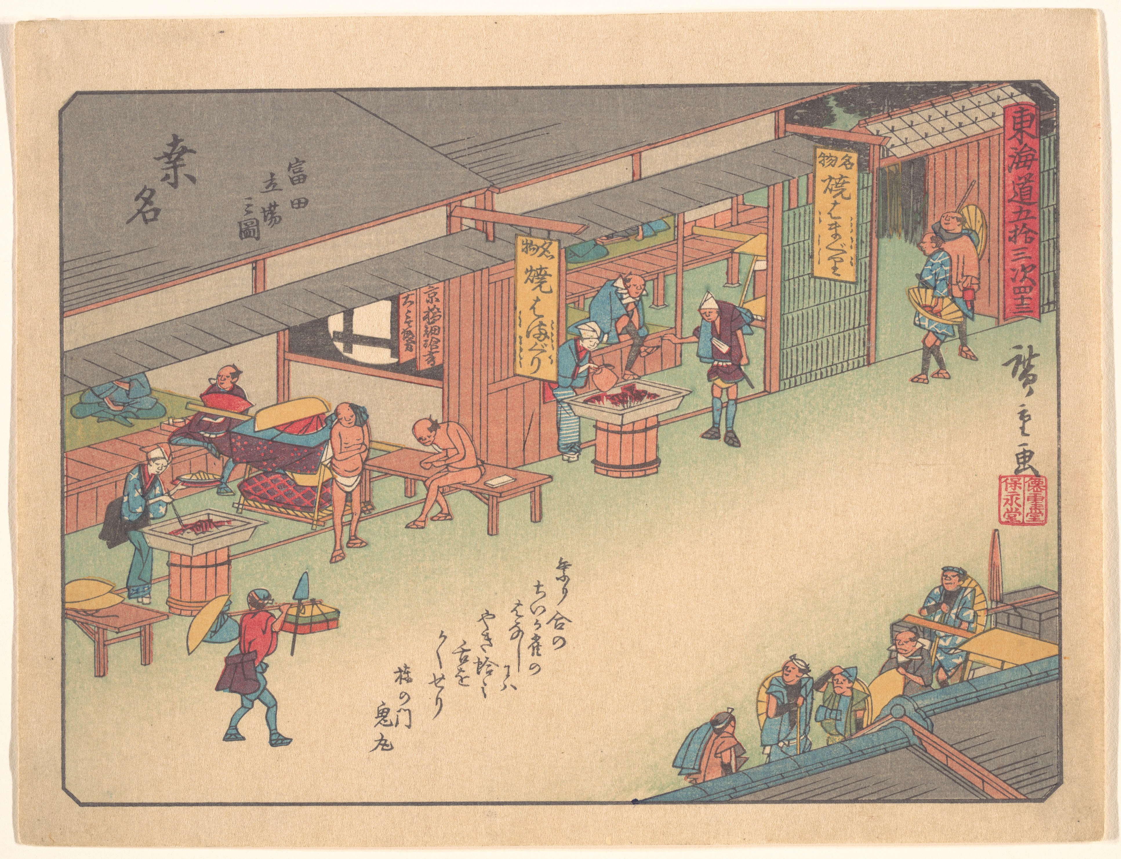
Before the next painting, I took a little walk around the block to scout out the other 3 entrances to the Peel station, and also to see if there was any more trouble. In fact, nothing was happening except some construction on Metcalfe, and they were setting up a sidewalk sale/street event on the same street. Before arriving on location I was thinking of doing a Hiroshige composition where he shows the scene on a simple 1 point (cartoon) perspective from a birds eye viewpoint. For example, in his print called, Kuwana from the The Fifty-Three Stations of the Tōkaidō Road, you see in the link he created an imaginary perspective to show the street, buildings, and pedestrians. I studied that print the night before to understand the angles. It was harder than I thought, to warp the perspective, I was sitting on the sidewalk near the orange sign you see at the bottom, looking at the station entrance. The orange sign is the only thing with proper perspective that I saw, kind of a mistake but you can see how different the imaginary perspective had to be. 8 x 10" cold press, watercolour, July 2020


The last painting was a lot of fun, these pigeons showed up thinking I feed them, and I decided to include them in the painting albeit they look a little larger than they were. They kept walking away until I threw them some peanuts, then they posed for me! When I was done I tossed some more peanuts down as payment for their modeling services. The violet sign in the top middle was the inspiration, I used violet paint (PV19 and PR233) in most of the mixes including the pigeons. The actual sign was a neon violet which is impossible to do with paints, especially since I lack certain colours. Since I have the next week and a half off for vacation I plan to drop by the art store and get some new colours. 6" x 7.5 cold press, watercolour, July 2020.


For the fourth entrance I just did a sketch, since the door was open you could see into the station which was cool. There was also an amazing reflection on the windows above the sign which are not quite obvious from the simple pencil drawing. The road in this part of de Maisonneuve was in pretty bad shape but at least the cracks gave some interesting lines for the foreground. That was the end of a pretty eventful location. 8 x 11" sketch book, pencil, July 2020