Monday, July 6, 2020

Sutton Day 1

Sutton is a small town near the border with a tourism industry based on hiking, skiing and camping around mont Sutton. It is a bit of a hippie enclave too, lots of health food and artsy stuff going on. The painting shows Horizon hotel where I am staying. 6 x 7.5"  cold press watercolour, July 2020

There is a bike trail that goes through town, I think it goes for hundreds of kilometers in both direction but I just walked down it a little bit. Vines were growing on a fence, and there were buildings in the distance and train tracks but I left them out. Just want nature to take over for awhile...like the vine takes over the fence. 8x10"  cold press, watercolour, July 2020

It turns out that the best view was from the parking lot at the hotel! The sun was setting, and part of the scene was reflecting off the front of the car. 8x 10" cold press watercolour, July 2020

Sunday, July 5, 2020

Palette Cleanser #11


Here is a new palette cleanser where I use extra paint for an original design. This is also a test to see if I can make a blog entirely on my smart phone including the photo, some photo cropping and adjustments, and the blog itself. So far so good but the colours were off due to the poor indoor lighting I had available. (EDIT: subsequently, I scanned it and updated the photo). Tomorrow I will be off on my trip, it looks like I can make a blog on my phone. I tried in Amsterdam but blogger wouldn't work, the new version is meant to be more phone friendly. 9 x 12" watercolour paper, watercolour. July 2020

Yellow Orange...just right

One last blog for the day, in fact, it may be the last blog for a few days since I am taking a solo vacation to Sutton to do some hiking and relaxing. I am looking forward to painting trees, rocks, and water for a little while before getting back to the concrete, metal, and bricks. Poring over Handprint.com by MacEvoy, I learned that at least 4 paints I have are the same hue. That means they reflect a similar 'colour' of wavelength, the difference being the amount of light they are reflecting. In the figure, four paints are used, they are all considered to be approximately yellow-orange, which is the colour of traffic lines or some construction vehicles.

Part A shows two colour scales of raw umber (chocolaty), raw umber natural (toasted bread), yellow ochre (pea soup), and then isoindolone yellow (traffic lines), with various mixes. When they are put together like this, it is more clear that they belong to the same colour family. In part B, the four paints were mixed with each other to see all of the possible variations. In part C, the top row shows a colour scale of lamp black with the bright isoindoline yellow. in part C bottom row, the raw umber was mixed with the bright isoindoline yellow. Combining the bright version with darker paints reproduces a very similar range of oranges as seen with raw umber natural and yellow ochre.

In summary, there are paints that do not appear to be related at first glance, but they belong to the same colour family (i.e. hue). Furthermore, just using the brightest paint in the family along with black paint, or the darkest one, you can reproduce the intermediate colours. Thus, the main difference between the four paints is their value (lightness or darkness).

One more thing to consider is that each paint has special characteristics, like raw umber natural is transparent, while yellow ochre is opaque, which give them unique advantages.   

9 x 12" watercolour paper ( B side of palette cleanser #8), July, 2020

Saint-Laurent Station, Green Line Metro, Ville-Marie

Situated on the historical dividing line between East and West Montreal, Saint-Laurent is the last one on my tour of Ville-Marie green line stations (EDIT: Frontenac is actually the last station in Ville-Marie). The area is heavily gentrifying, as in, condo skyscrapers and arts infrastructure are being built up very fast. This is just on the edge of the Place des Arts area where the Jazz festival is normally held. It is also next to a working class neighborhood, so this station is a lifeline for many people. One fellow asked me if I would do a portrait of his face, which is not the first time, but I declined. It was a tough location, most people looked at me and wondered what I was doing.
The structure is a rugged metal and steel box with iron-oxide paint around the roof. It is slated for redevelopment into a cultural center and metro station complex, perhaps this was the last chance to paint it as it was. 7 x 10" cold press, watercolour, July 2020

For the next scene it took awhile to find a good spot, there are just sidewalks and roads and a big empty space in front of the station. I am looking across St. Laurent street at the station and the large apartment behind it. I decided to throw in the telephone booth to give the foreground some action. The last thing I did was the yellow stripes on the doors using mostly bismuth vanadate (an opaque greenish yellow), and the brief details of the bixi bikes bottom left.
6 x 7.5" cold press, watercolour, July 2020
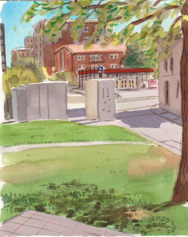
Saint-Laurent station is one of the few downtown stations with only one entrance, and it is not connected to underground shopping or other buildings. As mentioned that will change soon, Montreal has this insatiable urge to pave, build, and obscure every piece of land. Craving open space, I sat back on the edge of the Place des Arts field where they set up the stage for Jazz Festival. The random white rectangles in the middle ground are some kind of permanent structure upon which they normally build the stage each year. Except this year of course. At the very bottom is a glimpse of the fancy paving stones they set up for people to sit on. Finally, wedged in the middle of the design is the Saint-Laurent station! Had to use the small brush for that. 7 x 10" cold press, watercolour, July 2020

The sketch was of the back side of the station, it was the first thing I did before making the paintings. Some of the metallic detailing showed up on the first painting. To make it easier to scan these sketches I drew a 1 inch margin at the binding so it fits easier into my scanner. 8 x11" pencil, sketchbook, July 2020


Saturday, July 4, 2020

Palette Cleanser #10

One more to make it four... blogs for the day. And I finished St. Laurent station this morning but will probably do the blog tomorrow. This is a truly special painting. The thing about the special paintings, is that somebody always seems to love them even if I don't. In fact, my ability to predict which paintings will be popular is very poor. For example, Potato Beach, a small abstract, is still my most viewed and most liked painting. Perhaps I need to start a new series called Hot Potatos on the Beach. Or baked potatos?

9 x 12" watercolour paper, July 2020

Palette Cleanser #9 (and image of current palette)

Don't adjust your screen, this painting is really yellow. After a long day of painting on Friday I cleaned my palette and made some adjustments to the placement of my colours which meant a lot of scraping and removing. This one shows a rolling hill with burnt grass, some iron oxide platforms, and a grey moon.

 9 x 12" watercolour paper, watercolour, July 2020

I scanned an artistic rendering of my palette, these days I keep a record of all the changes (which means that technically, I did 12 artworks on Friday!). I change it all the time to accommodate new colours and optimize the workflow. Here is the palette, looks like I need a bigger one soon:


The colours, clockwise from top left are 1. venetian red (PR101, DaVinci), 2. pyrrole red vermillion, and ferrari (PR255 and PR254, Schmincke), 3. quinacridone red scarlet shade (PR209 Holbein), 4. benzimida orange (PO36 DaVinci), 5. iron oxide red (PR101/PBr7 Holbein irodori mixed with sennelier), 6. isoindoline yellow (PY110, Schmincke),7. azo yellow (PY154, holbein), 8. bismuth vanadate yellow (PY184, Schmincke), 9. azo yellow (PY154, holbein), 10. phthalo green yellow shade (PG36, Schmincke), 11. Neutral tint (PV19, PB15, PBk6, Winsor Newton), 12. phthalo blue green shade (PB15:3, M Graham, Holbein), bottom row: 13. quinacridone rose (PV19, M Graham), 14. quinacridone purple (PV55, Schmincke), 15. raw umber (PBr7, DaVinci), 16. phthalo green blue shade (PG7, winsor newton), 17. indothrene blue (PB60 winsor newton), 18. phthalo blue red shade (PB15, Holbein), 19. yellow ochre (PY43 DaVinci), 20. raw umber natural (PBr7 DaVinci), 21. lamp black (PBk6, Daniel Smith). 

Place des Arts, Metro Station, green line, Ville-Marie

After being interrupted once I went to the next station Place des Arts and parked my bike, only to be told by a security guard that no bikes were allowed to lean against the building, please move to the bike rack on the sidewalk! Nothing seemed to be going right on this painting trip. The angle was just as good though, this shows the side of one of the many entrances to the station, in the background is some sort of fancy building they built as part of the Place des Arts development. I didn't even know what I was looking at until I got up to leave. The building in the background has an underhang covered in orange cladding, so the shape of the structure is like an abstract cube. The spheres are an art installation. At least the foreground elements were more straightforward, I had fun mixing all the different greys. 8 x 10" cold press, watercolour, July 2020
With the sun coming up and a cool breeze my mood improved. The main Place des Arts square had plenty of good places to sit, it is where they hold the Jazz festival concerts (not this year!) and other special events. The granite building in the middle ground with the greenhouse structure on top is the metro entrance. The little shape in the immediate foregound is one of the stone benches of the main square where I was sitting. The monstrosity in the background is University of Quebec and Montreal, which was depicted with a neutralized yellow ochre. I tried to find an angle without it in the background but in the end I gave up and included it. Luckily there was a little tree on the corner. This was the first painting were I really used the new quinacridone purple (PV55) it was incredible for making all the purple shadows. I even signed my name in it. What a paint. 8 x 10" cold press, watercolour, July 2020


The last scene was ambitious to begin with, a jigsaw puzzle of buildings, and then a bus stopped. It was the famous #80 bus that goes up through the mile end, a bus I have taken many times. My brain was saying 'please, please do not try to include the bus.' but my brush was saying 'include the bus'. By now I was quite warmed up (both literally and figuratively) and managed to nail the bus, although some of the other building may be a little off. The dreadful UQAM building on the top left looks like a poorly made cake! Anyways, I love this painting, it really captures the immersive quality of the location. I had a great place to sit too, full shade and some grass even. An artist came up and talked to me about colours for awhile which was neat. Since the scenes were so massive, all three paintings were on the larger format. 8 x 10" cold press, watercolour, July 2020

At the last spot, I did a sketch of the back side of the metro entrance seen in the second painting, where there is an art deco park and the unique curved lamp posts of the Jazz festival. It would have made a great painting but there was full sun blasting down, and I could only find a small shadow to stand in while I completed the sketch. After this I headed back to the Hudson's Bay location to finish McGill, then stopped off at Westmount park on the way back to paint in relative peace and quiet at Westmount park. At home I cleaned the palette and got more paper ready for the next day. Including sketches, there were 11 works, it felt great to be an artist for a day. 8 x 11 sketchbook, pencil, July 2020