Saturday, November 5, 2022

Fall Leaves and Shadows

Not far from where I was painting today is st Paul park, which is just to the west of the autoroute 15/20. The park was a large flat square with millions of leaves on the ground. Long, bluish shadows were being cast by all the trees. Most of the housing was typical of the area, the three-storey brick boxes with white widows, balconies, and spiraling black staircases. This painting was really about the leaves on the grass. I started with a yellow-orange glow (PY43 and PO72), then worked up the colours towards green and brown with short interlocking brush strokes. Finally I applied the blueish shadows (PB60) and dark highlights (PBk31, PR101, PBk6). One colour I don't write much about is magenta, I carry two on my palette, a dark magenta (PV19) and a bright magenta (PR122). Sometimes the colour appears in clothing, furniture and a sun-set on a humid day. Most of the time I use these colours to adjust grey and blue mixtures. For example, the tree and its shadow actually contain magenta to give it the tree bark appearance. This was a good place to sit on a bench and eat lunch. I was just surprised at the lack of squirrels here considering how many tall trees there were.

Fall Leaves and Shadows, watercolour 8 x 10" Strathmore Series 400, November 2022 (No. 3338a)

Old House on Cabot Street


Right in the middle of an industrial road that runs along the elevated autoroute is an old residential house that people live in. It was likely an old farmhouse that was there before all the highways and warehouses. One day the whole area will probably be condo developments, so it seemed a good idea to make a painting of the house. I usually stay away from intense architecture, the last effort, Dépanneur Diamond 10, took 3 visits and five tries to get it right. This painting has it problems, the bottom part slants awkwardly, the details are a bit muddled, and I narrowed the building considerably to fit it on a portrait format. The house probably wont go anywhere soon, and there is a great wide sidewalk to set up on, so perhaps I will give it another try one day.

Old House on Cabot Street,  watercolour 9 x 12" watercolour paper, November 2022 (No. 3205b)

Ride Around Côte st Paul East


With summer-like weather I did another bike ride around Côte st Paul East which has the autoroute A15/A20 and an old industrial area. Approaching the area from Rue st Remi took me under the canal where I made this painting of the underpass road looking south. It was very cool and windy in the tunnel, and cars noisily passed. A few pedestrians walked by as I painted. This painting was all about the composition and value contrasts. Just a tiny sliver of light at the end of the tunnel indicates a bright day outside. In the tunnel a variety of grey shadows mixed with an eerie orange glow.

Under the Canal, watercolour 5 x 7" cold press, November 2022 (No. 3281)


Along Rue Angers is an enormous, dilapidated factory/warehouse with broken windows, boarded over sections, and plenty of graffiti. There was a row of creepy looking trees that had completely lost their leaves. Apparently 'creepy' was today's theme, a little late for Halloween though!

Dilapidated Factory Warehouse, watercolour 8 x 10" Strathmore Series 400, November 2022 (No. 3339b)


From Cabot street looking northwards I could see the pink house on the horizon, with more industrial buildings in the foregound. The building on the left has an enormous mural on the front of it, the side has more graffiti on the sidewalk level. 

View of Pink House from Cabot st., watercolour 8 x 10" Strathmore Series 400, November 2022 (No. 3342a)


On my way back this scene caught my attention, the sun was creating a highlight in a puddle, and the autoroute was backlit against an impressive sky. I did a few more paintings on this trip and will make a few more blogs about them.

Puddle Highlight near Autoroute, watercolour 5 x 7" cold press, November 2022 (No. 3282a)


Primal Tools


This painting was yet another palette cleanser done as I was prepping the palette for the weekend which is supposed to be like summer. I normally paint these in portrait format, but this one is in landscape format. For most of the palette cleansers you wouldn't even know which way is up if it weren't for my signature and the title. Nowadays at least there is a blog so people would be able to figure it out. A famous painting had been hung upside-down for a long time in a big museum, and the curators decided to leave it that way to prevent any damage. Needless to say, it was an abstract painting, it was by the well known painter Mondrian. Sometimes I wonder what will become of my paintings in the future, for now most of them pile up in boxes but from time to time I sell a few or give them as gifts. Most recently I gave two to graduating students, the Sunset on the River, and Reflection in Canal from a trip I did down the canal path this summer.

Primal Tools, watercolour 9 x 12" watercolour paper, November 2022 (No. 3206)

Friday, November 4, 2022

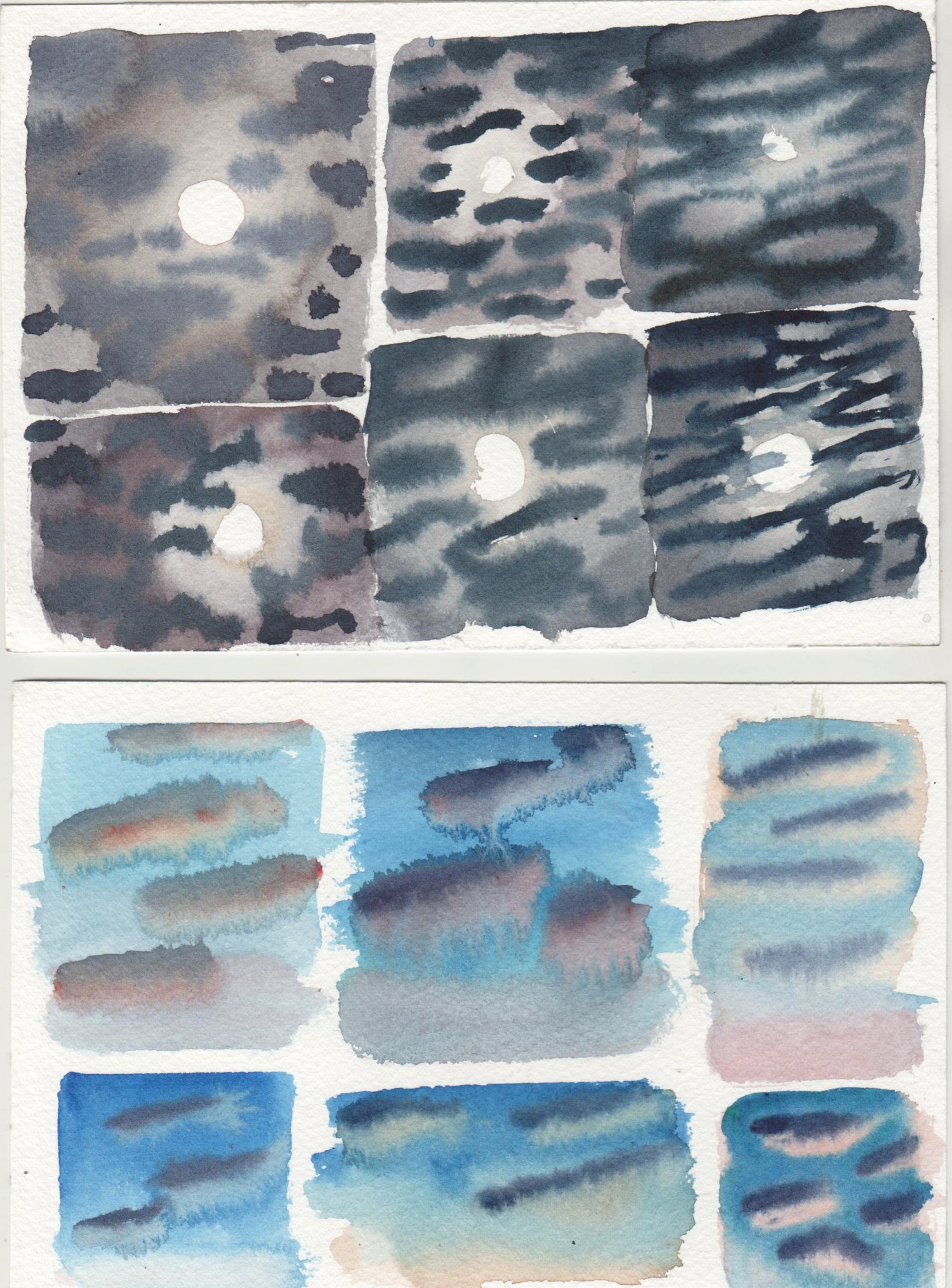
Complex Cloud Test


These are some tests I did to figure out how to paint complex cloud effects that I saw in the sky recently. The first one shows a night sky with a bright moon and overlapping clouds. The sky was an inky blue, while the clouds were illuminated by the moonlight. The moonlight was not very strong so it only illuminated a halo of clouds around it, after which the clouds became darker. Each cloud had a light side and a dark side. Capturing the effect also required a wet-in-wet approach to keep the clouds looking fluffy.With these criteria in mind, I painted around a blank circle with some greyish yellow-orange which became darker as the circle grew. When it hit the right moisture level I added the dark blue sky with indo blue (PB60) and perylene maroon (PR179). The first tries were too wet and the clouds lost their definition. The top right and bottom left efforts are pretty close to what I was going for. 

The bottom tests are for a sun-set sky, where the clouds have one half illuminated in a peachy light, while the other half is a dark violet. The sky fades from blue to cyan to orange at the horizon. for the first few efforts I applied the blue sky first, then tried to add the light cloud side, and finish with the shadowed sides. The top right and bottom left were painted with another strategy, I applied the peach first, painted around with sky, and then added the shadowed sides. The last few tests were close to what I hoped for.

Next time I see these kinds of clouds on location I will give it a try. It is exceptionally difficult to get this right, today I was sitting at the kitchen table, but on location it levels up another notch. It never ceases to amaze me that there is a seemingly never ending series of challenges to paint. 

Complex Cloud Test 1 and 2 watercolour 5 x 7" cold press, November 2022

Sports Dome Behind the Field


 In this painting you can see the Concordia University winter sports dome in the background, and on the left a tiny sliver of the Perform Center. The foreground contains the field where I have done many painting, the famous table and chairs are visible at the bottom right. I painted the bacground and foreground first, then added the trees and shrubs over top. The tree mixture was something new I was trying, it was a combination of green umber (PBr7) with benzi orange (PO62), and carbon black for shadows. It made a nice orange pekoe tea colour which represents the low winter sun illuminating the tree bark. Another reason I make so many paintings here is that it is nearby the Snowdon Bakery where I often go to buy bread and a sandwich for lunch.

Sports Dome Behind the Field, watercolour 5 x 7" cold press, November 2022 (No. 3280)

Wednesday, November 2, 2022

Changing Colours


This tree on campus was partly brown, yellow and green. It was like seeing the many stages of fall all in one moment. I've painted many trees before so I had some idea how to paint the various effects. The yellow was mostly yellow ochre (PY43) with some benzi yellow (PY154) accents. The brown was burnt yellow ochre (PR102) with some perylene maroon (PR79). The strategy for making fall colours is to mix an earth colour with a higher chroma version of the same hue. I kind of thought fall was over and the cold weather would arrive, but is nearly like summer weather this week.

Changing Colours Tree, watercolour 5 x 7" cold press, November 2022 (No. 3279)