Sunday, April 10, 2022

A few palette cleansing abstracts

As I moved some paints around and tried to finish off my winter palette, it was a good occasion for some more palette cleansing abstracts. In this one, I created a patchwork of filled boxed with every colour in the rainbow. It reminds me of an artist named Chuck Close who was known for making large photorealistic paintings that would kind of look like this painting when viewed close up. I could not think of a name for this one, when suddenly I noticed the squirrels taking away some peanuts we threw out for them, and the parallel between me hoarding paints and them hoarding peanuts stuck with me. Painuts is a fusion of peanuts and paints.
 

Stash of Painuts, watercolour 9 x 12" watercolour paper, April 2022 (No. 2988a)


After taking cobalt blue off the palette I used the remainders to make the background and overlay in this small abstract painting. The magenta, red and iso yellow complete the colour scheme. Cobalt blue is a nice colour, it has a soft granular effect and mixed interesting lilacs with a magenta paint, and light turquoises with a yellow paint. I will still use it in studio painting but retire it from location painting where I tend to make more of a mess!

Revolving Colours, watercolour 9 x 12" watercolour paper, April 2022


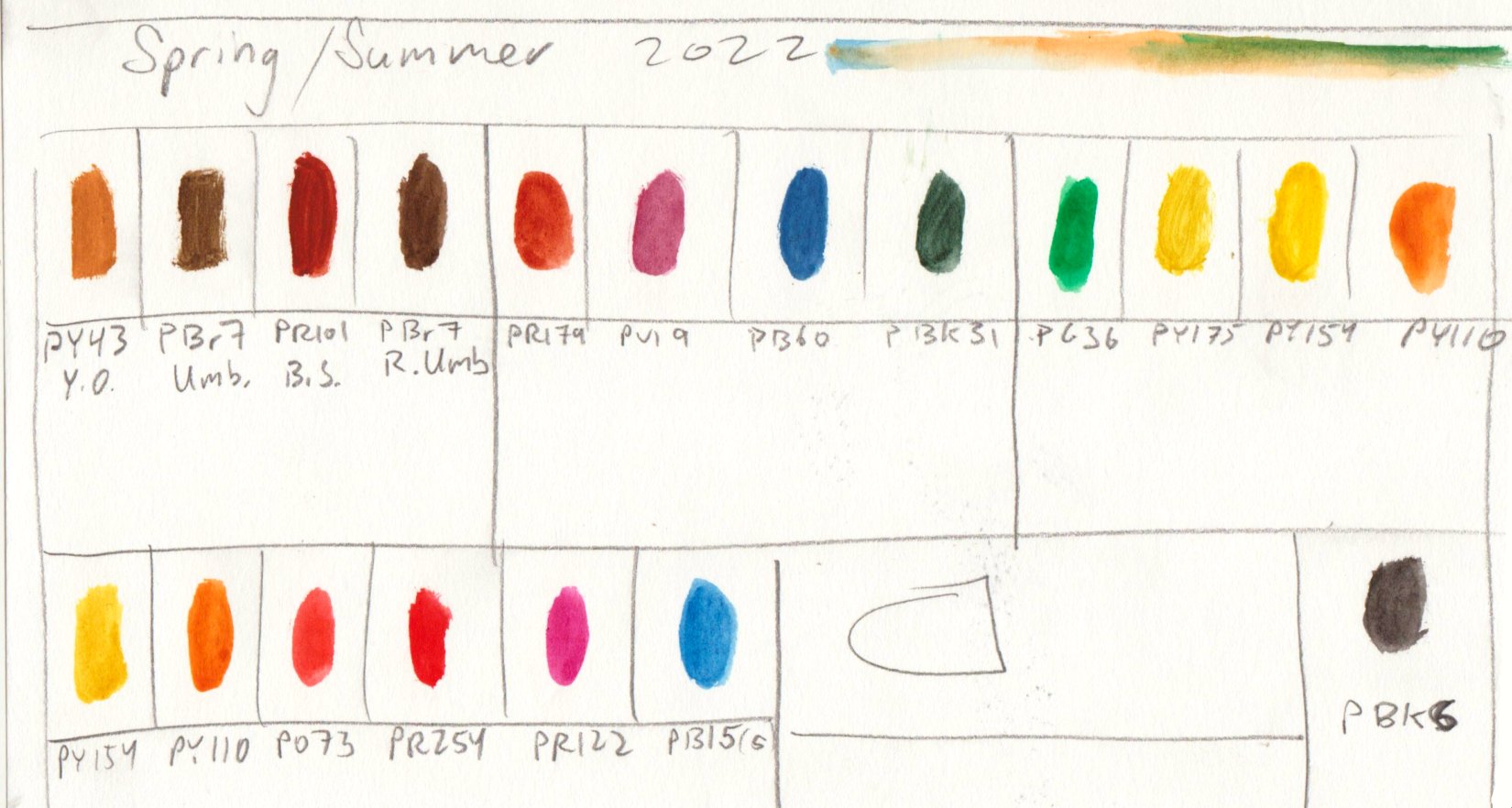
Spring / Summer Palette


For my Spring / Summer Palette I made some slight adjustments including the removal of cobalt blue (PB28) and the addition of a second blob of isoindolinone yellow (PY110). After using it for awhile the cobalt blue was redundant with phthalo blue sapphire (PB15) and has some slight toxicity being made from cobalt. Cobalt is not really poisonous, in fact we need a teeny tiny but in our diet, but large amounts of it could cause illness. The main concern would be for aquatic life, although I always collect the waster water when painting on location and dispose of it down the sink. I thought about some possible replacements since there was a free spot and settled on a second blob of iso yellow. I have one from Holbein, and then a larger one from Daniel Smith company called permanent yellow deep, both are PY110. This pigment is very stable and bright like a tangerine, it is a modern version of an azo dye. In the old day, like 19th century old, they called these 'coal tar' dyes and they were terrible at the time, a kind of dark magenta that faded quickly. It would not be long before the entire spectrum could be made from coal tar (azo) dyes and derivatives. Most of the paints on my palette are derived from those chemicals. Handprint.com by MacEvoy has a lengthy discussion on chemistry of pigments.  I made a link there in case you are curious. 


Saturday, April 9, 2022

Signs of Spring


 On the way back from the library I sat on a park bench near the sports complex and noticed some signs of spring, leaf buds on the large tree. The background was painted wet in wet to give a blurry distant effect, then the branch was applied after the under painting had dried a bit. The winter palette is almost finished so I just used up as much paint as possible, then I will switch over to the summer palette and make a blog about it. Tomorrow seems like it will be a nice day so hopefully I can get out for a ride.

Signs of Spring, Spring Branch, watercolour 5 x 7" cold press, April 2022 (No. 3085b)

Friday, April 8, 2022

World Inspired Landscapes: France


 Most of the earth pigments are synthetic nowadays, made from iron ore products in a chemical factory, however, there are still a few natural pigment mines around the world. France is famous for its ochre mines that have been in operation since antiquity and some are still function today. Ochre is the base mineral that is used to make pigments such as yellow ochre, burnt (red) ochre, and siennas (raw and burnt). The word burnt signifies a heating process that drives off the water from the chemical structure and shifts it to the orange and red hues. In the painting, I depicted a natural ochre mine in amongst the sand cliffs of Provence, the southern region of France best known for its wine and food. To make the painting I literally used French yellow ochre, along with a variety of other ochres, umbers, and siennas. 

I didn't write much about France in this blog, most of us know a lot about France, more say, than we knew about Djibouti or Eritrea. I have noticed an inequity in how much literature a country gets at the library, the popular tourist destinations have a whole lot more information out there than the small countries. The bitter irony is that many colonial countries like France extracted culture from their colonies and brought it back to their homeland. Lately there are moves to keep de-colonizing, such as returning island territories to the indigenous peoples and re-repatriating artifacts. At least the ochre seems to be native to France, I can imagine stone aged painters going to the pigment makers to buy some French ochre just like I did. 

Note, I never blogged about version 1, it was similar but in reverse and more yellow, on WC paper. Version 1 is No. 2986a.

World Inspired Landscapes: France version 2, watercolour 6 x 8" cold press, April  2022 (No. 2996)

Thursday, April 7, 2022

Campus Quad Rainy Day


 After work today I found a sheltered spot to sit at the edge of the campus quad and made this painting of the big tree and great puddles of rainwater that tend to collect in this corner. It was actually the pylon and its reflection that drew my attention, and the rest of the composition and the rain drop effect really worked out. What's remarkable about this painting is that there is no visible sky but it is very clear that it is an overcast rainy day. To produce the rain effect, the surrounding areas of the puddle were done in a heavy dark yellow/brown to give the contrast, and the radiating circles were done with a small brush. All the little dots on the tree and around the painting were the actual rain drops hitting the painting while it was still moist.

Campus Quad Rainy Day, watercolour 5 x 7" cold press, April 2022 (No. 3102)

Tuesday, April 5, 2022

World Inspired Landscapes: Finland


Looking at parts of Finland's landscape and you would swear it was Canada. They have glacial lakes with granite features and rolling forested hills. In the far north it is a tundra-like barren landscape populated with sparse trees and abundant wildlife. Finland also has some incredible views of the aurora borealis, otherwise known as the northern lights. In the painting, I show a winter forest scene with tall, snow covered pine trees against the eerie backdrop of the northern lights. The trees look as if connected to the lights display, or almost like they are producing it. 

This was my first attempt at depicting the northern lights and it worked out better than I had expected. The key elements were the high-chroma high value turquoise against an inky black nights sky. The trees just had to show an blue-green glow as if illuminated strongly by the night's sky. To paint the effect I applied a juicy wash of the turquoise which was a mix of the three phthalo paints I wrote about in the last blog (PB15:3, PB16 and PG36). I applied the mix darker than needed because phthalo paints loose about half their intensity and lighten in value after drying. At the right moisture level, I dropped in the carbon black (PBk6) sky with some perylene maroon (PR179) and indo blue (PB60) mixed in to give the inky look. The technique had to be done in one decisive move to avoid back-runs or blossoming. The swirls and twirls were done quickly and then allowed to dry.

World Inspired Landscapes: Finland, watercolour 6 x 8" cold press, April  2022 (No. 3000b)

Monday, April 4, 2022

World Inspired Landscapes: Fiji

Fiji is actually a collection of up to 300 islands located east of Australia in the South Pacific Ocean. Historically it was populated by a mix of indigenous and Polynesian peoples until the British established a colony for sugar plantations and other commodities. After about a century of British rule Fiji underwent civil unrest until becoming a legitimate democracy. The people retained an interest in many British pastimes like cricket and rugby. When I looked into the landscape of Fiji, there was a lot of long beaches and lush greenery. In fact, the foliage appeared to be greener than any other I had seen in my research of many countries. The water was also a deep turquoise unlike any other I had seen.

To capture these colours in the painting I used some phthalocyanine pigments, or phthalo for short. The phthalo pigments rose to prominence in the 20th century, and recently gained worldwide fame although not many people realize it. Phthalo blue (PB15:3) is used to dye medical masks, like the rectangular ones many people wore and continue to weak during the SARS-Cov2 pandemic. The colourant is so scarce now, one of the laboratory suppliers sent us tubes with a white cap instead of the customary blue cap due to lack of pigments on the market. Luckily I have enough phthalo blue paint for the rest of my life, it is a very strong pigment. In the trees, I used phthalo green (PG36) with some of the blue, and for the water I mostly used phthalo turquoise (PB16). These blue paints are so staining, they will turn the plastic palette a blue shade. So I have a special plastic piece just to mix these ones up without polluting the main palette. 

For the Fiji painting, these paints were just the right amount of intensity to show the colour ideas. For the composition I made use of a curve linear (fish eye) perspective to show the vastness of the beach. Maybe next time I do a beach scene I will paint it from the perspective of a fish underwater!

World Inspired Landscapes: Fiji, watercolour 6 x 8" cold press, April  2022 (No. 2999b)