Tuesday, April 30, 2024

Painting around Hall Building Rainy Day

After a pleasant bike ride downtown to pick up the final exams a sudden rain shower broke out. People ran for the building, probably students heading out to the 2:45 pm exams. I was just waiting for the exam pick up office to open and made this painting standing under the Hall building overhang and looking south on Bishop street. I started with a rough outline including the buildings and running people using dilute black paint. As I filled in the colours the rain was pelting me despite the shelter. To do the sky I applied phthalo blue (PB15) with some black (PBk6) mixed in on the paper.

Rainy day on Bishop st., watercolour 5 x 7" cold press, April 2024 (No. 3744)

This was the first one I did as the rain started. The C is backwards because it is meant to be viewed from Maisonneuve. You can see the contrast between the old brick and concrete buildings and the modern green glass and steel sky scrapers.

Rainy day on Bishop st. Concordia ,watercolour 5 x 7" cold press, April 2024 (No. 3740b)

This is the kind of scene that will give me nightmares for weeks, the dreaded hallway full of lockers. It was challenging to say the least, this scene was a wall of caramel and beige tones and an infinite row of lockers. The lights are simple white shapes outlines in yellow, green and black to give that eerie glow.

Hall in the Hall Building, watercolour 5 x 7" cold press, April 2024 (No. 3745a)

Monday, April 29, 2024

Final Exam Hall Building

The final exam was on the downtown campus today at the Hall building, shown in the background of the painting. I showed up a bit early to find where all the rooms were, that can take anywhere from 10 minutes to an hour its so confusing but I managed to locate them all in short order across two different buildings. At any rate, there was a few minutes to make a quick painting standing on one corner looking across at the Hall building which has not changed much on the outside since its creation. Inside there is a hodgepodge of renovations done over the decades. Most recently they have been going floor by floor redoing the surfaces, plumbing, bathrooms, floors, and classrooms. Quite a few people were out and about, a few stressed out students no doubt. The painting composition makes use of a strong 2 point perspective, the sides of the square building receding off into the distance. They have an interesting metal sculpture too, it rotates inwards with the wind. Tomorrow I pick up the exams downtown and weather permitting I can squeeze in another painting. 

Final Exam Hall Building, watercolour 5 x 7" cold press, April 2024 (No. 3743a)

Saturday, April 27, 2024

Wellington Street Verdun

After painting up on Maisonneuve I continued the theme of store fronts with this scene on Wellington street in Verdun. For people of my parents generation they knew Verdun as a working neighborhood surrounded by warehouses and factories. Nowadays it is rated the coolest place on the planet, with Wellington street at the epicenter. We went to a great Tandoori restaurant on my birthday, and today I got some takeaway and brought it home today. This scene shows various storefronts with their colourful signage. The whole facade including the balconies was added on top of the old building which would have had a relatively flat facade in the old days. A lot of Verdun is being gentrified in this manner, which had the negative effect of pricing the neighborhood out of range for long time locals. 

Wellington Street Signs, watercolour 5 x 7" cold press, April 2024 (No. 3742a)

 I took another crack at painting the Eglise metro, its one of the most difficult stations to make look good. It looks like a concrete and metal cheese cake went through the blender or something. This angle has some potential but it would look better if I can somehow fit in the bus and more people.

de l'Eglise lamp, watercolour 5 x  7" cold press, April 2024 (No. 3742b)

Lave Auto À La Main


After riding past this car wash hundreds of times I always wanted to stop and paint it when the fellows were working there and a car was going through. Since it was early and the sun was shining on the facade, it was the perfect opportunity. Near the end of the painting the guy in the cap, his name was Reza, turns out to be the cousin of the owner and works there occasionally. He loved the painting so much so we made a deal, he got the painting and I could get a free car wash. So if I ever get a car I know where to go!

Lave Auto À La Main,  watercolour 5 x 7" cold press, April 2024 (No. 3741)

here is an alternate photo , I took it on the spot with my smart phone which I brought along accidentally, it was in my bag from work on Friday.


Recycle Cycle Used Bike Store


On the corner of Maisonneuve and Decarie there is a used bike store called Recycle Cycle, it has old bike frames adorning its facade and cars on blocks out front. The cars are probably from the Swedish auto right next door. The building is a simple rectangle with pale green siding and boxy windows. Despite the relative simplicity of the architecture it was a difficult painting to pull off on location, I was standing with my bike in a deep pile of mulch between the bike path and the fence and the wind kept blowing things around. I filled in the background elements with great speed, and spent most of the paint time on the windows, bike frames, and interior of the store with its many hanging bikes. The other day I painted the Girouard exchange which is seen just to the right on this painting, one of the shop keepers came out and said cool painting. He was there today too but didn't take a look this time.

Recycle Cycle, watercolour 8 x 10" cold press, April 2024 (No. 3864a)

This was the first painting of the day, I got early to catch the sun shining on the facade of this building, in the afternoon it is backlit. I made some adjustments to the green in the final painting, and made it on a horizontal 8 x 10 instead of the vertical 5 x 7. The first painting of the day on a tip like this is a good warm up.

Recycle Cycle (study), watercolour 5 x 7" cold press, April 2024 (No. 3632b)

Friday, April 26, 2024

Girouard Exchange

After a tiring day in the office I rode home on the Maisonneuve path and kept riding until I reached the Giouard overpass. Looking northwards I could see the crazy Giouard exchange lanes which I know from driving here several times. If you are driving out of NDG onto the autoroute 15, you have to cross the oncoming lane based on a traffic light. Watching it from above seemed chaotic. The rest of the scene was a typical collage of brick, concrete and asphalt with the occasional tree sprinkled in. The traffic cones were done with pyrol orange (PO73), I like to call it Montreal orange. The sky is slightly different here, in MacEvoy's handprint.com there was a passage on sky colours, he pointed out that the shade of blue is different depending on the location of the sun. The sun (about to set on my left) was casting a more cyan pale glow, with a more blue on the right. The effect may just need to be a bit more subtle. Painting the blue sky is one of my favorite parts of the painting.

Girouard Exchange, watercolour 5 x 7" cold press, April 2024 (No. 3740a)

Thursday, April 25, 2024

Mural on Elmhurst and Harley ave


Today I painted a scene on Elmhurst and Harley avenues, showing the side of the City Fruit and Grocer, with a view south on Elmhurst, minus the cars this time. I felt like there was enough going on without trying to cram in a row of cars during rush hour, but you can easily imagine that along with the sounds. The side of this building has an interesting mural of animals on a space-like background, you see a heron, a roaring bear and a tiger. This scene incorporates a lot of the character of the neighborhood, including the mural, the other items on the wall, the road and sidewalks and the classic brick condo apartments. It was a warm and sunny, blue sky kind of day although quite chilly.

Mural on Elmhust and Harley ave , watercolour 5 x 7" cold press, April 2024 (No. 3738b)

Wednesday, April 24, 2024

World Inspired Landscapes: Morocco


Morocco, located on the north west corner of Africa has a long and storied history that goes back to the beginning of humans, through successions of world powers and a lengthy colonial rule that would forever change their culture. Indigenous peoples called Berbers were there long before, and to this day they remain as a distinct people although merged with the Roman and Arab cultures. In Montreal there are Jewish people with Moroccan ancestry because Morocco used to be home to many Jewish people before Israel was created. Now, most Jewish people from Morocco live in Israel, France, Canada and around the world with only a few thousand living in Morocco still. Nowadays Morocco is almost entirely Islamic. Echoing the cultural tapestry is the geographical tapestry. Morocco has beaches, rocks, vast deserts, mountains, tall trees and several islands in the Atlantic Ocean or Mediterranean. The painting was really just based on a single line starting in the sea and working its way to an undulating, then flat landscape capped with some tall green foliage. A few brush strokes in the sky, and some textural effects completed the stripped down composition. I thought about using just one continuous line for the entire scene, but then decided to go with a slightly more realistic approach.

World Inspired Landscapes: Morocco, watercolour 9 x 12" watercolour paper, April 2024 (No. 3833)

Painting Part of the Table


Part of the kitchen table is dedicated to my painting supplies. Although I paint outdoors most of the time, on occasion I will sit and paint something, like the painting above, while most of the time I drop off my location gear and work on the palette here. You can see a ruler used to measure paper, a handmade ceramic cup by Naomi that is used to hold brushes, the palette, some brushes including the big hog's hair, two of the Holbeins, and the pink 1 inch I've had for 25 years. Two plastic containers for clean and dirty water, and a well used rag made from an old T shirt complete the picture. Which object doesn't seem to belong? The can of WD40 in the background which I used to degrease my bicycle chain. So don't try to put WD40 on your paintings! I was kind of inspired to do this after looking at some of Van Gogh's still life paintings that he did presumably when weather was bad outside. He would simply paint whatever was in front of him or on the table at the time like food, books, alcohol, pipes, or on the floor like old boots. The background depicts our small kitchen behind a counter, the yellow colour was copied from one of Van Gogh's still lifes, he liked to use a lot of yellow.

Painting Part of the Table, watercolour 9 x 12" watercolour paper, April 2024 (No. 3840)

Tuesday, April 23, 2024

Pile of Rubbish near Field

After I painted the Chair in a Field of Yellow Buttercups, the chair was moved around and finally fell out of sight for quite some time, probably tossed into the tree line along the fence. Today I rode past and saw this pile of rubbish that seemed tempting to paint, but then again I was looking for blossoming trees or another spring-themes scene. I noticed that the very chair I painted in the field of buttercups was busted up and cast upon the pile of sticks, shovels, tires and other garbage probably put there due to city cleanup. You can see the chair legs pointing up, and the upholstered seating surface on top of the pile. The spring elements include a greenish grass colour and leaf buds on the background trees. I used the red hydrant and shovel handle to break up the green, brown and grey colour scheme. 

Pile of Rubbish near Field, watercolour 5 x 7" cold press, April 2024 (No. 3739b)

Monday, April 22, 2024

Blooming Tree Next Door

With spring well underway the trees are starting to make leaves and some are making blossoms. I painted this tree on the next door neighbor's front lawn, which was not quite as colourful as you see it in the painting, it is shown as it may be in a few days from now if the weather holds. To create a fireworks-like effect, I left in plenty of white space interspersed with flecks of red, green, and a variety of pink shades. The tree over top provides an essential dark contrast, and the shadowed buildings across the street make the pinks pop out. Over the years I have learned that a painting is essentially a sum of its parts, that each component contributes to an overall effect and feeling. I paint these on location, which also provides a feeling. Although I felt lousy today from the blood pressure pills, at least with the sun shining and the nice spring colours it was a reprieve of sorts.

Blooming Tree Next Door, watercolour 5 x 7" cold press, April 2024 (No. 3737b)

Saturday, April 20, 2024

Rustic Scenes near the Highway

There was an article on Belmont Park in the news today, it used to be an amusement park up until the 1980's when it was dismantled and became a standard park by the river. Located up on the North shore in Ahuntsic, the park still hosts an annual fair with rides by the looks of the pictures on Google Maps. It also appears to have great views of the bridges over the Prairie river which gave me a reason to ride my bike up there. About halfway I was tired and saw some interesting rustic buildings just north of the Autoroute 40, which you can see in the background. One day these old structures will be cleared for condo developments.

Rustic Buildings, watercolour 5 x 7" cold press, April 2024 (No. 3737a)

Around the side of the rustic structures is a vast pebble field with patches of tall grass. The city has blocked development here for some time, the idea was to build a massive sprawling shopping and condo development. The main issue was the congested autoroute 40 which would be made worse with a large development here. Its hard to describe the vastness of the space, this view is looking West with the autoroute in the background. It was very windy and cold when I did this painting.

Pebble Field, watercolour 5 x 7" cold press, April 2024 (No. 3738a)

A rickety old retail space runs along the La Croix road, in the background is the brick wall surrounding a large cemetery. The scene had a wide variety of yellow and green shades, made with combinations of yellow ochre (PY43), orange (PY110), green (PG36), dark green (PBk31) and some brown (PBr7). To capture the building and all its detail I made a fairly accurate outline first with a small synthetic brush I got from Kama pigments last year. There was no indication as to what GBS stood for by the way, one can imagine a lot of possibilities.

GBS, watercolour 5 x 7" cold press, April 2024 (No. 3739a)

Friday, April 19, 2024

Grocer and Gas Station Rainy Day

If you are just seeing my blog, then I should mention that I tend to paint almost every day and often bring my paint bag with me to work and back. Some days I can't get the time or I am too tired to paint, but usually I can find some scene or another on the way to or from work, or on a lunch hour. This one shows the grocery store across the street in the background which has a colourful mural, and in the foreground is the front of the auto shop where there is a gas station. The gas station sign was red and green, the prices actually were quite high almost $1.90 per liter! Lucky I don't have a car, although the high prices affect everything including the grocery store prices. It started to rain when I was painting this one, so I had to finish it rather quickly and touch it up a  bit at home. Tomorrow calls for a sunny, cool windy day which should be alright for painting. 

Grocer and Gas Station Rainy Day, watercolour 5 x 7" cold press, April 2024 (No. 3733b)

Wednesday, April 17, 2024

Gas Station with Mountain View


 Up on a berm there are several views such as the odd green and blue building, and this view of the distant mountain with gas station. Most landscape painters would want to paint the mountain view without all the clutter, and so would I to be honest, but somehow its the clutter that makes the scene unique. Parked cars, trees, the gas station, and a construction crane not to mention a lot of traffic and noise. They are actually building a huge 5 story condo block down here on st Jacques right next to all the industry which seems wrong for a lot of reasons. When painting a busy scene such as this, it is important to include a few decisive brush strokes like the mountain, the red roof of the gas station, and the Van Gogh dark pine tree in the lower left.

Gas Station Mountain View, watercolour 5 x 7" cold press, April 2024 (No. 3736)

Tuesday, April 16, 2024

World Inspired Landscapes: Montenegro

Montenegro is next to the other Balkan countries, much of its west borders on the Adriatic Sea. Other than its neighbor Serbia, I have painted pictures of the other countries in the region such as Albania, Croatia, Bosnia and Herzegovina, and Greece. A history of Montenegro would no doubt fill many volumes, it has undergone many sweeping changes since history was recorded. In the bronze age they were populated by the Illyria, a vast tribal group on even footing with the Romans and Greeks. Over time, the Slavs conquered the region and absorbed the indigenous people to create the foundation of modern day Montenegro. After a long succession of civil wars between rival kingdoms, Montenegro was independent for some time until being incorporated to a kingdom of Yugoslavia, that became a socialist (Italian) state, then part of the soviet-aligned Yugoslavia that mostly dissolved in the early 1990's. After all this, Montenegro was ruled by one person continually until 2023 when it elected a pro-western leader. Speaking of diversity, they have one of the most biodiverse countries in Europe with many different types of biomes. I went with an overhead view of a lily pond showing fronds, flowers and a turtle, with an impressionistic water treatment. I suppose this painting could represent many countries, but I kind of liked how the diverse history and biodiversity was reflected in the lively, almost poetic composition. Of course I had Monet in mind too, he was after all the master of the water lily paintings.  

World Inspired Landscapes: Montenegro, watercolour 8 x 10" cold press, April 2024 (No. 3849a)

Catherine Booth Hospital Silhouette

There is a saying in English "easier said than done" which could also apply to some painting subjects. In this case, the sprawling Catherine Booth Hospital nearby our house was backlit by the sun as usual. A little bit ominous, scary even, the hospital is built from red bricks and solid stone inlays. I've always wanted to paint the scene, but the scope of the structure and the fact that it is almost always back lit make it a difficult painting subject. After 35 years of painting experience, I know what can go wrong in a painting like this, for example, the brick colour has to be dark but still high chroma. Its tempting to add blue or black to burnt sienna but that will make the product dull and unappealing. Instead, I mixed red ochre (PR101), perylene maroon (PR179) and quinacridone purple (PV55). Where the bricks are even darker I dabbed in phthalo green (PG7). For the yellow-grey stone, the mixture was similar but with more green and a touch of yellow mixed in. Composition wise, a back lit scene will usually be bland because its all in shadow, so I emphasized the orange light over the front door, and made the windows greenish for some colour contrast. I still want to do a larger version to capture the full impact of the hospital, even at dusk or night would be neat. With the weather improving I should be able to increase the scale and detail of the paintings as compared to winter. 

Catherine Booth Hospital Silhouette, watercolour 5 x 7" cold press, April 2024 (No. 3735a)

Sunday, April 14, 2024

Painting Tree Blossoms


Painting tree blossoms is one of the brief joys of location paintings that only comes around once per year for a week at most. The extent of it varies depending on weather conditions, for example in the last few years the blossoms were ruined by strong wind and rain. With a string of warm sunny days ahead we may be in for a treat. This tree was down in Parc Jean Drapeau on ile Notre Dame where they have a race track. When its not being used for car racing, the track is open to local traffic, but most popular with the 'spandex people'. The spandex people have bikes worth thousands and thousands of dollars that only weigh a few grams, and their legs are bigger than the average torso. Pedaling for all my worth, I felt like a pylon as the spandex people zipped around me effortlessly. But how many of them could have pulled over and made a watercolour painting? 

This tree caught my eye, the blossoms were very small, just little points of pink-cream set against a grey, brown and green background. The painting embellishes quite a bit, this is what the tree will look like a few days from now. A ground hog went by and stopped just long enough for me to get the form in, you see it at the base of the tree. I did a second one on location to try a different technique involving wet-in-wet, which gave a softer look. I will try and get out to paint blossoms again, there are some more great ones down in the Lachine park peninsula, and a few right here in our neighborhood. Since there is no white paint in watercolour, painting tree blossoms is perhaps one of the highest technical difficulties there is. They are very delicate, which demands intricate brushwork, but its easy to over work the effect. Van Gogh famously painted tree blossoms in southern France, it was the first series of paintings he made on his penultimate journey south. 

Early Tree Blossoms, watercolour 8 x 10" cold press, April 2024 (No. 3863b)

Ride to Parc Jean Drapeau


There were a couple geese here but only one stuck around long enough to make it into the painting. The scene is from the south canal berm which has a wide bike path and bird reserve area. There were lots of small songbirds there, and plenty of insects that covered my clothing as I rode down toward Parc Jean Drapeau.

Goose with a View, watercolour 5 x 7" cold press, April 2024 (No. 3734a)


Behind st Helen's island is a section  of the river called Monk's channel in French its Chenal le Moyne which I found out on Google maps. The water back there is an incredible blue-green that is even more impressive when the sun is shining. As the water passes under the bridge it churns up creating a range of greenish yellow, blue and pale violet. It was about to rain so I headed home after this one.

Chenal le Moyne with Cartier Bridge, watercolour 9 x 10" cold press, April 2024 (No. 3863a)


This monolithic structure is the Montreal Casino on Ile Notre Dame, a small island attached to st Helen's island. Its funny that with all the religious symbolism of the names of everything around here, they still built a casino, a mecca of vice so to speak. Rumor has it the Casino operators are looking to rebuild it elsewhere. I went there once and lost $20 on slot machines, then just got a few beers, they had an incredible Trois Pistols on tap which was far more worth it, although maybe they should have been serving Mon Dieu instead.

Casino Montreal, watercolour 5 x 7" cold press, April 2024 (No. 3734a)

Saturday, April 13, 2024

Still Plugged In

Here I am catching up on some blogging on a rainy day. Luckily tomorrow's forecast is sunny and I should be able to get down to the river for some painting. I did this abstract on the horizontal but kind of liked it better on the vertical like this. The blue on the top is cobalt blue (PB28), its a colour that I took off my palette a long time ago, but I still have some left in some old tubes. The bright yellow is vanadium yellow (PY184) which is extremely opaque basically a type of gauche in the way it handles. My current lab book #25 is almost full of doodles and I think its going to be good for at least two doodle paintings. This abstract was a test to see if I can use these paints in a larger doodle work. I think that it will work, the colours are bright and work well together with the blue, yellow and red-magenta giving a range of mixtures. No pigment is truly magenta by the way, despite the names the company gives. The only thing that is technically magenta based on hue angle is carbazol violet and you would call it purple if you saw it. PR122 is the closest to the idea of magenta, it is about half way between red and magenta and has a really high value (bright looking). Some companies add artificial brightener agents though (aluminum hydrate for example) so its hard to tell what you are buying some times.    

Still Plugged In, watercolour 9 x 12" watercolour paper, April 2024 (No. 3828a)

Ancestral Colours

I was walking to work the other day and noticed a shimmering oil slick on top of a freshly paved road that had been rained upon. At the right angle there was a rainbow's worth of colours visible on the black asphalt. Its not an accident or anything, just the tar leaching out of the road...asphalt is derived from petro chemicals after all. It makes you wonder what we inhale and get from these toxic roadways? There is an interesting connection between the colours on the wet road and the history of art pigments. As far back as the 19th century the pigment makers knew about coal-tar pigments, the first one was a dark red magenta, similar to the colour you see in the upper left of the abstract painting. The initial pigments were unstable and unpleasant, but after enough time the chemistry was optimized and by 1960's onwards the coal tar pigments would basically replace most other pigments in the yellow to magenta range. 

For the painting I was trying to use up some tubes that I don't use for anything else. The charcoal colour is a grey mix (PV19 + PG7 + PBk6), the yellow is vanadium yellow (PY184), the magenta is PV19, the red and orange are from pyrol red (PR254). I splashed in some green (PG36) to complete the charcoal rainbow effect.
 

Ancestral Colours, watercolour 9 x 12" watercolour paper, April 2024 (No. 3831b)

World Inspired Landscapes: Mongolia

At first glance there is a vast expanse of rolling green and brown hills, then you notice that there are horses grazing in the foreground. Mongolia is an arid mountainous country sandwiched between Russia and China. Unlike many countries in history, Mongolia was the conqueror not the conquered. At their peak, the Mongolian empire ruled most of what became China, the middle east and swaths of Europe. Eventually, like most empires it receded to its central lands and  remained sovereign ever since although at times it was under influence of either China or the Soviets. Horses are a major part of Mongolian culture. The Mongol armies used horses for transportation, warfare, and even for nourishment. Horse milk, and blood letting in an emergency, and meat from killed animals were used to feed soldiers. Interestingly, the horses of Mongolia come from a very ancient lineage that is very much unrelated to the horses of Europe and North America. European horses are almost entirely derived from a very limited stock, in fact, thoroughbred race horses all come from one of three stallions. There has been an attempt to back cross European horses with Mongolian horses to create a fast and hardy breed, however, the European horses are too big for the smaller mares of Mongolia, and the progeny are not hearty enough to survive the harsh conditions. Mongolian horses can live off very little water, and they adapt to the winter with heavy coats of fur.
 

World Inspired Landscapes: Mongolia  watercolour 9 x 12" watercolour paper, April 2024 (No. 3832a)

Friday, April 12, 2024

Community Reflections

Down at City Fruiterie there are some good views of the Harley street neighborhood, Westhaven. I stood under the overhang in front of the store looking across the street to make this paining. It was raining steadily which created drops on the road and the parked car. The usual traffic was going by. Some of the locals came by and took a look, one fellow made a video of me painting, and so I put in two figures in the reflection of the car window, me and the fellow. He seemed to be quite amazed by the feat. Its one of the important aspects of painting on location, to show how artistic the scenery can be to the local people. I used to ride my bike through NDG regularly and never appreciated it until I made so many paintings during the pandemic. 

Community Reflections, watercolour 5 x 7" cold press, April 2024 (No. 3733a)

Thursday, April 11, 2024

Sherbrooke street with clouds


As the sun went down clouds turned a pinkish orange hue and the cars reflected blue light. Pastel earth colours rounded out this sombre scene done just outside of Trenholme park after picking up the LUFA vegetables. When I think occasionally about the question of why do I paint? there is no clear answer other than I am compelled to produce art whether it be lab book doodles or watercolour paintings. Paintings like this one, or the many paintings I have done of dumpsters, garbage cans, electrical boxes, fire hydrants and other urban miscellany, are more telling of my mission than the large series that I embarked on such as the Montreal metro series and world inspired landscape series. Some time in ancient history I must have had an ancestor who scribbled pictures of antelopes on a cave wall using iron oxide and carbon pigments. Of all the things I do, painting is one that I hope to continue as long as I can.

Sherbrooke street with clouds, watercolour 5 x 7" cold press, April 2024 (No. 3632a)

Solar Eclipse over Commuter Train

Earlier in the week there was a complete solar eclipse that lasted for about a minute and a half in Montreal. I walked down to the train tracks and made a location painting, which I started about ten minutes before the eclipse and completed just after totality. The initial painting captured the raw energy of the scene, but I was taken by surprise at the actual moment of the event, the sky washed over with dark blue, stars were visible, shadows disappeared and the passing commuter train's headlights were visible against the surrounding darkness. Keep in mind, all this happened at 3:30PM on an otherwise blue sky afternoon! This version is a re-paint with a redesigned composition and stronger light/shadow contrast. I brought the train more towards the middle, dropped the horizon line to the 1/3 mark, de-emphasized the railroad posts, showed the entire eclipsed sun/moon combo, and added stars. 

To paint the eclipse effect, I made a circle of water, then filled in the dark blue sky with the glowing rings and stars, which are done by leaving the paper showing. The dark blue was indo blue and pyrol orange (PB60 + PO73), faded to a dilute pyrol orange with benzi orange (PO62) at the horizon. When it all dried I applied the moon using indo blue plus red ochre (PR101) and some carbon black (PBk6). Since I was painting in my studio (also known as our kitchen table) I could control the solar disc effect to create that feathery texture around the moon.
 

Solar Eclipse over Commuter Train, watercolour 8 x 10" cold press, April 2024 (No. 3866)

Monday, April 8, 2024

A few more scenes from Lachine canal and area

Before running out of blue paint on Sunday I got in a few paintings, for example this scene looking at the Monk Boulevard bridge over the Lachine canal. The bridge was backlit by the sun, which also created a sparkle on the blue water (PB60). The canal produces caramel and greenish tones on the waves from the mucky bottom.

Monk Boulevard bridge, watercolour 5 x 7" cold press, April 2024 (No. 3731b)

Just on Eglise street there was an interesting yellow sign and colourful rusty drums. The currugated fence had graffiti on it which added even more colour to the scene. Despite the desolate and somewhat lonely scene, this painting still coveys a sense of warmth and light. One day most of these old shops will be condos, so may as well paint for posterity.

Church Truck Shop, watercolour 5 x 7" cold press, April 2024 (No. 3729b)

There was a lot to take in with this scene, with the autoroute 15 bridge in the background and an interesting turquoise and stone walled building. With a bigger piece of paper this would be a good scene to try again, there is even a bike path and sliver of the canal visible in the distance. 

Bridge and Turquoise Building, watercolour 5 x 7" cold press, April 2024 (No. 3731a)

Total Eclipse on Location

Knowing that the total eclipse was happening around 3:30PM today I set out after class to the train tracks at the Westminster crossing. Luckily another professor was handing out eclipse viewing glasses, kind of like 3D glasses but they completely block all light except from the sun. Using the glasses I watched the moon slowly devour the sun like taking a bite out of a cookie. Since the actual full eclipse would only last about one and half minutes in Montreal, I began the painting with an outline and waited for the conditions to change. At about 50% I noticed that the lighting became the equivalent of an overcast day even though there was only a thin cloud cover. The headlights of a passing train, and the red lights of the crossing were noticeably brighter which is one way you can gauge the lighting conditions. But what happened next took me by surprise. The sky turned dark blue at the horizon, and then the dark blue swept over the whole sky until it was a kind of in between day and night. A few stars became visible. There were no shadows at all in the full eclipse other than those cast from the passing commuter trains. The shadows in the painting were from moments just before the eclipse was full. I had filled in the sky early with a pale orange, but added dark blue rapidly as the conditions changed. It was like being on another world, and with a train rumbling by on the other side of the fence it was surreal. I took a very quick peek at the eclipsed sun and saw the moon, a dark charcoal-blue colour at its very center. After the full eclipse passed, the horizon turned orange like a sunset, then slowly went back to overcast and back into a blue sky day.

Total Eclipse (on location), watercolour 5 x 7" cold press, April 2024 (No. 3730)

Paper Eclipse

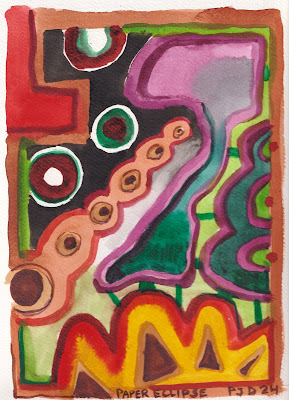
April 8th is the big day of the solar eclipse, its all over the news and people are selling eclipse glasses or telling you how to make your own. This palette cleansing abstract was inspired by the eclipse idea, with the white-ringed circles in the top left. My palettes were in need of some cleaning, I have two identical palettes nowadays. In theory I should always have one ready to go, but today I had to clean both and squeeze out paint. That's the fun part, squeezing fresh paint out, its so bright and gooey looking. When it dries on the palette its has a matte almost glassy appearance. Even though I teach on Monday, I may try to make an eclipse painting after class, just careful not to look it at directly.

Paper Eclipse, watercolour 9 x 12" watercolour paper, April 2024 (No. 3832b)

Blue Sky, No More Blue

There was a beautiful blue sky today, however, after three paintings I ran out of phthalo blue paint on both of the palettes that I brought along. So for this one, I used indo blue (PB60) in the sky, and made the shadows with magenta (PR122) and blue-green (PG7) which produces some blue-violet grey tones. At any rate, the scene was kind of dystopian to begin with, and the dreary colour scheme adds nicely to that theme. On top of the building someone spray painted a pale smiley face. There was still a bit of snow left on the ground.

Bridge and Industrial Building, watercolour 5 x 7" cold press, April 2024 (No. 3728a)

For this one I was completely out of blue paint, to do the sky I added some prussian blue (PB27) at home. Prussian blue is a weird one, it looks blue-violet and dark upon application, then it dries pale and green-blue. Its hard to control so I leave it off the palette. These old warehouses near the autoroute 15 will be gone one day, surely to be replaced with luxury condos.

Two Point Perspective Warehouse, watercolour 5 x 7" cold press, April 2024 (No. 3728b)

On the left is a warehouse with corrugated steel panelling covered with graffiti, on the right is the elevated autoroute 15, and up in the distance is a tall billboard. There was still snow on the ground although it was melting fast. These kinds of scenes are endangered in Montreal due to condo development. Who wouldn't want to live right next to the highway after all.

Billboard and Highway 15, watercolour 5 x 7" cold press, April 2024 (No. 3729a)

Saturday, April 6, 2024

Gloomy Day, Smells like cinnamon

Anatol spices is on the other side of town, its in Little Italy just north of the Mile End neighborhood. This scene is from the corner of Parc avenue and Bernard looking East towards a gloomy sky and sprawling tree. I got the trash can in too, glad the city made them look so nice. I wasn't sure the sky would dry in time but it did, and I was able to overlay the tree on location. The first coat dries fast because the dry paper absorbs the moisture, but subsequent layers will potentially blur if one fusses too much.

Gloomy Tree (smells like cinnamon), watercolour 5 x 7" cold press, April 2024 (No. 3725b)

On the way back my bike smelled strongly of cinnamon since I bought a big bag of it from the spice store. Last time I had a strong tea called Arctic fire and that was the aroma I remember. I have rode under this underpass many times and thought it would make a good painting, but only attempted it once or twice over the years. This is on st Laurent street right around the train tracks at the top of Mile End, looking south. To get the angles right I hold my brush up in front of me and tilt the brush until I understand the angle, plus, it makes me look like I am doing artist things. A lot of cars, bikes and people went by as I painted this one. I resisted the urge to put my initials in the graffiti this time.

Graffiti Underpasses, watercolour 5 x 7" cold press, April 2024 (No. 3727)

Friday, April 5, 2024

Snowy Rainy Windy Coffee Park


Its been a few days that I made a painting outside. Part of me was holding out for Spring-time weather, I do enjoy painting the cranberry trees when they flower, and the yellow dandelions. Instead we got hit with snow and and a steady drizzle of rain that continued on until today. In Coffee park I found a leaning tree to stand under which offered some protection, and made the only painting I could of the scene immediately in front of me. The tree leaf buds were all knocked off and strewn across the ground, they were mixed up with the puddles, snow piles, and muddy grass. The foreground was a complex mix of slush, water and snow. To paint the tree colour, a mix of yellow ochre (PY43) and carbon black (PBk6) was used, along with a few streaks of green (PG36) and orange (PO62).

Snowy Rainy Windy Coffee Park, watercolour 5 x 7" cold press, April 2024 (No. 3726b)

World Inspired Landscapes: Monaco


When I set about researching the landscape of Monaco using google maps, I was very surprised to see that it basically does not have a landscape. Its a country without a landscape. In fact, most of the tree line visible in the background of Monaco is probably part of France. Monaco is considered a micro-country, a sovereign state nestled in the south of France not too far from Italy. It seems to have a history of powerful ruling families perhaps residual from the Greek and Roman Empires, after which it was largely ignored by France and Italy with some brief times of being taken over by one or the other, and by Nazi Germany in world war II. Since then, Monaco regained its sovereignty and made a fortune off of casino's and off-shore banking. It is one of the wealthiest countries per capita in the same vein as Luxembourg. The concept for the painting was to hide the landscape underneath and between the walls of apartments and houses. Structures are built flush to the rock faces of the Mediterranean, with a few crowded beaches nestled between the rock cliffs and the water.

World Inspired Landscapes: Monaco, watercolour 6 x 12" cold press, April 2024 (No. 3830)

World Inspired Landscapes: Micronesia version ii


The first version of the World Inspired Landscapes: Micronesia depicted a number of glass marbles floating around in an abstract sea. It was an ambitious composition but as I thought about the concept, the coolest part was that the interior decoration of the glass marbles looked an awful lot like a tropical islands. With so many marbles in the painting it was hard to key in on that idea. The marbles also had an amazing light and shadow effect under the lamp that was hard to depict on a small scale. I knew that the painting would need a black background in order to create the illusion of an illuminated glass marble. In this version I depicted one marble with a tropical island-inspired decoration inside of the glass sphere, illuminated from the top and casting an interesting shadow. The shadow had a donut appearance since some light was passing straight through and carrying some of the colour with it. To maintain a soft, matte effect, I did the painting all in one go, keeping the paint damp but not overly wet or dry. So far as the concept, this composition carries a sense of isolation and vastness even though it is a tiny marble on a dark grey background. I feel the same sense of isolation as was created in the Marshall Islands painting, which is in the same desolate geographical location.
 

World Inspired Landscapes: Micronesia ii, watercolour 6 x 6" cold press, April 2024

Thursday, April 4, 2024

World Inspired Landscapes: Moldova

Moldova has an ancient history of civilization with artifacts dating as far back as artifacts can date. Shards of pottery indicate that an ancient people continually lived in the region for some 3000 years in the stone ages. Since then the land has been conquered by about a dozen region powers successively until it finally broke free of the soviet union in the 1990's. Despite all the turmoil over the centuries the vast majority of the Moldovan people still identify with their indigenous ancestors. With respect to the landscape, Moldova is mostly land locked although according to google maps I saw a small shard of it contacting an inlet of the Chorne sea, part of the Black sea. For the most part, Moldova resembles Canada to my eye, there are plenty of trees, rivers, and lakes interspersed with grasslands and rolling mountains. How Moldova got its name remains a mystery, on wikipedia there was a story about a historical figure loosing his hunting dog named Molda in a river, which lead to him naming the river Molda, which sounds an awful lot like Moldova. I think the story would be better if the dog were named Maldo, and the historical fellow shouted out "Where's Maldo?" which lead to the idea for the book series of a similar sounding name. But I just made up that part. 

One thing that did strike me were there prominent trees. Maybe its because they cleared most of the land for farming, but I saw several pictures of mighty trees towering over an otherwise desolate landscape. Japanese prints often feature mighty trees with red leaves, so I went with that concept for the painting, along with the meandering Molda river. After doing a lot of blue and green paintings I intentionally avoided those two colours, instead relying on orange, magenta, dark brown, and black to carry the scene. The main compositional elements are the dark tree against the shimmering river, and the red leaves against the pale orange sky. 

World Inspired Landscapes: Moldova, watercolour 9 x 12" watercolour paper, April 2024 (No. 3831)

Wednesday, April 3, 2024

World Inspired Landscapes: Micronesia


 Micronesia is in the same region of the Pacific Ocean as the Marshall Islands, in fact, the entire region is known as Micronesia which includes the country of Micronesia. As a country, it occupies one of the biggest areas, although the vast majority of it is ocean, dotted with some 600 small islands and archipelagos. Only a few of the land masses have significant settlements, many of the smaller islands are uninhabited by people. Historically the region would have been an outpost for traders, and then became a focal point of World War II due to its strategic value as a naval military base. The biggest issue now, like Marshall Island, the Maldives, and other low-lying ocean nations is the steadily rising ocean. At some point, much of Micronesia will be submerged, with intense cyclone storms. Cyclone is the name of a hurricane when it happens in the Pacific ocean. 

To compose this landscape I thought about getting away from the traditional landscape format where you see a sky, a horizon line, and some manner of foreground and mid ground elements. Most of the paintings in the series follow that general template, with variations on the azimuth (horizontal tilt angle) and points of view. With so many small islands separated by vast expanse of ocean, the initial idea was to represent each island as a sphere hanging in empty space. Then I found some glass marbles in a drawer and noticed how the patterns and colours inside of the marbles kind of looked like small tropical islands. In the end, I created a surrealistic scene where marbles appear to hover or float over a tropical-colour background of sky or water. During the painting I got a little carried away, perhaps inspired a little by Van Gogh's infamous Starry Night painting.

World Inspired Landscapes: Micronesia, watercolour 8 x 10" cold press, April 2024 (No. 3862a)