
Snow Pile with Shadow Loyola Campus, 5 x 7.5" cold press, watercolour, February 2021 (No. 2557b)
To solve this once and for all I took a cell phone photo and analyzed it using image J and a colour picker from the internet. Here was the picture, you can also see what I was working from,

Considering that there are differences in the optics (my painting does not look as yellow as it does in the scan), it seems like the photo shadow is darker and more blue, and I don't see yellow reflections. Here is a colour analysis of the snow blue shadow from the photo.

The hue is almost exactly blue, and it is about 30% de-saturated (less blue) and 30% darker (lower value). I analyzed other parts of the shadow and there was surprisingly little variation, certainly no yellow. The lighter areas were shifted left on the color plot (about 50% de-saturated), while the dark areas were shifted down on the colour plot, about 50% darker, but in either case the hue did not change much, still blue. The conclusion is that the entire shadow area is blue, with some slight de-saturation and darkening here and there. So how did I do in the painting? Lets look at colour analysis of my painting, centered on the shadow.
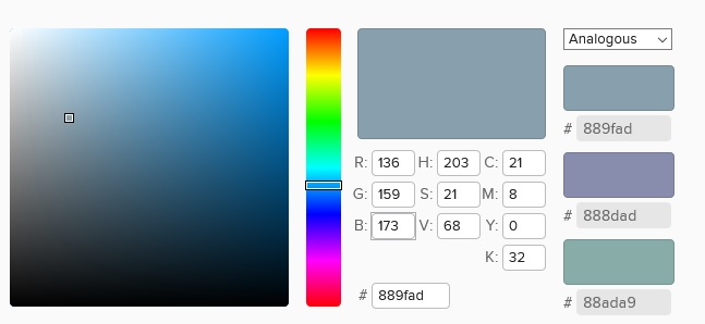
Not too far off, A for effort! The hue is not exactly blue, it is leaning towards cyan, you would call this teal blue. It is also heavily de-saturated, like 80% or something, and the value is too high (too light) compared to the photo. If we assume that the both the photo and the scan of my painting are equivalent, then I needed to make the shadow more blue, more saturated, and slightly darker than I did. I also analyzed my painting shadow and to my surprise, there was no yellow anywhere even though I literally put yellow in the mix. The areas were almost exactly gray because the blue and yellow cancelled out. The idea of adding yellow was wrong anyways. Next time I will go with a true blue like phthalo sapphire (PB15) and mix it with water and varying amounts of ivory black perhaps.
Regardless of the technicalities I think the painting is wonderful, and in the end what you notice is how much darn snow there is!
No comments:
Post a Comment