Monday, March 31, 2025

World Inspired Landscapes: San Marino

San Marino is on of three countries that is completely surrounded by another country, that is Italy. The other surrounded countries the Holy See (Vatican City) also surrounded by Italy, and Lesotho completely surrounded by South Africa. A few blogs back I was musing about how mountainous countries seem to be less conquered in history, but the story on San Marino is a little different. Although mountainous in places, there were no particular defense attributes this country had, rather, it was the complicated history of Italy. Before I started the series, I did not know that Italy only formed as a country more recently, during the mid 19th century actually. Prior to that it was a collection of regional areas, the remnants of the Roman Empire. San Marino has been independent since antiquity, although is suffered from some occupations by Italy and France. In the World Wars they stayed neutral. Their government is unique, they rule by an elected committee rather than a head of state, and there are elections every 6 months. 

Exploring pictures of San Marino revealed a lot of chartreuse (lime green) and yellow-tan colours, with dark pine trees. In the Italy painting, there was a similar colour scheme, and olive trees were shown. In this painting of San Marino I started by painting an elaborate field of grass with flowers, then realized it was the foliage of an imaginary tree so I flipped the painting over and painted the tree trunk, branches and added a simple wash for the grassy meadow. Just missing the Spring Fawn!
 

World Inspired Landscapes: San Marino, watercolour 8 x 10" cold press, March 2025

Sunday, March 30, 2025

World Inspired Landscapes: Samoa

Samoa is a remote island-nation in the south pacific ocean, the closest location you may know is Fiji, and even that is over 1000 km to the south! Despite its remoteness, it was briefly occupied by German Empire, and afterwards without violence it was ruled by New Zealand until its independence. Like most of these locations, the islands have steep interiors due to volcanic activity, surrounded by lush vegetation and wide valleys. When a volcano erupts it leaves a cone of debris which steadily erodes, leaving the molten core behind. Called a volcanic plug, these cores stand tall on the landscape, such the ones I painted under the giraffe in the Cameroon painting. This one shows a volcanic mountain off in the distance and a typical beach in the foreground. Since this was a rare place where the indigenous culture and people seemed to have existed without too much outside influence, I wanted the painting to feature some cultural element. A famous ritual involves swirling of fire-batons in a circle, which creates a spinning disc of light. I omitted the person that would be behind such a display, instead showing the landscape at night. Using my experience from painting on location, I could mix all the necessary colours and make the fire pop.
 To make the fire effect, first I outlined in light orange, then filled in the entire background. To finish, a bright orange outline, with a bright yellow outline were added to make the fire seem to be alive. The inside of the fire is just white paper, but the dark background and glow-effect on the sand gives it the illusion of being bright.

World Inspired Landscapes: Samoa, watercolour 8 x 10" cold press, March 2025

Saturday, March 29, 2025

World Inspired Landscapes: Saint Vincent and the Grenadines


Like the other islands in this region, Saint Vincent and the Grenadines had an indigenous population that was mostly displaced by European colonialists and slaves that were eventually freed in the 19th century. After slavery ended, a labor shortage lead to workers from Portugal and India immigrating. The Grendadines are 32 smaller islands but only 7 of them are inhabited by people. In the painting, it looks like a side-view of palm trees against a turquoise sea at first, but its actually meant to be an overhead view of palm tree shadows. I saw this kind of image while scrolling through Caribbean pictures on the internet and took on the challenge of painting it for the World Inspired Landscape series. It was harder than I thought, below are the first two versions. The key was to get the value of the water correct, simplify the textures, and omit the actual palm trees to complete the illusion.

World Inspired Landscapes: Saint Vincent and the Grenadines v3. 2.5 x 4.5" cold press, March 2025 (No. 4293)


In the second version I raised the value of the water, making it lighter, and simplified the textures. The brown shadows on the sand looked too much like tree bark, and the paint ran near the sand.

World Inspired Landscapes: Saint Vincent and the Grenadines v2, watercolour 9 x 6" watercolour paper, March 2025 (No. 4292)


The first version had a realistic look to it, with waves, and the actual palm trees on the bottom of the composition. It has the look of a picture taken by a drone, or the view of bird soaring over head. While the realism is evident, I felt like the main gimmick, the tree-shadows that look like trees, was a little lost with all the other elements. The third version at the top seems to work best no matter how its interpreted.

World Inspired Landscapes: Saint Vincent and the Grenadines v1, watercolour 8 x 10" cold press, March 2025 (No. 4306b)

World Inspired Landscapes: Russia


Russia has some really cold parts up in Siberia, where the lakes are frozen solid. In the painting I show the cracked ice layer upon layer. In some cases there are methane bubbles that freeze in place creating even more interesting patterns. To paint the scene I applied successively darker layers, leaving narrow gaps between the washes to create depth and a sense of tension.

World Inspired Landscapes: Russia, watercolour 9 x 12" watercolour paper, March 2025


Friday, March 28, 2025

Yellow bins, commuter corner

The last time I painted these yellow bins, there was no graffiti on them and it was a lot tidier. The bins are outside of City Fruterie by the train tracks where the commuter train picks up passengers and the train crossing bell rings every ten minutes. Instead of the graffiti tag, I added my initials on the front using the same style, and the year on the side (in blue scribble). To make the yellow pop, I surrounded it by purplish tones and variations of yellow that were duller or darker.

Yellow bin with tag, watercolour 6 x 7.5" cold press, March 2025 (No. 4202b)


Shifting to the left, this scene looks down the back of the building with the commuter train coming by on the tracks, heading in a west direction. There was a lot going on with this painting, it was one of those paintings where I had a little regret being so ambitious, but stuck with it to the finish. Not many artists are going to set up in front of garbage bins and rubbish piles.

Bin and commuter train, watercolour 6 x 7.5" cold press, March 2025 (No. 4206b)


This scene seemed impossible, and it basically was. I tried to paint the image of the yellow bins reflecting in the side of a passing car. The cars were moving making it hard to get the image right. I like the idea of painting reflections in the sides of cars, or the reflection on the windshield, there was a good from back in 2021 of a park reflecting in the side of an SUV. When the conditions improve, its still cold and windy, i will take another crack at something like this.

Yellow bins reflection in passing car, watercolour 6 x 7.5" cold press, March 2025 (No. 4207a)

Thursday, March 27, 2025

More scenes from the demo mall

For today's paintings the idea was to catch the last bit of sun before it set, so I rode down the Terrebonne bike path to what I call the 'demo mall', its an unsightly old strip mall that is slated for re-development soon. The first painting shows the old lashes-and-nails place, it still has most of the signage intact and even still has curtains. The paint painted bricks retain the original pinkish hue, which I recreated with dilute pyrol-orange (PO73). Using pyrol-orange to paint pink seems wrong, but according to MacEvoy's handprint.com, the source of all watercolour knowledge, he said pyrol orange has coral (salmon) undertones upon dilution. Trusting his assessment, I diluted the colour and it looks great here.

Lashes and nail shop, watercolour 6 x 7.5" cold press, March 2025 (No. 4208a)


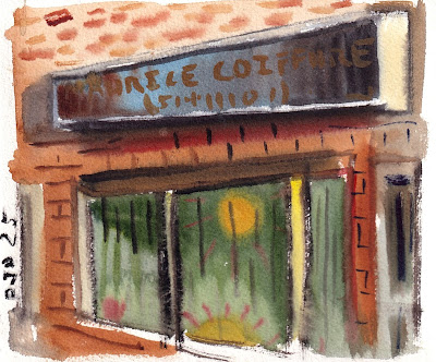
I've been looking for a good barber in town but unfortunately this one is shut down and ready for demolition. Right next to the lashes and nails shop, its decorated in all manner of beige and caramel tones, with a dark chocolatey sign painted with golden letters. In fact the whole colour scheme seemed like baby puke and it was not easy to coax a good painting from it. I infused the shadow with purple, and tried to texture other elements to distract. Its the hardest one to paint because the front is really long, and well, the colour scheme.

Coiffure entrance, watercolour 6 x 7.5" cold press, March 2025 (No. 4208b)


This version mostly features the sign, and the sun-decals on the window. I was rather hoping for some nice weather but as the sun descended it became very cold and windy. I used the brand new palette that was featured in a recent blog, however being new, the paint beaded up and was harder to mix. It will take a few sessions to get it broken in, just not literally broken at least for awhile. You may wonder why I return to this doomed building so much, and so do I. The interesting thing is that the demo mall blogs have garnered the highest view counts this year so far, so the work is connecting with more than average viewers. In 2022 I returned to Dépanneur Diamond 10 several times to get the perfect painting and it also has a high view count, which was the whole idea. Photos, and google maps, retain the images of these structures, but an artist can only visit and paint on location until they are gone. The Dépanneur Diamond 10 is just an empty lot now. For the demo mall, perhaps a few more visits are warranted, its always been cold and miserable there, so hope it lasts at least until spring time.

Maurice Coiffure, watercolour 6 x 7.5" cold press, March 2025 (No. 4207b)


Wednesday, March 26, 2025

Sundown end of street


The street in question is Avenue Rosedale, looking north of Cote st Luc road, I was standing outside of the excellent Mazzeh takeout restaurant waiting for the Kebabs when I made the painting. If it looks a little rushed its because I was hungry, not to mention, there was a chilly wet wind barreling in from the west. Painting a scene like this is quite a challenge because the paint dries slowly, and the entire foreground is extremely dark... green becomes black and orange gets a yellowish tinge. I started with the sky, using a similar technique as the dépanneur Yo Yo painting from 2022, and the Quebec City sundown from 2023, which is to paint peach on the horizon, make a light green to cyan transition, the darker blue at the top. I will list the colours in more detail. When semi-dry I added the deep purple clouds, then started daubing in the near-black trees, and brownish houses and street. Keeping the small areas open for the street lamps completed the effect. I omitted all the parked cars. 

Sundown end of street, watercolour 6 x 7.5" cold press, March 2025 (No. 4206a)

 Notes on colour transition in sky... it is painted like assembling cake layers from the bottom up, with blending between these layers.

1. start at horizon: pyrol orange (PO73) medium dilution, keep clean

2. orange (PO62) medium dilution

3. neutral grey/blue dilute

4. green (PO36) keep very dilute

4. switch to blue (PB15 sapphire) medium dilution  

5. same blue stronger dilution

6. end at top, daubs of dark blue (PB60 at top). 

7. finish with clouds: when semi dry, overlay clouds wet-in-wet (PB60 and PV55 for hue, with some PR179 and PBr7 to adjust chroma to half-neutral) move brush quickly for feathering effect. 

If you are an artist and try this, the skills needed include accurate judgement of moisture on brush, and knowledge of the paint mixtures to produce the correct hue, chroma and value on the first try. Fiddling with it will collapse the washes, so it must be done clean, one pass for it to come out like in this example. At least I got a great kebab dish for a reward!


Sunday, March 23, 2025

World Inspired Landscapes: Saint Lucia


 Saint Lucia is in the same region as the previous painting in the series, Saint Kitts and Nevis. The two countries have much the same history with the native Arawak people being displaced by a succession of British and French colonial rule which eventually settled on the British. Slavery for sugar cane was predominant on the island until the early 19th century. In the mid 20th century it became independent although remained part of the Commonwealth with the Queen, now the King, as the ceremonial head of state. Otherwise they have a democracy. As you might have guessed, tourism is now the number one industry, followed by agricultural, mostly tropical fruits.

After painting a large number of island countries, there are less and less original ways to show the ocean, lush mountains and turquoise sea. Here, I mixed graphite grey (PBk11) with prussian blue (PB27), cerulean blue (PB35), vandium yellow (PY184), and mica (PW20) which sparkles. So the original paintings sparkles when held up to light but that doesn't show up well on the scan. The idea was to let the contours of the sharp mountains and textures of the foliage carry the composition without using much colour. 

World Inspired Landscapes: Saint Lucia version 1 (No. 3900b)

In this version I made an outline using the grey-blue mix, hoping to capture the feel of the scene without using colour. The lines were too thick on the mountains, but the idea here has some potential.

World Inspired Landscapes: Saint Lucia version 2 (No. 3896a)

 Here is the third version,


It was meant to be a stylized motif of the twin-peak mountains, but the foreground felt flat. It will be challenge to compose the next painting, Saint Vincent and the Grenadines, its in the same region. Maybe I just need to literally go to one of these places and see it for real!

World Inspired Landscapes: Saint Lucia version 3 (No. 3898b)

Paper and cardboard recycling, and somebodies home

Behind the paper and cardboard recycling facility there were these giant bus-sized palettes of compressed paper and cardboard. It was not very inspiring, and the cold weather made me want to leave, but as I stood assessing the scene, a racoon lumbered across the ground and I wondered where it was going at this time of day. Then the raccoon turned up on its back paws and disappeared into a hole in the back of the cardboard palette. It had made a nest inside of the mound of pulp! I suppose it is excellent insulation and easy to dig inside, maybe there is a whole condo full of raccoons in there. 

Painting a giant pile of compressed paper and cardboard was a unique challenge. There was plenty of beige which I made with pure umber (PBr7), it has nearly the exact colour of cardboard without any mixing. Burnt umber (PBr7) gave a sharper, reddish texture, then black (PBk6) and blue (PB60) for shadowing. Lastly, I daubed in random bright colours to represent the labels and markings the material had. Leaving white gaps signified the paper mixed in. Getting the perspective correct on these cube-like shapes was tough because the edges all seemed to disintegrate. The raccoon was only in view for about 5-10 seconds so I had to memorize its shape and patterns, and go by memory.

Paper and cardboard recycling with raccoon, watercolour 8 x 10" cold press, March 2025 (No. 4306a)

More industry along the Lachine canal


 A large truck depot and warehouse sits next to the Lachine canal, its called Garfield, apparently unrelated to the cat. These colourful trailers were lined up in an interesting way. Despite the bitterly cold wind I gutted this one out. It a scene that I ride by all the time on the way to the canal and have always wanted to paint.

Colourful trailers, watercolour 6 x 7.5" cold press, March 2025 (No. 4205b)


The truck rigs were just as colourful and interesting. By now the wind had picked up and it was like standing inside of a blast chiller...  I know what it feels like to be inside of an ice cream machine. The painting actually blew away at some point and it was lucky to not blow onto the highway. So the rough appearance is genuine, in fact, it suits the subject matter nicely.

Colourful rigs, watercolour 6 x 7.5" cold press, March 2025 (No. 4204b)


Earlier I painted this plume of steam emanating from the paper and cardboard recycling center. It smelled like wet cardboard, so I assumed they were boiling it inside. Since I am standing next to the canal path, this is the view of the back of the facility, and you see the giant bus-sized palettes of compressed cardboard. I did a larger version with a surprise in it, will post next. For this painting, the plume of steam needed to have more contrast, it was a stark white with almost hard edges against a blue background. I'll try to do it better next time, today was tough, this painting also blew away but I retrieved it, then my bike blew over !

Steam recycling center, watercolour 6 x 7.5" cold press, March 2025 (No. 4205a)

Hipster hangout and view of hospital


 Ville st Henri used to be a light industrial manufacturing hub with plentiful warehouses and factories. A few of them are still in use, but most of the structures are shelters, community housing, or hipster hangouts like the one in the painting. A collection of old industrial buildings were heavily spray painted with graffiti, and the various structures were connected by a nexus of electrical wires. A few communist symbols were spray painted on some of the walls. I'd imagine the people who live here may well have moved in when the factories were abandoned, squatters is the term. It's the opposite of gentrification.

Hipster enclave, watercolour 6 x 7.5" cold press, March 2025 (No. 4204a)


Looking north, there was a view of the mega hospital which I depicted as a pile of lego bricks. The foreground was more interesting, with bright sun illuminating a pole and sign, and some poplar or aspen trees in the mid ground. It was Valliant street. I hoped the weather would be amenable to warm painting but in fact it was incredibly cold with a nasty wind. Luckily I brought the big coat and gloves and small container of salt which I could sprinkle in the water.

View of Hospital from south, watercolour 6 x 7.5" cold press, March 2025

Palette update 2025


Here is a photo of the brand new palette, its from Holbein and holds up to 18 colours plus a few extra here and there. The small size is more manageable on location when there is wind, and it fits into my bike pack or shoulder bag. The thumb hole is useful in warm weather but in the winter my glove wont fit so I just hold the palette kind of like you see in the photo (but with the oven-mitt sized gauntlets on). Since a few years ago, the palette arrangement has stayed mostly the same with a few substitutions here and there. You can see a photo of the old one here, before it cracked, and here, the old one after it cracked:


good old palette ... not made for winter painting!

 The paints I am using now (with pigment code and companies), in some cases I have two or more versions that are almost identical. They are all single pigment paints. You can see how crazy the paint names really are and how hard it is to get the right one. Just Daniel Smith company sells over 300 varieties! From top left to bottom right the paints are, 

1. yellow ochre (PY43 Da Vinci)

2. umber (PBr7 Shin Han) 

3. burnt umber (PBr7 Schmincke), or burnt umber (PBr7 M Graham)

4. red ochre (PR101, Daniel Smith, Sennelier, Holbien, Da Vinci)

5. perylene maroon (PR175 Holbein), or deep scarlet (PR175, Daniel Smith) 

6. quinacridone purple (PV55 Schmincke or Daniel Smith)

7. indothrone blue (PB60 Daniel Smith), or royal blue (PB60 Holbien)

8. phthalo green blue shade/viridian hue (PG7 Holbein)

9. perylene green (PBk31 Daniel Smith), or shadow green (PBk31 Holbein)

10. phthalo green blue shade/bamboo green (PG36 Holbein)

11. yellow (PY154 Holbein) ... for mixing greens

12. isoindo yellow, permanent yellow deep (PY110 Daniel Smith)

13. yellow (PY154 Holbein) ... for mixing oranges

14. chromate orange hue (PO62 Schmincke)

15. pyrol orange/winsor red-orange (PO73 Winsor and Newton)

16. pyrol red (PR254 Holbein)

17. Quinacridone magenta (PR122 Schmincke) 

18. phthalo blue sapphire (PB15 Holbein)

19. lamp black (PBk6 Holbein)


Notes: 

The yellow ochre is a dijon mustard shade, not leaning orange like other brands.

The umber is a greenish shade, similar to a green umber, like tea with milk. 

The red ochre ran out, I'm using burnt sienna deep with a little blob of pyrol red underneath, I will try to make it brick red by mixing on location. Hope to use up all the excess paint I bought on the pandemic year. 

Holbein is a great product, low price, high quality and many single pigments. 

Winsor and Newton is good quality but over priced. They have the best pyrol orange (PO73), its an expensive pigment but worth it.


Spill Thrill

With spring and summer just around the next snowy corner, I got a new palette ready to go, as seen below. In this abstract painting I was using some of the old paint and making good progress when I spilled the water cup. Embracing the embarrassing mistake, I took the painting to the sink and ran it under the faucet for good measure. The effect was to create blurry edges here and there, and it smoothed out the textures. Not that I would run all my painting under the water but for this one its seemed to work out. 

Spill Thrill, watercolour 8 x 10" cold press, March 2025 (No. 3899b)


Saturday, March 22, 2025

Manor house pile of pylons

At the east side of Terry Fox park on st Jacques street, there is a view of the side of a large manor house that probably serves as a truck stop office or something. The entire yard was full of concrete blocks, blue tarps, green palettes, and a heap of pylons thrown on. What was once a stately manor is now an industrial storage lot. The top of the house was impressive, there were three ornate windows set upon a greenish roof. With rain on the way I headed back home after this one. To do the bricks, I used a mix of red ochre (PR101) with pyrol red (PO73), then washed in some pale green here and there to give the bricks a natural look. Simple hatch strokes were used to give the illusion of bricks.

Manor house pile of pylons, watercolour 8 x 10" cold press, March 2025 (No. 4305)

Views through trees along NDG escarpment

Terry Fox park is a narrow strip of grass, trees, and a walking path that must have been too small to build on because its one of the only plots open to the public. I have painted here several times before, I only go on weekends since st Jacques street is quite noisy with cars and trucks. One of my favorite motifs, the garbage bin, is featured front and center in the painting. Its tidier than real life since there was a big pile of cardboard next to it that I edited out. The escarpment is actually what used to be the shore of a lake called lake Pierre, now it is covered in trees and creeper vines. 

Bin Terry Fox Park, watercolour 6 x 7.5" cold press, March 2025 (No. 4203b)


The back of this empty lot, which used to be some sort of industrial lot and is now for sale, was covered in piles of snow. A crow was in a puddle trying to eat something, and it stayed around long enough for me to get a decent likeness into the painting. To get the 'old snow' look I used multiple textural layers, then finished with the undulating tree shadows over top.

Crow in a puddle, watercolour 6 x 7.5" cold press, March 2025 (No. 4202a)


At the edge of the empty lot was the beginning of a full lot, completely stuffed with parked trucks, bins, and other utility vehicles. In the foreground, you see some remaining snow, and the trees that are actively growing in the empty lot. Given enough time the forest will retake this spot. The city should buy it and restore it into a forest. Call it Pierre Forest.

Empty lot full lot, watercolour 6 x 7.5" cold press, March 2025 (No. 4203a)

Friday, March 21, 2025

Tag lines and crazy angles

At the end of grand Boulevard there is a walkway going over the train tracks, it is a switch-back walkway that runs parallel to the tracks then goes over to the other side. There was still some snow piled up, it was encrusted in dirt and dried grass. Someone had spray painted their tag line in magenta outlined with cyan, which I could recreate using purple magenta (PR122) and cyan (PB15 + PG7) pigments, and making it into my tag line PJD 25. Shadows from a tree were overlapping the concrete structure and snow pile. Monday is calling for 5cm of snow actually, so everyone will get a reality check.

Post tag, watercolour 6 x 7.5" cold press, March 2025 (No. 4201a)

On the other side, you see the concrete walkway angling downwards, with the train tracks angling upwards on the perspective. This was a test of perspective drawing... I held my brush up to judge the angles and made sure they were relatively correct on the paper. In the background is part of the downtown Montreal skyline. The commuter trains went by but I could not fit them into the composition, there was a lot going on. On the last step I overlaid the fence texture and shadow which had its own perspective. It turned out well enough, you can imagine walking down, turning right, and walking again down a slope to the sidewalk.

Crazy angles, watercolour 6 x 7.5" cold press, March 2025 (No. 4201b)

Thursday, March 20, 2025

Desaturated colours, winter thaw st Pierre neighborhood

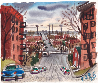
After a s**tty effort painting yesterday, you have to read that blog to get the joke, I headed out to Ville st Pierre which is part of Upper Lachine. From NDG, there is a very steep road on what is called Devil's hill, leading to the train tracks and the underpass that allows bikes and pedestrians across to the rest of st Pierre and to the Lachine canal. Most of my weekend bike rides to the west direction take me up and down this hill. Artistically, it was a challenge to get the drawing correct, with a perspective point that you could sense a downward slope. It worked out okay, but the actual hill is even steeper than it looks here.

Devil's hill view, watercolour 6 x 7.5" cold press, March 2025 (No. 4199a)

The main drag through the neighborhood, other than st Jacques street, is Rue des Érables (Maple street) which had a large tree shadow, possible a maple tree, as seen in the painting. Getting the colours properly de-saturated was key, the grass, sidewalk, tree and brick walls were all slightly dusty and worn-out from the winter. Using the red/green of the cars provided the contrast element, and I darkened the sky to add drama. Yellow ochre (PY43) was the key in creating the warm, greyish tones.

Tree shadow on Rue des Érables watercolour 6 x 7.5" cold press, March 2025 (No. 4200a)

Painting in somewhat mundane locations really challenges the art skills, one has to find a theme, composition and the elements to make a piece of artwork. Quite a few people walked by and looked to see what the heck this guy was doing standing next to his bike with a paint brush. The twists and turns of the elevated highway is fun to paint, and I ride by it all the time. There was a small pile of snow, you see it in the foreground, probably where they dumped it during the winter.

Overpass curve, watercolour 6 x 7.5" cold press, March 2025 (No. 4200b)

It was so great to paint with fresh water, warm sun and no gloves on for the first time since last fall. This traffic sign used to be yellow, but it faded so much that it was just a pale beige. The porcelain coating had also cracked like an old oil painting. The subject looks simple enough but it took all my skills to produce the correct hue, saturation and value of the yellow sign against a slightly darker and slightly more orange background concrete. Adding the textural elements completed the effect, along with my graffiti signature. 

De-saturated yellow sign, watercolour 6 x 7.5" cold press, March 2025 (No. 4199b)

Wednesday, March 19, 2025

Harley Diamonds, Truffles and other treasures

Harley street is one of those hidden gems of Montreal, an artist's haven really. There was even a guy who used to sit on the sidewalk outside of the bakery trying to sell his paintings while also asking for spare change. I have painted here many times mostly due to proximity but also due to the subject matter of an old fashioned-modern community with many of the amenities such as this auto shop named Raffi auto service. Looming in the background is one of the massive apartment buildings up on Sherbrooke on the other side of the train tracks. 

Raffi auto big tree, watercolour 6 x 7.5" cold press, March 2025 (No. 4196b)


I saw these bits of glass on the road near the sidewalk at the end of Harley street and its likely from broken car windows. With the strong backlighting from the sun, the pale green glass was shimmering like diamonds. There is a recent Stones album called Hackney diamonds, a reference to smashed glass on the ground in a town in England, so I named this painting Harley diamonds. It was a tough effect to get, and the first time I tried it. Using side-drag with the asphalt colour I left some small white bits showing, then daubed on green and turquoise using a Caribbean palette. If I can get a better angle on this it may make a neat larger painting. A delivery truck was parked just in front of where I stood.

Harley diamonds study, watercolour 6 x 7.5" cold press, March 2025 (No. 4197a)


Chairs in the field is a major theme around here, the locals drag chairs out here to enjoy sitting around and getting sun, since there is no park in the neighborhood, just Coffee park across the train tracks. In the background you see the remaining snow piled from the Reno depot parking lot, its got awhile yet before it completely melts. There is even snow on call for later this week. The velvety-olive grass was mostly yellow ochre (PY43) with perylene green (PBk31) and yellow-orange (PY110). Over top I daubed on burnt umber and carbon black for the leafy-compost textures.

Two red chairs (snow behind us), watercolour 6 x 7.5" cold press, March 2025 (No. 4198a)


What is more decadent than Harley diamonds? How about Harley truffles? You can see some on the sidewalk all around. Ironically, someone had dumped (illegally) a disused toilette on the sidewalk. The back was off but for the painting I visually reassembled the toilette (not in real life though ...I wouldn't get near the thing especially with the mountain of dog crap). Its been awhile since I painted dog crap, I try to make good paintings but this one turned out like s**t. In fact, its the s**tiest painting of the year. Adding to the ambiance was the commuter train rumbling by in the background. I almost walked past this considering the vulgarity of the scene, but the rich theme of a discarded toilette on the sidewalk with a pile of do-do laying beside it was too much. 

Harley truffles, watercolour 6 x 7.5" cold press, March 2025 (No. 4197b)

Tuesday, March 18, 2025

World Inspired Landscapes: Saint Kitts and Nevis

For the next three paintings in the World Inspired Landscapes its Caribbean time! Saint Kitts and Nevis is a two-island country in the east part of the island chain near two other countries I painted before: Antigua and Barbuda, and Dominica. Painting the Caribbean islands is always fun, although the scenery is quite similar with blue-green water, bright yellow green foliage and white sand beaches. Whats not to like? Saint Kitts and Nevis has the distinction of being one of the most conquered and re-conquered countries over history, in fact, it started long before the colonial times when the original indigenous people the Arawak, were taken over by another Caribbean tribe probably from South America. Apparently Christopher Columbus sighted the island, it would be one of the first encountered if sailing from the direction of Europe, which started a series of take overs by Spain, France and the British Empire who at some point shared it with France for awhile. The islands were a launching ground for colonizing the other islands in the region. Today it is independent but like Canada, is part of the British commonwealth.

Slavery for sugar cane ended in the early 19th century leaving most of the islands inhabited by freed people who's descendants live there to this day. In the painting there is an old, colonial era turret that would have been part of defensive fortifications and to spot oncoming ships. Such structures are grown-over with plants, although some are maintained as popular tourist attractions. What was once meant to repel people is nowadays meant to attract people. Like the Great Wall of China. It was important to get the shades of the sea water correct, so I dug out my old tube of cerulean blue (PB35) which is a cobalt stannate (tin) pigment normally used in pottery, phthalo turquoise (PB16) which is a metal-free pigment, and phthalo green blue shade (PG7). The darker water on the horizon is indo blue (PB60). These paints made a fantastic array of aqua hues. With side-drag technique I left a few bits of paper showing to simulate the waves rolling in. 
 

World Inspired Landscapes: Saint Kitts and Nevis, watercolour 8 x 10" cold press, March 2025 (No. 4302b)

Sunday, March 16, 2025

Ice melting on the Lachine Canal, sun and train views

The ice on the Lachine canal was fast melting, patches of water were visible here and there. Most of the bike path was clear although I had to walk through various segments and gave up around here with Lachine in view. The path was icy and wet all the rest of the way so I stopped and made some paintings, looking west along the canal. Embellishment of colours evoked the feelings of the sky, rather than realism which may have been bland. I let the paint do the work, and applied daubs of yellow ochre (PY43) to simulate warmth of sun.

Colourful sky over canal, watercolour 6 x 7.5" cold press, March 2025 (No. 4196a)


A train passed by as I painted the other scene, so I turned and started a new one. The bridge is a simple mix of red ochre (PR101) and indo blue (PB60), with carbon black (PBk6) detailing, while the train is done with Ferrari red (PR254). The toasty lawn in the foreground is primarily yellow ochre (PY43) with burnt umber (PBr7) detailing. The new effect here is the smoke coming out of the engine, which I dropped in while the sky was still semi moist. It reminds me of a Monet painting of a train.

Train over melting canal, watercolour 5 x 7" cold press, March 2025 (No. 4195b)

In this composition the melting surface of the canal was emphasized. pools of water were on top of the ice, and some parts were completely exposed. Trees from the background reflected in parts of the water. The railing looks simple enough but it is a tricky thing to get right. After 5 years I have painted these railing many times before. I recall the first time I was able to ride the canal bike path and thinking that there was a whole lifetime of scenes to capture.

Melting canal, watercolour 5 x 7" cold press, March 2025 (No. 4284b)

Rain rain go away ...

With steady drizzle I set out by bike with my new rain suit to make a few paintings. There is one spot I know with a large metal roof, its just next to the relatively new path they installed along the train tracks near the Turcot interchange. You see the path next to the fence, on the other side of the fence, if you could look over it, is a steep incline, a concrete wall and the train tracks. In the background on the horizon is the massive mountain of snow they piled up throughout the winter for snow removal. In the foreground, the city restored this small hillside with pine trees, deciduous trees and natural grasses. Some invasive vines were getting into it but I removed them last year. I have to take care of my subject matter! The last of the snow was melting around the base of the hillside.

Restored hill last snow, watercolour 6 x 7.5" cold press, March 2025 (No. 4198b)


Looking to the south from the same spot there is a view of the highway overpass and some of the red branches poking up... those will eventually form leaves and become shrubs that turn bright red in the fall. Even though I was under shelter the rain drops were still blowing in. After spending the winter outside painting, today felt like summer to me, although the base temperature was rather chilly.

Red branches overpass, watercolour 5 x 7" cold press, March 2025 (No. 4286b)


A row of three condos was put up right next to the Turcot interchange with a great view of the highways and train tracks. Its a wonder they allow condo construction so close to the pollution and noise. I emphasized the green and red contrast to create a dystopian atmosphere. These are still people's homes and I would not want to disparage that... I tried to find the colour and interesting patterns to show. The best part was that it stopped raining and I could continue on down to the Lachine canal path. 

Green condos red plants, watercolour 5 x 7" cold press, March 2025 (No. 4287a)

Saturday, March 15, 2025

Wasserman forest thaw

There were plenty of shades of brown in Wasserman forest, just east of Decarie in NDG. Including the kind of brown that dogs make... it seems a lot of dog walkers let their dogs poop around here during the winter and I had to walk down the melting path very carefully! In the painting, you see the felled trees strewn about the forest, those were invasive tree species that some knowledgeable volunteers removed and replaced with hundreds of native tree saplings. The old trees they cut will slowly compost and feed the growth of the new trees. Apparently this area used to be something of a dumping ground until the community took it upon themselves to clean it up and take care of the forest. I will return here more often to paint now that I know about it. I did some paintings there late last year when I first stumbled across the location.

Wasserman forest thaw, watercolour 5 x 7" cold press, March 2025 (No. 4287a)

Park Extension / Mile End shades of brown, thawing snow


At the north part of the Mile End neighborhood there are train tracks, and on the other side a bike path connecting to many neighborhoods including Park Extension. On the way back from Anatol, the spice store in Little Italy (more neighborhood name dropping), I stopped on the still iced-over bike path to make a painting of the vintage warehouse that the city is protecting from re-development. If any developer wants to renovate it, they have to maintain its exact appearance.

Vintage warehouse, watercolour 5 x 7" cold press, March 2025 (No. 4285)

On the other side of the bike path is a lumber yard, with several buildings made from, you guessed it, lumber. The building on the left has a wavy roof line held up by arched pillars. It seemed awfully fancy for a lumber yard and maybe the roof just sagged over the years, but lets just call it modern architecture.

Lumber Yard contrasting eaves, watercolour 6 x 7.5" cold press, March 2025 (No. 4195a)


Just a few steps further and there was a neat view in between the two structures, showing the interplay of the rooflines. Using side-drag with the brush, I created the textured effects on the wood. Today was an exercise in shades of brown, everything from yellow to orange to bleached beige. It wont be long until we start to see some green.

 Lumberyard Rooflines, watercolour 5 x 7" cold press, March 2025 (No. 4286a)