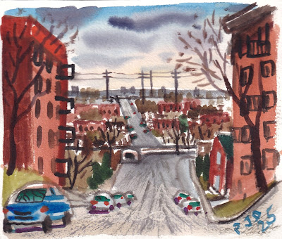
Devil's hill view, watercolour 6 x 7.5" cold press, March 2025 (No. 4199a)
The main drag through the neighborhood, other than st Jacques street, is Rue des Érables (Maple street) which had a large tree shadow, possible a maple tree, as seen in the painting. Getting the colours properly de-saturated was key, the grass, sidewalk, tree and brick walls were all slightly dusty and worn-out from the winter. Using the red/green of the cars provided the contrast element, and I darkened the sky to add drama. Yellow ochre (PY43) was the key in creating the warm, greyish tones.Tree shadow on Rue des Érables watercolour 6 x 7.5" cold press, March 2025 (No. 4200a)
Painting in somewhat mundane locations really challenges the art skills, one has to find a theme, composition and the elements to make a piece of artwork. Quite a few people walked by and looked to see what the heck this guy was doing standing next to his bike with a paint brush. The twists and turns of the elevated highway is fun to paint, and I ride by it all the time. There was a small pile of snow, you see it in the foreground, probably where they dumped it during the winter.Overpass curve, watercolour 6 x 7.5" cold press, March 2025 (No. 4200b)
It was so great to paint with fresh water, warm sun and no gloves on for the first time since last fall. This traffic sign used to be yellow, but it faded so much that it was just a pale beige. The porcelain coating had also cracked like an old oil painting. The subject looks simple enough but it took all my skills to produce the correct hue, saturation and value of the yellow sign against a slightly darker and slightly more orange background concrete. Adding the textural elements completed the effect, along with my graffiti signature.De-saturated yellow sign, watercolour 6 x 7.5" cold press, March 2025 (No. 4199b)


No comments:
Post a Comment