Thursday, December 31, 2020

Painting Year in Review: 2020

The Blue House

What a strange year it has been. In the end things went mostly well for us, including family and work. For my painting hobby it was a great boom, a combination of spare time and cabin fever inspired the largest number of paintings I have ever done, including the creation of a complete art catalogue of over 2400 paintings done since 1989. In this blog I am picking out a few of the notable paintings I did this year, sort of like an award show but I am doing the picking!

The first one is The Blue House, done in May down in Ville St. Pierre this painting captures a charming little house painted in two tones of blue, located right next to the highway. The dandelions were just popping up. The Blue House is my personal favorite from this year because it has a Van Gogh inspired composition, it is part of the pandemic blues paintings, and it just has a lot of character to it, more than just the sum of its parts. 


 St. Lawrence river at Parc Honoré Mercier

The next painting I wanted to highlight was a landscape done on the St. Lawrence river at Parc Honoré Mercier. It was the furthest point that I reached with my old bike. I did it on the same day I completed the Stations of the Green Line Metro Series. The painting captures the rugged coast and strong current, using short interlocking brush strokes reminiscent of Monet or Tom Thompson, but in watercolour. I did quite a few St. Lawrence river paintings this year, mostly upstream in Verdun, Lasalle and Nun's Island.


Lake Vogel, Sutton

Keeping on the nature theme, this was a memorable experience- I went out to Sutton on a solo hiking trip and made a number of watercolours including this one at Lake Vogel, nestled up in Mount Sutton. I found a nice spot in the shade sitting on a thick carpet of pine needles, and enjoyed the relative peace. smell of pine, and the hum of the dragon flies. 


Hiking Elvis

It was also a big year for abstract painting, which began with the completion of Hiking Elvis, a doodleism painting I had started late in 2019. It definitely gets the award for best title.


Palette Cleanser #10

There is always a painting that everyone else likes but me. This year it was one of the palette cleansers, number 10, which is an energetic mix of tropical flowers. I should make posters or T shirts from this one.


Your Melting Heart

Done on the hottest day of the year, this is one of a series of paint-intensive abstracts called Your Melting Heart. It was named by Cilei, and I hung it on the wall for some time. Like an ink blot, everyone can see something different!


World Inspired Landscapes: Bahamas

To escape, this is a hybrid landscape-abstract I call 'World Inspired Landscapes' where the material comes from a variety of sources on the internet and from the local library. This one depicts the Bahamas, which is somewhere a lot of us would like to be right now! Perhaps in 2021 things will improve and we can travel once again. For now we live vicariously in our imaginations. 


Summit Park Barrier

I went for a bike ride during the first wave pandemic and made this painting of a barrier in Westmount's Summit park, in fact the whole lookout was blocked with a tall fence. Later in the summer I went back and it was open again, with some curious sight seers, adhering to social distancing signs and staying apart from each other. Unfortunately like everywhere else we had a second wave that is still going strong. With the vaccine hopefully we start to see the end of it in 2021. Going into next year I hope to continue painting and blogging although perhaps not quite as much as this year which was an exception.


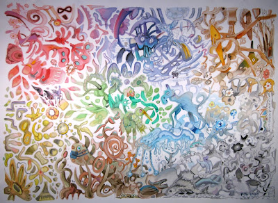
Biological Immortality (Detail)

Happy new year! 

... enough said


World Inspired Landscapes: Belarus


 I researched Belarus using a travel guide, the internet including google earth, and a book about the Chernobyl disaster. The remarkable thing was about how important the land is to the people, and the effects of Chernobyl which contaminated a huge fraction of the Belarus hinterland. One type of image seemed iconic to the region, that is, the low lying swamps and rivers that are lined with great trees. Blanketed with snow, the pastel lights are almost neon. I borrowed from Hiroshige to design this one, the print I had in mind was Meguro Drum Bridge and Sunset Hill, which featured snow covered trees, falling snow and a strangely blue river. Water does not seem to freeze in Hiroshige's world. Belarus and Japan have noting to do with one another, however the combination certainly created an interesting painting for the series. Unless I get inspired between now and midnight, this will be the last painting I do for the year!

The series is going roughly in alphabetical order, so Belize, Benin, and Bhutan would be the next three. 

World Inspired Landscapes: Belarus 4 x 6" cold press watercolour, December 2020 (No. 2504)

Coffee Street, NDG


Very close to the train tracks is Coffee street which I painted in the rain this year. There is a large apartment building that is being renovated which you see on the right, and a bus depot surrounded by trees which you see in the background. Coffee street is the one turning into the picture, where the car is parked. To punch up the drab colour scheme I emphasized the red construction tarps and the green rubbish bin. It was nearly sun set which created an orange glow and backlit clouds. I didn't need any salt in the water because the temperature was just around zero today. It looks like this is the last landscape painting of the year! 

Coffee Street,green bin, NDG 4 x 6" cold press watercolour, December 2020 (No. 2517a)

Tuesday, December 29, 2020

Biological Immortality


Some plants and animals are able to live forever by constantly regenerating like the bristlecone pine tree than regrows itself, and some types of jelly fish like Turritopsis dohrnii, which can revert to a larval state and then grow up again. Hence the term biological immortality that I learned about from reading BBC news. The painting was done freestyle using my imagination and inspirations of the moment. There are many creatures, plants, microbes and even a virus. Each section of the painting has its own colour scheme. I used the full range of paints available, and varied the tones and values throughout. When there is more sunlight and I get the chance I will update the photo which looks more grey than the original painting which  is hung up on the wall already.

Biological Immortality 22 x 30" cold press watercolour, December 2020

Sunday, December 27, 2020

World Inspired Landscapes: Ecuador


A tropical jungle could not be farther than the current weather in Montreal. This painting is from the front of a birthday card that I painted for Cilei, on the inside there were a bunch of colourful balloons and a birthday message. We had recently watched a documentary of CBC streaming about a fancy eco-hotel that was built in the jungle of Ecuador. It is called Mashpi Lodge, part fancy hotel, part nature reserve, very expensive! They have a tram line that goes through the jungle, and they discovered a species of frog that is new to science. In the painting I included some of these ideas, and included some orchids growing on the tree trunks. The world inspired series has been going more or less alphabetically, but I decided to include this one in the series. The next on my list is Belarus, which will be back to a winter scene. 

 World Inspired Landscapes: Ecuador 4.5 x 6" watercolour paper watercolour December 2020

Palette Cleansers #49


After a few outdoor paintings my palette was a right mess! I like doing these ones because I use the colours near full strength and very bright. It is a good way to get to know the paint and discover new combinations like the different browns, reds, greens, and yellows seen in this painting. In the future I may pick out a few favorites and do a proper version on rag paper and a larger size. 

Palette Cleanser #49a, 6 x 9" watercolour paper, watercolour, December 2020


This one is on the back of the previous one. Recently I made a birthday card and included a whole bunch of coloured balloons in the design, so this is a homage to balloons. The bright colours are offset by browns and blacks in the background. That lilac colour is the quinacridone purple (PV55) from schmincke- it is the most bluish one. I bought a PV55 from Daniel Smith but it is slightly more reddish. It is like the colour of wine almost.

Palette Cleanser #49b, 6 x 9" watercolour paper, watercolour, December 2020

Lachine Canal Ice, Snow and Water,


I walked down to the Lachine canal today it was 3km and took about 30 minutes one way. There were very few people around but I wore a mask the whole time anyways (mostly to keep my face warm). The canal is slowly freezing, there was a wavy line where the ice was creeping across the water, as you see in the painting. The ice colour was a navy-brown and the texture had a marbled appearance. There were sheets of snow that had blown over the ice creating additional patterns. In the background is Ville st. Pierre which is part of Lachine. Going on paining trips these days is more of a challenge, mainly due to the cold and the weather conditions which make it difficult to be comfortable and do a watercolour on location. After some adjustments to my clothing and painting technique the paintings are working out well although I know they can be even better.

Lachine Canal, encroaching Ice 6 x 9" cold press watercolour, December 2020


This scene is looking to the west you see the train bridge in the distance which I painted this fall closer up, and you see one of the many highway overpasses. I think the only reason they kept the canal in tact was to justify building condos and highway overpasses. The entire canal was frozen over, you can see the marbled textures and blowing snow effect. I was sitting on a little platform that sits above the canal, it is protected by a fence, but I wouldn't have wanted to drop a brush or anything. I almost dropped my palette because it was stuck and I was wearing thick gloves. Both of today's paintings required touch ups at home, because they would not dry on location. In fact, I walked half way home with this one in my hand and it was still moist. I added 50 grams of salt to 333g of water today which is the exact amount required to prevent water from freezing at -10C. 

Lachine Canal Ice, Overpass and Bridge 6 x 9" cold press watercolour, December 2020

Saturday, December 26, 2020

Benny Sports Complex Take Two


Don't adjust your sets, this painting really looks this way, dull and faded. When I applied the paint is was brightly coloured and lots of contrast, but the paper absorbed the paint rendering it very pale. The other day I used this paper to great effect to paint a red bike in the snow on Harley Street but this time it dried quite differently maybe because it wasn't as cold today, or perhaps it was the choice of pigments. I attempted this scene previously with the other kind of paper and as seen in the previous blog it turned into a blustery blizzard. Looks like I have some more experimenting to do before mastering the art of winter watercolours! Tomorrow (Sunday) looks to have favorable weather for another attempt, sunny and about -5C. 

Benny Sports Complex Take Two, 5 x 7" hot press 90lbs watercolour, December 2020

Wednesday, December 23, 2020

Winter Painting Discoveries, en Tempête de Neige


 As winter descends in full force it is increasingly difficult to make watercolour paintings on location. The phrase 'en plein air' sounds so nice and fancy in French (in fresh air) but less so when the plein air is a raging blizzard (en tempête de neige?). This was the second painting I did on my walk, I was down on Harley street picking up some bread at the Snowdon Bakery when I saw a good place to sit under an overhang at the local strip mall. Mostly protected from the snow, I could get this painting done of a red bike in deep snow, with the side wall of a condo in the background. Since I ran out of cold press paper I used the thin hot press that I cut up recently for the edgy abstacts. To my delight, the paint quickly absorbed into the paper, making it possible to capture a lot more detail that ever before. An annoyance in the studio, this paper attribute of absorbing paint fast, turned out to be perfect for winter paintings.

Harley Street Red Bicycle in Deep Snow, 5 x 7" hot press 90lbs watercolour, December 2020
 

 The next painting is an example of what I am writing about. It was done on my regular cold press 140lbs paper which does not absorb paint very quickly, especially on humid days or in the winter. The reason is that they add a lot of sizing, a substance that allows paint to flow and mix before being absorbed. Without sizing the paint is quickly absorbed exactly where the brush touches. This painting got sprayed with tiny ice crystals of snow- I was sitting under a thick copse of pine trees so only the tiniest of snow flakes made it through and onto the painting. I walked home and dropped off the painting so it could dry, and when I came back from the second painting, I saw this misty mess! At least it looks a lot like the Benny Sports Complex in a Blizzard!

Benny Sports Complex in Blizzard, 5 x 7" cold press 140lbs watercolour, December 2020

More Cutting Edge Abstracts

 
Cutting Edge Abstract Chicken Surprise 5 x 6" hot press, watercolour, December 2020


They are edgier, they are cuttier, they are abstractier. Recently I cut up a larger painting that was on some kind of thin rag paper, maybe it was 90lbs hot press which is about the thickness of a thin piece of cardboard such as a cereal box for example. It was difficult to paint on because of its low amount of sizing, that is the substance they apply to the paper so that the paint is evenly distributed. Without sizing at all, rag paper would instantly absorb the paint, so the paint would stay exactly where the brush touches making it hard to blend the watercolour or get special effects. For these paintings I worked quickly and decisively with the brush work,  and chose single clean colours for most of the elements. 

Top: Cutting Edge Abstract Brown Aqueducts 1 x 8" hot press, watercolour, December 2020

Second from Top: Cutting Edge Abstract Rainbow Aqueducts 1 x 8" hot press, watercolour, December 2020

Bottom left: Cutting Edge Abstract Chicken Surprise (upside down!)5 x 6" hot press, watercolour, December 2020

Middle Right: Cutting Edge Abstract Pizza Box with Aurora Borealis 2 3/4 x 4" hot press, watercolour, December 2020

Bottom Right: Cutting Edge Abstract Earth Tones 3  x 4" hot press, watercolour, December 2020

 note I noticed that Chicken surprise was upside down, so I put a right side up version at the beginning of the blog. 


Tuesday, December 22, 2020

Cutting Edge Abstracts


 These are really cutting edge abstracts because I cut them off the edge of a bigger piece of paper! The bigger piece of paper had a large painting that was not the best, and it had been ripped in places owing to a lack of proper storage for large sized painting. The large paintings get stored behind my dresser without much protection, something I hope to solve soon with a bigger portfolio. For the painting I wanted to use as much raw umber natural as possible (PBr7), it is a nice colour of melted caramel or toasted toffee. Using it as an under-painting worked out quite well. 

Cutting Edge Abstract Pink Fish and Wood, 1 x 7" cold press watercolour, December 2020


This one had a primary colour scheme, yellow, red, blue and green. There are also accents of  raw umber natural and black in the forest. To create green I painted yellow on top of the phthalo blue sky. Painting with phthalo on this particular paper is tough, it absorbs instantly and you need to paint fast.

Cutting Edge Abstract Yellow Totems on Shore, 1 x 7" cold press watercolour, December 2020


Two planets recently converged, Jupiter and Saturn. I used the motif in the top left. To start this painting I made the raw umber natural under painting, then added the outlines in indo blue (PB60). I shaded the sky and the tops of the hills with dilute carbon black, and over laid the colours which all contained an opaque yellow bismuth (PY184) and various tints. I like this one a lot, and may do a larger version of it on some more cuttings.

Cutting Edge Abstract Two Planets over Hills, 1 x 7" cold press watercolour, December 2020

Sunday, December 20, 2020

Bloodstone Genuine and Phthalo Blue, and December palette


Every so often I complete a painting after some time passes. The top and bottom of this painting were done with bloodstone genuine, a granulating red/black pigment made from iron oxide. I used that for the background of my blog this summer, which can be seen on the desktop version of the blog. Today, I was moving some paint around my big palette, and needed to clean off the phthalo blue, so I used it to fill in the center of this design. I tried to make the blue look like it was integrated with the textured black portions.

Bloodstone Genine and Phthalo Blue, 4 x 10" cold press watercolour, December 2020


Here is a depiction of my December palette that I have been using for outdoor and indoor paintings. It follows the rainbow mostly. The hue angles go from yellow-green on the top left, across to red-magenta top right, then around to blue violet and into the greens going clockwise. Black has its own little spot off to the side because it really messes up the mixing areas. The changes from my summer palette was I took off one of the yellows since I don't need to paint much grass or foliage, and I added back phthalo green blue shade and rose-magenta because they make great blue-grey mixes for winter. Just today, I set up my other, bigger palette (it hold 28 colours compared to the 18+1 in this palette) so I can get to use all the paints I am lucky to have. 

Depiction of Palette, December 2020


Palette Cleanser #48

My palette did not need to be cleaned really, I just wanted to do an abstract painting. It started with the orange circles, and then the reflective water ripples in the foreground. The colour scheme worked surprisingly well here, its not often that orange yellow and brown works together. On the back of some of these paintings there is an old failed attempt at a Venice scene done from a photograph taken in Italy by a colleague. It didn't work out so I cut it up and used the backs to do more paintings. Since I am nearly finished the Fabriano pad of watercolour paper, I may just turn them over and start again on the backs! 


Palette Cleanser #48, 9 x 12" watercolour paper, watercolour, December 2020

Saturday, December 19, 2020

Iron Oxide Brick Houses


Certain paint pigments are commonly used in construction materials such as the iron oxides. The house on the left was done using iron oxide red/brown with a touch of red and black paint. On the right, it was raw sienna, goethite, and a touch of carbon black. Chances are that the bricks themselves included similar pigments which are created from iron oxide slag waste produced in the steel industry. Iron oxides are also the pigments that indigenous people used in rock art thousands of years ago, which goes to show how resilient the pigments are. The main advantages are that they are lightfast (dont fade in sunlight), are resistant to chemicals like acids, and they do not easily degenerate over time. Iron oxide colours include shades of beige and brown that look yellow, red, orange, dark brown, and even dark red/violet and some have a blue-grey appearance. 

Iron Oxide Brick Houses NDG 5 x 8" cold press watercolour, December 2020

Paletter Cleanser #47


Some of the paints that I acquired over the past few years are really useful, others, not so much. Bloodstone genuine is a reddish-black paint that granulates after application- meaning that it forms little clumps instead of drying smooth. Here, I mixed it with the beige paint in the background, if you zoom in you can see a textured, sandy appearance. I got this paint in Scotland at the end of 2018 and really liked it for awhile. The trouble is that it contains a lot of additives including a dispersant (usually ox gall) and an adhesive (gum arabic). All paints have these additives, but they add more to certain pigments especially the heavy mineral based paints so that they spread and stick to the paper. Since I got carbon black (PBk6) I stopped using bloodstone genuine in my main palette but I still like to use it in some situations. 

9 x 12" watercolour paper, watercolour, December 2020

Sun Setting on Somerled


Getting closer to winter, the days are shorter and the nights are colder. I've made some adjustments to my painting routine, for example less outdoor painting and more indoor painting. I snuck out yesterday to make this one in front of our condo, looking west towards the setting sun. I learned that it takes 300 grams of salt per kg of water to keep it from freezing. Unfortunately with that much salt in the water, and the dark cool climate, the paint does not dry very fast. It was a challenge to control the watery paint but I managed to get 99% of this scene completed on location. I just fixed the tires under the car which had completely blended in with the shadow. The painting has an eerie, winter glow.

Sun Setting on Somerled, 5 x 8" cold press watercolour, December 2020

Thursday, December 17, 2020

Keeping Busy Paintings


'Keeping busy paintings' are great to do when you want to keep busy. For example when it is -10C outside and you pants can freeze. Also paints, they can freeze too. I was cleaning the palette after my frozen painting, this time mostly the blues, greens, and a bit of yellow and burnt sienna. I like the contrast between the blue-green of the tentacles and the yellow-green of the background. The illusion of sub beams coming through murky water was created with a yellow wash and a few diagonal brush strokes.

Tentacle Aquarium  4 x 8" watercolour paper, watercolour, December 2020


These paintings are actually on the back side of the dust cloud abstracts. I am running out of paper again, at least the cuttings and back sides I have used for the past few months. With the stores set to close again after Christmas I will have to stock up. I used several iron oxide (earth) pigments for the painting, including siennas and umbers.

Earthy Abstract 1 x 7" watercolour paper, watercolour, December 2020


In this abstract, I created an imaginary landscape using some compositional elements of Hiroshige the great Japanese illustrator from the 19th century. He liked to include triangular elements at the bottom of the scene, like the berm of grass and outcropping of rocks. To make it fit with my lemon sunset theme, I included some yellow smiley faces in the rock near the curve in the path, a giant chicken-shaped apartment on the horizon, and the 3020 year signature. Next year I will label them 3021. 

Path to the Lemon Sunset 5 x 7" cold press watercolour, December 3020

Thinking about how to paint in the winter...I discovered a blog called Citizen Sketcher when I was looking for tips on how to keep water from freezing while doing watercolours. Of course, a Canadian landscape painter would know something about it! The blog mentioned alcohol and how it didn't really work to stop water from freezing, but it did mention that you need a good pair of boots like Baffin snow boots. I enjoyed looking at the art on the site, the artist also makes location paintings in Montreal including a scene of Snowdon Theater that I also painted years ago from a similar angle. After some more research, and drawing on my background as a scientist, it looks like glycerol is the best bet- with 50% glycerol I could probably do a painting at -30C, but in that case I'm going to need warmer clothes!


Wednesday, December 16, 2020

More Guppies, Literally


 For awhile my fish tank was struggling, the fish would not survive and the guppies, live bearers, were not having babies. I made some adjustments this year to the filtration and water, and bought a few rounds of guppies from the pet store, and voila! The tank is filled with new guppies and their many progeny, you can see some of the tiniest ones in the middle of the painting. I also have a plecko in the tank, which is seen bottom left but not to scale, it would be about 4 times this size relative to the guppies. That ghostly image on the top right is the best I could do for a loach- it only appeared for a split second before hiding behind the habitat. The habitat are dense wood chunks sold at the pet store for aquariums. I will have to be more patient to do a portrait of the loaches, and maybe drop some bloodworms in the tank which will  draw them out if I am quiet. 

More Guppies 4 x 8" watercolour paper, watercolour, December 2020

Dust Cloud Abstracts

 After doing the sub-zero painting outside yesterday, my palette was a serious mess. Salt and water had gooped up many of the colours so I cleaned the palette off using a brush and used the extra paint in these small abstracts. Essentially it was a palette cleanser on a much smaller format. The syrupy consistency of the paint made for some intense colours especially the indo blue (PB60) seen in the sky and burnt sienna (PR101) seen in the field. Quin magenta and violet (PV19, PV55), phthalo blue, perylene green, and a touch of iso yellow (PY110) finished the painting.  

Egg and Chicken Dust Storm, 4 x 8" watercolour paper, watercolour, December 2020


This one has a similar story, but I used bismuth yellow, a very opaque paint, to overlay the shrubberies. Perylene green was used for their shadows. These paper cuttings were leftover from a home-made framing I did for some Japanese postcards. I also received another print today from Mokuhankan, the 12th and final one in their woodblock print series called Japan Journey.

Bismuth Trees Dust Storm, 1 x 7" watercolour paper, watercolour, December 2020

Tuesday, December 15, 2020

Somerled Auto Mechanic NDG, with Windchill


With the winter weather approaching, it is difficult to make location paintings. Today was very sunny with a clear blue sky but the temperature was about -12C with a -17C windchill factor (1.4F). To test out the theory that I can still make paintings in these conditions, I bundled up and went out front with a minimal kit: a cup of salty water, palette, paper, and two brushes. A few notes on the experience, my face was frozen by a bitter northerly wind, the palette rapidly froze up creating a kind of colourful slush puppy, it was like painting with crayons, and my eyes were tearing up making it difficult to see. The painting seems to convey all of these factors- it looks like a windy cold mess where your eyes are watering and nose is running.

The paper was actually cold press, but I decided to call it frozen press this time! 

Somerled Auto Mechanic NDG, with Windchill 5 x 8" frozen press, watercolour December 2020

World Inspired Landscapes: Belgium


In researching Belgium from a travel guide and google maps I learned that Belgium is very flat and non-de script. Sweeping fields, marshes, low lying grassy hills and winding rivers adorn the landscape. Another characteristic of the Belgium countryside is the poppy, made famous by the Canadian Great War poem Flanders Field by McCrae. The travel book had a picture of that too, and I remembered the many paintings made of poppy fields by Monet one of which I copied in acrylic years ago. Belgium is also known for cartoons such as Tin Tin and others including the Smurfs! To add a flair to the painting there is a Smurf on a hike behind the foreground poppy field. 

The design for this one included layers like a cake, in variations of green, olive and chartreuse. This year I learned a lot about colour mixing and expanded my range of greens. I used phthalo green yellow shade (PG36), a variety of yellow, yellow-orange, and orange with touches of perylene green (PBk31) and blues. The poppies were pyrolle vermillion (PR255). The smurf colour? Phthalo blues (yellow and red shade).

World Inspired Landscapes: Belgium 8 x 10" cold press watercolour, December 2020

Sunday, December 13, 2020

Palette Cleanser #46

The idea here was festive, like Christmas and birthday wrapped up into one day. Like Cilei! I was also cleaning my palette off after the four location paintings I completed this weekend. Certain colours are working well in the cold weather such as burnt sienna, indo blue, carbon black, and benzi yellow. Other colours are not working well in the cold like the umbers. It may have to do with the formulation of the paint, and the fact that paint companies probably dont test their paints in sub-zero temperatures! 

In the the painting, I used dilute carbon black to make the tentacle, which was later decorated with bismuth yellow and quin magenta. Then I added in the baloons starting with the blues, greens, then reds. The deep red is perylene maroon with quinacridone pink- it looks just like alizarin crimson one of my favorite paints that I abandoned this year due its poor lightfastness (fades in light). 

 Palette Cleanser #46, 9 x 12" watercolour paper, watercolour, December 2020

Benny Sports Center, view of Paths, NDG


Staying a bit closer to home today, this painting was done at the Benny farm community area which includes a sports complex with landscaping in the front. The path and black light post in the foreground heads to the front door of the sports center, and the curbing path heads up to a few benches and trees. In the distant background you see the monolithic green apartment building located in Monkland village, which was painted with a dilute mix of phthalo green (PG7) and carbon black (PBk6). To make the tree greens I used various yellow/orange mixes with phthalo green. The middle ground tree mix is benzi orange (PO36) with phthalo green blue (PG7). The lighter, grassy fields in the foreground includes goethite and some earth colours with benzi yellow (PY154). I just made one outside, it was pretty cold with the wind, although I was sitting at a tall retaining wall so mostly protected.  

Rarely do I touch up a painting back at home, but in this case, the middle ground hills of grass has washed out so I made a slight adjustment there, and added some shadowing under the tree branches on the top left. Monet always bragged about doing all of his location painting on location, and some people questioned him about the claim. In some cases he finished paintings in the studio or made adjustments requested by his dealer or the clients. Van Gogh was known to made adjustments, he would even add ghost-like black figures in his landscapes back in the studio. One of his most famous paintings The Starry Night, was entirely done in the studio from his memory of a view out the window of a mental asylum! 

Benny Sports Center, view of Paths, NDG 5 x 7" cold press watercolour, December 2020

Saturday, December 12, 2020

Saturday Painting Trip, brrr

Painting outdoors brings about many challenges such as cold, precipitation, and corona virus. So I dressed really warm, wore a mask, and stayed away from people! The extra benefit of the mask is that it keeps the face warm and protects from windchill. The wind was actually coming over my back from roughly the north when I did this painting, a small outcropping of concrete/stone breakwater offered some protection. I made the mistake of adding too much moisture in the river and it never really dried. But I got in enough of the detail I think. 

St. Lawrence River, Lachine Park Point 5 x 7" cold press, watercolour December 2020 


The weather was deteriorating into a light sleet with nasty windchill. I found a place to sit under a copse of huge cedar trees which broke the wind and sleet a little bit. I was looking east towards the point of Lachine Park, on the left is St. Lawrence river, the walking path and the bike path. On the right is the shore line of Dorval. After having problems finishing the first painting, I adjusted my approach for this one. I started with a carbon black outline to establish the main shapes and shadows, then worked in the blocks of colour and some details like the branches and lamp posts. 

Lachine Park, Under the Cedar Trees 8 x 10" cold press, watercolour December 2020 


 I was riding the bike towards home, when I just decided to turn onto Ranger Park where I found a row of juniper trees to sit under with a view of Honoré Mercier Bridge. This painting looked fantastic when I was nearly done but small pellets of hail had landed on the picture. When I took it out at home it acquired a mottled appearance. At least you can get the full experience of being there, hail and all! I also grabbed some juniper berries to make hot tea at home.

Ranger Park under the Juniper Trees, Honoré Mercier Bridge 5 x 7" cold press, watercolour December 2020


Thursday, December 10, 2020

Birthday Card Cover with Tulips


 Kitchy? A little bit. This is the front of a hand painted birthday card for someone in my family! I was inspired by the cover of an Amsterdam travel guide that we had from our 2018 trip to the city of tulips. The background was black and the flowers made of wood on the travel guide, here I made the flowers more life-like and put in a lush green background with tulip stems. It is all non-toxic paint, and the paper is sufficient quality to last a very long time. Now people will feel extra guilty when they recycle the cards later on.

Birthday Card Cover with Tulips, 4 x 8 (8 x 8) watercolour paper, watercolour, December 2020

Tuesday, December 8, 2020

Abstract Frames


A good frame can make a big difference in how a painting looks. Over the years many of my paintings have been framed, the interesting thing is that the framer will have their own opinion on the choices, or, if you are using a frame a store you just don't have much choice other than standard options. Either way, the frame and mat end up becoming a major part of the artwork. In this group of paintings I left a wide border then filled it with an abstract frame. The above design contains 5 pink paints that I have  including quin magenta (PV19), quin rose (PV19), quin purple (PV55), manga violet (PV16), and ultra pink (PR259). The border is mostly goethite (PY43).

Abstract Frame with Five Variations of Pink 2 x 5" cold press watercolour, December 2020


In the painting above I used indo blue (PB60) and quin rose (PV19) with raw sienna (PBr7) and nicosia green earth (PG23) in the twirly shapes. The abstract frame is shaded as if the moon were glowing on it. If it were a real painting that would be impossible of course. It gives the whole thing an eerie glow. 

Abstract Frame with Moon Glow and River 5 x 7" cold press watercolour, December 2020


The last painting also has an abstract frame done in umber (PBr7) and dilute quin rose (PV19). The sky was mostly indo blue (PB60) tinted with phtalo green (PG36) or quin purple (PV55). The specters are quin rose outlined with indo blue. I liked the way umber and indo blue mixed together. 

Abstract Frame with Specters 5 x 7" cold press watercolour, December 2020


Sunday, December 6, 2020

Eight Odd Size Rust Abstracts


I had some bits and pieces of paper cuttings from old paintings and used them for a quick series of 'rust' paintings. The main colour used in the background is iron oxide red/brown, which is quite literally rust. I mixed in another earth colour called umber, and then overlaid with quinacridone purple, and bismuth yellow. The subsequent paintings include indo blue or quinacridone rose. These are very odd sizes! When I get through the odd sizes I plan to go back to more standard sizes.


 Rust Abstract #1, cold press 1 1/4 x 7" watercolour, December 2020


 Rust Abstract #2, cold press 2 x 4.5" watercolour, December 2020


  Rust Abstract #3, cold press 1 x 8 1/4" watercolour, December 2020


 Rust Abstract #4, cold press 2 1/2 x 4 3/4" watercolour, December 2020


 Rust Abstract #5, cold press 2 x 4 3/4" watercolour, December 2020


 Rust Abstract #6, cold press 2 x 3 1/2" watercolour, December 2020


  Rust Abstract #7, cold press 1 x 7" watercolour, December 2020


  Rust Abstract #8, cold press 1 x 7" watercolour, December 2020