Sunday, January 31, 2021

Sunday Painting Trip, Winter Blues


Sunday brought the promised sunny day, what a coincidence. It was still -15℃ with additional windchill but I was dressed for the occasion with 4 layers on bottom, 6 layers on top, and my new Anfibio boots with thick socks. I adjusted the salt a bit higher, to the theoretical maximum of 30g of salt for 100g of water. I walked through the back streets of Ville St. Pierre, and came upon a neat side view of the blue house. It was still just as blue as ever, but the bright, low sun was reflecting off the wall creating a blue-grey with hints of yellow. The icicles were very long, and glistening with the bright sun. The bottom portion of the icicles were in shadow. With my polarized sun glasses it made things more bearable, and my double tuke was also reducing the direct sun in my eyes. In the background is the tangle highway overpasses and ramps.

 The Blue House with Icicles, Ville St. Pierre 5 x 7.5" cold press, watercolour, January 2021 (No. 2541b)


Arriving at the Lachine canal I was feeling pretty good- sunny day, warm, perfectly dressed for the climate. After doing so many paintings of the canal, it was surprising to see it with a fresh layer of snow on top of ice. It was a bit of an uninteresting scene but the canal cut a nice angle, and the tone of the snow was mysterious. Painting snow has been a challenge, but I am slowly learning how to see the various tints, however subtle they are. Unfortunately, the temperature was dropping, the sun was going down, and the layers of paint stubbornly would not dry. I studied the scene carefully, committing the remaining details to memory, and then packed up and marched home. This time, I had a thick piece of cardboard to protect the surface of the drying painting which worked great. When I got home, the salt had crystalized creating a sandy texture over the whole scene. I finished the painting at home by adding the railing, tree, buildings, upper portion of the canal wall on the opposite side, the shadow on the snow along with some other details including PJD 21. All of the blues are done with phthalo blues (PB15:0, PB15:3) and indothrene blue (PB60). The little footprints in the canal snow, I believe were made by a running cat, you can see them in the bottom right.

Snow Covered Lachine Canal 5 x 7.5" cold press, watercolour, January 2021 (No. 2543b)

Saturday, January 30, 2021

Experimental Colour Abstracts

Certain paints get along nicely, others not so much. In order to make discoveries it is a good idea to experiment from time time, for example in this painting I combined some really natural pigments including lapis lazui, red opalite, and green porphyry with synthetics like phthalo green, blue, ferrari red, and benzi yellow. I wanted to see if the natural pigments would stand up to their brighter cousins. It worked out okay in the end, although this isn't one I would hang on my wall.

New Colour Directions, 5 x 7.5" cold press, watercolour, January 2021 (No. 2531a)


 For this painting I started with some liquid frisket otherwise known as masking fluid, it is a kind of latex substance that you can apply wet, and let dry. Then I painted over it with a metallic combination of iridescent moonstone, raw umber natural, and neutral tint. I'll admit it, I bought iridescent moonstone just because of the cool name, it is a Daniel Smith brand paint made of titanium white (PW6) and mica flakes. The real painting sparkles in the light but you can't see it on the screen. Then I peeled the frisket off which took awhile, and finally filled in the colours. I may work on this method a bit, it has some potential.

Colour Curfew Metallic, 10 x 11" cold press 300lb, watercolour, January 2021 (No. 1330b)

Lab Book #22: Hokusai's Turtle


After a bit of fiddling with the lighting and camera setting I finally got a decent shot of this painting which I completed a few days ago. For the purpose of teaching online I obtained some small studio lights, which also turn out to be useful for photographing artwork. I set the white light to maximum and yellow light to minimum, and used an indoor exposure setting (+1) on the camera. With those settings I just needed to tweak it a bit with Image J which is akin to photoshop. It is still better to take pictures in a full summer sun light, but that is a little ways off right now. 

Lab Book #22 contains my laboratory and meeting notes from 2019-2020, including a plethora of doodles. The last one was also named after a Japanese artist I called it "I am Utamaro". This one is named after the great illustrator Hokusai who is best known for his "Under the Great Wave" print, but he also illustrated dozens of books including manga books and created thousands of prints. A manga book contains all sorts of illustrations of everyday life objects. He was known to draw turtles swimming, so I included one in the river near the bridge. I used some of his technique to create the waves and swirling water on the left. One sketch was a chipmunk on the back balconey with a peanut, you may see it in the middle. There is a lemon sunset theme, seen hidden on the horizon, and with the happy faces in the submarine-structure at the bottom. 

Lab Book #22 Hokusai's Turtle, 10 x 15" cold press, watercolour, January 2021 (No. 1346b)

Saturday Painting Trip, Lots of Snow


 I left early this morning to get to Mount Royal hoping to avoid the crowd. There were however plenty of people there already, can't blame people for wanting to get out of the small apartments. Families, kids, and couples were skating on this rink right next to Beaver Lake. I painted the same scene last summer, unsure of what it was meant to be, now I know its a skating rink. The snow was piled high around the rink, it was a mix of pale turquoise, blue and lilacs. I did some touch ups at home because it smeared a bit, and the skyline needed some work.

Mount Royal Skating Rink, 5 x 7.5" cold press, watercolour, January 2021 (No. 2545)


Today was supposed to be relatively sunny with a blue sky, instead it was a bitter -16℃ overcast with a mild blizzard. I nearly headed home when it became obvious that the sun was not going to come out. Wandering around the snow shoe trails I found this scene, there were about a hundred picnic table set aside, all piled with snow that looked like marshmallows. I found a place to sit and made this painting using a simple method. The central tree defines the shape of the middle snow pile, and blue-grey shadows create the cream puff snow piles. Finally I finished with the bits of visible table, and the background.

Mount Royal Picnic Tables, 5 x 7.5" cold press, watercolour, January 2021 (No. 2546)


Disappointed with only two paintings, I retreated home. When I stepped off the bus I saw this amazing scene looking down Fielding Avenue at the corner of Walkley. I found a little corner to stand on and made this scene, or at least something closely resembling this scene. At home I had to re do the buildings, and fill in the snow covered leaning tree. It worked out surprisingly well, this is really Fielding Avenue!

Fielding Avenue Leaning Tree, 5 x 7.5" cold press, watercolour, January 2021 (No. 2547)


Friday, January 29, 2021

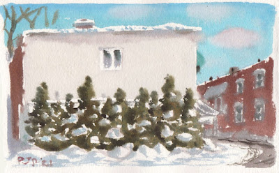
Cedar Trees with Snow, NDG


On my way back from the laboratory I stopped at this scene, on the corner of Sherbrooke street near Loyola campus. The Greek restaurant is behind the shrubs, it was built from cream coloured bricks that contrasted against the bright snow. To make the cedar green, I used three different mixes. The brighter green was yellow-orange (PY110) with phthalo green yellow shade (PG36), which produces a green olive colour. The middle tone was burnt sienna (PR101) with phthalo green yellow shade, which gives a darker version. The shadows were perylene black (PBk31) with touches of benzi red (PR175) and indo blue (PB60) to create the shadow green. Finishing this painting was tough because it was -15℃ and the high salt was slowing the drying time. At least this time, there were no touch ups at home, this is how I completed it on location.

Cedar Trees with Snow, NDG, 5 x 7.5" cold press, watercolour, January 2021 (No. 2544)

Palette Cleansers #55 #56


These were not really palette cleansers, I was using up some extra paint from various tubes. The background is red opalite with a bit of Venetian red (PR101), it creates an apricot colour but feels rough like sandpaper when dry. It is a natural pigment, that is, ground up rocks as opposed to a finely ground synthetic. The olive green was actually a burnt sienna (dark orange) with a bright green, and I added some quinacridone red (PR209) and winsor green (PG7) for visual interest.

Palette Cleanser #55, 9 x 12" watercolour paper, watercolour, January 2021 (No. 2524a)


I went ahead and used the whole tube of red opalite! It was pretty fun to squeeze out a whole tube of paint at once, it was a small tube of 5mL. Its a very weak paint, so I added venetian red to give it some colour. The rest of the painting was made with bloodstone genuine, and burnt sienna. It is like an abstract cave painting. This one is also rough like sandpaper due to the red opalite. It was from a special release by Schmincke, I wrote about for the Albania painting, the paint is weak and hard to use. The manufacturer had to add a lot of gum arabic to make the crushed rock stick to the paper, which is why it feels rough. I have more respect for the historical painters now, they had to use some difficult pigments.

Palette Cleanser #56, 9 x 12" watercolour paper, watercolour, January 2021 (No. 2533a)


Four More Cutting Edge Abstracts


Earlier this week, it was great weather, very sunny and not so cold, but I got stuck inside all day zooming and typing. So I made a quick series of imagination paintings from edge cuttings off a painting called 'Origins of Original'. I had cut down the painting so as to fit our poster frame, then used the pieces to do some abstracts and location paintings. This 90lb paper is highly absorbent. Here, I used umbers to make a textured lane, and bright synthetics to create the field. 

Lane with Field of Flowers, 5 x 7" hot press 90lb, watercolour, January 2021 (No. 2538a)


 Overall the colour scheme of this one is low chroma (mostly grey) with subtle pastel tones. On the left, I created additional colour schemes within the cube shapes. Most of the design was from the original cutting, it was the head of an abstract character. Is it really cool anymore to have a balloon? I think so.

Cool Guy with Balloon 5 x 7" hot press 90lb, watercolour, January 2021 (No. 2538b)


 This 'painting' is an exploration of 'warm brown', 'yellow', and 'orange'. As I learned last year, 'brown' is actually a darker version of 'yellow-orange' or 'orange'. I could recreate brown using 'synthetic yellow-orange' and adding 'carbon black', although it looked 'better' using a 'raw umber'. Or presumably 'burnt umber', a neat colour I would like to 'buy'. The 'gratuitous use' of apostrophes was intentional. 

Earth Apostrophes 5 x 7" hot press 90lb, watercolour, January 2021 (No. 2539a)


 You need a paddle if you are up a creek. We all know what happens if you don't have one. The stained glass was actually part of the painting I trimmed down 'Origins of Original'. I never knew why I called that painting Origins of Original until this day. It means that I would cut up the painting and make even more original paintings years later. I like the yellow-purple colour scheme here, always difficult to pull off. The blue and green, with splashes of red help it stay together. 

Stained Glass Manor with a View 5 x 7" hot press 90lb, watercolour, January 2021 (No. 2539b)

Tuesday, January 26, 2021

Colour Curfew


 Experimenting with some of the weird paints I have in my collection resulted in this small abstract inspired by the Quebec curfew! The idea was graffiti on a wall, or coloured chalk on a board. To create the shiny grey background (which actually sparkles in real life), I used a mix of neutral tint and mica with titanium white. It sounds fancy but this is essentially car paint! They use a lot of titanium white in car paint, and the mica provides the sparkle you see when looking at a car in the sunlight. Most artists pigments come from the paint or cosmetic industry. The other objects contain synthetics, but I also used lapis lazuli (blue), porphyry (green) and ochre (yellow) which are more or less natural pigments.

5 x 7.5" cold press, watercolour, January 2021 (No. 2532b)

Sunday, January 24, 2021

Car Wash, Heaps of Snow


Today there were heaps of fresh snow and a clear blue sky. The sun was shining, but it was -26℃ with windchill. I wanted to do this scene yesterday but it was too complicated and my water was freezing. With twice the amount of salt I could make washes and paint almost normally, it also has a slight sparkle now that it dried due to salt. To make this painting I took off my shell glove, and just wore the base glove- a thin insulated layer- but it was a mistake and my hands were very cold by the end of doing this one. Just a few touch ups were done in the home studio afterwards. There is actually another building on the background that rises above the other one but I omitted it for sake of size. Later I realized that my wood frame was blocking about 1 cm of the top. This painting really captures the heaps of snow everywhere, yo may not even notice that there is a car on the right mostly buried.

Maisonneuve Blvd. Lave Auto Heaps of Snow, 5 x 7.5" cold press, watercolour, January 2021 (No. 2543a)

Saturday, January 23, 2021

Palette Cleanser #54


After some freezing cold location paintings it was nice to sit down with a hot cup of coffee and do a painting from the comfort of the apartment. The salt I use in the water can create a good mess in the palette, so I went over each blob of paint and used it to make this Van Gogh-inspired creation from my imagination. To create the golden pot with reflection I used yellow ochre (PY43), then circled the highlight with some orange and yellow. I used my new lemon yellow (PY175) and a touch of phthalo green yellow shade (PG36) for the chartreuse leaves, and perylene green (PBk31) and burnt sienna (PR101) for the dark leaves. If I could go back in time and give myself these paints when I was doing a lot of florals, I think I would have enjoyed them. I am not sure PG36 and PBk31 were in use back then. Many of the pigments used today in paints are relatively new to the art world, although most of them were known as industrial pigments for a long time. 

Palette Cleanser #54, 9 x 12" watercolour paper, watercolour, January 2021 (No.2523b)

Saturday Painting: Cold Day on Maisonneuve

Boulevard de Maisonneuve stretches all the way across NDG and Montreal. Through NDG, Maisonneuve is located between the train tracks, bike path, and rows of light industrial warehouses, car washes, and some housing units. I rode my bike past these buildings hundreds of times but never painted them due to the lack of places to sit and paint- the area between the bike path and the fence that surrounds the train tracks is about 1 meter and infested with poison ivy in the summer. On foot, I am able to just stand and paint, albeit in a deep snowdrift today. As I fumbled around with the water bottles in my attache case (by Calvin Klein- from the reuse store) I dropped my paint brush in the deep snow. Luckily I recovered it before I left. The intersecting road is Hampton. I made a few touch ups at home since it dried a little washed out.
 

Maisonneuve Blvd Warehouse 5 x 7.5" cold press, watercolour, January 2021 (No. 2531b)


For this painting I was standing next to the Muslim school on Cavendish and de Maisonneuve which had a little patch of open snow and some trees to break the wind. Unfortunately there were very fine snow particles blowing onto the painting which I tried to brush off. In the foreground is the mucky road, a billboard, and in the background is the Provigo grocery store across the train tracks on St. Jacques street. Even with the salt, the water was freezing slightly and the paint was like slush, so it was more like using crayons! Next time I need to double the salt, the amount I used will prevent freezing at -10℃, but today it was -22℃ with the windchill. At least I was warm with the new Baffin boots (from Amazon) and the parka (from Schreter's). The jacket's colour is called smoked paprika, which is actually burnt sienna. If I spill burnt sienna paint on my jacket nobody will notice.  

Maisonneuve Blvd Billboard, 5 x 7.5" cold press, watercolour, January 2021 (No. 2532)

Friday, January 22, 2021

William-Hurst Park Snowy Tree


On my way back from picking up bread at La Meunerie today I stopped to make a quick painting of a snowy tree in a park along Grand Boulevard. There were very few people out and about just a dog walker and a fellow with his kid, he was pulling icicles off the eave of this building. I hung up my bag of bread on a fence while I stood in a snow drift to make this painting using my new setup. When I saw the dog, I realized that the fence I hung my bread bag on was in fact part of the dog park! Luckily there were no dogs in the fenced area otherwise my precious bread could have been captured by some canines. The Sun was perched in among the branches of this tree, just shining through some thin cloud cover. The snow was in silhouette, with a yellow-orange aura. I had to paint around the areas of snow to provide contrast, and then carefully fill in the background elements. Once the two red poles were added everything came together. For the snow covered bench, there were just small bits of it showing from underneath heaps of fresh snow.

William-Hurst Park Snowy Tree, NDG 5 x 7.5" cold press, watercolour, January 2021 (No. 2542b)

Thursday, January 21, 2021

Palette Cleanser #53

Another installment of the palette cleanser series, this one features an array of warm toffee browns and yellows with green and red accents. The yellow background gives it an eerie glow. That pale green is actually a mix of the warm brown (PBr7) with a bright synthetic green (PG36) which produces an olive green. It is interesting that green is for the most part referred to as green- olive green, lime green, army green , etc. Orange, however, is not so popular, try to think of a variation of orange with a name. Here in Montreal I named 'Montreal orange' which is the colour of a traffic cone. In fact, brown is a variation on orange much the same as olive green is a variation on green. Yet we don't say earth orange, or army orange. 

Colour naming is a funny thing, which why several colour naming systems have been invented like the old Munsell colour system which used a series of numbers and letters to describe colours. The Munsell system or the modern versions can be read about on MacEvoys Handprint.com or wikipedia. I find the knowledge is not very practical for an artist, but imperative to understand the components of a colour. Since learning about colour attributes, I have been able to observe and produce a much wider range of colours (hue value chroma) than ever before. 

MacEvoy had a good quote, it was the last thing he wrote on his sprawling blog:

"Returning to paint each day, with the time I could bring to the task, I would teach myself to see." MacEvoy"

 Palette Cleanser #53, 9 x 12" watercolour paper, watercolour, January 2021 (No.2523a)

Sports Dome in Blizzard


 Today in the midst of a blizzard I managed to make a painting thanks to some tweaks to the gear. New winter boots and several layers to stay warm, and a dose of salt in the water to stop it from freezing. I also have a new paper system to keep the page dry afterwards. Unfortunately, nothing to stop the painting from getting pummeled with snow flakes. By the time I got home this painting was entirely washed out. It shows a corner of the sports dome I painted yesterday in sunnier weather, looking at the back angle with some trees behind. Most of what you see here I had to paint from memory back home. The good news was that I could do the painting in relative ease and had easy access to the water and brushes, posted a pic of the blizzard bag below.

Sports Dome in Blizzard, 5 x 7.5" cold press, watercolour, January 2021 (No. 2542a)


This is a hardened leather attache bag I got a few years ago from the reuse store. I used it for carrying files to the classroom when we taught on campus. The water containers were held firm in an upright position and my brushes (not seen in the picture) were easy to get to wearing heavy gloves. With this setup I could paint standing up and save time which matters when its below freezing. My parent suggested that I write a book on how to paint watercolours outdoors in the winter- I am quickly becoming a world class expert on the matter! Not sure how many people would want to read that though...

Wednesday, January 20, 2021

Sports Dome and PERFORM Centre

On my way to the laboratory today I stopped to make a painting in the cold weather. The Concordia Sports dome (left) has been up since last year. On the right is a glimpse of the side of PERFORM Centre where my lab is located on the top floor. The Centre has stylized windows and on the front, an etched mural of people exercising which you can't see in this painting. With this kind of cold, I needed to add a lot of salt to the water, which prevents freezing but also slows down the drying process. That means a painting stays wet and mushy, and would get messed up if it went back into the folder right away. So I resurrected an old wood frame I made 20 years ago- it provides protection, and also keeps the paper attached. I put a few pics below. The other new thing, I was standing up the whole time, and had arranged my bag to have the water and brushes easier to work with while wearing heavy gloves.

Sports Dome and PERFORM Centre, 5 x 7.5" cold press, watercolour, January 2021 (No. 2541a)


top view, this is an old pad empty of its paper, I cut to size, then fixed the wood rack with two elastics. The paper is held firm on the thick cardboard backing. You can also see my home 'studio' in the background which is half of our kitchen table.


side view, when closed, the painting is protected when wet, and can dry without smearing or lifting of the paint. This helps if painting watercolours in extreme cold, also useful in moist humid conditions or rainy conditions.

Tuesday, January 19, 2021

Saturation Costs Studies #2 and #3


Based on lab book doodles from early 2020 these studies develop the initial study #1 that I posted back in November. Far from being spontaneous, this work has gone through several pencil sketches in my sketchbook, and recently these two small studies. I was experimenting with colour schemes, using almost entirely earth paints from Stoneground Paint company, along with a few of the bright synthetics like lemon yellow. The dude under the tree is creepier than intended- he is hanging out peacefully with a giant virus. on the right is a toilette paper roll barricade with ER workers wielding needle-rifles full of vaccine and toilet plungers. Through the middle is a classic Ukiyo-e cloud effect, with hoards of angry viruses storming up the hill. I will probably try a few more studies, the tree, sky and colour scheme need work, and the middle can open a bit- the final painting will be on the large 22 x 30" format.

Saturation Costs Studies #2, 5 x 7.5" cold press watercolour, January 2021 (No. 2534b)

Saturation Costs Studies #3, 5 x 7.5" cold press watercolour, January 2021 (No. 2533b)

Sunday, January 17, 2021

Sunday Painting Snow Mountains


The plan for today was to head out to Mont Royal to do some mountain paintings. Instead I took the wrong bus and ended up at Vendome terminus! Luckily there are some good views just south of the station like this one, looking north with Mont Royal in the background, and a huge pile of snow in the foreground. A tree still had little scarlet seeds on it, and some grass was poking up from the snow. I used the new colours here - deep scarlet (PR175) for the berries, lemon yellow (PY175) for the glow in the snow, and info blue (PB60) for the cools. I mixed some raw umber with honey yesterday and let it dry- it worked a lot better int he cold weather.

Mountains of Snow, 5 x 7.5" cold press, watercolour, January 2021 (No. 2535)


 This hill is a narrow ridge running behind the Glen Hospital. A solitary tree stood on the top of the snowy slopes. The Montreal skyline was visible in the background. To paint this one I had to kick out a spot in a snow drift next to the sidewalk by a lamp post. My new boots held up to the task and kept my feet warm today although it was only hovering around zero. The wind was strong though.

Snowy Hill, Solitary Tree 5 x 7.5" cold press, watercolour, January 2021 (No. 2536)


 To satisfy my urge to climb a mountain I tromped up the snowy hillside, it was slippery due to partially melted snow with patches of ice underneath. I used the herring bone method of cross country skiing, that is were you walk duck feet so as to not slide down backwards. At the top I found an awesome view of downtown, mostly Ville St. Henri, Verdun, and Lasalle would be visible from here. The wind was whipping up a fury, making the paper flop around and the temperature feel a lot colder than it was. Light snow also picked up. I was glad to finish and head home. I saw some neat snow covered trees along Masonneuve on the way back. At home I touched up these paintings a bit.

View from the Top 5 x 7.5" cold press, watercolour, January 2021 (No. 2537a)

Friday, January 15, 2021

NDG Sunny Day Melting Snow


This afternoon was very sunny and warm, hovering around zero causing the snow to slowly melt. Loyola park had been well trampled on by kids and pedestrians, a stark contrast to the fresh snow that I painted a few weeks ago. I had one of the new paint brushes with me, the Neptune number 4 script brush and it was fantastic for making expressive accurate lines. The path was melted snow, showing asphalt through translucent layers of ice.

NDG Loyola Park Path Melting Snow 5 x 7.5" cold press watercolour January 2021 (No. 2533a)


In Loyola park there is an elementary school in fact it is similar to the one my Mom once attended as a child although recently rebuilt. I don't know if she was a noisy child, but the kids on their lunch break sure were noisy! I was glad to move on, I walked to the end of Fielding near Patricia street and found a small park with a dig park, skating rink, play area, and this structure with a pointed A frame roof. The colour of the brick and the big shadows from nearby trees (off to my left) were casting interesting colours. I really put the brush to work here to capture the complicated structure which had an obtuse roof angle, and it had the perspective too. 

Note: The sky was done well here, after over a year of trying! I started at the horizon with PB15:3 and a touch of the new lemon yellow (PY175), then quickly moved to pure PB15:3, then a mix of PB15:3 with PB15:0, then pure PB15:0. If you look at the horizon it was that yellow haze, but at the top it is a rich blue. The yellow haze is because Montreal traffic has picked up again after being mostly quiet during the pandemic.

NDG Park William Bowie Structure 5 x 7.5" cold press watercolour January 2021 (No. 2534a)

Thursday, January 14, 2021

Palette Cleanser #52


With the new paints I had to make room and clean the palette! You see the new lemon yellow projecting strongly. The red is used throughout, it has a yellow-brown tint to it. I also used some of the new blue, along with quite a few other paints just to see what the mixes were like. This painting was done on the same background sheet you see in the last post. Cilei was watching so I put a little message for her on the top right. Now that we are under curfew/lockdown here in Quebec, we find new ways to have fun.

Palette Cleanser #52, 9 x 12" watercolour paper, watercolour, January 2021 (No. 2522a)

New paints and Brushes from Kama Pigments


Kama Pigments is an art store in Montreal that specializes in raw colour pigments, but they also sell a huge range of brushes, and they carry Daniel Smith brand watercolour paints at low prices. With the current lockdown it is not possible to visit the store, but you can still order online and Canada Post delivers. This time the package came in about one day! The three new paints I got here are Lemon Yellow (PY175), Deep Scarlet (PR175) and Indanthrone Blue (PB60). I used to have Lemon Yellow from Winsor and Newton, but I used it up on one of the big abstracts this summer "Spring Fawn Dancing Across a Sun-kissed Meadow". Deep scarlet is chemically similar to the Lemon Yellow, they are both benzimidazalones. It is very similar to the old Alizarin Crimson (PR83) that I abandoned early in 2020, but it leans more to the yellow than Alizarin. Indanthrone Blue is one I already have from Winsor and Newton, but I am using it a lot. The Daniel Smith version is more purplish compared to the Winsor and Newton one. 

The three brushes are made by Princeton, their Neptune brand of synthetic brushes. The left-most brush is one I had never seen before, it is called a dagger due to the unique shape of the brush, which is 1.4 inch wide at the base, and sharp on the tip. It holds a lot of paint, but gives a sharp line. The middle brush is a standard number 4, although the length of the brush fibers is longer than my other number 4, this one is called a script brush. The last one is a 0, very small and long script brush. I hope to bring more detail to the paintings with these brushes, like the old Japanese masters!


Here is a small painting I made with the new paint, the background is a rich navy blue (PB60), the yellow stands out a very bright lemon (PY175), and the red was used to accent the middle section (PR175). I added some phthtalo green yellow shade (PG36) on the left to see how it blended with the lemon yellow. These are powerful and versatile paints. The title is a play on the brand name Daniel Smith. 

Paint Smithing, 1 1/4 x 5 1/4" hot press, watercolour January 2021 (No. 2614a)


Tuesday, January 12, 2021

Cutting Edge Abstract Pastel Surprise, Mount Fuji


Just before I did Biological Immortality, I did these two small abstracts on some cuttings I made off an old painting called Origins of Original. Part of that painting was integrated with the new abstracts seen above at the bottom right stained glass panels which were part of Origins of Original. If placed side by side, they form a continuous landscape scene. My plan was to do 'Saturation Costs' instead of Biological Immortality, but after doing these small landscapes I had this creative inspiration to do an abstract interpretation of the pandemic rather than a more literal one. Biological Immortality is very abstract, it shows how life forms are all connected and therefor live forever, while the planned 'Saturation Costs' will show the human side of the pandemic. It is funny all the twists and turns than can lead to a piece of artwork.

Cutting Edge Abstract Pastel Surprise 2.5 x 12" hot press 90lb December 2020

Cutting Edge Abstract Mount Fuji 2.5 x 12" hot press 90lb December 2020

Sunday, January 10, 2021

Palette Cleanser #51


 This palette cleanser was done after yesterday's painting trip, the palette was a mess of brown blue and salt. Some colours like isoindothrone yellow make a big mess in the winter, I may have to swap it out as I learn more about which paints work below zero. The composition of this painting was inspired by one of the Saturday paintings done of the bridge over the canal from Ville St. Pierre. I made an extensive study of Hiroshige including some copies of his work, and recently started to study Hokusai who was best known for Under the Wave off Kanagawa, better known as the 'Great Wave' which was part of his groundbreaking 36 views of Mount Fuji series completed in the 19th century. Hiroshige and Hokusai made extensive use of triangles in their compositions, that is, they shaped mountainsides, trees, rivers, rooftops, or pathways into triangular forms usually at the bottom of the painting. 

A good example is in Hokusai's print of The Jewel River in Musashi Province, the shore line at the bottom is a triangle, and so is of course Mount Fuji. Before Saturday's painting trip, I studied a book Hokusai illustrated called 100 view of Mount Fuji which contains some of the most incredible illustrations of all time, you can see a digital version on the website. The Lachine Canal and St. Lawrence river along with some well placed trees allowed me to recreate the dramatic triangular compositions reminiscent of the old Japanese masters. In the palette cleanser #51 I also used the trick, in the pink sidewalk which cuts a diagonal across the bottom left of the painting.

 9 x 12" watercolour paper, watercolour, January 2021

Coffee Park, Bench and Bin, NDG


 After a great day of winter painting yesterday, the weather turned cold and grey with a bitter wind chill on Sunday. On the way back from buying bread at Snowdon Bakery I stopped to make this painting in Coffee Park located between the train tracks and coffee street. The back of the bakery you can see in the painting as the long grey building. Fitting that many of the objects in the painting are coffee-coloured! I used variations of three iron oxide paints including yellow ochre, burnt sienna and raw umber. The snow was a lot greyer than it appears in the painting, and there was a fence between the bench and the train tracks that I omitted. It was a difficult finish as I had not prepared well enough to sit in the cold this long but in the end it worked out okay. The composition is quite different than the previous day's paintings which used dramatic angles this one is all about horizontals and verticals.

NDG Coffee Park Bench and Bin 5 x 7.5" cold press, watercolour, January 2021

Saturday's Painting Trip: Lachine Canal and St. Lawrence River


 Saturday was a delightful day, just below freezing and full sun with just a gentle (but bitterly cold) breeze. The Canal path is not plowed all the way so there were very few people here I didn't see soul for 45 minutes. With all the adjustments the winter painting is starting to work out, I pre-soaked the paper for up to 20 minutes the night before so it was just the right amount of absorption. This is the train bridge that I painted in the summer, from a distance and looking west down the canal. The canal was mostly frozen here, it had long blue-violet shadows from the trees, and a dark olive-navy of the water underneath the thin ice.The bike path is on the left in front of the fence, completely snow covered.

Lachine Canal Frozen with Train Bridge 5 x 7.5"cold press, watercolour, January 2021


 Unsure about how far I could walk in my new boots, I forged ahead to the beginnings of the Lachine open air Museum, which is basically a narrow outcrop of land that housed a number of sculptures and art installations. This scene is sitting at the very beginnings of the park, looking across the St. Lawrence river with a majestic tree leaning over the water. A constant slurry of ice chunks was coming down the river which I captures with a range of white and yellow-greens. Some snow prints including foot prints, and what looks like paw prints of a mouse could be seen. 

St. Lawrence River Ice Flow with Leaning Tree 5 x 7.5" cold press, watercolour, January 2021


Three paintings was my goal, so on the way back I sat on this scene, which is the bridge from Ville St. Pierre across the canal onto St. Patrick Street. I am looking at a partially frozen canal with the sun directly behind me, casting the shadows of several trees, and myself, onto the near snowbank. I also got the toe of my right boot in the scene. You can see from the shadow I am sitting down with the painting, and my right arm and head. The boots have kept my feet really really warm, in fact, too warm! We just need winter to start now. 

Lachine Canal Bridge from Ville St. Pierre, 5 x 7" cold press, watercolour, January 2021

Friday, January 8, 2021

Auto Mechanic Somerled Av. NDG


Here is another painting of the now famous Joe and Ralph Auto Mechanic on Somerled Avenue. It was very sunny today and I got out for some painting at lunch hour. The weather was surprisingly cold, with a fierce wind. Glad I was right in front of home and could quickly get back to warmth. The paint was drying okay but I had to do a few touch ups afterwards along the edges of the brick wall in the background. After many attempts, I am getting better at capturing the three different tones of wall, the dark red on the left, the classic brick orange of the middle, and the neutral yellow-orange on the right.

Auto Mechanic Somerled Av. NDG, 4 x 6" cold press, watercolour,January 2021

Palette Cleanser #50


 After several painting done outdoors my palette was dirty and very salty from the salted water that I have used to paint in the sub zero temperatures. It was fitting to include a snow-filled abstract scene here in the 50th installment of palette cleansers. Using a number 4 brush I filled in the shaped and colours, leaving little circular chip marks of paper showing through, it was a real wrist buster of a procedure reminiscent of the dandelions painting from last summer.

Palette Cleanser #50, 9 x 12" watercolour paper, watercolour, January 2021

Wednesday, January 6, 2021

Benny Sports Complex NDG Clear Day


Take three! This is the third time attempting the scene at the Sports Complex. Today was a little below zero and sunny. The paper held the paint but there was some difficulty around the edges and in the area where the tree overlaps the side of the building on the left. The brick colours are about right, the front had that deep red almost violet tint, while the left wall was more orange due to the sunlight. I think this pretty much sums up the scene- the snow was very choppy and full of footprints since many people walk here and kids play. The spot I chose is on a small hill, under some trees, and away from the main places people walk. There is a curfew soon in Montreal and Quebec evenings from 8PM to 5AM, but I wasn't going out or painting in the dark hours anyways and continue to work from home so it shouldn't affect me much.

 Benny Sports Complex NDG Clear Day, 4 x 6" cold press watercolour December 2021

 Here is the same scene in a snowstorm:

Here is the same scene on a very cold day and it looked more like a foggy day:


Sunday, January 3, 2021

Snow Covered Tree, Apartments NDG


I received new boots today Baffin Yoho style boots that are rated to -50°C so my feet were warm and dry this time around! There were great piles of snow all around the grocery store parking lot, this is near the Provigo on St. Jacques near the forested hillside that defines the southern most end of NDG. I made several paintings at this location over the years such as the blue truck. When overcast and grey, the trick is to find scenes with high contrast. For example, the snow on the big tree, and the snow piles against the road and apartments provided strong value contrasts. The snow was mixed from various blues (PB15, PB15:3, PB60) and the amazing quinacridone purple (PV55). The browns were mostly raw umber which is difficult to use at this temperature. Maybe I will mix in some honey with the paint which should improve flow. At least then I can eat the paint if I need to.

Snow Covered Tree, Apartments NDG 4 x 6" cold press watercolour January 2021


notes to self:

Today was colder than yesterday it was around -7°C and a moist wet feel. Boots vastly improved cold tolerance, just the seat of the pants, gloves, and parka could be improved. Today not too cold. Simplified water system today, just brought one container with a mix of the salt water stock and fresh water- a small mason jar with tightly fitting lid. Paper cold press, was absorbing well. Small size good for cold, keeps sitting time down.

Saturday, January 2, 2021

Saturday Painting, Fresh Snow


Today was a lucky combination of a fresh snow fall, sunny day, and just slightly below freezing temperature. It made for some spectacular scenes around town like the one above, painted from a high vantage point looking west over highway 138 (Rue St. Jacques) and highway 20. I was sitting close to the large storage Uhaul warehouse and Canadian Tire. It is close to where I sat for the secret spot this summer, but that actual spot is now fenced off with tall wire barricades because they have construction material there. Like everything else in NDG they will no doubt pave over and build over the secret spot, but I hope not. They are actually going to plant thousands of trees down in this area that you see in the painting, and stretching to the east, along with a new bike path.

Highway 138 and 720 Looking West 4 x 6" cold press watercolour, January 2021


I found my way into a large expanse, a local soccer pitch that was completely blanketed in fresh snow. It is located behind the Renaissance thrift store which is currently closed, so the whole area was silent and without other people. It was so quiet I could hear the trees rustling and the birds chirping. I did this scene of a soccer bench emerging from the snow, it cast an electric blue shadow on the pristine white snow. The trees behind the fence and the distant building provided the perfect background. I signed PJD and for this year, I wont be writing 2021 just '21. On my larger paintings I may spell out my full name. I probably wont go back to the scrawl signature I used for so many years.

 Snowy Pitch NDG 4 x 6" cold press watercolour, January 2021

artists notes to self: 

Water: today was -1C and I could complete the first painting with just water. Halfway through the second painting the water and paint was freezing, so I added about 50% of the salt water stock to the fresh water (the stock is 50g salt in 300g water).

Clothing: the wind was moderate, and my gloves were adequate- outer layer medium thickness insulated gloves, with a pair of base gloves which I could use for handling the brush. Just a light insulated jacket and under layers to complete. The boots were inadequate, left one leaking slightly. 

Paper/paint: I could use the cold press today. I had previously soaked them for twice as long during preparation 20 minutes to enhance their absorption and let dry. The paint absorbed well. I replaced raw sienna with yellow ochre and it worked a lot better in the cold, same thing, I replaced perylene maroon with quinacridone violet. The raw umber is too solid at this temperature. Some paints are working better than others at freezing temperatures.