Monday, August 12, 2019

Lac Du Coeur, Quebec, Canada

We went to visit our friends up at their cottage in Lac Du Coeur near Morin Heights which is about an hour north of Montreal without traffic, two and a half hours with traffic! The lake is a beautiful, motor boat-free, deep lake with crystal clear water. I swam out about half way down the lake and tread water for awhile, luckily I have been training at the pool. The lake was better than the public pool because nobody else was there swimming and the water temperature is great. When googling the name of the lake it turns out there is a similarly named lake in France where Claude Monet used to visit, so maybe this was like a coincidence, or something more? It was our second trip out there.

Capturing the trees and the water of the Canadian shield is surprisingly difficult. As an artist you think 'it's just a bunch of trees and water what can be so difficult?' but I have always found it to be very challenging. On this trip I struggled to get the power of the landscape to speak in the artwork, so on the final attempt, I distracted the viewer with a dock and the items that were there after a day of having fun on the lake. It tells a nice story- we are all up in the cottage preparing dinner and relaxing- I am sitting in the grass painting and swatting mosquitoes off my body.

5 x 7 " cold press Watercolour, 2019

Wednesday, June 12, 2019

Water Tower, Bolton, Ontario

When in Rome paint the statues, when in Bolton paint the water towers in the forest, at least that was always my motto! This painting was done a long time ago probably around 1995 when my Mom got me new paints, paper, and a 'how to' book called Everything You need to Know About Watercolor. (but were afraid to ask). Okay I made up the part in parenthesis but the book does actually exist. They mentioned that you can use the end of your paintbrush, the pointy end that is, and scrape out lines to create the look of trees, or in this example the wispy grass at the bottom of the painting. The water tower is a simple negative shape created with the skyline and the surrounding foliage. I am quite sure this was done from a photo since I was not painting outdoors a lot in the mid nineties, I really starting painting on location (en plien air) in the later nineties. I did several other water tower paintings, most of them are framed and hanging in the personal collection of Mom and Dad! Maybe this one will too one day, but the price has gone up since now I am internet famous. This  one was done portrait format, there is a water tower painting in landscape format from the same photo. 

8 x 9" cold press (300lbs), watercolour. 1993 (No. 0041)

Tulips and view from Chalet, Montreal

Quality art on location is never a guarantee. The results can never be sure until it is all dried and ready to hang on the wall! In this painting I was sure that it would be a disaster because the whole scene was a mess of different parts, in congruent and overlapping. But I knew that once that flower bed went in, and the details were finished on the ice cream stand that it would be spectacular. I will let the viewer be the judge. You see a bed of yeallow and peach coloured tulips and the great vista of Montreal and the St. Lawrence river all the way to the south shore. It was a beautiful sunny day and I was part of a group walk led by the conference organizers. The conference was the Canadian Society of Chronobiology (CSC) meeting of scientists, it was a fantastic conference and I learned a lot, not to mention got to make a few paintings in my old neighborhood.

To paint the tulips I put a wide wash of yellow and red (windsor or scarlet lake) across the painting, it looked more like a sleeping bag than a bed of flowers. Once dry, I overlapped the green foliage, and added some red and orange details to create the bulb shape. The initial wash was the key in creating a dense, warm flower bed even though the finished product does not contain very much actual detail the feel is what is more important when painting. 


5 x 7 " hot press, Watercolour, June 2019

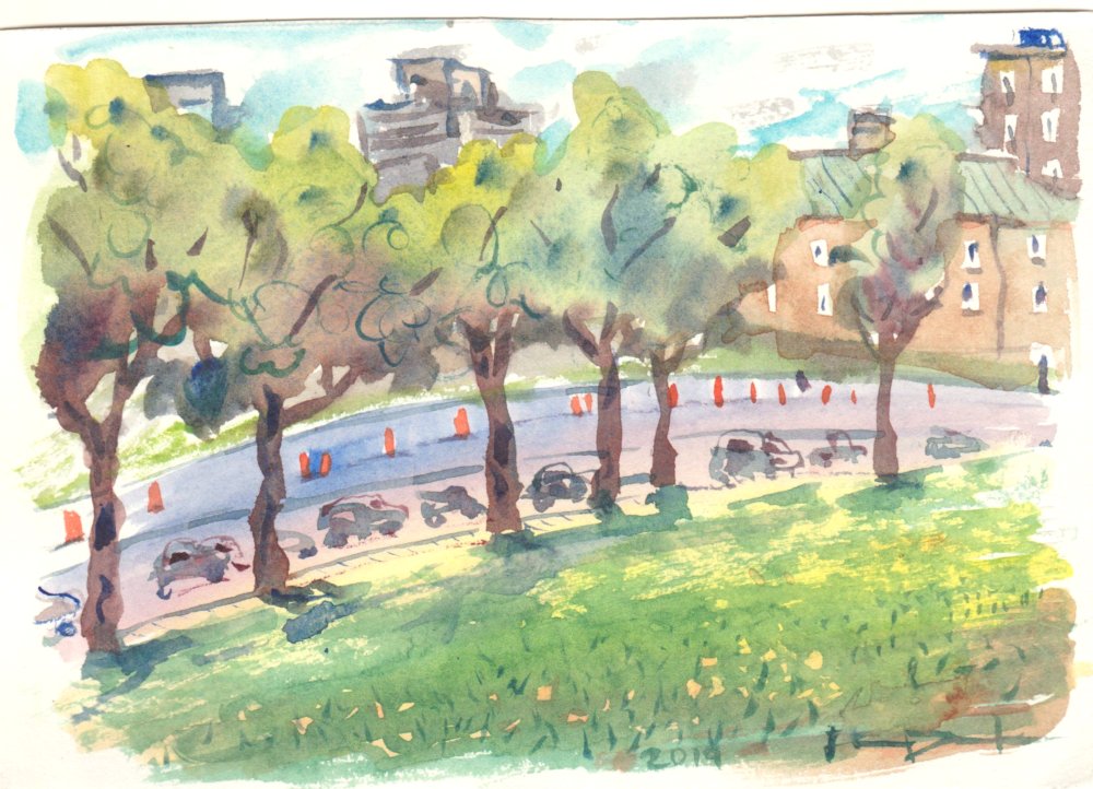
Avenue Parc, Montreal

Some themes are timeless, like construction in Montreal and the ever present orange cones. This scene was done from the vantage point of Mont Royale park approximately near the new gazebo that was reconstructed recently. The field of grass was dotted with dandelions, and the Parc Avenue was dotted with traffic and pylons. In the background you see some downtown Montreal skyline and the hospital in the mid ground with its typical copper roof and peach bricks.
5x7" hot press, watercolour, June 2019

Real or Plastic?

Zenith of the skyline, distant ocean, a picnic table, two misshapen vases containing twisted flowers. Are they real or plastic? This painting started out as a watercolour, and then I overlapped generous amounts of oil pastel and some acrylic paint for highlights and effects. With the heavy outlining it took on a graphic novel look, like Monet drew a comic. The final effect is pretty stunning even though it breaks the 'old English' rule of not using white and not mixing medias. But then again rules were made to be broken. (The person who first said that may have received a fine). Maybe this is the theme of our age, is it real or plastic?

10 x 14 "  mixed media 2005 (No. 1346)

Saturday, May 4, 2019

Jarry Park, Red Winged Black Bird

Not long ago we attended a birthday party in Jarry Park. It was a beautiful sunny day albeit a little cold to fully enjoy the weather. The birds had clearly returned and they were waiting for the park service people to fill up the artificial pond again. I caught a red-winged black bird on the dried willow branches about to take off. Actually I finished the entire painting and then put the bird on last from memory. It was just luck that I got the colours right, red on top yellow on bottom.

5 x 7"  hot press. April 2019

Tri colour study

Blue, yellow, and red are the primary colours that make up all other colours. Green is a mix of blue and yellow! At least that is the theory. When buying paints you are confronted with over one hundred options, all with funny names. I realized over time that there are discrete hues with numeric codes used across all types of industries from art, to wall paint, to car paint etc. The paints you buy can contain one discrete hue, but some can contain two or more hues mixed up. In theory you can just buy the discrete hues, mix them yourself, and get the exact version of the mix they sell. For example, Hooker's green is a blend of PY110 and PG36, which are Isoindolinone Yellow and Phthalocyanine Green!

Watercolour paints can be mixed on the palette and then applied to the paper, or the colours can be put down in layers. A thin washed is applied and then let dry, then another layer applied over top. I used that extensively in this painting, so as to create more colours than I actually put on the paper... the orange is a layering of the red and yellow.

5x 7" hot press Watercolour. April 2019