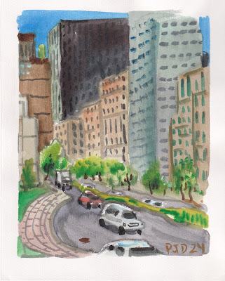
Thursday, May 30, 2024

Cloud Over Trenholme Park


Every year I do a painting that becomes one of my personal favorites and its for different reasons. With the sun going down I was impressed by the intensity of this cloud and how the light was creating auras around the trees with their new leaves. The first brush strokes were heavy yellow ochre on the top left of the cloud, so thick it looked like mustard on the paper, to this I added a putrid purple mix like grape juice to the bottom right of the cloud. Then with one magical brush full of water across the middle it blended into a lively, soft cloud like texture infused with light. Not wanting to upset the wash I circled it with sky colours leaving a white outline as you see with clouds backlit by sun. Going with the interpretive theme, the trees, parks and condos were painted in a similar, almost child-like fashion. What makes me keen on this painting is that I could look at it years from now and the entirety of the moment will come flooding back. And I hope any other viewers can also get that sense of wonder of looking up at a cloud with a touch of awe and appreciation of the outdoors.

Cloud Over Trenholme Park, watercolour 5 x 7" 80lb, May 2024 (No. 3771b)


yellow ochre = PY43 from DaVinci

putrid purple mix = quinacridone magenta PV55 by Schmincke + PB60 by Daniel Smith

Light and Shadow at the Park


Looking at the bleachers in shadow against the field in light presented quite a challenge. The dark shadow on the field completely enveloped the bleachers making the lower two thirds of the painting a dark grey value. Painting from bottom to top it all looked rather gloomy until I put the brilliant yellow wash on the lit part of the field. Adding the interesting trees capped off the painting. Often times there is a moment, a brush stroke, a wash, a detail that suddenly makes the painting come alive. You can only see the finished product here, but I see the painting emerge in front of my eyes. Too bad I can't make videos of the process, maybe its something to work on but I abhor technology when painting on location.

Bleachers shadow field light, watercolour 5 x 7" 80lb, May 2024 (No. 3774a)


They set up a play area with horseshoe pits, lawn bowling, and croquet pitches in Trenholme park. Colourful flags adorn the rusty fence. The sun was almost down making for a difficult scene. I would rather paint this on the horizontal and enhance the chroma on the foreground flags. With another sunny day slated for tomorrow I can probably swing by the park again.

Fence with flags, watercolour 5 x 8" 80lb, May 2024 (No. 3775a)

Wednesday, May 29, 2024

Campus Field


The Loyola campus has precious little green space left, this field was cut in half recently with the monolithic science pavilion that looms just to my left, unseen in the painting. The rest of the field that you see in the painting will be gobbled up with temporary teaching facilities, some kind of prefab portable structure like in a high school, at least that is the rumor. To paint the field I started with the general shape, a rhombus or trapezoid or something like that, and then filled in the yellow and green washes. The background trees are done in a variety of yellow, dark yellow, dark green, and green with plenty of contrast. In the foreground is a garbage and recycling dual bin which anchors the composition. I would be remiss to not call out some pigment codes, so the greens you see were all made with four pigments in various combinations (PY97, PG36, PBk31 and PY110). Those are yellow, green, dark green, and orange-yellow. For super dark areas I dabbed in a touch of dark blue PB60.

Campus Field, watercolour 5 x 7" 80lb, May 2024 (No. 3773)

New Chair New Table Same Field


As you may know if you follow my blog, there is an open field at the end of Harley street in the Westhaven neighborhood near campus where people leave chairs and tables. There is no park in this community, and the land I believe is owned by Reno Depot just next door to the plot. The other part of the field is occupied by community gardens where locals grow vegetables, it has a sign saying that it is sponsored by Reno Depot. Good to know that a prominent business has the interests of the local community at heart since the city seems to neglect the needs of Westhaven. So these chairs and tables represent more than just discarded furniture, people sit here and relax outside, not to mention the evidence that they smoke and drink too, so its a kind of novelty outdoor pub as well! Artistically its neat to juxtapose kitchen furniture against the foliage and the fence that separates the train tracks from the field. Ironically, a no littering sign adorns the fence.

New Chair and Table in Field, watercolour 5 x 7" 80lb, May 2024 (No. 3772)

World Inspired Landscapes: Namibia

Namibia is on the south west coast of Africa right next to Angola along the great rift and plains. There are still many indigenous tribes living in Namibia, along with a growing urban population. Some of the tribes represent peoples with ancestors who lived there since the beginnings of humanity. One aspect that struck me was that one of the tribes used clay formulations to protect their hair and skin from ultraviolet damage from the sun. A kind of natural sun screen that would absorb light due to the iron oxide content. The women work their hair into thick braids molded with clay and woven with decorative elements at the end of the hair or on the crowns of their head. Along with opulent gold and beaded necklaces it made for some compelling images found on google search image and wikipedia. I also noticed how much fun the people seemed to be having, they seemed like people who liked to smile and laugh a lot. For the painting my first instinct was to do a portrait of the people with their clay-molded hair, but after some trials it didn't go so well and in the end I was just copying some photos off the internet without anyone's permission including the people who posed. In the midst of perusing Namibia landscapes, I saw something interesting called 'fold geology' where the earth rises up and twists into curvy, multi-layered mountains. The analogous imagery of clay-woven hair and fold-mountains was fused into the Namibia painting, so when you look at it, you may see a mountain or a flowing hair-do. Some typical African plains landscape in the background gives a context to the scene.

World Inspired Landscapes: Namibia, watercolour 9 x 12" watercolour paper, May 2024 (No. 3834a)

Tuesday, May 28, 2024

Rain Clouds and Flower Pots

On my way to make a painting I stopped under a tree at Reno Depot to wait out a brief rain storm. I took the opportunity to paint part of the facade, including their flower pot display and the tops of the greenhouse enclosure, along with the rolling dark clouds. To paint bright colours like this, I start with a greyish wash around the area, then dab in the greens, red, oranges and yellows on the blank paper. Using this method ensures a consistent grey background that will make the colours pop. In watercolour, if you paint the grey everywhere, there is no way to apply bright colours or white over top of it without using gauche or some gimmicky thing. Maybe its just me being stubborn or traditional or whatever, but when an artist says they did a watercolour it should be a watercolour. Adding gauche makes it mixed media. The worst case I saw of misrepresentation was a watercolour magazine where the artist had to photoshop one of the elements on the last step because they messed up the first step. It was a scene of two people walking through a bamboo forest, one was holding a bright pink umbrella. On the first step, the artist applied a dark green with phthalocyanine pigments, and right away I thought, its impossible to paint bright pink on top of that. Well, impossible without photoshop! 

Rain Clouds and Flower Pots, watercolour 5 x 7" 80lb, May 2024 (No. 3771a)


Clouds and Flower Pots, watercolour 5 x 7" cold press, May 2024

Sunday, May 26, 2024

Not so secret garden, Old Montreal

Typing Montreal Gardens into a search engine revealed a list of gardens to visit, the botanical garden being at the top of the list. One seemed interesting, it was billed as a secret garden, found behind the Château Ramezay museum in Old Montreal next to Place Jacques Cartier tourist street. It is totally open to the street, just surrounded by tall stone walls covered in vines. At the top of the ramp you see the old apartments in the background, they looked like a movie set or something they were so well kept. I bet they cost a fortune.

Secret Garden Shrubberies, watercolour 5 x 7" 80lb, May 2024 (No. 3766b)

At the bottom of the ramp, there is a maze of shrubberies and conical pine trees, interspersed with flower beds and planter pots. The flowers had already bloomed, irises and tulips. Otherwise it was almost all greenery. Another expensive looking apartment loomed in the background. As always I use four paints to mix greens, including phthalo green yellow shade (PG36), dark green (PBk31), yellow (PY154/PY97) and orange-yellow (PY110). For the really dark areas I dab in black (PBk6) or dark red (PR179/PR176).

Secret Garden Planter Box, watercolour 5 x 7" 80lb, May 2024 (No. 3765b)

Finding shade in a corner I set my bike up and did this scene, on the left you see the tall stone wall completely covered in vines. The remains of tulips and irises were near the base of the wall. The plant in the bottom right was a raspberry bush, and apparently strawberries grow here according to a sign. Fresh potable water was coming out of the wall into a mini pond so I filled my water container. To get that colour of the path, I actually used red paint and neutralized it with greenish hues. For a long time I did not know how to make that shade of grey until I learned that it was a dull neutral red. In the background you see one of the historical buildings, they have old stone masonry walls, checkered aluminum roofs, and windows popping out of the roof in French Canadian fashion. Kids were running around shouting the whole time, it seemed like a lot of fun for them.

Secret Garden Path, watercolour 5 x 7" 80lb, May 2024 (No. 3770)


instagram format:


Saturday, May 25, 2024

More paintings from the neighborhoods

Just past the train bridge there is a grocery store adorned with colourful murals, as depicted in the background of this painting. In the foreground there was a manicured garden area with yellow shrubs, lilacs, and trees with fresh leaves. The lilac colour is magenta (PR122), phthalo blue red shade (PB15) and a slight touch of neutralizing green (PG7). The neutralizing helps cut the chroma. As shown, it has a nice pastel violet like the lilacs have.

Lilacs in ville st Henri, watercolour 5 x 7" 80lb, May 2024 (No. 3768)

In the foreground there is a newly renovated park area with a community garden, seating areas, walking paths and kids play areas. The building in the middle is a gym of sorts. In the background, looming ominously, is the derelict Canadian Maltage factory that I have painted many times, along with the pink house suggested at the top of the painting. The old factory was hovering like a UFO or something, although it gives a great character to the neighborhood.

New and Old (Pink House), watercolour 8 x 10" 80lb, May 2024 (No. 3868)

After painting in ville st Henri I cut up to the bike path and headed back along the canal just north of Verdun. Under the power lines there is a warehouse complex that is heavily graffitied on it side with colourful, splashy block letters. Continuing with the theme of the day I put my own initials in the graffiti. It was a surprisingly hard painting to do, as I got into it, the odd angles and jigsaw puzzle of elements were tough to fit together. Looking at it now it worked out, the keys to the composition were the corrugated roof on top and the tree on the left (under which I was standing to get some shade).

Graffiti next to path, watercolour 5 x 7" 80lb, May 2024 (No. 3769)


Nice day in the neighborhoods (ville st Henri)

Ville st Henri is a small neighborhood wedged between downtown Montreal and Verdun, it runs along the major highway 720. This scene shows the train bridge and underpass, with the shimmering downtown sky scrapers in the distance. The contrast between old brick with the new glass makes for great compositions.
 

Train Bridge ville st Henri, watercolour 5 x 7" 80lb, May 2024 (No. 3766a)


Looking for something to paint in the neighborhood I saw this very narrow apartment building. Although it looks like this from the front, it actually fans out on both sides, like a thin wedge of cheese. It kind of represents the neighborhood in many ways, wedged between bigger things, old brick, and recently renovated, i.e. gentrified.

Narrow Apartment, watercolour 5 x 7" 80lb, May 2024 (No. 3767)

A large warehouse structure had the words machine shop faded but still visible on the brick work. More prominent was a white and violet graffiti that I morphed into my signature, as on the train bridge in the first painting. The building was textured and interesting, but when I saw the sky scraper in the distance the scene came together. An ominous presence of down town Montreal, greedily eyeing all the land and old structures it can gobble up next.

Machine Shop, watercolour 8 x 10" 80lb, May 2024 (No. 3869a)

Friday, May 24, 2024

Construction Yard

For some reason they are building a massive apartment building down on st Jacques street right next to the escarpment area. The road is extremely congested on a good day, so adding all these condos in the midst of it seemed odd, not to mention the Paramalat factory is next door, which has giant vats of toxic gas that necessitate an emergency warning siren that is tested once a year. In case of toxic gas, close your windows and tell pertinent people that you love them. It makes little sense to mix residential and industrial, but there is a housing crisis after all. In the painting I show a cross section of the giant hole with a welder working at the bottom on some fittings.
 

Welder, watercolour 5 x 7" 80lb, May 2024 (No. 3761b)

Standing on the other corner looking across I did this panoramic of the construction yard and the bus station. In the background you see the trees that line the escarpment. The escarpment is where there used to be an edge of a lake. Just think about how much more valuable these apartments would be if there was a lake right next to it !

Construction Yard Bus Stop, watercolour 5 x 7" 80lb, May 2024 (No. 3765a)


Thursday, May 23, 2024

Insistent tree at sunset


For years now I have been tracking the growth of this tree in front of the old Royal Bank branch that closed. It started off as a small sprout in the gap between the foundation and the sidewalk, and now it is about four meters tall with a 20 cm wide trunk. If they ever rent out the building again the tree will have to go, but suffice to say that each summer it spreads large amounts of seeds around town and I see small sprouts in every nook and cranny. Its an interesting motif to paint because of what it represents. This land used to be indigenous territory and it was a dense forest up until around the 17th century when it was cleared by French settlers for farmland. Fast forward to the post world war II building boom and the farms were quickly plowed over for an extensive housing development. With plenty of concrete sidewalks, asphalt roads, condos and manicured lawns it does not leave a lot of room for nature to thrive. So I appreciate the fact that this tree is reclaiming a couple of square meters even if just temporarily. The shadow by the way, shows the billboard from across the street. For the illuminated bricks I mixed red ochre (PBr7/PR101) with orange (PO62), for the shadow brick I added red ochre and dark red (PR179) and a touch of violet magenta (PV55).

Insistent tree at sunset, watercolour 5 x 7" cold press, May 2024 (No. 3758a)

Wednesday, May 22, 2024

Discussion on Hiroshige's 100 Views of Edo 001: Nihonbashi Yukibare


Hiroshige's 100 Views of Edo 001: Nihonbashi Yukibare (from https://www.hiroshige.org.uk/)

If you follow my blog you know that with few exceptions I only post my own artwork, and more recently it is almost all 'hot of the press' so to speak. In this blog, I wanted to discuss Hiroshige's print Nihonbashi Yukibare from his famous series 100 views of Edo. You see an image of his original print from the excellent website hiroshige.org.uk. In real life it would be about 39 x 26.5 cm which is the Japanese Oban format, and they are all composed on the vertical instead of horizontal. This was the series that put Hiroshige into the elite category of artisan in Edo (the old name for Tokyo), it really did represent his peak output. He was the first to compose landscapes on a vertical format since traditionally landscapes are done on a horizontal format. It was quite the sensation, in mid 1800's imagine seeing this big colourful landscape print showing a popular bridge in Edo, mount Fuji in the background, and the ships and stores along the river. He often composed winter scenes, and you can see how expertly he designed the snow features on the trees, hills, boats, bricks and roof tops. These are wood block prints so Hiroshige made a drawing and gave instructions for the wood block carvers and printers who would churn out hundreds or perhaps up to thousands of prints for sale by the publisher. 

The reason this print is so exciting is that it represents a cross roads of influences spanning the globe. Prior to the Dutch colony which was established in Japan around in the 18th century (1700's), Japanese artists were mostly influenced by Chinese buddist art which consisted of a 'floating world'. The Chinese artists had objects like mountains, paths, trees and people, all floating in amongst clouds without much of a clear horizon line or sense of landscape per say. It was the great Hokusai who first entered one of the Dutch trading colonies in Japan and learned from their artists how to paint through the 'Dutch lens' as he called it. Dutch painters were used to painting expansive flat scenes with windmills and boats tightly composed on a horizon line. Fast forward to the print under discussion and we see elements of all those influences. The pinkish clouds just below mount Fuji at the top represent the 'floating world' which translates to Ukiyo-e the name of this style. The mountain line and realistic looking perspective comes from the dutch influence. Thus, Hiroshige was able to fuse together the decorative and 'flattened out' traditional Japanese style with the more accurate and earthy Dutch style to produce these unique prints.


Between storms (over the auto shop)

Between storms, I snuck out to make a quick painting of the sky over the auto shop across the street. It was good just to cool off since we don't have or plan to get air conditioning. Living on the lower floor corner apartment makes it possible, had I bought on second or third floors it would be a whole different story with heat rising. Since everyone else has air conditioning, I can just open my front (interior facing) door and let the cool air rush in from the hallways. To do the painting I first established the sky by using wet washes of various hue and value. The trick is to get the moisture just right so the washes don't completely blend into one monotonous grey, and have a pleasant feathering effect like you see in the painting. Switching colours on your brush inevitably changes the moisture levels which takes some practice to gauge correctly. The rest of the scene is done at low chroma grey, brown, blue and green with light orange highlights. I like the way the orange and blue blended together in the sky up at the top left.
 

Between storms (over the auto shop), watercolour 5 x 7" 80lb, May 2024 (No. 3764)

Monday, May 20, 2024

Parc Extension Colourful Shops

On the way out of Park Jarry I rode through Parc Extension neighborhood known for a mostly south east Asian culture and plenty of colourful shops. Setting up in the shade, I made this painting looking across the street at a row of shops and cars. Towards the end of the paint some fellows stopped and commented in broken English, one of them made a movie with his phone and when I finished the painting I gave a thumbs up. To do a scene like this, first the angles have to be close to correct, which is achieved by holding the brush up and gauging the degrees. Next, the height of the buildings has to make sense, this can also be done by holding the brush up as a measuring stick. I liked the different colours and textures of this mid 20th century architecture interspersed with colourful signs and awnings. The bricks are all variations of yellow ochre (PY43) diluted and neutralized with indo blue (PB60), or red ochre with varying amounts of umber and burnt umber (PBr7). Instead of a blue-bird sky I went with a neutral dark blue with hazy orange mixed in, and blue just hinted at. during the pandemic the sky was a brilliant sapphire blue, but since then its hazy and slightly greyish orange. Its my third or fourth trip to Parc Ex and finally I captured the full feeling of the neighborhood in this painting.

Parc Extension Colourful Shops, watercolour 8 x 10" 80lb, May 2024 (No. 3867b)

Jarry Park tennis stadium and other scenes

Park Jarry is a vast flat expanse of grass interspersed with trees, paths and various park elements including a massive tennis stadium where the pros play. With baking sun and hot, hazy conditions the air was thick and colours bleached. The whole painting was done in shades of greyish green and brown, accented by a few dark elements on top of the stadium. Using contrast like this created an intense hot atmosphere without resorting to high chroma colours like I did on the underpass painting from Sunday.

Tennis Stadium, watercolour 5 x 7" cold press, May 2024 (No. 3762)


It's a tough location to paint, Park Jarry, very flat with a few trees and lots of people. I tried composing the tree and path on a flattened, vertical format and directional brush strokes. Scribbling in a few figures on the path helped with the believably of this dream tree.  

Dream Tree and Path, watercolour 5 x 7" cold press, May 2024 (No. 3763a)


This painting only took about two minutes, not that I time myself or anything, it was just like, diamond, field, trees, grass, blue sky, voila. Mostly it was a test to see if this kind of outrageous composition could work. Essentially its an abstract painting with a few trees and blades of grass. Having said that I can see some potential with the idea.

Baseball Diamond, watercolour 5 x 7" cold press, May 2024 (No. 3763b)

Metro Parc Shrubberies


Intending to go through Parc Extension neighborhood towards Jarry Park, I took a wrong turn and came up Parc avenue to the Parc metro, and rode by several parks on the way before I parked my bike and made this painting of a few interesting shrubberies. You would think after all that I would have made a painting of a park! That would be a little bit later. A lot of people were walking around here and sitting in the shade. I found a good spot under a tree and went about painting the two contrasting shrubs, one in shades of yellow and green (PY154, PG36, PBk31), the other red and maroon (PR254, PR179). Black accents (PBk6) helped punch up the contrasts.

Metro Parc Shrubberies, watercolour 5 x 7" cold press, May 2024 (No. 3756b)

Ride around the south circuit

After painting in an around Montreal intensely for the last four years, and periodically before that, I have visited and revisited most of the popular areas. What I am calling the south circuit goes from Ville st Henri to Ville st Pierre along the canal path, the access points are down steep inclines from atop the NDG plateau. In fact, the south circuit was once a lake that was drained to make the canal and the highway, along with the aforementioned neighborhoods. In the painting, you see the tree line in the background with the two apartment towers, they are up an Sherbrooke. This community garden is at the end of Harley street where I have done many painting of the field, the chairs in the field and the sun flowers. In this scene a fellow was watering the plants.

Community Garden Westhaven, watercolour 5 x 7" cold press, May 2024 (No. 3759a)

Whenever I paint ducks they wont sit still for ten seconds. These ones sat still for about twenty seconds. A few other cyclists stopped by, but instead of being scared away the ducks seemed to activate themselves and waddled towards the cyclists, and then to me, expecting handouts. To paint the water I applied a wet-in-wet two colour layer, then after it dried painted over with short transparent brush strokes in blue, brown, and blue-grey.

Mallards next to Lachine Canal, watercolour 5 x 7" cold press, May 2024 (No. 3760)


Here is a scene that only Peter Darlington would want to paint. I am standing under the noisy highway underpass just south of Ville st Pierre, looking up towards the westbound on ramp. I've rode past this a hundred times and always wanted to paint it, and yesterday was the moment. There is no formula for a painting like this, you just paint it. The main thing was to get that brilliant chartreuse coming through between the concrete structures, and the fade to brown polluted dirt towards the bottom near the road.

Highway Underpass Ville st Pierre, watercolour 5 x 7" cold press, May 2024 (No. 3761a)

Saturday, May 18, 2024

Encampment at McGill University

On the way back I stopped off at the encampment at McGill University. Other than a person here and there it was largely deserted and very quiet. Curious onlookers milled about, had conversations and took a few selfies. A row of tents had been pitched close to the central walkway, behind which there was a long fence with blue tarpaulin identical to what they use in construction. The tarpaulin was adorned with posters, banners and all manner of signage including one with Concordia University written on to it. In the painting all the flags depict the Palestinian flag, although there were other flags there which I did not understand, some pink, some white. I noticed several Irish flags too, and a sign equating Irish struggles with the Palestinian's situation. 

Painting what is essentially a forest scene, a scene of a campground, is a very technical exercise. The key to it was painting decisively and no fussing about. The tree foliage at the top for instance was done in less than 20 seconds, add yellow, add light green, add dark green, add dark red, finish with branches. The rest of it, similarly, was done fast and with no more than two layers of paint. The red tent for example was one layer of light red, a second layer of dark red. Once the greens were filled in, the white highlights really popped and the painting took on some significance.

Encampment at McGill University, watercolour, 8 x 10 cold press, May 2024 (No. 3872)


Touring Downtown

Many of these parking lots have been converted into more lucrative condo housing. This one is right next to the downtown highway, its ideal for tourists to park and go off to see the sights, or for hockey games people have to park here now and take the metro to the arena since the Habs turned their parking lots into condos a long time ago. This small shack was in the center of a vast asphalt desert, the attendant was standing in the shade, as was I under a large tree.

Parking Lot China Town, watercolour 5 x 7" 80lb, May 2024 (No. 3756a)

Looking up to the downtown core, this is a classic view of Montreal. Its amazing how if you're off by one millimeter the buildings look like they will fall over in the painting. At least you get the enormity of the structures and the steady weekend flow of traffic. It was quite hot and sunny today, I stood in the shadow of the elevated highway at my back.

View up Robert Bourassa, watercolour 8 x 10" 80lb, May 2024 (No. 3867a)

Most of st Henri is gentrifying at a rapid pace but you still find some of the old structures standing and even in use. This one looks like 1945 post war construction when window frames were big, solid and made of wood, and the entire single story building was made from aged brick with several layers of paint peeling off. Even the graffiti was old, it had newer graffiti on top of it. It seems as if this is an auto shop, around the side of it looked more modern, although the side facing Notre Dame was still original construction covered in murals and graffiti.

Old Building st Henri, watercolour 5 x 7" 80lb, May 2024 (No. 3657a)

Palette Puzzle

Part palette update, part palette cleanser, this abstract painting is a real palette puzzle. An artist's choice of paint is very personal, it reflects their style and approach to the craft. Sometimes it just reflects which paints you happen to buy. In the old days I would use whatever paints I could get on sale, for example I had the privilege of visiting the original Sennelier paint shop on left bank Paris in '08 and they had a bin full of discount paints. To this day I still have one, its the rusty brown colour up in the top right (Red Brown PBr7). Since 2018 onwards I started a more systematic approach to choosing paints and settled on a so called 'colourists palette' covering a wide range of high chroma (intense) colours, dark variations, and a selection of earth paints. You can see each one in the puzzle pieces, although its not a puzzle you could actually solve. 

Palette Puzzle, watercolour 9 x 12" watercolour paper, May 2024 (No. 3838)

Friday, May 17, 2024

Western Blot Apparatus

Here is a rare painting of a western blot apparatus, used in the research laboratory to measure proteins. The device on the right in red and green is the chamber, it pulls proteins through a gelatinous rectangle floating in a buffered saline solution. On the left is the power pack that supplies electricity. A bottle of ponceau sits in the middle, it is a pink dye used to stain the proteins after the test completes to check for quality. Other accoutrements like graduate cyclinder, basin, blue sharpie, gel comb, pipette with loading tip, and a Styrofoam box adorn the picture. Like all labs, a jumble of shelves, doors and eerie fluorescent lamps complete the scene. Unlike the TV shows, real labs tend to be well it but rather bland, so I had to arrange these objects and select some colourful items to create a good still life arrangement. Van Gogh did a painting called Still Life with Coffee Pot, which inspired some of the composition and idea for this one.

Western Blot Apparatus, watercolour 8 x 10" 80lb, May 2024 (No. 3882)


Thursday, May 16, 2024

Patching up the Field

Yesterday I saw orange flags in a wide open field on campus and I speculated that it meant impending construction. Today there was a truck next to the field, but the workers were pouring out wheelbarrows full of top soil onto the positions with the flags. After that they raked the earth piles flat. So they were actually patching up the field, which is heavily used by next door students for sports from the private school (seen in the background). Pitch forks lowered as they say on the internet, that means we don't have to be angry about it anymore. The other neat thing was that the mounds of earth were a very dark reddish brown which contrasted nicely against the green grass. One of the workers was peeking at the painting with each load and told me that it was pefecto in Spanish. The grass effect was something I worked out last night with some test paintings, in the end I settled for a medium value green background with darker green painted over in short directional brush strokes. The green was painted around the flowers, then the blank spot daubed in yellow followed by orange. The inclusion of the worker was a continuation of the Van Gogh theme of showing laborers, for example in the famous Sower with Setting Sun. The link takes you to the Van Gogh museum web page. We were there in real life back in 2018, and it the artwork was quite impressive. 
 

Patching up the Field, watercolour 8 x 10" 80lb, May 2024 (No. 3870)

Mushrooms on Sherbrooke


On the way over to the laboratory I stopped to make a painting of a giant group of mushrooms growing next to the sidewalk on Sherbrooke street. To begin I outlined the mushrooms and the perspective lines with dark brown paint that I mixed with burnt umber and lamp black (PBr7 + PBk6). Next I filled in the initial washes on the mushrooms with shades of brown and lots of white showing. After blocking out the grass and doing the sidewalk and street I added more textural elements to the mushrooms. Meanwhile the sun was fully shining on my right neck and shoulder without any sun screen which was noticable as I painted. One dandelion was growing tall out of the mushroom bunch.

Mushrooms on Sherbrooke, watercolour 5 x 7" 80lb, May 2024 (No. 3754)

Wednesday, May 15, 2024

Orange flags and dandelions

Unfortunately these innocent looking orange flags likely mean the end of the large grassy field on campus. These flags mark the utility lines and precede the sighting crew. Next they will install the electrical post and the earth works begin. Years ago the University circulated a plan to build buildings all over campus including this field. It seemed odd in the midst of a budget crisis that the University would choose to build an expensive building, then it occurred to me that the building is meant to alleviate the budget crisis. Once an asset is created, money can be borrowed against it thus helping the bottom line. I hope I am wrong but time will soon tell. In the meantime, I will try to make one last great painting of the field, starting with this study. The idea was to mix the flags and the dandelions in amongst a sea of flowing green grass. The technique is meant to emulate Van Gogh's masterpiece called Grass with Butterflies part of his series done early in Paris when he arrived. That painting is going up for auction and could fetch 40 million. When I first saw it, it seemed like one of his later works it was so well realized, but in fact he was just in the process of learning French impressionism. Its very hard to emulate impressionistic brush strokes with watercolour paint since you can not overlap light on dark, but I did learn a few things when trying this. Weather permitting I'll take another crack at it tomorrow on a larger format.
 

If they do start construction I'll do another series sarcastically called "Green Concordia" 

Orange flags and dandelions, watercolour 5 x 7" 80lb, May 2024 (No. 3755)

Tuesday, May 14, 2024

Earth Water Paint Life

From time to time I do these abstract paintings while cleaning off the palette. To form the palette, I bought a plastic fold-able tray with 18 slots from Avenue des Arts, and then squeeze paint out of tubes and let it dry solid. This can last for several dozen paintings before I need to replace the paint. In the meantime the cleaning just involves running a wet brush with clean water over the dry paint until the gunk is removed. The gunk comes from mixing colours. Its most noticeable on the yellow paint, which turns greenish when you use it to mix green for example. If I am in a rush I just quickly run tap water over the palette in the sink but it tends to waste some of the paint that way. I like to keep the palette clean in this manner so the colours remain fresh when starting a new painting. 
 

Earth Water Paint Life, watercolour 9 x 12" watercolour paper, May 2024 (No. 3834)

Sunday, May 12, 2024

Across the Neighborhoods


Final destination st Hubert street, took me across at least six neighborhoods including NDG, Hampstead, Outremont, Mile End, Little Italy and La Petite-Patrie where I stopped to make this painting. The location is Place Hector-Prud'homme a tiny postage stamp of a park mostly paved with concrete, its surrounded by what appear to be crab apple trees that were in full pink blossom. Sitting to eat a snack and rest after a long bike ride, the fellow on the bench down the way started smoking some pungent pot that wafted over. Along with the Arabic music he was playing on the radio it was quite the experience painting these flowers high up in the sky. First I outlined the flowers in purple magenta (PR122) then filled in the bus and building outlines, and finished with the green foliage, dark brown branches and details on the bus which I had to memorize since buses tend to move a lot.

Crab-apple Flowers High, watercolour 5 x 7" cold press, May 2024


To get to the Aquarium du Nord I cut down this rather smelly alley it was recycling day apparently the cat didn't mind. Some of the alleys in Montreal are astounding, I've seen photography books that feature such scenes. The back alleys are mainly for access, services, and emergencies, but they also take on a life of their own. Various cladding, facades, murals, brick, rust, wood, wired and steel staircases adorned this scene adjacent to st Hubert street. A cat walked by, but it looks more like a dog in the painting!

Alley Cat Smelly Alley, watercolour 5 x 7" cold press, May 2024 (No. 3753a)


It's been a good few days for the flowering trees, last year it was very brief then we got rain and wind. This year the flowers came out and this weekend especially it was perfect. With rain on tap for the next three days I may have caught the window. This pink tree was just above the Beaubien metro station which I have painted before on several occasions during the 68 station of the Montreal metro series. The only spot to set up was on a distant corner, the rest of the sidewalk was too narrow and crowded to place my bike. I made the pink tree more detailed than the rest of the painting so it stands out more. The traffic was painted as if it were moving, which it was of course. It captures that fleeting moment in the city when you see something colourful and interesting.

Pink tree over Beaubien Station, watercolour 5 x 7" cold press, May 2024 (No. 3753b)

Saturday, May 11, 2024

Brewery st Ambrose summer patio


Maybe it would have been nice to stop and have a pint of cream ale on tap here, but I was working after all. That didn't stop the cyclists going by, even the ones wearing spandex they were going in for a pint. I could hear people roaring drunk with laughter and everyone seemed to be having a good time. In the background you see the old factory with the famous pink house on top. The pink house is a part of the factory, some creative vigilante artists scaled up the building and painted it pink with green roofs. There are even faux flower planters under the windows. I've painted the pink house many times from various angles, I suppose one day the whole thing will be taken down and replaced with a condo. I liked this scene because it says a lot about the Lachine Canal's past and present. It used to be a heavy industrial area before the modern ports were built, and over the past twenty odd years its gentrified and become a recreation park. There is another pub down by Verdun, it looks quite popular too and offers some views of the bike path and canal. 

To paint this, I started by outlining the scene with a pale grey (no pencil just watercolour). I composed the scene by compressing the background elements, in real life they were much further apart. I also decided to cut off the foreground to give maximum focus on the sky and pink house soaring above the red umbrellas of the summer patio. The sky was done wet in wet, a dilute yellow followed by blue and blue-green around the clouds, finished with a purplish grey for the cloud shadows. The pink of the pink house is a paint from Schmincke I got from Avenue des arts in Westmount, it called purple magenta which has pigment code PR122. Other companies have this paint but the names vary. I always look to the pigment code to know what I am getting since the names of paints are kind of random.

Brewery st Ambrose summer patio, watercolour 8 x 10" 80lb cold press, May 2024 (No. 3865a)

Bike Ride Lachine Canal path from end to end

With a chance of rain I rode down to Lachine park where they have an area called arboretum which means tree area. I've been waiting for these trees to turn red, today they were a mix of pale pink, greenish and some dark red. The dandelions were very prominent, bright yellow against a rich yellow-green. This park is just next to the beginnings of the Lachine canal, although that would be behind me from this vantage point.

To paint the dandelions the grass is done first, leaving little holes were the flowers go, then the yellow is applied over top. I used yellow paint that has code PY154, and a touch of orange which has paint code PO62. The paint codes are on the tubes, and there are some tables of information also available on the internet, but the best place to go is Blundell's website and check out her labeled colour swatches. 
 

Pinkish Trees next to st Laurence River, watercolour, 5 x 7" cold press, May 2024 (No. 3751b)


This white blossoming tree was almost glittering in the bright sun. It reminded me a lot of a Monet painting, where he had a woman in a pink tress reading a book underneath a tree like this. The tree was done with a wet in wet wash to begin. After that dried I applied several textural layers from light to dark. Finally I daubed in some brighter yellows and yellow-oranges. The hardest part was the grassy area with dandelions, my wrist ached a little after doing all the brushwork! It took a little while this one, but it was worth it. Of course I had to throw in the fire hydrant and row of cars on st Patrick street.

White blossoming tree next to bike path, watercolour 8 x 10" 80lb cold press, May 2024


At the end of a great ride down the canal path, slaloming through all the pedestrians and slow cyclists, I made it to the peel Basin which is the other end of the Lachine canal. The old rusty train bridge is on the bottom, it is still in use, while the new elevated commuter bridge is just above it, you can see one of the weekend rail car pairs going across. A pile of condos adorns this part of Montreal, they keep jamming them into this neighborhood. I was glad that there were only a few dandelions to paint here!

Bridges over Canal Peel Basin, watercolour 5 x 7" cold press, May 2024 (No. 3757b)

Friday, May 10, 2024

Red bench, green grass


The fire station keeps good care of the front driveway and lawn areas, each spring they paint the bench with a fresh coat of red paint and take care of the community herb garden in the form of a tall mound of earth. With the grass finally turning a bright green there was a contrast of red and green that tempted me to make this painting on the way to the grocery store. Even though the bench was a very bright red, the sun light and the reflected light from the ground made the red a bit paler around the edges. I used pyrol red (PR254) which is also called Ferrari red, its probably the exact same pigment they used to paint the bench. We finally have decent weather on tap for the weekend so hopefully I can get out for a good ride and some painting.

Red bench, green grass, watercolour 5 x 7" cold press, May 2024

Thursday, May 9, 2024

Snowdon Bakery Delivery Door

We are lucky to have a few great bakeries in town including Meunerie Urbaine up on Monkland avenue, and Snowdon Bakery down on Harley street. In the painting I depict the delivery door of the Snowdon bakery where trucks roll up to the driveway and bring in carts full of flour and baking supplies in. There is an even bigger door for bringing palettes in and out around the side. There is a large antique vent on the wall, it used to have a rusted patina until they painted it with red ochre (iron oxide) rust protecting coat. On the right you can see Rafi auto mechanic in the background with its distinctive painted white brick walls and red trim. 

I liked the subtle variations in yellows, you see the yellow dandelions on the bottom right near my signature, the yellow post which protects the brick wall from trucks backing up, and the pale yellow ochre bricks. Mixing these three shades of yellow is tricky, the bricks are yellow ochre (PY43) with some greyish purple mixed in (PB60 + PR179 + PV55), the post is similar but with bright yellow added (PY154), and the dandelions are bright yellow with a dab of orange (PY154 + PO62). Sometimes I think these 'lunch hour' paintings or 'on my way to somewhere else' paintings are the best ones!

Snowdon Bakery Delivery Door, watercolour 5 x 7" cold press, May 2024 (No. 3750b)

Tuesday, May 7, 2024

More spring colours in Montreal


In springtime the tulips pop up, the trees flower, and new leaves emerge bright green and yellow. But the most notable colour in spring is orange, I call it Montreal orange! Terrebonne street is being all torn up to remove the lead pipes connecting to houses, which entails a square hole to be cut followed by insertion of some complex metal box device. Considering that they just paved the road a few years back its interesting how now they decide to cut holes in it again. The good thing about construction is that the roads are blocked off partially so I could stand on one side and easily paint the view opposite. Cars were slowing down and stopping because they thought I was some kind of police officer writing tickets, that happens from time to time when I am painting in the neighborhood. To mix Montreal orange I combine pyrol orange (PO73) with benzi orange (PO62) so that it will look accurate after scanning and showing on a screen.

Montreal Orange on Terrebonne, watercolour 5 x 7" cold press, May 2024 (No. 3750a)