Monday, October 29, 2018

Amstel Station Bicycle Racks, Amsterdam

Here is a painting that I almost did not do because it seemed impossible. There are so many bikes in Amsterdam that they built two-level bike racks where a metal roller is pulled out and the bike loaded up on the second level. As a result there was a veritable pile of bikes, hundreds, outside of the Amstel station (east part of Amsterdam). I completed the upper part of the painting including the sky, building and tree in the middle, and then faced with a blank piece area of paper at the bottom I painted the bikes. Not knowing how to accurately paint hundreds of bikes in a 3 x2 inch space, I decided on an abstract approach. The wheels, handles, seats and myriad of colours were completed in a mere 5 minutes. To my surprise it worked out very well, the feel I get looking at the painting is the same as the feel I got looking at the scene, even more than a month later I remember. Lastly I filled in the trees behind the station, did the windows quickly, and lifted some colour off the tree because I wanted the tree to look like the wind was blowing and the leaves were moving, reflecting the sky.

5.5 x 7.5" hot press watercolour. Sept. 2018

Sunday, September 16, 2018

Centraal Station Amsterdam, Netherlands

Amsterdam is a very touristy place, the main area where they tend to congregate is near the central station (central is spelled with two a's in Dutch). In this small painting you see the central station in the background, it is actually a really long building that goes on for about a large city block! In front you see a restaurant/cafe that was built upon a pier where the tour boats come and go for canal tours. I am sitting on the opposite side of the canal, looking back toward the central station. On the patio near the edge of the canal people are no doubt enjoying their expensive espresso's and latte's talking about Van Gogh or Anne Frank.

We arrived in Amsterdam late afternoon and made our way up to central station with about an hour and half of light left in the sky. It was hard to find anywhere to sit because the Dutch are not big on installing benches anywhere in the city. So I sat on a large stone staircase that had many tourists sitting down enjoying the atmosphere. And by atmosphere, I mean weed. Like, I smelled a lot of weed wafting around, but I tried not to inhale ; ) I completed about 15 paintings while in Amsterdam and will be posting some of the highlights on the blog. One common feature is the ever present canal. The water was difficult to paint, it is a muddy green colour, and it reflects the blue sky and the architecture.

5.5 x 7.5 " hot press watercolour, Sept. 2018

Thursday, August 30, 2018

Sunflowers, NDG, Montreal

Here is a small painting I did of a large sunflower growing in one of the community garden boxes on Somerled Avenue near Prince of Wales. I exaggerated the proportions to make it look like more of a close up, in fact, I was sitting all the way across the street since there was no way to sit closer. In the background is the Metro grocery store, but I put windows on it so that it looked more like a building. That is called artistic license! This is on 140lb hot press for a change ( I usually use cold press). The conditions were extremely humid so the paint wasn't drying fast, which created the blurred effect. I kind of like that, it draws even more attention to the main sunflower at the top. I wanted to paint these flowers to practice!

5.5 x 7.5" hot press, Watercolour. Aug 2018

Saturday, August 18, 2018

Ile de La Réunion

Here are a few paintings from my trip to Ile de La Réunion a small island in the middle of the Indian Ocean. The first two are on the top of the old volvanic ridge that forms part of St. Denis, a city on the north of the island. It is quite built up there, in fact the painting of the tree was done next to a large grocery store, that fence in the background is the parking lot. The one with the road is just in the suburbs, you wouldn't believe how good the view is from some of these houses. I emphasized the light and colour by using plenty of bright yellow.The last painting here is the pink flower growing on the side of the road that leads up the side of the old volcano. In the background you see the Indian ocean. It wasn't very safe there due to all the cars and the possibility of falling rocks. That's why they call it intense island I guess! 2011 Watercolour.

Wednesday, July 4, 2018

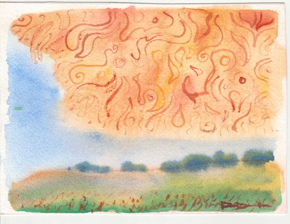
Heat Wave

Recent events inspired this painting, namely, a heat wave in Montreal! It is literally melting temperature here, you could fry an egg on the sidewalk and some bacon too. This painting was originally something else, and I scraped off the paint and turned it upside down, and then created the image. The last thing I did was the patterns in the orange blob in the sky which is meant to be a stylized fire cloud.

5 x 7 " hot watercolour, July 2018

Saturday, June 23, 2018

Walkley Street, NDG, Montreal

Is this the first watercolour painting of Walkley street ever? Nobody knows, but it is the first one I have done! It was something I wanted to do for awhile but just couldn't find the right scene since Walkley street is basically a long row of condo style housing with a lot of trees. This scene caught my eye because of the flower bush and the large tree casting shadows over the building and the lawn.

Painting details like these flowers is very difficult in watercolour because you cannot put lighter paint on top of darker paint. This time I tried something different, I made the shape of the bush in red/pink first, keeping the top right of the bush lighter to suggest a highlight. Then I put the green on top to create the outline of the flowers. The results were good I think, the bush looks together and realistic. The rest of the painting was just there to fill in, I wanted the tree to have bright yellow. There is no sky shown in this painting but you still get the feel of a bright blue day.

5 x 7 " cold press watercolour, June 2018

Friday, June 22, 2018

Bakery in NDG, Montreal

A few doors down from where we live in NDG there is a little, old fashioned bakery and deli that sells pastries pasta lunch meat, sauces and that sort of thing. I tried shopping there once but it seemed to be more of a social club where the customer talks endlessly to the shopkeeper and tries a samples of everything before actually buying anything. The good news is that they give you free samples while you wait! The unique colour of the brick work and the contrasting bright colours of the sign and awning caught my attention for this painting. Across the street is the Royal Bank, but I put the current year on the sign instead!

Painting these kind of ivory colours in watercolour is very challenging like you see in the bricks. I accomplished the effect with a layer of warm yellow-orange to give it the brightness, then overlayed some neutral greenish-grey, very thin. When dry I looked at the actual bricks and adjusted the tone a bit using a third layer of very thin warm yellow in places to give is a shimmer. The brick detail is done in warm grey with a smaller brush. The effect is better observed in the original painting, but the scan version here does it justice.

5 x 7" cold press watercolour, June 2018