Saturday, October 31, 2020

Blue Moon, Happy Halloween!


Once in a blue moon I will make a painting of a blue moon. It is totally true. Boo! 

Blue Moon, With Composter, 5 x 8.5" cold press, watercolour, October 31st, 2020


There was so much light from the blue moon I could do this painting of the composter sitting just under the kitchen window sill. I had turn off the inside lights to not spoil the eerie glow. Trick or treat!

Blue Moon, with composter, under window sill. 4 1/4 x 6.5"cold press, watercolour, October 31st, 2020

Saturday Painting Trip, Nun's Island


Technically part of Verdun, Nun's Island is a collection of roads, condos and bike paths built upon what used to be a farm long ago. I wasn't sure what to expect today, the weather was about 5 Celsius with a bitter wind, and the sky was true blue with a bright sun. I used two different phthalo blue paints- the yellow shade (PB15:3) for the horizon and the red shade (PB15:0) for the top. The St. Lawrence River was done with indo blue (PB50) and tints of phthalo green yellow shade (PG36) and magenta (PV55). These colour combinations have been useful this year, and I am learning how to control the phthalo paints a bit better, they are strong and quickly stain the paper. Applying the sumac buds was a lot of fun, it was perylene maroon (PR175) with tints of benzi orange (PO36) and ferrari red (PR254). Part of the reason I am writing all this down is so I can remember. Oh yeah, I tried a new combo for the trees on the horizon, it was raw sienna (PBr7) with phthalo blue red shade, and tints of isoindo yellow (PY110). It gave the perfect neutral green that reflects the last part of autumn. 

Trees and Sumac, Nun's Island, 4 x 6" cold press, watercolour, October 31st 2020


Having rode my bike all the way down to Nun's Island I opened my folder and found only one piece of paper! Oops. Luckily I had put another folder with two larger pieces in my bike pack, so I used half of one sheet to do this painting. There were these incredible fronds of grass with near white wispy tops, like wheat, you can just make them out where the water meets the grass at the bottom of the painting.I planned to have them ore prominent, but the green paint was bleeding and spoiled some of the effect. In fact, nothing was drying fast partly because I was sitting in the shade. You can see the tree trunks bled into the background water. Despite the technical difficulties this painting really does capture the moment, and the colours on Nun's Island. 

Trees and Wispy Grass, Nun's Island, 6 x 8.5" cold press, watercolour, October 31st 2020


Finally I found a location where I could look down the shore line with the sun behind me. It was a small peninsula park called Maynard-Ferguson. There were quite a few people there enjoying the sun, so I kept my mask on as I painted, not to mention gloves because the wind was a little too much for bare hands. This painting was a battle, my brush kept dropping due to gloves and wind, and the paper was blowing up and down a bit. I love the colour of the distant horizon, the water, and how the directional brush strokes move the composition along neatly. There were several more locations on Nun's Island I would like to visit in the future. 

Shore Line, Nun's Island, 8 x 10" cold press, watercolour, October 31st 2020


Palette Cleanser #38


 Before 2020 my palette selection had remained relatively unchanged for decades, there had been a few alternatives, and I dropped aureolin yellow a long time ago. When I did this palette cleanser painting it occurred to me that every paint I am using in 2020 is new to me. It goes to show that you can change your habit, even drastically and get even better results. To a viewer it would not be easy to notice which particular paint I am using, but if you have followed the blog you may notice a brighter, more livelier group of paintings this year. Not only did I overhaul my entire palette, but I rethought how to mix colours, guided by Handprint.com (MacEvoy) and the artists colour wheel that plotted every watercolour paint on a hue circle. My experience now, is an easier time mixing, and less guesswork about how to create certain colours. The best example was asphalt, which is a low saturation, low value blue-violet. To lower saturation add water, to lower value add carbon black, then adjust the hue if needed. When I mix colours now on location I guess the colour property (hue, value, chroma), then use a strategy to create it. It was a good move to overhaul the palette, and the new paints are incredibly lightfast, meaning they will last for generations.

 Palette Cleanser #38, 9 x 12" watercolour paper, watercolour, October 2020

Thursday, October 29, 2020

Fall Fences and Beyond


Being cooped up so much is not much fun for anyone. This painting is a metaphor for the lock down, it was done in my backyard area looking towards Somerled Street. If you follow my blog (or live here) you may recognize the auto mechanic building across the street. Most of the fall leaves are gone now, this tree hardly had any left. I used carbon black throughout the painting to create all the earthy neutrals. I started by painting the fence and then filled in the rest. 

Backyard Fence, Somerled, NDG, 5 x 7" cold press, watercolour, October 2020


Fences have occasionally been a theme over the years. With the new catalogue it was easy to pull up a few examples of paintings with fences featured in the composition. In this case it was winter and extremely cold to the point of the paint partially freezing. The orderly fence was a great contrast against the wild tree. It is very similar to the one I just did of our backyard. 

 France, Segny, Blue Gate and Tree, 7.5 x 11" cold press, 2009 (No. 1247)


Ok, this one wasn't actually a fence but it had a similar strucure. There was another bench just like it that I was sitting on. Between the slats there is a very narrow gap to fill in the colours. I was using very dark mixes during this phase of painting, mostly due to cerulean blue. It is a nice sky blue on its own but can be muddy in mixes. I was convinced that it would make everything look light and bright but it made things look heavy. 

London UWO Bench and curved sidewalk, 5 x 8" cold press, 2000 (No. 0637)


 Now this is a fence.  Said crocodile Dundee. A palisade actually. There are no gaps between these tall pointed pieces of rounded lumber. It was a very hot day, and dry too the grass was like saw dust. The dry wood tones are spot on, considering my lack of training is was neat that I could make such a variety of brown and grey. It is actually tough to do because the paints in watercolour tend to be super bright, so you have to mix them in the right proportions to get that neutral grey/brown. In the recent painting (top of blog) I just used umber tinted with carbon black and some indo blue. In this painting I probably mixed aureolin, rose madder, french ultramarine.

Kingston, fort palisade, 5 x 7" cold press, watercolour, 1998 (No. 0326)


Tuesday, October 27, 2020

Fall Colours, Now and Then


 As October winds down it has been a remarkable fall season so far- the colours of the leaves changed slowly and the sky stayed blue most of the time. Every now and then I get to paint in the fall season, some years it rains or even snows suddenly and the leaves go brown, other years it is bitterly cold, or recently, the leaves barely changed colour it was so warm. We just had a near-zero evening or two, and the leaves have gone golden yellows and rusty oranges. To make the oranges I mixed isoindo yellow (PY110), benzi yellow (PY154) and benzi orange (PO36) along with umber (PBr7)and perylene green (PBk31). Here and there I dabbed in phthalo green yellow shade (PG36). 

Terrebonne Street Fall Trees 4 x 6" cold press, watercolour, October 2020


I have posted quite a few fall scenes on my blog this year like at Trenholme Park, and in the past for example the blue car on the 8th line, and a river in London reflecting fall colours. The one above was from the 90's I guessed 1999 based on the style and proximity to other paintings in the pile. Cataloguing my art from 1997 until about 2015 was difficult due to poor record keeping, although there were dates on paintings, and other trips I could remember. This is out towards Highway 50 and Columbia Way, there used to be good views there until the houses were built.

Bolton Fall Vista Sun Beams, 5 x 7" cold press, watercolour, 1999 (No. 0255)


This painting was done from a similar vantage point, albeit a few years after the previous painting was done. You can see the wide range of colours and confident technique compared to the 99 paitning. I assigned dates to each painting, this one could have even been as late as 2010. The colours are very stylized here, I've got the French Vermillion hue in the mixes (PR242) which is a very bright red but it tends to fade with sun exposure. The greens were using Hooker's green, a kind of bright army green.

Bolton Fall Vista with Pine Tree, 5 x 8.5" cold press, watercolour, 2004 (No. 0143) 


Here is a scene from London Ontario, featuring one of my favorite motifs at the time, a truck trailer. There is even another one sandwiched into the scene. Bright orange and green leaves adorn the background. The colours were similar to the last painting, which makes me think they were done about the same time give or take. The sky, and the side of the truck rely on cerulean blue (PB35), with touches of rose madder (PR83) and aureolin (PY40). As of 2020, I have now replaced the entire selection of paints from that era with equivalents and replacements.

London Truck Trailer Fall Tree, 5 x 8" cold press, watercolour, 2004 (No. 0537)

Monday, October 26, 2020

Evolution of the Tag

Most artists sign their paintings, traditionally in the bottom right, sometimes with the date. Over the years my signature tag line has changed a lot, and it helps me figure out the era that I painted it. In the beginning I listened to mom and used a fine ink pen to write my signature at the time, along with an initial PD, and year in the circle, in the painting below it was 91. 

Blue vase orange flowers, 12 x 18", craft paper, watercolour, 1991(No. 0132-1)

This wasn't cool enough as I became an older teenager so I invented the P---- D---t---  scrawl, there is even a back of a painting where I worked this out and practiced a bunch of times. In this painting, which was done from a mix of imagination and source material (a plant book), you see the bold new signature adorning the bottom right, no date. Over time I would shrink it and place it less conspicuously in the corner. Versions of this signature were used until 2019. 


Jack-O-Lantern Arrangement, 12 x 16", cold press, 1993 (No. 0099)


 At the turn of the millennium, yes, Y2K... I had Monet on my mind and a desire to sell paintings, to market myself as he did. My chicken scrawl signature wasn't going to cut it, people had to know who I was! Using my new favorite paint cerulean blue, I carefully printed my name in legible block letters in the bottom right. In 1999 it was DARLINGTON, then 2000 P DARLINGTON, then 2001-02 was PJ. DARLINGTON. As you see in the original Spinners version below done in 2001. An alternate version of Spinners with the same signature was done around the same time.


 Spinners, 15 x 22, cold press 300lbs, watercolour, 2001 


I didn't use this signature for long though, I phased it out around 2002 and went back to the chicken scrawl. Partly because my dream of selling art and being a famous artist like Monet was on hold as I was grinding through the difficult last part of my PhD. Occasionally I used an interlocking PD initial, as with Bubble Catchers and a few others over the years. One bad habit was leaving paintings unsigned, which I would sometimes do if I wasn't happy with the quality of the painting or was pressed for time and forgot. In this example, I just named the painting Unsigned. It is a sombre painting done after a co-worker had suddenly passed away.


Unsigned, 7.5 x 11" cold press, watercolour 2014 (No. 1609)

As I start to put 2020 in context, it was a mix of things leading up to it, including the 2018 Amsterdam trip and inspiration from Van Gogh, discovering Hiroshige and his Japanese prints, and reading about paints and colour theory from Handprint.com (MacEvoy) and The Color of Art Pigment Datbase (Myers). This painting is perhaps the very first one I did in 2020. At first you see the absence of a signature, then you may notice a PJD 2020 prominent on the top of the building. Although its hard to see in this small version, you can click on it and it should go full screen. I would use PJD 2020 on almost every painting in 2020, usually on the bottom right. In some paintings I would even blend it into the design as graffiti like in this Montreal West train track painting. A true tag.

Full Colour Range, 7 x 22" cold press, watercolour, 2020 (No. 1811)


Sunday, October 25, 2020

A few Bolton paintings (and Algonquin Park!)


 Valley views are a plenty in Bolton, a small town in Ontario that was initially a grain mill. This view is along a walking path behind my parent's house, you can see the ever-present suburban houses in the background, with a lush field of grass blowing, and a red winged black bird. This is actually a re-paint of a location painting I did in 2019. I was improving the colour and composition over the original. 

Bolton Valley, Red Winged Black Bird, 5 x 7" watercolour paper, watercolour, 2020 (No. 1641a)


Going with the wind theme, here is an older painting I did of my old highschool Humberview, on a very cold and windy day. The paper was flapping up and down and the paint splashing, which created a great wind effect. Looking back on this I am impressed with the earth tones and values. I even tried to get the "H" logo on the garbage can. 

Bolton, Humberview Flag, 5 x 7" cold press, watercolour, 2000 (No. 0253)


Jumping backwards in time, this one was among the first group of paintings I did on location back in the mid 90's. The theme here was 'Vanishing Landscapes', you see the barn in the background being carried away by the truck. The variations of grey are quite good, but the drawing needed a little work. I repainted this one too, but this version is the original done on location. 

Bolton Semi and Barn, 5 x 7" cold press, watercolour, 1997, (No. 254) 


Going with the truck theme now, here is the other part of the rig! I found this truck trailer in a farmers field and took a photo. So this painting was done from a photo back at home, it was a time before I started landscape painting on location. The metallic effect is convincing but the balance seems a little off. You can tell how much I enjoyed painting green. 

Truck Trailer in Field, 12 x16" hot press, watercolour, 1993 (No. 0004)


And on the back of the truck trailer painting, or what might have been the front, is a scene done from a photo I took at algonquin park. I probably walked along the shore and took this shot of the camp site. Over the years I have painted the red canoe many times. In this painting of my parents back yard, you can see the canoe retired under the deck.

Red Canoe, Stormy Sky, 12 x16" hot press, watercolour, 1993 (No. 0004b)


London Market, Working at Art Co-Op


 For about a year I worked at an art co-op in the new (at the time) London farmer's market which had a wide range of stores. The art gallery was located on the top floor mezzanine so it had a good view of the floor. There was a coffee roaster on the bottom floor which I initially enjoyed, but after awhile the aroma was hard to take! This painting was done while I sat at the co-op, it shows the perspective of the mezzanine, and the light coming into the industrial structure. It was done on the back of 'Lantern Festival' a painting I also did at the co-op. 

London Market, Mezzanine, 5 x 8", cold press, watercolour, (No. 1720b)


As you can tell from this painting I had a lot of time on my hands, we didn't get that many customers. In retrospect I could have been trying to get more customers interested in buying, but as usual I was more interested in painting, just like the craft show that Mom and I went to in 1996. I used the railing as a guide to get the other shaped and lines right, like a grid technique. Grid technique is were you apply a grid on your subject, then apply a similar grid on your painting. It helps with the drawing. When you look at this painting, try to imagine a powerful stench of roasting coffee beans, and a hum-drum of shoppers.

 London Market, Busy Floor, 11 x 14" hot press block, watercolour, 2003


Tri-colour Palette Test, with black


 Earlier this year I was exploring new paints, and the idea of using a minimalist palette.I painted out this test on the back of another painting, which I often do in order to conserve paper. The three paints were quinacridone magenta (PR122) which is a very bright pink, lemon yellow (PY175), and phthalo blue yellow shade (PB15), which is a kind of sky blue. In the top right I mixed them and over-layed carbon black to see if I could make earth tones, it didn't work out too well. In the big grid I mixed the colours in various combinations to see what kind of range I could get. Where indicated I added various paints for comparison, PB36 a bright green, PB29 a bright warm blue, PO62 a bright orange, and PR254 a bright red. The tri-colour mixes were subdued compared to the bright examples. To test it out for real, I did a painting on location of a hazy day in Benny park. It worked okay but the experience of using only three paints was frustrating, especially to make dark and earth tones. I think at least 6-8 paints would be a good minimal palette, but I use about 18 now

Tri-colour paint test with black, 5 x 7" cold press, watercolour, (No. 1640b)

Saturday, October 24, 2020

Saturday Painting Trip: Lachine Canal, City Interrupted (Fall)


Oops, I labelled this Sunday, but it was Saturday. I already lost track of the days! 

 In a few years from now the Lachine Canal area will be overtaken with condos and cafes. This is an old factory building which appears to be still in use, except for the rusty old watertower. While the watertower may not be functional anymore, it is still technically in use because underneath it (not seen in the painting) there is an outdoor hipster cafe restaurant. Imagine the workers from 100 years ago seeing a bunch of folks dining out in their old factory floors. Other structures are refurbished and turned into condos, or bulldozed for new construction. I had had my eye on this scene for awhile now, and today got the chance to do three paintings along the canal. 

Factory and Rusty Watertower, Lachine Canal, 8 x 10", cold press, watercolour, October 2020


Finding places to sit is easy along the canal, and most of the people stick to the paths so I can be away from others (we are still in a red alert pandemic, so I stay away from walkways and paths, and wear a mask). This scene is looking east along the canal, they have rehabilitated parts of the bank to have more natural habitat. On the other side you see the condos and distant buildings. This composition emphasizes the near curves along the water edge, and the great colours and texture of the water itself. The sky was an eerie blue today. 

Natural banks, Lachine Canal, 8 x 10", cold press 300lb, watercolour, October 2020


I did another one from the same spot, almost the same angle. The composition emphasizes the condo construction and the crane boom which was in among the clouds. It was quite cold sitting here for so long, the temperature has dropped to around 10 and lots of wind. I just noticed the canal on the right seems to go too high! Oh well, the colours and 'energy' of the painting are about right, I wanted to convey a kind of mayhem and construction, and so I used more carbon black than the previous painting which featured the nature. 

Condo Development (City Interrupted), 5 x 7", cold press, watercolour, October 2020

Friday, October 23, 2020

Our Composter, with Climbing Vine, Fall


Taking time out to paint was tough this week especially today, but I found a moment to sit in the backyard area and do a portrait of our composter and climbing vine in the background. I also got in the sliding door on left and kitchen window on right which were reflecting the bricks and air conditioner on the wall behind me. The composter has seen better days, it is a black plastic thing that is crumbling, at this point it is just sitting on top of a pile of dirt! That near black soil is actually the very rich compost spilling out. I think the vine has roots going under and consuming the compost. It was all in shadow due to the location.

I had an idea today for a series called 'real or imagined?' As I was cataloguing my art there was quite a difference between my abstract and landscape work. For one thing the abstract is done in studio and landscape on location. I thought about 'real or imagined?' where I would start an imaginary surrealism painting in studio, then go out on location to finish it from real life material. Or the other way around, start a landscape and then finish as surrealism. For example, I could have left the composter blank, and then added in a 'dalek' later on. If you don't know what a dalek is then you better call the Dr. 

Our Composter, with Climbing Vine, Fall, 5 x 7", cold press, watercolour, October 2020

Palette Cleanser #37, and new abstract study


Palette cleansers are a new thing in my repertoire this year- a palate cleanser is a refreshing food item usually icy and minty, that is given in between courses at fancy restaurants. Palate is the roof of your mouth, palette is the thing artists use for painting. I use the opportunity of cleaning the little blobs of paint to experiment with abstracts, and to use the colours without any further mixing. What you see are the paints being used almost pure. Some artists call this 'straight from the tube' but I don't like that phrase because you are supposed to dilute the paint with water before applying it to the paper. I actually saw a video of a watercolour painter sticking his brush into the tube and trying to smear it on the wet paper which was not going very well. The artist was very confident though, I was concerned the people watching the video would try and copy that, but its bad for the brush, and not a very easy way to paint. Maybe next year I can look into making some videos! Being both and educator and a painter may be an asset to make instructional videos. And after the COVID year I am getting proficient at on line teaching and recordings. 

Palette Cleanser #37, 9 x 12" watercolour paper, watercolour, October 2020


Here is a small abstract study, it was kind of a palette cleanser too, I needed to clean my phthalo green and didn't want to apply it to the other painting you see above. So I used a small cutting, and created some nice colours and shapes to compliment the green.  

 O Box Red Green Orange, 4 x 6" cold press, watercolour, October 2020

Three Small Abstract Surrealism Paintings


Going through the collection I am finding some pretty neat paintings that I hardly remember doing. There was a time when I could remember doing every painting but now there are just bits and pieces in my memory banks for some of them which makes it hard to know what the date was. About the paintings.. in this one I used strong colours with a splashy technique. It looks like salt was sprinkled in. When it all dried I added the couple as an overlay. Most of my abstract surrealism style paintings have trees or landscapes. 

 New Friends, New Thoughts, 5 1/4 x 6 3/4", cold press watercolour, 2013 (No. 1570)


Here is another example with a tree and some grass and shrubs in the distance.  The colour scheme is much more subdued that the previous paintings which creates an ominous feeling along with a turbulent sky. This was probably based from doodles, I can recognize some signature elements like the snail-like swirls. This one had the year (15) painted on the bottom left. As I name paintings for the catalogue I am using certain words and phrases, like "search light" or "connections".

 Search Light with Snail, 5.5 x 7", cold press watercolour, 2015, (No. 1566) 


LOL, this one makes me laugh.. out loud. In case you didn't know the acronym. TIL As I work from lab note-doodles, I sometimes copy graphs and curves into the art. This bird seems to be very helpful, I wish it worked for me in the lab. Another detail, I really like the waves in the distance, it is reminiscent of Hokusai the great Japanese print designer and painter. I had some small Hokusai postcards including his famous Great Wave, so it might have inspired me. From 2015 onward I got better putting the year on the paintings, so it is getting easier to complete the catalogue.

Graph Pad Bird,  5.5 x 7", cold press watercolour, 2015 (No. 1564)

Tuesday, October 20, 2020

Sunset, Benny Park with Fall Trees


Some paintings become more than just a sum of their parts- its is true that every painting is merely paint applied in a clever way to a piece of absorbent paper- but the best paintings are the ones where you can just forget that its a painting and enjoy the moment. Looking at this one, its like a recording of my experience of the moment. I was actually in a rush to get some errands done and it was getting dark fast, so I grabbed the first place to sit I could find, on one of the benches in Benny park looking south towards the direction of the Benny sports complex and the ugly apartment building on Sherbrooke in the distance. The sky had two layers- a very delicate pale orange/blue wash with heavier purplish clouds. As the sun sank, a pink glow overcame the scene and I managed to get in some pink highlights while the clouds were still wet. The orange windows in the distant apartment create a sense of people turning their interior lights on, creating colours that are matched only by the brilliant fall trees. From MacEvoy's Handprint.com I learned that green is more visible in the dark, and knowing this has allowed me to see it, then paint it. The green grass and foliage shines. 

Despite all those bits and pieces, this painting represents a moment, and when you look at the painting, you are sitting next to me on those bleachers next to the baseball diamond in Benny park watching the sun set with me. Wearing a mask of course!

Sunset, Benny Park with Fall Trees, 5 x 7" cold press, watercolour, October 2020

Various Abstract Formats


Learning how to paint on different formats can take some time and experimentation. There are standard North American framing sizes like 4 x 6 or 8 x 10 inches, and larger sizes including poster size. Art paper tends to be sold in other formats like 7 x 10 or 9 x 12 inch. If you want art to be easily framed the standard sizes are better but can be less than ideal for painting. For example, the popular seascape format is a 1:2 ratio like 10 x 20 inch but it would require custom framing. This painting is standard art paper size although I cut it from a 22 x 30 inch piece.

Bee the Ruler of the Land, 9 x 12", cold press, watercolour, 2006 (No. 1400)


In this miniature I did not concern myself with a ratio and made it a square. Actually it was a show that was arranged at the art co-op I volunteered at from 2003-2004 in London Ontario. They asked for specific sized paintings of any subject matter. I didn't win but one of the judges bought one! 

Miniature Doodleism, 2.5 x 2.5", cold press, watercolour, 2004


Here is a unique format! The scene shows a multi-platform abode complete with living room, den, and family room. Over the years I have worked on making this style more aesthetically pleasing, hence the renovation. The signature stained glass is hidden in plain sight.

Style Renovations, 7 x 12", cold press, watercolour, 2011 (No.1376)

Sunday Painting, fall in the neighborhood


I got out for a quick Sunday painting trip in the neighborhood of NDG while the weather held up. This is a small park near the Provigo on Sherbrooke street called Parc Herbert-Outerbridge. The building is the old library before it moved to the new Benny cultural center. There were a lot of different colours and textures too. On the right there were several sumac trees that turned all manner of yellow through red, and on the left a crab-apple tree. 

Parc Herbert-Outerbridge, old library, 5 x 7" cold press, October 2020


The path caught my attention, it carved an interesting triangle into the composition. This is a smaller version where the building is de-emphasized, and the colour scheme is warmer than the first version. It is not often I paint the same scene twice like this but there was a great bench to sit on and the weather was actually quite nice. This smaller format I started using lately makes it easier to do an extra painting here and there.  

Parc Herbert-Outerbridge, old library and path, 4 x 6" cold press, October 2020


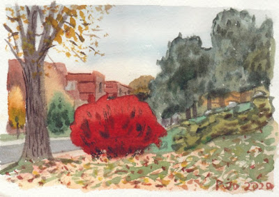
I had seen this bush on the way to the other location but there was no real place to sit. I circled around on my bike and finally found an okay angle. To make the colour I combined ferrari red, perylene maroon, and quinacridone magenta. A little perylene green darkened it at the bottom. The rest of the painting was made from variations on earth tones. It was a surprisingly complex scene, and the weather was starting to get unpleasant. It was so windy my bike blew over onto me in the middle of doing this painting. The leaves on the ground were interesting, the wind was causing them to swirl and lift. 

Near Benny sports complex, red bush, 5 x 7" cold press, October 2020

Sunday, October 18, 2020

Saturday Painting Trip, NDG and canal


I saw this scene the other day when the weather was overcast, but I knew it would be best to come back when the sun was shining. These are milkweed plants in Trenholme park, they are turning yellow and lime green with some splashes of orange. The blue bin gives a great colour contrast to the yellow milkweed leaves. Including bins might not be to everybody's taste, but they can provide a lot of composition, for example, in this painting the entire design hinges on the bin. The curved path, the flowers, and the end of the bleacher stands that I was sitting on all emanate from the image of the blue bin. Capturing the milkweeds was done with several layers, and a bit of brushwork at the end to get the shapes of the leaves. 

Trenholme Park, Milkweed and Blue Bin, 5 x 7",  cold press, watercolour, October 2020


Veering off the path I found a secret field, located up a landscaped embankment between two highways. It is a large (perhaps an acre) of land that they planted with local flora. For this scene I sat right at the edge of the landscaped area which has newly planted grass and trees, and on the left you see that brown stuff, its the naturalized field. The scene here shows many layers of fall trees, with Mont Royal in the background. On the mountain there is a depiction of Montreal General Hospital which is where I was apparently born, although I have no recollection. I quite like this painting, it brings in elements of Hiroshige the great Japanese print designer. 

View of Mount Royal from the Secret Field, 5 x 7",  cold press, watercolour, October 2020


I  couldn't resist going into the field, there was a small path that was probably from deer or rabbits that I followed until a reached a narrow rocky surface where I could set up my chair. Sitting in amongst the plants everything was nearly silent, the sounds of the city a distant hum. There wasn't any trash on the ground or any signs of people being here. I could see the nearby shopping mall through the vines, it looked like nature was engulfing the mall! The sun was warm and the sky was blue. I did another painting here from the same spot of a yellow poplar and green tree. 

View of Mall from the Secret Field, 4 x 6", cold press, 300lbs. watercolour, October 2020


Without much sunlight left I swung by Park Angrignon which had incredible fall coloured leaves, however, it was also crawling with people making it hard to find a secluded spot. We still in the midst of the pandemic so I am avoiding painting in places where there are a lot of people. They tend to want to see what you are doing and look, or they annoyingly walk past, so it was best to move on. Maybe I will go there early one morning. In the dying light I sat for this painting of the footbridge across the canal, which leads up the road to park Angrignon eventually. I omitted the black fence railings from the edge of the canal. 

Lachine Canal Footbridge (to Angrignon), 5 x 7",  cold press, watercolour, October 2020


Without missing a beat I turned to this mighty tree trunk that was reflecting the setting sun. In the top left is the bike path, to the right of the tree is the beginning of the footbridge. As you can tell the paint was not drying here, the whole painting was a puddle of watercolour. I had put down the tree trunk first knowing that if it dried, I could put on the bark detailing. It is wise to consider you center of interest and make sure it will be completed. In the dusk I was also getting pretty cold having not dressed for a temperature drop. I got it done and made it home in time for coffee. 

Mighty Tree Trunk, Sunset, 4 x 6", cold press, 300lbs. watercolour, October 2020


Friday, October 16, 2020

1998: Backpacking trip to Europe (France and Spain)


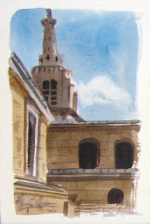
Throughout the late 90's I was traveling and painting a lot, for example around Caledon, and a trip to California. When I graduated with my Bachelor's of Science degree, I had a summer off before I would start graduate school in the fall, and with some savings, and help from Mom and Dad, I was able to spend two months in France and Spain. The painting shown here is the first one I did on the trip- a youth hostel in Paris called Three Ducks which had a courtyard with a view of a nearby spire. 

 France, Paris 1 Three Ducks Tower, 5 x 7" cold press, watercolour, 1998 (No. 0830)

The last painting I did on this trip is, ironically, the first painting that I blogged about on this site, a scene of Notre Dame Cathedral. There are other paintings from France, you can see them using the 'France' label visible in the web version of the site. 


 After spending time in Paris it occurred to me that I couldn't afford to stay there the whole time, and that I was getting sick of baguette, cheese and cheap table wine. So I made my way down to Spain, inspired by Hemingway perhaps. This scene is the mountain that holds the Sacred Heart Monument, it is actually a small peninsula that can be reached by foot. I made other paintings from the beach. There are many more, I will work on making a page for them. 

Spain 14 San Sebastian, Sacred Heart Monument, 5.5 x 9, cold press, 300lbs, 1998 (No. 0843)


The stop was Madrid, located roughly in the center of the country. It was a big bustling city and I would only spend a few days there. Some of the best views were from the university. I used artistic license to move this building into the scene, it was actually far off to the right. It was a lonely hilltop for sure.

Spain 30 Madrid, Ciudad Universiterio Vista, 5 x 7" cold press, watercolour, 1998 (No. 0860)


While in Madrid, I did a day trip to Segovia, a small town famous for its Roman aqueducts, and throngs of tourists! It was hard finding a spot to sit. The sheer size of the aqueducts and their quality was impressive, for scale I included a small landscape at the bottom framed by the stone arches.

Spain 37 Segovia, Aqueduct, 5 x 8" cold press, watercolour, 1998 (No. 0867)


After Madrid, I visited Toledo Spain for a few days painting the Toledo Cathedral, then I turned east to Barcelona painting the impressive art museum. I followed the coast painting Valencia boats on the beach, followed by Alicante where I did a neat beach view from the castle. Continuing south I visited the Alhambra in Granada, and painted the sunset in Ronda


Ronda was my favorite place to paint in Spain, other than San Sebastian perhaps. You can search my blog for others from Ronda. Here is one I didn't post yet, it shows a house with the greatest view in town! It was an ambitious scene, but after doing the Toledo Cathedral I was confident the rest of the trip. Somebody filmed me as I painted this with a cam quarter (with my permission) this was a time before smart phones remember.

Spain 88 Ronda, vista through three windows, 5 x 7" hot press, watercolour, 1998 (No. 0918)


In the south of Spain I stayed in what was a British colony of sorts called Gibraltar painting the ships passing by and other scenes. Here is a scene I painted of the rock of Gibraltar. If I could fit a whole cathedral on a small piece of paper, why not a small mountain? Later I would walk up the mountain and do a painting from the top. But what I remember most from this moment 22 years ago is what I ate- from my backpack I assembled a huge ham sandwich with cheese, tomato and lettuce, along with a large piece of chocolate to finish off.

Spain 102 Gibraltar, Rock of Gibraltar, 5 x 8" cold press, watercolour, 1998 (No. 932)

I could keep going telling stories in this blog but I will try to wrap it up shortly. After Gibraltar, which was not a very pleasant place to visit, I headed north through Seville, Cordoba, Salamanca, Zamora, and back to Paris via Irun. 

I will leave you with one last painting, it is a close-up of a famous decoration on the outside of the University building. The facade is very ornate with hundreds of carvings, and in among the myriad of shapes is a hidden frog. Finding the frog is like a tourist magnet, the tour guides bring great throngs of visitors by to search for the darn amphibian. When I went, there was a smart ass local fellow who would jump in and point at it, ruining the fun. Well it was fun for him which was fair enough he lived there. So I came back one day when there weren't so many tourists and made this painting. Spoiler alert, if you are planning to go to Spain some day look away! 


It is that disappointing little blob on top of the skull by the way.

Spain 145 Salamanca, Hidden Frog, 5 x 8" cold press, watercolour, 1998 (No. 0977b)