Monday, August 31, 2020

Palette Cleanser #28

Palette cleaning really helps maintain bright colours in my paintings. I used to keep a very dirty palette where the colours were left from previous paintings. It was done intentionally, and maybe with a little lack of preparation, because I knew that bright colours did not really exist in nature. Having the dirty palette was, in effect, a way of having a touch of grey in the paints. As I blogged about the early works recently, I noticed that most of those older paintings do look rather grey and cold sometimes, which was not the intended outcome. The latest Verdun paintings show a completely different appearance, light and bright. The other breakthrough was reading MacEvoy's Handprint .com, he said that you have to paint a little brighter that you think if you want it to look good hanging on the wall. 

This palette cleanser was inspired by the group of seven! Before going out to paint today I flipped through my Group of Seven coffee table book, and saw a snow scene by A.J. Casson and was amazed by the variations in pastel blue and purples, and how it contrasted against the dark sap green, and glowing yellow light. I tried to copy the colours here, using an abstraction of organic shapes.  

9 x 12" watercolour paper, watercolour, August 2020


Verdun #7-9, Old Stone House, and Beach


Last week I made a small painting of the old stone house in Verdun, which jogged a memory in my parents who knew the area back in the day, and they had a landscape painting of the scene done by Violet Robertson. It was a tough week last week so I didn't get any painting done, then it rained profusely on Saturday preventing any outdoor activity. Finally I got down to Verdun for some painting and did a new painting of the old stone house, technically this is the back of the house, with Lasalle Boulevard in the background. To get the shingled roof colour I mixed phthalo green with burnt sienna, and a touch of goethite and black, then diluted with water. The bricks were fun to paint, I just put them wherever it looked right. This was done on the new d'Arches 140lb cold press watercolour paper I got from Avenue des Arts, I got 10 sheet of it which should last awhile. They call it 'natural' paper since it is not bleached white. 8 x 10" watercolour August 2020 Verdun 7


Here is a sketch of the old stone house that I did prior to the painting. The roof line was at the exact half way mark of the height, and the width was one and a half the height. The main window and door was centered, and the flanking ones were halfway from center to the edge. Getting the proportions right is important when doing buildings, the rest of the details just have to be the right size, colour, value, and texture. No problem. 8 x 11" sketch book, pencil, August 2020


I have a plan to try and recreate the Robertson landscape, so I did a side view looking east. It is more colourful and filled with light, and of course there is no river embankment. Next chance I get I'll do a river embankment scene, then combine it with this scene. I used a simpler technique on this one as compared to the first one, I put down the warm beige of the wall completely, let it dry, then overlaid the brick. In this way I can not create the lighter tones stones and the coloured stones, but it creates a very similar effect. 5 x 7" hot press, watercolour, August 2020 Verdun 8


As part of the park development in Verdun they opened a beach recently. The foreground here just shows some of the landscaping and a piece of the sidewalk leading to the beach. The beach itself is not visible from this vantage point. Entering the beach required going though a checkpoint where they made sure people were not with COVID before going in, and getting hand sanitizer. In the background is Nun's Island, with a few of the condo buildings. To get that middle green, the cool grey-green across the river, I used diluted perylene green (PBk31) which worked out perfectly. The rest of the greens are mixes of phthalo greens, benzimida yellow, and some burnt sienna. For dark rich greens I mixed phthalo green (PG7) with perylene maroon (PR179). 5 x 7" hot press, watercolour, August 2020 Verdun 9


Old Stone House, by Violet Robertson


Violet Robertson was a local artist from Westmount who did landscapes. My mom and dad met her when they bought their dining room set in the 1970's. They also bought 2 other landscapes she did, which now hang in my parent's house. Her mother liked Dad so much that she gave him an Aldridge watercolour of boats in a harbour done using the traditional English method of painting. 

This scene shows the stone house in Verdun, it is a historical house built in 1710 called  Maison Nivard-De Saint-Dizier. My dad told me that my great grandfather use to row from Pointe St. Charles to the old stone house to go fishing. In those days, they had no motors. Their first motor, when they went to Heron Island, was a five horse power. He said that it took them forever to get past the rapids! My Dad also went out there with his kayak and put it in the river just at the end of the rapids. Back then the house actually backed onto the river embankments, but now the whole shoreline has been filled in for about 100 meters and has a park with bike paths. You can really see the natural state of things, and the great shoreline along the St. Lawrence. It looks like an oil painting but has texture like a pastel drawing, I will have to ask about that. Thanks Mom for the photo!

Pastel, ~ 10 x 12 " year: mid 20th century


Saturday, August 29, 2020

Blood Cell Clotting Factor (Lipstick Tornado)


Here is the 6th endless colour painting done on the hottest day in the universe. I called it Blood Cell Clotting Factor' but there are all kinds of names that may have worked. 'Exploding Rose', 'Spilled the Koolaid', 'Strawberry in the Blender', 'Lipstick Tornado'. The main goal here was to use some paint up, including potter's pink (PR233), quinacridone red (PR209), quinacridone violet (PV19), quinacridone magenta (PR122). Maybe it could be called "Calling Earl on the Quinacridone Phone?". That one is too good to pass up. Edit: Mr. Clarke saw a panda bear in the top left, now I can't un-see it. Cilei noticed a dinosaur in the bottom right, its like a whole animal kingdom hiding!

22 x 30" (B side The Deluge). July 2020

Psychedelic Fabric


Psychedelic fabric makes you see things that may be there or may be in your imagination. Lately I took an interest in Japanese art and the kimono fabric was mesmerizing, intricate patterns of flowers trees and geometric shapes. At the same time I practiced drawing fabric fold with a pencil, like all artists are supposed to do. This painting was completed some time ago, around the time I did 'Woven World'  or shortly after. I think its a good idea, maybe I'll try more like this. Next up is Saturation Cost, a painting about COVID-19 that I have been ruminating on for almost 6 months now. I'm also heading down to Verdun tomorrow to paint the stone house and Lachine rapids. Using a real life, en plein air, 'photoshop' technique I hope to recreate the scene as it was 70 years ago. 

5 x7" cold press, watercolour, 2010-2014?

Flood Plain & Sunset


Keeping it real with the unreal. Eat it all but the banana peel. In this painting a fish-human seems to be trying to breath in a bubble of water floating in a desert. The colour sense is reversed, cool green reeds with coy at the bottom and searing hot desert sunset at the top. Incredible range of warm grey and browns connect it all. On a more real note I just bought ten more guppies for my tank today. One looks sick upon arrival but that's okay. It reminds me that I would like to do another portrait of my apartment and fish tank a la where go the fish. And no I'm not drinking again, just listening to Neil Young Psychedelic Pill, which is almost the equivalent to a mild joint. 6 x 8" cold press, watercolour, 2016

Abstracts (I Dig Picasso)


"Hey now, I used to dig Picasso." (sang Neil Young) Deconstructing art into its components, lines, shapes colours, representing nothing with something. Abstract art is poetry no rules. Abstract art is a daredevil, no limits. Abstract art is a dream, no waking. This painting was done from imagination or perhaps using some doodles here and there. The watercolour paint technique does a lot of work here, in the top left a yellow backwash creates the feeling of sunlight, bottom left the dry brush texture gives a feeling of stones, and the pastel colour fades on the right cast an eerie glow. 6 x 8" cold press, watercolour, 2015

Bottom up, top down, who knows. Just the signature makes sense, the roots are going down the branch is up going down. What's in the background, bubblegum scraped off the sidewalk? Those yellow egg shapes are hypnotic. 6 x 7" cold press, watercolour, 2017


Just a relaxing day on the beach on some other planet. The textural work gives a strong sense of a sandy rocky surface. The creatures tail is like the nib of a pen drawing the horizon. It this the poet of paint? I don't know what's in the background it looks curvy. 5 x 8" cold press, watercolour, 2017


Wednesday, August 26, 2020

Bolton Ontario, Childhood Schools


 Having a lot of open space is a real luxery that I can now appreciate more living in the city. This is James Bolton public highschool where I attended grades 2 - 6, as seen from the bleachers that are in between the highschool. It looks like spring time since the leaves are off and the ground looks like its starting to grow again. 5 x 7" cold press, watercolour, 1996?


In the other direction Humberview highschool can be seen, it is where I attended 7 - 12. These little yellow portables were used at the time, they have now been replaced with a bricks and mortar extension. Looking back on this painting, I wouldn't change a thing! Getting those tonal yellows is tough, and notice how one side of the portable is a slightly grayish yellow signifying shadow. The texture and colour of the grass is right on, and that juicy blue sky with fluffy clouds plays well against the earth tone of the highschool bricks. 5 x 7" cold press, watercolour, 2000- 2004?


This is nowhere near the schools but I thought I'd throw it in the blog, it was done up around the community center on the south hill, looking north across the valley. It was a really early painting I did, not long after the ones I did at the art show. The initial is quite strange, I used this for awhile, at least it contains the date! 5 x 7" cold press, watercolour, 1996


 On the back of the previous painting I started a painting but was clearly disappointed with the result. It says Antwerp dries mud... along with an expletive that I covered up in the scan although you can still see what it says through the paper. I had antwerp blue paint based on the recommendation made in a book by Zoltan Szabo, who liked to use it in all kinds of mixes. Antwerp blue is a fugitive (fades in light) phthalo blue variation that looks very bright blue when wet, but looses chroma and intensity when it dries. So I didn't use it much, favoring french ultramarine until 2020 when I stopped using that too.  5 x 7" cold press, watercolour, 1996


Guelph Ontario


 I went to Guelph for a few painting trips it is half way between London where I went to University and Bolton where my parents lived. This scene was from the stadium, you see the prominent red and yellow logo of a Griffon. I painted another one of the same stadium on the same day, posted here.   5x7" cold press, watercolour, 1997?


Another scene from the Guelph University campus, this is a barn they use for teaching. Yes, they have a teaching barn, those professor cows sure know how to lecture. Actually Guelph University specializes in agriculture. 5x8" cold press, watercolour, 1997?


I've no idea what this building is, perhaps a museum? It was on the campus too, and the shape of the roof was cool. 5x7" cold press, watercolour, 1997?


It may have been the last one I did that day, I have a memory of being really hungry when I painted this. It was a bright sunny day and the sun was beating down, creating some stark light and shadow effects. The difficulty level of this painting was high, and I was in the habit of not using outlines. I like the metallic effect on the sign. It is the famous Albion Hotel. 5x7" cold press, watercolour, 1997?

I also painted the famous cannon on campus (it is even listed on google maps as a tourist attraction), the students paint it different colours every week. It was Canada Day. Here is the link of the canon painting, I updated that blog post because I found another version of the canon painting. It was a different day because it was raining that day.

Bolton Vanising landscape


Vanishing landscapes can be seen all over Canada, but not for long, because they are vanishing! This painting was done in Bolton on Queen street at the corner of Columbia way. A beautiful autumn scene of rolling hills and orange trees. 6 x 9" cold press, watercolour 


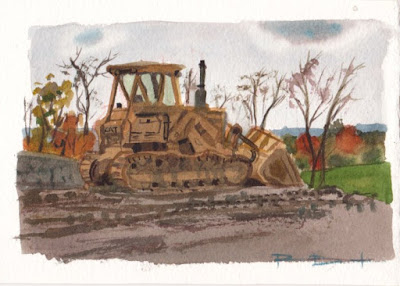
Landscapes fare poorly versus bulldozers, as you can see in the painting. The bulldozer was not actually moving, but I composed the scene to look like the landscape was being scooped up. 5 x 7" cold press, watercolour

Gale force winds joined with stormy clouds on the construction site. The lot would soon become a suburb of copy paste houses (they all look the same). It is a rare opportunity to paint a scene like this without it being rainy- half the sky is sun, the other half purple clouds. 5 x 7" cold press, watercolour

Happy days arrived, the suburb was complete! This is actually a different suburb but in the same North hill neighborhood. Those that live across the street from this scene will recognize it, from some time ago though when it was better maintained and the bricks were naturally coloured. This completes the cycle of the vanishing landscapes. Instead, this series can be called emerging suburbs? 5 x 7" cold press, watercolour. These paintings were done on various dates ranging from 1997 - 2004 ?

Tuesday, August 25, 2020

Stratford, Ontario


Stratford Ontario is a picturesque theater town north of London Ontario, where tourists (used to) come from far and wide to see Shakespeare plays and enjoy the parks and restaurants. I went there by train from London to paint in 2001, I remember the date because the Raptors were playing the 76ers and Vince Carter missed the shot. It was a brief but eventful and productive weekend painting trip. I did previous blogs which I updated with more paintings and comments, including swans and river scenes, and Jazz in the park with scene of canon, which I actually sold on the spot which was enough to pay for dinner and the train ticket! I watched the last Raptors game, so after consulting Wikipedia, I know this was May 20th 2001.(The Raptors would not be in the playoffs again for 15 years after!) 5 x 7" cold press, watercolour, May 2001

Next up, a classic scene of Shakespeare's disembodied head on a pedestal, somehow fitting. I would have been thinking about the Statue of a Horse in Paris, which had similar colours and textures. You can click on those links by the way to see the blog and painting I am referring to. 5 x 8" cold press, watercolour, May 2001

In case you are wondering why some of the paintings are 8" instead of 7", its because when I cut up a 22x30", you get 18 pieces that are 5" wide on the short axis, but on the long axis you get 7" + 7" + 8" = 22". So when I painted a tall or wide subject I used the 8" pieces. Now I make them all about 7.5" instead. 


It was productive there, here are a few more. These geese were quite active, and you can see two little yellow chicks in the grass. 5 x 7" cold press, watercolour, May 2001


Here is an amazing tree in the park near the river, neutral browns and lots of texture.5 x 7" cold press, watercolour, May 2001


And I painted a row of buildings from the town, the spire is part of the town hall. 5 x 7" cold press, watercolour, May 2001


Colour tests and Sizing tests

 Just before the lock-down was announced due to COVID-19 in March, I did a few essential errands like fish food, hair cut, dentist, and new paper and paints. In the test, I was using a limited palette, just 4 paints, to make all the colours. Starting on the left is PR122 a bright rose red, then mixed with PY154 yellow at the top to create oranges and pinkish colours. Then PG36 on the top right which is phthalo green yellow shade, mixed with PB15 phthalo blue on the bottom which is close to cyan. The blue plus magenta gave the purples. The mixes looked a little flat, so in the middle I placed some stronger mixes to compare. After a field test in Benny Park, I gave up on the idea of using a limited palette like this.


As we sat around during lock-down, I pored over the Handprint web site by MacEvoy, and found it interesting that paper had a slightly fatty chemical added called sizing that prevents the paint from moving too much once it is on the paper. In contrast, rice paper has no sizing, and paint will diffuse all over it making it hard to produce detail. By wetting and rubbing the paper with a lint free rag, you can remove some of the sizing. In the example, I wetted and scrubbed the paper different number of times from zero (no wetting on the left), to intense (3 cycles, on the right). Then I let it all dry, and applied test strips of paint, including the shimmering silver paint from Daniel Smith company. As a result- the paint looked exactly the same no matter what. It was good to know this, since I always pre-soak my paper before using it to paint, now I know the sizing is still on it even with intense scrubbing. 


Monday, August 24, 2020

Ultimate tournaments in Kanata Ontario and Rochester NY


Near Ottawa there are a few large suburbs including Kanata, and Carp (where my sister lives). I went to an Ultimate tournament as part of a team, and made a few paintings of the action. This scene depicts the disk flying through the air after a 'pull', that is, when the play starts one team throws it to the other teams. The opposition is standing on the sidelines across the field watching on.  5 x 8" cold press, watercolour, 2000-2002?


And the real action, eating. I was inspired by the arrangement of the marker cone, bananas, oranges, and the line markers. The Kanata fields are built upon an old sod farm, so the grass was luxurious and perfectly flat. Ideal for ultimate. This is a good example of using a neutral (olive greenish) background to enhance the bright colours of the objects. 5 x 7" cold press, watercolour, 2000-2002?


This one was done at a different tournament I went to in Rochester NY, called the Zodiac tournament. It is a pickup tournament where the teams are formed based on zodiac sign, so the teams are basically people who have never played together as a team. We did quite well, and had a lot of fun. I tackled this scene with my brush, you see the person with their hand up was about to pull (throw the disk to the other team). We were on a break between games, waiting for our turn to play. I got the port-o-lets in there too! I think I remember the date because I bought two disks with the date on them, one my Dad still has, the other I used so much it fell apart.

5 x 7" cold press, watercolour, 2001


Ottawa

The concept of 'early works' is all relative, I have been labeling things early works if they were done awhile ago, like before 2005. The label is meant to signify that I am blogging about old paintings, rather than a precise cutoff time. Besides, I don't even know when I did a lot of paintings from the old days. This was done in Ottawa when I visited with some friends from University of Western, we did a road trip from London Ontario and I brought my paint kit. 5 x 7" cold press, watercolour, 2000?


Another scene painted on the same trip- on the left is the old embassy building, the background Parliament again, and a traffic light featured prominently. Even without the signature I would know it's my painting, traffic signals (and pylons) often show up. I was using that cerulean blue, rose madder aureolin yellow, mix for the grey, which was rather heavy and muddy at times. Now I use phthalo green (PG7) and quinacridone violet (PV19) with a touch of burnt sienna (PR101), it is lighter and airier. 5 x 7" cold press, watercolour, 2000


I was on a roll, this scene is in the Ottawa restaurant district featuring provincial flags of Quebec and Ontario in unison, and a colourful awning. Most of the scene including the pole in the foreground is back lit creating a lot of heavy shadows. 5 x 7" cold press, watercolour, 2000


This is the war memorial, with the tomb of the unknown soldiers which had been just added in the year 2000.  There are quite a few mistakes here on the perspective and the green blob on top that looks like Godzilla, maybe I did one too many paintings this day. I never had fear on a location, no matter how complex the subject appeared to be, I plopped down my chair and went at the scene with aplomb. In retrospect, a scene like this requires a careful drawing, and a bigger piece of paper. I'll have to go back once they ease off on the travel advisories between provinces and give it another go. 5 x 7" cold press, watercolour, 2000


Bolton and Area

Pedaling up this hill is a real chore, it is the ironic Mount Pleasant road formerly known as the 9th line. Whomever renamed the road hadn't rode their bike up it that's for sure! From this vantage point on a clear day you can see all the way to downtown Toronto including the CN tower, although I exaggerated the scale of the city on the horizon for effect. 5 x 8" cold press, watercolour, 2000 - 2004?  


The next scene is closer to home, literally, it is a view underneath the large balcony in my parent's backyard. You can see their red fiberglass canoe, wheelbarrow, potted flowers, and patio furniture. I like the little slice of light on the end of the canoe. There is no garden here, which puts the date way back, it was done around the same era as the other painting or maybe a little later. 5 x 7" cold press, watercolour, 2002 - 2006?  


Here is a cool car that was for sale, it was on the corner of Mount Hope road (8th line) and Castlederg side road. I posted this before, but the picture was lousy, you can read more thoughts about it there. It was a little earlier than the others, I can only put ranges on the dates. 5 x 7" cold press, watercolour, 1997 - 2001?


Palette Cleanser #27


Variety is the spice of life, and art. All art serves a common purpose, that is, to connect with people. The first connection is with the artist themself, and then with an audience such at an art gallery, show, or on line (a blog!). I was thinking the other day, all the ways that art connects with a viewer. When my parents look at the Montreal landscapes especially from NDG and Verdun, they feel connected to the subject matter- an artistic image from 2020 brings back memories from more than 50 years ago. And the paintings are not too bad either! But an abstract painting, like the one in this blog, it can not bring back memories or anything like that, it is a pure visual stimulation (abstract). My doodleism paintings are somewhere in between abstraction and realism, but still from my imagination. Those paintings have lots of ideas in them which may make people think, like a collage of ideas and puzzle pieces. Sometimes I do concept art, like Blockheads and Bright Ideas, which are sort of like a political cartoon, or a meme. Each type of image connects with viewers in a different way, I know from experience different people will connect with different aspects- idea, visual, thought, memory. 

9 x 12" watercolour paper, watercolour, 2020

Sunday, August 23, 2020

Lab Book #22: Infectious Perspectives


Laboratory books are for notes on scientific discoveries, procedures, and meetings. Since March I have been working from home, but I still keep a lab book for progress and meeting notes, and doodles. Lab book #22 started around the end of 2019, and goes all the way through August of 2020, which overlaps with the COVID-19 pandemic. These particular doodles were around March when the news came out of the pandemic, and some of the thoughts and feeling spilled over into the doodles, which were turned into paintings. The name obviously refers to the virus outbreak, and if you look carefully you will see that the castle in the middle is made from toilet paper rolls. The rest of it is inspired by Japanese design which I was studying a lot late 2019 early 2020. The next Lab book 22 painting will be directly related to the pandemic and have even more toilette paper rolls. 

15 x 22" cold press, watercolour, August 2020


By the way, I painted it on the back of one that I never properly finished...I know somebody will love this painting...


Verdun #4-6

 Near Crawford Street in George O'Reilly Park there is a historical house built in 1710 called  Maison Nivard-De Saint-Dizier, it is now a museum and archeological site with tourism visits available. It was closed when I was there today though, maybe due to COVID 19 restrictions. The stones are all different shades of brown, grey and even pink, while the doors, windows, and roof are earth colours. I was going to pass on this today because I only had 5 x 7" (post card sized) paper with me due to being almost out of paper, but I found a good angle to get a sliver of the building, and some of the park land around it including the bixi bike stand and some of Lasalle Street. The only things that were here in the old days were the house and Lasalle street. The park, tree, and bixi stands were added a lot later. My Dad was saying how he would put his Kayak into the water from right here, around where I was sitting! They filled in the river side with landfill and turned it into a park. 5 x 7" cold press, watercolour, August 2020


The big attraction around here is the Lachine rapids, many people were relaxing and taking in the view. I found a spot to sit away from people and in the shade. There were hundreds of seagulls standing on the rocks in the river, which I barely manged to depict in the painting. The water was broken with froth and foam all over the place, with a smooth flow of lilac/blue water reflecting the sky and showing some of the green brown from underneath. In fact, the water was even darker and richer than shown in the painting. I would like to come back and do the historical house and the rapids a few more times. 5 x 7" cold press, watercolour, August 2020


Going all the way down the bike path brought me to the end of Verdun... or did it? Verdun merged with Nun's Island awhile ago, and it remains part of the same borough. Sure enough, after crossing the Nun's Island bridge on the bike path to the island, I ran into yet another Verdun sign the same style as the other two, minus the landscaped flower garden. Maybe they ran out of money or something, it was just a mound of grass and pebbles strewn about. The whole bridge and bike path was under renovation so it may just be a limitation this year, that they didn't do the flowers due to construction. The sun was going down, and it was partly cloudy, which made the lighting conditions unpredictable. It was all in shade when suddenly I got hit with full blast sunlight. The ugly apartment building in the background seemed part of the welcome sign. Welcome to Nun's island and sky scraper apartments. Since I ran out of cold press, I had to use my last piece which happened to be hot press. Time for a visit to the art store!  5 x 7" hot press, watercolour, August 2020


Guelph Ontario


From 1997 until about 2001 I was doing a lot of location painting, and my parents were nice enough to lend me the car which I used to go to work in people's gardens, a job I very much enjoyed, and I went to various locations around southern Ontario. Guelph is a small city with a University that is about 1 hour west of Bolton. I posted one painting of the Canada day decorated cannon from Guelph, it was the same day I did this paining, with a steady drizzle of rain. The white car really makes the painting work, it contrasts against all the low contrast misty background. 5  x 7" cold press, watercolour, 1997?


Perhaps this was done on another visit, I do remember going there at least twice to paint. The weather is obviously better than the other two paintings, here it is partly cloudy with bright sun. The perspective on this painting is pretty neat, it was always one of my favorites from this era. The name of the team was Guelph Griffons. I have more paintings from this area of the University campus. 5  x 7" cold press, watercolour, 1997-2001?

I must have been inspired by the composition and contrast of this scene. From the looks of it, this is fall weather because of the lack of foliage and apparent brown leaves on the tree in the background. If that is the case maybe I went to Guelph three times, or this is not Guelph! I have this vague feeling it is somewhere else, although I wrote Guelph on the back in pencil at some later date. Anyways, we can call this 'anywhere Ontario'. The red bricks make a nice complement against the army green of the artillery. I managed to suggest a lot of detail in the piece without too much fuss. For a small painting it carries a lot of punch. 5  x 7" cold press, watercolour, 1997-2001?