Thursday, May 21, 2020
The Blue House, Ville St. Pierre, Montreal
Blue has become a theme of the pandemic series, it started with blue skies, and then slides, shorts, and houses apparently! Having trouble with phthalo blue, I decided to go back to some of the other blues including iron blue (prussian/PB27) for the outline and tints, cobalt blue (PB28) for the house paint, and cerulean blue (PB35) for the sky. It made the sky a lot easier to control, in fact I mixed cerulean with a touch of phthalo. After the light blue dried, I layered on cobalt blue to create the brilliant blue paint on the bottom half of the house. I finished with a darker layer of cobalt blue and a touch of phthalo. To complete the tour-de-bleu, I used french ultramarine blue (PB29) in the purple-shadows, and indo blue (PB60) in the dark shadows. Cobalt paints are slightly more toxic than average paint, but they are generally safe with proper handling.
7 x 10" rough press, watercolour, May 2020
Wednesday, May 20, 2020
View Down Lansdowne Avenue, Westmount, Montreal
With all the new colours in my palette I have been adapting to several challenges, such as tree bark and blue skies. In this painting, I left the tree trunk until the end, and then put down one quick wash of iron oxide red with phthalo blue. When it dried I made the bark textures with bloodstone genuine which is a heliotrope/hematite pigment. Heliotrope is a kind of black sandstone, while hematite is a red iron oxide found within the stone. I am quite satisfied with this method of painting trees, it provides the weight of a tree trunk, but still gives the warm reflectivity of the bark. The blue skies have been tricky since the clouds showed up- the phthalo blue tends to flood the whole area and obscure the shapes of the clouds. This time I put the blue last, but it dried with hard edges. The shadows in the clouds are almost the same mix as the tree, but with a touch of magenta and french ultramarine (purple) added in.
7 x 10" rough press, watercolour, May 2020
Tuesday, May 19, 2020
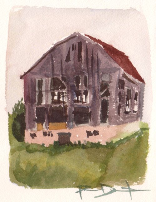
Barn Burner, Bolton Ontario
Not much longer, and the barn burned down, it was in the newspaper! I packed up my supplies and walked down the street to see the burned barn, complete with smouldering ashes. The painting is below. Talk about a vanishing landscape! As of today (2020) the farm lot still sits vacant.
5 x 7" cold press, watercolour, July 1996
Elm Park, Ville St.Pierre Montreal
Convenience mixes are paints that come pre-mixed, like, the company puts two colours together so that the artist doesn't have to do as much work. I never knew that until recently, when I started reading Handprint.com which is a vast resource of knowledge and opinion. I decided to mix my own convenience mix consisting of winsor green (PG7) and benzi yello (PY154), yielding a spring-like lime colour. As spring turns to summer, I added slightly more of the green to represent the increased chlorophyll. The grass and budding leaves both contain ample amount of the convenience mix. Lets call it Montreal spring green.
7 x 10" rough press, watercolour, May 2020
Sunday, May 17, 2020
Stretching Rack, List of Large Paintings with Links to Respective Blog
2002 The Grapes of Tuscany
2003 Superencrypted
2003 Floating Cathedral Statues
2003-2004 Public Highway Drivers (PHD)
2004 Lab Book #4, Finding Space
2004 Blue Flames Consuming the Stylized Image of a Woman
2004 Lab Book # 5, Making Connections
2004 Lab Book #6, Spanky's Fantastic Cathedral
2006 Inner Workings
2006 Failure to Understand, Something to Learn
2006-2007 Summer Scene
2008 Lab Book #9, The End of Colour
2008 Lab Book #11, The Legendary Isle of Sixe
2008 Lab Book #12, Archi-doodle City (W/E)
2009 Life of an Onion
2009 Lost in a Mall
2009 Addictive Puzzle
2009 Preventing the Deterioration of an Otherwise Normal Scene
2010 Current Demand
2010 The Extruders
2010 The Twenty-Ten Solution
2010 The Deluge
2010 Creation's Creations
2011 Insignificant Details
2011 Instant Nostalgia
2011 The Plan (Suburban Escape)
2011 Fertile Idea
2012 Social Networking (Life on Venus)
2012 The Paper Chase (No More Outlines)
2012 The Crushing Delicate
2012 Attempted Evolution
2012 Immortal Time, Infinite Ideas
2013 Where we Were (Ancestors)
2013 Perpetual Load Theory (The 2012 Question)
2013 In Sequence [B side]
2013 Responsible for Reality (Dinosaurus)
2013 The Lemon Sunset
2013 She Was...
2014 New Thoughts and Human Adaptations
2015 Never Done (No Idea)
2015 The End of Ego (High Tide)
2016 Desert Appliances (Applications Unclear)
2017 Community Connections
2018 Tourist Destiny
2018 Apple Eye, Shrimp in the Sky
2019-2020 Lab Book #23, Hiking Elvis
update: I have finally filled in the missing blogs, and updated some of the old scans to make the images better. I needed to be outside on a sunny wind-free day to take good pictures. The Grapes of Tuscany is now posted, I found an old photo of it while it was still on the rack in 2002.
Hiking Elvis
Find Hiking Elvis! Last year I stretched a 22 x 30" paper on the rack, and there it sat for months on end. In December I splashed some colours around including a swath of cerulean blue, green and blue blobs, and some washes of alizarin crimson red. And there it sat for almost six months without any progress. It first occurred to me that this was to be a mountainous scene, and that it would involve Elvis, four Elvis' was the original plan. By accident I had dropped four beads of water on the washes when it was wet, and I became obsessed with the idea that they represented Elvis. At the same time I had a doodle in my lab book #22 that resembled Elvis on a mountain, and the idea started to come together (it was mistakenly labelled lab book #23 on the painting). I also worked out a few compositions in my sketchbook that would fit the background painting. Complicated path just like the painting.
There are a lot of little symbols and jokes in this painting, the main joke turned out to be that the characters are all taking selfies! I also included the abominable snowman as I remember from the SkiFree game, and a Canadian maple leaf to remember Canadian climbers who died on Mount Everest. In the end, this painting is about the absurdity of commercialized climbing in the Himalaya's, which is currently on hold due to the pandemic. There is even a Ferris wheel, fast food restaurant and french fries strewn throughout. Hokusai's wave-drawing style was used in the foreground cliffs.
22 x 30" cold press, watercolour, 2019 - 2020
note, I went over the alizarin washes with quinacridone and pyrrole reds to
make sure they are lightfast, since the beginning of 2020 I dropped
alizarin from use which is a shame since it is such a powerful colour, but
it fades like crazy in sunlight. Here is a crop of Hiking Elvis taking a selfie...
St. Jacques Street, Rusty Store, NDG
I used to sign all of my landscapes, well most of my landscapes, with the P Darlington 'scrawl', barely legible and easy to miss. With few exceptions I signed in cerulean blue or mostly ultramarine blue. In the pandemic blues series, I have been signing with a PJD 2020 inscription using mostly indothrene blue. It is hidden in this painting, but you will find PJD 2020 if you look around. Part of the reason I haven't been signing as usual is just the situation being what it is, and these are very experimental paintings as I work out the new paints and how to use them. I will get back to signing normally in due course. By the way, the blue here was a mix of phthalo blue (PB15) and iron oxide red (PR101) and some adjustments with phthalo green (PG7) to make it turquoise. The rust was iron oxide red, bloodstone genuine (heliotrope with hematite from Daniel Smith co.), some vandium yellow (PY184), and purplish tints.
7 x 10" rough press, watercolour, May 2020