Friday, February 29, 2008

Outhouse, Bolton, Ontario


I first started outdoor landscape paintings in Bolton Ontario Canada, and this work was among the first, done some time in 1996 or 1997. It was a warm winter day in the north hill valley, a fresh layer of snow had just fallen. I was in the Bolton camp area where my Dad and I often went skiing. The structure is an outhouse, in another version of this scene I put a moon shape on the door just for fun. I love the contrast between the artificial green of the plastic roof and the natural greens of the trees in the background.

The snow is mostly just the white of the paper. To make the light blue and pink shadows in the snow I initially put down a layer of clear water and then drop in a tiny bit of colour. After it dries I may need to soften the edges of the shadows by lifting off paint with a moist brush. To make the green in the roof I use viridian green, with a bit of ultramarine blue and alizarin crimson red. The tree green is more based on burnt sienna, with only hints of viridian green and probably lots of ultramarine blue and aureolin yellow. It was a long time ago to remember the exact mixtures, but most of the colour combinations I use have stayed the same for many years. 

Bolton Camp Outhouse Winter, watercolour 5 x 9" cold press, 1998 (No. 0251)

Tuesday, February 26, 2008

Stand on Two

Often I create a painting that has a deep meaning, it just takes a little while for me to understand what it is. This painting depicts a reptile-like creature standing on a landing pad, the creature has luminescent wings. Beside the creature stands a mother and child in shabby clothes, the mother holding a bag. The background is a red sunset or sunrise. Honestly I do not understand what this all means yet, but it looks cool.

The background sky was done with a glaze-technique. Blue-green paint was applied on top a dry layer of red. In watercolour, the light bounces off the white paper and optically mixes the layers as the light reached your eye. This means that the dark colours of the sky are a mix of two pure colours. By reducing the thickness of the blue-green layer, more red shows up, which gives the sunset effect. For the composition, the animals wings dominate the scene...it was important to keep the outline of the wing visually interesting, to do this, the line itself is like a wave, and I also made part of the wings outline blurry, to add variety. There is also a collection of shapes painted on top of the wing just for fun.


Stand on Two, watercolour 7.5 x 11" cold press, 2008 (No. 1443)

Tuesday, February 19, 2008

Fairmount St. view of Mount Royal, Fall

Here is a recent landscape done near my apartment, at the crossroads of Fairmount and Esplanade, looking towards Mount Royal. It was done last fall, which seems like a hundred years ago...looking at this paintings reminds me what the town looks like without snow! The parking in our neighborhood is always difficult, and many people own compact cars like the one seen in the foreground.

The trick with landscape painting is to put most effort into the center of interest, which is the mountain and the fall colours. As the leaves change colour they loose green pigment revealing the orange and yellow and red. To paint the fall colours, I start with a weak green and add in the warm colours. To keep the colours looking vibrant, I contrast them with deep browns and other cool colours (as seen in the buildings surrounding the mountain). The car in the foreground has a splash of water across the rear bumper which was an accident but adds a nice reflected-light effect. 

 Fairmount St. view of Mount Royal, Fall, watercolour 5 x 7" cold press 2008 (No. 1073)

Friday, February 15, 2008

End multiple sclerosis

This painting was done for an article in a multiple sclerosis magazine written with my supervisor. The magazine was dealing with stem cell therapy for treating multiple sclerosis and I was asked to make a painting to capture the idea of stem cell repair. A group of scientists stand in the foreground with a blueprint and a construction sign and equipment indicates that they are busy working. In the center of the picture is a MRI-brain scan of a brain with lesions (the white holes in the grey part of the scan). These lesions need to be repaired, and stem cells may be a way to do it.

The composition of the painting was carefully planned. The orange signs captures your eye first (the orange is contrasted by the blue sky; orange and blue are complementary colours) and allows your eye to move into the brain scan, and then down to the scientists. The corner of the sign overlaps with the scan, as does the corner of the blueprint. Three orange cones on the ground convey the perspective of the ground. Light comes down from the top right, which contrasts the general flow of the brush strokes and eye-movement.

I left a lot of space around the painting because the editors were going to crop the magazine layout. The free magazine can be found at http://www.msif.org/en/resources/msif_resources/msif_publications/ms_in_focus/index.html

 End multiple sclerosis, watercolour 11 x 15" cold press, 2008 (No. 1917)

Monday, February 11, 2008

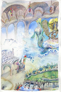
Kernels of Thought

Often I like to sit down in front of a blank piece of paper and start painting without any thoughts in my head. I start with random squiggles and see where they go and what they become. In Kernels of Thought I began with the corn cob towards the right edge of the painting and surrounded it with the easter island inspired totem-heads. The mermaid followed, with the dramatic tail splash, and then the mini-put golf course, the red headed chicken, the decorative bench, the dolphins, the cathedral on the skyline, the stained-glass butterfly cocoons at the top and not to mention the koala bare. All that came out of my head??

The splash from the mermaid tail was done by splashing the paint across the page by flicking the brush. The koala was done by applying the brown wash and then just before it dries drop a bit of clean water in which creates the bloom effect with the crisp edges. When dry, the koala nose and eyes are applied. The picture is on a fine aquarelle paper from France (Arches brand-140lb cold pressed).


Kernels of Thought, watercolour 15 x 22" cold press, 2008 (No. 1952)

Friday, February 8, 2008

Lab Book #7 (Construction at Site 22)

You may need a magnifying glass to see the details in this thumbnail-click on the picture to see an expanded version! The original and took nearly 4 months to complete. The work is based on doodles from my lab book notes (during Ph.D). The individual doodles from margins of the lab book were assembled into the large scene in the painting. The scene depicts the construction of a (strange) building on the surface of the moon. The building is flood-lit from the front. Beside the site, there is a lake filled with moon-sea-monsters, and in the distant sky a space ship prepares to land. On the other side (right) a tribal statue stands in a field of tree stumps. In the foreground there are vehicles, construction workers (that look like grover) and moon-birds.

Despite the detail, doing this painting was very straighforward. It began with the outline of the doodles in dark paint. Then I applied the shadows in brown and blue paint and began to establish a colour scheme. Lastly, I went over the first two layers with the final colour washes, and then applied the finishing touches. I will be displaying expanded excerpts of the work in the future. There are currently three others in the lab-book collection (lab book #4,#5, #6).


Lab Book #7: Construction at Site 22, watercolour 30 x 42" cold press, 2004 (No. 3346) 

Monday, February 4, 2008

Bubble Catchers- Doodleism

In the course of learning science I have made many, many doodles in the margins of my notebooks. I like to think that science inspires art, but in fact sometimes science is just boring and the art comes as a consequence. Luckily when you are doodling people often think your are astutely taking notes. The painting 'Bubble Catchers" was done based on a doodle I made during my training at McGill. I have made several such paintings from my lab book doodles, and call the style "Doodleism", since all art movements seem to end in "-ism". The largest work I have ever done is called "Lab Book#7: Construction at site 22" and will be featured soon.

Technically this is a straightforward painting. I used a light weight rag/pulp mix paper, student quality. The paper does not hold too much paint so everything is done quickly in a single layer, the colour-fades done by dropping concentrated paint into the wet layers. Some details were put on the next day when the painting dried. The bright pink was from a different brand of paint (usually all my paint is Windsor-Newton). I signed with a shorthand P-D. 


Bubble Catchers, watercolour 9 x 12" watercolour paper, 2008 (No. 1606-2)

Friday, February 1, 2008

London, Ontario, Rainbow Fall Reflections

I spent 10 years doing 'hard time' in London Ontario-I was not in jail but attending University from 1994-2004. The fall colours in London were captured in this watercolour, done in the woods surrounding the University campus on the banks of a tributary of the Thames River runs. I walked past the scene several times and almost did not attempt to paint it....this scene was as intimidating as the Notre Dame cathedral painting.

This was a challenging painting. The lighting is bad in the woods because the sun does not come down, so the colours need to applied a shade brighter than you think. The blended colours in the water are done all at the same time to prevent hard edges, and after it dries lines are over-layed to give the illusion of ripples. The reflection of the log at the top was 'lifted'-meaning that you use a clean brush to remove paint, leaving a the desired shape. Without direct sunlight the paint dries very slowly, so the artist needs to be patient. 

London Rainbow Fall Reflections, watercolour 5 x 8" cold press 2004 (No. 0685)