Wednesday, October 28, 2015

Small Study Number 4

Small studies can be done a lot faster than large ones in most cases, which can have several advantages. For one the small study provides quick gratification since one like this can be completed in one or two sittings. There is more learned from doing 10 small studies than 1 large one. About two years into my painting 'career' I tried to switch to large format, but it did not go well at first and so I switched to mostly small format paintings. In 2004 I did "Construction at site 22" part of the lab book series which would be one of the largest at 44 inch x 30 inch. This one is about 5 inch by 7 inch. There is another version of the same design on the back of this painting, I was not happy with that version so this was the improved version.

Watercolour 5x7", August 2015

Wednesday, August 26, 2015

Church, London Ontario.

Every painting I do is on a piece of 100% rag acid free watercolour paper, usually from Windsor Newton or Arches. It tends to be a little pricey at times so I buy in bulk when possible. Occasionally I paint on the back of the painting but not very often, it is to save paper, and to salvage what would otherwise be a bit of a waste. This was a front-side painting done from a photograph taken in London Ontario. I do not often paint from photos because it is difficult to capture the energy and spirit of the scene, which is after all the essence of painting. I decided to paint on the back of this one, I think Eggs and Mankind is on the back. Notice the bright yellow fire hydrant in the foreground, it is my favorite part.

22x15" cold press watercolour. 2003.

Eggs and Mankind

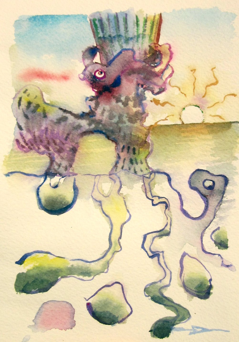
How many eggs does it take to screw in a lightbulb? 11, because one is scrambled. But seriously, this painting was done from a group of doodles, which were assembled into a complete work of art. The art work contains some typical features of this style, including a tree line and a sunset. The eggs are meant to look like eyes in the sky, and the mankind, well, its hidden behind the trees.

Controlling watercolout paint is possible, with a lot of practice. When I first started painting many years ago the paint was an uncontrollable animal, but over the years the animal was tamed. Look in the top part of this painting, there is a series of grey and red streaks on a yellow background. to achieve this, the yellow wash is applied, and at precisely the right time (about 20-40 seconds later depending on relative humidity in the air) you drop in the redish mix which is altzerian crimson and viridian green. Then when that is just about dry you drop in a stronger mix of the same colours with more of the green, and a touch of ultramarine blue. If the timing is perfect then the colours bleed into each other. If too wet it all mixes, if too dry it looks choppy. This whole painting is filled with the same technique, I guess you would call it a triple wet-in-wet. As they say in the e-sports world, good luck and have fun.  

Eggs and Mankind, 11 1/4 x 14.5", cold press watercolour, 2015 (No.1759)

Thursday, August 20, 2015

Gas Pump, NDG, Montreal

Here is a small landscape painting done on location in the neighborhood of NDG, in fact, this is the view from the front of my building! The red-green complimentary colours caught my attention, and so did the strong blue shadow cutting across the foreground towards the left bottom. Painting landscapes on location is tricky, you want to catch all the details, but time constraints mean that you have to pick and choose where to put the details. In this example I spent most of the time on the gas station pump and the light post, and much less time on the surrounding elements. Unfortunately a giant SUV parked in front of the pump during the painting, so I had to make up a few details. That's called artistic license!

5x7" watercolour, 2015

Wednesday, August 19, 2015

Atmosfear


This is a recent painting called Atmosfear, which is a word play on atmosphere. The sky is a twisting mass of forms and figures, culminating in an outstretched hand nearly touching the apex of the long house. The structure looks religious in some ways, but it was not meant to be. I have always enjoyed stained glass as a motif, it appears in dozens of paintings, the most memorable perhaps being 'Escape Route' an old painting about the relationship of art and science (in my brain?).

I am a watercolour painter but I was always inspired by oil painters such as Monet,  Degas, and Dali. The two medias are quite different. Oil paint is generally very bright and 'juicy' with clear lines and definition, watercolour tends to be less intense and more free-flowing. Because I was inspired by oil painters I tried to copy the look and feel of their work using watercolours, which explains part of my style, that is, bright colours and fairly well defined details. But still, I do try to bring in the power of watercolour, which is seen for example in the sky, and in the shimmering reflections on the grassy field in this painting. I tried oil painting once, and produced but one oil painting which I sold to a friend, then gave away the oil paints!

22x15 cold press, watercolour, 2015

The Fish Catchers

An older painting done in the doodleism style, this one depicts fish falling from the sky and some curious onlookers. Instead of signing it where I normally would in the bottom right, the signature is incorporated into a graffiti on the wall, front center. There is a haunting castle in the background, and some marshy areas around. The painting has a futuristic look to it, like the flying fish have taken over or something like that.

The colour palette for this one was  pastel, with a difficult purple-yellow complimentary colour scheme.  In a few spots there is red-green, just above the heads of the two characters, and some blue-orange, in the characters themselves. Purple-yellow schemes are difficult because the yellow is easily over-done, one has to blend it carefully. It also helped to have the cold greens throughout. I do not think consciously about colour very much, when the colours are off, you feel it, when the colours are on, it gives a kind of subliminal satisfaction. Now that would make a good name for a painting!

15x15" cold press, watercolour, 2007

Thursday, August 6, 2015

New Thoughts and Human Adaptations


Human's adapt as do styles adapt. The doodleism style started years ago, I had always made drawings in notebooks and it felt like they were stuck there where nobody could see them. When I found out that my lab books from graduate school were not allowed to leave the lab, it gave me the idea to transform the drawings into larger works of art. The challenge was to make the small doodles into something that was greater than the sum of its parts. This painting shows many of the features that have become typical of the style, a broken horizon, a distant sunset, random foliage, flowing water. The water was a main feature of the work, the river on the right has many creepy crawly things underneath, the lake on the left is meant to be calm and reflective.

Depicting objects underwater is tricky in any media, including watercolour. I started with the outlines of the underwater creatures, making the outlines squiggly and not complete was key in creating the illusion that their shapes are being bent by the rippling water. Then I overlayed the reflections in the rippling river using wet-in-wet techniques. Finally I put on the colours of the creatures, and some light shadowing to indicate that they are sitting on the bottom of a riverbed.

22x30" cold press, watercolour, 2015

Inner Critic

Here is an old painting I did probably back in early 2000's when I was using the capital letters for a signature. The scene is an imaginary art gallery containing paintings and sculptures and a character (Colonel Sanders?) who is criticizing the work by saying "Learn how to paint, because Steve Hanks you ain't!". Steve Hanks is a great watercolour painter, he specializes in photo-realism portraits of women and children, and he wrote an article in a watercolour magazine describing how to paint realistic looking skin tones. That article was very useful, I often employ the technique to depict skin tones, as discussed in previous blogs.

10x30" hot press (300lbs), watercolour, 2001?

Programmed to Paint

"Programmed to Paint" is a recent doodleism-style painting made from the doodles done in my notes taken during work, but I swear I was paying attention at the meetings!The title describes one reason why I paint, because I am programmed to paint. If I do not paint for a few days I feel a kind of sadness or the sense of missing something. Perhaps it is better described as an addiction, when you are missing it you feel bad, when you are having it you are feeling normal. Many people say that art is relaxing, a peaceful hobby, but in fact it is quite agitating at times, like feeding a compulsion. When I finish a painting it is more like, ahhh, okay I am good for a few days now.

The technical idea behind this painting was to use a lot of red. Every component except for the tree tops contains red in the colour mixture. Most of it is done as a single layer of paint with accents on top, except for the shadow on the mountain and the honeycomb-like structure on the bottom right, which are done using glazing techniques that I learned from the great book Everything You Ever Wanted to Know About Watercolour edited by Appellof. Most watercolour artists have been more traditional in their subjects, my work uses very traditional methods but with surrealist themes. I also paint landscapes when opportunity presents.

15 x 22 " cold press, watercolour, 2015

Monday, August 3, 2015

Never Done (No Idea)

Here is another doodleism painting done from notebook doodles. I called this one "Never Done (No Idea)" for two reasons: because this phrase was in the notebooks- probably in reference to a very long meeting that seemed like it would never end, and because I never seem to be done with the doodleism style. An element of this theme is the broken hourglass that is constantly being filled with sand. My goal is to catch up to the doodles... for instance this painting was done recently in 2015, but the doodles are from 2014. I am making doodles faster than I can turn them into works of art!

The compositions of the doodleism paintings are usually created as the painting is being done, rather than being planned in advance. That is why the horizon line is often disjointed- here you can see a mountain and skyline on the left middle, which turns into a desert as you move right, and then becomes split into two, in fact the perspective changes completely at the top right and bottom right. This occurs because I don't plan it in advance, and because the notebook doodles are independent and have their own compositions, so when I mash them together they appear to be disjointed. Anyways, by now the broken horizon is part of the style, just like the random pine tree and shrubberies. The first instance of doodleism was "The Master of the Margin" which sold in early 2000's, and I suppose "Chem 451 Caged Mind, Lab book #1" would be the first doodleism that was a composite of many doodles, done perhaps in the late 90's and still in my collection.


22x30" cold press, watercolour 2015

Kingston, KOA

Camping means different things to different people, in this camp site just north of Kingston, the size of the RV seems to matter a lot. Many of the RV's were lined up in a field for storage, the colours and shapes made for an interesting  composition. This painting is reminiscent of one I did back in the 90's where there were a row of canoes lined up on the shore in Algonquin park.

Painting on location brings about many risks and rewards. The risk is that you have very little time, and need to capture the scene all in one sitting. Unless of course you plan to come back to the same scene as Monet did with some of his landscapes, or if you plan to use photos and finish the work in the studio. Working outdoors allows you to properly see the colours especially in the shadows, and it gives the 'vibe' of the location which ends up filtering into the painting.

5x8" cold press, watercolour, 2015

Wednesday, July 1, 2015

Three Small Doodleism Studies


These three paintings were done on a small format, each one is about the size of a postcard. They are based on some doodles from notebooks that I keep at work, these notebooks are filled with a blend of doodles and work-related information such as lab records, ideas, notes from conferences or faculty meetings. The first doodleism paintings done in the early 2000's were based on doodles from my undergradute class notes (for example the very first one called 'Master of the Margin'), and when those doodles ran out I used drawings from my lab books kept as a graduate student, now it is the notes made at the University as a professor (in the sciences though, not fine arts !). They are all 5x7 " Watercolour, 180lbs cold press, 2015. Here are the other two:


Monday, June 29, 2015

Floral Impressions

This was done some time ago, after I had moved out of the student residence and into a shared house where I had the chance to set up a studio in a spare room, and then later in the basement. The 13 impression are the 12 small paintings-within-the-painting, and then the one in the background which makes a bakers dozen of images. It was a transition time when I was moving away from painting florals which had been the mainstay in my early career, and then moving towards the abstract style. Around this time I also painted 'Art vs. Science' which was perhaps the first real abstract-surrealist painting I did, at least that was the one that got it going. There is a similar painting I did more in green hues, and one in red hues, both with 11 impressions and a clean design:


Together, the paintings completed the impressions series. Looking at them now maybe it would be cool to do some new ones.

22x30" watercolour, 300lbs cold pressed, 1996 (?)

The Joker

A few times music has entered my artwork, usually in the form of lyrics of songs that I was listening to at the time. In this painting I was listening to Nirvana and some Beatles... these bands seems miles apart at least in terms of generation, but both bands sung about similar kinds of angst, and of course, love. The drawing was based on doodles from the little notebooks I bring to meetings, probably from 2014 or so. I have started putting the year on the paintings, the number 2015 shows up near the three legged character at the bottom. The meaning of the painting has something to do with that time in my life when I was painting a lot and doing the graduate degree at Western, or maybe high school, I kind of view myself as the joker because I joked a lot and painted all the time, and played lots of Ultimate frisbee.

22x15" watercolour, cold press, 2015

Wednesday, May 27, 2015

Japanese Garden, São Paulo, Brazil

In São Paulo Brazil there is a large community of people of Japanese descent that live in one part of the city known as a sort of Japanese town that,  like Japan, was very crowded. The side walks were narrow and the streets lined with many shops. I really wanted to make a painting there but it seemed hopeless because there was nowhere to sit, let alone stand, and the views were not all that good from the main street. Finally I ducked down a little alley and there was a small Japanese-style garden with some food stands and souvenirs for sale. There was an amazing coy pond with large flat rocks next to it where I could sit. That is where I made this painting, which shows part of the pond, an umbrella, flowers, trees, and a twisting staircase.

Shadows contain light and colour. A common mistake among amateurs is to use black for a shadow when in fact a dark blue, brown or green could be used. In this example the shadow on the umbrella in the center of the painting has deep red/crimson shadows. The stairs and the fish also have warm purples and oranges for shadows. This is the way to create realistic light-filled shadows. The impressionists did this all the time. Afterwards, the fauvists started using black for shadows just to be different. Rules are meant to be broken in art.

5x7" Watercolour, 2014

Tuesday, May 26, 2015

São Paulo, Rooftop View, Brazil

São Paulo is a dense city filled with buildings of all shapes and sizes. Small brick shacks along side of towering apartment buildings, as seen in this view out of a second floor window. There were fireworks going off periodically while I painted this because it was close to new years.

Yellow plaster (or brick) is quite difficult to depict in a painting, too much yellow and it looks fake, too little and it looks muddy. There are two yellow walls in this painting, one in the foreground which was done in a single layer, and one up in the midground which was done in two layers (warm purple underneath, yellow on top). The key to creating natural looking yellow is to mix purple or green first, and then add in a bit of yellow.

5x7", Watercolour, 2014

Monday, May 25, 2015

São Paulo, Downtown, Brazil

While in downtown São Paulo I made several paintings amid the bustling city noise, pedestrians, buses, motorcycles, etc. There was even a spiritual marching band that came down the sidewalk complete with chanting monks and string guitars. The biggest challenge perhaps was the lack of anywhere to sit down; to do this painting I stood up the whole time! It is the first time in memory that I painted on location standing up. There was a store security guard who kept coming by and checking on me.  The street view is St. Paulista, right in the heart of the city, looking towards the south.

I have been signing my paintings with the 'PDT' scribble for a long time, usually using blue paint. In this case I used green paint in the spirit of Brazil. The green in the flag is also exaggerated in order to really pop off the page. To create this sensational green,  start with a layer of yellow paint, let it dry, and then apply a layer of green on top.

2014, Watercolour, 5.5 x 11"

Saturday, May 23, 2015

Instituto Butantan, São Paulo, Brazil

This painting was done at the Instituto Butantan which is near São Paulo University. The building is a library but it was closed the day we were there. It was a very hot and sunny day, in fact I had to sit in the shade to make this painting. When it is winter in Canada it is actually summer in Brazil! 
One advantage to painting as compared to taking a photo is that the artist can remove unwanted items. In this case there were a lot more trees but they were blocking the building, in particular the windows which I wanted to feature. Just two big trees seemed to get the feeling of some foliage without overdoing it. To create a focal point I made more detail on the upper left part of the main building, while the rest of the building is done with relatively less detail. 

Dec. 2014, Watercolour,  9 x 11"