Friday, December 26, 2008

Downtown London Dundas Street, Ontario, Canada

I began doing urban landscapes in London Ontario, the first of which was done in frigid temperatures sometime in 1996. This scene was done some years later, perhaps on the corner of Richmond and Dundas looking east. The city of London was built a hundred years ago or more, and the old fashioned architecture is still seen in the rectangular false-front brick buildings with cast iron exterior fire-escapes and deco trim on the angular rooflines. Building booms in the 60's-80's brought on the steel and concrete sky-scrapers, which are depicted in this work-towering over the old 3-story brick buildings. Where are the people and the cars? The glib answer is that nobody lives in London, or at least bothers to go downtown, but the real answer is that painting people and cars on location is hard! For one thing they move, and for another people and cars have tremendous detail that could take hours to capture. It may have been possible in this painting to put some people walking on the sidewalk by using thick, dark colours which would overlay on the heavy washes that are already there. For some good examples of that see the Montreal Jazz fest paintings posted this summer. 

Downtown London Dundas Street, watercolour 7 x 10" cold press, 2001 (No. 0436)

Thursday, December 25, 2008

Spanky's Fantastic House

For lack of a better name I called this one 'Spanky's Fantastic House' as it was this painting that inspired 'Lab Book #6, Spanky's Fantastic Cathedral". Here, in the distance lies a realistic cathedral reminiscent of the one appearing in LB#6, while in the foreground is a romanesque house and a garden filled with abstract statues. The viewer is drawn into the middle ground by a walkway, where their eye can wander into the flamingo-pink sky streaked with blue cotton-candy clouds (that should be an ice cream flavor?). The house has a heavy dark outline which makes it stand out from the rest of the drawing and gives a surrealism feel to the piece. The dark outline was an innovation I first used in "Birdman" using Chinese black ink, although here the outline is done with paint, and was applied over top of the finished work. Sometimes outlines can be used as an effect, while other times the outlines just need to disappear. In comic book format, or some movies (A Scanner Darkly) outlines are used to create the character, convey emotions, and define the form. In fine art, outlines are often meant to be unseen. Traditional watercolour painting begins with a light pencil drawing, which can be (gently) erased when the paint dries. I prefer to use paint for outlines, using light greys or other neutral colours, which mostly dissapear as you apply washes over top. In the doodle technique I make the initial paint outlines heavier, so they show through in the final work, helping to convey the detail and the energy 

Spanky's Fantastic House, watercolour 16 x 12" hot press, 2003 (No. 1782)

Wednesday, December 24, 2008

London Rooftops, London Ontario, Canada

Reminiscent of the Notre Dame Cathedral painting, this painting captures the detailed architecture of the cathedral in downtown London Ontario. Mind you, the cathedral in London Ontario is not quite as spectacular as the little one in Paris, but it still stands out against the surrounding residential buildings. I had wanted to paint this scene for years but could never find the right angle. Finally one day I was walking around and found a parking lot that had a great site line to the cathedral and so I took a photo, and also did a small location painting to get the colours. This work is a composite of the photo and the location painting.

Painting green is always tricky for the beginner painter, regardless of the medium. In this painting there are several examples of greens, the stairs in the foreground (viridian+french ultramarine+a spot of crimson red), the lawn in front of the house (winsor yellow+viridian+burnt sienna), the roof of the house (emerald green+rose madder genuine), the spires (emerald plus viridian, with some crimson red). Notice how each combination contains some warm colours to balance the green, this is important to achieve realistic greens. Another factor that makes the greens really sing is the overall colour scheme. Here, the reddish bricks of the cathedral provide a good complementary scheme. By the way, you may wonder why I left the ugly telephone wires in; for one thing, it helps fill the composition in the top right sky, but they also give a good sense of the environment....beautiful cathedral in an otherwise.... hansom? city.

11 x 15" hot press. watercolour, 2004

Monday, December 22, 2008

Self Portrait (Selfie)

Self portraits have never really been my thing, and with results like this you can probably see why. The painting was based on a photo I took by holding the camera two feet in front of my face while I made a funny face. The painting captures the shimmering light effect and dark shadows that the flash produced, as well as the warped 'fish eye' from the lens. Does it look like me? Sort of. But it looks more like an intoxicated mannequin of an Irishman stuck in a bad horror movie.... To create realistic skin tones I use a strategy based on some advice from a magazine article written by the master of painting watercolour skin tones, Steve Hanks. His advice was to start with a layer of light blue and purples, and build layers of orange/peach tones on top. In this way, you avoid creating fake looking lobster red or canary yellow skin. Another aspect of keeping the skin tone real is to think about the reflected light, in this work the flash created white highlights on the front, while the dark surroundings (the photo was taken indoors at night) created bluish reflections on my temple.

Self Portrait (Selfie), watercolour 7.5 x11" cold press, 1999 (No. 1492)

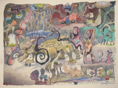
Lab Book #14, Part 1: The Lion Tamer (Three Ringed Flying Circus on Wheels)


The concept behind Lab Book #14, is to have a group of paintings centered around the theme of a (surrealistic) circus, with the drawings based on lab notes from 2006-2007. Referring to an earlier painting I did of the same title, "Three Wheeled Flying Circus on Wheels" is the name for the entire group of paintings. In "Pt 1. The Lion Tamer", an alien-like golden beast is under the whip of a new-age character airing out her armpit while a crowd of ghosts looks on. In the background a sports car sits behind a pillar which goes up and off the picture plane. The scene is set inside of a circus tent (a door opens up to the blue sky on the left) that has the appearance of an underground cavern. 

I chose to use hot press paper for this series, just to mix things up a bit and see what is really different about this type of paper. I almost always used cold press, which is rougher and does not absorb paint as readily, which allows you to flow the colours together and creates some random shapes and patterns that often add to the texture and energy of the work. With hot press paper, the paint seems to get absorbed quickly, making it difficult to make colours flow together or create any randomness. Overall, the hot press allows a greater degree of control over what you do, which seems to suit the doodle style quite well. I have finished the drawing part of the next installment, "Pt.2 the Tight Rope Walker", and will start to fill in the colours soon. 

Lab Book #14, Part 1 The Lion Tamer: watercolour 12 x 16", hot press, 2008 (No. 1800)

Thursday, December 18, 2008

Lab Book #1; C451, Caged Mind

This painting was an early example of the developing doodleism concept. Most of the material came from doodles done in the margins of my undergraduate notes from my chemistry 451 course. Perhaps the very first painting where I used a lab note for a painting was 'Master of the Margin' which was sold at the Artisan's alley. I have (film) photo of it remaining and would like to scan it and post it in the future. In 'Caged Mind' a funny looking man with a goatee (bottom right) looks onwards into a tangle of imagery including a whale, a fish net, a man holding a cage, a trivial pursuit piece....but where's Waldo? Looking back on the doodle pieces I see a slow change in the underlying theme. In 'caged mind', the composition is like an impenetrable net, challenging the viewer to cross it. The doodle paintings has similar themes initially, until 'Lab Book #6 Spanky's fantastic Cathedral' which invited viewers to stroll down the path and enter the abstracted building. In Lab Book #13 (painted in 2007) there is an inviting beach, and in the most recent installment, Lab Book #14, Three Ringed Flying Circus on Wheels (Pt.1), the Lion Tamer, the viewer is placed inside a circus tent witness to some pretty wild entertainment spectacles (to post soon). I plan to make several parts to the Three Ring concept, thus creating a series within the series! In retrospect, I decided to assign this work to the Lab Book Series, giving it Lab Book# 1 designation. 

Lab Book #1; C451 Caged Mind, watercolour 11 x 15", hot press, 2003 (No. 1415)

Wednesday, December 17, 2008

A Man Opens His Umbrella

Sequel to 'A Man Loosing His Umbrella' (posted 5/14/08), this work follows the trials and tribulations of modern man and his umbrella. This time he finds himself on a warm and sunny beach (with all the snow here in Montreal right now I wonder what that feels like) wearing a leather jacket and a flatcap, in the company of a scurrying crab. The umbrella opens up into a flat abstract pattern (a gateway to heaven surrounded by curtains?). The umbrella rod is crooked because I put the rod in last, and found that the handle did not align properly with the umbrella. Kind of like when they finished the railroad and the two sides were off by an inch. From a technical standpoint this was a gut-wrenching painting to create because I had to paint the beach scene first, and then overlay the dark figure of the man, which could not be changed or adjusted due to the dark, staining pigments . Luckily is came out okay the first try, although I had a lot of trouble with the hand and had to do some heavy lifting to correct it. The other notable feature (due to error), is that I originally started the umbrella shape and did not like it, so I turned the painting upside-down and started again. The evidence is seen in the sand on the bottom left where you can still see the faint outline of the original umbrella shape. I liked the star-effect in the sand anyways, so did not try to fix it. 

A Man Opens His Umbrella, watercolour 15 x 22" cold press, 2008 (No. 1937)

Wednesday, December 10, 2008

Science vs. Art

On the topic of balancing art and science, I found this painting, done in 1995 in the basement of the PaperBirch Street house that I was living in for that year, which shows you how I felt about the situation at the time. There are two creepy ghouls facing off against each other, but they are at the same time connected at the waist. Intertwined is a candle, burning at both ends. It is interesting as I make these posts to compare how my style, and ideas have changed over a decade. In escape route (yesterdays post) the colours are lighter in spirit, and the concept of balancing art and science is much less conflict than seen in 'Art vs Science'. Maybe in another decade I should try another version. Also of note, I think this was the first surrealism I ever did. In 'Art vs. Science' I was experimenting with a technique called glazing. The black colour you see in the background is actually three layers of unmixed paint, red, green, an blue. The layers were very bright, and were applied one at a time allowing time to dry. When finished, the colours optically mix, creating the nearly black appearance. The characters were created in a similar way, although by layering orange and green. The bright highlights were created by lifting the dark colours off with a clean damp brush. To allow all that complicated stuff I used a 300 lb press paper which is a really thick paper that does not buckle much, and can hold a lot of paint on its surface.

 Science vs. Art, watercolour 5 x 8" 300lb cold press, 1995 (No. 1686)

Tuesday, December 9, 2008

Escape Route

For me science and art provides a good balance. When I do art I forget about science, and when I do science I doodle all the time which gives me lots of ideas for the art. Okay, I guess it is a bit of a lop-sided balance. In this painting I tried to depict that balance, portraying 'art' as a boardwalk-gallery with plants, and 'science' as the mechanical guts underneath. A staircase connects the two parts. My art dealer at the time (from Artisan's Alley in London Ontario Canada) suggested the title, which is very fitting and indicates that the purpose of the art is to act as an escape. The other notable feature of this painting, is that I do believe it is the first time I painted stained glass (see under the boardwalk towards the right. There is a lot of detail in this painting and yet it all seems to flow together. To help unify the details I made sure that all of the pieces of the 'science' were tinted with purple. In this way the details seem to fit together, and the viewer's eye is more comfortable. Similarly, the art gallery part is tied together with yellow oranges. The cool colours of the science also contrast the warm colors of the art, which further intensifies the idea that the two halves are different. By using colour in this way, you can make the idea of your painting much stronger. 

Escape Route, watercolour 11 x 15" hot press, 2003 (No. 1423)

Wednesday, December 3, 2008

Drumheller Rivers, Alberta, Canada

Here is a painting I did from a photograph my family took while on vacation out west years ago, looking down a valley in Drumheller Alberta, famous for its dinosaur bones and great views. Before I started painting on location (actually doing the painting outdoors while at the scene) I used to practice by painting from photo. When I got some confidence with pieces like this, I finally took to the outdoors sometime in the mid 90's. A couple of other things helped me along the way, one was Zoltan Szabo's book called 'painting little landscapes', and the popular text 'Everything you need to know about watercolour' , and the other helpful thing was getting artist quality windsor newton paints instead of the student quality, which made the colours a lot brighter. I would have to thank my mother for these things, and more so because she enrolled me in a watercolour class in 1989 that kicked off my interest in the first place. When painting from photo there are several things to consider in order to come up with a realistic looking finished product. One thing is that mountains in the distance usually loose their colour in a photo. In reality, a mountain in the distance has a light blue/purple tinge to it. Knowing this, I made sure the painting reflected that, even though the photo did not have the teal tones you see in the final work. I also took some liberty depicting the river, in order to emphasize the clear reflection. To paint the reflection I laid down a blue wash, blended it with clean water while the blue wash was still wet, and let it dry. Then I put on the rest of the stuff using mostly drybrush techniques. 

Drumheller Rivers, watercolour 8 x 10" cold press (300lb), 1993 (No. 0042)

Monday, December 1, 2008

Lab Book #12 Archi-doodle City (W/E), updated photo

Here is the 9th painting in the Lab Book series, which was done in two parts called "Archi-doodle City W" (top panel) and "Archi-doodle City E" (bottom panel). The two sides are part of a single design, which depicts a sprawling European-style city filled with doodle-inspired buildings and strange creatures. The two paintings are complete works on their own, meant to be viewed side by side. The majority of the design came from lab notes, although some of the normal looking building interspersed throughout the painting were taken from a postcard from Lyon France.

This was by far the hardest of the lab book series. I was trying to pack in as many doodles as I could so that I could get to the end of all of the lab notebooks I have, but I could only make it to my lab notes from 2006. And in the last six months or so I have amassed another few books. At any rate, the doodles in this work were densely packed into an intricate, 3-D design with many overlapping and interweaving elements. Somewhere in the middle of filling in the colours and shadows of the west side, I felt great despair that the work would never be finished, but after chipping away at it 20 minutes or n hour at a time, somehow it got done! While painting I listened to some classic/psychedelic rock, using some of the song names and lyrics in the design (see the inscriptions on the roofs on both segments and the train on the east segment).

Lab Book #12 Archi-doodle City (W), 11 x 22", cold press 2008 (No. 2000)

Lab Book #12 Archi-doodle City (E), 11 x 22", cold press 2008 (No. 2001)