Wednesday, September 30, 2020

Loyola Campus, NDG, Yellow Tree in Rain


This painting is one of those lightning in a bottle paintings, you lay it down with no time to spare and it really captures the energy of the moment. I went to campus early this morning...well its yesterday now that I see the time, and the chemical stores told me to wait 15 minutes for the chemical pickup. Luckily I had my paint set with me, unluckily it started to rain. I knew from experience that light rain can actually produce a special effect of rain on the painting. The blurry background was an accident, I just ran out of time and added the details, which created an almost photographic effect! 

Loyola Campus, NDG, Yellow Tree in Rain, 5 x 7" (painting is on half of the sheet, I ran out of cut paper again). watercolour (with added rain), cold press ( I was colder), September (I think), 2020 (not for much longer). 


Monday, September 28, 2020

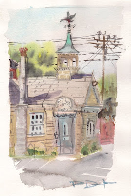
Fire Department Tower at Sunset, NDG


 Opportunity knocked today, after seemingly endless zoom meetings I got out before sunset to do this painting of the local fire precinct tower. The view is from a side street, so the building in the left is an apartment, and the right is a house. I only had about 20 minutes to paint this before the sun went down so I worked fast and focused on colours and shaped rather than too much detail. The style reminds me of the older paintings from the later 90's such as my trip to France and Spain. It has been interesting as I photograph and catalogue my oeuvre to see the growth over the years. Dad just photographed their collection of my art (about 40 pieces) and provided a list of sizes and dates which I will add to the catalogue.There is a column for 'owner' so their name will appear for those. I have to try and remember all the ones I sold and to whom. Somewhere I have a list of that too. 

Fire Department Tower at Sunset, NDG , 5 x 8" cold press, watercolour, September 2020

Sunday, September 27, 2020

Sunday Painting Trip, Lachine


Just about 20 minutes bike ride from NDG is the beginnings of the Lachine canal. There is a short stretch of it that looks just like Amsterdam complete with bridges, houses, and little docks with boats here and there. This one is just where the canal turns, in the background you can see the dome of College St. Anne. The trees are just starting to turn colour now, they are a blend of yellow, orange and green. To capture that rusty orange colour I mixed some very bright yellow and orange paint with umber, which is mud brown! Umber is the least expensive paint in my collection but it is turning out to be the most useful. 

Lachine Canal with Bike/Pedestrian Bridge, 5 x 7" hot press, watercolour, September 2020 


I could have painted all day at the canal, but I wanted to save something for another trip. So I headed out to the Musee Plein Air de Lachine, a breakwater peninsula that is a family friendly park with dozens of large sculptures. I found a relatively secluded and quiet spot to sit on the shore of the St. Lawrence River, with a great view of Mercier bridge. It wasn't quiet or secluded for long though. Some poor fellow floated by in the river clinging to a turned-over windsurf board, and then a police car roared up full siren and parked right behind me. The officer shouted over her loudspeaker at the man, she was telling him to get to a nearby boat. The commotion attracted a crowd of people, kids yelling, dog barking, people filming with smart phones. The guy in the water was waving and thumbs up like he was okay. Finally a rescue boat got the guy and the crowd dispersed. Luckily I had been wearing my mask the whole time.

St. Lawrence River with view of Mercier Bridge, 5 x 7" hot press, watercolour, September 2020

Saturday, September 26, 2020

Saturday Painting Trip, Ville St. Henri


 Between the highway and the canal lies a post-industrial neighborhood called Ville Saint-Henri. It was once bustling with factories, warehouses, and manufacturing plants, but now it is mostly condos, triplexes and cool hole-in-the-wall restaurants. I noticed right away that the real hipsters live there, like literally in converted factories. This house was once part of a factory but an old hippie fellow turned it into a house, I saw home come out to water the sunflower (not in the painting). I liked the contrast between this industrial home buried in vines and trees with the distant view of Mont Royale where all the mansions have a view of Montreal. I'm sure for the old hippie he would much rather be here! The road went steeply under the train bridge creating a triangle composition on the bottom. 

Hippie House, Ville St. Henri, 6.5 x 7" cold press, watercolour, Sept. 2020


Not far from that scene I found a green alley, that is where the city provides funding and support for local people to turn their alley way into a green park and walking path. This one had many large stones, trees, and decorative grass. The building is what really grabbed my attention, it was a neutralized warm yellow and rust-red, with all kind of crooked lines. The building was as crooked as you see in the painting!

Green Alley, Yellow and Rust House, 5 x 7" hot press, watercolour, Sept. 2020


Turning another corner, I found a long, almost 5 or 6 blocks, of a road that they converted into more green space, rows of trees, benches and grass lined the walkways. There were many birds and squirrels among the forested laneway. This scene caught the corner of my eye and I braked, found a bench and made this painting. It was an easy composition because this is exactly how it was, minus a few telephone poles and wired. The open space had been converted into what appears to be a pear orchard. I used a lot of neutral tones here by adding carbon black, water, and colour in the right proportions. 

Pink Houses Atop the Old Factory, with Pear Orchard, 8 x 10" cold press, watercolour, Sept. 2020


On the way back I rode behind the grocery store parking lot area and found a great view of downtown Montreal from just behind the elevated highway. The highway was still shut off for construction so it was completely silent, I could almost hear a pin drop! The entire area had been planted with local plants and trees creating a kind of oasis in the parking lot. Hey, good name for the painting!

 City View, Oasis in the Parking Lot, 6.5 x 7" cold press, watercolour, Sept. 2020


 There was one more painting I did of the pink houses atop the old factory from the viewpoint of an empty lot, 5 x 7" hot press, watercolour, Sept. 2020

Friday, September 25, 2020

Palette Cleanser 34


Going through Handprint.com I found an article on the importance of value, that is, the lightness or darkness of the painting. You can think of this as black and white photography, where only shades of grey are used to create a visual image. The interesting point was that even a colour painting is built up from value contrasts. To make the point, MacEvoy showed a Hopper oil painting with all the colour removed, and it still looked great. Then he removed all the values, and what remained was incomprehensible. Why is this important to an artist? Because artists tend to focus a lot on colour, its what comes out of the tube, its what makes us excited. In fact paintings are mostly built from values!

In the palette cleanser I tested the idea by creating a colour-inspired painting on the left, and a value-inspired painting on the right of the paper. For the colour painting I started with an outline and then coloured it in, like paint by numbers. On the value painting I did the outline in pink, filled in the whole thing with shades of carbon black, then added a tiny bit of thin colour washes. Both sides have visual impact but feel much different, the left feels like a pizza exploded in the microwave, the right feels like a moon base. 

I will need to think about this some more. Values are the cake, colours are the icing on the cake. 

Palette Cleanse 34, 9 x 12" watercolour paper, watercolour, September2020


Green Tree, Loyola Campus


Recently the Loyola campus renovated the unsightly parking lot to create a green, pedestrian friendly area with several benches and sustainable plants. As I sat painting here a fellow talked to me, from a safe distance, and it turned out he was an architect who designed the space with the team. He seemed pleased that a painter was drawn to the space, I appreciated having a place to sit. For my students it will be much better since they used to have to walk across this parking lot from the bus stop, now they have a sidewalk and some place to sit. The scene was overcast, making it grey and low contrast. When the sun is out this tree has an incredible hue of green, I will try to go back before it changes. 

Green Tree, Loyola Campus. 5 x 7" hot press, watercolour, Sept. 2020

Wednesday, September 23, 2020

1993: The Flower (and Photo) Painter


When I started painting watercolours in 1989 I was focusing on florals and imaginary landscapes, which persisted for the next few years. I was doing okay, selling the odd painting here and there to friends and family. In 1992 I did a pivotal series of Studies of group of Seven plus Tom Thompson paintings that began an initiative to do landscape painting. The idea of landscapes had interested me from the get go, probably influenced by the many camping trips we did as a family when I was younger. 1993 saw a steep increase in productivity, I have catalogued 80 paintings from that year, which was more that I had painted in all of the previous years. The work continued along the flower theme like in this example, which combined flowers from a source book, and imagination. I posted previously about some of the other flower paintings from this era

Old Fashioned Yellow Rose    11 x 15" watercolour paper,  1993 (No. 0116)


I had also started taking a lot of photos with the old film camera, including on a camping trip in 1993 with my best friend Chris. After the trip I went about making paintings from these photos, including this interesting scene of canoes and row boats at the dock. It is probably the main launching point from the highway, at Canoe Lake.

At the Docks, Algonquin park    12 x 16"   cold press 140lb    1993(No. 0133)


Bolton was and still is a major theme of my landscape paintings, there are quite a few in the catalogue, over 100 I suppose. In this painting I used a photograph to recreate a typical scene on the backroads of Bolton and surrounding areas. The real painting is brighter and more colourful I will try to get a better picture on a sunny day. I was using mostly clean, transparent paints back then, and the paintings looked light and fast.

Eighth Line Stormy Field    12 x 16"    hot press, watercolour, 1993 (No. 0021)


On the back of that one, I did a half page study of our house cat at the time Tabby, doing what Tabby did best, lounging in the sun! Otherwise he was asking for food or killing the ET doll for the thousandth time. This brown 'suede' style chair is also a relic, it is not longer in the house. I noticed how good the browns were in this painting, I didn't have any earth colours, so it was a mix of aureolin, alizarin, and viridian with some ultramarine. In retrospect a good raw umber would have been perfect.

Sleeping Tabby Study    12 x 16"    hot press, watercolour,    1993 (No. 0021B)

There are a few other blogs from this era, including the Bolton grand tourMom and Dad's boat, Snow Scenes, Valley View, Water Tower Fall, and Drumheller Alberta.


Tuesday, September 22, 2020

Sunset at Baseball Park, NDG


Catching the last bit of sun for the day, I ran out to the baseball park to make a few paintings. I had been at home all day, and felt like it was time to cover all the bases. Who knows? I could paint a diamond in the rough. Kidding aside, the trees were just starting to change colour, green to orange, and the sun setting cast an amber glow all over. I made good use of benzimida orange (PO36) and isoindo yellow (PY110) tints, they are orange and warm yellow paints that I discovered this year. Great for making olive-greens too. I also used perylene green (PBk31) in the shadow parts of trees. 

Baseball Diamond, Loyola Park, NDG, 6.5 x 7.5", cold press, watercolour, September 2020 


The second painting I made was done on the same spot, I barely paused because the sun would be down in about 10 minutes. There was no time to fuss about or let things dry! I was wearing a baseball cap which shielded my eyes against the setting sun, I only peeked at it briefly to see that it was a very bright tangerine. The painting shows the sun as much darker value, but I wanted it that way so as to look like Monet's Impression of a Sunrise. It looks like a solar eclipse with mars or something! The poles are the giant lights that illuminate the playing surface, they were off at the time.

Impression of a Sunset, Loyola Park, NDG, 6.5 x 7.5", cold press, watercolour, September 2020


Monday, September 21, 2020

Palette Cleanser 33


 Bugles in the sky? After my weekend painting trip the palette was pretty dirty, lots of grey green and brown was used. I brought raw sienna (a toasty beige) and umber (mud) paint on my palette last weekend, they are very useful colours for landscapes. I also had the Schmincke quinacridone violet (PV55) it is a truly great paint for making silvery/grey shadows. In this painting I used colours just about pure, with the caveat that they were all a little dirty from the painting trip. Having some 'mud' in the mixes actually serves a purpose, when a colour is straight from the tube it can appear very bright and artificial. With a touch of grey added, the colour is more subdued and useful. In the past I kept my palette very dirty which helped subdue the colours. However, in retrospect my old paintings did tend to be less colourful than this years batch. You live you learn! 

Palette Cleanser 33, 9 x 12" watercolour paper, watercolour, September 2020


Amsterdam Trip City Views, The Netherlands


Recently I went to Amsterdam with Cilei for a conference and vacation, this was before the pandemic issues and conferences were popular. Now that I think about it, conferences probably used to spread viruses as much as ever, but there was no COVID-19 to draw our attention. Maybe we will all be safer against other viruses like the flu. The painting shows Hotel Casa on the right where we stayed, it is located in the south west part of the city but like everywhere in Amsterdam it is well connected by tramway, metro and bike paths. The colour of the hotel was tough to mix; I found the colour by trial and error. In retrospect, it is a desturated low value turquoise, but at the time I wouldn't have known that. Hotel Casa 5.5 x 7.5" hot press, watercolour, August 2018


Going into the touristy areas was a challenge, there are throngs of tourists everywhere crowding the sidewalks and shops. I did not include them in this painting in order to focus on the shops and architecture. This was a typical set of buildings with a souvenir shop on ground level, and crooked windows on the top floors. The X shape in the windows is a sort of Amstersdam flag, a triple X logo.

Tourist Shop, 5.5 x 7.5" hot press, watercolour, August 2018


This building is some kind of museum or theater called the Eye, it is visible across a very large canal from the back of the famous Centraal station. The iron girder beam is holding up a huge covering that keeps pedestrians covered when it rains (which it dos a lot there). I caught the tiniest portion of a bike tire in the bottom left of the scene. 

View of the Eye, 5.5 x 7.5" hot press, watercolour, August 2018

 I did a few other paintings that I wont show on the blog, including a garden near the conference center, the conference building, and another scene of Centraal station. 


Sunday, September 20, 2020

Amsterdam Trip, Water Views, The Netherlands


In Amsterdam the canal system runs throughout the entire city so you are never far from water. This scene is actually along the bank of the Amstel river where many house boats, more like floating cottages, are situated. The roof of the closest floating house was covered in grass and flowers, and a bird landing there as I painted. This one was done later in the trip so I had a better sense of how to paint the water. I used a layer of pale purple and overlaid greens purples and browns in short brushstrokes.

 Amstel River Floating Houses, 5.5 x 7.5" hot press, watercolour, August 2018


This scene was of one of the many canals that feeds into the Amstel river. The apartment building was white plaster but covered in a thin layer of moss giving it a green glow. The rest of the scene was in purples and yellows. The water was done using a similar style to the others, with an under-painting and short colourful brushstrokes to create the illusion of ripples and reflections.

5.5 x 7.5" hot press, watercolour, August 2018


This looks like a pond but it is the terminus of one of the canals, a great square shaped artificial lake of sorts right next to the conference center (RAI). There were ducks swimming about, which I tried to capture with an over painting technique. Perhaps inspired by Van Gogh, I used a wide variety of brushstrokes here to create different textures in each element. It kind of looks like an oil painting. 

5.5 x 7.5" hot press, watercolour, August 2018

Preparations for Amsterdam trip (2018!)


Before heading out to Amsterdam for the conference (and our short vacation) I went around town practicing a few landscapes in town. It had been a while since I made location paintings and I wanted to test out my setup and get a bit of practice in. If you haven't painted in awhile it takes a few days to get in the groove again, so my hope was to arrive on site already 'in the groove'. These buildings are on Somerled Av. near our apartment, the one on the left is a Jean Coutu pharmacy. The building look like they are falling over, which was not intentional, ironically many of the buildings in Amsterdam also looked like they were falling over as they are all built in sand using deep piles. 

Apartment and pharmacy on Somerled Avenue, 5 x 7" hot press, watercolour, August 2018


Luckily enough, there were a few flower planters with sunflowers, what better way to prepare for a painting trip. This one was near the end of its growth and the flowers were twisted, browned and falling off. I tried to channel my inner Van Gogh for this one! Introducing the background apartment was extremely difficult, the window details are hard enough, when inserted between flowers and leaves it was even harder, and the cool humid weather made the paint run a bit. None the less it does the job of portraying an urban flower garden.  

Urban Sunflowers Last Blooms on Somerled Avenue, 5 x 7" hot press, watercolour, August 2018


This was another urban flower planter with giant sunflowers. This year (2020) they didn't plant anything because of the pandemic lock-down, but I noticed that sunflowers were growing in and around the planters anyways! In the background barely visible is the Metro grocery store, the paint was really running around with the humidity and failing sunlight. I posted this one before

 Urban Sunflowers on Somerled Avenue, 5 x 7" hot press, watercolour, August 2018


Saturday, September 19, 2020

Saturday Painting Trip: Parc Jean-Drapeau and Verdun


Going for a bike today was a real pleasure- brand new bike with all the gears and brakes working perfectly, and a bright sunny, albeit chilly, September day. I made it out to Saint Helen's Island which contains Jean-Drapeau Park where they used to hold summer music concerts. There was a small live music show there today, I could here the sounds echoing from somewhere. They made numerous renovations to the area, interlocking paving stones, wood benches, and flower gardens now surround the entire metro station. Jean-Drapeau metro is part of the yellow line, which begins at Berri-Uquam, stops on the island (seen in this painting), and terminates at Longueuil–Université-de-Sherbrooke station on the south shore. I couldn't resist putting the handlebars of my new bike in the painting. The grip, components, and headset are all jet black. The metal mesh dome with flag in the background is from Expo 67 the inaugural event held on this human-made island wonder. 

8 x 10" cold press, watercolour, September, 2020


 In Verdun I found an interesting set of buildings that looks a lot like an old military barracks, I saw similar architecture at a London Ontario barracks. The use of these buldings is shrouded in mystery, no sign, no hints, but on Google map it is listed as a City waterworks, which makes sense considering it is right next to the aqueduct.Getting the brick colour correct was key to this painting (and keeping the lines straight!). I used a complex mix of raw sienna, benzimida orange, and small amounts of black paint, then diluted. It came out looking exactly like what I saw! This year I have learned how to recognize three properties of colour namely hue, chroma, and value. With this knowledge I am also learning how to replicate those properties with paint, all thanks to Handprint.com (MacEvoy). 

Verdun 10, 6.5 x 7" cold press, watercolour, September 2020


On the way back to home I rode along the bike path that runs through the north part of Verdun near the aqueduct. This building caught my eye and I slammed on the brakes. Once the sun came out from over a cloud, I set up my gear and started making the outline. Sure enough, a giant fire truck showed up and parked in front of the building blocking the view for about 10 minutes. At first I thought this building was lonely but then I realized it was a very social building, it had trucks visiting it, and a painter painting it! The red, blue, yellow elements were really there, they play well against all the other greys. I intentionally painted the back-lit clouds this way for maximum intensity. It is on Bannantyne Avenue and Dupuis street.

Verdun 11, 6.5 x 7" cold press, watercolour, September 2020


I was surprised to find yet another blue-topped Verdun borough sign, this one near Jolicoeur Bridge. They had a flower/garden sign depicting cyclists and starbursts, the rest of the scene was framed in blue pine and deciduous trees. The sun was low, which cast an amber glow on the scene. This makes 4 paintings of borough signs, will I find anymore of them? 

Verdun 12, 6.5 x 7" cold press, watercolour, September 2020


Australia, World Inspired Landscape


 World traveling was definitely off the itinerary for most of 2020 due to the lock-down situation, so I developed an idea to explore the world through books and internet. Actually, this series began before the lock-down, I was keen on doing landscape paintings of Japan and used google earth to explore locations there virtually. Due to copyright rules on Google I decided not to use source material directly, instead I brought together a variety of sources and came up with a highly original design based on visual and thematic ideas. In this scene, Australia is depicted almost like wallpaper, with repetitive elements. There are 9 green trees, 9 burnt trees, 9 piles of rocks, 3 swamps, 3 snakes, 27 tufts of grass, 1 road, 1 kangaroo, and 1 crocodile hiding. What stuck me about Australia was the huge variety of landscape, the design tries to capture many such elements from the interior. I decided not to show beaches or reefs because many other countries are defined by those features and I plan to do one such painting for each country. Australia was the last painting I needed to complete countries with the letter A (use blog page or labels to see the others). Next up, countries that start with the letter B, do you know what the first one will be? 

Australia, World Inspired Landscape, 12 x 12" cold press, watercolour, September 2020

Friday, September 18, 2020

1989: The Beginner Painter


Big hair bands, booming economy, wallpaper, things that were in, in the 80's. My mom signed me up for a watercolour course after having done some drawing lessons back in 85. Sonya Vernot was the teacher, she got us started by bringing in a vase of flowers, and after that, some other still life items like baskets and fruit. Flower painting would occupy most of my output until 1993 when I started paintings landscapes from photos. This painting was likely done from my imagination, I seemed content to invent as many flowers as I could! Two Yellow Daisies, 9 x 12" watercolour paper, watercolour 1989 (No. 0050)


Here is another one, even more inventive than the last. This is a really far-out flower, with a beaker-like vase. Starting around 1991 I would rely more on source material like flower books and calendars of flower paintings, but at this time it was from imagination. These were done outside of the course. I recently gave names and code numbers to all the old paintings for my catalogue. There were about 15 paintings from 1989, although I may have sold a few back in the day. Purple Space Flower, 9 x 12" watercolour paper, watercolour 1989 (No. 0092)


It was a sign of things to come, during the lessons with Vernot and the group I got bored with the flowers and started looking out the window. I saw the top of a tree, and did this imaginary scene based on the real life tree. In some ways this would be my first landscape painting. Sonya took some time to show me how to properly paint a sky and use wet and wet to make the skyline, there are a few of those practice paintings. Sepia Tree and Hills 9 x 12" watercolour paper, watercolour 1989 (No. 0093)

A few others I already blogged about can be seen in the links here, here, and here.


Glasgow, Scotland last batch from trip


 Being in Glasgow was a real treat, I had never been in the United Kingdom before so it was all new, the money looked different and the accents were very thick. I tried to make a painting of the famous landscape but there were many highways and difficult areas to walk so I settled for this view from a parking lot in the Maryhill area. You get a sense of the lush countryside views. 5.5x7.5" cold press, watercolour, Maryhill area, 2018


I spent time painting in the University of Glasgow. I had bought some new Daniel Smith paints in an art shop, but found the ultramarine blue to be unsatisfactory. In this painting you see everywhere the blue paint was added it broke into little clumps and patches as it dried. It gave the painting a creepy feel. I since discarded the tube. 5.5x7.5" cold press, watercolour, Glasgow University, Kelvingrove Museum 2018


There was a strong cold wind coming off the Clyde river, my palette blew over several times and so did my water containers (this was before I used glass jars for water). I had to paint fast here it was almost unbearable the cold wind. I used Winsor and Newton's green gold PY129 a neat option to paint foliage.  5.5x7.5" cold press, watercolour, Clyde River, 2018


Finally I sat down in a small park in the city and made one last painting for the trip. The sun was just about down, so I had to paint fast. To get the sun effect, I put a wash down first, then let it dry, and added the leaves last. I filled in the rest of the picture as the big wash dried. Its risky to try this since the wash has to dry which depends on sunlight and humidity. When it was done I didn't care for this painting but looking at it now it is one of my favorites from the trip. 5.5x7.5" cold press, watercolour, Lilybank Gardens, 2018

 The other Glasgow paintings can be seen using the label feature on the desktop version of the blog, click on 'Scotland' label. 

Thursday, September 17, 2020

Sunset on Somerled Avenue, NDG


 It was the last chance to make a painting today outside with the sun going down around 6:30 now the days are getting shorter and shorter. I was stuck in all day recording educational videos, the system actually crashed for the whole university this afternoon, but they brought it back up too late for my live class. So they got everything per-recorded, jokes and all. I set it up with a beach background and wore sunglasses for a moment to complete the virtual classroom illusion. 

This painting started out simple enough, and it looks fast and easy, but there are a ton of elements packed in, each with a complex light and shadow effect. The railing is the front steps of our building and the structure behind it is a bus stop. In the background, the grocery store that used to be a Steinberg's. 

5 x 7 " hot press, watercolour, September 2020

Wednesday, September 16, 2020

Bolton and Area, the grand tour


Let's take a tour of Bolton and surrounding area! We start off with a walk in the Bolton camp trails and find the iconic water tower. The leaves have changed colour and the sky is turbulent. Bolton Water tower, landscape 6.5 x 11", cold press, watercolour 1993 (No. 0040) 


Amazingly, it snowed all afternoon and changed seasons! We can go for some cross country skiing up in Albion hills conservation area. This scene is where the trail turns sharply and presents some of the greatest views of the rolling hills and farms of the surrounding area. I have made other paintings from this area. Albion Hills, Red Trail 9 x 12' cold press block, watercolour, 1993 (No. 0041)


And what a way to end the day, we head downtown to the Mainstreet Station in Bolton. Many a good pints and clubhouse sandwiches were eaten there, and the staff were great! They changed their sign a few times since then, and then sadly closed up shop a few years back. Now its time to walk back up the hill. Bolton Main Street Station 6.5 x 11" cold press, watercolour 1993 (No. 0045)


But we still have to walk back up the hill to get home. On the way all the snow has melted and it is fall again, or maybe we had one too many pints? This is the Bolton Cemetery war memorial commemorating the fallen soldiers of the great war, and world war II. We loop around the back road and finish the walk along the path back to home.  6.5 x 11" cold press, watercolour 1993 (No. 0041)

Tuesday, September 15, 2020

Cape Cod, USA


Cape Cod is a vacation getaway location south of Boston, it has sandy beaches, cold water and decent clam chowder. Most of the other food was deep fried and kind of bland, but the beer was great... Samuel Adam's on tap in a turbulator glass. I made a few other paintings while I was there including the beach, and a museum. 5 x 8" cold press watercolour, 2009

Hiding behind this parking lot was a nice scene, unfortunately there was nowhere to sit and paint it other than a tiny patch of grass. I remember being frustrated with Cape Cod, all of the waterfront was hidden behind private property leaving just a few little looks for tourists other than the beach. I deliberately made the filthy parking lot occupy two thirds of the composition, and made sure to get in every oil stain and tire track. 7.5 x 11" cold press, watercolour, 2009


Capturing the ugly side of things was important for these paintings, in this case some otherwise nice architecture is overlapped with a tangle of cables on a pole. The hotel was named Three Ducks so I wrote quack quack quack on the sign. Now a days I try to beautify the locations when I paint them, mostly leaving out parking lots and wires in favor of composition and focal points. I always liked this painting for its deft use of pastel tones, the warm beige, yellows, and greens provide a contrast with the harsh wires. 7.5 x 11" cold press, watercolour, 2009


Palette Cleanser 32


I made this painting early today, it is an abstract from my imagination. The outlines were done first, and then filled in with various colours that seemed to harmonize. The minty green and mustard in the background go well with the reds and browns of the foreground elements. It reminds me of an old computer game called asteroids, where you had to shoot them and fly around them in space. Doing a black background would have been nice but this paper is very thin so it wont hold heavy washes. 

After work, I entered more paintings into the catalogue. The catalogue is a spreadsheet that contains a code number, name, and year for each painting which I also write in the margins or on the back of the painting. It also has size, paper, subject matter source, owner, comment on date, and additional notes.

I am starting with my oldest portfolio, it contains drawing and paintings mostly from 1980's until about 1995, along with a few more recent ones. I constantly shuffled things around my portfolios over the years. One on the list is Birdman which I sold in 2000, I gave it a code number too. Naming some of the old paintings has been fun.  

9 x 12" watercolour paper, watercolour, September 2020


Come Play, Trenholme Park


Snuck out at lunch hour to donate a few bags of items to the reuse store and made a quick painting today. I wanted to paint the sports dome but couldn't find a good angle, so I headed to Trenholme park and painted a fenced in recreation area where they had set up colourful banners and a sign saying "come play". There weren't any people around but there were plenty of squirrels. As I set up to paint they mobbed me, curious about if I had peanuts. One even tried to hop on my bike so I scared them away. You see one on a tree and one staring at me from the ground. 5 x 7" hot press, watercolour Sept. 2020

Monday, September 14, 2020

Mom and Dad's Boat


 Just one blog for the today. This painting was done from an old family photo, it shows Mom and Dad's day sailor boat from the 1970's with perhaps Mom and Dad in the boat. To paint the reflection I had to leave the paper blank where you see the white elements, and the darker reflection were painted over top of the water. The mast should of been in the reflection too, but this was a very hard painting considering my skill level at the time, I would have been about 17 years old. The tonal blue-grey of the water looks great and the value contrasts throughout the painting give a feeling of depth and atmosphere.

Today, I started making a catalogue of my artwork, starting with the older ones in no particular order. This painting seemed a fitting one to start the catalogue with. I am amazed at my output in 1993, there seem to be over 40 paintings I found so far and I am only partway through that portfolio. 

12 x 16" hot press block, watercolour, 1993 #0001