Saturday, April 29, 2023

Montreal Skyline and Curving Highways

Behind the Glen hospital there is a very steep embankment accessible by a narrow dirt path. It offers incredible views of the city. The last time I painted this scene was in 2021 at night, and in 2019 in the fall. If you click on the 2019 fall painting, you can see the progress that I have made as a painter over the last four years. Today's painting features a light and airy atmosphere with a strong composition featuring the highways. The grassy embankment is subtle, and the skyline is playful. As usual, the cars are like marshmallows on wheels! Another improvement is a 3/4 inch border around the painting due to the 8 x 10" wooden rectangle I use to hold the paper down. That is significant because it will pop right into a standard 8 x 10" mat without any cutoff. One small detail, the brick-red building on the center right has a top-shadowing, which creates the sense that light is emanating from underneath. I used the same trick on the highway to make it look like it was glowing, and with white highlights on the horizon. With these tricks, the scene is infused with ethereal lighting from the overcast sun. Luckily I didn't get rained on!

Montreal Skyline and Curving Highways, watercolour 8 x 10" rough press, April 2023 (No. 3598)

Train tracks and other scenes

With rain in the forecast I stayed close to home today. This scene is down at the end of Trenholme park looking south to the train tracks. The rusted steel tracks really pop against a mostly grey background. A steep, rocky embankment connects the foreground and middle ground. 

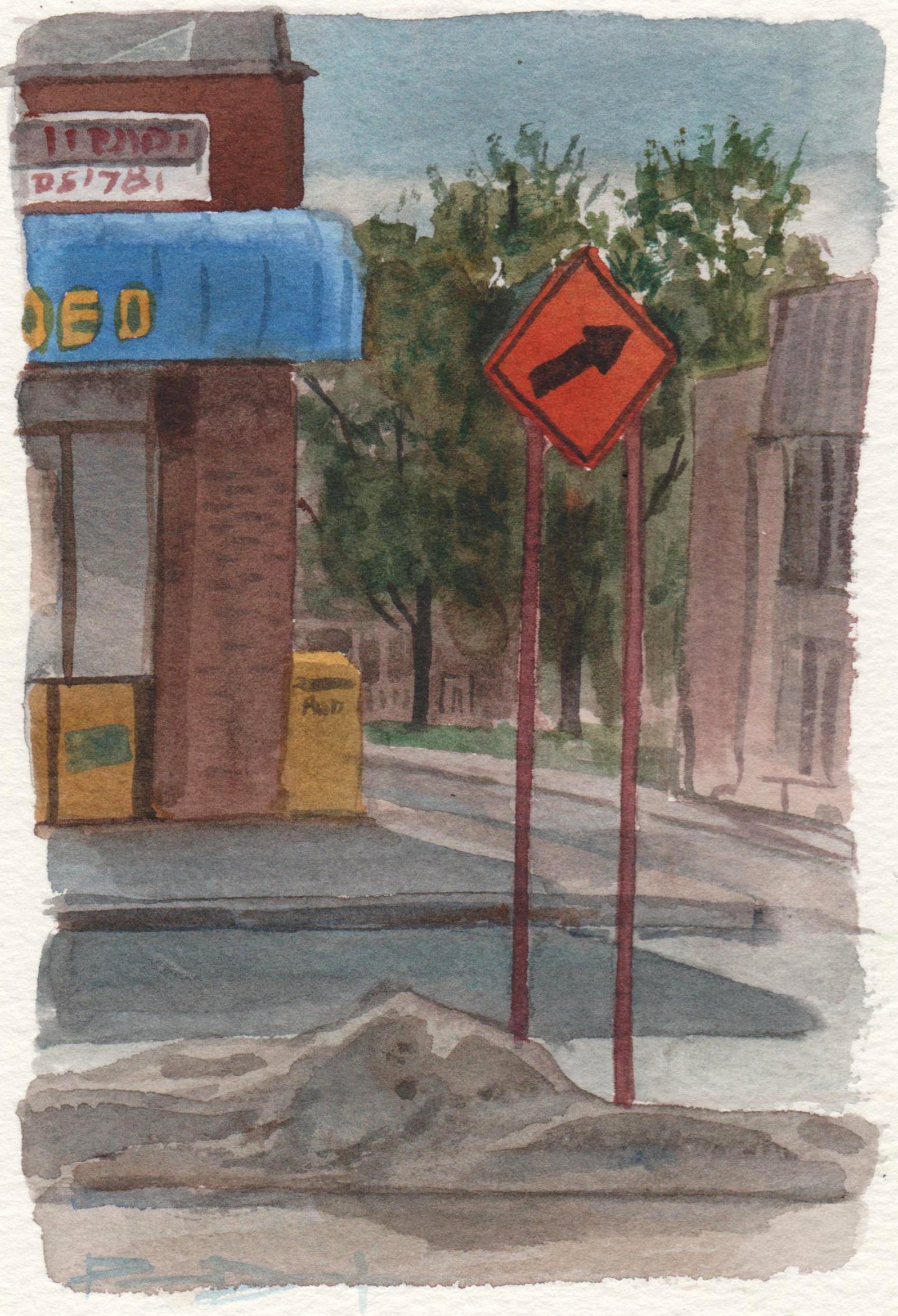
Trees and Train Tracks, watercolour 5 x 7" cold press, April 2023 (No. 3438a)


Toward Vendome, the bike path loops around in a circle. I have made several paintings from this vantage point because its a great place to set up the bike and get some views of trees. I've not painted it from this angle because the background is a horrendous wall of condos and apartment. Using my imagination, I added a more pleasant background! Recently I put in some fertilizer spikes for these trees to help them grow. An artist has to take care of the subject matter.

Trees near Vendome, watercolour 5 x 7" cold press, April 2023 (No. 3439a)


A few drops of rain splattered down causing me to turn around. Inadvertently, I caught a glimpse of the Montreal General hospital on mount Royal where rumor has it I was born. The buildings of the new Glen hospital were framing the scene. The Glen hospital is like a giant pile of discombobulated Lego, which contrasts the classic brick structure of the General.

Hospitals Old and New, watercolour 5 x 7" cold press, April 2023 (No. 3439b)


Signs of Spring with Mercier Bridge

Considering the gloomy forecast for the next week I took the opportunity today to make a painting down at the peninsula park near Lachine. I was hoping to catch the trees blooming but it was probably a week too early for that. Signs of spring included leaf buds, greenish grass, and some cyclists on the path. To paint the river I used pure indo blue (PB60) which looks bright violet-blue, but after it dries it looks more of a grey-blue especially on the rough press paper I was using. Certain papers absorb the paint more than other papers, which causes an extra dull (low intensity) finish after the paint dries. Being able to understand and predict the drying shifts of watercolour paint is an advanced skill. Both the colour intensity, and the hue can change. That means the colour you see while painting is not exactly what you get. Handprint.com by MacEvoy had extensive data on drying shifts which helped me understand the concept, then I practiced it a lot to be able to predict what the finished product would look like after drying. The funny thing is that I tried many variations of colour mixtures to capture the right colour of the st Lawrence river on a sunny day, and in the end it was just indo blue (PB60). Indo blue is the colour of brand new blue jeans, better known as navy blue.  

Signs of Spring with Mercier Bridge, watercolour 8 x 10" rough press, April 2023 (No. 3596)

Thursday, April 27, 2023

Spring Field of Flowers and Trees

Today around noon the sun came out and the weather was very warm and spring like, which is fitting considering it is spring! Its just not spring in my office, where they crank on the air conditioning about now and it feels like winter all over again. I snuck out to the little strip of grass along West Broadway at lunch hour and made a quick painting of the beautiful spring field of trees and flowers across the street. Maybe that's how it used to look like anyways! To compose the scene I decided to eliminate the entire row of duplex housing from across the street and just show the garden flowers and glimpse of the backyard lawn which became a large field of grass in my painting. There was a strange satisfaction in transporting myself into a scene that the impressionist painters of the 19th century would have found themselves painting. To complete the joke I kept in the ever-present sidewalk and road although I made the sidewalk like a glowing white-gold instead of dusty grey. I much prefer the look of this semi-imaginary scene over what was actually there.

Spring Field of Flowers and Trees, watercolour 5 x 7" cold press, April 2023 (No. 3437)

Wednesday, April 26, 2023

World Inspired Landscapes: Iran version 3


The first versions of the Iran painting were not quite hitting the mark so I made a few adjustments to the colours and composition. Switching from portrait to landscape format allowed for elongation of the mountain ranges and more depth. I omitted most colours and softened the blue to balance all of the intense orange and magenta. Finally, I applied decorative brush strokes to suggest trees and interesting patterns. The paints include rose red (PV19 M Graham), bismuth yellow (PY184 Schmincke), pyrol orange (PO73 Winsor and Newton), cobalt blue (PB28 Holbein), and a combo of warm yellow ochre (PY43) and iridescent moonstone, love the name, (PW20) both from Daniel Smith. Version 3 hits the blazing colors that I was going for, the colour scheme was inspired by the famous Endless Summer movie poster.
 

World Inspired Landscapes: Iran, version 3, watercolour 9 x 12" watercolour paper, April 2023 (No. 3599a)

Tuesday, April 25, 2023

Auto Shop Sun Behind Trees, thoughts on Renoir


Joe and Ralph Auto has been the subject of many paintings now, owing to its very close proximity to our condo. Of all artists, I have made the most number of paintings of Joe and Ralph's auto shop! For my birthday, the students gave me a coffee table book on Renoir, the great French master from the late 19th and early 20th century. He was of course an oil painter but also dabbled in pastel, watercolour and sculptures. Most of his work was portrait and figures, with a decent number of landscapes, some of which were painted along side of Monet. One thing that stood out was that Renoir used a lot of dark/light contrast using flake white (lead white) and bitumen black (carbon black). He used dark mixtures of ultramarine, viridian and alizarin as Monet did at the time. Renoir juxtaposed dark/light contrast with high chroma (intense) highlights and plenty of tinted pastel colours (coloured grey). Somehow he got it all to work together to great effect. I was thinking about these ideas when I made this painting. It is a little different than I usually do, it has a heavy base of grey, dark black, and pops of high chroma colours. On top, there is an airy, pastely depiction of the evening sky and soaring trees. Just a hint of yellow-green on the left horizon depicts the budding leaves and Spring season.

Auto Shop Sun Behind Trees, watercolour 5 x 7" cold press, April 2023 (No. 3436b)

Sunday, April 23, 2023

Afternoon and Evening in Verdun

Cilei and I  had a belated birthday dinner in Verdun with Cilene and Fritz. She went down early and I rode down with my paint supplies and made this painting after my haircut in Mile End. Labelle park is a little park off of Lasalle Boulevard where it meets Atwater Avenue. The trees were just starting to put out leaf buds and the beginnings of leaves. In the background there is a new modern looking condo with black walls and green windows, and off to the right are some of the water works buildings. The trees and leaves were painted over top of the rest of the painting after it had mostly dried.

Labelle Park Bench, watercolour 5 x 7" cold press, April 2023 (No. 3435b)


The restaurant, a Hindu-style Indian restaurant called Bombay, was about a 20 minute walk down Wellington street. Every time we go down there, there seems to be more restaurants and cafes. During the 20 minute walk we must have seen close to a hundred restaurants, cafes, and little boutique stores. It was really hopping. After dinner I rode back to NDG on my bike, and finally stopped to attempt a painting of the Hydro Quebec station on Lasalle Boulevard. The sun usually sets behind it, creating an eerie looking scene completed with the tall trees in silhouette. It was a hard painting to do. In retrospect I would have shown more sky and less cars. The sky had a crescent moon and bright star that was probably some planet or another.

Verdun Powerplant at Dusk, watercolour 5 x 7" cold press, April 2023 (No. 3433b)

Hollywood Barber Interior


Since I moved to Montreal in 2004 I have been going to the same barber shop, even after moving to NDG. The barber changed a few years ago, as the old fellow who worked at the place since the 1950's finally retired. On Saturday it was the last day for the new barber who was moving on to British Columbia. Apparently a new barber will take over and I said it would give them a try. While waiting for my haircut, it was unusually busy since his regular customers knew it was his last day, I made a painting of the interior of the shop. In the foreground is the back of one of the old barber chairs, while the background has the benches, cupboards and wall mirrors that were reflecting the other mirrors and so on. I started with a fairly elaborate brush-drawing (made with dilute carbon black) then filled it in paint-by-numbers style.

Hollywood Barber Interior, watercolour 5 x 7" cold press, April 2023 (No. 3436a)

Friday, April 21, 2023

World Inspired Landscapes: Iran

World Inspired Landscapes: Iran version 2, watercolour 9 x 12" watercolour paper, April 2023

Iran can be roughly translated into 'Middle Persia' which was the central region of the Persian Empire. Over time, the empire lost its eastern and northern regions and the area now known as Iran was the only remaining area that they controlled. The Persian Empire was at the heights of science, medicine, art, culture, literature and influenced most of the ancient world. All of the countries ending in 'stan', for the crossword buffs, used to be part of the Persian Empire. In modern times Iran is best known for its political troubles and internal violence, however, the culture and the people of Iran for the most part still retain all the wealth and the values of education and a desire for freedom of expression. When researching the landscape I was amazed by the spectacular mountain vistas, valleys, fields of flowers and archeological sites. There is an island in Iran that has multi-coloured rocks, its translated into the Rainbow Island. Instead of trying to replicate the scenes, I interpreted the various aspects of Iranian multi-cultural, diverse people and landscape into a decorative, brightly coloured mountain range. To create the metallic silver, gold and bronze colours I mixed a mica pigment (PW20) called iridescent moonstone from Daniel Smith Co. with yellow ochre (PY43), burnt sienna (PBr7/PR101), and lamp black (PBk6). Its the first time I could use the mica pigment to good effect and it scanned pretty well. In real life, the metallic mountains sparkle.
 

World Inspired Landscapes: Iran version 1, watercolour 9 x 12" watercolour paper, April 2023

Thursday, April 20, 2023

Marché Fruiterie Cité

Marche City Fruiterie is a great store down by the train tracks that sells fresh fruit, veg, spices, and interesting dry goods. I often walk down there for lunch hour, and stop by the Snowdon Bakery down the street. I painted a similar scene in 2019 with a wider view. You may not even notice it but I used yellow ochre (PY43) throughout the painting, including in the sky, the bricks and on the sidewalks. After the first washes, the sidewalks and roads looked too cold, kind of blue violet, but after applying a thin glaze of yellow ochre they were infused with the illusion of sunlight. The bright yellow in the sign is probably PY97, and azo yellow dye, but I sometimes loose track of which bright yellow is on my palette because they are all pretty much the same. Yellow ochre is actually an orange-yellow but the one I have is very close to yellow. Its such a useful paint I bought a 37mL tube which is a large size that should last for many years to come, perhaps a decade even at the rate I am paining.

Marché Fruiterie Cité End of Winter,  watercolour 5 x 7" cold press, April 2023 (No. 3435a)

Wednesday, April 19, 2023

Baked Retina

You might think that two people are posting on this blog, one who does careful, realistic scenes in the city, and another who does wild and crazy abstract paintings. I can assure you its the same artist who does both styles, and everything in between. In this painting I was using up the last of the perylene green (PBk31), yellow (PY154) and pyrol orange (PO73) from old tubes. I already replaced the perylene green since its a mainstay of my palette, as well as the yellow which I just got delivered today from Studio Six. I probably wont replace the pyrol orange, the only use I had was mixing it with indo blue (PB60) for night skies, but I can approximate it with another orange I have called benzi orange deep from Da Vinci company (PO36). Orange was the paint that I never had at all until 2020, now I find it useful for many things including high-intensity brick when mixed with burnt sienna (PR101), and to create the glowing sun on tree bark or wood structures, and to tint the sky when the sun is getting low. Isoindo yellow (PY110) is also excellent for simulating the low sun, and for making high intensity olive greens. I forget why I called this painting baked retina, but it sure is a cool name! 

Baked Retina, watercolour 9 x 12" watercolour paper, April 2023 (No. 3597b)

A Few more Paintings from London Ontario

In this painting you can see the edge of the Alumni Hall building where they held large lectures and events. I would have walked on those paths in the foreground many times over the years that I spent at University of Western Ontario (UWO). I can still remember the day Mom and Dad dropped me off in 1994, it was raining slightly and I was sad to see them go home. It wasn't long until I made friends and partook in the usual first year student shenanigans. This painting was done quite a bit later, in 1998 when I was a graduate student.  The first year I was there, 1994, I didn't have my paints with me, but brought them to the dorm for 1995 onwards.

Lecture Hall with Paths UWO, watercolour 5 x 7" cold press, 1998 (No. 0620)


This one was done towards the end of my time in London Ontario, it shows the new (at the time) arena art installations which included a tree and large red concrete balls. Using google earth I zoomed in on this scene and unfortunately it was not kept up because the tree was gone and most of the balls were missing. I like how some of this painting is very realistic while other parts like in the background are simplified.

Tree and Art Installation at Arena, watercolour 5 x 7" cold press, 2002 (No. 0623)


I am not entirely sure of which year any of these London paintings were done, I made guesses based on vague memories and stylistic tells. In this case, the use of cerulean blue in the mixes means that it was between 98-02, since I stopped using it in mixes after 2002 and only used it in the sky until about 2020. That shade of yellow-grey on the wall is tough to mix, it looks like it contains aureolin yellow. Nowadays I would use yellow ochre (PY43) with a touch of perylene green (PBk31) to get that colour. The yellow ochre I use from Da Vinci company (Via Studio Six Ontario) is like a yellow dijon mustard colour with fantastic handling characteristics. I liked it so much I just ordered and received the jumbo 37mL size, along with their Da Vinci yellow (15mL, PY154) and lamp black (15mL PBk6). Guess that counts as a birthday present since it just arrived today!

New Yorker London Ontario, watercolour 5 x 7" cold press, 1999 (No. 0621)

Combined Seasons


Here is another abstract painting using the dregs from old paint tubes. The main colours are pyrol orange (PO73), lapis lazuli (natural pigment), perylene green (PBk31), and yellow (PY154). I had the idea to name this painting after we experienced some wild swings in weather from frigid ice storm to plus 25 summery weather all in the matter of a few days. Rick Mercer the Canadian comic once quipped that all the seasons would morph into one combined season called Springsumwinfall or something like that. Although the warm weather was welcome it did feel a little eerie to out painting in T shirt and thin cotton pants in early April. I did several of these kinds of paintings, as it turns out there is quite a lot of paint stuck in those empty tubes.

 Combined Seasons, watercolour 9 x 12" watercolour paper, April 2023 (No. 3597a)

Tuesday, April 18, 2023

Last Drop Valley

I've been trying to use up the last of my old paint tubes. When they get low I roll the tin tubes and squeeze them with a pair of pliers to get every last drop. Then, I unroll and snip them open to get at the last of the paint stuck to inside the tube. At that point its not very practical but I can extract the last dregs of paint and make a few extra paintings. In this one, pyrol orange (PO73) provides the brilliant orange, along with yellow (PY154), perylene green (PBk31) and some lapis lazuli (natural pigment). Watercolour paint is like coffee, good to the last drop. The composition was inspired by Hiroshige, the great Japanese painter and illustrator who developed the idea of using triangles in the foreground, and overlapping elements to create depth. The circular reflection pond in the bottom right was borrowed from my painting called 'The 20/10 Solution'.

Last Drop Valley, watercolour 9 x 12" watercolour paper, April 2023 (No. 3593b)

Dagwood's on Sherbrooke

Often I walk or ride past this restaurant on the way home and always though it would make a good painting, albeit a challenging one. The Dagwood's scene reminded me of the painting of the Grand avenue convenience store painting I did in the late 90's that I posted the other day on my blog along with a few other old London Ontario paintings. The colour schemes were very similar, with yellow, green, brown blue and a pop of white. Today I figured if 1997 Peter would paint a scene like this, than so should 2023 Peter! The large trees on the left are neat, I got a lot better at painting trees over the years, its something that I always enjoyed.  

Dagwood's on Sherbrooke Spring, watercolour 5 x 7" cold press, April 2023 (No. 3434)

Monday, April 17, 2023

Scenes from London Ontario


Richmond street is the main drag down the center of London Ontario, it connects the downtown with the campus and shopping area in the north of the city. Mom and Dad and myself walked from the downtown back to campus several times back when I lived there, it was quite a hike. TJ Baxters and MexiCali were our favorite restaurants. The store on the corner in the painting is Blockbuster video where we rented movies, which really dates the painting. Like most of these paintings I am not sure of the exact date painted, I can only approximate give or take a year. The heavy use of cerulean blue in this one puts it between 2001 to 2004 but I recall painting this one on a later visit to the city when I was living in Montreal.

Richmond Street Construction London Ontario, watercolour 5 x 7" cold press, 2004 (No. 0619)


This scene shows the old hospital with its impressive yellow ochre brick and copper roof elements. Considering that I didn't have yellow ochre on my palette at the time, it was an impressive feat to duplicate the colour with a mixture that probably contained aureolin and cerulean both cobalt paints. Now a days, I carry a fantastic yellow ochre (PY43) from Da Vinci company that I bought from Studio Six art supplies in Markham by mail delivery. In fact, Studio Six only delivers, they have not had in store service for decades even before the pandemic they were ahead of the times.

Richmond Street Old Hospital London Ontario, watercolour 5 x 7" cold press, 1999 (No. 0618)


Much earlier than the first two paintings, this one was likely done in 1997, just a year after I had started location painting. It was an ambitious effort and I still remember painting it. I was working on getting the light highlight on the front of the convenience store against the shadowed side. The road slopes down a lot from my vantage point which is conveyed by the perspective on the road. I was showing art at a gallery called Artisan's Alley and an art group at the Garden Market, but for some reason I never showed these paintings. I like the combination of yellow, green, brown and blue.

Grand Avenue London Ontario, watercolour 5 x 7" cold press, 1997 (No. 0622)

Fowl Pool

The public pool in Confederation park was half filled with melt water and rimmed with old leaves. A couple of ducks landed in the water and swam around, while some seagulls looked on with interest. I painted this pool before during the pandemic when I was exploring the colour blue. Back then I used cerulean blue, which is a cobalt based paint, but yesterday I was using purely phthalocyanines, including phthalo blue (PB15) and green (PG7). The phthalos are strong, staining pigments that need to be diluted correctly to get maximum effect. The concept of staining is one of those watercolour myths, it goes that some paints will stick to the paper permanently. While there is some truth to the idea of staining, the more important factor is the paper. If I used phthalo blue on the Winsor and Newton sheet it will stain an be difficult to lift. If I use the same paint on the Fabriano block it comes off no problem. The difference is the sizing- an oily substance they apply to the paper during manufacturing to prevent the paint from diffusing through the paper fibers. Even if the idea that some paints are staining was true, it has never been clear to me what to do with the information. Is staining good or bad? At any rate, the ducks don't care, they just need to have a pond and some habitat.

Fowl Pool, watercolour 5 x 7" cold press, April 2023 (No. 3432b)

Saturday, April 15, 2023

Old Canada Malting Silos

The Lachine Canal used to be the main artery of a dense industrial zone. Much of it has been razed and turned into condos and parks, along with the famous bike path. I have painted this building a few times before, last summer I showed it from the east side with a view of the pink house on top.  Setting my bike up on st Ambroise street I got a good view of the west side of the building in full sun. Tall structures with corrugated steel or maybe aluminum siding soared upwards into the hazy blue sky. Rust streaked down the sides as if applied by an artist's brush. Old crumbling brick walls were adorned with gaping holes where windows used to be. Strewn about the grass were old rusted steel components. Graffiti art provided a splash of colour on the side of the building. The Lachine canal and bike path are seen in the background.  If you could look up, you would be looking straight up at the pink house, which is an art project done secretly years ago. Looking to the right, you would see st Ambroise brewery and its giant back beer-gardens/patio which is just gearing up to open for the summer.  Using rough press paper was perfect for this one, it really allowed me to get that rusty texture. Its a surprisingly airy and delicate scene considering the subject matter.

Old Canada Malting Silos, watercolour 8 x 10" rough press, April 2023 (No. 3595)

Terry Fox Park and Canal, feels like Summer

Along st Jacques on the south side of NDG there are fantastic views of Montreal and surrounding region from the escarpment. I stopped my bike in a small, long park called Terry Fox Park. I have painted here before but never knew the proper name of the park until just now. The grass is starting to poke out from the muddy ground. On the right, trees were leaning over the fence, and just starting to show their leaf buds. The trees were mostly done with umber (PBr7) and orange (PO62), with purple shadows (PB60 and PV19).

Terry Fox Park Path end of winter, watercolour 5 x 7" cold press, April 2023 (No. 3431b)

Since the weather was so nice I dressed in my summer garb. Light pants, just a T shirt, and plenty of sunscreen, I even brought the old bucket hat. The sun was rather low and the temperature was a balmy 25℃. This is the kind of painting I can only attempt in warm, dry, breezy weather conditions because there are a lot of layers. Through the trees you see the Turcot interchange and some of the industrial buildings including the disused building with the pink house on top of it. I got one my favorite things in this painting, the garbage can at bottom left.

Terry Fox Park Path City View, watercolour 5 x 7" cold press, April 2023 (No. 3430b)

After the escarpment I zoomed down tot he canal via st Henri, and made a painting of the old factory which I will post separately. A little further to the west there is a relatively new suspension bridge going over the canal. The water was sparkling intensely from the strong sun. I knew that juxtaposing the dark yellows, greys, and blacks with the delicate water would give the illusion of sparkles. I signed in red to give some colour. Today I had neutral tint on my palette, it is PBk6, PV19, and PB15 (black, violet, blue) from Winsor and Newton brand. It helped me to quickly get the cold black accents in this painting. 

Sparkling Canal with Suspension Bridge, watercolour 5 x 7" cold press, April 2023 (No. 3433a)

Friday, April 14, 2023

Girouard park end of winter

Girouard park is a large multi functional space with a lot of trees and walking paths. It is near the Decarrie, and facing onto Sherbrooke. A monument of sorts adorns a circular walking and sitting area surrounded by a variety of trees. In the foreground, there was a pile of twisted branches piled up from the ice storm. To get the sunny glow of the low sun, I used liberal amounts of yellow ochre (PY43) at tinting strength, with some orange mixed in. The main tree is a neutral yellow orange with purple shadows. To make the shadows I combine indo blue (PB60) with dark magenta (PV19). Today a lot of people were in the park, and there were plenty of squirrels running around. Luckily for them I brought some peanuts.

Girouard park end of winter, watercolour 5 x 7" cold press, April 2023 (No. 3429b)


Thursday, April 13, 2023

Summery Ride to Sculpture Park


I had hoped to sneak off at lunch break but a meeting got moved and the whole schedule was thrown off. So I rode down after work and caught the last few hours of sun on a summery day. The wind was fierce, but luckily not too cold until I got down to sculpture park near Lachine. It is a narrow breakwater/peninsula with a picnic area and many different sculptures strewn about. I have made many paintings there before in all seasons, although I have never painted the sculptures themselves. One of the rules I have when doing paintings is to not copy other people's artwork, although I do copy the graffiti from time to time. This tree is actually leaning severely over the river, I have painted it before, but this time I found a more direct angle. In the background, mid left, is the end of the Honoré Mercier Bridge where it crosses over into Kanawaki.

Leaning Tree end of Winter, watercolour 5 x 7" cold press, April 2023 (No. 3429a)

On the other side of the park is the Marina. The ice was still on the surface albeit melting rapidly. This did not deter some intrepid seagulls through. I liked the variation in value, hue and texture in the melting ice. Where it was melted through it was light blue, where the ice was still formed it was a grey-green, and where the snow was still piled it was cream white. In the background is Lachine, and some suggestion of the cars travelling along boulevard st Joseph.

Seagull on Melting Ice, watercolour 5 x 7" cold press, April 2023 (No. 3430a)


Not far from the last scene, the water was fully melted and flowing strongly. Towards the left you see the Lachine Lighthouse in park st Louis, and in the foreground is a sail boarder getting an early start on the season. I re-positioned the lighthouse and peninsula a little to fit in the composition, it actually sticks out some more than shown. To paint the waves in the water I used mostly yellow ochre (PY43) from Daniel Smith company which is a toasty yellow. When applied on the blue water background it turns into a greenish/dark yellow. Over the years I noticed that when the st Lawrence gets choppy, the green mud on the bottom shows through. 

Sail Boarding and Lachine Lighthouse, watercolour 5 x 7" cold press, April 2023 (No. 3431a)

All the while that I was painting there was a symphony of birds chirping, they were noisy red winged blackbirds congregating in a copse of cedar trees. I pushed my bike up the small hill but to my dismay I could not see any of the darned things until one hopped out onto a branch. To paint this scene I had to disconnect from reality and channel my inner Maud Lewis for awhile. If you can imagine loudly chirping red winged blackbirds then you get the idea. In the Background is Lachine.

Red Winged Blackbirds in Cedar Trees, watercolour 5 x 7" cold press, April 2023 (No. 3432a)

Adjust your Set


There are quite a few pigments out there some of which are really unique. When I was travelling in Scotland back in 2018 I stopped by an art store and found that they sold the small 5mL size of Daniel Smith company paints. That size is not sold in Canada as far as I know. So I picked up a tube of ultramarine which was awful, bloodstone genuine (hematite) which was all right, and green-gold (PY129) which I used in some of the Scotland paintings. When green-gold is used at full strength it appears to be like pea soup, but when it is diluted with water it becomes almost lemon yellow. In the painting, I used full strength green-gold at the bottom around the orange things, and diluted green-gold for the other yellow objects. Its an interesting paint, but hard to use properly. It also contains some nickel and is labelled toxic in Europe and California, but thankfully not in Canada. 

After work today I took a ride down to the 'Sculpture Park' near Lachine to make the most of the summery weather. I made four small paintings and will post them this evening.

Adjust your Set, watercolour 9 x 12" watercolour paper, April 2023 (No. 3593a)

Wednesday, April 12, 2023

Farm House no Bricks

Recently an old farm house on a large plot of land was sold in NDG on Cavendish boulevard. It's not clear what they are doing to it, so far they have carefully dismantled the roof, windows and bricks. We are hoping they restore the building because it is one of the few cultural elements in NDG, an original farm house that must be over 150 years old. Once in history this house must have stood prominently over a vast agricultural expanse, now it is nestled among rows of duplex and a major road. If they city had any sense it would be a heritage property, which it probably is considering how long it has lasted. The developers would likely have razed it and put up a condo-cube. To paint the scene I used yellow ochre and burnt sienna, something I learned when painting the sugar shack a few years ago. I have also painted ruined farm houses several times in Bolton.

Farm House no Bricks, watercolour 5 x 7" cold press, April 2023 (No. 3425b)

Monday, April 10, 2023

Hipster Haven


After painting the old fellow on the scooter I turned down to the canal and rode across to an industrial area that is slowly but surely gentrifying. At the center of this small neighborhood is a factory converted into a craft beer-restaurant, ideal for hipsters, and people riding their bikes on the nearby canal path. I set up across the street on the sidewalk and took on the challenge of this intricate scene. All the while, there was a strong odor of brewing beer wafting down the street, it smelled like they were boiling the malt or straining the grain on an industrial scale. As a former amateur beer brewer myself, I recognized the smells and it made my crave beer. Scale was important in this painting, the industrial background had to have a crushing weight to it, which is contrasted by the crowd of people enjoying their craft brew, and a delicate tree sweeping from left to right. Centering the view is a tall rusted smoke stack and some old wine barrels that served as standing tables. As I painted, more and more hipsters and cyclists showed up, and it occurred to me that some people would be getting their first exercise of the year, along with their first patio pint!

Hipster Haven watercolour 8 x 10" Strathmore Gemini, April 2023 (No. 3592)

Warming up for Spring

Just as I was setting up to paint this one, an old fellow on a motorized scooter whipped by with a mini trailer in tow filled with bags and stuff. Purely from memory I included the image front and center. The rest of the scene shows a unique road in ville st Henri, where there used to be factories and warehouses, there are now factories and warehouses with some condos mixed in. At the end of the street is a whole row of brown and red new construction duplexes. The actual red in the building is likely to be pyrol red (PR254) since I could duplicate exactly with my pyrol red paint made of the same pigment. If I ever see the old fellow again driving in a red Ferrari I am ready!

Electric Scooter, watercolour 5 x 7" cold press, April 2023 (No. 3428)


Last fall I painted a scene along the Lachine canal of the gantry crane, and also leaned what the proper name for this iconic device really was (gantry crane). In this painting I am looking at it from the other direction, with backlighting from an overcast sky. In the foreground, there was a great mass of greyish ice still floating on the canal, although most of it had thawed. When I finished this painting on location I really thought it was a disaster, like, leave it off the blog kind of disaster. However, when I got it home and saw it dried it really captured my imagination. Recently, I studied Maud Lewis a bit, she was a Canadian folk painter who's work is now worth a fortune. While her paintings are the quintessential 'Gramma Moses' paintings, she had a brilliant way of simplifying things and showing them as they feel, more so than how they look.

Melting Canal with Gantry Crane, watercolour 5 x 7" cold press, April 2023 (No. 3427b)

Iron Lung Oxide

Aside from the ice storm last week, I was also a little under the weather so to speak. As part of the seasonal palette cleaning, I used up the last of the brown, green and red to make this painting of an unhealthy looking lung. Iron oxide is the name of the chemical that makes up earth paints such as sienna and umber, which I used in this painting. The red is pyrol red (PR254), a synthetic, and the green is phthalo green (PG36) also a synthetic that contains copper and bromination and the carbon ring. Having taken chemistry classes during undergraduate it was kind of fun to learn more about pigment chemistry. For a long time I didn't want science to invade my art, but since 2020 I have been reading Handprint.com and learning a lot from it. Incidentally, I am feeling fine now.
 

Iron Lung Oxide, watercolour 9 x 12" watercolour paper, April 2023 (No. 3591b)

Branch Deposits

With the ice storm almost behind us, there are still quite a few branches down and homes without power. Luckily our power got on last Friday afternoon and we have just had intermittent internet for the long weekend. As it seems that winter is almost in the past too, I decided to finish off all the paint on my winter palette and give it a good cleaning with scouring powder. Over time, the phthalo blue and quinacridone reds tend to stain the plastic palette making the mixtures harder to judge. I use VIM and toothbrush to do the cleaning. But first, all the paint had to come off, which included a whole lot of orange, brown and green. In the painting I show an abstract power grid intertwined with tree branches, and a steady drizzle of freezing rain in the background. It showed how delicate the whole thing really was.
 

Branch Deposits, watercolour 9 x 12" watercolour paper, April 2023 (No. 3591a)

Saturday, April 8, 2023

World Inspired Landscapes: Indonesia


As I approach the half-way point of the World Inspired Landscapes series, it has never ceased to amaze me how much variety the world has. Indonesia is a highly populated island archipelago with brilliant turquoise waters and lush vegetation. These kinds of scenes are famous in Indonesia, many screen savers have a shot of the tall conical rocks covered in growth and casting shimmering green shadows. I have tried to avoid doing touristy designs or 'screen saver' designs but in this cased it seemed like a worthy challenge. In the first attempt I got the colours all wrong and the scene was lifeless. In this second try I adjusted the colours to have much more turquoise, blue and green, with warm yellow and red accents in the rocky structures. The foreground is just water, with suggestions of rocks underneath. For what must be a very dense and urbanized country, Indonesia still has some amazing vistas to behold.

World Inspired Landscapes: Indonesia v2, watercolour 10 x 11" cold press, April 2023 (No. 3589)

A Few More Shadows

Awhile back I did a painting at Trenholme park called a few less shadows, which showed a large tree stump where there used to be a grand old tree. Today, I  noticed that the city had planted a bunch of new trees including this one, which is situated where the old tree was cut down. In the background you can see some branches on the ground where the trees were damaged from the recent ice storm. The squirrels didn't seem to mind, although they seemed to be a little disappointment that I had no peanuts for them! To paint the grass I used a mix of indo yellow (PY110), phthalo green (PG36) and a touch of burnt sienna (PBr7/PR101). For accents I dabbed in some oranges and dark greens for shadows. It turned out to be a very detailed painting, I was just enjoying the moment of breathing some fresh air and sitting under a blue sky.

A Few More Shadows, watercolour 5 x 7" cold press, April 2023 (No. 3427a)

Broken Branches after Ice Storm


Today the wind settled down and it was warmer than yesterday so I made it out to survey the damage after the ice storm and make a few paintings. This tree lost a huge branch but otherwise didn't look any worse for wear. In the background you see the sports dome and Perform Centre on campus.

Broken Branch on Campus, watercolour 5 x 7" cold press, April 2023 (No. 3426a)

Not far, I found another big broken branch on one of the trees in Coffee Park. The splintered portion had a pale ochre colour. For the tree I mostly used umber (PBr7) with some mixed purple for shadows (PB15 + PV19). The grass is still a flat olive green but signs of green grass are starting to show.

Broken Branch in Coffee Park, watercolour 5 x 7" cold press, April 2023 (No. 3426b)


Friday, April 7, 2023

Renewed Electrification


Before the power went out I finished a series of abstract paintings, the first was an AI -inspired abstract shown in the previous blog. These ones were straight from my imagination, using a variety of extra paints. This one started with a wash of grey ochre, then yellow ochre (PY43) highlights were painted in while moist. The paints were from Stoneground paint Co., and I dissolved the entire cube into a small pot of water for all these paintings.

Grey Appreciation, watercolour 5.5 x 11.5" cold press, April 2023 (No. 1266b)


The same grey ochre was used to paint in the background, with the lid of my water container filling in as a template for the circles. When dry, I added yellow ochre orbs and burnt sienna (PR101/PBr7) highlights. All of these pigments have similar chemical structures based on iron oxide, they just differ on hydration and manganese content.

Iron Precipitation, watercolour 10 x 11" cold press, April 2023 (No. 3587)


The more manganese there is in a pigment, the darker it becomes. In this case, the roman black (PBk11) is like dark chocolate due to high manganese content. A yellow ochre background, and ochre and sienna patterns completes the look. Note, I initially wrote down the wrong element, magnesium.

Magnesium Depreciation, watercolour 10 x 11" cold press, April 2023 (No. 3588)

With the ochres and other paints mostly used up, I finished the grey ochre and added blue washes with lapis lazuli. I've written about it before, lapis lazuli is an ancient pigment that is now mostly replaced with a chemically similar pigment called ultramarine blue. The sample I have is apparently genuine lapis lazuli from Schmincke company. The grey ochre combined with lapis lazuli created some amazing granulation, that is the textured effect you see where the paint ran.

Ultra Contemplation, watercolour 7.5 x 11" cold press, April 2023 (No. 1150b... in box near No. 3588)

Sun Earth Moon (Deep AI inspired)

Prior to the big ice storm I completed a series of abstract paintings, the first one based upon a computer-generated image from Deep AI using the abstract filter and keywords Sun Earth Moon. That was the name of an old painting I did in 1990 and I was curious to see what the computer did with the idea. In the painting, seen above, I made several adjustments over the computer image which you can see at the end of the blog. I separated the sun and earth, and recomposed some of the other elements. Instead of making it look like a computer image, the painting has lots of evidence that an artist did it, like visible brush strokes and little dots of paint here and there. It went better this way, by considering this kind of art as a collaboration with the computer instead of just copying the computer. I will update the picture when the weather is more agreeable. 

Sun Earth Moon, (Deep AI inspired) watercolour 16 x 20" cold press, April 2023 (No. 3356b)

here is the deep AI image...