Monday, February 28, 2022

More Colour Doodles


Here are a few more colour doodles I did to demonstrate some thoughts on colour mixing. This painting shows sky-blue colours around the edges, which transition from a bright middle blue (PB15 and PB28), to a pale cyan towards the horizon (PB15 with PG7 or PG36). On the edges I made a slight cloud effect, the cloud shadow is indo blue (PB60) and perylene maroon (PR179). I use these colours all the time to paint a nice blue sky. Today there was a blue sky but the temperatures were frigid once again. In the middle of the painting is a blueberry pie, makes me want blueberry pie now!

Blueberry Pie in the Sky, watercolour 9 x 12" watercolour paper, February 2022 (No. 2978b top)


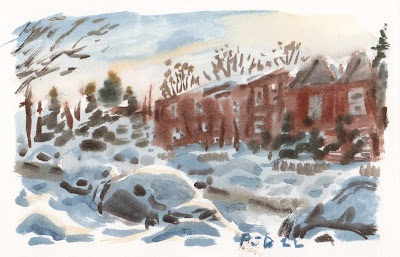
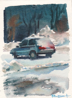
After exploring sky blue, this painting explores the night sky, just after sunset. I stumbled into this most useful colour pairing of pyrol orange (PO73) with indo blue (PB60) that creates a wonderful neutral maroon, pale orange, and grape-juice purples. By adding a touch of phthalo green (PG7 or PG36) it turns almost jet black. To paint stars I use careful brushwork, this was just a rough example. The grey outlines in all these paintings was done with graphite grey (PBk11) which is the same pigment as found in pencils, but in a watercolour paint format.

Around the Moon, watercolour 9 x 12" watercolour paper, February 2022 (No. 2978b bottom)

Sunday, February 27, 2022

Tree and Benny Apartments


 The weather was a bit warmer today but the wind picked up and the snow was blowing around. I found a nook protected from the elements at the back entrance of the library and cultural center and made a painting of the scene before me. The snow was wind-swept and piled high around the tree. The background was a jumble of windows and bricks. To paint the snow I used a nearly grey shade of blue with some darker parts for the shadows. There are also subtle washes of yellow-orange to create the effects caused by the sub reflecting off the snow. The colour of the snow depends on the sky, today it was half cloudy, half bright blue sky. To paint the bricks I used a mix of near identical red iron oxides (PR101/PBr7/PR102) slightly neutralized with carbon black (PBk6).

Tree and Benny Apartments, watercolour 5 x 7" cold press, February 2022 (No. 3072a)

Saturday, February 26, 2022

World Inspired Landscapes: Denmark

I have not visited most of the countries in the World Inspired Landscapes series save a few such as Barbados, Brazil and Canada of course. I actually went to Denmark about a decade ago, there are a few blogs on it including the one showing emerald waters. The guide book I borrowed from the library mentioned some interesting chalk cliffs that are very photogenic and touristy. Many Danish artists have painted the cliffs on the island Møns Klint, but it seemed a little too cliche for my series. None the less, I just suggested the brilliant white chalk cliffs off on the distant horizon in the painting. The rest of the landscape shows gently rolling fields of grass with sparse beech trees and a breezy atmosphere. This was the general lay of the land when I searched google earth across Denmark.
 

 In the last post I wrote about mixing shades of green with a demonstration piece. In the Denmark painting I used many of the those colour mixes to create a variety of golden greens and cool blues. The painting was designed to make the fields of grass almost feel like waves of water. Denmark is a series of islands surrounded by the sea.  It seems like the protected their coast line since there wasn't too much development and the beaches all seemed very natural. So the painting tired to capture that feeling of airy meadows and pastures near the sea.

World Inspired Landscapes: Denmark version 1, watercolour 8 x 10" cold press, February 2022 (No. 2979b)

Thoughts on Colour Mixing, Green Blue Grey


Continuing with the thoughts on colour mixing, here is a demonstration of the green gamut that I have been using lately. A gamut describes all of the possible colours you can make with a given number of paints. Here you see yellow (PY154), yellow-orange (PY110), green (PG36), and dark green (PBk31) mixed in a belt shape. Inside are examples of the range of greens that can be made, including chartreuse, sap green, forest green, olive green, and dark yellows that look green. I selected the orange paint- isoindo yellow (PY110) - after trying out quite a few. This one makes nice bright olive greens. These colour mixes are handy for making all manner of grass, trees and foliage. By adding more yellow and yellow-orange you can simulate the the effect of sunlight. 

Green Belt, watercolour 9 x 12" watercolour paper, February 2022 (No. 2978a top)


Another important range of mixtures for landscape are the blue, grey and neutral browns. These can be used for tree trunks, rocks, concrete, sky effects, shadows, etc. I run most of the mixtures off indo blue (PB60) with burnt sienna (PR101) or raw sienna (PBr7). By adding vivid blue like phthalo (PB15) or cobalt (PB28) at can become a flat cool blue, like a worn pair of jeans. Hopefully the weather is okay tomorrow, I have been holding off of outdoor painting until it warms up a bit!

Blue Grey Day, watercolour 9 x 12" watercolour paper, February 2022 (No. 2978a bottom)
 

Friday, February 25, 2022

Paint Chips, Thoughts on Colour Mixing

After some thoughts on Colour Mixing, I has some more thoughts about it. You could say I was having second thoughts. The painting shown above is a continuation of the thoughts, in abstract format. At the top you see variations of red (PR254) mixed with water and carbon black (PBk6). The dark reds are maroon, and the grey versions appear to be a granite colour. In effect I was reproducing the Munsell colour system which portrays all of the possible colours out there. You may know the concept better as paint chips, the kind you find in great numbers at the paint store that help you choose a colour to paint the walls. On the bottom part of the painting, I depicted three colour wheels, one warm, one cool, and one earthy. Any one of the colours in the wheels could be inserted in the Munsell system to produce dark and grey versions. So if I wanted to create pastel turquoise, I would mix up the vivid turquoise, add some black, and add some water. It is actually a method I use when painting on location to get the complicated colours correct. Hopefully this painting, aside from being a demonstration, is also kind of neat to look at!
 

Paint Chips, watercolour 9 x 12" watercolour paper, February 2022 (No. 2977a)

Thursday, February 24, 2022

Art from the Dining Room Table

Given the smallish nature of our condo my painting location of choice is half of our dining room table. I keep a grey table cloth folded in half upon which sits my paper, paint, brushes, water and other tools of the trade. When I want to paint there I carry over an end-table lamp. Since 2020 I have mostly painted outside on location, but the abstracts and world inspired paintings have all been done on the table. Cilei also gave me a small book stand where I can place the painting du jour on display. This painting looked like musical notes sprinkled in cinnamon and paprika.
 

Spicy Notes, watercolour 5 x 7" cold press, February 2022 (No. 3071b)


If this looks familiar its because it was the first attempt at the rainbow for the Côte d'Ivoire painting. The finished version is on the back of this one. I was just goofing around today with the paints and didn't want to use a fresh sheet of paper, so painted over the first attempt using an array of iron oxide pigments ranging from burnt sienna to caput mortum. The earth paints have a lot of potential, especially when combined with some vivid paints like in the background of this painting.
   

Rainbow Restoration, watercolour 5 x 7" hot press, February 2022 (No. 3067b)

Wednesday, February 23, 2022

Fans of Colour

With the weather cold and blustery I have been painting mostly indoors for now. Hopefully the weekend gets better. This painting was a quick palette cleanser, where I clean off the dried paint blobs on my palette. If you don't do this, the colours tend to get grey and muddy especially the yellows. The idea here was to show a series of overlapping fan-shapes attached to a kind of plant stalk. Perhaps it signifies the upcoming growing season, soon it will be time to plant the seeds for spring!

Fans of Colour, watercolour 9 x 12" watercolour paper, February 2022 (No. 2977b)

Tuesday, February 22, 2022

World Inspired Landscapes: Democratic Republic of the Congo


The area that most people know as the Congo is actually two countries roughly divided by the Congo river. I made a painting of the Republic of the Congo showing gorillas in the mist. This painting was inspired by the Democratic Republic of the Congo which is located to the east of the Congo river and is known for its large capital city Kinshasa. Rich in wildlife, the country has many protected areas of tropical jungle and lush greenery. Of course much of the land is used for agriculture, farmlands and cash crops like cocoa and bran. They are very rich in resources such as copper, cobalt, petroleum and diamonds. Sadly, many of their people suffer from infectious diseases which reduce the lifespan and affect children. I guess the rest of the world got a sense of it now with the pandemic, but they have been with infectious diseases for a long time. 

In the painting, a low sun hangs over a misty jungle valley. A few bats descend from a tall tree looking for a meal. To create the sun I traced a bottle top with light blue paint, then outlined it in some moist pyrol orange (PO73). Then I filled in the sky with a pastel blue, moving the brush in circles to create a penetrating glow. Then I completed the foreground with an array of dark yellows, olives, dark green, and brown. The middle ground was done with dilute perylene green (PBk31), water to blend it, and some light orange to create a glow. I knew the sun would scan and show red on the computer monitor, so I made the colour much more yellow than usual. It worked out because the shade of orange I am seeing looks correct, it should appear as a fresh clementine orange.

World Inspired Landscapes: Democratic Republic of the Congo (No. 2976)

Mountains of Snow Near Library

These mountains of snow were impressive, they made people look small and they seemed to be holding up the apartment buildings in the background. Unfortunately, the original location painting was ruined by blowing snow so I did this painting at home from the remnants of the original and my memory of the scene. Painting at home is a lot easier, the paint dries faster and all my painting equipment is sitting flat on the table. When on location my painting gear is in a shoulder attache bag in the winter, or a bike saddle pack in the summer. This location was at the Benny urban complex which has apartments, a library, and a sports recreation building. For the brick shadow I simply used perylene maroon (PR179) with carbon black (PBk6). Yellow ochre (PY43) gives the snow a nice glow, with accents of blue and grey.
 

Mountains of Snow Near Library (repaint), watercolour 5 x 7" hot press, February 2022 (No. 3070b)


And here is the original. It looked okay when frozen but as the ice crystals melted the whole painting ran together. It looks like mountains of snow melting, with melted apartment on top.

Mountains of Snow Near Library (original), watercolour 5 x 7" hot press, February 2022 (No. 3071a)

Saturday, February 19, 2022

Blizzard on Somerled


 After a whole day of whiteout conditions the weather finally broke and I could get out for a quick painting, not far from the condo. Everything was buried in snow, and the plows were going by trying to clear up the road and sidewalks. The sun was just about down below the houses across the street, a few highlights were catching the tops of the snow-covered parked cars. The painting started with a rough layer of dark blue, leaving the highlight areas free. Then I worked up the dark value areas including the trees, houses, and pieces of the cars you can see. As it dried I applied the yellow-orange highlights with isoindo yellow (PY110), and the tree details. For the first time ever, a paintbrush literally snapped in half as I was painting, it must have been very brittle from the cold. The bottom part flew into the snowbank behind the shrubs, I will have to look for it when things thaw out.

Blizzard on Somerled, watercolour 5 x 7" hot press, February 2022 (No. 3068b)

Whiteout Outside


 Today there were brief periods of blue sky and sun, but for the most part there was a wall of snow blowing outside! Finally I decided to make a painting from the comfort of our home, with a hot cup of tea and room temperature. I included a leaf from our banana tree to signify the comfort of the interior. In the middle ground you see the fence and the shrubs poking up behind the canvas they installed to protect the them. The background shows the now famous gas station in whiteout conditions. Perhaps I will try to actually go out and make a painting now, the sky is blue again. Or another cup of hot tea?

Whiteout Outside, watercolour 5 x 7" hot press, February 2022 (No. 3070a)

Time Over Time

After spending a few extra hours in the office this week I did this painting to symbolize how fast time can go down the drain. The painting uses a wide range of earth colours from my Earth Max palette including siennas, umbers, ochres, and many more. For the bright yellow and red highlights I used vanadium yellow (PY184) and pyrol vermillion (PR255). At the very top, and in some of the dark areas I added bloodstone genuine, a hematite-like pigment, and bone black (PBk9) a warm granular black paint. In case you are wondering where all the research time and effort goes here is a link to a recent paper we published at a journal. In the paper we show that adrenaline hormone receptors have funny effects on some T cells. Except we explained it more professionally and with data!
 

Time Over Time, watercolour 9 x 12" watercolour paper, February 2022 (No. 2975)

Thursday, February 17, 2022

Car in Parking lot Winter, Bayfield Hall


Painting at night is always a challenge, and painting and night int he winter even more so. This was perhaps my first attempt at the feat, a painting of a car in a snowy parking lot at night. In the parking lot there were tall, powerful lamps illuminating the scene, which created a distinctive shadow underneath the car, and cast-shadows from the snow piles. The tops of the snow piles had a bright glow, while the background was a dark blue and brown. One thing that helps a lot is to have white spaces between the elements. In watercolour, white is just the paper showing through. The white spaces separate the areas of paint which prevents them from blurring together. If you look at the top right area you see where the brown trees ran into the snow pile, and the red taillight ran into the snow on the back window. None the less, this is one of the more memorable paintings I did at the time. Another neat example were the day/night paintings of a basketball net.

 Car in Parking lot Winter, Bayfield Hall,  watercolour 5 x 7" cold press, 2002

Winter Painting Memories of London Ontario

Shortly after I started painting outdoors, winter was upon us and I forged ahead into the cold. These mallard ducks were rather incredibly hanging out in the extreme cold, it must have been 20 below Celsius. There was some bread and crumbs there so a passerby must have fed them. I made two paintings of this scene, the previous one did not turn out as clear as this one. There was probably some alcohol in the water but not salt at the time. 

Mallards, Winter by the River, watercolour 5 x 7" cold press, 1996 (No. 0449)


These were among my first experiences painting outdoors in the winter. It was very peaceful, with all the snow and the cavernous stadium devoid of any people. Getting all the brushwork in was a chore here, I recall the challenge it entailed. The background is really neat, the sky has that yellowish haze, and the office towers are shades of blue and grey.

Western Mustangs, Bleachers, watercolour 5 x 7" cold press, 1996 (No. 0453)


This was done on my walk down the Thames river towards where the mallard paintings were done. The river has some shallow rapids at this point, and the sun was sparkling off the rippling water. Being backlit created an array of blue shadows and silhouettes.

Thames River, though the trees, watercolour 5 x 7" cold press, 1996 (No. 0454)


Wednesday, February 16, 2022

Window and Blue Wall, Family House, Brazil, São Paulo

 This was always one of my favorite paintings from the time, it was done sitting up on the terrace floor where they dry laundry and have a hammock for lounging. You can guess which one I was doing more of (laundry or lounging). Cilei's dad built the house brick by brick many years ago, and he even gave it fresh coat of blue paint before we arrived. It was a cobalt blue that I recreated with cerulean blue (PB35) and French ultramarine (PB28). The strong sun created warm shadows and a brilliant glow on the plant. Hopefully we can go back soon and visit the family again.
Window and Blue Wall, Family House, Brazil, São Paulo, watercolour 5.5 x 8" cold press, 2014 (No. 1281)

World Inspired Landscapes: Czechia


Recently the Czech republic officially created a new name for their country, calling it Czechia. This seems to be more in line with one of their neighbors, Slovakia, which is also a republic. Who knew that naming countries could be so complex? During soviet times the countries were stuck together and called Czechoslovakia but that did not last past the early 1990's when the USSR broke up. Going back even further in time, Czechia was part of the Bohemian empire which encompassed vast territories. This painting was inspired by the landscape in the north part of the country where huge sandstone pillars adorn the hilly terrain. Tall pine trees soar above the rocky foliage, while the Danube river silently flows past. 

To create the rock colour and texture I used my 'earth max' palette which consists of an indulgent number of earth paints. The rock buttes were created with a base layer of bloodstone genuine, which is a type of iron oxide hematite that produces a warm charcoal granulation. On top of that I glazed some French yellow ochre (PY43). Mais oui! The rest of the colours are from yellow (PY154) blue (PB28) bluegreen (PG7) and some other accents. It was kind of meant to be a practice painting but it turned out just like I was imagining, so ...tady! (that is Czech for the french word voila)

World Inspired Landscapes: Czechia, watercolour 9 x 12" watercolour paper, February 2022 (No. 2974a)

Sunday, February 13, 2022

Bolton, Ontario Vistas


In 1995, I was taking a lot of photos on bike rides and on hikes through the woods, then turning them into paintings. The plan was to improve my skills enough to be able to paint on location. This was a small study that I used to make a larger version, which now hangs framed in Mom and Dad's house in Bolton. This small version looks similar in most respects, it gives you the sense of depth and a far-off horizon.

Bolton Red House study, watercolour 5 x 7" cold press, 1995

Emboldened by my small successes with the photo-painting, I ventured out to make some location paintings. Only to encounter rain! These storm clouds were clearing up, the sun was creating beams of light against the grey sky. It was a tough effect to paint on location. The painting made good use of burnt sienna (PR101) and ultramarine blue (PB29), you can see how it separated a bit in the clouds creating a granulation effect. A more recent attempt at a stormy sky was the Langelier Metro Station.

Sun, Cloud, Field Bolton, watercolour 5 x 7" cold press, 1996


And another scene painted at the same location, showing a panorama of the sun beams. I was putting a bold outline around the painting for some reason, it was like a painted frame. The signature was bold, probably done in phthalo blue which suggests I did the signature at home and not on location. I like the neutral yellow of the field, it was probably aureolin cobalt yellow (PY40) with burnt sienna. Nowadays I would paint that with yellow ochre (PY43) and a touch of burnt sienna (PR101), or raw sienna (PBr7). Hopefully I can go back and make some panoramas some day! 

North Hill Bolton Valley, watercolour 5 x 7" cold press, 1996

Saturday, February 12, 2022

House with Tile Roof and Yellow Flowers

Shortly after moving back to Quebec I made a bike ride along the river path making it as far out as Lachine and Point Claire. The island seemed so big and mysterious back then, and it remained so until my end-to-end cycling trip last year when I explored the whole island. I am not entirely sure when and exactly where this painting was done, my cataloguing did not start until 2020, so I supposed it was done in 2006. Back then I was still using cerulean blue in the sky and shadows, and there is a prolific use of phthalo green (PG7).  The pine trees are a combination of burnt sienna (PR101) and sap green (a convenience mix). It is a neat painting, the tile roof looks realistic, it is clearly summer. 

House with Tile Roof and Yellow Flowers, watercolour 5 x 7" cold press, 2006 (No. 1102)

Bohemian Forest and River

After doing a bit of research on Czech Republic I was inspired to do this painting of a Bohemian forest, painted in the psychedelic style. It isn't exactly a world inspired landscape, but an abstract palette cleanser. At any rate, it was fun to paint something since my bike trip was a bust in terms of painting. I did pick up some great food out at Anatol our favorite bulk store in Little Italy. The weather was surprisingly nasty today, it started with flurries and the wind picked up. At least the roads were okay for cycling after the melt. On the topic of the painting, I used various earth paints including yellow ochre (PY43). For a long time I despised yellow ochre, but the brand I have now (from Da Vinci company) is really good to handle and has a warm yellow glow. Looking back on this painting I kind of like it better for the World Inspired Landscape: Czechia.

Bohemian Forest and River, watercolour 9 x 12" watercolour paper, February 2022 (No. 2974b)

World Inspired Landscapes: Cyprus

Tucked away in the far corner of the Mediterranean Sea, Cyprus is a small arid island populated with spas and restaurants. Cilei and I checked it out on google maps and saw that french fries were very popular. Some regions are affected by tourism, their local cuisine gets pushed out for more conventional fare. The island is sun-baked with sparse trees and yellowish clay surrounded by brilliant turquoise water. It was tempting to paint a scene of the shore line, but what caught my attention were the abundant sea caves. Due to erosion, Cyprus is riddled with submerged caverns that make for good scuba diving. 

This is the second under-water painting I've done in the series, the first one was Antigua and Barbuda, which featured a lot of creatures. In this painting, a prominent sea cave frames the sunlight beaming through the water while a lone fish swims by. To achieve the necessary contrasts I used a combination of bone black (PBk9) with indo blue (PB60) and phthalo green (PG7). Hints of brown and yellow provide some highlights. To get the turquoise at the top of the water I combined cobalt blue (PB28) with phthalo green (PG7). The sunbeam effect was done by lifting the paint with a moist brush.


World Inspired Landscapes: Cyprus, watercolour 5 x 7" hot press, February 2022 (No. 3069)

Friday, February 11, 2022

Atlas Pizza, Winter Night

Today was a drizzly winter's day with the temperature hovering around zero Celsius. I stopped to make a quick painting of our local pizza joint while I was waiting for the pizza. It was nearly nighttime so the sun was down and the visibility was low. Without my headlamp it was hard to see what I was doing! Two paints that helped me capture the light and dark contrasts were iron oxide red (PR101/PBr7) and carbon black (PBk6). The sky consists of neutral mixtures of indo blue (PB60) and pyrol orange (PO73) ranging from blue at the top to orange at the bottom. 

For awhile I have been using burnt ochre as my brick colour, it is called PR102 which is supposed to signify a natural iron oxide pigment. In reality they are almost all synthetic nowadays. But recently I went back to my special mix of two iron oxide paints. The first one is a tube I bought way back in 2008 in Paris at the Sennelier store on the left bank. The paint is called red brown, and has a rich, rust red appearance. The other one is a paint made in Japan called Iridori burnt ochre. If you follow my blog you know I have about a dozen shades of rust to pick from!

Atlas Pizza, Winter Night, watercolour 5 x 7" hot press, February 2022 (No. 3068a)

Thursday, February 10, 2022

Seychelles, Turquoise Sea


This could have been another installment in the World Inspired Landscape series except that I painted it on location many years ago on a tropical island country called Seychelles. The beaches were pristine white-coral sands with lush greenery and an incredible turquoise sea. This view shows one of the many sea-views with one of the other islands off in the distance. I like how the shades of green and turquoise harmonize, and the wet-in-wet effect used for the water.

Seychelles, Palms, Emerald Sea, watercolour 5 x 7" cold press, 2011 (No. 1276)


There seemed to be a never-ending series of islands and beaches. Sitting under a tree for shade I made this painting of the jewel-like water splashing against a granite rock. Rugged vegetation adorned the landscape. The rocks really appear realistic here! I also blogged previously about my Seychelles trip including a boat in a cove, a neat mountain with flowers, and a tree on the beach.

Seychelles, Rocks on Beach, watercolour 5 x 7" cold press, 2011  (No. 1275)

Wednesday, February 9, 2022

World Inspired Landscapes: Côte d'Ivoire


 Côte d'Ivoire, located in West Africa, is a great expanse savanna with rolling hills and sparse forests. There are a few major national parks, and a very large number of animals, in fact the country has one of the largest concentrations of wildlife in the region. It was under French colonial rule for a long time until about 1960 when it declared independence and has enjoyed relative stability compared to some of the neighboring countries. In researching the landscape I found pictures of incredible beaches and lush jungles. The savanna seemed to be the defining feature, there were pictures of it during dry season and during rainy season as seen in the painting. 

Painting a rainbow is no easy feat. Rainbows do not actually have bands of colour, they are made up of a continuous colour gradation going from the outside in: red, orange, yellow, green, cyan, blue, violet, magenta. On the first attempt I used a dry brush technique but the rainbow looked like a paper cut-out. In the above version I applied the entire blue/grey sky first, then painted in the rainbow arcs at the perfect moisture level. I gauged the moisture level by holding the painting on an angle under the lamp and seeing the sheen turn slightly matte. The remainder of the painting was a Van Gogh-inspired field of grass and sparse trees. I composed it so that the rainbow seemed to be emanating an ethereal light.

World Inspired Landscapes: Côte d'Ivoire (Ivory Coast)  watercolour 5 x 7" cold press, February 2022 (No. 3067a)

Basketball Net, Coffee Park


The weather today was hovering around zero Celsius. In the middle of the summer zero Celsius would seem outrageous, but after the past few weeks of frigid cold today's weather felt very warm. In fact, I painted this one with just my wool wrist gators on, no gloves. Last summer the city installed a small basketball court in Coffee Park down by the train tracks. It has not been used at all this winter, judging by the lack of footprints in the snow. The sun was low and coming across from right to left which created a long, blue shadow. The shadow colour was cobalt blue (PB28) with a touch of indo blue (PB60), and a bit of grey. To make grey I just swirl together some mixtures on my palette. To capture the back-lit backboard, I made a glow with the amazing indo yellow (PY110). In the background, behind the trees, are the train tracks, and the back of Snowdon Bakery and City Fruiterie where I often shop for health food.

Basketball Net, Coffee Park,  watercolour 5 x 7" cold press, February 2022 (No. 3066)

Tuesday, February 8, 2022

Copenhagen, Denmark

Copenhagen is a few hours train ride from Gothenburg where I attended a conference in 2010. A relatively new bridge connected the two land masses that spanned the North sea and Baltic seas. Copenhagen had many canal systems and charming buildings in and around the city. The sun went down very early there and even during the day everything felt a little dark and cool. It was fall season. This painting shows some of the apartments along a big canal area where I painted swans swimming. Painting windows in watercolour is exceptionally difficult, it looks like I made a good go of it though. 

Copenhagen, Denmark, Trees and Houses, watercolour 7.5 x 11" cold press, 2010 (No. 1219)


One of the buildings in town had a living wall, which was actually a giant metal frame suspended on the facade planted with a variety of vines and flowering shrubs. It contrasted nicely against the more traditional brick architecture next to it. This scene was probably one of the rare times when the sun came out and struck some of the building surfaces. It was also very colourful, when in fact most of Copenhagen was grey and brown. It was an interesting city and I wouldn't mind going back one day.

Copenhagen, Denmark, Plant Wall, watercolour 7.5 x 11" cold press, 2010 (No. 1216)

Monday, February 7, 2022

World Inspired Landscapes: Costa Rica, and Friends


Costa Rica is home to some of the greatest biodiversity on the planet, in a large part due to the efforts of the Government to preserve the nature. Almost clear-cut by the colonialists, the country has bounced back and is nowadays a major tourist attraction and haven for certain animals like the sloths, red frogs, and blue butterflies. As mentioned in the first post on Costa Rica, it has remarkable waterfalls and turquoise rivers owing to the unique mosses and intense light. I recomposed the initial scene of a waterfall and river to be framed by a lush jungle populated with creatures. Aside from being very slow, sloths are also known to have dense, matted hair that is rife with millions of insects. I guess when they need a snack they just have some ready to eat. Talk about convenience food!

World Inspired Landscapes: Costa Rica, and Friends, watercolour 9 x 12" cold press, February 2022 (No. 2973a)

Gothenburg, Sweden


Over ten years ago I made trip out to Gothenburg, Sweden, with the main purpose to attend a conference, and the second purpose to do some tourism and painting. I posted one of the paintings of a sunset on the apartments. Looking through my carton of landscape paintings I found a few more and just made some scans. The painting shown above is in a similar location as the previous one, with a better view of the mountain line, and a misty park with fall-coloured trees. 

Gothenburg, Sweden, Park, Apartment, Trees, watercolour 7.5 x 11" cold press, 2010 (No. 1220)


Here is another one, not too far from the conference center. Everything was remarkably organized there, and all of the apartments were at least three stories high if not five or six. There was little traffic, and no garbage anywhere.  I read over my notes from the previous blog, and I remarked on how difficult was to paint in the cool weather with the low sun. The paint was drying slowly. In this painting, colour was infused into the scene to energize it a bit. The red/green contrast and the yellow/purple contrast were intended to punch up the colour. Gothenburg is in the south of the country, really close to Denmark, which was the next stop on the trip. 

Gothenburg, Sweden, Apartment and Road, watercolour 7.5 x 11" cold press, 2010 (No. 1218)


Sunday, February 6, 2022

World Inspired Landscapes: Costa Rica


 Costa Rica is in Central America located mostly along the Pacific Ocean side. The country is rich with protected jungles and incredible wildlife. One of the biggest tourist areas in the region, Costa Rica boasts tree-top walkways, scuba diving and towering waterfalls. This is a quick preliminary painting I made to test out the composition and colour ideas on the watercolour paper pad. The sky is overcast but the water has a brilliant turquoise hue. The colour is due to the white moss that grows on the rocks on the riverbed, which reflects sun light in a peculiar way. Scientists were baffled by the coloured rivers of Costa Rica when they could not find any special chemicals in the water, in fact, the water was completely transparent when a sample was taken out for inspection. It is an optical illusion! This is the second colourful river I painted, the first one was in Colombia, that painting turned out to popular. 

The painting shown here was my original idea, but somebody wanted to have a sloth or an orangutan in the painting so I recomposed the scene in my sketch book and will work on it this week. This weekend I have gone from mountains of snow, to lush jungle waterfalls.

World Inspired Landscapes: Costa Rica version 1, watercolour 9 x 12" watercolour paper, February 2022 (No. 2972a)

Saturday, February 5, 2022

Dorito Explorers


I was eating doritos hence the name for the painting. There are hidden doritos in the painting too, and a dorito-shaped volcano in the distance. This was also a palette cleaner painting, made after a day of outdoor paining. Several colours were out on the palette, lemon yellow, phtalo blue, cobalt blue and yellow ochre. So I squeezed out fresh paint onto the palette after cleaning it, the most satisfying thing to do is squeeze fresh paint from the tube.

Dorito Explorers, watercolour 9 x 12" watercolour paper, February 2022 (No. 2972b)

Mountains of Snow


Braving the cold I rode my winter bicycle down to Ville St. Pierre and found this scene of a mountain of snow in the parking lot of la Belle Province. The main challenge was enduring the smell of greasy french fires emanating from the fast food restaurant. Not to mention the wind chill. The sign for the restaurant and a few telephone poles were buried in the snow pile.

La Belle Province, Mountains of Snow, watercolour 5 x 7" cold press, February 2022 (No. 3063)


The main canal path was covered in deep snow so I continued along the sidewalk which went over an overpass towards Verdun. I stopped at the top of the overpass on the sidewalk to make this interesting scene of a mountain of snow with the iconic Montreal skyline in the distance. A snow plow sat idly by the pile. This was a tough one, the traffic was noisy and the wind was blasting me from the south west.

Snow Mountain Montreal, watercolour 5 x 7" cold press, February 2022 (No. 3064)


By now I was feeling the bitter cold. While cycling my little 'ab master' bike I noticed some crows flying and one landed on the top of a snow pile. Thinking about a hot cup of tea I kept riding, but then I stopped at the Reno Depot parking lot and made this painting of the snow mountains, and then painted in the raven. It took about 10 minutes for the sky to dry so that I could overlay the trees and birds. I had to make this painting, because how many water painters will ever paint a crow on a pile of snow?

Crow on a pile of snow, watercolour 5 x 7" cold press, February 2022 (No. 3065)

Thursday, February 3, 2022

World Inspired Landscapes: Cuba version ii

Cuba has some amazing mountains in hidden away in a valley called the Viñales Valley. Tobacco farmers have worked the land there for a long time. As seen in the painting there are A frame tobacco drying sheds and small farm houses in amongst the oddly shaped mountains. Erosion of the limestone seems to cause this natural phenomenon. In the previous blog I wrote some more about it, and had an earlier version of the painting. In this version I re-composed the foreground elements, sharpened up the rolling fog clouds, and crafted the trees and buildings to fit the scene.   

World Inspired Landscapes: Cuba version ii watercolour 6 x 7.5" cold press, February 2022 (No. 2971b)

World Inspired Landscapes: Cuba

Cuba has wonderful beaches and dense tropical jungle. Hidden away in the west part of the island is the famous Viñales Valley dotted with limestone mogotes. The mountains are unusual shapes due to erosion, and covered in rich vegetation and trees. The valley is also known for its tobacco agriculture which I depicted in the painting. The A-frame sheds are for drying, the quilt-like fields are strewn about, and the farmers houses nestled in amongst the almost outer-worldly landscape. Although it was not visible in any of the reference material that I studied, I tucked the Caribbean sea up in the background.  

To create the morning mist effect I filled in the mountain shapes with a graded dark blue wash that faded to white. Then I applied a yellow orange (PY110) wash to the right side, and a dark olive to the left side of each mountain, with additional texturing (PBk31). I made sure the colour washes also blended with the ground mist. The rising sun is casting shadows across the mountains which gives the feeling of morning. It seems like a neat place to visit, maybe one day my brushes will paint it in real life.  

World Inspired Landscapes: Cuba, watercolour 6 x 7.5" rough press, February 2022 (No. 2971a)