Sunday, May 31, 2020

Blue Jay and Chickadees sitting in treetops

One last blog for today, based on some really early work. The blue jay and chickadees sitting in treetops was done using a tempera type of gauche from my art class, I was 11 years old so this must have been around grade 6 or 7. My love of brown, blue, grey, and tree branches started early.

This was done a few years before I did my first original watercolour painting of red flowers from imagination. It also seems to be mostly from my imagination although the birds probably used the illustrated Roger Tory Peterson field guide to birds as source material. We had a copy in our family for bird watching in the backyard and on our annual camping trips.

8 x 10" art paper, tempera 1987

Group of Seven homage

On the topic of early works and practicing, these paintings are my homage to famous oil paintings done by the Group of Seven and Tom Thompson the great Canadian landscape painters from the early 20th Century. To their credit, I wrote the name of the artist and work on the back of the painting as well as the date it was completed. This one was called Black Spruce in Autumn by Tom Thompson who was an unofficial member of the group. You can click on the link to see the original. 9 x 12" watercolour paper, watercolour, 1992 (No. 0080)

This one was a homage to Montreal River by Lauren Harris. Was it foretelling that I would eventually live in Montreal and paint the river?
9 x 12" watercolour paper, watercolour, 1992 (No. 0081)

This is my version of Stormy Weather, Georgian Bay II, by Fred Varley. I had only been painting watercolour for 3 years at this point, so it was ambitious to try and copy masterpieces done in oil. Seeing the originals now, it looks like I had trouble getting the thick juicy coloured brush strokes, and the drawing is off, but I certainly learned a lot in the attempt. If possible I would like to travel to some of these locations and try for real once the pandemic lock-down is eased off.
9 x 12" watercolour paper, watercolour, 1992 (No. 0082)


There was a fourth one I did, Scrub Oaks and Maples by Carmichael. I will make a nice scan of it soon. 9 x 12" watercolour paper, watercolour, 1992 (No. 0083)

Grandma Flowers

Flowers are a great place to start for a beginner watercolor painter because of the variety of shapes and colours. At first I was copying from a flower calendar, then after some time I just freestyled the motifs like in this example. The palette of colours was very limited, just ultramarine blue, alizarin crimson, aureolin yellow, and perhaps a touch of viridian and burnt sienna. My Mother, Grandmother, and Aunt really enjoyed these kinds of paintings, and they kept buying me more paper or buying the paintings and supplies so it was a win win! 

Lilacs and One Big Pink Rose, 9 x 12", watercolour paper, watercolour 1991 (No. 0059)

Here is another one, as I remember it was a more direct copy (homage) to one of the calendar paintings. To be fair the calendar paintings were oil paintings and I was using watercolour. As a young watercolour painter there were not too many idols that used the media, so I tended to emulate oil painters. The colour scheme here is a garish purple and yellow. Aureolin yellow (and alizarin crimson) will fade in sunlight, but because these paintings were kept in my portfolio for 30 years the colours are just as bright as when I applied them.

Lilacs and Two Big Yellow Roses, 9 x 12", watercolour paper, watercolour 1991 (No. 0058)

In the third example, the flower style was purely an abstraction, you see a more stylized lilacs, confident brushstrokes, and lots of different leaves. The signature had evolved into the scrawl with paint, rather than the legible writing with pen I had used on earlier works. I kept at the flower paintings until about 1994 when I went to University and actually stopped painting for the last part of 1994. In 1995 I started painting again but my style had clearly evolved, for example Science vs. Art in 1995 was a far cry from pink roses. 


Yellow Purple Rust Bouquet, 9 x 12", watercolour paper, watercolour, 1993 (No. 0073)

Saturday, May 30, 2020

Summit Park barrier, Westmount, Montreal

The pandemic blues series are a group of paintings I did during the COVID-19 lock-down of 2020, which is still going on in Quebec and Ontario mostly. Painting was the one thing I could do outside of the apartment that did not involve going into a grocery store, or getting near other people. I found this famous view of St. Lawrence river and down town Montreal from the vantage point of Summit Park Westmount. The viewing platform was surrounded by a tall fence, and the stairways were blocked off by construction barriers to prevent people from gathering. I was sitting at the edge of the park which overhangs the road. Other than the odd cyclist whizzing by I was completely alone. If I ever make a collection of these paintings this one will be on the cover.

Making this painting was like walking a tight-rope, one slip up and disaster. There were two key elements, one was the 'z' shape of the stone fence, and the second was the orange stripes on the construction barrier. The outline of the foreground scene was completed first using light grey paint for an outline. I slowly worked from top to bottom shifting the colours from cool to coral. As the layers dried I built up stronger volume washes and details on the building, fence, and garbage can. With the strong sun, the painting looked washed out and dull, in fact it was a disaster. Then I added the orange stripes on the barrier and magic happened. The strong orange brought everything to life- the distance seemed farther away, the stone-work glowed, and the whole concept of pandemic lock-down became prominent. Ironically, I spent by far the most amount of time on the garbage can, it has about 10 layers and techniques!

5 x 7" cold press, watercolour, May 2020


Resting Prism (featuring Da Vinci Earth Colours)

Recently, I acquired several earth colours made by Da Vinci company (USA) sold from Studio 6 Toronto. It took awhile for them to arrive due to the lock-down, but that is understandable since the post workers are taking precautions to keep safe.The earth colours were yellow ochre (PY43), raw umber natural (PBr7), raw umber (PBr7), burnt sienna deep (PR101) and venetian red (PR101). I also got benzi orange (PO36) by Da Vinci. The sky is yellow ochre, the distant hills are venetian red, the central triangular mount is raw umber natural, the middle earth is raw umber, the starfish shaped earth is burnt sienna deep, and the foreground melting shape is benzi orange. I threw in some prussian blue (iron blue) for contrast, and some green earth in the tree. The paints handled exceptionally well and harmonized beautifully together. 7x 10" rough press (B side) watercolour May 2020

After further testing, I took the following notes on each paint:


Yellow ochre PY43
Appearance
fresh hay, cut wood, sunny clay
 
Pros
Leaf greens with PG36
Pastel oranges, reds, magentas
Golden mixes with yellow, PBr7s
Situational gloomy grey blues
 
Cons
Very thick
Greys are muddy
 
Character
Wanna be bright yellow

Raw umber natural (PBr7)
Appearance
Old hay, burnt lawn, ash tree bark
 
Pros
Neutral greens
Golden mixes 
 
Cons
Not versatile
Tends to be gummy
 
Character
Shy but confident


Raw Umber (PBr7)
Appearance
Dark chocolate, wet soil, pine bark
 
Pros
Pine needle greens
Granite grey with PB29
Neon contrast with synthetics
 
Cons
Warm mixes redundant
 
Character
Captain cool


Venetian red (PR101)
Appearance
Bricks, aged plums, tiled roof
 
Pros
Fabulous violets with PB29 PR122
Toffee caramel with PY154
Perfect brick base colour 
 
Cons
Poor mixes with dark colds
Thick
 
Character
Skilled specialist


Burnt sienna deep (PR101)
Appearance
Rust, fall leaves, sunset trees
 
Pros
Versatile
Carmines with reds, magentas
Sensational greys, charcoal black
Olive greens
Rusty sunset yellows
 
Cons
Mixed poorly with other earths 
Character
Egotistical, pretentious


Summit Park, Westmount, Montreal

High up in summit park you can see all the way past the St. Lawrence river to the horizon. Summit park is part of Mount Royale although it is separated by a steep valley that is not easily traversed. The park is surrounded by mansions that must have incredible views. It took me awhile to find a good view, finally I found this spot to sit, looking 'over the shoulder' of one of the mansions. The buildings barely visible in the distant middle-ground are the mega Hospital situated on the old glen train yards. It was very hot that day, which is why I headed to the nearest forest to get some cool shade.

Recently I acquired some new earth colours made by Da Vinci Company, sold out of Studio Six Toronto. They were recommended by Jane Blundell a prominent watercolour blogger and teacher from Australia. I made an abstract painting featuring each one which I will blog about soon. In this work, I used the burnt sienna deep (PR101) to create the brick colours and the neutralized brown. The yellowish tree bark in the foreground tree was using raw umber, although it was the old one I had from Holbein Watercolour Company. I used some cobalts in the sky and horizon. Since this painting (done last Tuesday) I removed all cobalts, and the Holbein raw umber from my palette.

7 x 10" rough press, watercolour, May 2020


Friday, May 29, 2020

Lac du Castor, Montreal

As my 'staycation' vacation week wraps up, I feel somewhat less stressed out. Now I am ready to spend my whole summer at home too. Just hope we can travel a bit, would be nice to escape to nature for awhile. We talked about going up to our friends lac du Coeur cottage if its possible, say, to rent it out. I also want to visit the Ontario town of Madawaska and Algonquin park if permissible. For now laying low is the best advice.

I made it up to Lac du Castor (Beaver Lake) on the top of Mont Royale, there were very few people there and it was very hot. I found some shade and painted this concrete structure which I believe is a children's wading pool when they fill it, and in the background there is the turquoise lake, more of a constructed pond than a lake. As usual, there were some fresh dandelions growing in the grass. Cilei liked this one so I put it in a frame and hung it in the living room.

5 x 7" cold press, watercolour, May 2020

Payez Ici, Mount Royal Park, Montreal

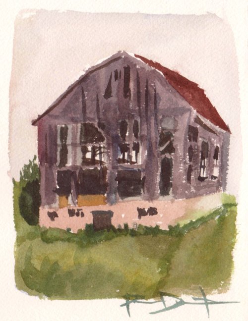
Type F to pay respect.  That phrase is a 'meme', F is typed to show respect on-line, usually for a tragic event or loss. Choosing a location to paint seems innocuous but has a big impact on the finished work. I have written at length about where to sit- in this case under a tree for shade, and with a side-lit subject in clear view. Juxtaposing the parking sign "Payez Ici" (Pay here), with the cemetery in the background creates a dark humor, and social commentary considering this is part of the pandemic blues series of paintings. Hopefully things stabilize, it is 'wait and see' in Quebec for now.
7 x 10" rough press, watercolour, May 2020

F

Speaking of respects, there are a number of paint tubes I took out of my collection and will bring to the environmental center for disposal. Most of them I will not replace or use anymore, except where noted. For the sake of record-keeping, here is the list of paint tubes I will dispose of and some notes:


PB28 cobalt blue SEN, old, semi solidified, moderate toxicity cobalt
PB35 cerulean blue WN, moderate toxicity cobalt
PB35 cerulean blue WN (2 tubes), old, solidified, moderate toxicity cobalt
PB35 cerulean blue SEN, old, solidified
PY40 aureolin yellow WN, substantial toxicity cobalt, poor LF
PY53 yellow and red mixes DS, moderate toxicity nickel
PY129 green gold WN, moderate toxicity copper WN
PV1 rose tyrian, substantial toxicity rhodamine, very poor LF
PB28+PW6 Verditer blue HWC, moderate toxicity cobalt
PR242 french vermilion hue, poor LF
PBk6 PBr7 Sepia WN old, gummy
PG18(+PG7!) HWC old, gummy, spiked with PG7 as noted on Handprint.com
PB15 SEN old ... replaced with PB15.3 MG, and PB15 yellow shade HWC
PY154 SEN old ... replaced with PY154 HWC
PR209 SEN old ...replaced with PR209 HWC
PG7 WN and HWC old ...need to replace soon, probably PG7 HWC

These were not toxic, I already threw out in Jan 2020:
PR83 alizarin crimson, very poor LF
PR83+PR48 crimson lake, very poor LF
PR83+PBk7+PB27+PB29 payne grey, poor LF ... replaced with PV19+PB15+PBk6 neutral tint WN
PR83+PG7 hookers green very poor LF
PY3 lemon yellow
PB29 french ultramarine DS, had severe pigment separation
PBr7 raw umber HWC old, gummy, excessive gum arabic
DS = Daniel Smith, MG = M. Graham, SEN=sennelier, WN= winsor and newton, HWC = holbein watercolor, old = the old brand selection
LF = lightfast (fades in sunlight)


Thursday, May 28, 2020

Light and Shadows

Brilliant colours emerge at sunset, casting a coral glow on the hospital in London Ontario. When the sun drops to the horizon light passes through more of the atmosphere giving a peachy colour to anything that is illuminated. The shadows take on dark pastel tones. Many objects will have just the top lit up by the falling sun, while the bottom of the object will be plunged into shadow. Reflections really stand out because the whole scene around them is becoming desaturated.  The dark pine trees overlap the brightest parts, which increases contrast. Time is the biggest challenge in a sun set, the lighting conditions will only stay for 15- 20 minutes and they change rapidly. 5" x 7" cold press watercolour, 2003?

Concentrating on the important things, I did this painting in 2005 during a neuroscience conference in DC. A rare date shows up on the front. It took a lot of guts to paint this seemingly simple scene, which contains an autumn tree, a decorative lamp post, a Gothic window, lime stone bricks, and a slanting shadow. The shadow is what drew my attention, it was similar to a painting I did in Spain. To make the shadow really glow, I used purple tones, and overlaid the near black lamp post and brick detailing. 5" x 7" cold press watercolour

Different eras superimposed in time and space. This old storage shed was part of some farmland being slowly consumed by housing developers in London Ontario. It was interesting to see the large apartment building and the much smaller barn nearly overlapping, and with a common light source from the setting sun.  There is a little dark dirt pile at the front right of the barn, it provides dark contrast in order to illuminate the shadowed side of the barn. 5" x 7" cold press watercolour. 2003?

You see the theme here...to paint light you are really painting dark. The visual system will compare mid tones and light tones to the really dark element like the pine trees, the lamp post, or the dirt pile. Clever use of these devices will create a strong illusion of light in a painted work. I accidentally discovered this trick while painting a pile of construction debris.

Wednesday, May 27, 2020

Colourful Containers, NDG, Montreal

Many potential scenes catch my attention as I walk around, but often the light is bad, or the spot is difficult. This scene was on the south train tracks where I have made a few paintings lately, along the road is a bike path on one side and a narrow sidewalk on the other. I had about 2 meters of grass to sit back on, trying to avoid the passer-byes. Unfortunately someone tried to sneak a peak and I told them to stand back because of the social distancing. I knew it would be a problem as this is a busy sidewalk, so I generally rushed this painting more than usual.

What does it feel like to make a painting on location? Part of it is fear, like being embarrassed of having a bad result, or sitting somewhere you really shouldn't be sitting ( I avoid private property or secluded places). A lot of it is hope and exhilaration, kind of like waiting in line to go on a roller coaster. Then, intense focus, an almost zen like meditation. In the midst of doing a painting the reality I am seeing, and the painting I am working on start to merge, almost dreamlike. Anxiety is intense because every element of the painting is alive- the water wet, the paper blank, the details waiting. The last thing is 'now I just gotta sign it!'. As I stand up, the pain comes, aching knees a sore back, brush hand sore, thumb holding palette is raw. My mind is mushy and blank, so I walk at least 10 -15 minutes before I can do the next scene. At home, more fear and anxiety to see what the result was like! Finally a sense of pride and accomplishment, and the entertainment of writing a blog, posting on facebook, and seeing some comments and likes.

7 x 10" rough press, watercolour, May 2020

Tuesday, May 26, 2020

Dandelions, dandelions, dandelions, Cote St. Luc, Montreal

Barbecue season is upon us, complete with social distancing, limited numbers of people, and donuts. Yes, barbecued donuts (the cake style ones) are truly delicious. The other thing is dandelion season. Millions of the little yellow 'weeds' are growing all over town in every available patch of grass including this embankment which is part of a small park near the train tracks called Aaron Hart Park. I found a good spot to sit in the shade and grinded out a couple of hundred yellow flowers on a grassy green berm.

To begin the flowers and grass I made a wash of lemon yellow from the Stoneground Paint Co. in order to raise the temperature. Then I painted the green lawn leaving little circles were the dandelions would go, continuing from bottom to the mid point of the tree. Above the tree, I dragged and dabbed the brush with green paint from side to side to create the berm shape. Finally I filled in the dandelions mainly with isoindo yellow (PY154) and vanadium yellow (PY184), with hints of benzi yellow, a yellow-orange (PY110). I used a bit of the verona green earth (PG23) up on the building in the background.

7 x 10" rough press. watercolour. May 2020

But wait, there are more... dandelions.

Heading home, I found this scene in the parking lot of Decarie square mall which is totally empty. I just stopped for shade and water and I was stuck by the contrasting yellows and the "I" shape parking lot barrier full of grass and dandelions. I put some tinted grey ochre on the asphalt, and used the benzi and isoindo yellow on the deep shadow of the painted curb.

5 x 7" cold press, watercolour, May 2020

Monday, May 25, 2020

Crab Apple Blossoms, NDG, Montreal


One more blog today, then I plan to head out and make some more paintings on my week off ("staycation"). At this time of year the crab-apple blossoms are out, in all their pink and red glory. It only lasts a week, and then they drop the flowers and produce the small bitter berries that the squirrels wont even eat. I had seen them earlier, but couldn't quite muster up the courage to try it. To get this effect right, I practiced a few times beforehand at home, working out the best way to do it. You see, painting light pink on a darker brick red is one of the toughest things to do in watercolour, not to mention the shadows have to be there too. I don't use white paint, so the best way to do this was to draw a faint outline in paint, then wet the paper, then carefully put the brick-orange colour around the shape of the tree and in between the branches. When it is drying, then drop in the purple-orange shadows. The last thing I did was put the pink, then darker pink, then the two leaf greens.

This is where I made the painting called Cultural Center Looking at Benny Housing, in fact, it is the same building seen here behind the tree.


That grey colour on the right was made from pyrrol red and winsor green, I was waiting for a moment to try it out. In the future I am going to buy a greenish raw umber which may do the trick with half the effort and a less expensive pigment.

5 x 7" cold press watercolour, May 2020

London Ontario

Variations on brown are important when painting landscapes especially in London Ontario where there is a lot of limestone, trees, and asphalt. These small studies were done on the University of Western campus during winter, it was not far from where I lived at the time (Bayfield Hall). To get the brown tones I used burnt sienna (transparent) from Winsor and Newton, it was the only earth colour I really used for my entire painting career. That all changed in 2020, this year, when I introduced many new earth colours like a thick iron oxide red, some raw umber, and the suite of earth colours from Stoneground Paint Co. In the past, I used yellow ochre sporadically but did not like it much because it was runny and mixed poorly with other paints.

In retrospect, I quite admire the quality of these small paintings. I was on my game, ambitious and well practiced. Soon after these paintings (there are a lot of them, I can scan more), I moved away from landscapes towards abstract paintings and the doodleism style. Perhaps it was getting rather boring painting pictures of parking lots and fire hydrants after painting Cathedrals and epic landscapes in Spain.  I never stopped though, every year I have painted at least a dozen or more landscapes mostly from travels or some local scenes. It wouldn't be until 2020 (this year) that I really got back into the landscape groove, partly due to the discovery of Hiroshige, my idea of doing a Montreal landscape series, and partly to do with the pandemic lockdown which deprived us of our normal entertainments.

5 x 7" cold press watercolour, 2000-2003? (these two scenes are on the front side of the same piece of paper)

No Truck Parking! NDG, Montreal

Capturing textures is a key part of landscape painting. I saw this scene awhile ago, it is down by the Provigo near the southmost part of NDG where the plateau drops off into the trains and the highways. There are several interesting textures here, starting from left to right, the dilapidated painted brick with rusted trim, the corrugated aluminum wall panel, the wooded truck siding painted blue, the plywood hiding the underside of the truck, the pebbly asphalt, the clear blue sky, and the tree with new spring leaves. Each texture required a layering approach. For example, the plywood had a base coat, a washed texture, then a drybrush grain texture. The joke was that the traffic sign depicted the no parking symbol with an image of a truck below it, so no truck parking!

I took the watercolour pans with me for this outing, the ones from Stoneground Paint Co. The grey ochre was used for the grainy, grey asphalt along with some tints added. Buff titanium was used for the cream colour in the bricks, the umbers were used in the treebark and tires of the truck, and roman black for the deep shadows under the truck and aluminum wall. I also used some cobalt blue for the truck. The yellow lines were with PY110, but I feel that it looks too dark, still unsure how to easily make those parking spot lines! Next time I may try buff titanium tinted with the PY110.

I have taken this week off to unwind a bit, and concentrate on painting, so far I have just been able to paint sporadically on weekends or sneaking out for an hour here or there.

7 x 10" rough press, watercolour, May 2020

Friday, May 22, 2020

Bolton's vanashing landscape

Looking around the neighborhood it is easy to find examples of a vanishing landscape. An old house is bulldozed and turned into a condo, a parking lot is dug up and turned into a condo, a farm is bought out and turned into condos. Basically condos are taking over the world (along with the worms!?). This abandoned house was located along Columbia Way and highway 50, North Hill Bolton. It was part of a farm that was slated for a housing development. The city stepped in a blocked development, but I think they built some kind of shop on this lot. I actually do remember painting this, the wood frame with all the details was particularly challenging. I love the way the clouds look, light an fluffy.5 x7 " cold press, watercolour, July 1996

Not content with an outside view, I explored further into the abandoned house, creeping up the stairs in into the remains of the attic. In the distance, through the old window frame was the purple and orange development sign. The shadows from the naked beams created a laddering effect on the fallen support beam. In retrospect, I probably shouldn't have been up there.

5 x 7" cold press, watercolour, July 1996

Armenia, World Inspired Landscapes (with Stoneground Paint Co)

Found deep in the foothills of Armenia on a winding hiking trail is a remarkable natural stone arch. Forged from the surrounding mountains, it curves gracefully over the trail, framing the picturesque mountain ranges in the distance. Like the other Wold Inspired Landscapes this one was created from extensive on-line and library research, which was compiled into an original drawing and watercolour painting. It seems like a great country to visit, located in Eurasia between the Middle East and Asia.

To do this painting I used 15 watercolour pans I just bought from Stoneground Paint Company, located in Canada. They make an incredible array of pigments in small batches, and sell them at reasonable prices in half, or full sized pans. A pan is a small plastic holder that has semi solid paint in it, as opposed to tubes which are more liquid, and are squeezed out as needed. I ordered their line of earth colours, and used them exclusively to make this painting. The coolest part was that one of the paints is called Armenian Purple Ochre, it is literally from clay earths mined in Armenia! I used it on the stone arch, in the sky, and on the mountain in the distance. Most of these paints have a natural sparkle, when I tilt the painting in the sun, the whole thing sparkles like a real rocky, sandy terrain. 5 x 7" cold press, watercolour, May 2020 (B side of Ranger Park).

Here is a test of all 15 pigments, so you can see what they look like. They are all amazing! They also came in a nice metal case and fantastic packaging, not to mention a thank you note. So Canadian ; )

The colours are going left to right top: raw umber green shade (PBr7), raw umber neutral shade (PBr7), grey ochre, titanium buff (PW6:1), felsite (PY43), lemon ochre (PY43), light yellow ochre (PY43), raw sienna warm shade (PBr7), mars orange (PY42), Pozzuoli red earth (PR102), burnt sienna deep crimson (PBr7), Armenian purple ochre (PR102), nicosia green earth (PG23), antica green earth (PG23), Roman black (PBk11).

Empty Pool, Confederation Park, NDG, Montreal

When I turned the corner off Somerled Av towards Confederation Park, I saw the brilliant blue empty pool glowing in the hot sun. A quick walk around the fenced-off pool I found the perfect spot to sit on a park bench. The whole scene was observed through a fence which I did not try and show except in the back behind the two large shade umbrellas.

One key decision when painting on location is the orientation of the paper, landscape (horizontal) or portrait (vertical). In this case landscape was the natural choice due to the wide lines and angles of the pool and cool shapes of the platform. The 3-D shape of the pool carries the foreground through to the background which creates an exciting composition. Due to the pandemic lock-down the pool is shut indefinitely which made this painting possible. The wealth of rich blue tones include cerulean in the pool walls and cobalt on the umbrellas. I also included a pile of sticks, some deck signs, and the pool ladder in the foreground to help with the composition, but I omitted a complicated lifeguard ladder/seat which would have obscured the scene.

7 x 10" rough press, watercolour, May 2020

Thursday, May 21, 2020

Downtown Bolton

Just another trip down memory lane, this painting was dated on the back as May 1996, exactly 24 years ago! At least we don't have to guess what the building was, Mr. Submarine in downtown Bolton. Now a days it is a fish and chips joint last time I checked. The summer of '96 was the beginning of my plein-air (location ) painting journey, there are about 2 dozen or more paintings from this era. The weather was apparently nice that summer, plenty of hot looking atmosphere. The palette was simpler back then, just 5 colours that I had from my paint classes done in 1989. There are too many numbers in this blog, but how about another one? 74. That is how many blogs I have completed this year, looks like I should easily break the record I made in 2008, when I did 100 blogs. 5 x7" cold press, watercolour, May 1996

How about one more? This painting was not dated, from the looks of it I would guess it was a little later, maybe 1998 because of the cerulean blue in the sky, and the much heavier application of paint. The scene is from the old Courtyards of Caledon downtown Bolton, which was mostly vacant around then, now it is half lumber yard, the other half donut store? 5 x 7" cold press, watercolour 1998?


Ranger Park, Lasalle, Montreal

After painting The Blue House, I headed down the Lachine canal path to the beginnings of Lachine, and turned left into a small park called Ranger Park technically in Lasalle. The view looked westward down the St. Lawrence river through some old crusty trees on the shoreline. Armed with 5 different blue paints I created the complex, wavy shimmering water, and then proceeded to deface it with the dark brown trees. Part of the distant shore line is shining through the tree, I thought the iron oxide paint would cover it but it was more transparent than anticipated, I will have to remember that next time.

Brushes are quite important for painting, otherwise you are finger painting! Most of my brushes are synthetic, with a half dozen sable brushes from Escoda or Winsor and Newton. The sable brushes are not from actual animal called sable, they are from a kolinsky weasel (Mustela sibirica) that lives in the wild and is trapped for its fur. This animal is on a watch list for species, but not considered endangered in any way. To take care of my brushes properly I read the section on brush maintenance from Handprint.com, and discovered a lot of things I did not know. For example, to clean the brushes I acquired some glycerol bar soap from Lufa farms, and used it to soap down the brushes and rinse them well. Then I treated them with hair conditioner (like for people) for a few hours and rinsed that off. They are like new now.

Note, I just got the new paints from Stoneground paint company yesterday, and made a painting that I will blog about soon. 

5 x 7" cold press, watercolour, May 2020

The Blue House, Ville St. Pierre, Montreal

This scene is just down the street from Elm Park in Ville St. Pierre, a small neighborhood sandwiched between NDG and Lasalle just north of autoroute 720/20. In fact, I was sitting on a small boulder in a patch of grass backing onto the tall concrete wall of the overpass. I was nowhere near the cars or the people so it was safe, but it was rather noisy. Good thing I was using earplugs. The wind was strong on that day blowing the paper up and down several times creating splashing effects. I have wanted to paint this scene for a long time, it is on the way when you ride your bike from NDG to the Lachine canal. The house has so much character, as does the tree beside in on the left, which had branches cut off the top but was still growing and surviving. The name and composition of this painting was inspired by Van Gogh's Yellow House. Awile ago, I did a painting called Green House, Barbados. Now I just need to find a red house, orange house, purple house....

Blue has become a theme of the pandemic series, it started with blue skies, and then slides, shorts, and houses apparently! Having trouble with phthalo blue, I decided to go back to some of the other blues including iron blue (prussian/PB27) for the outline and tints, cobalt blue (PB28) for the house paint, and cerulean blue (PB35) for the sky. It made the sky a lot easier to control, in fact I mixed cerulean with a touch of phthalo. After the light blue dried, I layered on cobalt blue to create the brilliant blue paint on the bottom half of the house. I finished with a darker layer of cobalt blue and a touch of phthalo. To complete the tour-de-bleu, I used french ultramarine blue (PB29) in the purple-shadows, and indo blue (PB60) in the dark shadows. Cobalt paints are slightly more toxic than average paint, but they are generally safe with proper handling.


7 x 10" rough press, watercolour, May 2020

Wednesday, May 20, 2020

View Down Lansdowne Avenue, Westmount, Montreal

Cityscapes are a kind of landscape done in the city, hence the clever name. I try to observe nature in the city such as trees, grass, and water and how they integrate with the human-made stuff. Houses are made of brick wood and clay, and concrete and asphalt are made of minerals and oils from the ground, so in some ways, even the human-made stuff is part of the earth. And the trees, grass, even the water are all put there or modified by people. In this scene I was looking down the steep part of Lansdowne Avenue from the vantage point of a small embankment of grass up and away from the sidewalks. The towering apartment buildings and old houses seemed like they were part of the forest.

With all the new colours in my palette I have been adapting to several challenges, such as tree bark and blue skies. In this painting, I left the tree trunk until the end, and then put down one quick wash of iron oxide red with phthalo blue. When it dried I made the bark textures with bloodstone genuine which is a heliotrope/hematite pigment. Heliotrope is a kind of black sandstone, while hematite is a red iron oxide found within the stone. I am quite satisfied with this method of painting trees, it provides the weight of a tree trunk, but still gives the warm reflectivity of the bark. The blue skies have been tricky since the clouds showed up- the phthalo blue tends to flood the whole area and obscure the shapes of the clouds. This time I put the blue last, but it dried with hard edges. The shadows in the clouds are almost the same mix as the tree, but with a touch of magenta and french ultramarine (purple) added in.

7 x 10" rough press, watercolour, May 2020

Tuesday, May 19, 2020

Barn Burner, Bolton Ontario

Ok, I will admit it, I painted the barn. This was one of the vanishing landscape series chronicling the slow development of agricultural land into suburban housing developments. This barn was located on the north hill just past the neighborhood on Coventry road. The city had put a moratorium on new housing developments, but the farm had been sold and nobody was maintaining it anymore. I did a painting of the property a little earlier before it got abandoned.

Not much longer, and the barn burned down, it was in the newspaper! I packed up my supplies and walked down the street to see the burned barn, complete with smouldering ashes. The painting is below. Talk about a vanishing landscape! As of today (2020) the farm lot still sits vacant.

5 x 7" cold press, watercolour, July 1996

Elm Park, Ville St.Pierre Montreal

I would wager that this is the first ever watercolour painting done in Parc Elm, which is located in Ville St. Pierre, right next to autoroute 20. The wall you see in this painting is the sound barrier separating the houses and park from the highway. The park is about 1000 square feet or less, just a path, a bench, and a small garden you see here with some tulips. One tulip was pushing up into the shadows, and the sun was otherwise sparkling on the grass and sidewalk. It was a pleasure to capture this thin sliver of spring.

Convenience mixes are paints that come pre-mixed, like, the company puts two colours together so that the artist doesn't have to do as much work. I never knew that until recently, when I started reading Handprint.com which is a vast resource of knowledge and opinion. I decided to mix my own convenience mix consisting of winsor green (PG7) and benzi yello (PY154), yielding a spring-like lime colour. As spring turns to summer, I added slightly more of the green to represent the increased chlorophyll. The grass and budding leaves both contain ample amount of the convenience mix. Lets call it Montreal spring green.

7 x 10" rough press, watercolour, May 2020

Sunday, May 17, 2020

Stretching Rack, List of Large Paintings with Links to Respective Blog

No painting this time, just a photo of the backside of the stretching rack I use to make larger sized watercolours. On the front is the surface of the wood frame riddled with staple holes. Mom and Dad helped with this one, years ago they drove me out to a hardware store to buy the lumber and we whacked together what was a very large frame (like meters) for holding acrylic canvasses. As I gave up on acrylic, I cut it down to size for 22 x 30" watercolour paper to complete "The Grapes of Tuscany" for my late Uncle Ross. Every painting done on the rack was written in pen on the back. Since it is hard to see, here is the list of year, title (the spaces denote where the piece of wood ends, it starts with the bottom piece and goes counter clockwise), and links are provided for ones that have a blog:


2002 The Grapes of Tuscany
2003 Superencrypted
2003 Floating Cathedral Statues
2003-2004 Public Highway Drivers (PHD)
2004 Lab Book #4, Finding Space
2004 Blue Flames Consuming the Stylized Image of a Woman
2004 Lab Book # 5, Making Connections
2004 Lab Book #6, Spanky's Fantastic Cathedral
2006 Inner Workings
2006 Failure to Understand, Something to Learn
2006-2007 Summer Scene
2008 Lab Book #9, The End of Colour
2008 Lab Book #11, The Legendary Isle of Sixe

2008 Lab Book #12, Archi-doodle City (W/E)
2009 Life of an Onion
2009 Lost in a Mall
2009 Addictive Puzzle
2009 Preventing the Deterioration of an Otherwise Normal Scene
2010 Current Demand
2010 The Extruders
2010 The Twenty-Ten Solution
2010 The Deluge
2010 Creation's Creations
2011 Insignificant Details
2011 Instant Nostalgia
2011 The Plan (Suburban Escape)
2011 Fertile Idea
2012 Social Networking (Life on Venus)
2012 The Paper Chase (No More Outlines)
2012 The Crushing Delicate
2012 Attempted Evolution
2012 Immortal Time, Infinite Ideas

2013 Where we Were (Ancestors)
2013 Perpetual Load Theory (The 2012 Question)
2013 In Sequence [B side]
2013 Responsible for Reality (Dinosaurus)
2013 The Lemon Sunset
2013 She Was...
2014 New Thoughts and Human Adaptations
2015 Never Done (No Idea)
2015 The End of Ego (High Tide)
2016 Desert Appliances (Applications Unclear)
2017 Community Connections
2018 Tourist Destiny
2018 Apple Eye, Shrimp in the Sky
2019-2020 Lab Book #23, Hiking Elvis

update: I have finally filled in the missing blogs, and updated some of the old scans to make the images better. I needed to be outside on a sunny wind-free day to take good pictures. The Grapes of Tuscany is now posted, I found an old photo of it while it was still on the rack in 2002. 

Hiking Elvis

Find Hiking Elvis! Last year I stretched a 22 x 30" paper on the rack, and there it sat for months on end. In December I splashed some colours around including a swath of cerulean blue, green and blue blobs, and some washes of alizarin crimson red. And there it sat for almost six months without any progress. It first occurred to me that this was to be a mountainous scene, and that it would involve Elvis, four Elvis' was the original plan. By accident I had dropped four beads of water on the washes when it was wet, and I became obsessed with the idea that they represented Elvis. At the same time I had a doodle in my lab book #22 that resembled Elvis on a mountain, and the idea started to come together (it was mistakenly labelled lab book #23 on the painting). I also worked out a few compositions in my sketchbook that would fit the background painting. Complicated path just like the painting.  

There are a lot of little symbols and jokes in this painting, the main joke turned out to be that the characters are all taking selfies! I also included the abominable snowman as I remember from the SkiFree game, and a Canadian maple leaf to remember Canadian climbers who died on Mount Everest. In the end, this painting is about the absurdity of commercialized climbing in the Himalaya's, which is currently on hold due to the pandemic. There is even a Ferris wheel, fast food restaurant and french fries strewn throughout. Hokusai's wave-drawing style was used in the foreground cliffs.

22 x 30" cold press, watercolour, 2019 - 2020

note, I went over the alizarin washes with quinacridone and pyrrole reds to make sure they are lightfast, since the beginning of 2020 I dropped alizarin from use which is a shame since it is such a powerful colour, but it fades like crazy in sunlight. Here is a crop of Hiking Elvis taking a selfie...

St. Jacques Street, Rusty Store, NDG

Rust is a very appealing colour and texture, it embodies rich earth orange, yellow, brown, black red, and has an almost velvety texture. The large family of artists pigments based iron oxides are perfect for capturing rust, because they are in fact, rust! Using rust to paint rust, it doesn't get any better than that. Other than painting a picture of a ferrari using pyrrole (ferrari) red which is on my painting wish list. To find rust, I used google maps to identify a junk yard for scrap cars. Unfortunately it was surrounded by a tall fence. This scene was on St. Jacques Street, usually a terribly busy an noisy light-highway, it was not too bad when I was there last week. The blue shop caught my attention, and of course the rusty overhanging metallic awning, and the rusty yellow poles.

I used to sign all of my landscapes, well most of my landscapes, with the P Darlington 'scrawl', barely legible and easy to miss. With few exceptions I signed in cerulean blue or mostly ultramarine blue. In the pandemic blues series, I have been signing with a PJD 2020 inscription using mostly indothrene blue. It is hidden in this painting, but you will find PJD 2020 if you look around. Part of the reason I haven't been signing as usual is just the situation being what it is, and these are very experimental paintings as I work out the new paints and how to use them. I will get back to signing normally in due course. By the way, the blue here was a mix of phthalo blue (PB15) and iron oxide red (PR101) and some adjustments with phthalo green (PG7) to make it turquoise. The rust was iron oxide red, bloodstone genuine (heliotrope with hematite from Daniel Smith co.), some vandium yellow (PY184), and purplish tints.

7 x 10" rough press, watercolour, May 2020

Friday, May 15, 2020

Bolton Valley

Having control over watercolour medium can be a chore, it may feel sometimes like the medium has more control over you! Through experimentation I discovered the backwash technique where you let a wash dry almost completely, then drop in some water which causes a blossoming effect. In this painting, done in May 1996, I used that technique to create the bushes next to the pine tree. The scene is from the south side of the Bolton Valley. The other trick I used was the 'blue fade' where you make the hills in the distance get lighter and bluer towards the horizon. I had read about that in a book 'Everything you need to know about watercolor'.

Another painting from summer 1996, this one shows the Bolton cemetery looking north. The cemetery is located on the North part of the valley and provides some great views of the town, and it is generally very quiet! This one was labelled 1996 in pencil on the back, but looking at it, I feel like the technique was too good for 1996, but the palette is right (all transparents). So maybe I did do this in 1996. I seem to remember the name on the stone was 'Crowley' but I didn't want to use the full name for some reason, like to not disturb the dead?

5 x 7" cold press, watercolour, 1996 (?)

Benny cultural center and library, NDG

For the last few months the weather has been exceptionally good making it possible to paint springtime like never before. During spring the trees do not have leaves yet which makes certain sight lines possible. For example, in this scene, the building, which is the Benny cultural center and library (with the big ugly apartment building in the background) would be totally obscured by leaves. Usually it is too cold, wet and miserable to go out and paint in March-early May, but this year perhaps due to global warming or something its been near perfect conditions. It so happens that the pandemic started in March which meant everyone was, and still is, staying at home for the most part.

I wrote about the pandemic blues in a previous blog, referring to the brilliant blue sky as well as the feeling of being blue. These paintings are meant to capture the moment with mostly empty scenes of the neighborhood, and with blue accents. In this case, the top part of the cultural center was a powder blue, also known as periwinkle, which is a combination of cyan and magenta. Its CMYK code is 20,20,0,0 meaning that it was a little bit of cyan and magenta in equal proportions, with no yellow or black. I had actually studied that beforehand, and used the knowledge to mix this otherwise mysterious blue colour using phthalo blue and quinacridone magenta.

The red part of the building turned out a little disappointing, it is supposed to be a brighter red but after it dried it looked more brick red. I used pyrrol red but that colour is not mixing well, I guess I will have to work out a new formula for bright reds like that.

7 x 10" rough press, watercolour, May 2020

Thursday, May 14, 2020

Craft Show, Bolton Ontario

August 10th 1996 was the day I did this painting! There are actually dates on these paintings done in the summer of 1996 which was the first summer that I was painting outdoor 'on location' paintings. My mom signed me up for an art show at the Bolton community arts and crafts fair on the South hill where I sat all day in the heat with my paintings on a small table. Mom was hanging around talking to people. I didn't sell anything that day although a few people came by and took a look. Instead I made a bunch of paintings, there are more than just these two. In retrospect I wasn't much of a salesman.
5 x 7" cold press, watercolour, 1996

Here is another one from the same day showing the tables, garbage cans, and trees in the background. The purple shadows are cool, I must have mixed french ultramarine blue and alizarin crimson. I also used aureolin yellow at the time, and viridian green. You can really feel the heat of the day! 5 x 7" cold press, watercolour, 1996


Wednesday, May 13, 2020

Farine Five Roses, Montreal

Velvety chocolate textures can be seen in the brick buildings, the muddy base of the dried up canal, and the various other concrete structures. I was motivated to paint a water scene and knew just the spot. Thirty minutes later, on bike, I arrived at the Farine Five Roses factory, an old granary that is no longer operational but has been maintained as a Montreal landmark. To my dismay, the canal was mostly empty of water, perhaps the city shuts it off in the winter or something? There were some sad little puddles of melt water in the muddy basin, in which a family of mallard ducks was hanging out. The wind was extreme that day (last weekend), I think my face was frozen and eyes blurry with tears by the time I finished. At least the ducks stayed there the whole time posing for me.

Mixing paints is a big part of watercolour painting. Unlike oil or acrylic, you can easily mix two, three, four, or more watercolour paints together in order to produce variety. In oil or acrylic, based on my limited experience, colour mixing will quickly produce mud, and it is hard to change the colour on your brush especially with oil. In the old days, I used only a half dozen or so transparent colours to make everything. The brick and mud colours seen in this painting were done using an opaque red iron oxide (PR101 mixed with PBr7) adjusted with PR179 maroon or quinacridone red to get it to be more reddish. As I did this painting, it occured to me that I should have just started by painting the whole thing brown, it would have been faster!

7 x 10 rough press, watercolour, May 2020

Sunday, May 10, 2020

Palgrave and Bolton

Dad and I go for bike rides when we get the chance, although it has been too long since our last one! This scene was done up around Palgrave which is north of Bolton, the scene depicts a fish ladder that was part of the river rehabilitation program. In theory the trout would have a chance to jump up the rock steps to reach their spawning grounds. I don't know if it ever worked but the idea was good and it certainly improved the look of the whole river all the way down to Bolton and beyond. Dad was sitting right next to me, we were having a water break and he was patient enough for me to finish this detailed painting.
 5 x 8" cold press, watercolour, 2005?

I found a photo I took of Dad sitting near the ladder. I spy my painting box (held with duct tape) and green cup there which I was using around this time for painting.

Speaking of Bolton, if there ever was a signature motif from Bolton it would have to be the water tower out in the woods, but a close second would be the outhouse. It was part of a four seasons camp that they ran up in the woods where we would go cross country skiing in the winter or hiking in the summer and fall. It was a favorite place of mine growing up. Seen below is a summer scene of the outhouse. Other paintings of the same outhouse with some embellishment are the very early Winter Palace, and a similar scene outhouse in winter.

 5 x 7" cold press, 1997?


Tulip Time, NDG

For May the weather has been remarkably good, I can't remember a time when March, April up until now was so amiable for painting outdoors. There have been a few cold and rainy times, but for the most part clear blue skies and tolerable temperatures. This scene was painted up at the Fleet Street and Cavendish intersection where they have landscaped the area with nice trees and flower beds that are just now sprouting tulips. It is the third painting I did up there, mostly because there were some great places to sit while keeping distance with the walkways. Unfortunately the traffic has picked up significantly as of late, and it really made this location unpleasant. Up on a hill side, my butt was literally vibrating from the construction trucks, recycling trucks, and buses rumbling down Cavendish. I captured one of the recycling trucks in the upper middle of this scene.

I packed a lot of detail into this small painting, there are hundreds of elements including two types of flowers (tulips and dandelions). To accommodate everything I started with a fairly detailed outline using diluted black paint and then worked up the details one by one. The last element was the tulips and dandelions. I saved them for last because I wanted to properly judge the colour. If you put the colourful things in first they could end up looking pale and faded at the end. It was still offa little though, so I added red, orange and yellow washes where needed to enhance the tints. The 'PJD 2020' signature that I adopted this year is hidden on the street sign in the foreground.

5 x 7" cold press, watercolour May 2020

Friday, May 8, 2020

Rural Caledon/King township

While riding my bike out in the east part of rural Caledon I crossed over to King township, basically the middle of nowhere. There were never-ending rolling hills, farms, fences, cows, and plenty of bad weather that day. I remember being worried about getting stuck out in the rain 10 km from home! The conditions were tough but I managed to hack out a few watercolour paintings that day. The technique was rather simple, but the wet humid conditions made it impossible to get more that one or two layers of paint down. As evidence, they weren't even signed. I think the results were okay, these paintings may even be worth redoing in a larger updated version. 

Here is another one done on the same trip. The paint was drying a bit better there and I could get multiple layers. It really conveys the atmosphere, and I love the yellow/violet contrasts. It is really hard to know when I did these, the techniques and pigments used indicate an early 2000 work. There is obvious use of iron oxide pigments, cerulean blue, and a rose coloured paint in the sky that I got sometime in early 2000. I also vaguely remember the circumstances around the time and it was when I was a graduate student at University of Western Ontario, visiting my parents in Bolton. 5 x 8" cold press watercolour 2003?