Friday, November 27, 2009

Winter Palace, Bolton, Ontario, Canada

Old but good, this painting must have been done somewhere between 1991 and 1992, from a photograph of an outhouse in the woods of Bolton. The area is somewhere near the town line, close to an old camp ground, the outhouse is part of the camp infrastructure. My Dad and I used to ski up there, the trail you see in the painting is part of the ski trail we carved out.

It is interesting sometimes to look back on the older work. There are some key differences in style, the brushstrokes are a little more tentative and there are clearly areas where I have gone over the old brush strokes a few times...typically that will lead to bit of a muddy 'overworked' appearance. But overall this work has a fresh clean feel to it. Most of the paint is applies in a very transparent way (not as heavy and thick as I do more recently), and I have made a lot of 'glazing' effects, where thin layers of paint are applied over top of each other for a shimmering effect, the best example being the trail itself, which was created by putting darker layers beside it. I had also added the two trees from imagination, they were not in the photo as I remember, this was done to break the monotony of the horizontal tree line and keep the viewers eye from following the ski trail off the picture.

cold press (watercolour block) 11x14" , 1991 or 1992

Thursday, October 22, 2009

Concrete Nature

Concrete Nature was based on a doodle in one of my work books, the subject probably reflects the way I feel sometimes when sitting in a meeting, that one one hand you may want to fly away, but on the other hand you are grounded and focused on the topic. Maybe I was one of those kids who stared out the window during class. There is a definite native theme to the design, with the bird and the fish both connected physically to the earth. Not sure what the walking teddy bear means.

Important to any composition are the lines that define the major shapes. In this work there is one continuous line that defines the wings and face of the bird and the entire shape of the fish, starting at the top of the picture and ending in a ripple at the bottom right. This defining line provides a smooth pathway for the viewers eye to slide up and down the composition. In this painting the central line is easier to see, in some of the other doodleisms works the line is not so easy, and can often be made up of several different elements. It is none the less important to have a nice line in your work regardless of whether it is abstract, portrait or landscape.

10x11" cold press, 2008

Thursday, October 15, 2009

Calypso

Calypso is a painting based on scientific ideas but meant to be purely abstract. The concept was two cells (small independent units of life in your body) contacting eachother in a meaningful way. The green cell on the top and the purple cell on the bottom meet in the middle, with small red highlights indicating the action in the middle. The blue dots represent nucleus of the cell, the epicenter of control.

Technically this painting looks simple but is in fact very difficult. I used the 'paint blob' technique where you drop on a large amount of fluid paint, and then let it dry overnight. The tricky part was ensuring that the purple and green blob did not mix too much, although a little mixing was inevitable and desired, as it provided a bit of harmony at the center. In addition, the blobs needed to dry in a somewhat circular pattern. Somehow I managed to get it right, and once it all dried I put on the pale orange background, the blue centers, and the red and green highlights, which are just barely visible at the interface.

10x11" cold press, 2006

Wednesday, October 7, 2009

Addictive Puzzle

The idea for addictive puzzle came from an old doodle, in the doodle there were also groups of people on each level, trying to assemble the pieces, however the drawing was complex enough without having to depict a hundred people! The original concept had to do with the process of scientific discovery... you have a bunch of pieces that are all over the place, and many groups of people try to put them together. Without the people in the final work the message is lost a little, however you still get the feeling that a puzzle is sitting there, waiting to be assembled.

The method for this painting was rather straight forward. I started with a quick outline of where the different levels would be and then overlaid an heavy wash of pink and yellow and beige. Then I drew the outline of each puzzle piece, and filled in the colours as I went. Making the puzzle pieces was quite a chore, in fact I see now looking at the photo that a few are not filled in. The major challenge was maintaining the different sizes of the pieces, each level down the pieces get smaller. I called it addictive puzzle because when I started to look at the final work I couldn't take my eyes off it.

22x30" cold press, 2009

Friday, October 2, 2009

Waffle House, North Carolina, USA

Waffle House, for the uninitiated, is a chain of breakfast restaurants in the southern US, rivaled only by IHOP. On a walk around Greensville North Carolina I came upon this scene, which I felt reflected the American culture. Inside the restaurant I recreated Edward Hopper's original 'Night Owls' painting, the idea was to provide a more modern urban context for the classic painting. Of course 'night owls' was depicted at night, and this painting is during the day, but who eats pancakes at night. I smell an idea for a new painting here.... This version of Waffle House was painted from two sources, a photograph, and a location painting. I remember well the location paitning experience, lots of cars going by and little red ants biting my butt. Painting from photo is always a challenge because the colours are off, and there is too much detail. I used the location painting to get the colours right, and the photo to nail down some of the details. In the end the work looks a little stiff as compared to the location painting (which I should dig up some time and photograph). The thing that is missing in your studio is the 'environment', the noise, the smell, the air...when on location these elements will channel through the artist and onto the work. Other examples of this concept are my paintings Japan Busy Street, View from Mount Royale, and in general look to Monet and Tom Thompson (and the entire group of seven/Emily Carr) for examples of artists who channeled external energy into their work for great effect. 14x11" hot press, 2002

Tuesday, September 29, 2009

Sunset, Nagoya Japan

Nagoya Japan was largely business-like with many large structures and office towers, yet there were many instances of spectacular landscape especially along the river. Here, logs from a timber-mill float on the mirror-like river reflecting a brilliant sunset. A bridge with modern design and the ever-present city-skyline dominate the background. Painting reflective water is always a challenge no matter what the media. In oil painting, greats like Monet and Tom Thomson used small interlocking brush strokes to create vibrant reflections, the american Turner and the old English masters used glazed-watercolour techniques. But a common theme among all is to use value contrast. Here, the logs are done in a fairly dark tone, which provides a contrast with the water. In the end the water ends up looking brighter than it actually is as a result of the contrast. To play up and enhance the effect I added some even darker highlights to the logs. 5x7" cold press, 2006.

Thursday, September 24, 2009

Bus Stop London Ontario

Bus Stops in London were indeed few and far between (as were the actual busses which took their sweet time getting to the stop-Montreal has spoiled me with fast bus service), however it can be said that some of the bus stops had better views in London. This painting depicts a fall or spring (I can not remember which), the leaves are off the trees and the bushes are bare. What grabbed my attention was the yellow thing (a newspaper box?) and the way the sky reflected off the top.

Painting reflections from the sky is an important way to create atmosphere in your work. The trick is mixing the colours properly. In the painting there are two examples of reflected light from the sky, one on the mail box, the other on the glass rook of the bus stop. To make the yellow reflection I made a pale yellow with aurelian, and added a bit of green, and a touch of ceurulian blue. Adding green is a good way to neutralize your yellows withouth making them look washed out. The roof of the bus stop was just a thinner (more water) version of the beige colour used for the roof of the bus stop (that is not in reflection).

5x7" cold press. 2002

Tuesday, September 15, 2009

Barbados Sunset

Barbados provided some great landscapes and the sun was very brilliant illuminating the colours to heights previously unknown to me. Here the sun had just set on the sea, the clouds a cotton-candy shade and the beach a warm umber. The trees were a deep blue-green with red tints.

To enhance the illusion of reflective water I made the edge of the beach a thin dark line (see the bottom left) which made the pale orange of the sea seem even brighter than it actually is. This trick of value contrast was also used with the dark trees in the middle ground, which were set against the big purple cloud to make it look lighter.

5x7" cold press, 2002

Friday, August 28, 2009

Ronda Valley

Ronda is a small town in southern Spain I visited ( a decade ago!), the town is built on a deep gorge that offers tremendous panoramic views and sunsets. Here I capture the sense of distance, and also some of the unique southern architecture.
In a few days I made a dozen paintings in this town, it was certainly a wealth of material.

I discovered a mixture of colours in Hamilton Ontario of all places, that is very useful for tree covered mountains. The mixture begins with ceurelian blue and rose madder genuine, and then a dark green and a touch of yellow is added...the cool blue base and opacity of the ceurelian gives that blue 'distance' feel, and the other additives tint it with tree colours.

5x7" cold press. 1998

Thursday, August 27, 2009

Molecular Buoancy

Going through some old doodles recently I found a few that would make decent paintings, including this one, and an earlier post called 'Irreversable Modification'. Equally creepy, this painting entitled Molecular Buoancy, depicts an invisible 'ET' type character standing in a cold and desolate forest in the winter. Maybe he is just covered in snow...

I created the shape of the character without any actual lines to define his shape, instead I used the background elements to define his shape. The trees branches end where his head would be, and the bushes in the distance carve out is shoulder and arms. The reflection in the ice give the sense of his legs. To cap off I painted his hands and feet and did a few light washes on his body to give a slight impression of clothing.

5x7" cold press, 2009

Tuesday, August 25, 2009

Question Landmark

In this small abstract I was going for one simple object set against a stark baron landscape, similar to Bottle Sunset posted a few weeks ago. The background was supposed to be a desert but it looks more like a sea. My favorite aspect of the work is the rich blue colour in the Landmark. The object is backlit by a sunset, but the shadow still retains a luminous quality. I kept the shadows warm and luminous by laying down a bright red wash and covering it with a cool green/blue. Directional brush strokes are commonly used in oil painting, best exemplified by Cezanne, Monet, and the more contemporary Canadian painter Tom Thompson. They were all oil painters, and it is a lot easier to make the brush strokes visible in oil painting as compared to watercolour, however in this work I attempted to create some directional brush work in the foreground grass element. To do this I let the colour wash of the grass dry, and then on top I put on fairly wide brush strokes loaded with colours. The colour of the directional brush stroke varied to match the blue shadows or the warmer light. As you can see, the actual direction of the strokes make a sweeping S turn which helps bring the viewers eye from the foreground into the central Landmark object. 

 Question Landmark, 7.5 x 11" cold press 2009 (No. 1474)

Monday, August 24, 2009

Veggie Time


Here is the last painting I did at the old place on Esplanade, it was actually finished in the new place down in the south Plateau. A mixture of hope and optimism this painting looks forwards (as does the small dog in the bottom left) not backwards, as emphasized by the clock in the sky. The clock is kind of ugly, it was in the Esplanade apartment upon arrival, and it went in the garbage when I left, you can see in the close up that the numbers are replaced with vegtables.

I used a technique here that may be called very wet on wet...(a play on the classic technique name wet on wet). The idea with 'very wet on wet' is to put one layer of paint down (the sky) wait until it is just a little dry, then bombard it with an almost pure water mixture. It works best with staining pigements like Alzarian Crimson or windsor yellow, because these colours have a n attotude and will spread into their neighbor. I did not intend the effect to be so dramatic (look around the clock where I dropped down the wet bomb) but in the end I kind of like it, the clock looks like it is 'emitting' time in some gelatonous physical form.

22x15" cold press, 2009

Friday, August 21, 2009

Brain in a Box

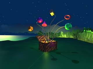
For awhile I have been learning a 3-D animation package called 'Blender' it is a piece of software developed by a now defunct animation studio and now made available to the community for free. The package is quite powerful, allowing the user to model shapes, colours, textures, lights and cameras, not to mention make movies and computer games if you wanted. In this example I modeled a landscape and a box with some random shapes attached to tentacles popping out of the box. I was illustrating the concept that stem cell, a type of cell in your bone marrow, could become different types of other cells...many different things can come from one.

With any medium the basic principles of art still need to apply, to create this 3-D model I used the things I have learned painting landscapes...the sliver of lake, the low clouds, the trees in the distance all come together in one tight composition. I also tried to keep the colours under control, it is easy to make fake, shiny looking colours. Having said that I also wanted the work to look computerized... it kind of added to the feeling of the painting, it is usually good if the viewer senses that it is made by someone, in that way they get to participate in the process that the artist went through.


Brain in a Box, Blender Render, 2009

Tuesday, August 4, 2009

Irreversible Modification

I was sifting through some of the old notes from undergraduate and found this little doodle of a candycane/frankenstein character. The doodle probably also appeared in some of the earlier doodle paintings (Lab book 1-3) but I haven't taken the time to look for it. In this new take on the design, I placed the character in a dimly lit room, and gave it a red-green colour scheme. The name came from some of the words on the note, the subjetc was chemical equations and the term irreverable modification can describe a particular chemical state. In this case the title suggests a transformation that can not be undone (did frankenstein ever get plastic surgery?).

I usually load up the backgroud with lots of detail and colour, but this time I wanted them character to stand out, and so left the background relatively simple. There is a suggestion of a window and a wall, all done with very light watercolour washes. The idea to keep the background simple comes from traditional chinese painting, they often left the backgrounds all white, accentuating the foreground instead. If composed properly the blank space of the background can be very energetic, even in this small work the shape of the background elements is very interesting to look at with the curves and lines formed by the object itself.

5x7" cold press paper, 2009

Friday, July 31, 2009

Bottle Sunset

Here is the first painting I did in the new apartment down in the south Plateau Montreal, of course it was not a location painting but something from my imagination. Maybe it is a depiction of what the Plateau was 200 years ago, a stark desert populated by yellow-green bottle/lamps. The concept behind this painting was to keep it simple, to concentrate on one object only making the composition on colour scheme as powerful as possible.

The outline as usual is done with the watercolour paint, this time I used a fairly potent yellow (windsor or the like). The potent yellow paints have a lot of "attitude", they are quite pushy. What I mean by that, is that the yellow pigements are so powerful that they will repel other paints and push their way into other colour washes. I use this to my advantage when creating luminous effects, for example in the sky I surrounded the sun by a pale yellow wash that kind of ran into the darker portion of the sky. Also, the yellow outline of the bottle 'repelled' the sandy brown of the background creating a nice textured effect that looks like reflecting sunslight (examine the left side of the bottle). Each type of pigment has it's own personality that you will learn after time, and use to your advantage.

5x7" cold press , 2009

Thursday, July 30, 2009

Orb Vines

The Sequel to Orb Vine, this painting Orb Vines picks up on the same style and theme but presents a few refinements over the initial painting. I softened the lines and the colours to create a more peaceful atmosphere, and improved on the compostion by creating 3 orbs arranged in a triangle, and a pile of rocks on the right to break the symmetry. I like this painting because it looks like it came out of a 1960's TV set design for Star Trek.

Creating the shiny sphere effect (the orbs) is a little tricky but can be done well with a little practice. You start by painting the entire shape of the orb with the lighteset colour (the highlight on the top right of the orb), then let it dry just a little, so it is just damp. You will know how wet your paint is by checking the reflection, when it is really wet it is glistening, when it dries a little it looks darker, like a wet towel. Now, on the palette, add a bit of a darker colour to your mix (but no more water) and then paint the next layer of shadow, leaving some of the original wash where you want the highlight to be. Keep making your palette mix darker and layering on shadow until you are satisfied. When it dries the colours should hopefully be blended together smoothly, if not, take a moist brush and try to gently smooth out any parts to look chunky. You can also lift some paint off in the highlight area to give an even shinier effect.

16x12" hot press, between 2002-2006?

Wednesday, July 29, 2009

Covenant Garden Market, London, Ontario

London Ontario is a small sized town with a big heart. In the downtown they built a large covered market to sell fresh produce and interesting items including artwork and crafts. For a time I worked part time at a gallery there, where some of my work was offered for sale, and during the day I would sit and paint. This scene was from the top level, looking through the fence down into the busy ground floor. I tried to put in every detail I could, the final result is kind of abstract, but if you concentrate you can see the maze of booths, stairs and a few shoppers.

Usually when painting on location, you want to keep the amount of detail to a minimum in order to save time, and to prevent the viewer from getting overwhelmed. I usually try to decide what is the main center of interest and start with that, then fill in the surroundings last. In this work I did the opposite, there is no real center of interest and the detail is totally overwhelming...the viewer's eyes can not settle on any one detail....but in that sense the painting is more successful...you get the feeling of a busy, colourful market with a million things to do. As they say, rules are meant to be broken...

12x16", hot press paper, 2004

Monday, July 27, 2009

Surf's Up, Barbados

On the north shore of Barbados the water is a deep blue and the waves roll in 1 meter high. More rugged than the touristic south shore, this beach was the backdrop for an international surfing competition which I had the chance to see. A surfer hangs ten while spectators watch on.

Painting waves is not easy to do, especially with watercolour. You would thing that the transparency of watercolour paint would make the job easier, but in fact the job of painting waves becomes harder without white paint like you would have in an oil or acrylic set. With white paint, you could paint the waves last, on top of the water, wheras with watercolour you have to leave the white waves blank, i.e. with the paper itself providing the white. On the other hand, the watercolour is easier to blend, so you can create some nice effects....for example if you look at the transition from the deep blue sea to the white crest of the wave, there is a yellow-green fade...this is done by mixing the deep blue and heyellow-green while it is still wet, creating a smooth blend.

7.5x9" cold press, 2002

Friday, July 24, 2009

Trident

This abstract painting was done awhile ago, I did not use lab doodles or preliminary sketches of any sort, instead producing the design on the paper in watercolour. The foreground shapes flow together into the background and off into the distance. In some ways it looks like a hand reaching out, with some pretty funky fingernails.

I never use pencil to make outlines on the watercolour works. I was told not to do this by an excellent painter by the name of Jon Joy, who pointed out that watercolour is transparent, and pencil will show through. Instead of pencil I use paint, usually a thin gre, which tends to dissapear. In the case of Trident, I used a dark blue green to establish the shape, which can be clearly seen in the final work. I think the strong green outline helps define the shapes and pull together the composision.

10x11 cold press paper, sometime between 1997-2001

Thursday, July 23, 2009

Calling Dali

I don't know if I was ever directly inspired by Dali, but I certainly gravitated towards the surrealism style, as exemplified here in a work entitled Calling Dali. I was impressed by his lobster telephones one of which I saw at the Dali museum in St. Petersburg Florida, and thought that this painting kind of looked like a lobster telephone. At any rate, it had some Dali like characteristics, the extended branches across a stark blue sky, the melting organic structures, and the stark primary colours and complementary contrasts. Some of the motifs though are more 'Darlington' like the green tree line and the ocean , and that partiular shade of green I use on the grass that seems to come up again and again. I wonder if it is ok for an artist to talk about themselves in the third person, or is it a sign of egomania?

5x7 cold press paper, done between 2002-2004

Tuesday, July 21, 2009

Statue at Musée d'Orsay, France

Last I was there I could not find the statue, but in 1998 they had this and a few other similar statues outside the entrance of the Musée d'Orsay in Paris. Maybe the horse ran away? Unlikely as it was covered in bronze.... Painting statues always creates the compositional problem of symmetry...basically a drawing that is too symmetrical will not look very good. To help break the symmetry I chose an angle where the horses head was clearly pointing to the side, and the curve of the spine created an interesting S curve. In addition, I emphasized the larger tree on the right, and made the tree on the left much smaller (originally is was about the same size). So to break the symmetry you can use the background as well. 5x7" cold press paper, 1998

Friday, July 10, 2009

Feeling Whole

Feeling Whole was painted some time in the early days of my stay in Bayfield hall the student residence building where I was a tenant from 1999-2004. Perhaps the basement apartment influenced the dark feeling of this painting, which features a lot of blue and dark brown (not black), punctuated by brown and oranges. The two girls off to the side were drawn from an old photo from high school graduation, while the fellow in the front is not meant to be anyone in particular. I will leave the interpretation of this one up to the viewer.

To create the splattered paint effect on the painting depicted in the background, I used a complicated technique of splattering the paint. Just kidding, it is not complicated at all, the only trick is to use a brush with relatively long bristles (a brush type called 'rigger' works great), and to load the brush with a lot of paint that is not too concentrated. You may also want to watch the desk and wall around your painting when you flick paint, it tends to get messy. In this case, I overlaid the splatters on a wet-in-wet mixture of blues and brown to create a layered-texture effect.

11x14" hot press, 2000

Tuesday, June 23, 2009

Safety Lines

I used to play with 'tinker toys' which were round wooden pieces with holes in the side, you could connect them with sticks to create elaborate structures that were fun to jump on or throw down the stairs. This painting was inspired by the tinkertoys, except the sections are connected by cables. When I did this painting I had a pretty good idea as to what it meant, but alas I have forgotten. Looking at the painting it seems that people on their own little islands are none the less connected to one another by these safety lines. There are also various shapes on the platforms, one of which has fallen in the soupy-green water.

There are a lot of ways to create depth in your work, I have touched on a few points before. One trick is to put warm colours near the bottom, here the island in the bottom right is the brightest red, also the orange shape in the middle is very bright. Another trick is to fade you colours in the background, make the colours look a little paler to suggest atmosphere. The background segment (at the top of the painting) is done in pale pastels, creating the sense that they are off in the distance. To make paler colours, just add a bit more water to the same colour mixture you used for the bright part. In this way you have the exact same hue (colour) with a lower value (lighter).

11x14", hot press, 2001

Thursday, June 18, 2009

C451, #3; The Lesson

This could have easily been included in the lab book series, it was based on note-book doodles from my 4th year chemistry notes. I did this painting around the same time as lab book #1-3, well before Lab book #4. I suppose what stopped me from including this one in the lab book series was that this painting has a lot of 'depth' to it: the audience in the foreground, the perspective of the classroom, the blue sky and trees seen behind the fence to the right of the chalk board, all contribute to a highly 3-D image. The depth, plus the colour scheme, and overall feel of this work puts in the same stylistic category as the lab book #14 series 'three ringed flying circus on wheels'. For those reasons I felt that this work did not represent the continuum of visual ideas , but was rather ahead of it's time in the Lab Book series journey. I have not talked much about the actual doodles that these paintings come from. Most of them are in the margins across the top or down the side of the note page. The doodles can often be long and narrow, as you may notice in this work, look around the left right and top and you see some wide or tall doodles that make up the ceiling and the walls. In terms of the doodle content, I sometimes draw things from my surrounding (the professor in this case, and some students) although most of it comes from my imagination. Most if the doodles are flowing and organic, stripes and twirls and dots, less frequently I make the doodles linear and mechanical. But I always strive to make the doodles different from each other. I suppose that is one feature that drives the creativity, if you always just try to make one drawing different from the last one, you end up creating something totally different and ever evolving. 11x 14" cold press, 2002-2003?

EDIT: At some point I retrospectively included this in the lab book series, Lab Book #3, The Lesson

Monday, June 15, 2009

Spinners

A group of blue people (grown up smurfs?) spin around in circles, but are they enjoying themselves or clinging on for dear life? At the top one of the ropes recoils, suggesting that one of them let go. I'm not sure what the message is, but I suppose "Life is exciting, if you can hold on." would suit the theme.

The people in my paintings are simple but get the basic message across. I expressed movement with extended arms and arched back, and used basic foreshortening techniques, for example the fellow in the foreground has a large head and small feet, giving the character perspective. In this case the people are solid blocks of colours, with no attempts at skin or clothes. My simple approach to painting people has a bit to do with lack of formal training, but also my style, especially at the time when this painting was done, was to do paintings fast....this one would have been finished in under two hours. Trying to put more detail would add hours to the work, which saps the enthusiam. As I mature I tend to spend more time on a work, see Cosmetic Makeup, where I went for more detail on the face, although not so much the body.

12x16, hot press, 2001

Tuesday, June 9, 2009

Orb Vine

Here is a rather strange painting I did a number of years ago, it kind of reminds me of an old science fiction movies or TV show, kind of like those fake looking sets they designed for the original Star Trek TV show.

I used a variety of brush techniques to create the various textures and washes in this painting. The background in the mid section which is a dark green/red, was 'lifted' using a clean brush with white water, and probably wiped a bit with a tissue to remove some of the paint. I did this to prevent a big dark area in the painting which is usually a bad thing. By lifting, I also revealed some of the green colour, and created a nice sandy texture. The Orbital part of the vine was done with a wet-wet wash, which I let dry and then painted the red 'veins' over top.

14x11" hot press paper, 2001

Friday, June 5, 2009

'S' Tree, Dominican Republic

Another from the Dominican Republic trip, this painting shows a palm tree that juts out towards the sea and then grows straight up. From this angle, looking out to the sea, the bend in the tree created an interesting S curve that crossed the beach and the sea into the sky. I also was drawn to the light reflecting on the bark of the tree from the white sand, as well as the rich purple shadow cast on the beach. This painting also served as inspiration for the colour scheme found in a painting I posted earlier called 'Life of an Onion'.

Here is another good example of how to create a luminous shadow by using value contrast. The purple shadow on the beach is fairly dark, compare it to the white border of the painting, but it appears to be very light and airy. To create that illusion, put a dark colour right next to (or on top of) the shadow, in this case I used the roots of the tree to provide the dark contrast. I used a similar strategy on the bark of the tree, note the dark lines which both create the feeling of palm-bark, as well as provide the dark contrast for the luminous reflections.

The other trick with this painting was the leaves of the palm tree-one of the more difficult things to paint- over the years I learned to depict the overall shape of the palm leaves instead of trying to paint every single leaf...it is tempting to paint all the leaves, but then it starts looking like a pile of hay or messy hair instead of a palm leaf. In this painting I started with larger blocks of colours, and then put just a few fronds in to give the feeling and energy of the palm tree without overdoing the details.

5x7" cold press. 2009

Wednesday, May 27, 2009

Lost in a Mall

While in Lyon over the x-mas break I visited a cathedral and was impressed with the stained glass window at the back, a large round window with pale primary colours. I tried to reproduce that sensation in this painting, which depicts an abstract catherdral with dark gloomy corners juxtaposed with splashy waves of colour and light from the stained glass window. A dull red glow illuminates the foreground. Tapestries hang and creatures lurk throughout the building. The title 'lost in a mall' was written in one of the doodles, and I thought the message could be that religion is lost in the modern trappings (of a shopping mall) or something like that...

There is not much difference in the method of this painting compared to the other doodle paintings. I am still considering whether or not this one belongs formally in the 'Lab Book series', it certainly fits with the existing works from a technical and thematic standpoint....you can almost imagine that this painting is the interior view of 'Spank's Fantastic Cathedral' lab book #6. However, I think of the lab book series as a continuum of paintings, and 'Lost in a Mall' does not contribute to the evolution of ideas, rather it goes back and celebrates the style itself without demanding a change. And so I reserve the lab book title for a painting that will continue the evolution of the style rather that simply utilize the style. Whatever the case this is certainly an amazing piece, I have spent a long time just looking at the final work and enjoying it's energy and continual surprises no matter what I call it.

22x30" cold press 2009

Tuesday, May 26, 2009

Squid Thing

For lack of a better name I though 'Squid Thing' best described this painting. The drawing came out of lab note doodles, and I adapted it a little to make it look organic and alive. The structure is also reminiscent of a 'lymph node' the structure in your body that accumulates immune cells.

The colour scheme on this painting is a classic 'triad' which is when you choose three colours that are spaced equally on a colour wheel. Cool yellow, warm orange and warm purple make up the triad, with accents of pale greens and blue-grey. I also added a deep blue/green in the background to provide some contrast for the purple parts in the corners of the picture.

11 x 7.5" cold press 2009

Monday, May 25, 2009

Life of an Onion

Shortly after returning from Dominican Republic I began another doodleism style painting inspired by the colours of the Caribbean sea and white sand. The painting 'Life of an Onion' ended up looking like a beach, if you squint your eyes (or stand back when viewing the original) it does kind of look like a beach. As I painted it, I was intentionally trying not to make the scene into anything (usually the dooleism style calls for some sort of object or landscape in the finished work). In that sense the work does not fit well with the 'Lab Book' series and so I did not call this a lab book painting, even though I used my lab notes for the drawings.

The composition of this painting contains several 'layers', by which I mean like layers of a cake that you see when you cut a slice. The layers each contain similar colours; the bottom layer containing pinkish sand, the layer just above with topaz greens, then a layer of deeper blues and finally a sky-cloud effect at the top. It was important to make sure that these layers were distinct from each other but at the same time integrated. As you can see from the work (click to zoom) the layers are not really distinct, but fit together like puzzle pieces. It is very important that the layers of the work overlap a bit, otherwise the composition becomes dull and distracting. Such compositional layers occur often in landscapes with the sky, or with roads and lawns at the bottom. Make sure that if you have a layer in your composition that there is some kind of connecting element that overlaps the other layers. For example, put a tree that begins at the bottom of the picture and ends by overlapping on the sky, and in this way the whole composition will tie nicely together.

22x30" cold press, 2009

Thursday, May 21, 2009

Green House, Barbados

What else could I call this painting besides Green House? The variety of greens drew me to this scene, the roof was a moldy orangy-green, the walls cool mint, the trees a brown-green an the bushes in the front were a warm yellow-green. Right in the middle of the painting there is a small eave, which had a bright 'x-mas' green as well, which really stands out.

Green in nature is never pure, it is always filled with reds, browns and yellows. Some manufactured greens come already pre mixed...sap green has a warm brown tonw similar to the colour you see in the roof of the house or the pine tree in the background. Viridian green (or windsor ) greens are nearly as pure as it gets although they tend to have some deep blue tinting. Emerald green is an opaque (cloudy) cool mint, I used it for the walls of the house. You can try using the green from the tube without mixing, but it will likely look kind of artificial. I like to mix in some orange (rose madder with lemon yellow) or brown (burnt sienna) to keep it looking real.

7x11" cold press, 2002

Wednesday, May 13, 2009

Fledgeling

While writing about the process of painting I thought about 'Fledgeling', a surrealistic painting I did last year purely from inspiration. The painting started as a blank paper as all paintings do, and I just sort of let the brush do all the work. In the finished work a fledgeling bird stands on a rocky outcrop trying to flap it's tiny wings. In the distance a storm horizon and rough looking terrain awaits. I particularly love the way the colours in the sky came out, the contrasting red and greens make the clouds really alive and electric.

When I say the brush did all the work, of course it is not true; I have many brushes lying around my painting table and they never get up and do a painting on their own. The idea is that I do a kind of 'free association'....I knew this term from a form of creative writing where you simply let the words flow out without restraint. The difference between painting (watercolour in particular) and writing is that you can always go back and change your words on a word processor, but you sure can't change the painting very much! I suppose I developed the 'free association' painting method by doodling during my seemingly endless schooling in highschool and university (and now in frequent meetings). At any rate, the method is not for everyone, many artists prefer to think and plan alot, although I always felt that too much logicical thinking puts the creative part of your brain to sleep. Degas the great French painter claims to have painted purely from logical planning and not from creativity, and the results are certainly fantastic, so it all just depends on what type of artists you are.

5x11" cold press, 2008

Tuesday, May 12, 2009

Cross the Road

Often I will combine landscape with abstract to create surrealism effects. In this example I used imagery from the route I used to walk to school at the university of Western in Ontario, the tunnel in the foreground went under the busy road. In the distance you will see the hospital on the left and some gnarly trees on the right, and in between the other side of the tunnel emerging from under the street. Near the tunnel exit a person stands (waiting?). The man in the foreground is supposed to be carrying a bible. Although I rarely use religious themes, in this work I was trying to convey a sense of passage into the next life, perhaps death but also a transition.

I'll say a few words about the process I use to create abstract artwork, although there is no one set way that I do it. I generally do very little planning beforehand. Many artists extensively plan their works with preliminary drawings and first drafts, however I have never been able to do this because the initial excitement of the idea tends to fade if I spend hours or days planning a work. However, I often try to work out the general ideas in my head before commencing. In 'Cross the Road' I knew that I wanted to paint this particular scene and I did so in my apartment from memory. The concept of the death theme only came out during the painting; I added the person waiting (the already dead) and the person walking (the dying) and the priest (the living). I also invented the colour scheme as I went, which is quite outrageous but at the time I was going for a hippie-like colour effect. I also thought the funny colours would enhance the dream-like quality. So most of the major decisions happen before I start, but I remain flexible and develop the work as I paint, following the 'lifeforce' of the work as it develops, almost on its own.

14x11" hot press. 2002

Wednesday, May 6, 2009

Drawer Man

Here is a person made from drawers; the drawers are open, allowing the personal contents to spill out. The person's hands are tied behind their back, suggesting that they are not responsible for opening the drawers. In the top right of the picture a colourful star enters, possible representing a new idea?

The colour scheme in this work is quite complex- it combines olive tones with burnt-reds and primary hues in the background. The rich browns of the wooden drawers provide a foil for the brighter colours of his clothes. I seldom talk about the nuts-and-bolts of how to paint....so today I'll talk a bit about water. I use two containers of water, both mason jars, one medium (about 500mL) the other large (about 750mL). I use the large jar to take the colours off the brush, and then use the small jar to load clean water on the brush. It is important that the small jar contain clean water, change it once every hour or so if you are painting a lot, or just before you start. Keep both jars clean if you can, making sure the bottom is cleaned becuase the paint always settles to the bottom leaving chunky debris that can get into your brush, and also the paint can get fungusy if left in dirty water too long (weeks). I have a 8 inch (25cm) hogs-hair brish to help clean the bottom of the jars. Don't use your kitchen scrub pad because the paint is often toxic depending on the colour.

14x11" hot press 2002

Friday, May 1, 2009

Colour Slides


Here is an abstract painting done while I was staying in London Ontario in the basement apartment. The scene is a kind of fusion between abstract and landscape, I guess it would be best to call it a surrealism painting. It is reminiscent of Dali's melting clocks, although in this case the colour slides do not really look like much, to me they seem like sheets of music without any notes.

The technique for this one was fairly complex, there is a background scene of a forest painted in first, and then the colourful spots of the colour slides, which were done wet in wet. After the paint dried, I overlaid thick red border of the slide, and finsiehd with chinese black ink on top of the watercolour. I was in a phase of using chinese black ink at the time, the first use was in one of my personal favorites 'Birdman'. To hold the ink I do the painting on a thick mat board which is quite absorbant as well.

11x14" mat board, 2003 watercolour and chinese ink

Thursday, April 30, 2009

View of the City, Alicante Spain

Alicante Spain is on the Mediterranean sea south of Barcelona, it has a nice beach which I also painted and discussed on an earlier blog. In this painting you see the mountain and hints of the castle on top, the city, and the brilliant blue sea. I like the part of the city near the front of the painting where you can see the road and the shadow of the building. I was amazed at a particular cyclist who was riding up the steep mountain road, and then 20 minutes later would zoom down and then ride up again...he must have been training for tour de france, or otherwise he had lost his contact lense and was looking for it on the road. Painting complicated city scenes like this can be a challenge but with a few simple tricks you can make life a lot easier. In most cases, I represent the windows of the sky-scrapers with dark paint applied on top of the final wash in simple lines or dots to indicate a row of windows. In reality the windows are probably lighter than the building itself, but painting light on dark is impossible with watercolour. In some cases I painted light windows (see the building in the front). To paint a light window surrounded by dark brick, I paint the shadow first, leaving space for the window, and then apply a light colour for the window. 7 x 9" cold press, 1998

Monday, April 27, 2009

Sunset in Ronda, Spain

Capturing a sunset is always hard to do, especially when the sun is just below the horizon and darkness is looming. But the colours are so spectacular at this time, as you can see from this painting done in Ronda Spain. I was sitting in a little park situated right on the edge of a steep cliff and wide valley. The sunset had been truly grand, in fact I think I did another painting about 30 minutes before this one, I'll have to post that one soon.

The tricky part about sunsets is that the paint dries really slow, because the sun is down and the temperature drops. In this painting, I had to paint the sunset first, let it dry completely, and then put the dark fence and trees on top. It really helped that Granada was about 35C and the air bone dry, causing the paint to still dry fast at sunset. When you are mixing the colours in a sunset scene, remember to tint everything with a deep-red orange tone....even the blues greys and darker tones in this painting are tinted with some salmon-pink to reflect the colour of the sky.

5x7" cold press, 1998


Friday, April 24, 2009

Alumni Hall, University of Western Ontario, Canada

This painting was done a number of years ago just around the time the snow thawed and spring started, you can see the little bit of snow beside the tree. Also creating the feeling of spring is the lack of leaves on the trees, and the overall cold colours used in the painting. The shadow of the tree falls over several surfaces, the grass, the walkway, and he snow, creating a nice variety of blues in the shadow. This is what drew me to the scene, the interesting shadow. I was also interested to paint the brick work of alumni hall, the edge of the building is seen on the right of the picture.

This painting is a good example of how to create luminous shadows. The left side of the tree is in shadow, and so is the brick wall of alumni hall. To make the shadows seem bright, I overlaid some darker highlights to provide contrast. For the tree, I applied some dark brown streaks to look like bark, and for the brick wall I applied outlines of the limestone bricks. Notice that the underlying shadows contain a lot of blue and purple tones. Cereluean blue is very good for putting blue in your shadows, or cobablt blue although this colour is slightly toxic and should not be eaten.

5x7" cold press 2001

Friday, April 17, 2009

Highways, Fort Worth, Texas, USA

While searching for beautiful landscapes to paint in forth Worth, I instead came across this scene. Although the scene is a little ugly...the elevated highways, the sidewalks, the shapeless buildings, it still has a character to it that is undeniable. The passing cars and noisy highway gave it a hustle-bustle feel. I did like the composition too, the crossing highways make a nice complement to the vertical buildings. This painting has a fresh and energetic feeling to it, a sort of spontaneity that can come with watercolours and not so much in other media like oil or acrylic. Examine the edge of the buildings and you see lots of rough jagged parts that look unfinished, and in the sidewalk the paint bleeds out into the blue shadow. The car, lamp posts, and other elements were painted in a quick and easy fashion. All around the edge of the painting you see gaps and choppy lines. And despite this slopiness the painting still looks pleasing....why? Partly because the sloppiness gives a sort of energy to the work, and also reminds the viewer that they are looking at a painting...the product of a painter....and not a photograph. In that respect the energy of the brush strokes tells the viewer something about the energy of the painter (which should come from the painters surroundings). Thus, you should paint energetic scenes with energetic brushstrokes, and calm scenes with calmer, more careful brush strokes. 5x7" cold press, 2008

Wednesday, April 15, 2009

Stylized image of a Duck

Here is a miniature painting done from a doodle, adapted into a stand alone painting that may be small but has a big heart.

Although small this painting has a lot to it. The blue sky illuminates the ducks form creating light blue highlights. Note some of the techniques I have been describing in the last few blogs: the shrubbery is done with a golden yellow halo of light, the shadow is deep blue and fades into the grass, and the open space in the grass invites the viewers eye into the composition.

2.5x2.5" cold press, 2007

Tuesday, April 14, 2009

All you Can Eat, Dominican Republic

One of the great features of the resort down in the Dominican Repuplic was the all you can eat buffet. In this painting I show the view from our balcony, and behind the trees was the central eating area where the buffet was. Yes...fish, chicken, beef, veggies, potatoes sweet and mashed, and a dessert table...oh yeah and the palm trees and the garden was nice too. The main focus of the work is the different types of palm trees and the striking green grass with stark blue shadows. The trees in the middle were really flat, the leaves spreading out like a fan. I threw in a few coconuts too, the resort had a guy climbing up the tree an hacking them down, and then of course selling them to the tourists.

One point that is worth repeating over and over again is that outdoor shadows are filled with blue light from the sky. I have discussed this on other blogs before, and here again is a great example, intensified by the brilliant Caribbean sky. The shadows of the trees are a deep blue-green. In order to create this effect, it was important to minimize the amount of yellow in the shadow. To do this, I first painted the yellow-green lawn, and then put the blue paint in right away, before the yellow dried. In doing so, the shadow gets that deep-blue, and also the edges of the shadow get a chance to bleed a little, making them a little fuzzy on the edges (like a real shadow). What all that dried I put a second coat of a warmer green on top, to make the lawn look natural and not to shockingly bright. Finally, I put on a few dark blue/red highlights near the base of the tree where the shadow is darkest. Notice too, that the side of the tree, and the coconuts are also filled with purple-blue colours, really making the shadows sing.

5x7" cold press paper, 2009

Thursday, April 9, 2009

Reserved, Dominican Republic

Here is another painting done on the beach in the Dominican Republic, this time portraying the reality of the situation (as opposed to the postcards that show a single couple on the beach with a horse or something). Thatch-roof umbrellas and blue reclining chairs are scattered across a beach while people walk by soaking up the sun and boats of all kinds (not to mention parachute riders and helicopters) streak across the water. The chair in the front right of the painting has a towel on it, left by some inconsiderate ass who is probably up at the lunch buffet for the next three hours.

Painting a crowded scene like this definitely takes a bit of time, and in this case I chose a slightly larger size paper. Despite all the clutter in this painting I tried to arrange things in a pleasing composition, the umbrellas stretch across the top half of the work while the blue chairs occupy the middle part and the foreground. Also important, is to allow some open visual space in your composition to allow the viewers eyes to have 'access'. In this painting I left a wide section of beach open at the bottom of the painting, and you will notice that there is an unobstructed path that leads to the waterfront and up to the sky. Pay attention to where your eye moves when you look at the painting, and you may find that it prefers to move up and down this unobstructed visual corridor. Controlling where the viewers eye moves it the key to any good composition, the true master of this was Degas, the great French impressionist.

7x11", cold press, 2009

Wednesday, April 8, 2009

Lab Book #15: Chameleon Sunset

Just after finishing the Lab Book #14 miniseries I did this painting which was inspired by an old style of painting done in France just after the revolution and slightly before impressionism began. This style depicted mostly rural scenes with laborers working on the farm or with livestock. The style was kind of a slap in the face of the traditional 'academic' style that dominated at the time (academic painters focused on mythical greek or religous themes, and considered the painting of lower class common-folk to be unacceptable). In this painting I depicted a cartoon image of a farmer holding a pitchfork in the middle of a plot of land. A red golem comes out of the ground at his feet representing the blood and sweat that it takes to raise crops from the ground.

I really went for a bright colour scheme with this one, aiming for rich rusty-reds and deep candy-yellows, intermixed with tangerine oranges (hence the name of the painting). To get these colours I used some high intensity colour glazing...this is done by laying down a wash of an unmixed colour (right from the tube, not diluted too much to keep it bright), letting it dry, and then overlaying with a thin second wash of neutral gray or green to keep it 'earthy looking'. The second wash can drastically change the appearance of the first wash. For example, the deep purple shadows cast by the character were initially a hot bright-pink, onto which I layered a cool blue to give the final shadow, which is electric and full of life. The main character began as a crimson red, to which I overlayed a thin green (the same combination used extensively throughout the Lab Book 14 mini series). Most of the yellows began as pure aurelian yellow, on which I put greens or browns to make the yellow cool, or warm, respectively.

15x11" cold press 2009

Monday, April 6, 2009

Pina Colada on the Beach, Dominican Republic

Here is a painting I did on a recent trip down to the Dominican Republic at one of those all inclusive (including the mosquitos) resorts. The sand was white the water was aqua and the pina colada was cold. In the scene, two people are stretched out on chairs watching a catamaran go by. In the foreground a leafy tree casts shadows onto the beach. The two pink dots on the right were kind of an accident but I liked the way they looked, kind of like flowers?

Capturing the water was by far the most challenging aspect of the trip (besides the difficulty in getting out of the chair to go to the bar, and the annoying habit of some of the other vacationers to reserve pool-side chairs with their towels). The sea has several distinct phases...near the beach the water is tinted by the cream-coloured sand, and also reflects some of the cool blue sky, creating a puple tone. This fades into a yellow-green with blue highlights, and then becomes a cooler blue closer to the horizon. All over there are purple highlights reflecting from the sky, and bleach-white waves rolling in. I tried to keep it simple by excluding a lot of the waves, and the frothy ripples that come in near the sand, and also not painting a lot of the relfected light from the sky which created difficult highlights. Of all the Dominican paintings this one perhaps captures the sea the best, I used a lot of cobalt blue and cerulean blue, which give that textured effect that simulates ripples and reflections.

5x7" cold press, 2009

Wednesday, April 1, 2009

San Sebastian, Spain

Here is one of my favorites from the European collection that spanned a 2 month vacation in 1998, this one done in the wonderful beach-side town called San Sebastian, Spain. The beaches (as you can see in the distance) were quite nice, although the water was cold as this beach lies on the north shore of Spain on the Atlantic ocean. The painting captures the other unique aspect of this town, that is the old churches and architecture, and narrow cobblestone streets. It took awhile to find this scene, it captures the Pyrenees mountains in the background along with the beach and the church steeple.

A lot of my paintings depict shrubbery. The importance of a good shrubbery can not be underestimated. If there are any doubts about this fact, one should view Monty Python's Search for the Holy Grail movie and see how shrubberies can become a matter of life and death. But seriously, check out the middle right and you see a shrubbery tucked away behind a stone wall. I use a simple trick to create the golden-halo effect on the shrubs... start by laying down a warm yellow, let it dry just a bit, and then drop in an orangy/green, let that dry a bit and finally put in a cold dark green tinted with a bit of red. For further depth you can put on a few touches of dark purple into the shadow part.

5x7" cold press, 1998

Friday, March 27, 2009

Lab Book #14, Part 9: the Fire Eater

This is the final installment in the Lab Book 14 mini-series (please see the previous blog for part 8 posted today). The idea behind this painting actually came about as a result of writing this blog. I had been writing a few entries about how to paint fire (Stay Warm-Unleash Your Creativity, and Escaping the Act), and had the idea to make a whole painting based on the illusion of fire. In the bottom right of the painting I placed a cartoon face (a composite of many doodles) holding fire up to her mouth. Initially there were no eyelids but the character looked way too freaked out about the fire, she is a professional after all.

I tried to include the illusion of fire-light in every part of this painting. The fire originates from the bottom right, and there is also a second light source (the cool blue moon at top left). Some objects are lit with both light sources, see the two women in dresses and the crowd in the middle, their fronts have warm highlights from the fire while their heads and shoulders are lit by the blue moon. The distant background elements (trees, and rising smoke) are also illuminated by the fire, which gives the sense that this fire is quite strong, projecting light well into the horizon. The face of the Fire Eater is also lit up, with intense primary colours on the left part of his face, which fade to cool greens and blues on the right. One final note on composition of this series, I made sure that the center of interest (the main focal element) was in a different position for each work....compare the Fire Eater (bottom right) to the Burlesque Dancer (top left). This way, when looking at them one after another, your eye will always fall to a different place.

20x16" hot press, 2009

Lab Book #14, Part 8: The Burlesque Dancer

What is a circus without a burlesque dancer? I was watching a lot of a TV show on HBO called Carnivale, and they had this old-style circus with a lot of the classic performers like burlesque dancers. I suppose that series was part of the inspiration to do the Lab Book 14 series which is centered around circus themes. On the top left of this painting is the dancer, lights shining up from below as she works the stage. You will also see, to the right of the stage, an image of a couple dining on a pillar in the desert, this doodle was used to create another work, which I think I may have posted already, if not I will post it soon.

This painting was all about the light and shadow. Every object on and around the stage is depicted with bottom lighting (the light is from below). I have not actually indicated where the light is, adding to the mystery of the picture. To create strong lighting effects, try to have a fairly sharp border between the shadow and light. For example, the dancer herself is almost all lit up, except for a thin sliver of shadowing on her left side. Similarily, the 'fan-like' obejct in the wall to the right of the stage is nearly black and white (without too much grey area between), which intensifies the contrast between shadow and light. Another trick is to keep some of the background elements dark, look at underneath the stage, I have created very dark cave-like images which provides a backdrop enhancing the bright parts of the painting.

20x16", hot press, 2009

Thursday, March 26, 2009

Cobblestone Street, Paris, France

On a walk through Paris I came across this wonderful scene where the sun as just peaking over the apartments casting rich blue shadows across the cobblestone road. The location was somewhere west of the Notre Dame cathedral, just north of the seine river, in fact the road where you see the two cars is just next to the river, and the apartments you see in the background is on a small island. In the foreground on the right is a museum, I'm not sure what they were showing there but the security guard was quite interested in what I was doing, luckily he did not ask me to leave.

Finding the right location is half the challenge when painting ourdoors. For this scene I walked for almost 45 minutes to find the right conditions. First, it is important to find a spot where the sun is falling on your paper, try to avoid sitting in the shadow of a building. Second, it is best if the sun is shining on all or some of your landscape, in this example the road and the apartments on the right are lit up. Third, you need to find somewhere safe to sit, if you are teetering on the curb of a busy street or in the middle of a sidewalk this is not good. So after all that, you want to find something interesting to paint too, try not to compromise the first few rules too much even if the scene looks good because the results will be dissapointing. Here, the scene may not have been so spectacular (it is not the Eiffel tower or anything), but the simple lighting and rich blues and browns really make the painting a great success.

11 x 7.5" coldpress 2009

Monday, March 23, 2009

Lab Book #14, Part 7: The Ringmaster

I'll try to get through the Lab Book 14 series on the blog so I can show some of the new Dominican Republic paintings. In this installment of the Lab Book #14 mini series entitled three ringed flying circus on wheels, we see the Ringmaster of the circus, apparently standing in a desert populated by panicked stags and flying worms. Is he lost? Is he even alive? The form of the Ringmaster is scarecrow-like or even skeletal, his hands and lower torso unseen. Going with the lyrics of a Beatles song I was listening to at the time, the button on the Ringmasters lapel says "Hello Hello". Unlike the other paintings in this series, Part 7 is done in portrait size (taller height than width). My idea would be to hang all nine paintings on the same wall, with this one in the middle and the other eight arranged around it.

In the Lab Book book series I use a style I call doodleism, which puts together small independent doodles into a larger work. I am unsure as to the spelling of the word as 'doodleism' seems alot like 'yankee doodleism' a sort of american cultural term, while 'doodlism' without the e turns up a few references to a painting or drawing style when it is used in google searches. At any rate, the essence of the style is seen in 'The Ringmaster', look into the form of the Ringmasters body and you see dozens of small doodles put together into a torso-like form. Even in the background soil and sky, doodles have been included to represent contours and details. In some cases the doodles were pretty well formed in my original notes and appear more or less unchanged in the final work, for example the deer in the top right, and the desert scene in the top left, both appeared as full-paged drawings in my lab notebooks.

Lab Book #14, Part 7: the Ring Master, watercolour 16 x 20" hot press, 2009 (No. 1806)

Wednesday, March 11, 2009

Plaza De Espana in Seville, Spain

Another painting from the 1998 Spain trip, this one shows a part of a famous square, which I believe was called Plaza De Espana. I do remember that as I did this painting a large group of school kids gathered around and watched every brushstroke. It was pretty fun, and at least children are short and therefor dido not block the view. Often adults stand and watch (or film you, in Spain), and block the sunlight and your scene. But otherwise I really do enjoy having on-lookers when I paint. I'll talk a bit about painting windows, because they can be very difficult at times for the landscape painter. My advice with painting windows is to not bother with too much detail. Often, there are slats in the window painted white, which make it a very difficult thing with watercolour (because you would have to paint around all the slats and it would take forever). Instead, a better idea is to start by laying down the colour of the glass, filling in the entire area of the window, and then put the slats on top with a darker colour. Nobody will ever notice that you changed the colour of the slats from white to brown or whatever, and you end up saving a lot of time on something that nobody really notices anyways. 

 Palacio Arzobispal Sevilla Spain, watercolour 5x7" cold press, 1998 (No. 0936)