Saturday, December 28, 2019

Gas Station #19, St. Laurent Blvd, Little Italy, Montreal

Gas stations are seldom thought of as artistic subjects although there are some notable exceptions such as the painting called "Gas, 1940", by Edward Hopper an American oil painter. He captured the nostalgia of a vintage gas station at twilight, with an eerie loneliness under artificial lights. Recently I discovered Hiroshige, the Japanese master print designer from the 19th century. His work along with other prints were collected by the French impressionist painters including Monet, who appreciated the excellent compositions and colours of the work, hanging them in his drawing room at Giverny where the prints still hang. So I had this idea to work on a series of paintings based on "19 Odd Gas Stations of Montreal" inspired by Hiroshige's famous series called "The Fifty-Three Stations of the Tōkaidō". In fact there are a lot more than 19 gas stations in Montreal but I wanted to aim for something doable in one year. Gas station # 1 was the gas station across my street, and #2 was the one by the NDG Canadian Tire. I skipped the naming to #19 for this one because it is all the way across Montreal in Little Italy, so maybe it is the last in the series geographically. 

Gas Station #19 features a Petro Canada landscaped with shrubberies and an emotive tree hanging onto its leaves- one of the branches leans down to use the gas pump! Integrated with the background, the gas station blends with a church making it look like the stained glass windows and spires are part of the petrol pump. Bitter cold wind and a blue sky frame the scene.

5 x 7" rough press (block), watercolour December 2019

Thursday, December 5, 2019

Hiroshige's Sudden Shower over Shin-Ōhashi bridge and Atake, Japan

"Sudden Shower over Shin-Ōhashi bridge and Atake" is the name of a famous wood block print by the artist Hiroshige from the 19th century. It was made more famous by Vincent Van Gogh who made a copy of it using oil paints. Woodblock printing is an ancient method of mass producing artwork and stenciled fabrics. In 19th century Japan, woodblock prints were extremely popular among tourists and the growing middle-class. Hiroshige designed around 5000 pictures. His did the drawing and composition for a publisher, who would then send it to a copyist, a woodblock cutter, a printer, and finally distributor. The team could print up to 10,000 copies of each picture!

Lately I have been working a lot on drawing skills using a book called The complete Guide to Figure Drawing for Comics and Graphic Novels by Daniel Cooney, and by copying Hiroshige pictures using pencil. This painting was the first time I tried to copy a Hiroshige print, of course I had to pick the one Van Gogh copied. I measured out the proportions and carefully made a pencil drawing on hot press 140 lbs watercolour paper. I was surprised how much detail there was in such small spaces, and how rich the colours really are in the print. Painting the streaks of rain took some courage, after painstaking work I had to deface the picture with lines of gray paint! I signed my initials, and my impression of Hiroshige's signature in the top right.


This image is 24 x 16 cm, the paper about 2.5cm wider and 2cm longer around the margins.(The original print is listed at 37cm x 25cm)

Saturday, November 30, 2019

House and Telephone Pole, London Ontario

Most landscape scenes have many elements that an artist can choose to keep or omit. When painting on location with small formats like this one, you have to omit some things just to be able to finish it and fit everything on the paper. Despite the size and time limitations, I managed to fit quite a bit into this painting- the houses in the background have convincing textures and windows, the trees nicely abbreviated, the fences and telephone pole complete with wires are depicted in the foreground. What caught my eye here was the interesting contrast between the rich violet shadow of the house's facade, and the dark ultramarine paint on the window frames and trim.

Based on the picture this looks like spring, but I really can't remember when or what year I painted this. I have a vague awareness that this was very late in the London, Ontario paintings, it could have even been one of the last ones I did there from that era. I went to Western University and lived there from 1994 until 2004. During this time I painted landscapes from about 1996 until the time I left. Being young and bold I also painted all seasons including winter!

5 x 7" hot press watercolour, 2001-2004?

Monday, November 25, 2019

CN Tower, Rainy Day, Toronto

When it rains, watercolour painting becomes very challenging! I can see the raindrops in this painting, they landed when the paint was wet and created little snowflake effects. This scene was done in downtown Toronto, I am not even sure when exactly, but I recall painting about half a dozen paintings around the Spadina and U of T campus area.  There is an amazing amount of detail in such a small picture, all the overhead tram car wires, the tracks, window sills, leaves, even a red sign on the post. And oh yeah, the CN tower is hidden in the background!

The perspective lines in this painting are surprisingly good considering I did not do any preparatory work and used no pencil drawing underneath. I read a book recently from the library, it was called "Watercolor Secrets" by Robin Berry. She talked a lot about preparatory work and using photographs as source material. It made me think, if I had taken a photo of this scene maybe in the studio I could have merged this small study with a larger more accomplished work. I find landscape painting in a studio to be boring- it is hard to capture the feel you had when the tram car was rumbling by, the people were looking over your shoulder, and the rain started coming down.

5 x 7" cold press watercolour, Early 2000

Wednesday, November 20, 2019

Sea Bird, Florida, USA

This painting depicts a kind of sea bird living on the Florida coast. It looks like a heron or egret. Animals are always difficult to paint on location since they tend to move away. In this case it must have stood still long enough to capture the colour, shape and texture of the feathers. The rest of the painting depicts some characteristic stormy weather and choppy water of what is probably Sarasota bay.

I recently borrowed a book on Japanese wood block prints called One Hundred Famous Views of Edo which was begun by the famous print artist Hiroshige in the 19th century. Many of the French impressionist painters, and Van Gogh, were familiar with those types of prints and even collected them. When  I did this painting I wasn't really aware of Japanese prints, it just stuck me that there were a few similarities with the vertical picture format and the unusual foreground composition. One could say this painting has a birds eye view.

5 x 7 " cold press 2002?

Monday, November 11, 2019

NDG, Tennis Court in Winter

Perspective matters when painting landscapes. I recently got a book on perspective from the cultural center library and started to read about all the different kind of perspective. In fact, this painting was done earlier this year at the end of Winter in Parc Somerled looking at the tennis courts that were thawing out. I used a trick to get the perspective right on the fence and trees and walkway: I held up the painting in front of the scene and made small marks on the edge of the painting to know where the lines would cross. Notice the top left of the fence behind the trees intersects with the edge of the painting around the middle, whereas the top right of the fence intersects near the top of the painting. So the fence is on a shifting diagonal. The book recommended the same trick so I felt smart that I had already figured it out on my own! But the book has a ton of information to learn, it is by Matthew Brehm who is also a watercolour landscape painter, it is called Painting Perspective, How to See it and How to Apply it.

7 x 10" hot press (block).  2019

Mailbox, University of Western Ontario, London Ontario

London Ontario has plenty of interesting landscapes to paint...I just had some trouble finding them! But no matter where I was, something caught my eye. In this case it was the back side of a mailbox, with the University of Western Ontario entrance structure in the background. I was actually sitting within the campus looking outwards towards Richmond Street (seen cutting across the scene behind the entrance structure). The mailbox was a simple geometric shape with interesting variations on red-orange. I like the foliage details, there is a lot of variety in the different greens. Compare the rich emeralds of the manicured campus lawn to the rugged yellow-green of the wild growth in the background. The shadow of a tree is suggested on the right middle.

I was not big on putting dates on the paintings back then, so I can only assume this was done in the early 00's just before I left for Montreal. I can sort of tell based on the ambition and skill level it took to accomplish this, but it also has a rough finish to it, so that puts it around that date. 

5x7 " Cold press, 2001-2003 ?

Sunday, November 10, 2019

St. Mary's, Ontario, Train Bridge

Near London Ontario, there are several small towns such as Strathroy, Stratford, and St. Mary's. In St. Mary's there is a prominent train bridge that goes over the river valley towards the north. It is held up by massive stone pillars cut from that pale-rose stone that you can see throughout this town and others that are near the stone quarry. I was down in the valley and the sun was going down when I did this painting, it was probably the last one I did in St. Mary's. There are several others I did on the trip depicting houses bridges and rural scenes in the town. I accidentally left my thumb print in the sky in the upper left of the picture!

Cold press, 5 x 7" Watercolour, (some time between 2001 - 2003?)

Sunday, November 3, 2019

Lachine Canal

Going west along the bike path from the bridge that connects Ville St. Pierre to Upper Lachine (Pont Lafleur) there is a small train bridge, maybe its the one connected to Station Du Canal? I am just looking at google map now to find out the street names. I chose this angle to show off the brick work under the bridge, the interesting perspective, and the cool light and shadows on the water. Trying to capture the spirit of Van Gogh, I overlaid lively brushwork giving each section a unique feel, and made good use of yellow and green. This kind of viewpoint was made popular by Monet with his painting "The Railroad Bridge at Argenteuil" which was done at a time that railways were spreading all over Europe, and the cost of train tickets was more accessible to the middle class making it possible for artists to visit the country side. That is a big reason Van Gogh was able to make his formative trip to Arles. I did another Monet-inspired train bridge once, years ago, on my train trip to St. Mary's, I will make a blog of that one too.

This painting is very small, it would be considered a sketch by most standards. Watercolour paintings are inherently smaller than oil paintings, the maximum size of watercolour paper is only 22 x 30" compared to standard canvas size which is more like 36 x 48" and commonly even bigger. I bought a new block (where the sheets are loosely fastened together), it was made by Fabriano- the product was Artistico extra white rough press, 140lbs. It cost a lot as I recall, but so far I am satisfied with the quality and performance. The rough surface was perfect for this rugged train bridge!

5 x 7 " (12.5 x 18 cm) rough press, watercolour, October 2019

Thursday, October 17, 2019

Current Demand (updated picture)


Now that the weather improved I got a better photos of Current Demand, and several other of the large works. The original post had a low quality photo from my cell phone camera with practically no light.

We show the paintings in a poster frame, rotating them from time to time, it provides a different decoration, and also gives me and our guests a chance to look at the paintings. This one was interesting because it has a contemporary theme, that is, the relation between people and energy. On a recent trip to Shawinigan this theme was very prominent- power dam construction, electricity, and aluminum. I would like to redesign and paint a new version of this one, maybe it can be the next one after I finish "Four Elvis's Climbing a Mountain" which is on the painting frame at the moment.

On the back of the painting frame I mark down the name of the painting and the year, this one was done early in 2010, before The Extruders and The 2010 Solution. Stylistically this is a lot like The Fish Catchers 2008. I used the doodleism technique here, where individual doodles are combined into a larger work.

22 x 30" cold press, Watercolour. 2010


Wednesday, October 16, 2019

Lachine Canal, Lasalle, Montreal

Zest for colour in the fall, the trees turn and the geese fly south. This is the Lachine canal, looking to the East towards Verdun. I was on my way to Verdun when I stopped to make this painting in Lasalle just off St. Patrick Street. I was sitting right on the top of the wall of the canal here, my foot was dangling over the side! You can see the construction on the other side, they are rebuild the walls of the canal and eventually will open it up again for bikes. As I did this painting they were cutting trees down near the canal which seemed rather bad timing for me since the subject that inspired me most were the golden yellow trees.

Outlines are often used by the artist to establish the drawing and composition before doing the painting. In watercolour this is problematic because using a dark outline (like pencil) will show through in the final work. But is this bad? Van Gogh used paint to make outlines from what I can tell from studying his work, and he lets the outline show through in the final work. He probably picked this up from examining Japanese art. He was a big collector of Japanese prints, and even made copies. The Japanese artists used strong outlines to create energy in the work and define shapes. I almost always start with a light outline using paint, here I began with the top of the tree line on the upper left, then established the curving line of the canal, and the angle on the right embankment. I left the outline showing through in the tree line, and even accented it with some final strokes of red because I thought that line was strong and important to highlight the subject matter of interest. This painting is also a great example of a reflection on a wavy surface of water. I worked on that technique a lot last year in Amsterdam where there were plenty of canals.

5 x 7 " cold press, Watercolour, October 2019

Thursday, October 10, 2019

Verdun, Montreal, Dog Park

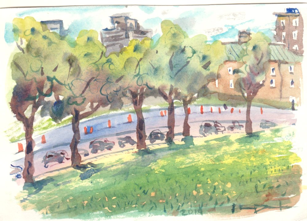
Verdun is known to be green and brown (in french: Vert et Brun, which kind of sounds like Verdun in English). That of course refers to the distinctive brown brick buildings and plenty of green trees around the neighborhood. Verdun is actually where my Dad grew up back when grandpa was working at the Glen train yards which used to be a big train interchange and repair facility. Now the old industrial land is park land, which includes sports fields, trails, a new beach, and a sizable dog park. I was sitting amid the dog park here, luckily dogs tend to ignore people ... there is important business like sniffing butt and chasing each other around, and the dogs like to do that too! The sun was rapidly going down for this painting, I had about 15 minutes to get it done. You can see the long shadows from the objects stretching all the way to the background. You might wonder now, why is their a giant construction pylon (Montreal Orange) in the middle of a dog park? I wondered the same thing, but there it is. It didn't stop the dogs though, you can see one tearing about on the left of the scene below the bench.

Landscape painters all face the same challenge when doing work on location, that is, the weather and the sun.  You start the painting, and by the time you get an hour into it the sun changes, the cloud changes, and the whole scene looks different due to the lighting. It can even rain, then you have to abandon the project. Claude Monet used to have many canvasses for the same location, one for each type of weather (full sun, overcast, sunset etc), and then he would bring the appropriate canvas to the scene that day. There was another painting I forget who, (was it Corot?) who would install a wood pole in the ground so he could set up his easel in the exact same spot when the conditions were right. Van Gogh painted fast, and he filled in a lot of the canvas in his studio from memory and imagination. Somehow the artist needs to have access to the subject matter long enough to capture all the detail. You could take a high resolution colour photo (not possible in the old days), but in my experience that approach tends to suck the life out of the finished product. I paint small postcard-sized paintings on location and it only takes 30-45 minutes usually to complete it, so the changing conditions are not too much of an issue. In this example, there was not enough time for the paint to dry, so I added some details at home later, including the dog, the outline of the bench, some of the pylon and pole details, and the leafs and trunks definitions. The black dog was a homage to Van Gogh who liked to put random black characters in his paintings. The dog looks a little like a L.S. Lowry detail, even though I didn't know that artist when I did this painting. I found out about Lowry from a Netflix documentary on how to detect forgeries.

5 x 7" Cold press, watercolour, October 2019


Salamanca, Spain

Keeping up with the Spain paintings, here is another one from the '98 collection done in Salamanca, Spain. This city is best known for its cathedral, and its very romantic vibe. Now that I am posting this painting, I guess it should also be known for its ducks! Painting ducks or birds is always tricky because they don't really sit still long enough to capture the drawings. I usually try to make a quick outline to get the shape, and then fill in the colours the best I can. If the animal leaves completely it is tough. Here it looks like they were mostly sitting down near a fountain. Painting fountains is really hard so maybe I wanted to paint the ducks instead- as I recall I was quite tired of painting fountains and statues towards the end of the trip (this was in the final two weeks of the 2 month Spain trip), and so focused more on other interesting things.

When there is a shadow next to a brightly coloured object, the shadow will pick up reflections and take on a glowing effect. The underside of a duck is normally a cool purple/beige tone, but with the intense sun reflecting off the grass the shadows took on a yellow-green tone. I quite deliberately create this effect by putting the purple/beige shadow first. While it is still wet, I dropped in some of the yellow/green from the grass. If you get the amount right and judge the wetness, they will blend together and give the reflection effect. In Spain it was hot and dry and the paint dried fast, so these wet-in-wet techniques had to be done fast. Faster than a duck can waddle!

5 x 7 " cold press, watercolour, 1998

Monday, September 23, 2019

Montreal Skyline and Construction

One  more for the record book, this painting was done from a vantage point just behind the new mega-hospital near Vendome, looking south east. There is narrow ridge of a grassy hill here that slopes sharply in all directions. Below, the Turcot interchange project is in full swing (although no workers were there actually doing anything at the time- it was Sunday). The ramp under construction looks like it will connect the main downtown highway to the new St. Jacques bridge and Avenue St. Jacques into NDG when it is done. We are hoping there is a bike path too that will connect NDG directly to Ville St. Henry and Verdun. These kinds of paintings are really leaps of faith, you sit down on location make a few decisions and then hope for the best. The amount of detail in the actual scene was absurd- for clarity I simplified the skyscrapers and the twisted mess of highways. The little details like the construction vehicles and the grassy hill, and the foliage throughout set the stage. I was sure to include as many traffic cones as possible, using a mix of windsor red, lemon yellow, and a touch of rose madder- a mix that I like to call 'Montreal orange'  mais oui?

It took a little while to complete this one, thanks to Cilei for heading out there with me by bike and waiting patiently!

8 x 10" hot press (block) Watercolour, Sept. 2019

Tree on Benny Avenue, NDG, Montreal

I am really posting a lot of paintings lately- over the years I probably average about 32 posts, this year looks like I will tip 40 blogs- like, is that over the hill? Not all the posts are new paintings, I like to scan and show off the old collection of landscapes and abstracts partly because it helps me understand how far my skills have come along. I also hope that the people who read the blog can get some back story on me as an artist. This painting was just done yesterday on a beautiful September Sunday down near the train tracks on Benny Avenue. The colours of the bark really caught my eye, they were a mix of yellow ocher, orange and mossy green which contrasted perfectly with the turquoise roof of the school and the sky blue. It is hard to see in the scan but I managed to get an airplane-streak across the blue sky by daubing out a diagonal line when the paint was still wet. I used the same technique for the tree. The outline of the tree was made first, then the blue sky and turquoise roof was added on top making sure the washes were even. Then I daubed out the tree trunk so the paper showed again. When it dried, I laid down the bark colours and started layering the different washes. There is a healthy amount of 'Glasgow Green' in this one (A colour I bought in an art store in Glasgow it is a brilliant pea green) to give it that Autumn feeling. The foliage is composed of hundreds of small blobs of colour, including some thick windsor yellow that sits on top of the darker tones almost like a gauche.

8 x 10 " hot press (block) Water Colour. Sept. 2019

Palacio de los Momos, Zamora, Spain

Another painting from Spain, this one was done in a small town in the north west called Zamora. My notes on the paintings from Zamora, of which there were 4, says that I didn't have a map, not did I have any idea of what locations I had painted! Nowadays with the magic of google maps I figured out that this is likely outside of the Palacio de los Momos church. It was an ambitious painting, I recall the challenge of having to fit the entire building in the background and had to make it a lot shorter that it appears in real life. There is a car in there too, hidden behind the palm tree. The statue gives just enough detail to see a mother playing with a baby. Like all of the latter paintings from the 1998 trip it was done on some crusty yellow watercolour paper I bought when I was there. It was still 140lb cold press and 100% rag- the brand may have been D'Arches. 5 x 7" watercolour.

Here is a second painting from the area, I wonder if that is the same car?

Sunday, September 22, 2019

Fruiterie Cite, Av Harley, NDG

If the last post was a blast from the past, then this post is a pleasant surprise from the present (or is it a pheasant from the present?). At any rate, there are a whopping 21 years between now and the 1998 Spain trip. I had scouted out a bunch of cool spots on Avenue Harley which is just south of the train tracks in NDG which included the auto mechanic painting that was posted earlier this month. This is a fruit and grocery store in the neighborhood that I go to all the time especially during the lunch hour if I don't have enough food with me in the office, it is only 5 minutes walking. The train crossing can be seen off to the left in the distance, surrounded by trees. I wanted to capture the feeling that this grocery store was sandwiched between the landscape, with a giant apartment building sitting on top and a bunch of roads, sidewalks, and trees surrounding it. The tree that pops up behind the sign (over the 'uite' ) was a bit of an accident, because I dripped water there accidentally and it destroyed the flat blue wash. With no way to fix it, I decided to turn it into a 'Vincent Van Gogh' tree- reminiscent of his cypress trees done around St. Remy. Most of the effort went into the store front and window interior, I tried to make it look as lively and colourful as possible. I was also very lucky a delivery truck didn't show up and obscure the whole view!

8 x 10"  hot press (block) watercolour. Sept. 2019

Irun, Spain

Here is one of the paintings I did in Spain way back when in 1998! This was a scene from Irun, a town on the border of France and Spain where the trains go through. I was waiting for a train transfer at the time and must have found this scene while seated on the platform.
There were 157 of these small postcard-sized paintings from the trip, luckily I kept up a list of all of them and scanned the papers so its on file and I can double check the location. Most of them have the information on the back too. There is a Cathedral and some houses in the background. The wires crossing the sky were a nice touch. By the time I was heading back to Paris to catch my flight I had over 150 paintings under my belt and my confidence was at an all time high. There was no fear at all here- the painting tackles a train locomotive on train tracks with the electrical wires, a town-scape, and a cathedral in the background for good measure, all on a postcard sized paper! A lot of the paper went yellow with time, in particular the second half roughly, because I ran out of paper and had to buy some in Spain. Who knows how old it was when I bought it, but that paper may have already had 50 years on it or something! So the yellowish tone in this painting is from the paper stock.
 
5 x 7" cold press Watercolour, July 1998, painting #154

Saturday, September 14, 2019

Beaver Lake, Mont Royal, Montreal

At the end of the day I found this scene up on Mont Royal near Beaver Lake. There is a large sloping hill of grass where people like to sit and sun-bathe and relax, and smoke weed! When I caught a whiff of the wacky tabacky it gave me a psychedelic hippie vibe which inspired the painting to be a little more trippy. The sky and tree line look more like layers in a cake or the bottom of the ocean. This painting was deceptively hard due to the strong back lighting from the sun. Back lighting is when your scene or subject has the main light source behind it, which creates silhouettes and forward casting shadows. Shapes, forms, and colours are all the more difficult to interpret. It also means that you (the artist) are going to get pounded by sun the whole time. I guess you could say I got baked while doing this painting.There were so many seagulls that I included one in the bottom left, it was walking around looking for handouts. Or maybe I imagined the seagull?

5 x 7" cold press watercolour, Sept. 2019

Mont Royal, Montreal

Up on Mont Royal there are several kilometers of trails winding around the forest with spectacular views of the city. Here, the view is looking northwards, the buildings are part of Outremont or the village of Mt Royal. I liked the fact that the tree was blocking most of the view, and the city-scape was kind of peeking through the bushes. There were a lot of people around so they were looking over my shoulder from time to time.

Traditionally, watercolour is meant to be painted from light to dark, meaning that the lighter parts go on the paper before the darker parts. I usually follow this rule because it keeps the water clear for longer; If you start with dark and rinse your brush the water turns dark and cloudy right away and all the subsequent colours will be muddied. Another way I avoid this problem is to have two cups of water: one clean, one dirty. Just before I pick up fresh paint, I dip the brush in the clean water. By the end though, usually both cups of water are dirty! In this painting I completed the lighter background scenery and then overlaid the dark tree and leaves. You can see where the bark of the tree blended with the mid-ground foliage and turned green in the middle of the trunk. I liked the feeling that the tree was being absorbed by the landscape. The tree also looked like an orchestra conductor standing up and waving its arms.... The Maestro of Landscape?

5 x 7" cold press watercolour, Sept. 2019

Monday, September 9, 2019

NDG St. Jacques St. , Montreal

Keen on painting more outdoors, I took a quick bike ride down to St. Jacques Street which is the very south part of NDG past the train tracks. I am sitting in a large grocery store parking lot looking north towards the big apartment complexes on Maissoneuve and along Cavendish. These urban scenes are tricky to compose because there is a ton of detail to pick from and everything is moving. Those cars stay for 30 seconds if you are lucky before the light changes, and the cloudy sky was shifting and churning. The only things that remains the same are the traffic cones, which are depicted in the lower left part of the paining. With all of the distractions in this composition it is easy to not notice the main character, right smack in the middle foreground, the young tree blowing in the wind. I wanted the tree to look like it was a maestro, that it was somehow at the center, and almost conducting the weather and the traffic.

Since studying Vincent Van Gogh, I have really tried to bring more character and expressiveness into the composition elements, to give everything a sense of being. One of the students in my laboratory recently gifted me a small Van Gogh book and I got to see a bunch of paintings I hadn't seen before. It inspired me to continue painting landscapes, something that had fallen out of my oeuvre for awhile. From reading about art I also learned the word oeuvre, it is meant to describe the accumulated works of an artist. I'll just give a quick shout out to Mr. Clarke, a high school art teacher of mine and avid facebook user- he was the one that really instilled the passion for art history and being analytical about how the old masters accomplished things.

8 x 10" hot press (block), watercolour 2019

Parc Ex, Montreal 2019

At the corner of Rue de Bellechasse and St. Dominique in Little Italy there is a big construction project going on, looks like an old industrial park has been rezoned for condos and retail. In the background of this painting you see the elevated portion of Rosemont Boulevard, in the foreground is the walled-off construction zone with some equipment visible over the fence and of course, the ever-present traffic signs and cones. I painted a construction scene once and it was a big hit, at least it was sold to a colleague who now hangs it proudly over the toilet. Don't worry, I have one of my paintings in the bathroom too, and what better place to put an artistic tribute to Montreal construction than the bathroom?

I spent a lot of time on the rue barre sign in the foreground because it needed a lot of detail being the first thing a viewer will see when they look at the painting. It was an interesting touch to include, like, saying, don't look here ! Look somewhere else! The base of the sign was made from three washes, and two texture overlays, along with two different shadow effects (the cast-shadow behind, and the shadow between the object and the ground at the front of the yellow dome). The background items took a long time too, but I made sure to keep them looking brief and fresh with minimal detail. Controlling the level of detail helps give the illusion of depth, and also helps the viewer know where to look. I'm getting good at doing that construction-orange colour but I wont tell you the secret formula!

5 x 8 " cold press. Watercolour, September 2019

Monday, August 26, 2019

Little Italy (Henri Julien Avenue) Montreal, Quebec

Great views are hard to find in the city, most of the sight lines are blocked by buildings or inaccessible without trespassing. But there are always scenes of interest, scenes that capture the ethos of the neighborhood. This scene caught my eye, it is just off the bike path in little Italy on Henri Julien Avenue, looking West into a small industrial area. The deep brown and rust colour and rugged textures really stood out against the blue sky, and the occasional pops of red completed the scene. It was a difficult location, although there was a relatively comfortable place to sit on the edge of a plant box across the street, the sun was pounding down full force most of the time. That made the paint dry quickly which helped to get in all the detail, but it was tough to endure for 35 minutes. There was a fence in between but I omitted it for clarity. This reminds me of a painting I made in Glasgow of a factory with smoke stacks. The object seen in the bottom left is, strangely enough, a small motorboat covered in a white tarp.

7 x 10 " hot press (block) watercolour, August 2019

Sunday, August 25, 2019

Snakes and Puzzles

Final post of the day, here is an abstract painting I made awhile ago on a hot-press block. I am unsure when this was done, in fact, it was missing a signature, title, and date so it is a real puzzle. I believe it was done some time around 2009 when I made 'Addictive Puzzle'. There is a curious use of lighting- all the objects are lit by a source in the upper right, but the painting shows a light source in the upper left. It was done quite deliberately, because the cube shape under the light bulb clearly has the shadow on the wrong side. The background is like a tapestry that has its own internal light source, unaffected by the external lights. There also seems to be a yellow light from bottom right, perhaps signifying a fire.

15 x 11" hot press (block) watercolour. 2009?

Sutton, Quebec

When I am landscape painting my goal is to capture the ethos of a scene, to record the spirit of what makes the landscape unique. The cliché is always tempting, when in Paris, paint the Eiffel tower, but there is always more to it than the obvious. We walked around the town of Sutton for awhile and then I spent about an hour on my own looking for a painting location. There was the obvious: the spectacular Mont Sutton looming in the distance, and the amazing store fronts on the main street, but when you got off the main street and looked around I saw an older, somewhat dilapidated (seedy) side of the town. Aluminum siding, paint peeling off, the smell of something rotten near the train tracks. For the painting, I found a spot to sit on a small bridge that spanned a creek that runs through town.The spot is very close to a local brew-pub so I could hear people chatting loudly and I could practically smell the hops and malted barley. I was uncomfortable, sitting on top of a guard rail and leaning down to get at the water sitting on the ground, and a hot sun was blazing on my back. The painting captures all the elements that make Sutton what it is, the neat, cottage-style storefront seen in the left hand side of the painting, the seedy shack in the middle made from a patchwork of building materials, and that deep emerald green Mont Sutton looming on the skyline. Cilei made a short video of me doing the painting too, I sure looked like a tourist!

5 x7 " cold press, Watercolour 2019

Horizon Hotel view from parking lot, Sutton, Quebec

I bet that the Horizon Hotel has one of the best views from any hotel parking lot in the world ...it was also the easiest painting location to find, just go out the lobby door and behold the vista. The sun was going down so I had to paint fast before the light changed too much. I liked this composition because it felt like the house was being crushed by the multiple layers of trees and hills going all the way up to the horizon. One thing I learned from studying Vincent (Van Gogh) was to give each element its own personality, the field, the tree, the sky etc. So here each tree or group of trees has its own colour scheme, lines, and general feel. By controlling the layering I created a sense of vast depth that takes your eyes from the warm reds and detail of the house, around the plethora of foliage, and off into the distance.

5 x 7" cold press Watercolour. Aug. 2019

Mont Sutton, (Abenakis rock, near Lake Mohawk), Quebec

Mont Sutton is a popular ski hill between Montreal and the border with Vermont, it is also criss-crossed with hiking paths. This view was from the Lake Mohawk trail at the Abernakis rock lookout point at about 730 meters. The rock, which you can see in the foreground of the painting is very large, about the size of the roof of a house. We sat there having lunch on top of the rock, the breeze was cool and the view was spectacular! There were trees growing just on the edge of the rock, which occupy the middle ground (and center focal point) of the painting, and there are rolling hills overlapping in the distance. Recently I had the idea that a painting has to be like a three course meal, appetizer, main course, and dessert. In other words, I try to emphasize three things, in this case, the rock with its great sweeping arc and mossy rough texture, the wind-swept pine tree in the middle, and the deep-blue vastness of the background hills. Bon appétit !

7 x 10" hot press (block) Watercolour Aug. 2019

PS, a 'block' is a type of paper where the sheets are initially in a stack and connected by an adhesive which you cut off when the painting is done. This obviates the need to stretch the paper and makes it a lot easier to transport on a landscape painting trip. I just bought two new ones.

Saturday, August 24, 2019

Fate of the World

At times I really try to push the technique in a new, strange direction just to see what the results are. In this painting (along with Dream Tree, and a few others), the paint was applied in great, wet blobs and allowed to dry over night before applying another layering in the same manner. Wet-in-wet washes were then applied to fill in the empty spaces. As I write this blog I can't remember exactly what I was thinking at the time other than I probably had a few too many beers in me. The idea of contrasting the blue and orange like that was a challenge that I was working on for awhile and never felt that I really got it. It is supposed to be like ice cubes sitting on flowing-lava, or cold rain on a hot fire. The title may have something to do with climate change? I like how at the very top of the painting, roughly in the middle, it looks like clouds with sun poking through, then the rest of it is just a mess of hot cold, and splotches of green. Maybe I should try this one again on a larger format.

15 x 22" cold press Watercolour, 2006 (?)

La Cité de l'énergie, Saint-Maurice River, Quebec

Here is another painting from the Shawinigan trip done at La Cité de l'énergie park which is right next to the hydro electric dams on Saint-Maurice River. The water slows to a standstill and many water lilies were growing. In the background is an old aluminum plant, and of course, the ever-present power lines that crisscross the landscape heading off into the unknown. Usually I omit the hydro lines from my paintings but in this case they were integral to the ethos of the scene. Water, power, industry, the city of energy. And Jean Chrétien former prime minister of Canada, he is also from Shawinigan. In fact there is a museum dedicated to his achievements, and displaying the huge number of gifts he received from other countries over the years. Hydro electric dams have a big impact on the environment, but it was good to learn more and to see one first hand; we took the tour of an operational one and it was really neat inside.

7 x 10" hot press (block) Watercolour, 2019 August

Saint-Maurice River, Quebec


Driving about an hour north of Shawinigan brings you to the Hotel Marineau Mattawain which is in the hamlet of Rivière-Matawin. Try saying that five times fast in both official languages. The river is a huge, powerful force of nature that has been used for hydro electric power for over a century, and for a logging route. Sitting next to it you can hear the swoosh of the water and feel the cool mist in the air. This scene was a view from the back of the hotel, I was sitting on a large boulder surrounded by blueberries and deer droppings, when a light rain began to fall. I had to retreat to under a shrub in the most uncomfortable position to complete the painting. I tried to channel the spirit of Vincent (Van gogh), giving each element of the composition its own personality, and adding the decorative swirls in the river water to give that plunging perspective and sense of movement that he so often used in his oil paintings. I also made my signature look like it is floating away on top of the river!

water (for real) colour, 7 x 10 hot press (block) August 2019

Monday, August 12, 2019

Birds on pole watching sunset

Just one more blog and I'll stop for the night, this is number five. I am trying to keep on pace for 30 or more blogs this year, which is about the average I have made since 2008, the first year of the blog. This painting was another one of the practice paintings I made before the recent trip to Shawinigan. I cleaned my palette off, and there was an abundance of cadmium-free red and windsor yellow which I used for this painting. The actual painting is even brighter and  more outrageous than the digital scan you are looking at! I don't pretend to know what this means at all- no wait, as the artist I should pretend like it has a meaning and make you guess and never tell you what it means.By the way, I am using my new series 7 watercolour brushes and really liking them, they distribute the paint extremely well and have a great feel. Definitely worth the cost and issues about using sable fur which are on my mind.

5x 7 " cold press, Watercolour

NDG Monkland Village, Montreal

One more of the warm-up paintings I made before traveling, this one was done on location in Monkland Village, an area of NDG close to the west side of the mountain. I saw this scene on a walk, the three apartment buildings just lined up perfectly creating an inter-locking spiral shape. I know most people wouldn't notice things in this way, and they would expect to see the sidewalk, people, cars and the road, but I wanted this composition to invite the viewer to look up and see what I saw. The colours of the three buildings in the painting match the actual colours of the buildings almost exactly. It is hard for a viewer to verify this without being at the location, but I am the first one to know when the colour is off. It just seemed satisfying to look down at the painting, and up at the actual scene that day and see that the colours were spot on. As I wrote in a previous blog, it is very hard to get the digital image to exactly match the original painting, but here on my screen it seems to have come out pretty well. I am starting to think about putting together a collection to show somewhere. I think about that from time to time since this blog is currently the only place to see my work. Lucky you!

5 x 7 cold press, Watercolour

Faces Plant

Recently I went on a number of trips and brought my paints with me to do location work. I know that it takes almost two weeks to get the feel of a location and make amazing paintings; the first few days of a painting excursion can produce interesting, yet very tight paintings that are affected by the stress of the trip, and the sense of your original location. I really learned this fact when I went to Barbados many years ago, and the first couple of days worth of paintings seemed faded and lifeless. When a local fellow looked at my paintings and said 'where is the colour?' I had a revelation, and all of the subsequent paintings were lively indeed. So it takes a combination of time and insight to gain the proper mindset. When a trip only lasts two or three days it is not possible to get relaxed and warmed up, so I decided to paint a lot before the trips. I tried this last year before Amsterdam, for about a week I tried to go out and get used to location painting again, and by and large it worked I only took a few days to get into the swing of things. To make along story short, this was one of about a dozen strange abstract paintings I made in July and August to get warmed up for location painting. None of the locations were this weird though! Most of them have paintings on the back too.

5x7" Cold press, Watercolour 2019

NDG Harley Street, Montreal

Here is a cool scene down on Harley street in NDG south of the train tracks near the Reno Depot. The building is an auto mechanic, the object in the foreground, is a fire hydrant. With that cleared up, we can look at some of other more interesting details! There is mural-work on the building, and the name of the business above the garage in the shadowed side of the structure. The orange dashes on the front are the bricks showing through because the white paint is peeling off. Weeds grow from the cracks in the side walk. A thicket of trees make a halo which contrasts the striking red-orange trim.

Painting decent shadows is key to landscape painting, but it is hard to get the image to look right in digital format. The scanned version of this painting does not quite do justice to the painting as seen in real life. When I scan a painting I have to make sure that the digital version matches the original. This is easier said than done. First I make the scan on a flat-bed scanner, or for larger paintings I use a digital camera. Then I make due the computer monitor settings are about neutral, not too bright, and not yellowed out. The original painting has to be illuminated well, this time I used two additional desk lamps to get as much light on it as possible. Now I can adjust the colour balance, and contrast to try and get the digital version looking like the original. It is never exactly right, but I try to get as close as possible to provide the right feel to the painting.

5 x 7" cold press, Watercolour, 2019

Lac Du Coeur, Quebec, Canada

We went to visit our friends up at their cottage in Lac Du Coeur near Morin Heights which is about an hour north of Montreal without traffic, two and a half hours with traffic! The lake is a beautiful, motor boat-free, deep lake with crystal clear water. I swam out about half way down the lake and tread water for awhile, luckily I have been training at the pool. The lake was better than the public pool because nobody else was there swimming and the water temperature is great. When googling the name of the lake it turns out there is a similarly named lake in France where Claude Monet used to visit, so maybe this was like a coincidence, or something more? It was our second trip out there.

Capturing the trees and the water of the Canadian shield is surprisingly difficult. As an artist you think 'it's just a bunch of trees and water what can be so difficult?' but I have always found it to be very challenging. On this trip I struggled to get the power of the landscape to speak in the artwork, so on the final attempt, I distracted the viewer with a dock and the items that were there after a day of having fun on the lake. It tells a nice story- we are all up in the cottage preparing dinner and relaxing- I am sitting in the grass painting and swatting mosquitoes off my body.

5 x 7 " cold press Watercolour, 2019

Wednesday, June 12, 2019

Water Tower, Bolton, Ontario

When in Rome paint the statues, when in Bolton paint the water towers in the forest, at least that was always my motto! This painting was done a long time ago probably around 1995 when my Mom got me new paints, paper, and a 'how to' book called Everything You need to Know About Watercolor. (but were afraid to ask). Okay I made up the part in parenthesis but the book does actually exist. They mentioned that you can use the end of your paintbrush, the pointy end that is, and scrape out lines to create the look of trees, or in this example the wispy grass at the bottom of the painting. The water tower is a simple negative shape created with the skyline and the surrounding foliage. I am quite sure this was done from a photo since I was not painting outdoors a lot in the mid nineties, I really starting painting on location (en plien air) in the later nineties. I did several other water tower paintings, most of them are framed and hanging in the personal collection of Mom and Dad! Maybe this one will too one day, but the price has gone up since now I am internet famous. This  one was done portrait format, there is a water tower painting in landscape format from the same photo. 

8 x 9" cold press (300lbs), watercolour. 1993 (No. 0041)

Tulips and view from Chalet, Montreal

Quality art on location is never a guarantee. The results can never be sure until it is all dried and ready to hang on the wall! In this painting I was sure that it would be a disaster because the whole scene was a mess of different parts, in congruent and overlapping. But I knew that once that flower bed went in, and the details were finished on the ice cream stand that it would be spectacular. I will let the viewer be the judge. You see a bed of yeallow and peach coloured tulips and the great vista of Montreal and the St. Lawrence river all the way to the south shore. It was a beautiful sunny day and I was part of a group walk led by the conference organizers. The conference was the Canadian Society of Chronobiology (CSC) meeting of scientists, it was a fantastic conference and I learned a lot, not to mention got to make a few paintings in my old neighborhood.

To paint the tulips I put a wide wash of yellow and red (windsor or scarlet lake) across the painting, it looked more like a sleeping bag than a bed of flowers. Once dry, I overlapped the green foliage, and added some red and orange details to create the bulb shape. The initial wash was the key in creating a dense, warm flower bed even though the finished product does not contain very much actual detail the feel is what is more important when painting. 


5 x 7 " hot press, Watercolour, June 2019

Avenue Parc, Montreal

Some themes are timeless, like construction in Montreal and the ever present orange cones. This scene was done from the vantage point of Mont Royale park approximately near the new gazebo that was reconstructed recently. The field of grass was dotted with dandelions, and the Parc Avenue was dotted with traffic and pylons. In the background you see some downtown Montreal skyline and the hospital in the mid ground with its typical copper roof and peach bricks.
5x7" hot press, watercolour, June 2019

Real or Plastic?

Zenith of the skyline, distant ocean, a picnic table, two misshapen vases containing twisted flowers. Are they real or plastic? This painting started out as a watercolour, and then I overlapped generous amounts of oil pastel and some acrylic paint for highlights and effects. With the heavy outlining it took on a graphic novel look, like Monet drew a comic. The final effect is pretty stunning even though it breaks the 'old English' rule of not using white and not mixing medias. But then again rules were made to be broken. (The person who first said that may have received a fine). Maybe this is the theme of our age, is it real or plastic?

10 x 14 "  mixed media 2005 (No. 1346)

Saturday, May 4, 2019

Jarry Park, Red Winged Black Bird

Not long ago we attended a birthday party in Jarry Park. It was a beautiful sunny day albeit a little cold to fully enjoy the weather. The birds had clearly returned and they were waiting for the park service people to fill up the artificial pond again. I caught a red-winged black bird on the dried willow branches about to take off. Actually I finished the entire painting and then put the bird on last from memory. It was just luck that I got the colours right, red on top yellow on bottom.

5 x 7"  hot press. April 2019

Tri colour study

Blue, yellow, and red are the primary colours that make up all other colours. Green is a mix of blue and yellow! At least that is the theory. When buying paints you are confronted with over one hundred options, all with funny names. I realized over time that there are discrete hues with numeric codes used across all types of industries from art, to wall paint, to car paint etc. The paints you buy can contain one discrete hue, but some can contain two or more hues mixed up. In theory you can just buy the discrete hues, mix them yourself, and get the exact version of the mix they sell. For example, Hooker's green is a blend of PY110 and PG36, which are Isoindolinone Yellow and Phthalocyanine Green!

Watercolour paints can be mixed on the palette and then applied to the paper, or the colours can be put down in layers. A thin washed is applied and then let dry, then another layer applied over top. I used that extensively in this painting, so as to create more colours than I actually put on the paper... the orange is a layering of the red and yellow.

5x 7" hot press Watercolour. April 2019

Monday, April 29, 2019

The Ride 2019

"The Train Ride 2013" was a previous painting I did from sketches that I made while on the train from London to Brampton many many years ago. I liked that painting enough so as to make a new version using the same size and format. Some changes were the bottom left which was fire in the original is now a relaxing koi fish pond, the look on the big fish top right is less stressed, I removed the scary trees, and the rest of the composition has a more harmonious perspective and composition. These decisions together created a more relaxed, dare I say more mature, painting than the 2013 version. Maybe in few years I can paint another version and see if I feel differently about the ride.

22x 15" hot press Watercolour, April 2019

Sunday, March 31, 2019

Weather Drill

Last but not least I just finished this painting at the end of March. My goal this year is for three blog posts per month, so here is one more to make it three. The name 'Weather Drill' was more politically correct than the original title of the painting that I was thinking of: 'Screw the Weather'. (there is literally a drill surrounded by bad weather). Anyways, just for revenge it actually snowed today.

As an artist you pick up little ideas and techniques from other artists (living and dead) along the journey. I learned a lot from Joy and Starkey, two Canadian watercolour painters, and also Van Gogh, who of course was a famous oil painter from Holland. I also learned a thing or two from Darlington- in this case I was inspired by Atmosfear a painting I made awhile back that was full of pink sky and bad weather. I guess by the time you are being inspired by yourself as an artist it also means you are out of ideas, or a little mad, or both !?

5 x7 " hot press, Watercolour, March 2019

Design Element

Just like I saw it on TV, here is an imaginary plan for a house in the woods. Actually, what I saw (on Netflix) was a show about amazing houses, architectural projects in remote locations. I don't think this house could ever really be made, not to mention banana's wouldn't rain from the sky, but you never know. As I scanned these for the web, I realized that the windows of the building here, are the same as the window of the last painting I just posted (Colourful Ideas). That means my imaginary home in the wilderness has a laboratory on the top floor. Shorter commute at least!

To depict bright colours in a painting it is tempting to dive into the palette and get some pure yellow or red or green, maybe just take it straight from the tube. The results will be better if the composition includes two things, complementary colours, and a near-neutral background. Contrasts are easily understood- if you put red and green next to each other they amplify the visual. Here, I put purple in the background to bring out the yellows, and used a green outline to contrast the reds. The concept of near-neutral is a bit different, that is where you put a neutral version of near the colour that you are trying to amplify. In this painting, the grassy lawn in front of the building contains a mix of the bright yellow, the brick red, and the green, then a bit of water to make it pale. Now, when someone looks at the painting the yellow banana-peel shapes really pop because of the neutral that surrounds it.

5 x 7" cold press. Watercolour 2019

Colourful Ideas

Good ideas are bright ideas, so great ideas are colourful ideas? I was thinking about all the different graduate students I have supervised over the years or from when I was a graduate student and had this vision of colourful, living sculptures in the laboratory. The background of this painting is a surreal laboratory environment, finished in neutral pastel tones. The three objects are kind of like warped cell phones, with bright, contrasting colours inside of them. It is the people who make the discoveries after all, not the lab equipment.

Making blended washes is a good technique to use in watercolour. I have read a book called 'Everything you Need to Know About Watercolor", and one chapter was on colour chickens. The exercise had you mixing two pigments and letting them naturally blend together on the paper to create an interface, resulting in a chicken-like shape. The trick is getting the moisture right, too much and the colours just merge into one wash, too little, and the colours dry without mixing. I used the colour-chicken concept in several places, the obvious being within the three main figures. I also used the technique in the floor by blending red, yellow, and a neutral grey, and blue. Each pigment has its own temperament that will affect how it blends, so it is worth practicing a lot to get the feel for it. Now I am tempted to do a new painting called colour chickens.

5 x 7" cold press. Watercolour. March 2019

Thursday, February 28, 2019

Beach Boogie

From a snow fight to a dance on the beach! This was also a painting done from a cutting of a larger painting similar to the last post, called Snow Fight. There was a bit of red, yellow and some blue left so I could produce this design. I really didn't know what the scene would be, and then I thought about being on a beach. There are several cartoony characters having fun there, and some Brazil-inspired houses on the steep cliff side. I kind of like the reduced colour scheme, maybe it is something I can use in the future. At the moment I am trying to to a new version of "The Conversation." but it is not going too well. In the end, these little throw-away studies may turn out to be the most interesting things. Guess I will keep them!

5 x 7" hot press, watercolour, February 2019

Snow Fight

This is what it would look like if two giant robot aliens painted with a McDonald's colour scheme had a snow fight while a turtle-snail looked on. It is a long story indeed, especially how this painting came to be. I did a painting called "The Conversation" a while back and wanted to show it in the new poster frame but it was too big, so I trimmed off some of the superfluous edging of that painting to get it down to 24 x 36" which left some 5 inch bits. The sky in this painting here is the old sky from the other painting, while the snow was the blank paper around the old painting. The other thing here was that I was trying to use up the remainder of the paint on my palette before cleaning it off, but the only colours remaining were yellow and red. That is called the creative process. 

hot press 5 x 7" watercolour. February 2019

Monday, February 18, 2019

Lemon Study

Just in time for summer I have some swamp land in Florida to sell, complete with air conditioned habitation tubes. I made several versions of Lemon Sunset, large and small, most of them are posted on my blog. This one was a test run of the new brushes I got recently, to see how they handled in various styles and circumstances. The big difference is in how sharp they are for detail, which is usually the case for a new brush, but these ones give me the feeling that the tip will stay sharp for a long time to come. The other thing I notices was how much paint they carry on one continuous brush stroke. That made certain effects more feasible, for example the charged-shadow of the trees on the hill top, they were done wet in wet. I think my next large work will be another attempt at Lemon Sunset, why not, eventually I will get it right, right? At the moment I am re-working "The Conversation" an old painting I did on large format (36 x 44"). I trimmed it down a bit, cropped you could say, but then decided to repaint the whole thing on the back side with a new composition that better reflects the idea I had for that painting. I am making a series of small studies for "The Conversation" reworked, and will post them when I get a good one.

5 x 8" hot press, watercolour. Feb. 2019

Thursday, January 31, 2019

Floating

Floating into the new year with style I got to use my new Windsor Newton series 7 sable brushes - it really is amazing that they make a difference in the amount of paint they carry and precision of the points. I used different sized brushes for the different effects, the numbers I have being 00, 2, 4 and 6. Having the extra paint in the brush let me do the seamless three-toned wash in the sky in the background, and then the different sized seed pods floating around. The last detail I threw in was the skyline at the bottom, I was going to leave that out because of Chinese art which typically leaves the open space, but then I put the detail in, and kind of regretted it at first. But now I really like the look of it, it kind of looks like New York's east river with some dandelion seeds floating around.

5 x 7" hot press, Watercolour, Jan. 2019