Sunday, November 29, 2020

Verdun, Backyard Crab Apple Tree and Clouds


Down in Verdun the urban sprawl is seemingly endless. However, there is plenty of green space interspersed hence the nick name 'green and brown' which sounds a little bit like 'verdun' when said in French. This painting was done in a backyard parking lot area behind some condos, looking west towards the setting sun. The clouds were fluffy like cotton and had a slight tinge of orange with deep purple centers. The bottom of the clouds took on a pink glow. The crab-apple tree branches on the right were meant to be the main composition but the clouds were so interesting that I left the trees to act as a frame to the sky in the background. 

It was cool and humid making the paint difficult to work with. I made some adjustments to get these paintings to a good standard. For example, I created most of the painting out of a simple two layer approach and omitted a lot of details like the chain link on the fence, the stairs on the condo, bark texture, grass texture, etc. The blue in the sky is a mix of phthalo blues and a bit of indo blue, its taken all year for me to figure out how to use those paints and its finally working out more reliably. 

Verdun, Backyard Crab Apple Tree and Clouds, 8 x 10" cold press watercolour, November 2020

Trenholme Park, Melted Snow


 Today the snow was reduced to interesting blobs and piles by the warm weather. Down at Trenholme Park I found a nice place to sit right in the middle of the field, and did a quick painting of the recreation building and a characteristic tree. I've done quite a few paintings here due its proximity and cool trees. I started the painting with a black outline which dried darker, so the snow blobs look a little weird! Or, I meant the snow blobs have style. As I walked around afterwards, the sun set and half the park took on a warm orange glow- a streak of yellow light cut across the soccer pitch and the tree tops were really glowing against an indigo sky. Unfortunately that lighting condition only lasted about 5 minutes until the sun went down. Next time I will try to be there with 20-30 minutes more to spare. 

Snow Blobs, Trenholme Park NDG, 5 x 7" cold press, watercolour, November 2020

Thursday, November 26, 2020

Three small abstract paintings

I did three small abstract paintings this week, mostly just to keep my brushes moving and to enjoy the feel of putting paint on paper. The teaching is almost done and the research is almost under control, so I hope to do a bit more painting in December than I did in November. In a typical year I would not paint much in the fall, but this year has been quite the exception. For the above painting, I wanted to explore the pairings of tertiary colours, those are the weird ones, rose red, yellow-orange, and a neutral 'jade-like'blue-green. Rose red is about half way between red and magenta.

Paid in Jade, 4 x 3 3/4 " cold press, watercolour, November 2020 

The other day I was looking wistfully out my front window, it was sunny that afternoon but I had zoom meetings all day. As my mind worked out the colours of the bricks, sky and shadows I remembered it, and made this small abstract painting later in the evening. I called it 'abstract outside' because the colours were inspired by the outside view of the now-famous mechanic and apartments on Walkley street on a sunny day.

Abstract Outside, 4 x 6" cold press, watercolour, November 2020 

 In the course of experimenting I found that rose red paint (PV19), also called magenta, can be mixed with yellow to create some earthy oranges. I blended in more of the rose red, or some indothrene blue (PB60) or benzi yellow (PY154), and then overlaid some organic outlines. It is a very small painting done on a cutting from an old painting that didn't make the grade. In fact, almost everything I painted in October and November was on the back of a cut up painting. Don't worry, the cut up ones were not that great. One day they can be put back together like a puzzle.

 Neutral Values, 2 x 7.5" cold press, watercolour, November 2020

Sunday, November 22, 2020

Palette Cleanser #44 and Paintings Chart


This one looks a little like a fish jumping out of the water. I was trying out some combinations of neutrals juxtaposed with a few brighter colours which I noticed while reading through a Group of Seven art book. I also discovered that orange plus dark green produces a kind of brown that looks like cafe latte.

Just today I finished the catalogue spreadsheet, there are 2670 entries consisting of 2453 paintings. There are more entries than paintings because I often paint on the backs of old paintings, so some of them count for two items. Just for interest I made a chart of how many paintings I did each year since I started in 1989. The lowest was zero in 1990, the highest for quite some time was 228 in 1998, but the undisputed best year for painting was 2020, with 446 paintings and counting! Here is the chart, made with Open Office. You can click on it to see the details.


Saturday, November 21, 2020

Saturday Painting Trip, NDG Chilly!


According to the forecast it will be hovering around zero for a little while- that is Celsius of course. Painting watercolours in cold weather is especially challenging due to the nature of the paint and how it mixes with water. Today I dropped off some items at the Renaissance store, and made this painting from the vantage point of the parking lot looking towards the 'Stinger's Dome' which is a sports enclosure normally used for winter sports by Concordia University. It stayed up all year this year, which was an oddity caused by COVID-19. There wont likely be any sports played in there due to the campus restrictions. It's been awhile since I painted in such weather, my plan here was a little too ambitious but I like the results. 

NDG Stinger Dome with Trees 5.5 x 7.5" cold press, watercolour, November 2020 (No. 2451)

By the way, I completed naming and numbering nearly every painting I ever did, there may have been a few I gave away or sold but the list contains virtually everything. That means today's paintings numbers 2451st, 2452nd and 2453rd are up to date. Not that anybody is counting! I've still got the work of typing the information into the spreadsheet which will take an hour or two. The next step is to update the blog with the catalogue numbers. 


Here is the second painting done on long hill, probably a protective landfill that was built around a factory of some sort. I made some adjustments for example, not doing much outline, and using a big brush. The sun was directly behind me casting a long shadow of me and my bike, unfortunately the paint was not drying well in this weather so it got a little muddy. There was a lot of orange used here including iron oxide red/brown (PR1010), isoindolone yellow (PY110) and raw sienna (PBr7) with phthalo green and blue for complement.

NDG Orange Building with Field, 5 x 7.5" cold press, watercolour, November 2020 (No. 2452)


Painting on location sometimes requires adjustments on the fly depending on weather conditions. It occurred to me that the approach I had used all summer was not going to work in this low light, cold weather environment. In this painting I made more adjustments to the methods, there were no outlines at all, I started with the body colour of the two buildings, and made it darker than necessary. What you see as bright coral in the front building, looked like a muddy brown when I first applied it to the white paper. By establishing the big shapes and colour first it dried a bit faster, and allowed me to apply some shadowing, trees, and window details. I think this quick and dirty approach is going to work better as it continues to get colder. My gloves were not up to the task though, need to wear heavier ones next time. 

NDG, Sunset on Parking Lot, 5 x 7.5" cold press, watercolour, November 2020 (No. 2453)


Friday, November 20, 2020

Past Bike Trip to Grand Bend Ontario


 How time flies! These paintings were done in the last year I lived in Ontario just before I moved out to Montreal. Grand bend is about 70 km north of London Ontario along some fairly treacherous highways and windy areas. The bike ride went well although I hit the wall with about 2 km to go, and it took me an hour to walk my bike into town. Along the way I made a couple of paintings while I rested. This one shows a nice contrast between the horizontals and verticals.

Grand Bend on Route, Trees seen from Highway, 5 x 7" cold press, watercolour, 2003 (No. 0183) 


I also saw this scene along the way, which resembles a Van Gogh painting of the Netherlands where such windmills were popular.There is an impressive array of browns here, despite the fact that I only had burnt sienna earth colour. Younger Peter would have really appreciated the umber earth paints!

Grand Bend on Route, Windmill in Field, 5.5 x 9" cold press, watercolour, 2003 (No. 0177) 


Keeping up with my love of painting blue waste bins, I made this painting at the final destination, the famed beaches of Grand Bend. The blue of the bin provides a nice foil for the turquoise of the sea. I also like the waves here, they feel really life like I can hear the water crashing on the sandy beach. There was almost no people here because it was off season, very cold and just before fall. I made other paintings of the beach, and from in the town. 

Grand Bend, Bin on Beach, 4 x 9" cold press, watercolour, 2003 (No. 0179)


There is a popular fishing pier at the beach, and I caught this scene of several of them fishing at sunset. I remember having to paint fast for this one. Normally I avoided painting people, but int his case it really made a great composition and helped break the otherwise symmetrical scene.

Grand Bend, Anglers at Sunset, 6 x 8" cold press, watercolour, 2003 (No. 0175)


Finally this scene, which edited out the anglers to focus on the diagonal line of the pier. I love how the pink of the sky reflects off some of the waves, and how rich and bright the clouds are. The peach-yellow of the sky is also quite profound. I never spent much time appreciating my own work, you see here it is not even signed. It is fun to know that people are reading this blog and having a chance to enjoy some paintings done almost 20 years ago. 

Grand Bend, Lighthouse at Sunset, 6 x 9" cold press, watercolour, 2003 (No. 0171)


Wednesday, November 18, 2020

November Palette, ideas


 November had been unseasonably warm until this week, when it dropped to around zero with a bit of snow. Usually I don't paint outdoors after the fall colours go away because the weather gets bad, and the scenery is drab and dreary, and it gets dark at like 4:30pm. But this year I have been trying, like last week I got out and did some work at St. Lawrence River. The lighting and scenery presents a new challenge, for one, the visual system adapts in low light, which throws off value and colour judgement. Also, colours tend to be desaturated making the mixes different. To accommodate, I made some adjustments to the palette, including bringing back phthalo green blue shade which makes great darks and cool greys with the PV19 and PV55 (pink/violet) paints. In the setup, you see some colours with two blobs- I did that so I can make desaturated versions by adding black brown or blue, while still having some preserved. Once you add a dark paint to a light paint, the light paint is 'dirty'. On location I can't clean the palette easy, so I developed this two blob approach it works well. The red blobs are two slightly different paints, PR254 ferrari red, and PR255 vermillion, both pyrole reds. 

I hope to do one more large painting before the year is out, it was going to be 'Saturation Costs' but that idea is a little depressing and I may scale it down. Instead, I am intending to do another 'Where go the Fish' Somerled Edition. The original one was done some 20 years ago in Bayfield Hall London, now that my fish are healthy again I would like to do a new one, featuring our current living room which includes a prominent banana palm. 


Palette Cleanser #43


 Yet another palette cleanser. I'll admit it, I really enjoy making these paintings because all day I live in a structured world and the paintings have no rules. Just keep the paint on the paper! Even that rule I break a lot. This painting explored magenta in its various forms. If you look up magenta you will see a cool pink, practically violet, like the pink panther. There are no paints that are actually magenta, even though many paints have magenta in their names. In this painting I used quinacridones including violet and rose versions. My quinacridone violet (PV19) is identical to the old quinacridone magenta (PV19) I had before. Confused? So is everyone! The short story is that quinacridones are used in lipstick, so the paints are just various shades of red and pink lipstick. I matched them with earth browns and oranges here, it was quite a pleasing array of shapes and colours. 

Palette Cleanser #43, 9 x 12" watercolour paper, watercolour, November 2020

Palette Cleanser #42


Zooming around a yellow field, the cyan snake dodges red orbs and heads for the water. I did this painting a few months ago but never got around to scanning or blogging about it as a palette cleanser. I may have indulged a bit in the yellow- mostly the bismuth yellow which is really intense. Quinacridone violet is also included (PV55) it really looks good with the yellow, cyan, and red/orange elements. The style here resembles 20th century pop art which used a lot of the synthetic paints that had been recently discovered. Most of those paints still remain to this day- the pigments are derived from the petro-chemical industry. MacEvoy's Handprint.com webpage has extensive descriptions of paints and their origins in case you are interested in more details.

 Palette Cleanser #42, 9 x 12" watercolour paper, watercolour, November 2020

Tuesday, November 17, 2020

Paint Tests


 Quite often I test out the paints in different ways, sometimes creating art like when I got new paints from Kama Pigments, or like in this example which resembles the 'colour chickens' I read about in an art book. More like colour boomerangs! I am looking at the central portion where the two colours mix to see what they do, the hue, and the consistency. Some combinations turn out grey and dull, others sharp and bright. Here, I saw how great the bismuth vanadate yellow made bright green (chartreuse) in the top right. 

This one was to see how the bright reds and yellows could make orange. In each case the orange was slightly dull compared to using actual orange paint. When two paints loose chroma after mixing it is called saturation cost. It is not bad necessarily, most landscapes have slightly dull colours compared to abstracts generally. 


If I am having trouble getting a colour correct, I may go back to the drawing board and try out a few mixes. These were done to make the Hiroshige copy even better. The reds were for the pagoda, the greys for the roof, and the blues for the sky. 


Before I go out landscape painting, occasionally I test out a few things at home to see how they work. Seen above, I was trying out the new blue paints I had, with little test marks, and an imaginary scene. The french ultramarine worked well with some mixed phthalo. I added the 'paint test' tag to other examples. The blog is kind of a reference book for me, I can go back and look at discoveries. Just making the scans today I found one of an amazing toffee-brown made by mixing perylene green (Pbk31) and perylene maroon (PR179). I didn't scan it, but will make a nicer painting using the combo.


Monday, November 16, 2020

Colour Splash Technique, 2005


 Perhaps you can lend me a helping hand? It looks like the Incredible Hulk's hand. This painting was done using a technique that I developed in 2005, the year I moved to Montreal (again) and I wanted to try out a completely different style to mark the occasion. The way it worked was to add large wet blobs of paint to the paper and wait a day for it to dry. Then I would add some details to turn it into a scene. Helping Hand, 10 x 11" cold press, watercolour, 2005 (No. 1437)

Other examples are Dream Tree, The Idea is This, Fate of the World, and many more on the blog archives. Here are a few more I didn't get around to blogging about, done using the colour splash technique...


Colour Splash Bird, 6 x 8" cold press, watercolour, 2005 (No. 1442)


Colour Splash Forest, 15 x 22" cold press, watercolour, 2005 (No. 1941)

Saturday, November 14, 2020

Swans


Stratford Ontario Swan Lake, Two Adult Swans 7 x 8" cold press, watercolour, 2004 

 Learning how to paint wildlife on location is a challenge because animals rarely stay still. In the last blog I did a painting on location with some mallard ducks, but I only got to see them for about 10 seconds, and had to complete the scene from memory. I also did a painting of swans in Denmark.On a trip to Stratford Ontario some time ago, I took a number of pictures of the river and its numerous swans. In the ensuing years I made paintings from these photos. 

The next one is from my parent's collection, it was put in a frame and I probably gave it to them as a gift at some time in the past. The Swans probably thought I was going to feed them! While the photo I used to make this painting may have been taken by me, it is also possible it was an old family photo since there was a box of them that I would go through and make paintings from.  


Stratford Ontario Swan Lake, One Adult Swans two Young Swans (Cygnets - there is your crossword word of the day). 5 x 7" cold press, watercolour, 2000 (No. 1854)

The one below is more experimental, it was surely done from a family photo based on the date of the painting being very early, before I went there on my own. I may have brought my camera on a family trip out there. Too bad blogger didn't exist back then, it would have been like a better version of my memory!


10 x 15" cold press, Watercolour, 1993 (No. 0024)


Saturday Painting Trip: Lachine Canal and St. Lawrence River Views


According to the weather forecast today was about +5C but according to my face it was a lot colder! One unintended benefit to wearing a mask is that it protects the face against windchill. Not that I needed the mask today there were very few people out and about, I had most of the paths and parks all to myself today. This scene is on the Lachine canal just before you get to Lachine, I was on my way to the St. Lawrence River when this scene caught my eye, there were large beach ball objects with fluorescent chartreuse (lime green) and prominent graffiti on the overpass. As I sat to paint, a pair of mallard ducks went by, I fit them in to the bottom of the painting. Just this morning I was studying the artist colour wheel by MacEvoy from Handprint, looking a the best way to make chartreuse from my paints. By coincidence this scene came up and I used bismuth vanadate yellow (PY184) with a touch of phthalo green yellow shade (PG36). The drake mallard's head was with phthalo green blue shade. 

Lachine call with Lime Balls, 5 x 7" cold press, watercolour, Novembrrr, 2020


Here is a westward view up the St. Lawrence, the sun was low and cast a tangerine glow across the landscape. There was a strip of bright white reflecting off the distant water. Judging the right colour and value for this type of water is very difficult, you have to consider that it will dry about one or two values higher (lighter), and the blue will dry a bit greenish. When this was wet, it had a clear blue tint but when it dried it had a dusty lilac appearance. It creates a nice colour balance with the orange, yellow and brown though, I quite like it. 

Westward View, St. Lawrence River, 7 x 8" cold press, watercolour, November, 2020


Finally I painted a scene looking across the St. Lawrence towards Kahnawake. The shrubbery in the foreground was a deep orange/yellow with splashes of green. Today's cloud cover was heavy, with a clear gap at the horizon. This created a ceiling of purple/grey, with an intense bright sky underneath. To capture the colour of the river I used a darker blue, with some magenta and carbon black, but it dried a little flatter and greyer that in reality. While it was wet I dropped in the golden highlights reflecting off the waves. 

View St. Lawrence, towards Kahnawake, 6 1/4 x 8" cold press, watercolour, November, 2020

Friday, November 13, 2020

Benny Sports Complex, cloud view, NDG


Fortunately, the weather has been holding up recently making it possible to do a few more paintings before the snow. It was about plus 7 when I did this one, with a medium wind, which nearly caused the paint to freeze but not quite. If it gets a tiny bit colder with wind the paint can start to freeze a little, of course, when it gets to zero and below it really freezes up. There isn't much colour left in the landscape so I focused more on a building here, the sports complex, which has a very unique shade of red in the bricks. It is a dark neutral red. This painting was surprisingly difficult, partly because my eyes were watering due to the cold wind. The brick is mostly pyrole vermilion (PR255) with carbon black, adjusted with raw sienna (PBr7) and perylene maroon (PR179).

Benny Sports Complex, NDG, 5.5 x 7.7" cold press, November 2020


I had just dropped a few books at the cultural center (Bangladesh and Bahrain) and made the painting seen above and was heading home when I saw the most incredible sky. I really didn't have the time to make another painting, as usual my schedule was packed with just an hour here. Recently I saw parts of a show called Canada's greatest Landscape painter on CBC streaming, it was a standard reality composition show featuring painters. Just before they announced the actual winner I turned it off because I thought all six of the painters were winners, and art shouldn't really have a winner per say. Anyways, I just wanted to remember the show like a bunch of great painters, not that there were winners and losers. What does this have to do with the cloud painting? One of the landscape challenges was to paint a sky and lake view, which was a challenge for them because oil paint is not ideal for painting clouds. It is the one thing that watercolour paint is better for, because you can make diffuse wet-in-wet applications that resemble clouds. An example is here at the Langelier metro station

Cloud view NDG, 5 x 7"cold press, November 2020


Wednesday, November 11, 2020

Snowy Creek, Zoltan Szabo Exercise


Zoltan Szabo authored numerous books on how to paint watercolour including 'Watercolor Techniques' which had 12 demonstrations. I received a copy of this book probably a gift from Mom in the mid 90's and read it with enthusiasm. The exercises and instructions were a little too advanced for me, I don't think I ever completed one of the demonstrations! Today I decided to try one out, Snowy Creek which had 5 steps listed starting with background orange and shadow blues, distant foliage and trees, water and snowy rocks, reflection and finishing touches. Each step had many sub steps and complex advice about technique, colour and composition. He controls the warm/cool from top left to bottom right to give the feeling of sun coming through, and uses a limited range to create harmony. My result looks quite nice, it captures the spirit of the scene. I must say it took nearly all of my skill to pull this off, so as a beginner it would have been quite a difficult achievement. It was fun to follow another artist's methodology. 

A few colour notes: Zoltan recommended new gamboge, alizarin crimson, burnt sienna, antwerp blue, french ultramarine blue, and sepia. I used isoindo yellow (PY110), pyrol vermilion (PR255), iron oxide red (PR101), raw umber (Pb7), indothrene blue (PB60), quinacridone violet (PV55) and neutral tint (PB60, PB15, PV19). From this list, you will see some really heavy darks and wide range of browns. 

 Snowy Creek, Zoltan Szabo Exercise, 8 x 10" hot press 300lbs, November 2020


Tuesday, November 10, 2020

Palette Cleanser #41


 Just as Fall is winding down, the colours are changing from red, orange, yellow to brown and grey. Actually fall ends on December 21st when winter begins, but it usually snows in November and December. It has been an interesting journey of painting this year, starting with winter scenes, then spring, summer, fall, and now almost full circle back to winter. Certain colours were more important depending on the season like I doubled up on my yellow during spring summer, then in fall included a wide range of orange and browns. As the weather becomes more drab, I have shifted the palette around some, bringing back phthalo green blue shade because it great for making cool darks. It seems likely I will try and paint outdoors this winter, excited to see how the paints hold up in freezing temperatures. One thing is for sure, I need to upgrade my winter clothes. 

Palette Cleanser #41,  9 x 12" watercolour paper, watercolour, November 2020

Metro Grocery Store, Somerled Avenue, NDG


 Next to the auto-mechanic, across Walkley Street is the Metro grocery store, not the metro transit, but the grocery store. Slowly but surely I am painting a panorama of the complete view from the front of my apartment condo. There is a great place to sit on a terraced garden wall, and it is far back from the sidewalk. With a daily work schedule that looks like a game of tetris (meetings, lab work, teaching crammed in to the calendar), it has been difficult to get out and paint. From the garden terrace I can just sit down for 20 minutes in front of the condo and paint whatever I see there. This painting is deceptively complex- in fact, it was pure technique and accuracy. The drawing (which I do with paint) takes most of the time, then you kind of colour by numbers after that. Of course, it's harder than that, it was kind of a challenge. The grocery actually used to be a Steinberg Grocery, for a long time there was a logo in the tiles leading up to the front door, but they renovated that recently and there is no more memory of what it once was. The sign to the left actually said Marche Somerled, but that wouldn't fit so I wrote my initials. 

Metro Grocery Store, Somerled Avenue, NDG, 4 x 6" cold press, watercolour, November 2020

Monday, November 9, 2020

Somerled Avenue, NDG, Pastel Sunset

 
Today was another day jammed with zoom meetings. I managed to get out just before the sun went down. This view is looking to the left of the auto mechanic, down the street where the sun was setting. There was a large, pastel lilac cloud floating just over the roof tops with splashes of tangerine orange. To create the back-lit houses I mixed the base colour with some carbon black and diluted it. So the brick was burnt sienna with carbon black, and the aluminum siding was indothrene blue (PB60), quin violet (PV55) and carbon black. The fluffy cloud was similar but with more quin violet and some burnt sienna. Finally, the carbon black was used for the details under the cars, the tree, and the roof details. I wanted to point out the use of black paint because it is widely considered to be a taboo. Admittedly, it takes some thought and skill to properly employ the black paint. There is no actual black colour in this painting, rather it was diluted into shades of grey. This painting is a good example of creating luminous atmosphere with a touch of grey.


Sunset 5 x 7" cold press, watercolour, November 2020

Palette Cleanser #40


Going for number 40, this series is officially over the hill! What started out as a way to save a little extra paint has turned into a stream of consciousness exploration of colour, shape and concept. Part of the fun of this series is that I have no expectation for the outcome. They are all done on a high quality, acid free, pulp watercolour paper that is quite a bit cheaper then the rag-press paper I normally use. As an artist, I find that it helps to stay interested by keeping up a balance of objectives. For years I have split my attention between landscape and abstract painting which feed off each other. The more I know about painting landscapes the more I can create realistic abstracts. And the abstract painting has really improved my landscape painting by discovering new colour combinations and exploring shape and form without restrictions. 

Palette Cleanser 40, 9 x 12" watercolour paper, watercolour, November 2020

Sunday, November 8, 2020

Sunday Painting Trip, Angrignon and Verdun


 Leaving relatively early this morning I got to park Angrignon before it was too busy with people. I wore a mask anyways for most of the trip due to the spike in cases in Quebec. Most people seemed unconcerned. Another odd thing is the weather, it is neither fall nor spring, but in between the two. Rusty yellow leaves still cling to the branches but most of the foliage is dark and brown. This scene captures the 'twilight-fall season' or whatever we can call it- most of the colours were neutralized with carbon black (PBk6) or indo blue (PB60) with a few splashes of earth pigment and the phthalo green. 

Park Angrignon, Twilight of Fall Season, 6 x 8" cold press, November 2020 


After crossing Verendrye and over a foot bridge to Douglas Hospital I continued on to the St. Lawrence River where I could find some great places to sit in the warm sun. My social distancing was set to maximum here I had almost 20 meters of space between me and the path, it must have been on old factory lot or something. These wispy reeds were dominating the landscape and it was my challenge to depict them in watercolour. For composition I made sure that at least a few of the reeds were overlapping the background, which catches the tip of Nun's Island, and the south shore.

St Lawrence River with Reeds, 4 x 6" hot press 300lbs, November 2020 


During the last painting I figured out a decent combination to get that particular beige of the reeds, it was raw umber (PBr7), quinacridone magenta (PV19), touch of carbon black, then dilute with water. This produced a slightly violet leaning beige. I had to shield my eyes from the sun using my sun polarized sun glasses and baseball cap for this one. Not to mention I was sitting on a very steep grass embankment. The view here would be Goat Island, just at the end of the rapids. My dad just told me a story about his brothers when they were kids, they would paddle their boats up and around the rapids and the gap between Goat island and Heron island.

 St Lawrence River, Rapids with Sun Glare and Reeds, 8 x 10" cold press,  November 2020 


There are several benches along the path, I was lucky to find one and have nice place to sit. Down this embankment there were about a dozen people relaxing and enjoying the scene. The tree was the focal point of this painting- it had yellow-rust colour leaves clinging to the branches. Underneath was a proliferation of burr plants. The rapids were swirling around in the background, it looks like the tree is almost going for a swim!

 St Lawrence River Tree with Rapids 8 x 10" hot press 300lbs, November 2020


 After a light snack, I did one more of a small orange oak tree just off the left of this scene. Capturing that particular shade of orange was tough and it got a little over-worked. This 'fall-twilight season' palette is tough! Lots of brown and grey mixed with earth tones.

St Lawrence River, Orange Oak, 4 x 6" hot press 300lbs, November 2020 


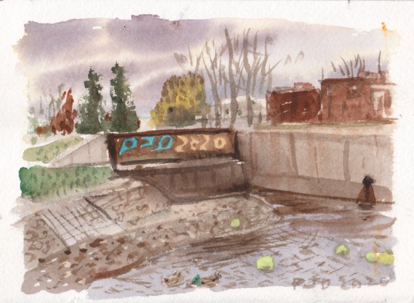
Finally I wanted to do 5 paintings today so I did one more on the way back. Upon scanning them today I realized I did 6! Time flies when you are having fun I guess. These are the massive power lines running along the aqueduct at the north side of Verdun, just along the bike path. The plan was to make it looking dystopian and rough, but in the end it looks quite light and bright. Somehow the electrical towers look good? It is hard to notice but the towers are a very dilute, neutral turquoise made with phthalo green, blue, and carbon black with lots of water. What a day, it felt like summer in November.

Verdun, Power Towers, 4 x 6" hot press 300lbs, November 2020

Saturday, November 7, 2020

Grand Boulevard, NDG


Virtually all of NDG is some type of private property- housing, stores, city buildings, schools- with very little green space or park space. Along this part of Grand Boulevard there is a small park where I made a painting of an apartment building. For this painting I sat on a unique spot that was possible due to some road construction. Most of the block was cut off from traffic, and there was no actual construction making it very easy to find a spot to sit in the middle of the road. To my back was a temporary fence. The low sun was casting long shadows across the boulevard. If there were more places to sit around town I could do even better paintings, but NDG is not big on making quality of life improvements, for example they removed the one bike path we had along Terrebonne, and they wont plant any trees on Somerled street. Oh well, tomorrow I will go down to the river and get a few last paintings in while the weather lasts. 

Grand Boulevard Construction NDG, 4 x 8" hot press 300lbs, watercolour, November 2020

World Inspired Landscapes, Bahamas


World inspired landscapes is a series of paintings that I started early in 2020. The original idea was to use google earth to make paintings, which other artists have been doing, in fact actual paintings are made from video game images now. In silico art? That term in silico is used in science to describe experiments that are done using computer simulations, so it could be used to describe art. I abandoned the use of copyrighted material after reading more about it, instead, I went for original designs inspired by a variety of sources. For the Bahamas I inspected google earth, and borrowed a travel book which was rich with information and pictures. The characteristic motifs were the beaches and sparkling turquoise water. I also learned that Bahamas consists of hundreds of islands and cays which are populated, and home to celebrities such as the late Sean Connery. He passed away recently in the Bahamas surrounded by family. One of my favorite actors, he played many roles including Marco Ramius from the movie Hunt for Red October. If you look closely at the painting I included the Red October submarine. At least red October is over... now it is blue November!

World Inspired Landscapes: Bahamas, 5.5 x 7.5" cold press, watercolour, November 2020


Friday, November 6, 2020

Lamarche Farm Series


Friends of the family, the Lamarches moved from Quebec to Somerstown Ontario to live on a farm for several decades. We would drive out to the farm during the summer which was loads of fun as little kids. As my interest in painting from photo was growing, I took a bunch of pictures on one of our trips and then made a series of paintings. They bought one painting of their horse. In this one, the old tractor seems to be holding up the barn, or maybe the other way around?

 Lamarche Farm, Tractor and Barns, 9 x 12" cold press, watercolour, 1993 (No. 0102)


When Guy saw this one he told me the barns looked too good, the roof lines were too straight compared to real life! It looks like I spent a lot of time on the sky and the field though, it is over worked. The painting is actually a bit brighter than it seems here, but there are those really dark almost sepia areas that I was trying to create in order to copy the photograph. It would be another 3 years before I did paintings on location. 

 Lamarche Farm, Barns, 12 x 16" cold press, watercolour, 1993 (No. 0031)


This is my favorite of the lot, it shows their old farmhouse which had been modified by a summer kitchen on the left, and a sun room on the front. Also my favorite because it shows two of their dogs one standing at the front door, and the other laying down behind the white wicker chair. The barns are tucked away in the background.

Lamarche Farm House, 12 x 16" cold press, watercolour, 1993 (No. 0006)


The roof lines on the barns are decidedly crooked here just like he asked for! You can also see Guy with his Kenora Dinner Jacket on ( red plaid jacket), tending to the cows. It was over cast that day but the roofs of the barns were providing a great contrast in value and shape. As a side note I find the greens really interesting here, it is a mix of burnt sienna and phthalo green. I was wondering when I starting using this combination.

Guy Lamarche with Cows, 7 x 11" cold press, watercolour, 1993 (No. 0095)


For the last painting I am showing an imaginary painting inspired by the Lamarche farm series. There is a strong light source maybe a sunset or sunrise illuminating one face of the barn. When composing scenes like this I sometimes put a lone tree, you see it on the left of the painting, like a blackened burnt tree trunk. I did this to stop 'the eye' from drifting off the composition, to keep you focused on the center of interest. Another example is in an old Bolton camp painting from the same era. It was not a bad idea, but the best guide for composition is the landscape itself, which can not be appreciated from photographs or conjured up from the imagination.

Sunset Barns, 9 x 12"cold press, watercolour, 1993 (No. 0094)