Friday, June 30, 2023

Hot and Muggy Last Day of June

Coffee park is down by the commuter train station, on the other side is the Westhaven neighborhood which has Snowdown Bakery and the City Fruit store. This scene is looking down at the brickwork and summer shadows, with a view of the park benches and train tracks off in the distance. There are actually two perspectives represented by the painting, one looking down at the path, and one looking up at the distant elements. I fixed my gaze on the two points successively to get the effect looking natural. As a viewer, you can get the sensation of looking down, and then looking up. The bushes with white flowers in the upper left were the same ones I recently painted at the train crossing.  

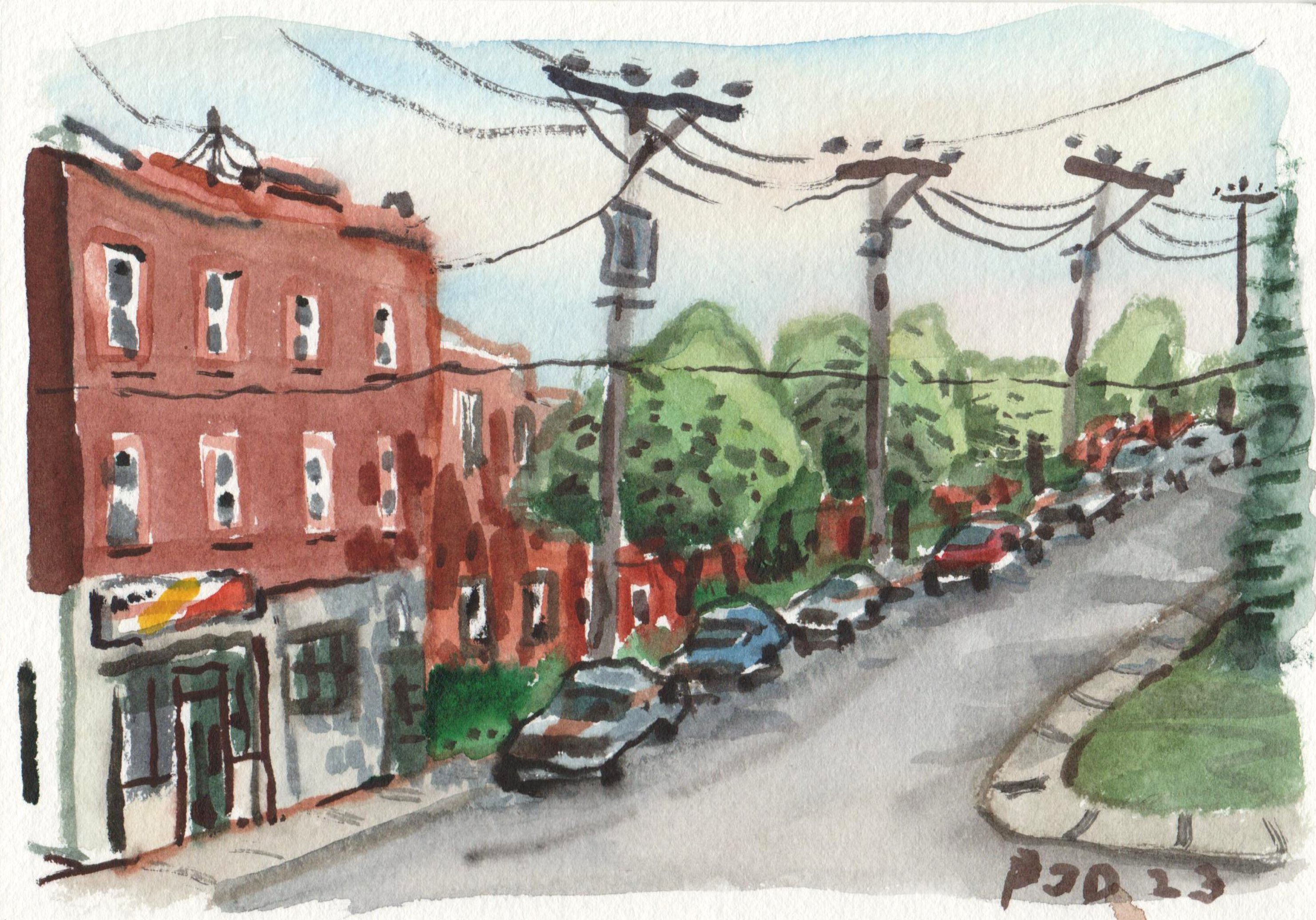
Coffee Park Summer Shadows, watercolour 5 x 7" cold press, June 2023 (No. 3483)


Here is the fruit store where we often shop for discounted chocolate, natural products,spices, fruits and vegetables. I have tried to paint it many times before and never quite got it right! Today I tried to play up the perspective and use a panorama format but it seems a little off in terms of composition. At least the colours and the summery atmosphere are clear, despite the smoky haze that we had again today. As always, there were construction pylons in the scene from some unknown project.

Marche Fruterie Citi Perspective, watercolour 5 x 7" cold press, June 2023 (3483_1a)

Thursday, June 29, 2023

Trenholme Park Sundown

Our weekly vegetables get delivered by truck to Sherbrooke street right around Trenholme Park where I have made many paintings over the years. Today the sun was just going down and I caught the final rays of light on the recreation building nestled among the trees. The facade of the building has a prominent art deco style sculpture and decorative patterns on the windows. To create the glow of setting sun I used yellow-orange tints at the edges of the trees, the illuminated portion of the grass and structure of the building. For the sky I used a range a of pastel tones such as pale yellow, lilac, and a light turquoise. Of course, the prominent orange components are a fixture of architecture from that era. Every building in Quebec of a certain size must come with an art installation, it is actually in the building code. 

Trenholme Park Sundown, watercolour 5 x 7" cold press, June 2023 (No. 3481a)

Tuesday, June 27, 2023

Tree Down

Just outside of my office window there was a large tree that came crashing down yesterday in the wind storm. I was typing away when suddenly there was a loud cracking sound and the tree split down the middle. Luckily, it fell along the grassy area and missed any of the cars or office windows. Today the tree was totally gone and just a stump remained as you can see from the painting. The middle of the tree looked rotted out which may have explained its structural failure. To paint the scene, I was standing at a sharp angle, but in the painting I portrayed the background as if looking head on to emphasize the stump and hydrant as compositional elements. In the background you can see the narrow base of the windows that we have in the office. The windows are more like archery slots in medieval castles, except that they are tightly sealed shut. I hope the trees get replanted some day, it is a good place for them to grow.

Tree Down, watercolour 5 x 7" cold press, June 2023 (No. 3482b)


Monday, June 26, 2023

Stones Unturned


Shortly after reading up on Klempt I did a quick colour study as seen above. The idea was to combine pastel colours with flashes of gold and some dark contrast elements. The painting seems upsidedown now that I look at it, but the signature and title were made at the time of painting it. Next, I did a more elaborate painting after Klempt including an attempt at a portrait. I called this painting stones unturned, after the old saying about not leaving any stones unturned when searching for something. With each artist I study there are new ideas and lessons to turn over, for example, Monet, Van Gogh, Hiroshige, Hokusai, and Maud Lewis were all recent influences. Sounds like the members of some kind of hippie folk band.

Stones Unturned, watercolour 9 x 12" watercolour paper, June 2023 (No. 3637a)

Sunday, June 25, 2023

Orange Sun over Auto Shop


To capture my impression of the sun on a smoky day, I first saturated the sky with water, leaving a dry sphere where the sun would go. I then applied mixtures of orange (PO36), blue (PB16) and a halo of orange-yellow (PY110) to the wet sky. As it dried, I outlined the autoshop elements, the details on the apartment building, and eventually the trees as the sky slowly dried. After filling in all the colours, which were tinted with yellow-orange, I carefully mixed a red-orange with pyrol red (PR254), benzi orange (PO36), and yellow orange (PY110) until it was the correct shade. I was wearing polarizing sun glasses and only glancing briefly at the sun to gauge its colour through the thick smoky air. In reality it was obviously much brighter than it appears in the painting, brighter than the surrounding sky, but I decided to represent the sun with that brilliant orange. As you can see at the bottom left the auto shop is heavily with orange to keep it interesting. As I throw around the word impression and orange sun, of course I am thinking of Monet's famous painting called Impression, Sunrise, which is credited as the painting that started impressionism. Taking a quick peek at Monet's painting and I see the same shade of orange so I guess I am doing something right!

Orange Sun over Auto Shop, watercolour 7 x 10" cold press, June 2023 (No. 3635)

Impressions of a Smoky Day, part 2

The dark grey path is made of tightly compacted gravel, it goes all along the base of the escarpment on the left, until reaching the Turcot interchange at Decarie/highway 15. In the middle of the scene runs the train line, which had stationary oil cars on the track, which I found ironic considering it was the world's worst air quality today in Montreal. To the right is the highway full of traffic in both directions.  The gloomy, smoggy sky was made with a wash of benzi orange (PO36) and phthalo blue (PB15) in places, and a bit of carbon black and greys.

Path, Trains, and Highway on a Smoky Day, watercolour 5 x 7" cold press, June 2023 (No. 3480b)


The train was really interesting so I decided to get a closer look by walking about half way down the trail. Eventually the view opened up at a spot with white field flower and some Van Gogh-esque trees. The trees seemed too dark when I finished them so I put some yellow paint daubs on top thinking they would blend in, but they stayed put and created a polka-dot pattern. Together with the turquoise trees in the distant the whole painting takes on an absurd look. Perfect look for painting on a weird, smoky day. 

Oil Train on a Smoky day, watercolour 5 x 7" cold press, June 2023 (No. 3481b)

As I turned to go home, the blazing orange sun caught my attention. It was a neon-red-orange sphere hanging in a dusty pink sky. Instead of trying to paint it realistically, which is not possible due to the limits of contrast in a painting, I decided to go with the tangerine approach. To complete the illusion, strong highlights were maintained on the trees and the construction vehicles. The colour of the smaller vehicle on the left echoes the sun, and I signed in the same orange paint (PO36).

Smoky Sky Impression with Construction Vehicles, watercolour 5 x 7" cold press, June 2023 (No. 3482a)


Impressions of a Smoky Day, part 1

Heading out today for a walk instead of a ride due to the world's worst air quality, I was not expecting to make so many paintings. It was a new challenge to paint everyday urban scenes through a thick fog and strong amber light filtering through from the sun. Blue was neutralized and greens took on an eerie glow due to mixing of coloured sunlight. Capturing the effect of smoke involved subtle adjustments to the chroma and value scaling of the tree line and field of grass. In the grass, the first thing I painted on the walk, you can see my strategy...greyish blue on the distance, dark yellow grey in the mid ground and higher chroma green in the foreground. Of course I included the famous table in the trees.

Hazy Day in a Field, watercolour 5 x 7" cold press, June 2023 (No. 3479a)


You can probably guess which burger joint this is, I'll give you a hint, it starts with an A and ends with a W. In the background there is the funny green-glass building, and the two big apartments on Sherbrooke on the horizon. The main reason I wanted to do this scene was to use the benzi orange (PO36) that I recently added back to my palette, it was used obviously for the awning and trim on the restaurant.

Burger Joint Orange, watercolour 5 x 7" cold press, June 2023 (No. 3480a)


The sky had an orange tint that faded to greyish blue in places. Overlapping the trees and providing some colour in the foreground helped to complete the illusion of depth. This scene is at the new walking path that goes from NDG to the new hospital area, following along the base of the escarpment. What I have been calling the escarpment is actually the embankment of a lake that was once here. 

Highway Smoky Day, watercolour 5 x 7" cold press, June 2023 (No. 3479b)


In Sense

After painting the homage to Klimpt, it gave me an idea to make a whole painting out of the candy/jewel effect seen in the painting. It was also another palette cleanser, where I clean off the blobs of paint from my landscape palette. I made a variety of circular and oval rings or blobs, then outlined or filled them in with a range of colours. Most of the colours are medium to high chroma (intensity) and the overall contrast (light/dark) was kept to a minimum. Contrast is an important part of composing a painting, the renaissance masters would often paint the whole background in sepia tones (dark brown/black) and then portray a single light source such as a window or candle illuminating the subject matter. The impressionists reduced these dramatic contrasts in their paintings, preferring to use a range of pastels with light and dark kept to a minimum. When I studied the Klimpt paintings, he reduced contrast even more, composing scenes almost entirely in grey tones, with flecks of gold highlight. As an artist, it is good to plan out the contrasts, where is the lightest light, where is the darkest dark, and what is the overall contrast of the painting? There is only one 'white' area in this painting, not white really but the paper showing, if you look around you will spy it.

In Sense, watercolour 9 x 12" watercolour paper, June 2023 (No. 3638b)

Gloomy Weather in NDG

After sporadic rain I got out for a walk down Somerled avenue and made this painting of the insistent tree with a red traffic light. The tree starting growing in a crack between the old Royal Bank building and the sidewalk. After a few years it was several meters tall, now it is approaching the top of the building in height. The sky was stormy looking with hints of blue. As I finished this painting the light came on on the lamp post but it was too late in the process to try and capture the effect.

Insistent Tree with Red Light, watercolour 5 x 7" cold press, June 2023 (No. 3478a)


This was an attempt to capture a beam of light on the side of a building that has pale yellow bricks. One adjustment I made on the palette was to change pyrol orange (PO72) for benzi orange (PO36). They are virtually the identical shade of orange, but the pyrol version has much higher chroma than the benzi version. What I am calling the benzi version is actually called Benzimida Orange Deep from Da Vinci company. It is very potent and tends to mix as an opaque paint even though it is listed as semi transparent. The main advantage is that it has a better lightfasteness rating from Handprint.com, so it is more stable than the pyrol. I used it in the sign on front of the store, although it bled into the wet surroundings. With the recent hot and humid weather the paints have been soft and gooey on the palette making it more challenging to get the right amount of paint on the brush. That is the opposite to the problem I have in the winter when the paint is literally frozen and difficult to get on the brush.

Light and Shadow on Building, watercolour 5 x 7" cold press, June 2023 (No. 3478b)

Saturday, June 24, 2023

Boisé Steinberg, Touche pas Mon Boisé

Boisé Steinberg is a small wooded area at the busy corner of Assomption boulevard and Hochelaga street, just south west of Olympic Stadium. The lot was apparently privately owned, or owned by Hydro Quebec. It had sat unused for a long time, leading to the growth of a grassy wooded area known as Boisé Steinberg. It was in the news recently because a group of homeless people who were evicted from their tents along Notre Dame avenue decided to set up in this area, which lead to the city removing them and securing the forest with barbed wire fence and locked gates. When I visited yesterday by bike, I found the area very secured, with no signs of people inside. This painting was done from the adjacent parking lot which you see in the foreground. The billboard is actually in the forest, but I changed the message to Touche pas Mon Boisé (don't touch my forest), which was written on a protest sign attached to the fence (not shown in the painting).

Touche pas Mon Boisé, watercolour 5 x 7" cold press, June 2023 (No. 3475b)

There is a south access to the forest, which you see in the background, however, a train track and fence prevented any access. Short of throwing my bike over a barbed wire fence there was no way to get in the forest. The city has purchased the land to make an official park, but then the province in all their wisdom announced that a highway for trucks has to be built here. I sincerely hope it doesn't happen especially considering that the city bought the land to make a park. At least I got to make a few paintings of it, and maybe one day I can ride through the forest and make some more. There was a sign on the fence that was very far away, but I think it said Our Green Earth in French.

Our Green Earth, watercolour 7 x 10" cold press, June 2023 (No. 3634)

Shady Park Old Montreal

Would you really want to go visit a shady park? It depends on the meaning of the word. Parc Ville-de-la-Flèche is a small, narrow park with some benches, plant installations and tall trees that provide a lot of shade. Last year, I made a painting sitting in this park, looking towards the underpass to the old port. Yesterday on my way out to Hochelaga by bike, I stopped here to cool off and rest a bit and decided to make a painting, this time of the park itself and its environs. To capture the lights and playful shadows, I established an underpainting and then applied shadows using lively brushwork. The pigeons were here too, like in the previous painting, but they did not stay around long enough for me to include them in the painting. Next time I'll bring a few bread crumbs.  

Shady Park Old Montreal, watercolour 5 x 7" cold press, June 2023 (No. 3477b)

Thursday, June 22, 2023

Changing Styles


 In 1993 I was painting quite a lot, mostly florals with the occasional landscape from photograph. This floral was done from imagination, although it was inspired by a painting that my parents have on their wall, its an original watercolour of lilacs. My version is mostly done wet in wet, that is, the paint was all wet when I applied the various colours. The blue would have been cerulean blue, and the red likely a mix of impermanent alizarian crimson. The green background was aureolin yellow and viridian green. It also looks like I splashed paint on to give it some extra verve.

Lilacs Wet in Wet, watercolour hot press 9.5 x 12.5", 1993 (No. 1326)


Fast forward ten years and I was living in the basement apartment of Bayfield Hall in London Ontario, cranking out abstract paintings on a hot press watercolour block. A block is a stack of papers fixed by a mild adhesive, so when you do a painting its fixed on the block, but you can easily peel it off. For some reason I was using this cathedral motif in a lot of abstract paintings, stained glass situated in surreal landscapes. Maybe it was just a coincidence, but the bottom left looks a lot like Van Gogh's starry night. I knew of the painting, so it was probably a homage.

Floating Cathedral Windows, watercolour cold press, 11 x 15" 2003 (No. 1332)  


Jumping in time and space once more, I did this painting in Montreal on Esplanade avenue shortly after moving there from Ontario. For about I year I produced paintings using the colour splash technique, which involved large amount of wet paint and letting it dry overnight. The results were unpredictable, kind of like a tye-dye technique. When dry, I embellished the paintings with some details depending on what I imagined. The blue colour in the sky looks a lot like phthalo blue, but it may have been prussian blue. During this time I pursued the doodle style quite a bit, for about 5 more years, as I write about in an older blog. In recent times most of the abstracts I do are in conjunction with palette cleaning, and they tend to be completely abstract, without the surrealism. And I continue to turn laboratory doodles into large abstracts as well, such as Lab Book #25 Words Belong Here. In fact, lab book 25 might have enough doodles for a new one soon, and I recently went down to Avenue des Arts and stocked up on paper and paint so I am good for more paintings! 

Complementary Splash Colour, watercolour 7 x 9" cold press, 2005 (No. 1488)


Wednesday, June 21, 2023

Bike Fixed, Paintings before Sundown

My bike developed a loud creaking noise and I could tell that the bottom bracket/crank was in major distress. Luckily it help up for the last week of riding, but finally it was time for a repair. I went to the Davelo shop in ville st Henri, expecting to drop off my bike and get it back by the weekend at least, but the repair person said that they could fix it in half an hour, which they did. I started this painting outside the bike shop, looking west along the new highway structure, when the phone rang and the bike was fixed. So I went and paid, then wheeled the bike out to the same spot to finish the painting. I was worried the shadowed grass would dry light, but it dried perfectly, as a mid-valued yellow/green. 

Field between Bike Shop and Highway, watercolour 5 x 7" cold press, June 2023 (No. 3476a)

Happy to have my bike fixed, I rode down to the Lachine canal and made a quick painting as the sun was going down and the shadows were getting long. The building in the background is a converted factory, now condos, and the footbridge is the way you go to ride or walk to Verdun, and leads to the Atwater market, then eventually downtown if you follow it. Its a nice painting but too bad the building was crooked, it looked straight when I painted it, but sometimes the paper moves around and things go awry.

Canal bike path with shadow, watercolour 5 x 7" cold press, June 2023 (No. 3476b)

Before the Lachine Canal there was a large lake that may have been called Lac St. Pierre or perhaps Petit Lac St. Pierre according to the Wikipedia page. I have often wondered where it was relative to NDG, on the old map it was between Verdun and what would become NDG. Then it occurred to me, based on the size of the lake, that it must have started at the NDG escarpment which would have been water's edge, and stretched across to the steep hill that goes up towards Lasalle and Verdun. This painting was done at the new highway overpass which has a bike path, looking southeast towards downtown. There is is a wide flat area of gravel that is used to store construction materials, which was likely close to the bottom of the old lake. So the highway and Lachine canal essentially cut across the lake bottom. In the foreground, there were two interesting shrubs, one dark yellow and one dark red. They both had white flowers last week when I rode by, but the flowers were pink/red this time around.

Yellow Shrub next to Dark Red Shrubs, watercolour 5 x 7" cold press, June 2023 (No. 3477a)

Place des Arts Convocation


Last night was the Spring convocation for Concordia University, a large event where over 600 students, their families, and faculty gather to hand out degrees diplomas and certificates. It is held at Place des Arts main stage where musicians and comedians have performed, such as Robin Williams many years ago when my family went to see him perform. Lucky me, I got to sit on the stage wearing my black gown with purple sash, the colours of a Western PhD graduate, along with the other professors wearing their colourful outfits. Basically we clapped and stood occasionally for 3 hours... a professorial cheer leading section! Just before the event I made a quick, like ten minute quick, painting of the Place des Arts exterior scene. The Jazz Fest is held at this location too, although it was just being set up from what I could tell. I've painted this scene before from a different angle, so I had a good idea of how to go about the components.

Place des Arts Convocation, watercolour 5 x 7" cold press, June 2023 (No. 3475a)

Tuesday, June 20, 2023

Colours After Klimpt

I read an article about a painting by Gustav Klimpt selling for a lot of money. He was an Austrian oil and watercolour painter who was active around the turn of the twentieth century, most famous for his use of gold leaf embellishments. His style was quite unusual, it was a mix of photo-realism with decorative abstractions. His most famous paintings were of figures of women embellished in gold leaf and bejeweled with plenty of colour highlights and textural effects. The subject matter is not for me personally, and the colour combinations seemed almost unreal. To better understand how it worked, I made an abstract painting to test some mixtures, then, working from memory I made the painting above. Getting the value contrasts on the yellow and caramel (gold) colours was difficult at first, and I was not able to fully replicate the sparkles in the background. The overall effect was not felt until the painting was about 90% complete. In the midst of painting the jewel embellishments in pale pastels, suddenly the golden highlights popped out. Like opening a pirate's treasure chest full of loot. I sort of wish I was more careful with the face portrait, but I like the noodly arms. Anyways, it was an interesting exercise to push my limits as a painter. And if anyone want to buy this painting I am charging 150,000,000 million monopoly dollars.

After Klimpt, watercolour 9 x 12" watercolour paper, June 2023 (No. 3637b)

Sunday, June 18, 2023

Bike Ride (almost) to Ile st Helen


Nun's Island is connected to the south canal (st Lawrence Seaway) by an ice flow control bridge with a wide bike and pedestrian path. Through the trees I got a view of the bridge arching across to Brossard on the south shore. I omitted several supporting struts to give the bridge the appearance of floating off into the distance. To make the various greys I primarily use mixes of blue (PB60), red (PR175) and yellow (PY43) or greenish-brown (PBr7).

Champlain Bridge to Brossard, watercolour 5 x 7" cold press, June 2023 (No. 3474b)


Looking along the banks of the Seaway path on the right, I could see what seems to be the Victoria bridge and the Jacques Cartier bridge behind it. The brown blob in the top left is the Molson Brewery, which is set to close up and move to the south shore soon.

View of Victoria and Cartier Bridges, watercolour 5 x 7" cold press, June 2023 (No. 3473b)

This is one of the supports for the train bridge which merges with the Victoria bridge, which was casting a green shadow into the flowing water. The water has two layers, and I left little white spots to signify the bubbles floating by. To make the greenish shadow, more of a dark yellow, I mixed perylene green (PBk31) with indo yellow (PY110). It was painted on a sheet from a new 10 x 7" Fabriano block, the same make and brand as the 5 x 7 blocks I have been using for several years now. The bike path was blocked off here, so I had to turn back. It was due to the big car race. I could hear the cars buzzing loudly around the nearby track, good thing I brought earplugs. 

Reflection under the Train Bridge, watercolour 7 x 10" cold press, June 2023 (No. 3618)

On the way back, the last remaining piece of the old Champlain bridge caught my eye. It appears that they are preparing this area to be a pedestrian area, like they did under the new Champlain bridge. I hope they do keep it intact, it is a colossal structure and sure to be a tourist magnet. Orange pylons provide scale. I spent a lot of time adjusting the grey of the concrete to get the exact hue and value.

Old Champlain Bridge Monument? watercolour 8 x 10" rough press, June 2023 (No. 3620)

Saturday, June 17, 2023

Soggy Day on Somerled

Across the street on Walkley there is a colourful mural that was reflecting in the puddles. I barely got into this painting when it started drizzling and I relocated to the covered staircase at our condo. Painting puddles is always an interesting challenge, we just have not seen too many of them with the recent dry weather. And the forecast is hot and dry for the next week. 

Mural Rainy Day, watercolour 5 x 7" cold press, June 2023 (No. 3473a)


Standing on the top platform of our staircase which is protected from rain, I made a simple painting looking east on Somerled Avenue. The road was a shimmering metallic grey with subtle blue reflections from the rain. As usual, painting the cars is a challenge. Their scaling, perspective and relative position on the street have to be accurate or else they look too big, too small, or like they are tilting on another plane. In the painting they are sitting about right. To get the perspective lines, I hold my brush up vertically and rotate it until the angle matches the scene, then move the brush to the paper. This is a simple trick to transfer angles onto the paper without using drawing aides like a perspective frame, or using a photograph in the studio. If I tried to take a picture of this and paint off the smart phone, it wouldn't have seemed so bright. Your eyes adjust in low light conditions, making the contrast seem enhanced. Over the years I learned this and was better able to paint scenes on location when overcast. 

Soggy Day on Somerled, watercolour 5 x 7" cold press, June 2023 (No. 3474a)

Lateral Design

Here is yet another palette cleanser, meant to clean my palette while creating a wild new abstract painting. I started doing this style in 2020 when I was experimenting with a lot of different paints and changing my palette around frequently. Orange was the biggest addition to my palette, I never had an orange paint and now I regularly use several. For example, isoindolone yellow (PY110) is a orange-yellow colour similar to that of a school bus or yellow lines on the road. Its very useful on location for mixing olive greens, toasty yellows, bright orange-yellow, and representing the setting sun. If I could reach back in time and give young PJD some paints, it would be isoindo yellow and perylene green (PBk31), not to mention perylene maroon (PR179) and lamp black (PBk6). And stop using alizarin crimson (PR83) it fades like crazy! Anyways, lessons were learned with time and careful study. In the painting I was experimenting with a lateral design where most of the elements are going side to side, like clouds in a psychedelic sky.

Lateral Design, watercolour 9 x 12" watercolour paper, June 2023 (No. 3656a)

Flowers with grains of salt

One of the first reference books I had was ambitiously titled 'Everything you need to know about waterolor". In fact, it only had a few things that you really needed to know about watercolour, along with a lot of oddball tricks you could use like applying saran-wrap to the painting while wet, making colour chickens, and throwing salt in the washes. In 2004 I was taking paintings to various art in the park shows in London Ontario and created a series of florals done in a light and airy style. To spice up the painting I threw salt grains into the semi-wet wash to create the appearance of small white flowers bursting from the vase. Judging the moisture is tricky, if the wash is too wet the salt just disappears, if the wash is too dry the salt wont dissolve at all. It works in a controlled studio setting, but not something I found to be very useful on location. Salt is better for preventing the water from freezing when painting in the winter.
 

Flowers with Grains of Salt, watercolour 5 x 7" cold press, 2004

Thursday, June 15, 2023

Memories of Painting in Paris part 3

After posting several Paris paintings, and most recently memories of painting in Paris part 1 and part 2, I thought I would complete the series with a part 3. As far as I can tell there are not many Paris paintings left in my box from the three separate trips I took over the years. In this painting, you can see the massive front of Notre Dame cathedral from an angle in the background, with a decorative lamp post in the foreground. When touring around Paris there was so much to see, it was almost overwhelming as an artist. I like some of the colour choices in the painting, like the reds and greens in the post, and the variety of grey, brown, and blues.
 

Lamp Post and Notre Dame Cathedral, watercolour 7.5 x 11" cold press, 2009 (No. 1234)


I am never quite sure of the dates on these painting, in the last one I noticed no leaves on the trees, while this one is clearly in Spring or fall judging by the foliage. At any rate, the painting captures one of the many bridges in Paris with people gathered around its right and left banks. There was a lot of attention to detail in the bridge structure and perspective, with a nice light atmosphere surrounding it. The foregrounded tree branches on the top left provide a compositional element for depth perception.

People Under Bridge, 6 3/4 x 7.5", 2011 (No. 1239)


Just off the river there are many old buildings with fantastic architecture. Most roads in Paris are quite straight, but this was a rare curved road in the city. The building and iron fence were also curved around it, giving a sense of history and permanence to the location. I was into painting the traffic signs on the roads at the time, you see the arrow near the bottom of the painting. Since then, I generally ignore the road symbols. I like the golden weather vane on the top of the building, it looks realistic, and the orange leaves seem to provide a genuine glow. 

Fall Trees, Curved Road, 5 x 7" 2011 (No. 1243)

Wednesday, June 14, 2023

Pine Trees with Sidewalk


Along Monkland avenue there is a row of pine trees in the Benny park corner with Cavendish. Today I found a spot to stand under the trees and made a naturalistic painting of the pine trees, shadows, and needles on the ground. The only sign of of the city is a sidewalk angling off in the background. I used a drybrush technique to make the pine needle textures, its done by just pushing the semi-moist brush directly down on the paper so it splays out a bit. That technique is bad for the brushes but my current brushes are pretty beat up now. Some of my brushes are almost 20 years old, although the Holbeins I bought in 2020, and the synthetic squirrel (not real animal hair) are from last year. Probably time for some new ones! The initials were done in red to provide some contrast against all the green. The Japanese print makers used that trick, they would make their signature symbols all different colours and even integrate the signature with the composition.

Pine Trees with Sidewalk, watercolour 5 x 7" cold press, June 2023 (No. 3466b)

Monday, June 12, 2023

48 Wires São Paulo, Brazil


Here is another memories of Brazil painting done from painting notes I took on the trip. The view from Cilei's parent's house included a nice view of the eucalyptus trees on the horizon that I painted at night. What I omitted from the location painting was a utility pole plastered with no less than 48 wires. The wires were mostly in neat arrangements and somehow delivering power and communication to the neighborhood. All over São Paulo the utility poles were like this. Wires would fan out laterally to various houses and shops. To make the painting, I did the background first, then painted over the 48 wires making sure to vary their thickness and count them. It was surprisingly challenging to paint 48 curving lines without too much overlap.

48 Wires São Paulo, Brazil watercolour 9 x 12" watercolour paper, June 2023 (No. 3655b)

Flowers in Field on Campus

What is left of a large field of grass on campus has been left to seed. Maybe its a good thing because a variety of plants and wild flowers starting growing as you can see in the painting. I embellished a little, in fact, most of the field was a toasty yellow from the dry burnt grass. At some point it will be a parking lot or new building, so here is a reminder of how it was in June of 2023.

Flowers in Field on Campus, watercolour 5 x 7" cold press, June 2023 (No. 3467b)


Here is the first painting I did of the scene, perhaps looking a bit more realistic. As I painted, it seemed unfortunate that the wild flowers were not in the picture, which prompted the second painting (seen above). Painting after work is always risky because I am wearing my cleanest clothes, today a bone white t shirt and white dress shirt. Luckily no paint was spilled in the making of this painting! I will have to bring a painting shirt next time.

 Field on Campus Parking Block, watercolour 5 x 7" cold press, June 2023 (No. 3468b)

Sunday, June 11, 2023

Ride Around Verdun, Warm Breezy Day

The bike route to Verdun from NDG is a winding one. It tarts with the new autoroute overpass bike path, to the Lachine Canal, across a foot bridge and up Senkus street, through Park Angrignon, across the aqueduct onto Crawford street, then follow the waterfront path to the east. This painting was done from the river shore park, somewhere near Douglas hospital. The south shore is visible in the distance, and a little island, probably Rock island is hiding behind the foliage.

River view from Verdun vertical, watercolour 10 x 7" cold press, June 2023 (No. 3614a)


This painting was from the same vantage point but composed differently to emphasize the end of what must be goat island, which is adjacent to Heron island, not seen in the painting. My Grandfather had a summer house, or shack, there in the 50's or so, where my dad and his brothers and parents would go to fish and boat. You can see how different this painting is from the same spot, just be removing the foreground trees and composing on the horizontal. 

Goat Island view from Verdun horizontal, watercolour 10 x 7" cold press, June 2023 (No. 3614b)


It took a little riding but I found 5th avenue where my Dad used to live as a child. This scene is looking directly across the street at a pink flowering shrub in full sunlight. It took awhile to complete all the intricate brush work of the shrub, along with all the background details. There were a lot of people around, many seemed curious and glanced at my painting. It's not often I paint on residential streets, sometimes people think I am a parking police writing a ticket. Which is silly because nowadays they print tickets.

Flowering Shrub on 5th Avenue, watercolour 5 x 7" cold press, June 2023 (No. 3471b)


After visiting Cilene and Fritz, I stopped at Labelle park looking down Lasalle Boulevard. Here I made a quick painting of the famous brown buildings, green trees, and crooked utility poles of Verdun. In French they call Verdun verte et brun!

View down Lasalle Boulevard, watercolour 5 x 7" cold press, June 2023 (No. 3472b)

Saturday, June 10, 2023

Scenes from Old Port Montreal

Its not the first time I've painted it, amazingly, there is a beach in Old Port Montreal! Nobody was using it today, just a narrow strip of sand and blue awnings next to the marina on st Lawrence river. I deliberately write lower case st by the way, instead of upper case dot, there are a lot of Catholic saints names in Quebec and its not fair in my opinion that so many things are named after them when we have a diverse community and the issue surrounding religion in Quebec with indigenous people. But I digress from the main fun of today which was painting in decent weather without the brutal snow and ice I faced last winter. The boats were all motor boats so I painted them like cars, and mostly in black and white. Cartier bridge is briefly shown in the top of the painting.
 

Beach Blue Umbrellas and boats, watercolour 5 x 7" cold press, June 2023 (No. 3470)

Not far from the last scene, here I am looking across the river at ile st Helene with the expo 67 dome, and an old turret they restored recently. Of all my attempts at the st Lawrence in this area, I think this one does the best at interpreting the flow and patterns of the river. It has some rapids here, and you can really feel the energy of the water flowing. I tried to use the water motif almost like an abstract, a palette cleanser painting of sorts.

st Lawrence and Dome, watercolour 5 x 7" cold press, June 2023 (No. 3471a)

The colours and textures grabbed my attention here, and the seagulls on the shallow water made for a nice contrast. As I painted, several people stopped and watched me paint, one fellow even took a picture of the painting and then took a picture of me doing the painting. In French he said how much precision was in the painting. Its funny because I painted this one with a deliberately loose and gritty style. I've been meaning to advertise my Instagram (PJDART42) on location especially when downtown. But if you read the blog, there is nothing new on the instagram, I just post the image of the painting there with a few words.

Bridge and gulls, watercolour 5 x 7" cold press, June 2023 (No. 3472a)

Friday, June 9, 2023

Machine Unlearn

Lately there has been a lot of talk of artificial intelligence, which is just a rebranding of a computer procedure called machine learning. Machine learning goes back to the mid twentieth century when computers were starting to be used to control various devices. The military was using computers to calculate intercepts for missiles, and had developed some early machine learning procedures. Nowadays, similar procedures are used on a massive scale to sift through data on the internet and come up with blended text or images. It is not really intelligent because it can only regurgitate variations on things that already exist, in academia we call the plagiarism. Perhaps one day machine learning can be creative and really think on its own. The painting represents machine learning in a way, although I called it machine unlearning. We need to unlearn what the machines told us to do!
 

Machine Unlearn, watercolour 9 x 12" watercolour paper, June 2023 (No. 3656b)

Thursday, June 8, 2023

Shrubs near Train Crossing


Down by the train tracks there is a small park called Coffee Park, great name, its just a strip of land with some play park, benches, trees, and a small basketball court. I've painted Coffee park and this train crossing many times before. Today I combined some of the flowering shrubs at the corner of the park with the train crossing elements and of course, the garbage pail in the foreground that practically counts as my signature. Each element is embellished with its own colour scheme and brush technique. The style of this painting is somewhere between Dutch impressionist painter Van Gogh and Canadian folk painter Maud Lewis. Maud Lewis's paintings have been in the news lately due to their high value, she sold them for mere dollars decades ago and now they are worth tens of thousands each. They are also easy to forge and that has dampened the market a little. I wonder if people will ever forge my paintings... it may be a little harder with watercolour paints! Not to mention, just about every painting I made is catalogued and most of them on this blog. Back in the old days records were scant, which make opportunities for the fakers.

Shrubs near Train Crossing, watercolour 5 x 7" cold press, June 2023 (No. 3469)