Monday, January 30, 2023

World Inspired Landscapes: Greece

Greece has a typical landscape for the region that is similar to its neighbor to the north, Albania and further up, Croatia. The interior consists of rolling hills, forests and rivers, the coast has gorgeous sandy beaches and turquoise water from the Ionian and Aegean seas. With its rich history, the people has produced pottery for a long time going back practically to the stone age. There are distinct periods of Byzantine and Greek pottery marked by shifts in the culture over time. The shapes of the pottery stayed relatively similar over the centuries, but the decorations changed quite a bit. At one stage. they made great use of geometric patterns like lines, diamonds and interlocking angles. There was also a popular octopus motif painted onto the pottery. In my painting, I superimposed ancient pottery with an octopus graphic over top of a brilliant bright background of rolling hills, beach and the sea. Its almost as if the octopus is leaping out of the water into the foreground. The warm, pottery-colours in the foreground help to complete the illusion of depth.

World Inspired Landscapes: Greece, watercolour 10 x 11" cold press, January 2023 (No. 3364)

World Inspired Landscapes: Ghana


Ghana is located in West Africa next to the Ivory Coast. It has one of the most stable democracies of all the African countries after becoming independent in the mid 19th century. The landscape consists of a variety of terrain including grasslands mangroves and forests. There seems to be many types of large and small animals that live in Ghana including grey parrots. Grey parrots are considered old world birds that are found from Ivory coast into mainland central Africa as far as Kenya. Despite their drab grey colour, their tails tend to have scarlet red feathers. To play up the colourful tails, I combined the parrots with a misty jungle scene in the background. In the painting the parrots look sleek and elegant but in real life I guess they are very noisy and annoying, kind of like pigeons. At least we can appreciate the biodiversity and hope that countries rich in biodiversity can do their best to preserve it. 

World Inspired Landscapes: Ghana, watercolour 10 x 11" cold press, January 2023 (No. 3363)

Ice Flow and Blizzard Dieppe Park


Sunday's painting excursion was all about perseverance. The weather called for snow all day, and a strong blizzard with whiteout conditions. I had wanted to paint the ice flow on the st Lawrence for some time now, but getting to the river without a bike is a tough proposition. The bus and metro took me to Bonadvanture station, then I walked south on Peel to the Peel Basin. Recognizing the landscape, I trudged around the Farine Five Roses and along the port and past Habitat 67. Just before Concorde bridge I veered off into park Dieppe and kept walking through deep snow on unbroken trails until I reached the gazebo at the end. The snow was blowing on an upward angle from the steep embankments but I found a bit of refuge under the gazebo to make this painting.  It was my first try with my new wooden frame that is sized for 8 x 10", which enables me to paint on this larger format in the winter. It prevents the painting from smearing. When I got back in the metro station, the snow on this painting melted and ruined the middle and top portions. At home, I touched up the railing, river, and background elements. As it turned out, it may be one of the greatest winter paintings I have done to date. Perseverance pays off!

Ice Flow and Blizzard st Lawrence River, watercolour 8 x 10" Strathmore Gemini, January 2023 (No. 3380)

This was actually the first painting I made on the Dieppe Park excursion, looking back at Concorde Bridge. The paining, and my palette were thoroughly coated in snow, but it dried out pretty well after all. I just touched up the railing and some shadows at home. The background was really white like you see in the painting due to blowing snow.

Ice under Concorde Bridge, watercolour 5 x 7" cold press, January 2023 (No. 3392a)


On my way back, I found a rest station at the beginning of the park that afforded significant shelter from the elements. The tables were piled high with powdery white snow, and the pine trees were a jigsaw puzzle of white and green. Off in the distance, the Montreal skyline appeared pale grey due to blowing snow. Today was a massive physical challenge, and I am happy to say that all my winter gear passed with flying colours. The Baffin boots kept my feet toasty warm the whole time, and my wool underclothes and thermal layer Cilei got me for Christmas worked wonders. Importantly, my hands were warm the whole time despite the -20℃ with windchill. I had a pair of light Auclair gloves, Woolpower wrist gators, and Deerskin Gauntlets over top. When I needed a bit of dexterity I could pull off a gauntlet and have the Auclair to keep my hand warm. It took a lot of fiddling to get all the gear right. If I ever go out in a blizzard again the only things I might add are a balaclava and a ski goggles perhaps.

Snow on Tables with Pine Trees, watercolour 5 x 7" cold press, January 2023 (No. 3393)


Saturday, January 28, 2023

Attempted Roses


Some time around the year 2000 I began a multi-paneled wall mural consisting of a lattice of roses. It was an attempt to fuse a flower theme with a decorative abstract style. The multiple panels remained unseen in a plastic bag at my Parent's house for twenty years, until recently, when I got the pieces back to Montreal. The backs of them were mostly blank but some had unfinished paintings. In this painting, I completed an unfinished rose design with new variations on the theme. Old elements were combined with new, so I have to date this painting with two years 2000 and 2023! Perhaps I will try and assemble the original rose panels and take a picture to see what it actually looked like.
 

Attempted Roses, watercolour 10 x11" cold press, 2000/2023 (No. 3361)

Noodle Vases


Noodle Vases is a multi-dimensional design that appears to show the same vase in different space and time. The vase was done with wet-in-wet technique using what appears to be daubs of alizarin crimson (PR83), phthalo blue-green (PG7) and french ultramarine blue (PB29). The wood benches are probably aureolin yellow (PY40) with an overlay of alizarin crimson. To create the dark spots, a glazing technique was used where layers of alizarin, phthalo green and french ultramarine were applied in succession. Since the red and yellow are not lightfast, meaning that the fade and alter in sunlight, this painting is best kept in the portfolio.

Noodle Vases, watercolour cold press 12 x 15", 2001 (No. 1767)

Return to Land (P.J.D.I. style)


In 2011 I made a painting called Land Escape, it depicted some abstract figures floating and standing around, with a wispy pastel landscape being torn apart. I saw the painting again while searching through the archive and noticed that the back of the painting was blank, almost inviting an new painting. Its a bad habit I know, but painting on the back of other paintings saves space and materials. If I personally love a painting or think its a masterpiece in my mind, then I will never paint on the back. In this case, the A-side painting was okay but very bland. Recently, I painted a series of Deep-A.I. (artificial intelligence) inspired paintings, and I thought, gee, I can come up with images like that without using A.I. For 'Return to Land' pictured above, I emulated the Deep A.I. style, but with a completely original abstract design. The A.I.-inspired style included an unusually blue sky, the 2D/3D hybrid shapes, and a nonsensical collection of objects. I think I nailed it? Lets call this style P.J.D.I. The title is a counter-point to the front-side painting, which showed a person escaping, but this painting suggests a person landing and staying.

 Return to Land, watercolour 5 x 7" cold press, January 2023 (No. 1813b)

More abstract paintings from the archive

Throughout the 2000 and 2010's I was not landscape painting as much and instead focusing on abstract painting in the doodleism style or free style. Prior to that, I was painting a lot of landscapes in London Ontario, on the Spain trip and other trips. One reason for the shift in emphasis was that Montreal was not the most inspiring place to paint at the time; I was living in the dense neighborhood of Plateau and had not quite worked out how to paint standing up or to use my bike as a mobile studio. Those developments would not come until 2020. In 2020 the Lachine canal bike path opened up which was a major reason for my renewed interest in Montreal as a subject. I can pinpoint the turning point to one painting, I was sitting on the ledge of the canal doing a fall canal scene while the construction crew was prepping the canal path across the way. Once it opened, I gained easy bicycle access to all of downtown and the aqueduct. Of course, the pandemic was the other driving force, I went from 50 paintings a year to 500 paintings a year and covered virtually every accessible portion of the island since then.

Some Old Painting, watercolour cold press 7 x 22", 2016 (No. 1811a)

Just before the pandemic, I had a renewed interest in art owing to a trip to Amsterdam with Cilei where we visited the van Gogh Museum and I discovered Hiroshige in a book about van Gogh. In 2018 I was mostly working on abstract paintings like the one shown above, and towards the end of the year doing paintings in the neighborhood. In the early part of 2020 I was copying Hiroshige paintings and starting to explore new paints like prussian blue.

Lost and Found Internal Connections, watercolour cold press 3.5 x 15", 2018 (No. 1817b)


Palette Update January 2023


 My palette setup has not changed much since last year, just a few adjustments and equivalent paints swapped in. During 2020 I bought a lot of new paints some of which were excellent but didn't suit my style or were redundant with the other paints. After significant trial and error I settled on these 19 paints for landscape painting. The top row starts with four earth colours ranging from yellow to brown to brick colour. The next four are cool dark colours good for shadows, violets and blue-greens. The last four on the top row are meant for creating a variety of greens. On the bottom row I have six very bright paints for highlights and for the sky. Last but not least is carbon black, which I keep in a separate compartment because it can get very messy. I put the colour category above the paint (D = Dark, and the letters are colour names), and the pigment code below the paint. So D-R is dark red, with pigment code PR101. I put an asterix on that one since it is actually a blend of two identical paints I have.


This is a quick palette cleanser I made in the sketch book before doing the palette painting above. After a bunch of night paintings my palette was a mess, encrusted with salt and carbon black all over the place. Night painting is indeed messy. I actually have the exact same palette with the same paints on them, one is for winter painting, the other for good weather painting. The only reason for doing this was because the winter palette is physically disintegrating, the hinge broke and the plastic is slowly cracking under the cold weather. But I will still use it to the bitter end.


Friday, January 27, 2023

Pizza Shop Winter Night


Waiting pizza I made a quick painting outside of the shop. When I went back in the pizza was waiting for me, and I said, you can make pizza faster than I can make a painting! The sky was a dull greenish-grey with dark blue accents. Strong lights from the shops illuminated the heaps of snow along Somerled, and the pharmacy across the street provided a splash of colour. In the very background our condo building is depicted.

Pizza Shop Winter Night, watercolour 5 x 7" cold press, January 2023 (No. 3390b)

Thursday, January 26, 2023

Big Pile of Snow


To get back from the Renaissance store to my office I took a shortcut through the Reno Depot parking lot but encountered great piles of snow. Standing in the midst of these piles I made a quick painting to show the impressive effect. Most of the painting is just snow pile, with a tree top, condo and telephone wires from across the street poking out at the top of the composition. Getting the value and colour correct on the snow pile was the key to the painting's success. After studying the true colour of snow for the past few years I knew that it had to be a pale, low chroma near-blue. Blue also dries a bit lighter, so it was applied slightly darker.

Big Pile of Snow, watercolour 5 x 7" cold press, January 2023 (No. 3390a)

Tuesday, January 24, 2023

Heaps of Snow PERFORM Centre


Located on campus, the PERFORM Centre has a gym on the main floor and laboratory spaces on the top floor. On the way over to the lab I stopped to make a quick painting of the heaps of snow in front of the building. To paint the building I emphasized the colours and basic shapes, making sure to retain the snow highlights. Lately, I started putting paint marks on the paper to keep track of where the edges are, but it shows up too much so I will go back to using light pencil which can be erased. For a less than 10 minute painting this one turned out all right.

Heaps of Snow PERFORM Centre, watercolour 5 x 7" cold press, January 2023 (No. 3388b)

Monday, January 23, 2023

Stratford Bridge Bright


While on a trip to Stratford Ontario I took a picture from a popular vantage point showing the stone bridge and interesting architecture in the background. This is the second version of the painting, the first version was darker and had less colour. The reflection in this one is quite realistic and the trees have many interesting shades of olive green and dark yellow. It was a nice location, I took pictures of swans and lakes and made paintings. Perhaps one day I can go back and paint on location.  

Stratford Bridge Bright, watercolour 12 x 16" hot press, 2004 (No. 3350)

Sunday, January 22, 2023

Ride to Canal Deep Snow

The roads were relatively clear and the snow was partially melted which made it possible to ride my bike down to the Lachine Canal. The path along the canal had deep snow so I walked by bike towards the west where there is a sweeping curve. To do this painting I was standing on the footbridge that is visible in the previous canal painting I did at night.  Most of this painting is just the paper (white snow) with delicate washes. The green thing frozen in the ice is a buoy.

Sweeping Curve Frozen Canal,  watercolour 5 x 7" cold press, January 2023 (No. 3387b)


Inspecting some old maps of Montreal I noticed that there used to be a small lake where the Turcot interchange is now. The lake had a few names including Small Lake Pierre. I can imagine that this shallow creek was part of the lake, or at least represents some low ground where the water still collects. In the background a train was going by. Behind the train is the renovated embankment that has a recreation trail although it is closed off in the winter.

Creek near Canal, watercolour 5 x 7" cold press, January 2023 (No. 3388a)


I've always wanted to make a painting of this billboard but I am usually on the way back from a painting excursion and too tired to do it. Given my limited range today due to the deep snow, I finally did a painting of it. The billboard also provided some much needed colours against an otherwise grey background. The cars in the foreground worked out pretty well I am finally getting the shape of them after years of practicing. 

Billboard near Overpass at Dusk, watercolour 5 x 7" cold press, January 2023 (No. 3389a)

Saturday, January 21, 2023

Algonquin Park White Canoe

Going back in time, this painting shows a scene from a camp site in Algonquin park that is only accessible by canoe. The canoe in question is a rental canoe as indicated by the yellow logo on the bow. Some gear is underneath due to rain fall if I remember correctly. It is based on a photo I took 30 years ago on a camping trip with my best friend Chris. A favorite painting of mine, I was surprised to see that it had not been posted on the blog before now, but it had been misplaced in one of my portfolios until recently.

Algonquin Park White Canoe, watercolour 12 x 16" hot press, 1993 (No. 0106)

Broccoli Lamp Deep A.I

Using the Deep A.I. website I created an image of a broccoli lamp using the object filter. The painting is close to what the digital image was, which I pasted down below. In this case the AI image used high chroma pixels that can not be replicated with paint, unlike the previous two paintings I did with Deep AI where the images were simulated paintings. Having a bit of fun with it, I made a few more AI images and might do some more paintings.

Broccoli Lamp Deep A.I., watercolour 10 x 11" cold press, January 2023 (No. 3362)


Thursday, January 19, 2023

Sports Dome Illuminated

Just one painting on my way to pick up the vegetables today- they were so late I went home and the returned when the text message was received. I have painted this dome before but not quite like this, it was illuminated by several sources from around campus, and set against a dark purple sky with red-orange clouds. By a stroke of luck the painting dried enough on the spot which enabled me to apply the tree and fence over top of the background elements.

Sports Dome Illuminated, watercolour 5 x 7" cold press, January 2023 (No. 3386b)

Deep A.I. Fish Falling from Sky


This watercolour painting was based upon an artificial intelligence image similar to a previous study, Gumdrop Tornado. It took a few tries to get the painting right. The image was rather like koi fish swimming in a pond, and the A.I. had attempted to make a frame around it. I could recognize the brushwork of Van Gogh and Monet with some Renoir mixed in. Clearly, the A.I. programmers had fed it some classic impressionism oil paintings. Scroll down and you will see the image that the A.I. produced. I was impressed by the quality and expression of the outlines that the A.I produced, and the simulated brush strokes.

Deep A.I. Fish Falling from Sky v1, watercolour 5 x 7" cold press, January 2023 (No. 3357)


Deep A.I. image 'fish falling from sky' with impressionism filter.


Monday, January 16, 2023

Bubble Catchers

Just to prove a point that I don't need artificial intelligence to produce abstract art, as I showed in the previous blog, here is a painting I did called Bubble Catchers! It was based on a doodle from a lab notebook, with embellished colours and a surreal landscape. As usual, I incorporated natural elements like trees and rolling hills into this surreal scene. I suppose that artificial intelligence and human creativity have similarities, for one thing, AI programs are created by humans. In terms of a process, being creative involves a certain degree of randomness. The result of creativity is an interesting combination of style and ideas to create a visual surprise for viewer.
 

Bubble Catchers, watercolour, 9 x 12" watercolour paper 2008 (No. 1606-2)

Deep A.I. Gumdrop Tornado


To create this abomination of a painting I started by typing the phrase 'gumdrop tornado' into an artificial intelligence website called deepai.org machine-learning-model/abstract-painting-generator. After a few seconds, out popped an original digital abstract image. The artwork you see above is a real watercolour painting that I just completed based upon the AI image, with some modifications. I elongated the ratio to make a landscape format, but otherwise I tried to follow the AI image. The colours were very bright and I could tell that the programmers had taught the AI using actual paintings because the hue and chroma closely matched actual paint which made my job easier. 

 Deep A.I. Gumdrop Tornado v1, watercolour 12 x 16" cold press, January 2023 (No. 3356)

So how does it work? Complex algorithms (math equations) are used to morph an image towards a final goal, in this case, an abstract design including gumdrops and a tornado. Presumably the algorithm was drawing upon stock file images of the key words, and morphing it into what appears to be a mid-20th century abstract style. A few things I noticed about the image, the spheres were not perfect circles, the shadows were often wrong, and some of the objects are illusions created by overlapping elements. With respect to copyright, the web site said that any image produced was free of copyright, although I have a feeling that other artists' paintings were used to teach the thing. I have two more AI images that I might turn into paintings, but its not something I would do regularly, I have enough ideas of my own!

Here is the AI image that was produced: 


Sunday, January 15, 2023

A Few more Abstract Paintings from the Archive

Abstract and surrealism art styles emerged in the early parts of the 20th century as a result of intense competition from lithography and photography. Prior to that time, painters had a virtual monopoly on the colourized art market with the exception of wood blocks, etchings and engravings which were done since ancient times. If a person wanted to buy a colour landscape or portrait, a painter was the best and basically only way to have it done. As print media, and eventually, screen media, took over, it coincided with the rise of abstract and surrealism.

Day Night Rusty Pipes, watercolour 12 x 16" hot press, 2010 (No. 1779b)

Two painters lead the charge, Picasso for abstract and Dali for surrealism. Of course, there were many other contemporaries at the time, and many who would follow in their footsteps. By creating abstract or surrealism art, the painters had regained their monopoly on imagery. A photographer would not likely be able to produce a painting or drawing like Picasso or Dali could through human creativity. Picasso ended up becoming the most prolific artist of all time (according to Guiness Records), he painted over 13,500 works, and designed 135,000 prints and engraving, not to mention 300 sculptures and ceramics in his lifetime.

Ominous Sky Warning, watercolour 2006 12 x 16", 2010 (No. 1880b)

Bus and Walk up Mountain


 Feeling slightly lazy today I took the bus to a stop near Mount Royal and walked the rest of the way to the main summit area where they have a large skating rink. There were hundreds of people up there, seemingly all crammed onto the skating rink, but a few were skiing and hiking on the trails. I found a quiet spot with a view of the undulating landscape and dense trees. This poor tree in the foreground had the orange spray-paint on it, indicating that it will be cut down soon due to the worms.

Forest with deep Snow, watercolour 5 x 7" cold press, January 2023 (No. 3386a)


The first painting dried slowly and was faded away when I next saw it, so I touched it up with some darks and details. For the next painting I tried something a little different, I used an impressionist style to create the background and middle ground. If you squint it should look like the river off in the distance, downtown Montreal in the middle ground, and some trees and snowy surfaces in the immediate foreground. You know its impressionism if you have to squint! It turned out all right but a larger piece of paper would help. I don't have a drying rack for 8 x 10" so its not possible right now to paint larger in winter. So I bought a narrow 1/4 by 3/4 wood molding piece, about 2 meters long, and will try to make a drying rack for 8 x 10 for winter location paintings. 

View of st Lawrence River Impressionism Style, watercolour 5 x 7" cold press, January 2023 (No. 3387a)

Meunerie Bakery with Snowy Tree


Yesterday after picking up some fresh bread at a local bakery I made a painting of the shop and a snowy tree. The window, behind the hydrant and bike, shows the relative warmth of the interior which included brown paper bags full of bread for people to pickup (they take internet orders and you can pick it up). Luckily they had the breads that I was looking for, a loaf they make from flour that they make in the shop, and a baguette. The painting needs a bigger piece of paper to show the whole scene, perhaps I will return with an 8 x 10" next time.

Meunerie Bakery with Snowy Tree, watercolour 5 x 7" cold press, January 2023 (No. 3389b)

Friday, January 13, 2023

Chicken Egg Royal (Chicken a la King)

There was a pocket of paintings in one of my many portfolios that contained some neat abstract paintings and other older paintings. This one is a montage of several ideas, including a yellow egg with scintillating pink accents, a row of ducks, and a person standing (painting?) in the foreground. Somehow, the paint looks like it was applied with a finger rather than a brush, it is very intriguing. If I paint a second version, the trees at the top could easily be added to the main scene, and the decorative shapes to the left could be included all around the edge as a pseudo-frame. The person in the front could be pointing, but also their finger would be connected to a brush stroke, like they are finger painting the very scene that they are looking at.

Chicken Egg Royal (Chicken a la King), watercolour 12 x 16" hot press, 2010 (No. 1779b)

Lachine Canal, Sunset on a Snowy Night


After painting the fresh snow on a table in the field with broken chairs, I tromped down to the canal to see if the sun was setting. There is a highway overpass here which I could stand underneath, and some lamps along the path which helped, although I had my trusty head lamp with me. The lamps were creating alternating patches of light orange and blue, and the traffic on st Patrick across the canal gave a distant glow. The canal itself was totally covered in fresh snow and it was reflecting the violet and peach from the sky and sunset. The painting was so moist that I had to add the lamp posts and central trees at home once the rest of it dried properly. It wasn't until I started to write the blog that I noticed the snow-effect, which was literally created by snow hitting the paper while its still moist. It was a difficult slog to walk down to the canal and back after a long day at the office but in the end well worth the effort.

Lachine Canal Sunset on a Snowy Night, watercolour 5 x 7" cold press, January 2023 (No. 3391)

Snow on Table with Broken Chairs


A strong blizzard was raging from mid afternoon until about sunset in Montreal. With the remaining light of the day I walked down to the field where I have made many paintings of the table and chairs. At long last, the table had a thick layer of fresh snow on top, although it was not an easy task to paint it. Despite standing in the tree line for shelter, snow was falling onto the painting encrusting it with heavy snowflakes. It was like trying to make a paining in a bowl of soup. I touched it up a bit at home to add the background trees since they had blended into the background apartments, and some detailing on the furniture. 

Snow on Table with Broken Chairs, watercolour 5 x 7" cold press, January 2023 (No. 3383b)


Waiting for Vegetables on a Snowy Night

Thursday night happens to be the vegetable delivery night, but the truck was very late. Not wanting to sit in my office any longer I struck out into the bitter cold and mixed precipitation to make some night paintings. The first one is an exaggerated view of Oscar Peterson Hall. Angles were made more acute to give the impression of a sheet of piano music, a kind of jazzy synesthesia.
 

Oscar Peterson Hall at Night, watercolour 5 x 7" cold press, January 2023 (No. 3384b)


The sky had that eerie maroon glow that tends to happen on a cold winter's night. I used the good old combination of pyrol orange (PO73) and indo blue (PB60). In Trenholme park they have a fenced-off play area filled with games in the summer, but today it was sombre, silent and snow-covered. Strings of small amber lights criss-crossed the trees and massive flood lights illuminated the area. The whole painting was moist making it difficult to capture details, but it created a soft glow. Without anywhere to sign I put my initials and year (PJD 23) in the tree branches.

Trenholme Park Bench with Snow, watercolour 5 x 7" cold press, January 2023 (No. 3385a)


Still waiting for vegetables I started one last painting of the dépanneur on Sherbrooke across from the intersection with Montclair street. From this angle the sky had an eerie grey-chartreuse glow, perhaps due to the artificial lights emanating from down-town Montreal reflecting off the cloud cover. I got the colour nearly right but the value is a notch too high and the constant snow pelting down created a strong texture. The front window of the dépanneur had a strong light beaming out from underneath its yellow facade. Half way through my phone buzzed and the vegetable truck showed up!

Déppaneur Marche Chartrand, watercolour 5 x 7" cold press, January 2023 (No. 3385b)

Bolton Pond in the Old Days


After taking watercolour lessons in '89 Mom got me a book called Zoltan Szabo's painting little landscapes which contained a list of new paints to try. One of them was burnt sienna transparent (PR101) from Winsor and Newton. I made good use of it to depict the pond behind the house, which was recently renovated into a storm water collection area. It was more natural back then but the general lay of the land was the same. The painting was done from a photograph that I took, it would still be a few years before I took to location painting. To create the twigs in the foreground and the tree trunks, I scraped the paint off with the end of a brush. I still have that brush and use it all the time, 30 years later!

Bolton Valley and Pond, watercolour 8 x 10.5 cod press 300lbs, 1993 (No. 0043)

Wednesday, January 11, 2023

Nova Scotia Harbour, Blue Rocks near Peggy's Cove


As a family we used to travel a lot and my parents continued to do so for a long time. This scene was likely done from one of their photos from Nova Scotia, Blue Rocks near Peggy's Cove. I will have to check the photo collection on a USB stick that Mom gave me over Christmas break. They remember taking this picture which is probably in my art drawer. The painting captures the details, complex reflections, and the atmospheric effects of a damp and foggy harbour. I only painted once on location in Nova Scotia, it was of the pier down in Halifax Harbour done on a conference. Going out to the Maritimes again would be nice.

Nova Scotia Harbour, Blue Boat, watercolour 12 x 16" hot press, 2010 (No. 1778)

Smokestack on Campus

After a long teaching day I stopped to make a painting on the way home of this smokestack on campus. A passer-by said in a bemused (sarcastic) tone, 'nice scene eh?' to which I replied 'not bad!'. Aside from just wanting to paint something on location, this scene reminded me of some Van Gogh paintings where he painted smoke stacks or smoke from trains which ran on coal back in the old days. After renewing study of Van Gogh, it impressed me how versatile and unafraid he was to try and paint just about any landscape. While he may be best known for the Starry Night, which was done from imagination, and the sunflower series, which were still life and re-paints of his original, he also painted hundreds on hundreds of on location landscapes such as the wheat field series and the pear tree-blossom series. To complete the homage I attempted an impressionistic style in the smoke stack painting by using a lattice-work of interconnected brush strokes to represent the colours and textures. This style was also much easier to pull off in the -20 windchill while wearing my heavy deerskin mitts! 
 

You may notice the change in the title of my blog to PJDART42. I chose this new name to be a better brand name across platforms, I will change the name of my instagram and facebook page to match. More people are interested in what I am doing while on location, and this will make it easier to tell them where to look. It can also be bilingual, french PJ d'Art or english PJD ART. The 42 was to make it unique on the internet. As some of you may know 42 was the answer to life the universe and everything in the Hitchhikers Guide to the Galaxy. But what was the question?

Smokestack on Campus, watercolour 5 x 7" cold press, January 2023 (No. 3384a)

Tuesday, January 10, 2023

Group Meeting: Lab Book #24


To complete the Lab Book #24 series required another full sized painting or so I thought. The remaining doodles covered the bottom half of the painting with the central pillar. The rest of the painting (the upper yellowish elements) were all done fresh from my imagination instead of from previous doodles. Loosely speaking, the top half is like a sunset sky, and the bottom half is like a lake reflecting the sky with ducks swimming and some underwater creatures. I've been reading about Van Gogh again hence all the yellow variations and blue/green highlights.

I just updated the previous blogs with full sized version photos of the first in the series, The Web we Leave, and the second in the series, The Budget Beast. The designs of the three paintings are very similar. They portray a web-like collage of interconnected doodles without any particular focal point. The designs contain points of interest where the scene is almost real, interspersed with fragmented, almost cubist elements. The first of the series was done in a very thin, textured black outline, the second done with a smooth dark blue outline, and the third (present) painting had a blend of blue, brown and greenish grey produced by mixing burnt sienna (PR101) with prussian blue and phthalo blue (PB27 and PB15 red shade). The first has sparse colouring with a limited palette, the second has no additional colouring beyond the blue outline, and the third has the most diverse colouring although parts are still left as outline only. 

When I first started doing doodleism, I brought one to an art show and an artist told me that people like to see objects rather than a wall of doodles. That painting was Lab Book #4 Finding Space, it was very fun to paint that one and the title was a double entendre. I was finding space on the paper to fit all the doodles, and there is a small space scene in the center which you can find by looking! For years I tried to establish form with the style, for example  Apple Eye, Violet Sky; Lab Book # 10 where a bunch of doodles were combined into a large apple. In the current Lab Book #24 series I went all the way back to the start and paid hommage to the 'web of doodles' composition in Lab Book #4. 

Regardless of who might like or not like these paintings, it was a great way to pass some time, and I got to practice using three of my detail brushes. The first was done with a sable Series 7 number zero which produced very thin, scratchy marks and was a pain to keep loaded with paint. The second was done with a slightly larger sable Series 7 number two which held more paint but produced much thicker, harder to control lines. And the third (present) painting was done with a synthetic fiber Princeton Neptune number 2. The last one was the best, it produced thin enough lines, held paint, and was easy to control. Each brush gave a distinct characteristic to the outlines. 

Group Meeting: Lab Book #24, watercolour, 22 x 30" hot press, January 2023 (No. 2030b)

Here are some crops for a closer look: 


crop 1 Birds and Eyeball Sunset


crop 2 Cartoon Whale in Yellow Sea


Sunday, January 8, 2023

Winter Walk to the Overpass


Although the roads looked fairly clear, there was a fresh snowfall this morning, so I opted to walk to the canal instead of ride my bike. Walking took longer, but it afforded me the chance to stop and paint some things that normally I would pedal past. This tree is on the Maisonneuve bike path, it used to be covered in vines but the local people go by and clip the vines each year which is necessary to ensure the survival of the trees. I clipped a bunch of vines off the chestnut trees in the ravine near my parents house.

Bike Path with Tree, watercolour 5 x 7" cold press, January 2023 (No. 3382a)


Here is another scene I would have probably just zoomed past on my bike and missed the opportunity. The angles of the embankment, train tracks, and retainer walls made a good contrast with the bridge. By luck, the train went by while I still had the space to sketch it in real fast. The engine was red, and it had about a hundred train cars in tow. 

Train Under the Overpass, watercolour 5 x 7" cold press, January 2023 (No. 3382b)


I got as far as the overpass, where I saw this interesting scene. The canal was still another 20 minutes walking and the sun was going down already so I opted to paint this scene despite the exposed, noisy location and strong wind. Cilei got me a new insulation to wear and it was working wonders. The rows of cars were painted in an abstract manner using a series of dots and dashes. In the distance is the Turcot interchange and the beginnings of a sunset.

Highway Sunset on a Snowy Day, watercolour 5 x 7" cold press, January 2023 (No. 3383a)

Thursday, January 5, 2023

The Budget Beast: Lab Book #24

2021 and 2022 was quite a time for doodling apparently, in my lab book margins. I use the lab book to record details of meeting, experiments, ideas, results and other management information. This is the second of three paintings done from the plethora of lab notes. 

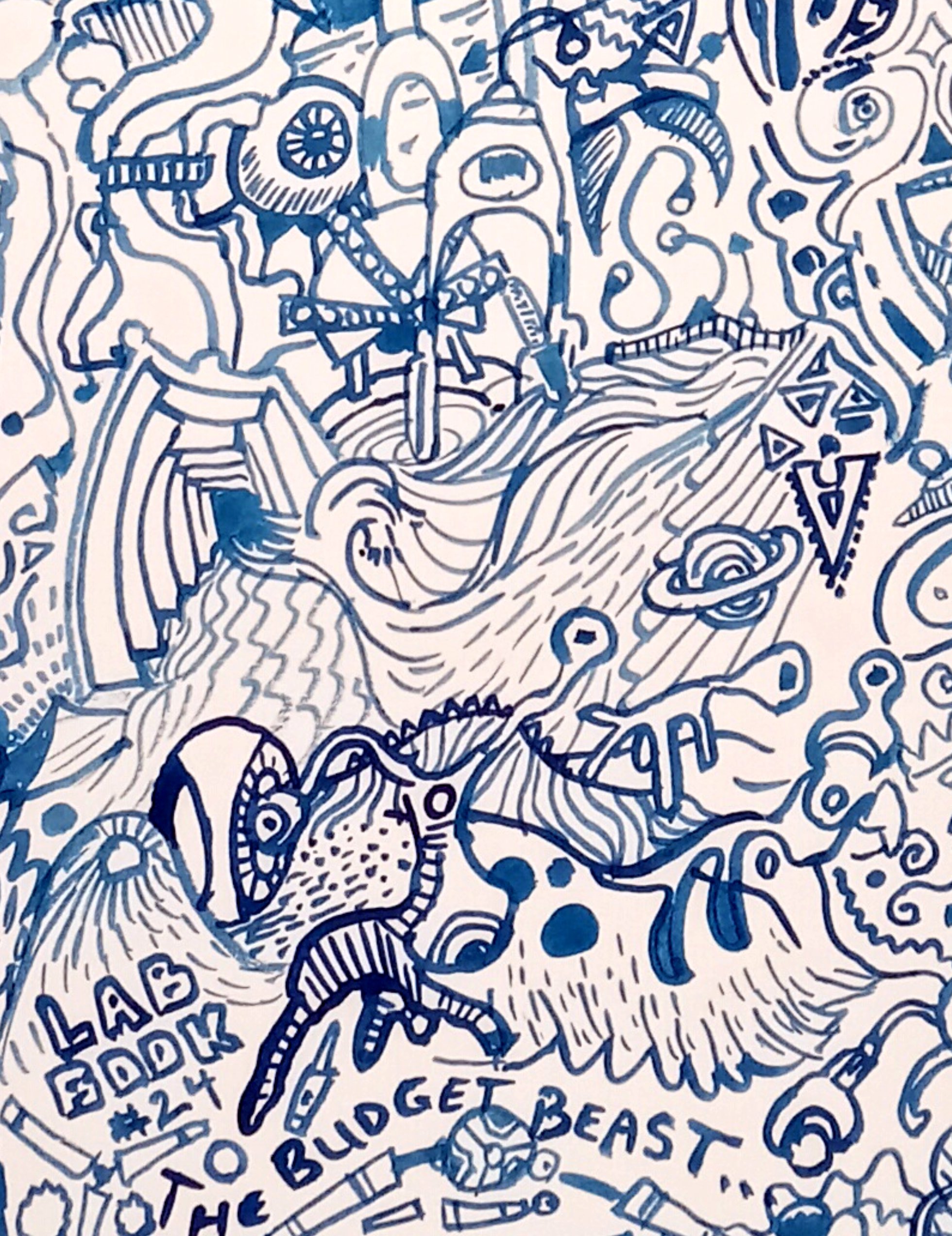
The Budget Beast: Lab Book #24, watercolour 22 x 30" Strathmore 400 series, January 2023 (No. 3355)

Here are some crops and other thoughts:

Crop 1 Laboratory notebook number 24 actually contained an enormous number of doodles. I completed "The Web we Leave" and still had doodles to spare. These are two crops from another full-sized abstract painting done from the doodles in lab book #24. In the middle of last year my laboratory was having a bit of a budget crisis and some of the notes and doodles reflect this difficult time. There was an inordinate number of tentacles, creatures, and elaborate squiggles which really challenged my painting ability. In the crop above, you can see the intricate brushwork depicting a tangle of organic forms

Crop 2 In this crop one of the characters can be seen, she has little faces peering out of her eye sockets. To paint the outlines, I used prussian blue (PB27) with some touches of phthalo blue red shade (PB15). The plan was to colour it in based on the old print by Hokusai called Red Fuji, however, when the outline was complete, it felt intense enough and I did not do any further colouring. This Strathmore 400 series paper was fantastic for this calligraphic-style. The brush was a number 2 sable, slightly larger than the number 0 I used in the last painting. Amazingly, there are enough doodles for a third such painting, but I will paint on the back of an old painting instead of using a new piece of paper. When the sun comes out I will get a picture of the complete painting, or maybe on the weekend I can set up my studio lights but they are not the greatest for taking photos indoors. Each crop is only about 1/6 of the painting. 


Crop 3 Creatures and Title