Wednesday, March 31, 2021

Opaque Ideas, Last Rain


 I did a little more reading on this 'controversy' between transparent colour and body colour. As expected Handprint.com (MacEvoy) had an extensive explanation debunking the whole theory that light can bounce off the paper and travel through a layer of watercolour pigments on its way back to your eye. Watercolour pigments are like any pigment, they absorb light and reflect light, but they do not transmit light. Boring science aside, I think everyone is talking about the same thing- you definitely don't want watercolours to get thick and muddy. In the test painting above, I really tried to be a bad artist and use my opaque pigments at full strength including bismuth vanadate (PY184), venetian red (PR101), benzi orange (PO36) and burnt sienna (PBr7). The only difference really was how much water I added- the opaque paints looked fine when diluted, but they looked a little 'over cooked' when applied full strength. But then again, so did the prussian blue one of the most 'transparent' pigments there is, it also looked bad at full strength. As MacEvoy pointed out it is all a matter of finding the right dilution. 

5.5 x 7" cold press, watercolour, March 2021 (No. 2601b)


This painting also used the opaques venetian red and bismuth yellow, along with the prussian blue. I've been researching one of the next World Inspired paintings, this time Brazil! The book I read described the Amazon river and rain forest destruction which was saddening and maddening especially for Cilei who is from Brazil. In the painting, the water is drying up and the mountains are scorched, while the plant is literally walking around and trying to catch the last rain. The World Inspired Brazil will not look anything like this because I try to avoid politicizing the series, but it will be on the theme of the Amazon River and rain forest. 

Last Rain, 5.5 x 7" cold press, watercolour, March 2021 (No. 2602a)

Tuesday, March 30, 2021

Two More Abstract Experiments

I had a craving to use the earth colours from Stonegrond paint after a bout of reading up on them on the internet. Most earth colours contain iron oxides to varying degrees, their content ranges from 10%- 90% depending on the pigment. The hydration state, and presence of other compounds like manganese oxide, clay, and silicate can also alter their properties. Most earth pigments are manufactured from iron ore slag waste, but some still come from the few remaining pigment mines in Europe mostly. In the painting I used them all! The main contrast element was the yellow ochre (PY43) and roman black (PBk11) with burnt sienna (PBr7) in the front brick wall around the staircase. I added some dilute ferrari red (PR254), ultramarine (PB29) and manganese violet (PV16) to the top and corner elements.

Ochre Alley, 5 x 7.5" cold press, watercolour, March 2021 (No. 2599b)


This was also an exploration of the earth colours, including green earth (PG23). From these small experiments I learned that value contrast is important to use in the compositions, since the colours themselves are rather dull on their own. I am slowly figuring out the earth colours, I have about 20 of them now. I used a thin (transparent) wash of manganese violet between the green fence thing which really made the green pop out.

I stumbled across something called the transparent watercolor society of America, they had a cool gallery of masterpiece watercolor paintings on their site, some looked just like photos! They said something odd about the judging, the paintings were not supposed to have too much body colour. I couldn't find further explanation, but it seems that using the watercolour in thin washes rather than thick brushstrokes is their preferred technique. Then I found another site by John Lovitt that said opaque paints can be transparent, transparent paints can be opaque, and you can use these properties to create great effects. The two sources seemed a bit contradictory.

In the end the only rule in art is that there are no rules! But you have to know a rule before you can break it.

Flower Samurai, 5 x 7.5" cold press, watercolour, March 2021 (No. 2601a)

Monday, March 29, 2021

Old Palette Primaries


Done on the back of a London Winter painting, I found a paint test that reveals some clues about what paint I used to have. Just because its on the back of a 1997 painting doesn't mean it was done then, I would sometimes grab an old painting to test things out on the back. In this case, it was a variety of yellows, blues, and reds which I considered to be primary colours at the time. After reading Handprint.com (MacEvoy) I learned that the idea of primary colours is an invention of Vicotrian era colour theorists, and the idea is mostly wrong. The main part of the theory was that you can not mix yellow, red or blue from other colours. It may have been true then, but now with modern paints you can mix blue from green and violet, you can mix red from yellow and magenta, and you can mix yellow from green and orange. To be fair, the colours you end up with are dark versions, but they are still blue, red and yellow. Anyways, I was taught to use the so called 'split primary' palette from books, where you have two of each primaries one warm and one cool. This too is a pretty limited idea, for one thing it caused me to avoid orange paint all these years. 

There are a few clues in the paint test as to what paints I had during my time in London and early days of Montreal, so roughly 2004 until 2008 I would guess. The paints on the test include:

AY which Aureolin yellow PY40, I used it a lot because it was a soft greenish yellow excellent for shadows and lime greens, but I stopped using it due to the fact the colour turns brown in the sun, and it is toxic, in fact, I still have the unfinished tubes ready for toxic waste disposal! 

WY was winsor yellow (PY154), I may well have bought it to try and replace aureolin yellow, and now it is my main yellow although I bought a less expensive version from Holbein. 

WL is Winsor lemon (PY175), it is the closest thing to aureolin there is, and I still use it to this day, the one I have is from Daniel Smith company. 

WB is winsor blue red shade (PB15:1) a phthalo blue, and the same one I still use but from Holbein. 

FU was not what you think, it was french ultramarine, an incredible blue that I reluctantly set aside in 2020 due to its chemical instability.  

CB was cerulean blue (PB35) a soft granulating cyan blue I used in skies and shadows. I stopped using it mostly, and then completely by 2020 due to slight toxicity. In the paint test I was trying to figure out the best way to paint a blue sky. I'm still working on that!

SL is scarlet lake, probably was PR188 from Winsor and Newton, which has decent lightfastness, but I never used it again, has some toxicity.

PR was probably permanent rose Winsor and Newton based on its appearance PV19, another colour I use currently but from M. Graham. 

From this list I notice a few things, I liked Winsor and Newton paints! Probably because Mom and I bought a lot of these from Curry's in Toronto which mostly carried this brand. It was in 2008 when I went to the Sennelier store I branched out a lot, then in Montreal discovered Holbein and others. Unfortunately the price on Winsor and Newton paint is too high now compared to the other brands so I just buy a few here and there. I was also surprised to see that many paints I use today were on my old palette from 15 years ago. What's old is new! 


1996-2004 London Ontario Landscapes


During my time as a student at Western Ontario University I had the chance to make a lot of landscape paintings between 1996 and 2004. My school started in 1994 but it wouldn't be until 1996 until I made my first location painting of a pine tree in the frigid winter. This paintings looks like it was done in the Spring, it was always one of my favorites from the era. The sun piercing through the clouds creates an ethereal glow. The blue shadows contain cerulean blue (PB35).

London Train Tracks and City, 5 x 7" cold press, watercolour, 1996 (No. 0438)


This could have been done on the same day, I used to go out for long painting trips on the weekends. During the week I would get out after classes or between them, I found an old agenda where I had made some notes on what paintings I did on the weeks. The view here is looking down one of the many valleys in London carved out by the Thames River. On the horizon lies the landmark office towers. The variety of greens and golds is really interesting here, I used burnt sienna transparent (PR101) with phthalo green (PG7) and aureolin yellow (PY40), although I had other yellows too.
 

London pine trees city view, 5 x 7" cold press, watercolour,0442 1996


Also looks like the same day perhaps, a close up of the office tower. I was standing up on the embankment of Thames River which is made of steep concrete at this point. The colours appear to be quite accurate here despite my lack of knowledge of colour mixing at the time I was able to figure things out with trial and error. Once I learned a combination that worked I would stick with it. I was obviously proud of the blue colour since I used it in the signature too.

London Office Towers and Trees, 5 x 7" cold press, watercolour, 1996 (0446)


This tree was on the University campus, I looked at it a few times but passed on making a painting until making some progress in my skills. It was quite a thrill to pull this one off, another one of my favorites of the era. I am not sure what year it was but 1997 stuck in my mind, often I can remember where I lived at the time of making the paintings. It was remarkable how many shades of green there were. 

London Tree with Blooms, 5 x 7" cold press, watercolour, 1997  (0463)


Finally, here is a painting I made in the last year that I resided in London, it shows Springbank park, where they built an amusement theme park for kids. It was not in use at the time, probably it was very early spring from what I recall. The frog obviously was not real but made of fiberglass. I can see the technical improvements, like the foreground shadowing that transitions across the path and the various textured surfaces like grass and treebark. It also seems to include a painted outline, which is something I used for the more complicated paintings. Ribbit. 

London Royal Toad, 5 x 7" cold press, watercolour, 2004 (0464)


Sunday, March 28, 2021

Sunday Painting Trip, NDG Rainy Day


Being a four season painter can mean braving the cold, wind and rain in search of the perfect landscape. Naturally then, I walked out to the Decarie expressway which is known for its great views. Okay I am being a little sarcastic but most people know the Decarie by driving through it, which is just walls of concrete, including a concrete road and plenty of underpasses. The underpass depicted here is near Duquette street, it is not a bridge overpass but a type of landscaped overpass connected to the Our Lady Grace property. That explains the forest apparently floating over the 6 lanes of chaos underneath! I am standing behind a 6 meter steel fence and guard rail, most of which I omitted except for some smudges at the bottom right .

Decarie Underpass Rainy Day  5 x 7" cold press, watercolour, March 2021 (No. 2584a)


I followed a walking path along the Decarie Blvd (the upper section) until reaching a vantage point with view of overpasses, the new bridge on St. Jacques, and the St. Lawrence river in the distance. The first overpass you see is Chemin de la Côte-Saint-Antoine. There is actually a community compost/garden area in between me and this view which I omitted for clarity. When faced with overwhelming amounts of detail its a good idea to omit things, and to use a big brush. I did the whole painting with my biggest brush. It was also a physical gruel, the wind and light rain was whipping up from the river straight into my face. I managed to hold a piece of cardboard over the painting to keep the rain off it. In the end you would hardly know it was rainy from the painting. it seems to sparkle with light.

Decarie Overpass River View 5 x 7" cold press, watercolour, March 2021 (No.2585)


Desperately seeking out some colour, I stopped at NDG park which was devoid of people. I stood next to a large tree to get a bit of protection from the elements. The strap on my shoulder bag started to tear away from all the whipping wind which made things tricky. In the painting you see the two giant pots in the foreground one chartreuse (PY175 + PG36), the other a vermillion hue (PR254, PR179, PV19), in fact there were about dozen of these each about 1 meter tall or so I guess they plant them in the spring. The main building of the park was recently redone, as were the interlocking bricks so it was all very shiny. It occurred to me as I wandered about NDG that there was not a whole lot out there for pedestrians, like if one had to find shelter from rain or go to the bathroom say, there aren't many options. At least I found some colourful things to paint here, I'd like to return when the leaves are out and see what they do with the pots. 

NDG park pots 5 x 7" cold press, watercolour, March 2021 (No. 2586a)

World Inspired Landscapes: Bosnia and Herzegovina


 Throughout the World Inspired series I have largely avoided politics in the paintings. With Bosnia and Herzegovina it was hard not see to see the deep ties between their recent violent past and the rugged landscape where so much of the fighting occurred in the mid 1990's. The factions were resilient against the aggressors but many lost their lives during the conflict and then again after the conflict due to unexploded munitions and mines. This region of the world consists of rolling mountains made of old eroded rock, deep valleys, and a wide array of green-gold colours. A previous painting in the series, Albania, also shows the same mountain range on the coast of the Adriatic sea. Bosnia and Herzegovina has a small section connected to the Adriatic, otherwise it is mostly a landlocked country. 

To make the painting I started with grey ochre to establish the dark shadowy sections and jagged broken landscape. I chose this approach to provide a high contrast, high tension element to the design particularly in the foreground. This created the rugged look and reflected the war torn landscape, which was accentuated with subtle washes of rose red in the hillsides. The rest of the scene is a patchwork of brown, green, and rocky greys with little yellow and magenta wildflowers strewn about. Notice how the foreground hillside on the left almost blends into the mountains in the distance, I did this in purpose to give a feeling of immersion. It was a difficult painting to do, not because of the technical challenge, but because I had read a graphic novel called War's End by Joe Sacco which depicted the people fighting in Sarajevo during the war. As I painted, the ideas and images from the graphic novel were in my mind.
 

World Inspired Landscapes: Bosnia and Herzegovina 5 x 11" cold press, watercolour, March 2021 (No. 2604)
 

Saturday, March 27, 2021

World Inspired Landscapes: Bolivia

Researching this painting I learned a lot about South America for example in Bolivia there is an entire community of people who are descendants of slaves that were brought over from Africa a long time ago. One of the men had special tattoos on him that signified he was taken from a ruling family in his country, and so he became the leader of the Afro-Bolivians, he became their king. Two generations later his descendant is the current king of the community and the president of Bolivia has recognized the man as leader. The area where they live is called the Yungas, a rugged mountainous region rich in natural resources. Farther to the south west of Boliva expansive salt flats are found. They are lakes of salt water, people can even walk in the shallow parts. Mirror-like reflections are created by the salt flats resulting in the most remarkable landscapes. In this painting I show the desert in the foreground, rolling mountains in the middle ground, lush forested mountains in the distant background, and the sky mirrored in the flats. The salt flats have interesting geometric shapes created when the salt dries and cracks but the painting was too small to catch the effect. Flamingos also flock to these areas presumably to feast on brine shrimp. 

World Inspired Landscapes: Bolivia, 3 x 5" cold press, watercolour, March 2021 (No. 2605)

Benny Reds and Browns


 With April almost upon us, the trees are starting to make buds and the grass looking more on the green side. Today was overcast and cool, but otherwise pleasant enough to make a painting out at the Benny complex. Last year around this time, in fact the blog was also on March 27th, I made a painting of the same scene although using a vertical format. I struggled to make the brick colours last year, but this year I had some different paints and more mixing knowledge. On the left, the edge of the cultural center can be seen, the red is a mix of perylene maroon (PR179) and quin magenta (PR122). The distant condo buildings are burnt sienna (PR101) with a touch of raw umber (PBr7) although it would have been fine with just the burnt sienna in retrospect. The medical center on the right was burnt sienna, venetian red and some perylene maroon, which was also used for the leaf buds.

Benny Reds and Browns 5 x 7" cold press, watercolour, March 2021 (No. 2590a)

Friday, March 26, 2021

Five More Abstract Experiments


 You may wonder why so many abstract paintings all of a sudden? Let me confess, a few weeks ago I left some cut paper in a sink full of water for well over an hour and it really messed up the paper. It lost the sizing, a thin fatty substance that keeps the paper together. Meanwhile I set up my new palette and wanted to take it for a test drive. Finally I've had a lot on my mind lately. Voila, five more abstract experiments!

Blue Frame, 5 x 7.5" cold press, watercolour, March 2021 (No. 2598a)


 This is not a spelling error, well it is technically but an intentional one. I put together the words invitation and invasion, to signify something something about UFO landings. Basically the arc shape looked like a UFO. I used the earth paints and some high chroma yellow and green.

Invitasion 5 x 7.5" cold press, watercolour, March 2021 (No. 2598b)


 Potato head is weathering the storm in this painting. Too bad he only has one leg and one arm. The outline was done with the incredible grey ochre, which I managed to get on my palette from a pan format I bought from a Canadian paint maker Stoneground Paints. If you have time go check out their web site, it is worth seeing it even if you are not an artist.

Unequ al Reaction 5.5 x 7" cold press, watercolour, March 2021 (No 2599a)


Besides new paints I got a few new brushes by Princeton brand, they are the Neptune line of synthetics that seem very similar to real sable brushes. The one I used in this painting was the dagger brush, a kind of slant brush that holds a lot of paint and has a sharp tip. The blue is prussian blue, I've taken phthalo blue 15:3 off my palette because it was staining the plastic. A little VIM cleaner helped get it clean.

Neptune's Rover 5 x 7.5" cold press, watercolour, March 2021 (No. 2600a)


 I'm feeling ready to do more landscape painting maybe later today (Friday) if I get the chance, and this weekend. This painting was a test run, I created some common colours needed on a landscape. The brick was burnt sienna, perylene  green, and perylene red, but I realized I could get the same colour with just burnt umber and perylene red. The shadow green was umber and indo blue. I called the painting Shadow So Long because I'd like to say goodbye to certain things that are important to an institution but none the less cast a long shadow, as symbolized by the tree.

Shadow So Long 5 x 7.5" cold press, watercolour, March 2021 (No. 2600b)


Wednesday, March 24, 2021

Four More Abstract Experiments

I've been experimenting with new paints, in this case I combined magentas, chartreuse, and earth colours together in an organic fiesta. 

Unfamiliar Colours 5 x 7" cold press, watercolour, March 2021 (No. 2595a)


This painting was a commentary on some pictures that shouldn't be on the wall at my University, they were framed improperly, figuratively speaking. I used venetian red (PR101) and grey ochre (natural) to create the sensational background. 

Framed Improperly 5 x 7" cold press, watercolour, March 2021 (No. 2595b)


After a few years, I still have not quite figured out how to best use 'iridescent moonstone' from Daniel Smith company, it is a shimmering mica pigment. Here I applied it on the black background like clouds. In real life it sparkles a bit but looks murky on the scan.

Sparkle Pink 5 x 7" cold press, watercolour, March 2021 (No. 2596a)


In undergraduate I dyed myself purple once, it was a thing we did. The dark purple in this painting is the same colour, it is called carbazole purple (PV23). Hence the name purple skin. 

Purple Skin 5 x 8" cold press, watercolour, March 2021 (No. 2597a)

Montreal Palette, (Refined Palette)


A palette, firstly, is a physical thing, it holds the paint and provides the mixing areas you use to load up a brush. The word palette also refers to the colours that are chosen by the artist. I often talk about colour choice, once I showed a picture of my small landscape palette that I still use. With so many new paints I bought, it was time for a larger palette, the one in the picture above was from Avenue des Arts, it is the Holbein folding plastic palette 1024-2000. It has 24 slots with 5 big mixing areas, 2 mixing wells, 1 little box area, a folding flap, and a thumb hole. This will make it easier to do bigger paintings on location and mix brighter colours. I wonder if the wind is going to blow the flap around though. 

Here is is a schematic that I painted out in my sketchbook to better show the colours. Across the top the first 8 are all iron oxide earth colours ranging from yellow, brown, orange red and grey. The next 8 are high chroma yellows, oranges and reds. The bottom left are the magentas, blues and greens. Finally I used the little box area for two shades of sky blue. I will try it this way for awhile, the main change is the large number of earth colours and more middle colours than before (magenta, orange, cyan). The grey ochre is amazing, its from Stoneground paint which is sold in a pan format. A pan is a solidified chunk of paint in a small plastic container. I had to take it out of its container, and used a 4 pound sledgehammer to break a chunk off! Another difference is no carbon black, I'll go without it for awhile, the grey ochre is a gentler version of the black. You see the Montreal palette is all about brown, green, grey, blue and pylon orange. All ready for the summer.


To break in the palette I did a quick abstract painting, you can see how the background used earthy yellow and purple colours, while the foreground used high chroma turquoise orange and yellows. It should be interesting to bring a lot of earth colours to my landscapes, just waiting for some sun and some green to show up on the plants outside!

Refined Palette 5 x 7" cold press, watercolour, March 2021 (No. 2597b)


Monday, March 22, 2021

Somerled Avenue Reflections


The weather was so nice today I couldn't resist doing a quick painting in the late afternoon on Somerled Avenue. There is a colourful wall mural across the street at the gas station, which was reflecting in the window of the food bank depot on the corner. The building in the foreground was in shadow, the building in the middleground and the apartment off in the background were in full sun. Based on the bright yellow and green of the store in the middle, you may guess what store it is, let me give you a hint everything there costs one dollar (well actually most of the stuff is more than than that!). I replaced the name of the store with my signature PJD 21. The bricks above the PJD 21 sign were charcoal black, it was interesting to portray black bricks- they has a similar value as the white elements that were in shadows. I got it almost perfect but misjudged the lamp black a little. Lamp black looses 180% of its darkness when it dries according to Handprint.com (MacEvoy) which means it looks really dark when you apply it, but it dries lighter. Looking a the scan now, it seems just right though.

Somerled Av Reflections 5 x 7" cold press, watercolour, March 2021

Sunday, March 21, 2021

2000: The Doodleist


 I have been writing autobiographical blogs from time to time, you can find them by going to the desktop version and using labels, or by searching the word autobiography. Hopefully you get to know more about the journey of PJD the artist. When the year 2000 rolled around I decided it was time to do abstract paintings, which have never really stopped after over 20 years now. At first, the paintings were spontaneous designs influenced by Dali or Picasso, they were produced purely through my imagination often with no planning. The other big change was I had moved into my own apartment around this time and had gone through my old notes from undergraduate. The first painting I did from doodles was Master of the Margin, which promptly sold out of the London Ontario Gallery Artisan's Alley. 


 I put away the style for a few years and then painted a small doodle painting from my old chem notes called Caged Mind, and several others along the same line. It was the stress and relative boredom of being in the classroom or lab meetings that inspired the outpouring of creativity in the margins. Over time I called the style doodleism, kind of like impressionism. Later I found out that a similar term doodleism could refer to a love of things related to Yankee Doodle, and that other artists have done doodle-based artwork, often influenced by graffiti art. The first turning point for the style was an outdoor show I did in London Ontario, another artist saw Finding Space,  and suggested that the style needed more form, like objects that people would recognize. That probably explains why my first one sold, it depicted a grinning clown head. 


 The style continued to evolve along these lines, I finally created an object that everyone could sort of recognize in Apple Eye Violet Sky, the Circus Series, and many such as Life of an Onion. I started to really think about the polish and planning of my artwork. In successive paintings I really tried to get every portion to look good and to continue to pull together the overall look. Getting the doodleism style to "look good on the wall" was turning out to be harder than I thought. But I persevered with doodleism precisely because I enjoyed doing it, and I had a feeling that no other artist was doing quite the same thing. The gallery owner in London told me as much, she said my most definitive work was the doodleism and recommended that I keep it up. After all these years I think the first doodleism painting that really came together in every way was the recent Saturation Costs (I just posted a new photo of it in the updated blog), which is explained further in this blog

By the way, I usually post some never-before seen paintings in the autobiography blogs. Instead I scanned some new doodles from Lab Book #23, which hopefully I get the chance to turn into paintings one day! 


Backyard Thaw

Today it was sunny and warm and a lot of people were outside not wearing masks carrying on like the whole pandemic is over, I hope they are right. But it caused me to stay home most of the day and just do one painting out of our little backyard alley. The main subject matter was the nice warm brick wall and the neat shadow. If you look carefully you see the famous auto mechanic just behind the wall. The lawn is still a brown green with some signs of life. 

Backyard Thaw 5 x 6 3/4" cold press, watercolour, March 2021 (No. 2582a)


I have been working on my new palette for the summer, it is slightly bigger with two extra mixing areas which will increase my colour range and the size of the paintings I can do on location. The new palette has slots for 24 plus a few extras. Carrying this many colours on location will be tricky at first so I am trying to organize it smartly. In the painting shown above I was trying to work out which blue paint to include on the palette, in the end I cut prussian blue (PB27) because it is a little redundant with the phthalo blues, and it is a bit unpredictable in mixes. The new phthalo turquoise (PB16) is proving to be the ideal horizon blue for skies. 

Battle of the Blues and Some Reds 5 x 7" cold press, watercolour, March 2021 (No. 2582b)

Saturday, March 20, 2021

Saturday Painting Trip: Point Saint Charles


With the weather getting warmer the snow is melting and the people are coming out of hibernation. Since COVID-19 is still going to be a problem I decided to wear a mask for my trip today, at least when I was riding down paths or painting at a spot where people could walk past. That is partly why I chose Point St. Charles, using google map I found several open spots off the beaten track with interesting views. In the painting you see a mountain of shipping containers, they actually go on and on for about 500 meters. It truly was a challenge to do this painting it stretched my ability to do perspective drawing and to create the variety of colours with their respective shadows. Piles of dirty melting snow were in the foreground.

Shipping Containers Melting Snow, 5 x 7.5" cold press, watercolour, March 2021 (No. 2580)


There were some fantastic views of downtown in the nooks and crannies of the neighborhood. The middle-ground building is a giant warehouse used to store stuff from the shipping containers. Many of the trucks and containers had flamboyant graffiti scrawled on them, for example the pesky PJD 21 on the back of the truck! Three different greens are featured, a chartreuse on the side of the truck, an apple green on a garbage bin, and an olive green on the newly exposed grass in the foreground.

Three Greens City View, 8 x 10" cold press, watercolour, March 2021 (No. 2593)


Park Saint Gabriel is central to Point St. Charles, apparently they had a lot of saints who were naming things. The park was very monochromatic nearly all grey so I infused some bright orange in the background and increased the contrast overall. I also increased the size of the buildings in order to convey a closeness between the park and the community. In general the neighborhood is very dense with wall-to-wall duplex and triplex. One exciting development is the city is developing a bike path network along the river, I managed to get a look at it, it will connect Verdun to Point Saint Charles and beyond.

Bark in the Park Melting Snow 5 x 7.0" cold press, watercolour, March 2021 (No. 2581a)

Thursday, March 18, 2021

Code Brown and Other Essentials


Recently I watched a clip from youtube called American Pickers, basically antiquing for cool junk. They came across a rare motocycle which was being sold for $55,000 and the narrator said he experienced a code brown when he heard the price. At first I though about the hospital I used to work at and code brown referred to a hazardous spill, but I think the fellow in the show was saying he crapped himself when he heard the price. Anyways he ended up buying the item. So this painting name just made me laugh. But seriously, the plan here was to compare every earth colour that I have along with a few bright synthetic colours for comparison. 

Code Brown, 3.5 x 6 1/4" cold press, watercolour, March 2021 (No. 2609a)


The paper I use from d'Arches has an infinity logo stamped into it along with their logo which inpired this small  painting. It was also a test of two different maroon paints, scarlet deep (PR175) and perylene maroon (PR179), they comprise the diagonal band, and are very similar.

Infinity Paper, 1.5 x 5" cold press, watercolour, March 2021 (No. 2610a)


 These three condo buildings were dipped in strawberry jam. Fruit flies were teeming.

No Added Value, 3.5 x 6 1/4"cold press, watercolour, March 2021 (No. 2611a)


This small painting could be worth millions as a non-fungible token who knows?

 Triple Earth Test, 1 x 3 3/4, cold press, watercolour, March 2021 (No. 2612)


More testing of the maroon paints, and one called buff titanium in the diagonal smoke plume. These colours resemble the old alizarin crimson that I used for so many years until abandoning it at the end of 2019. The is a painting I did called The Crushing Delicate years ago that featured alizarin crimson prominently, now that I know to replace it with more lightfast paints I can maybe redo that painting. But the next project is the Flamingo Heaven remake, another old painting that used a poor quality pigment called rhodamine pink, which I can replace now with quinacridone magenta. The world turns.
 

Crimson Cave, 3.5 x 5.5" cold press, watercolour, March 2021 (No. 2613a)

Tuesday, March 16, 2021

F440 Investment

Recently there has been a craze over the so called non fungible token or NFT. Essentially this is a form of crypto currency (digital money) that can be tied to a work of art or other original creation. An artist can thus sell a digital object representing their art rather than the art itself. So a buyer doesn't actually get the art, or even the copyright, just the digital representation and right to sell the NFT for profit which generates a commission for the artist. Great sums of money are changing hands, but where there is a winner there are many losers just think about how casinos work. I'm not sure it is something I would want to get into at the moment, but in the future this type of transaction may become more feasible and safer. The whole idea inspired me to think of a series of NFT paintings, I call it the F440 Investment because F stands for Flamingo, and investment makes it sound like a wise choice. The 440? I would produce 440 small Flamingo-themed original watercolour paintings. Here is #1! Time to start the bidding.
 

F440 Investment 6.9 cm x 9.7cm cold press, watercolour, March 2021 (500 x 714 pixels) (No. 2608a)

Making of Saturation Costs


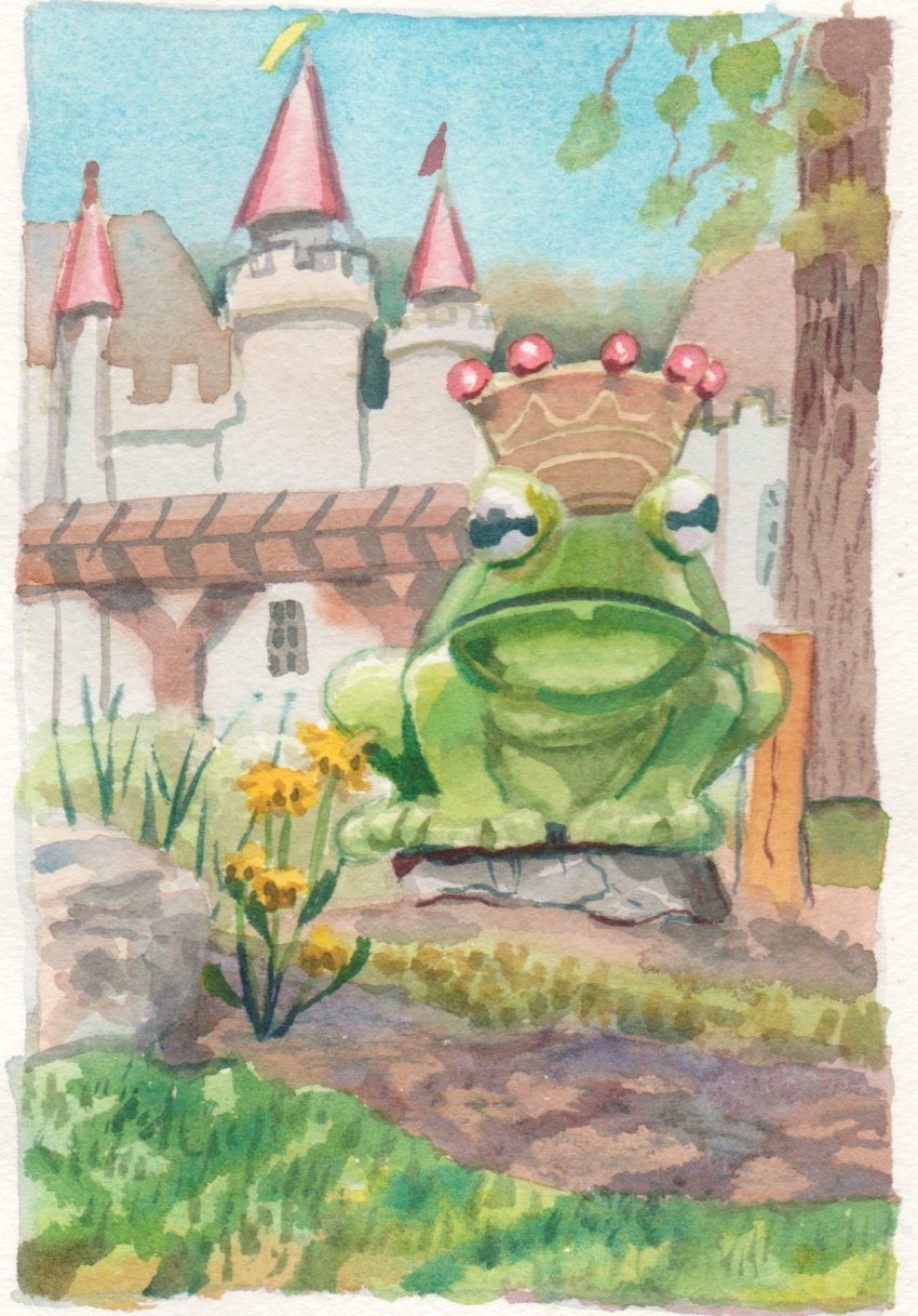
In this blog I explain the creation of my recently completed painting Saturation Costs. The abstract paintings I do are mostly spontaneous, I can make up the entire painting on the spot such as the recent Biological Immortality. Many years ago I started to convert my class notes doodles into paintings, the first one I remember doing was a painting called Master of the Margin which I actually sold out of a gallery in London Ontario. As I moved on in my science career I switched to doodling in lab notebooks such as the one depicted in this picture which is a cropped shot of the standard issue 8x10" laboratory note book.


As the COVID-19 pandemic unfolded last year I initially resisted painting the effect of the lockdown (real and psychological) until a landscape painting showing a line up at the grocery store, and an abstract called 
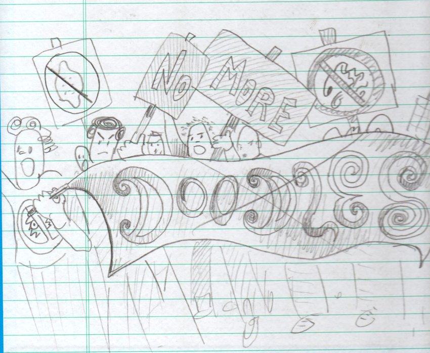
Ultramarine Sickness. By the end of May I had completed 60 location paintings (socially isolated the whole time!) and wrapped up the pandemic blues series. Meanwhile I made some doodles in my lab book around mid march. The one above shows Pirate Purple Pants with his Pandemic Parrot and Plague Leg, and Captain Immunology with his (or her) vaccine rifle and antibody mask. In the background is the infamous toilette paper wall and village on top of the hill. 

A few pages later is the key passage- the lazy man under a tree kissing the virus, which was inspired by the idea that some people were complacent about the pandemic at the outset. Also the hero doctor rushing in to help, and other elements like oxygen tanks, body bags, a crowd of citizens, more toilette paper rolls (which seemed to be the most precious commodity) and the apples on tree with viral horde. The title "Epic Battle Between Virus and Humanity" was coined here but in the end I had to go with Saturation Costs inspired by MacEvoy's Handprint.com where he taught about colour mixing and how two bright colours can make a dull one. 


For months I set the project aside working on a string of doodleism paintings derived from the same lab book #22 and a large number of location paintings until I was finally ready to tackle the difficult subject of the pandemic. I have a conventional art sketchbook it is 9 x 12 Fabriano which I use to make large sketches and do paint tests. There were about half a dozen attempts until I got to this stage, as you see above it closely resembles the finished painting. I had worked out the right side with the rolling hills and toilette paper castle, and the idea of "Ukiyo-e" clouds, those are the Japanese-inspired rolling tendrils of fog in the central valley. There was still a problem with the tree positioning and the foreground elements. Also, where was Pirate Purple Pants, The Hero Doctor and Captain Immunology supposed to go?  


Finally I had enough and got to painting on the 22x30" paper that was stretched on my trusty old wooden rack. I had been staring at the blank paper for quite some time when it suddenly occurred to me that the main character the lazy man kissing the virus, had to be raised up to the third-marker. Third markers are a common way to place a center of interest, you divide a page into thirds and put the object at one of the four cross points. In the schematic above you see the blue third markers and in red the approximate location of the key elements. I didn't mark the actual watercolour paper, instead I used my hand to determine the third location. That decision opened up the foreground for the characters, put the lazy man central to the painting, and solved the tree problem since it could occupy the upper left with the new composition.


Unsure what to do with the tree, I worked through several possibilities in my sketch book and settled on the 'tequila sunrise' version you see in the page shown above. I first established this idea in a small sketch of the tree and a tye-dye sky. Perylene black and other dark colours were used for the texture overlay. I knew the tree had to be fantastic, it had to command enough attention to both compete and complement the rest of the painting. I'll admit the finished tree was even better than I had hoped for. 

A few ideas occurred spontaneously in the painting including the smoke on the horizon, the artist's hand throwing the paintbrush, the creepy hand-branches in the tree, and the reaching hand in the foreground. It took 4 or five sitting to finish the painting, the critical session lasted countless hours into the early morning. 


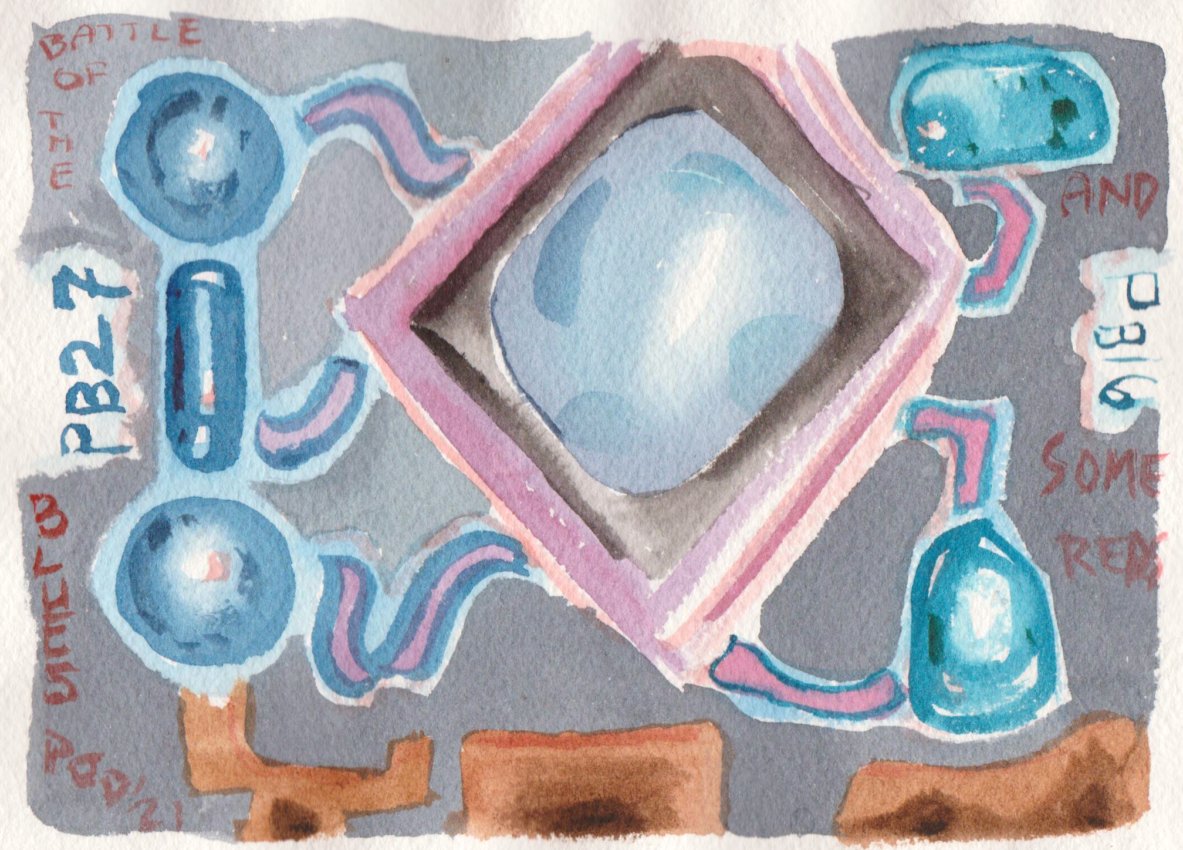
The colour scheme of the painting was essential to the theme of Saturation Costs. I worked that out with a few small colour test painting seen in this link, and this link. The links show the thought process, that is, juxtaposition of earthy unsaturated colours and bright saturated colours. In the crop above from the finished painting, I surrounded the painting title with a saturated chartreuse (PY175 + PG36), which contrasts against the unsaturated green of the Hero Doctor's coat which was done using Stoneground Paint's Victoria Green (PG51). All of the viruses are done using saturated colours, that means intense! The rest of the painting is earth and greyish. The title is a double entendre, since it also refers to the density of people on the planet and an increasingly close proximity to wildlife and agriculture which promotes new viruses. 


It is not often I plan a painting to such an extent, when I have tried it usually ends up looking overworked and over thought. The key for me here was to prepare extensively, listen to my instinct, and trouble shoot where needed. But in the end, about half of the painting was spontaneous, you can see little blue masks and expressions on the viruses, shading on the toilette paper, and colour choices throughout that were made up on the spot. So I found a good balance of methodology. Having said that my next painting will have to be a little less stressful, let's hope it can be called "End of the Pandemic" or something to that effect!