Saturday, September 30, 2023

Red Dumpsters, Teal Roof Hot Dogs

Seeking out dumpsters today, I finally found some worth painting just off the Maisonneuve bike path at the downtown Concordia Campus. The last of the sunlight was illuminating the wall and part of the dumpster creating a dramatic lighting effect. The green windows provided a good colour contrast with the red, and the black garbage bags had value contrast with the sunlit brick wall. Yellow poles, meant to prevent vehicles from colliding with the structures helped to cut through all the grey. The red colour was made with pyrol red (PR254) and a touch of magenta (PR122).

Red Dumpsters Sun Beam, watercolour 5 x 7" cold press, September 2023 (No. 3558b)

On the way back I veered off to the south and turned on Notre Dame street and stopped in Ville st Henri at the restaurant with the distinctive teal roof. Mixing the colour was a challenge, it is mostly green, but leaning slightly to cyan, slightly more than phthalo green. After one failed attempt and some adjustments thereafter, I got the mix right with phthalo green blue shade (PG7), a touch of phthalo blue sapphire (PB15), and a bit of grey to cut the chroma and darken it. To get that warm brown plaster wall in background I mixed a green umber (PBr7) with orange (PO62), then painted in my initials instead of the graffiti. Today I stopped by Avenue des Arts and picked up some more pyrol orange (PO73), its a colour I used for night skies, but then ran out and didn't replace it. Turns out it can't be replaced for that purpose with any of the other red-orange options, or with red paints either. So indo blue (PB60) and pyrol orange should give me some good night sky. I notice a dark cyan too at night which I haven't worked out either. There is always something to learn !

Teal Roof Hot Dogs, watercolour 5 x 7" cold press, September 2023 (No. 3552b)


Friday, September 29, 2023

Perry Island Beginning of Fall

I couldn't resist riding east to visit Perry Island, a tiny lump of land with trees and a rocky shore. Here I am looking back across the river with a mighty oak tree sprawling across the sky. Unfortunately, the tree is in a lot of distress, many branches were bare and dead, probably a beetle or worm got to it. There were small trees throughout the island, probably planted by some citizens by the look of it. To adjust the foliage towards fall colours, I mixed green-yellow (PG36+PY154) with orange yellow (PY110), or I painted the green directly on the paper and dabbed in the orange yellow. It's that time of year when the leaves start to change colour. I even saw some flashes of red leaves on the bike ride.

Perry Island, Prairie River, watercolour 5 x 7" cold press, September 2023 (No. 3561a)

Riding back, this scene on Perry Island caught my attention. The tall trees were cool colours on the bottom but light and warm colours at the top. I started by painting the outlines in yellow at the top and blue at the bottom, then filled in the trees and background as the painting dried. It was so cool and humid that the paint never really dried, but it gave a glowing effect to this forest scene. Van Gogh used to paint the tree trunks in all manner of colours like green, red, purple, white, he was obviously using the trees as a colour motif.

Perry Island,  Trees Light and Shadow version 2, watercolour 5 x 7" cold press, September 2023 (No. 3560b)

This was the first version I did of the scene. I painted the entire background first, then attempted to paint the trees over top. Unfortunately I misjudged the drying rate and the layers collapsed giving a dark muddy appearance. In version 2 I took a different approach, that is to paint the trees first, then fill in the background. Being a location painter who paints all seasons means technical adjustments. The  main adjustments are the palette selection, and adapting the technique to air temperature and humidity. 

Perry Island,  Trees Light and Shadow version 1, watercolour 5 x 7" cold press, September 2023 (No. 3561b)

Sun behind Sacré-Coeur Hospital

Sacré-Coeur Hospital is up on the north shore of Montreal not far from Prairie River. I had a checkup there which is why I made another painting of a hospital to go with the last one. This scene is looking up at the top portion of the main entrance facade, with the sun rising just behind one of the corners. It was a difficult effect to achieve especially during a cool and humid morning to contend with. The sun appeared to have a peach halo surrounded by a yellow halo, then a greyish blue sky all around. It dried just enough for me to paint the structure over top using mixtures of red ochre (PR101), umber (PR101) and yellow ochre (PY43). In fact my palette became such a mess I'm not even sure what mixtures I used! It turned out well enough, it has a kind of religious feel to it inspired by the ornate decorations of the hospital. It was built in a Gothic- Romanesque style with a healthy dose of Montreal brick and concrete.

Sun behind Sacré-Coeur Hospital, watercolour 5 x 7" cold press, September 2023 (No. 3560a)

Thursday, September 28, 2023

Full Moon Clear Sky

Tonight was one of the special full moons called the harvest moon, mostly due to its occurrence around the time farmers would harvest their crops. It was a lot higher in the sky than it appears, next time I will bring some of the 4 x 12" to compose it on the vertical. That condo on the bottom is where we live, although that is the top two floors. Since I am missing pyrol orange (PO73) I tried benzi orange (PO36) which has the identical hue angle, but mixed differently with indo blue (PB60). But it made an almost black mixture, and fading to brown and cream colour. It ended up looking pretty intense though, and the three different sources of light are obvious (moon, window and street lamp). If I had to paint the midnight sky then this combo wold be perfect (PO36 + PB60). 

Moon over Condo Dark Sky watercolour 5 x 7" cold press, September 2023 (No. 3558a)


Down the street, the moon was hanging over the fire station. The sky is dark blue in this painting, I mixed indo blue (PB60) with pyrol red (PR254), then switched it to phthalo sapphire (PB15) with some magenta (PR122). The detailed colour notes are mostly for my sake, as I try to refine the best colour mix to paint a night sky. At any rate, it is an effective painting, it really creates and eerie glow. I think I will pick up more pyrol orange next time I am at the art store.

Moon Over Fire Station Dark Blue Sky, watercolour 5 x 7" cold press, September 2023 (No. 3559a)

Grant Grunt

Spending time grant writing lately has impeded the art somewhat, but then again that's what scientists are supposed to do, see science vs. art. This quick painting sums it up, a figure stretched thin with head in clouds spews out pages of 'Best Science!' with dollar signs in their eyes. A pot of gold at the end of the rainbow awaits the winners. The majority of the painting was done using bone black (PBk9) and a touch of Prussian blue in the face of the character (PB27). I did the black and blue colour scheme awhile ago on location and quite enjoyed the challenge, but its not something I followed up on since I was exploring colour intensely in the past few years. I suddenly had the urge to try the colour scheme again, maybe it symbolizes the feelings of grant writing, being black and blue. Next time I go on location maybe I will paint some pictures of dumpsters and trash cans with a black and blue colour scheme, why not?

Grant Grunt, watercolour 9 x 12" watercolour paper, September 2023 (No. 3649a)

Monday, September 25, 2023

Auto Shop at Dusk, Trees are Gone


Just before the sun went completely away for the day I sat down in front of the condo and made a quick painting of the auto shop at dusk. I cut it pretty close because it was dark shortly after completing the painting. Since they painted the auto shop grey I figured out that it is a very slight violet grey but nearly completely desaturated. The main event was the sky which transitioned from a dull cyan, to a greyish green, to a faint salmon-coloured horizon. To get the rich brick shadow colour of the building in the background, I mixed red ochre (PR101) with burnt umber (also PR101). The pigment code PR means pigment red, and the number refers to the particular pigment. PR101 actually refers to dozens of distinct paint pigments ranging from brick red, dark violet, to dark chocolatey brown. You can read more about it by clicking the earth tab on this page on handprint.com. The burnt umber I used here is called transparent burnt umber from Schmincke company, the pigment is commonly used as a wood stain to give things a dark oak or walnut appearance. As a paint, it looks like a cup of espresso but you wouldn't want to drink it! By the way, the tall trees that used to sweep the background are gone now, they had been over-run with choke vines and finally had to be cut down. If you want to see what I am talking about, click here, for a painting I made back in April.

Auto Shop at Dusk, watercolour 5 x 7" cold press, September 2023 (No. 3556)

Time and Space are Fine


After seeing some graffiti proclaiming that space and time are doomed, I decided to make an abstract painting with a counter argument that space and time are in fact, fine. The painting was mostly improvised on the spot, it was not based on any prior drawings or doodles. I saw my cell phone sitting on a chair next to the fish tank, and it was reflecting the water bubbles upside-down, which you can sort of see in the phone-like shape bottom left. An asteroid is passing by, with a probe descending on a parachute, inspired by the latest space mission. Eerie neon symbols hover in the inky black, green and magenta sky. What painting about space and time would be complete without a Dali-esque melting clock? Based on the image, maybe space and time are not fine, but that's okay.

Time and Space are Fine, watercolour 11 x 15" cold press, September 2023

Sunday, September 24, 2023

China Town gate


As I revisited some old locations, I stopped for lunch in China Town under some shady trees where I painted a side view of the gate and a facade montage last week. I used  the vertical 3 : 1 ratio format I got from st Armand paper makers. The scene shows a cross section of the gate with a soaring skyscraper in the background. A bright yellow tree and part of the stone lion can be seen in the bottom left. The mauve gate was done with purple magenta (PV55) and orange (PO62), with some indo blue (PB60 for shadow). The turquoise building, purple gate with warm accents, and the lime-yellow tree all work well together. It looks like I forgot to initial this one which happens from time to time. If I had an even bigger piece of paper, say 12 x 19 or bigger I could fit the whole scene in. With the st Armand paper I find it best to paint fast and use ample amounts of water to keep the paint from getting too heavy. Its great paper to use, glad I bought a decent amount of it since the store will close and move out of Montreal by December.

China Town gate vertical, watercolour 4 x 12", rough press st Armand, September 2023 (No. 3651b)

Revisiting scenes around Montreal

Recently I dug through the archive and posted three paintings from various places around Montreal. I returned to those locations today by bicycle to see if the scenes were still there and if I could do a new painting around the same location. The downtown core can not be viewed anymore from this location, which is next to the canal just before the Peel basin, so I set up on the bike path looking east. In the distant background is the iconic Farine Five Roses maltage factory which I squeezed into the composition. As I painted, the commuter train went by on the upper bridge, then the VIA train went by on the lower bridge. The odd structure on the left was once some kind of bridge control building but now it lies derelict. It would make a fantastic spot for a cafe incidentally.

Two train bridges and bike path, watercolour 7.5 x 11" cold press, September 2023 (No. 1136b)

I did these on the b sides of the original paintings which I brought on location today. This one shows the Mission buildings which are still there after all these years. Other than the colour of the car in the foreground I could get the exact same scene as the one I did in 2016. Part of the fun of revisiting these scenes was to try and outdo myself. Looking back to the original one it seemed crude but still effective. In the new version I better described the complex arrangement of buildings, and captured the wide range of textures. The stone wall in the bottom left is one of those historical buildings you see all around Old Montreal. The new version is a lot warmer with a yellow-orange glow while the original version seems rather on the cool side. 

Mission Buildings, with red car, watercolour 7.5 x 11" cold press, September 2023 (No. 1143b)


Finally, after stopping at China Town to paint the gate again, I made it up to Mile End where I had made a painting of the auto shop with cathedral in the background in 2008. The scene was completely blocked by dense trees and a construction fence all around it. I located a small opening and could see that the auto shop was derelict and covered in graffiti. The hardest part of this painting was actually the roof which had repeating rows of pleats and a faded blue colour. The front was embellished with graffiti including my PJD 23 signature, and a slogan that I saw on the building that read 'space and time is doomed'. I'm not sure space and time are in any trouble, but this auto shop is surely doomed. A few things I learned about myself, were that I used to select very challenging scenes, and the paper I cut was seldom straight making the edges harder to manage. The paper absorbed a lot of colour probably because I used to remove the sizing with water and damp rag. These were tough scenes to recreate but I am glad I tried, it was a wonderful day for a bike ride at any rate.

Derelict Auto shop Mile End, watercolour 7.5 x 11" cold press., September 2023 (No. 1142b)


Saturday, September 23, 2023

Sunset Bench and Tree, Falling Leaves already


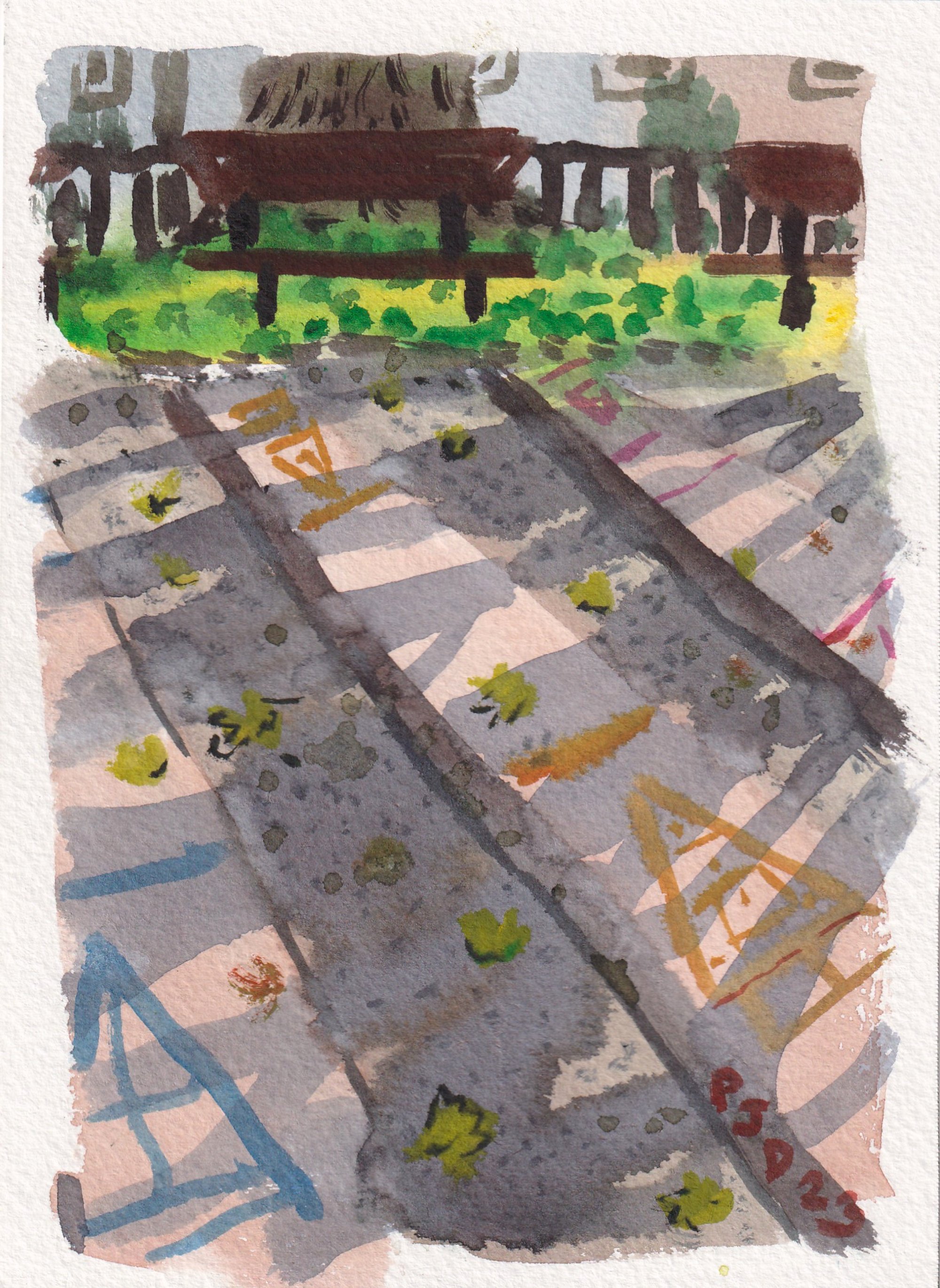
Park Georges-st-Pierre is just on on the north side of st Jacques across from Terry Fox Park. The junction you see in the painting is Oxford avenue and Upper Lachine Road. I was actually heading home from the Terry Fox park and decided to ride through this park for the first time to see if there was anything good to paint. I always avoided this park because on the map it is chock full of sports fields and play areas which are usually not good for painting. But up in the corner of the park there was a bench illuminated by the setting sun, and a grassy area covered in yellow and orange leaves. It was one of those paintings that seemed impossible, it had a lot of problems to solve, and I almost rode on. Undaunted, I started by outlining the negative shape of the park bench, then filled in the grass, tree trunk leaves and background elements. The sun was shining through the trees, it was haloed in strong orange, yellow and magenta . The tree trunk colour is a delicious mix of red ochre (PR101), dark blue (PB60), and a touch of dark magenta (PV19). The store across the street is actually a very interesting looking dépanneur that I will have to return to at some point. Glad I stopped, this painting was memorable.

Sunset Bench and Tree, watercolour 5 x 7" cold press, September 2023 (No. 3555)

Terry Fox Park at Sundown

Down on st Jacques street there is a narrow park on the escarpment called Belvédère Terry-Fox park where I have made many paintings over the years. A lot of the trees are overrun with choke vine which I tried to abate with a pair of snippers to variable effect. This scene shows a bin next to the path, and a curvy pine tree superimposed on the scene. The sun was going down which created a pastel glow. To paint the bin I left a white oval, filled in the rest of the painting, and then daubed on mixtures of black (PBk6) blue (PB60) and red ochre (PR101).

Bin Tree and Road, watercolour 5 x 7" cold press, September 2023 (No. 3551b)


The trees from the escarpment are leaning over the fence, those are the ones inundated with creeper vines. Large landscaping rocks adorn the park, and a gravely path runs along the fence line. I painted this one as fast as possible to prevent the paint from getting heavy. By now I have worked out a wide variety of green and yellow shades made from PG36, PG7, PBk31, yellow (whichever one!), sometimes orange yellow (PY110), and sometimes a touch of black (PBk31). Notice there is no blue used in my green mixtures although if turquoise is needed I'll daub in a little dark blue (PB60) or sapphire blue (PB15). You definitely need to know your way around green - yellow to paint landscapes.

Tree Rock and Path, watercolour 5 x 7" cold press, September 2023 (No. 3553b)

Friday, September 22, 2023

A Few Abstracts from the Archive

For a stretch of time between the years 2000 until about 2015 I painted mostly in the abstract style, including surrealism and a branch of surrealism I called doodleism. These paintings use elements of both styles. Surrealism is a variation of landscape, but using a dream like approach to depict reality. I always kept a small element of the horizon and some trees in order to create little pockets of reality. In the above painting there is a smidgen of tree and blue horizon showing towards the bottom left. Its hard to date these paintings exactly, but the 'scrawl' signature, which is cut off in the image due to my scanner size, indicates that it was painted around 2006 onwards. I like the black/yellow fade in the central element, it was a deliberate backwash to create a feathering effect.   

Lost and Found, watercolour, 11 x 15" cold press, 2009 (No. 1393)

At the time I was enthralled with ultimate frisbee, a field sport involving up to 14 players and a frisbee. In the painting there is a floating field with 14 miniature players ready to play, on player is holding the disk up which signified ready to the other team. Once they put their hand up the disk is thrown and game begins. The familiar trees and blue sky ground the image in reality, while the organic-metallic and tree forms provide the dream-like quality. In the catalogue I had this one as 2008 but noticing the block signature with PJ, puts this closer to 2002 I think. I vaguely remember painting this one but not much. It was probably a derivative of floating cathedrals, an unfinished large watercolour. I tend to paint with brighter colours and more contrast nowadays and  do pure abstract (palette cleansers) or pure doodleism from lab book doodles.

Floating Ultimate Field, watercolour, 8 x 15" cold press, 2002? (No. 1611)

Wednesday, September 20, 2023

Sunflowers on a Sunny Day


Today at lunch hour I went out to make a painting around the Westhaven Community garden which is in the field where I painted the chairs and tables. In fact, as I was painting this one, a gentleman walked up to see and said that he remembered seeing me paint the chairs and tables. Last time I painted the sunflowers it was a rainy day. In the rainy day painting the flowers were hunched over and suppressed by the heavy clouds, whereas the sunny day painting shows the sunflowers reaching up to the sky. Getting the painting right required a good contrast between the bright yellow petals and the bright blue sky. Since this is a watercolour painting, there are no pencil or pen outlines. The sunflowers were applied with juicy yellow brush strokes, and the blue sky painted carefully around it. For the centers of the flowers, I used transparent burnt umber (PR101), and daubed in some carbon black (PBr6) while moist. The rest of the foliage just had to support the flowers and not command too much attention, so I painted the leaves and stems in an almost abstract fashion. There was a row of condos in the background which I simplified by lowering them below the foliage, and only depicted with a few brick orange (PR101) brush strokes. These compositional adjustments helped to make yellow/blue play the starring role. Speaking of stars, I also recently painted sunflowers at night in NDG. A similar kind of painting was hanging in an art gallery in old Montreal, the artist had used oil paints to depict sunflowers against a dark, navy blue background on a large canvas. Obviously sunflowers are a great motif with endless possibilities.

Sunflowers on a Sunny Day, watercolour 5 x 7" cold press, September 2023 (No. 3554)

Tuesday, September 19, 2023

Punk Rock Painting

Perusing Wikipedia I came across the Ramones, a well known punk rock band from the 1970's until the 1990's. Watching some old YouTube videos of a live show from 1976 it seemed cool what they were doing. At the time, rock and roll was turning into a slower, softer sound, read the Eagles for example, but the Ramones wanted some stripped down no nonsense rock and roll sound. Their songs were very short, very simple and had repetitive hooks. It reminded me in some way of the these paintings I do, a sort of stripped down form of visceral art. So I called it Punk Rock painting and included some punk colours set against a pastel backdrop. Impressionism was kind of like punk rock, a simple rebuke against the establishment.

Punk Rock Painting, watercolour 9 x 12" watercolour paper, September 2023 (No. 3648b)

Monday, September 18, 2023

Looking over the Artist's Shoulder

Going through the carton of paintings I dug up some relatively recent paintings of Montreal that I did prior to my expansion in 2020. Although I did not paint on location very often, you can see the interest I had in local scenery and architecture. This painting shows the Lachine Canal close to downtown, just before the Peel Basin. There was, and still is a train bridge, although nowadays there is another bridge over top of this one. The water was nicely done and the city framed by the bridge support was a neat composition.

Down town view through train bridge, watercolour 7.5 x 11" cold press, 2014 (No. 1136)

From time to time I wonder why I paint. These paintings would have primarily sat in cartons for many years, just a few made it to the blog which started around 2008. Part of the answer is that I enjoy painting, it is a kind of compulsion, and the other part is that other people can look at the paintings and enjoy the finished product. Occasionally people see me painting and seem to get a kick out of it. There is also a bigger picture. Artists look at their surroundings in a different way, and their works can provide a cultural impact, a kind of definition. If you think of water lilies, you think of Claude Monet, if you think of sunflowers you think of Vincent Van Gogh. If you think of dumpsters and garbage bins, you think of Peter Darlington. Just kidding, I also painted water lilies and sunflowers.

Bernard Church and Auto Mechanic, watercolour 7.5 x 11" cold press, 2008 (No. 1142)


Which brings me to the third concept, that art is produced for art itself. Long after the viewer and the painter have moved on, one can hope that paintings remain in some capacity, at the very least immortalized on the internet. So painting is about the experiences of the artist, the viewer, and the existence of the art itself. Next time I will be the viewer standing over my own shoulder, watching myself paint.

Speaking of the three paintings I posted, the dates are only an estimation, but they were all done in the past 15 years or so. Maybe its just a coincidence, but all three of them feature a streak of green prominently in the composition. Perhaps if I am in these areas again I will do the same scene again for comparison. For one reason, the backs of these paintings are all blank, inviting new paintings to be done.

Roof Tops Mission, watercolour 7.5 x 11" cold press, 2016 (No. 1143)  

Sunday, September 17, 2023

China Town, Facade Montage

I sat in the shade eating lunch, a peanut butter sandwich with dates and prunes, admiring the variety of facades along st Laurent boulevard in China Town, Montreal. It seemed impossible to paint the scene with a sharp perspective to contend with. Instead of painting it realistically, I assembled a montage of the most interesting elements from along the block. The sweeping tree reaching from sidewalk to sky tied together the composition and symbolized the community of China Town. Windows, signs and bricks were depicted in a surreal manner, emanating from the soaring tree trunk. Ironically, a passer by really liked the painting and said how realistic it looked. Its neat because you can look at this painting and its almost as if you are looking at a whole block, examining all the interesting details along side of me. To complete the illusion, you have to imagine the potent aroma of Chinese food wafting up the street, inviting you to pop into one of the many restaurants. Alas, it was just peanut butter sandwich for me. 

China Town, Facade Montage, watercolour 8 x 10" cold press, September 2023 (No. 3620b)

China Town, Gateway with Reflection

When painting in touristy areas I generally try to avoid making touristy paintings. If a photograph will do, then there is no need for a painting! This scene shows the underside of the massive China Town gate that spans st Laurent street, I was standing near its base looking up. The top window of the building behind it was reflecting the iconic curved tip of the structure. Connecting the scene is a traffic pole showing a one way sign, which indicates the flow of traffic on st Laurent. A lot of people stopped and watched me paint and I think there were some photos and videos made too. I liked the contrast between the Chinese architecture and the old colonial style brick structure, along with a modern store front at sidewalk level. One of the stone lions is partly shown at the bottom right. I thought this angle was more artistic than painting the gateway from the simple front view.

Gateway with Reflection, watercolour 4 x 12", rough press st Armand, September 2023 (No. 3651a)


Paix Park, scenes near China Town

Paix Park is sandwiched between st Laurent boulevard and st Dominique street next to China Town. It is well known for its skate boarding according to Google maps, which I could confirm by seeing some people carrying skateboards. What interested me were the square stones, each set apart by a few centimeters by grassy earth. To capture the effect I applied a yellow-blue wash, let it dry, then painted a brown perspective grid over top with umber (PBr7). The umber I used is from PWC Shin Han, a Korean company, it looks just like the colour of tea with milk. As the brown dried I daubed in yellow and green to signify the grass and weeds growing in the grooves.

Paix Park, watercolour 5 x 7" cold press, September 2023 (No. 3552a)

The big tree at the end of this street is the beginning of China town. At this point, st Dominique street was more of a back alley for the restaurants and bars on st Laurent street. I managed to fit in a recycling bin in the foreground with my initials on it. The scene needed more height to it, but I was using a 5 x 7". I only had one piece of 4 x 12" with me today which I wanted to save for China Town. Next time I'll bring more 4 x 12" its good for city scapes.

View down st Dominique street, watercolour 5 x 7" cold press, September 2023 (No. 3553a)

Saturday, September 16, 2023

Chemical Cars near Canal

On my way down to Park Angrignon I stopped to make a quick painting of the chemical storage cars down by the canal. I made a very similar painting during the pandemic lock-down in Nowhere Montreal, showing storage cars in a desolate landscape. To paint the reflective surfaces, I first identify the value structure, that is, how light is the top and how dark is the bottom. Then I make a hue and value fade, its a technique where one colour like pale yellow, blends seamlessly into another colour like medium dark blue. It was so windy today that the paint dried really fast and the technique was more difficult. When painting outdoors you have the winds and humidity to contend with. At any rate, once the bright blue frames were painted, the effect really popped. In the foreground, there were bunches of wild flowers and rag weed growing.

Chemical Cars near Canal, watercolour 5 x 7" cold press, September 2023 (No. 3551a)

Scenes around Park Angrignon


On a warm and breezy day I rode across the canal to Park Angrignon and painted a few scenes. I wasn't the only one who had the idea to visit the park, there were plenty of people walking and having picnics, and quite a few Canada geese and seagulls. To make this painting I stood on the path and tried not to move much, just quickly sketching the outline of the birds in paint. Then I carefully filled in the green grass around the shapes, and daubed in some grey, brown and black details. One bird in the middle looks more like a goose-gull hybrid in the painting, but nobody seems to notice!

Geese and Gulls, watercolour 8 x 10" cold press, September 2023 (No. 3617a)

Metro Angrignon is a dense jumble of arches, walkways and the iconic orange rimmed plexiglass vaults. It can be confusing since this is the green line metro, not the orange line, but most locals know this anyways. I stood in the shade and painted the complex scene in front of me. There were a lot of subtle variations in grey and blue. The vaulted section was casting a brownish glow with arched shadows on the pillars and ground. It was no doubt what the architect intended. I first painted this station in 2020, as the first installment of the metro series.

Metro Angrignon Arches, watercolour 5 x 7" cold press, September 2023 (No. 3550a)

Here is another one of the geese, seen from far away and partly swimming in the pond. Unfortunately just when I started painting they all headed up the embankment so I tried to paint the swimming ones from memory. When painting animals you have to get the outline done as fast as possible before they move. Most artists would say, take a photo! But when I go out painting I do not bring my camera and most often not a smart phone either. Its more about paint, paper, brushes, and water. If I try an effect enough times, eventually I can good at it without taking shortcuts.

Geese in pond, watercolour 5 x 7" cold press, September 2023 (No. 3550a)

Friday, September 15, 2023

Ride back home from River, Sun Down

On the ride back the sun was getting low and bathing everything in an orange-yellow light. This tree had hundreds of golf-ball sized pods on it, perhaps it was a walnut variety. Capturing little yellow circles against a dark background is pretty hard in watercolour, although easy in oil, so I tried a more textural effect to give it the correct pattern. There was a wide variety of chartreuse and yellow variations which I painted in successive layers.

Chartreuse and Yellow Tree, watercolour 5 x 7" cold press, September 2023 (No. 3549b)

I wanted to paint this scene on the way back. The train bridge has a pale green surface streaked in rust, and the low sun was casting long shadows up the embankment next to the Lachine canal where I was standing. About a hundred Canada Geese were off to my right having a snack before the long flight south. Maybe tomorrow if I see them again I will try a painting, but painting birds is really tough. As I painted the commuter train zipped by and I outlined it quickly, then painted from memory. The key to this kind of painting is the value contrast in the shadows, I did it with a mix of the indispensable perylene green (PBk31) and orange-yellow (PY110). Applying the dark blue and black fencing and PJD signature really makes the shadow element glow. So the signature becomes part of the composition, that is something I learned from studying Hiroshige. He was a Japanese print design master, and would often place his signature cartouche strategically in  the drawing to balance out the composition. I really like this painting because it captures perfectly a fleeting moment by the canal with the train going past and the sun setting after work hours.

Canal Bridge with Commuter Train Long Shadows, watercolour 5 x 7" cold press, September 2023 (No. 3548b)

Ride down to River

Taking advantage of the nice weather I rode down to the river after work and made a few paintings. For this one I was standing up on a small hill looking down at the bike path that was freshly paved, the walking path, and a pair of rowers went by quickly. I liked how you could see the row boat going through the tree branches, as if the tree were giving you a view. The colour of fresh asphalt is dark neutral blue-violet, I mixed it up with indo blue (PB60) magenta (PV19), carbon black (PBk6), moderately diluted with water, and a touch of yellow since the sun was going down. 

Rowers and Paths Strange Tree, watercolour 5 x 7" cold press, September 2023 (No. 3548a)

At the tip of the park, looking south west you can see the other side of the river, its the Kahnawake reserve. I was trying to capture the effect of river foam lapping against the rocky shore but it was more difficult to do than I anticipated. In the end I went for contrasting textural effects of the reflecting water, the heaps of seaweed, the rocky breakwater, and pebbly beach.  The sun was shining strongly just to my right which created a vertical glare in the water

Windy Shore, watercolour 5 x 7" cold press, September 2023 (No. 3549a)

Wednesday, September 13, 2023

Dark Flood


Every now and then I do a random abstract painting with no prior planning or goal just to cleanse the proverbial palette. Today I used my 'everything palette' which has a sampling of various bright and interesting paints including purple (PV23), burgundy (PV19), cherry red (PR209) and many more. To make the colours look neon, the background was flooded with a rich black mix consisting of bone black (PBk9) and burgundy (PV19), at the bottom it is more carbon black (PBk6) and green (PG36). The method worked quite well, its like a set of neon crayons on a jet black surface. There was a devastating flood in Libya this week which partly informed the name of this painting. Canada is also facing some strong storm surges from the Atlantic soon, hopefully these kinds of tragedies can be avoided. 

Dark Flood, watercolour 9 x 12" watercolour paper, September 2023 (No. 3648a)

Sun Shining Coffee Park

Half of Coffee Park is fenced off now, and the shed structure is completely encased in orange tarp sealed with duct tape which is usually a sign of asbestos removal. Even the large construction waste container is sealed off with a tarp, so it seems sure that they are renovating the structure or tearing it down. I found place to sit on a picnic table closer to the train crossing and sat there feeling unwell for some time thinking about what I could paint from this position. I felt like painting something with colour, other than orange tarps. Over my shoulder to my right I got a view of the sun behind some clouds, next to the giant apartment block. In the foreground there were yellow and lilac wild flowers, and the iconic black fence that surrounds the park, similar to the type of fence used in Trenholme park. Initially I thought about a horizontal format to feature the flowers and fence, but settled on a vertical format to give you the full impact of the scene. The sun-shine effect worked out superbly, to do that I waited for the cloudy blue sky to dry about 50%, then applied pure water around the halo of the sun. If you're lucky it generates a backwash and dries with a feathered effect to signify the kind of sun rays you would see by squinting at the sun. I had polarized sunglasses and tried not to look into it directly. Feeling a bit better after doing the painting, I shuffled off towards home.

Sun Shining Coffee Park, watercolour 5 x 7" cold press, September 2023 (No. 3545b)

Monday, September 11, 2023

Trenholme Park Sun Down

After work I shuffled over to Trenholme park before the sun went down and reeled off some paintings. This one shows the light and shadows from unseen trees, undulating over the grassy fields with the fenced-in game area in the background. As I painted the yellowish objects on the ground it took a few moments to accept the fact that there were leaves on the ground already. Its a little too early to say fall is here, but the evidence is clear. 

Trenholme Park light and shadows, watercolour 5 x 7" cold press, September 2023 (No. 3547a)


Feeling exhausted, I continued standing and made another painting from the exact vantage point but focusing on the interesting twisty tree. A hopeful squirrel sat at my foot looking up for handouts. I chose the st Armand paper for this one to help with the textural effects of the tree bark and rough filed full of fallen leaves. The fence with colourful pendants is visible in the background but downplayed in the composition to emphasize the tree.

Trenholme Park twisty tree, watercolour 4 3/4 x 6.5", rough press st Armand, September 2023 (No. 3557)

I found a place to sit for this one, its a scene of the concrete shuffle board installations with tree shadows angled across their surface. It was a tough scene to get right, I made sure that the shadow washes had enough paint in them to dry mid-value. Often times in watercolours the shadows are going to dry light which necessitates fussing around. I learned over the years to apply the paint a bit stronger than you think since dark paint dries about a shade lighter. There were also leaves strewn about the game area, so it seems real that fall is on the horizon. I just hope we get a sharp cold snap followed by weeks of sun which produces the best tree colours as opposed to last year when it was cold, rainy and windy the whole of fall. At any rate, I just enjoy getting out and painting whatever the weather or scenery might be like.

Trenholme Park Game Area, watercolour 5 x 7" cold press, September 2023 (No. 3547b)


Saturday, September 9, 2023

Touristy Scenes from Old Montreal and Old Port

After picking up the bulk items at Anatol I worked my way down to Old Montreal by bike, and found a spot to set up on rue st Paul looking west. Many restaurants were open, they set up awnings to block the sun and tables and chairs on the cobblestone road. This painting looks busy, in fact, I painted the entire background first, then applied the people over top. To give the light and shadow effect, the under painting was done with bluish grey and whiteish yellow strips before applying the details. Remarkably, the painting captures the full impact of a a tourist-filled Old Montreal.

Tourists in Old Montreal, watercolour 5 x 7" cold press, September 2023 (No. 3546a)

Some book vendors set up under white tents to sell to the passer-bys in front of the Bonsecours market. To paint the cobblestones I applied grey first, then overlaid with the red stones (PR175). I'll try to go back and make some more paintings in Old Montreal, it would be neat to visit in the winter.

Bonsecours Market Book Stands, watercolour 5 x 7" cold press, September 2023 (No. 3546b)

As I was riding around I was looking for scenes that might be good for the vertical format. This scene shows the ferris wheel in the background, and an apple tree in the foreground, dropping some of its apples. In the middle is a triangle of water from the Old Port area where they built a small island. The vertical format is tricky to compose, but I can see the potential. If it works out, I saved up a bunch of 6 x 30" slices but have not figured out how to bring them on a bike trip yet. 

Ferris Wheel and Apple Tree, watercolour 4 x 12", rough press st Armand, September 2023 (No. 3644)


Ride Across Downtown Montreal


On my way out to Anatol spices I stopped to make a few painting downtown. The first one is done on the new paper I got recently from st Armand paper makers down by the canal. It shows the downtown campus, in fact, the building on the right is the one where I attended the department meeting last week and made a painting from one of those windows looking down. For this painting I was standing in the same spot but looking up. This format is interesting for the city, it makes an almost abstract painting. It will take some more practice to get it right.

Downtown Campus vertical, watercolour 4 x 12", rough press st Armand, September 2023 (No. 3647a)

Towards the east part of downtown is the big library, seen in the background here. Feeling out of sorts, this was a kind of warm up painting, and I was pleased with the way it turned out. It was an unremarkable view, however, the building, field, paths, and the impressive tree on the left anchored the composition. To make the pastel turquoise of the library I mixed dark blue (PB60), blue green (PG7) and a touch of black (PBk6) with water. 

Big Library, watercolour 5 x 7" cold press, September 2023 (No. 3545a)

Friday, September 8, 2023

Painting in London Ontario, Bins and other Scenes

While living in London Ontario I made hundreds of small paintings, mostly between 1996 and 2004 when I departed for Montreal. There wasn't much to inspire a painter in London Ontario but that did not deter me from finding motifs. This particular painting is a great example, it shows a concrete garbage bin with a black plastic bag, strongly lit by sun. I recall doing this painting at the campus quad which was all paved in concrete. At the time I was moving towards a photo-realistic style, and used a lot of cerulean blue in the mixes and for my signature.

Benches and Bin, watercolour 5 x 7" cold press, 1999 (No. 0483)

This scene is down by Saugeen Maitland residence, looking up towards the hospital behind the trees. I did better versions of this scene, this one was an earlier attempt. It was ambitious, you can even see the parking sign and details on the pole. The purplish asphalt in the foreground is a neat colour. As I look back on these paintings I notice a few trends. Most paintings are on the landscape (horizontal) format, and I would mostly only go out and paint on sunny or partly cloudy days. 
 

Electrical Box, watercolour 5 x 8" cold press, 1998 (No. 0484)


Shortly after my first watercolour painting en plein air (outdoors) I really started to do a lot of painting in London and abroad. Record keeping wasn't my strong point, and the internet barely existed at the time. I know this scene, it is downtown London near the location of the stadium, looking south. Last time I was there in 2018 on sabbatical I noticed a skyscraper condo in this location, maybe they built over these old buildings.

Old Buildings,  watercolour 5 x 8", 1998? (No. 0496)


Here is another realistic depiction of old houses and an auto shop. Who knew I would go on to make so many paintings of auto shops in my career. I like how the van is depicted. It is a white van in shadow, with different tones from reflected light, bluish at top, yellowish at the center, and greyish at the bottom. To paint, at the time, was a reactionary process. Paint, paper, brushes, water. The cerulean blue, as seen in the sky, trim of the auto shop, and shadows, really works in this design.

London Auto, watercolour 5 x 7, 2000 (No. 0497)