Thursday, July 27, 2023

No Comparison


With travelling on the agenda I prepared my second palette and did a little cleaning. This painting is also an abstract tribute of sorts to Sinéad O'Connor who passed away this week, she was a famous singer who broke through in the 90's. To make the painting I started out with a black outline, then filled in with a variety of dark yellows and pastel colours. It turned out to be quite different than most abstracts so the title is a kind of double entendre.

No Comparison, watercolour 9 x 12" watercolour paper, July 2023 (No. 3641b)

Tuesday, July 25, 2023

Basketball Court Coffee Park

As a hot, humid, rainy, muggy July starts to come to a close I find myself feeling a warm glow. Like, my neck, arms and legs actually feel like they are glowing red despite heaping on the sunscreen. Sunscreen might stop the bad infrared from getting in, but it doesn't stop the heat. What does stop the heat are trees. I stood in a big shadow looking east towards the baskeball court in coffee park which is bookended by two large mound of grass meant to keep the ball from rolling away. Its the first time I got the picnic table mostly correct. To paint the picnic table I outlined three rectangles in green, the green became the berm of grass, then filled in the rectangles with the reddish brown, painted over the black iron supports making sure to connect them properly, then applied the darker shadow on the edge of the surfaces. This is how I think when painting complex structures. The basketball hoops were much the same, paint around the shape, then fill in with shadow and detail. The rim was a mix of red-orange (PO32) and orange (PO62). This painting is very light and airy, the pastels contrast well against the dark greens, and the composition lets the viewer 'walk' around with their eyes.

Basketball Court Coffee Park, watercolour 5 x 7" cold press, July 2023 (No. 3503)

Monday, July 24, 2023

Somerled Purple and Green

Since I just squeezed out a fresh palette last night, I had to use my backup palette today since the fresh one was still tacky. I prefer to let the paint dry firmly on the palette before using it. Some watercolour painters only use the paint while wet, but I find that to be impractical on location. The backup palette had no blue paint to speak of, there were a range of earth and warm with a small blob of blue-green (PG7) and quin purple (PV55) which could be combined to make a blueish grey. You see the tints in the road. The purple and green worked well with all the warm browns, yellow and orange of the building. Quinacridone is an important, revolutionary, class of pigment that is very stable and covers a wide range of orange-red all the way to dark purple. This PV55 version is quite recent, the one I use is from Daniel Smith, but I had one from Winsor and Newton that was even bluer. I quite like this colour even though it is not very useful on location unless I am painting in expressionist style like today. The main reason quinacridones exist is for lipstick pigments, they can also make the kind of pink you might see in a Barbie movie for example.

Somerled Purple and Green, watercolour 5 x 7" cold press, July 2023 (No. 3498b)

Hatching Form


This week there were some pantry moth larva crawling around and it took some time to clean them up. Insects are interesting in that they change form several times before maturing, sort of like certain parasites like malaria. Humans do the same thing just a little less obvious, the fetus is kind of fish-like until born, then it breathes air and looks like a baby. I don't think any of that inspired the painting, but it did inspire the name of the painting. A long time ago I painted Alien Hand, actually titled "Happy Days (Alien Hand on a Post Apocolyptic Earth)" which has some similarities to this painting albeit upside down.  At any rate it was good to clean the palette, I used just about all the paint up and squeezed out a new selection which is always a lot of fun.

Hatching Form, watercolour 9 x 12" watercolour paper, July 2023 (No. 3641a)

Other Scenes from New Port at Sunset


These scenes were done in the new port, which is the active part, as opposed to the old port which is just for tourists now. The centerpiece of the port area is the massive malting center, previously known as Farine Five Roses. Montrealers loved the sign so much that an initial effort to take it down (the Farine Five Roses name is defunct) were met with opposition. Perhaps it was the Franglais aspect of the name, meaning combined french and English words, or just the prominence and historical significance. With the sun setting, I made this painting standing right next to the bike path, there wasn't much space to set up.

Farine Five Roses Silhouette, watercolour 5 x 7" cold press, July 2023 (No. 3500a)

A little further down the bike path I got this angle on the elevated elevator that stretches from the main silos to some other building. My parents called during this painting so I got to speak to two of my biggest fans in real time! The elevated elevator actually has a tangle of inverted v-shaped steel supports, but I decided to omit them in order to preserve the neat composition. It is almost an abstract painting until you see the window and tree details. The blue/orange pastel sky really held for a long time today, so I could feature it in several paintings. 

Elevated Elevator at Sunset, watercolour 5 x 7" cold press, July 2023 (No. 3499b)

Across the street, I found this view of a row of tank trailers reflecting the sunset in their metallic surfaces. A long time ago I painted a beer truck in Creemore, and giant beer vats in London Ontario, both paintings had a similar shiny metallic effect. This one was a little more complicated because of the sunset reflecting on them, but it turned out okay.

Sunset Reflecting in Tank Trailers, watercolour 5 x 7" cold press, July 2023 (No. 3500b)

Sunday, July 23, 2023

Gantry Cranes with Sunset

While painting on the st Helen Island I suddenly felt inspired to paint the new port area that I ride past all the time but rarely stop. Hopefully I would catch the sunset and also find some cool shade. This scene is looking East with Cartier bridge in the distance, and the new cruise boat docking tower marking the skyline. The foreground was industrial brick and concrete. I painted the sunset with variations of orange (PO36, PO72, PR254, PR122) that faded to blue (PB15) and blue-green (PG7 + PB15). The trick is to judge the moisture correctly so that it all blends. Then with trepidation I over=painted the dark blue gantry crane. When you do that, it has to work because there is no fixing it in watercolour! Luckily it worked out and you get the neopolitan sunset mixed in with a pastel skyline, and rugged industrial details.
 

Gantry Cranes with Sunset, watercolour 8 x 10" cold press, July 2023 (No. 3628)


Park Jean Drapeau, Foliage


 Park Jean Drapeau is on the popular st Helen's Island, teeming with tourists and locals. The main attraction is the theme park, and a large concert area that was built up with tents today. Seeking solace and cool shade, I found this spot in the adjacent forest where the trees seemed to be dancing in the light and shadow. Instead of going for accuracy, I tried to capture the colour, value and energy of the scene. Loud music played in the background, so the theme of dancing trees seemed fitting. The way to get the greens to glow is to avoid using blue... a common error among amateurs and something I used to do . Now I use just a few colours to make variations of green (PBk31, PG36, PY110, yellow, and sometimes PG7).

Dancing Trees, watercolour 5 x 7" cold press, July 2023 (No. 3498a)

Keeping to the shady side of the island I found a spot and decided to take on this complex scene of a segment of Cartier bridge behind the trees. The initial painting of the background went well, so it took some courage to paint over it with the foreground trees. I composed the bridge a bit lower than it actually is, to give the sky and foliage more space. Catching the light highlights takes some planning. I used the blue sky to outline the shapes of the bridge, then added pale orange to get that glow. The shadows were kept blue in this case. Very pale surfaces will reflect blue in their shadows.

Bridge seen through Trees, watercolour 5 x 7" cold press, July 2023 (No. 3499a)


Crescent Moon over Power Station

On the way back from Verdun I rode past the powerstation and was struck by the low hanging crescent moon. I kept riding and thought, I would be crazy to not try and paint that. Armed with my trusty headlamp, I set up my bike on the sidewalk opposite the scene and started the painting. It quickly looked like a total disaster of a painting, but I knew that these night scenes take time to develop... once all the white parts of the paper are covered the illusion becomes apparent. It also takes some practice to understand and trust which mixtures will work. I had trouble with the sky- it is dark blue at the top (PB60 + PBk6) and fades to a lighter colour of cyan (PB60 + PBk6 + PB15 + PG7). To paint that while maintaining the shape of the moon, which is just the paper, was tricky. For some reason the moon has a glowing aura which I quite like but it wasn't intentional. The power station was done with a neutral orange, overlaid with dark red brown, and the fence in the front was the classic mix of burnt sienna and blue (PR101 + PB60). Finally the pointy (oak?) tree was done with a mix of carbon black and blue-green (PBk6 + PG7). There is an obvious homage to Van Gogh's Starry Night here, minus the stars.

Crescent Moon over Power Station, watercolour 5 x 7" cold press, July 2023 (No. 3488b)

Cloudy Sky Ride to Verdun

On my way down to Verdun I stopped at the steep embankment near the new hospital and made a painting of the flowers and stormy-looking sky. Previously it was just dirt and then grass, but this year the hillside was covered in various flowers, yellow, white and purple. The highway in the midground is part of the Turcot intersection, I painted it using dark violet to contrast the light colours in the rest of the painting. The orange in the sky was added for extra drama.

Flowers on Hillside, Stormy Sky, watercolour 5 x 7" cold press, July 2023 (No. 3496)

Sitting on the back balcony I made a painting of the plentiful trees and condos (with a dog in the front). There were a lot of colours in the scene, although subtle, such as a lilac balcony privacy screen, pale turquoise siding, bright red bricks, and various shades of chartreuse. When landscape painting step one is to identify the colour, step two is to mix the colour. To make the lilac I mixed phthalo blue (PB15) with quin magenta (PR122) and dabbed in water. Phthalo blue is a tricky colour to work with, most of the brands are a greenish hue and have powerful tinting strength which makes them hard to mix. I discovered that the Holbien version is the best one, phthalo blue red shade (PB15) which is not red at all, but is a light blue-violet on the same hue angle as a typical cobalt blue. Best of all, the formula of the paint is mild enough that I can paint skies and use it in mixtures, and it doesn't stain the plastic palette and synthetic brushes the way that my other phthalo blue (PB15:3) from M. Graham that I bought a few years ago and never use. It takes at least a year of frequent use to fully understand and appreciate a new paint and its characteristics.

Condos and trees in Verdun, watercolour 5 x 7" cold press, July 2023 (No. 3497)

Friday, July 21, 2023

Sunset Scenes along Somerled Avenue


After kind of a grueling but satisfying week of research, I made it out for a walk along Somerled before the sun went down. There was a refreshingly cool breeze for a change, replacing the stifling humidity that persisted for the last few weeks. The colour of the fire station is a mustard yellow, no doubt from the yellow ochre bricks. As the sun was setting it took a yellow-orange tint and I adjusted accordingly with a thin wash. The conditions change so fast at sunset you may find the lighting completely different from one minute to the next. 

Fire station at Sunset, watercolour 5 x 7" cold press, July 2023 (No. 3495b)


 Walking back towards the condo I saw this impressive cloud over the building. To emphasize the cloud I composed the building and tree line towards the bottom and placed the cloud roughly in the middle. I had the whole technique planned out in my mind, but as I applied the first layer of water it dried a lot faster than expected and I had to scramble a bit to get the cloud looking right. The breeze and lower humidity made the paint dry faster than it had in recent paintings. Of all the paint media, watercolour is the most volatile and responsive to the elements. On a rainy day it may get little droplets, on a snowy day the flakes can make interesting effects, and on a freezing day ice crystals can form. Van Gogh made a series of paintings down at the sea side early in his career and he remarked in one of his many letters that the sand had encrusted into the wet oil paints. He pointed out how the sand incorporating into the painting was symbolic of the landscape becoming one with the painting. So next time I drop my painting and it gets dirty I'll have to write something eloquent like that. 

Cloud over Condo, watercolour 5 x 7" cold press, July 2023 (No. 3490b)


Wednesday, July 19, 2023

Flowering Shrub in Mile End


It was slightly cooler today and I got out to Mile End for an errand, then made a quick painting on the corner of Fairmount and Clarke street. The building on the left is where the famous Wilensky deli is located although I left it out of the painting this time. On the street corners in the Mile End there are elaborate flowers and shrubs growing in the garden areas. Montreal has been converting street corners into mini green space all over, even including NDG. Our local corner is mostly just construction fill and weeds now, but its better than nothing. Earlier this year I did a painting of a flowering shrub and tulips next to the Cavendish underpass, which unlocked a new way to paint flowering shrubs which are very difficult in watercolour because you can not paint the white or colourful flowers over top of the dark green foliage. It involves a lot of daubing with the brush and carefully filling in the flower colours towards the end. For the dark rich greens I mix perylene green (PBk31) with hansa yellow medium (PY97), and touches of green (PG36). For the really dark greens I even add some carbon black (PBk6).

Flowering Shrub in Mile End, watercolour 5 x 7" cold press, July 2023 (No. 3495a)

Tuesday, July 18, 2023

Sundown on the River

After work I made a quick ride down to Lachine and made a few painting at sundown. This painting is looking in a westerly direction, the background trees are part of Lachine, and the foreground is the peninsula near the marina. To start the painting I applied some delicate peach washes with a dilute mix of benzi red-orange (PO36) and benzi orange (PO72). At that point it looked quite pale and bland but I knew that it would really pop out when the painting was finished. Next I overlapped some blue (PB60) mixed with a touch of the orange mixture, and luckily it all dried well enough. While still slightly moist I applied the distant trees so they would look a bit fuzzy. The progression of greens into the distance was made by adjusting the ratios of greens (PG36 and PG7) dark green (PBk31), yellow (PY154) and blue (PB60). It takes practice to get the colour and value transition right; as the trees go to the distance they are lighter and more blue, and today, the furthest tree line was a pale orange.
 

Peachy Reflections, watercolour 5 x 7" cold press, July 2023 (No. 3493b)


For the second painting the sun was nearly down causing the trees to have a strip of orange glow on their tops, with darker greens in the shadow section. A prominent puddle from the recent rain reflected the tree trunks. I started with a slightly neutral yellow-orange blob at the top and blended it to a dark middle green. As it dried I applied additional texturing to simulate the leaves. The river was blue with a slight blend of orange to neutralize. To paint the sky, it was important to end up with a fuzzy, almost smooth appearance without and hard edges or backwashes in the clouds. Since the clouds were variations of grey, blue and orange, I had to change the paint on my brush several times while keeping the moisture levels constant. Those kind of techniques just have to be practiced over and over until its basic instinct. Bad phrasing, that was a infamous movie title.

Puddles in the Parking lot Near the River, watercolour 5 x 7" cold press, July 2023 (No. 3494)

Sunday, July 16, 2023

Terry Fox Park, still a cool place


Terry Fox Park is a little strip of nature along st Jacques street near the intersection of Melrose street. I took the underground tunnel at Melrose and Maisonneuve which allows pedestrians to get across to the escarpment area including a large park with courts and play areas. The underground tunnel was the coolest place in town. In this scene you can see cars parked along st Jacques through the numerous trees. The tree in the foreground is actually a blue pine, it had a very interesting bark that was reflecting all kinds of colours. The more I looked at it and made the painting, the more I thought it would be a good painting on its own. I will have to go back sometime, it is very close to where we live, and the tall trees along the escarpment provide a lot of canopy cover and shade.

Tree View Terry Fox Park, watercolour 5 x 7" cold press, July 2023 (No. 3501a)


Here is a view along the path, with the signature blue bin in the foreground hiding partly behind a large landscaping rock in the center of a circular brick path. In the background, the fence is covered in a dense tangle of Virginia creeper, and aggressive invasive vine that threatens to kill off all the nice trees growing in the escarpment. Its hard to tell from the painting, but all the trees in the background are completely covered in creeper vine from trunk to canopy. It may be time for some vigilante vine clearance since the city is not doing anything about it. This painting was quite elaborate, I had to use everything I know to get it done. Most of the technique involved coloured washes followed by dry brush on top. There wasn't a lot of room on this small piece of paper to describe all the elements, the rock in the front still comes across all right. This park is one of those locations in NDG that not too many people know about, and there certainly not that many artists trying to capture it! Today with the uncertain weather and high humidex it was a smart place to go. Hopefully it cools off a bit more.

Path View Terry Fox Park, watercolour 5 x 7" cold press, July 2023 (No. 3501a)

Saturday, July 15, 2023

Ride Through Verdun, Nun's Island and back


Just beside the ice flow control bridge connecting to Nun's Island, there is a small sitting area with a board walk, benches, and shady trees. In the background is the st Lawrence River, and the foreground are a variety of wild flowers. The prominent yellow flowers on the center right were crawling with little red-orange bugs that seemed to be pollinating the flowers and doing other things. The whole area was teeming with life, birds were chirping and the occasional red winged blackbird landed and squawked at me. For this painting I used the new Fabriano cold press sheet, cut to 8 x 10", its a great paper because it does not buckle during painting and really hold the washes and colours.

Yellow Flowers with Pollinating  Insects, watercolour 8 x 10" cold press, July 2023 (No. 3619)


Painting this commuter train bridge was a challenge because nothing was straight on the thing. It had complex flat cones with tapering supports, long arches, and the structure under the tracks was trapezoidal shaped on the cross section. Plus it had a sweeping curve and I was looking up, not to mention the train obviously was moving fast. To capture the subtle tints in this scene I mixed neutral versions of yellow, chartreuse and blue by dabbing in black, then diluting with enough water. Other elements like the oxidized steel train bridge at the bottom right required high chroma colours like dark orange-red and a bright neutral orange.

New Commuter Train Bridge, watercolour 5 x 7" cold press, July 2023 (No. 3492b)


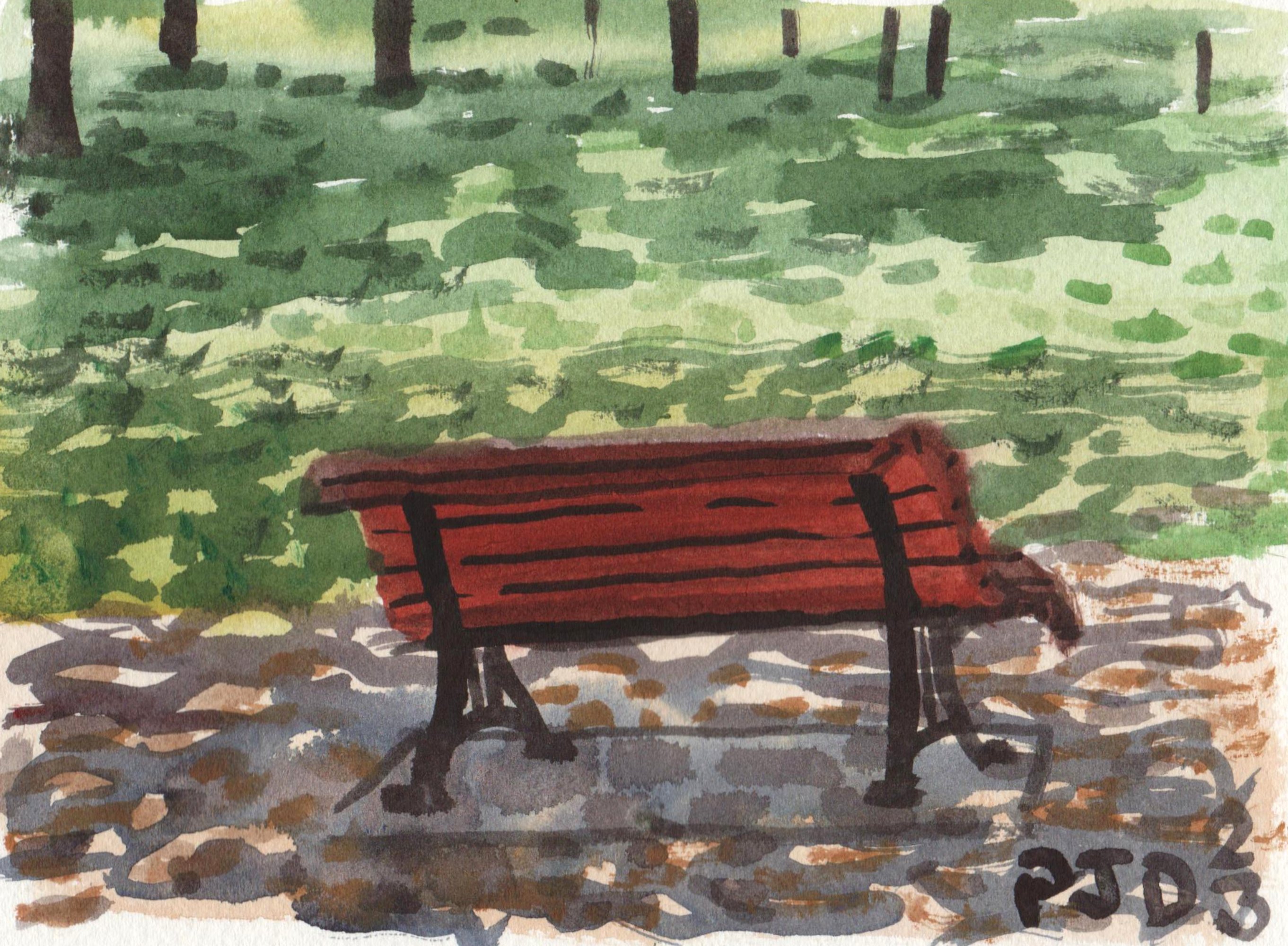
This bench was in Parc Gédéon-De Catalogne, a long narrow park that connect the Lachine canal to ville st Henri. I ride through this park almost every time I go to and fro a painting excursion, and sometimes sit in these benches to enjoy the shade. The bench colour was done with red ochre (PR101) and deep scarlet (PR175) with carbon black for the iron work (PBk6). The shadow effect on the path and the grass was done by applying the lighter portion first, then adding a dark neutral colour, allowing the light portions to shine. When a surface is close to white, light grey, or a tint, then shadows take on a blue appearance. If a surface is yellow, orange, red, magenta, or green, then shadows will not reflect much blue or no blue at all.

Bench in Shadows, watercolour 5 x 7" cold press, July 2023 (No. 3493a)


Friday, July 14, 2023

Poor Tree


This tree really got the worst of it from the strong wind storm that hit Montreal yesterday. Another large tree was down in Trenholme park down the street too. They put danger tape around the tangle of branches and leaves that broke off, and spray painted the trunk with an orange line which indicates to cut the rest of it down. I started off painting the shape of the tree and filling it in with a greenish umber (PBr7), burnt sienna (PR101) and indo blue (PB60) with carbon black for the shadowed sides (PBk6). I left the colour-highlight areas free until the end, which included the whitish parts of the broken branches, the neon orange line, and the red wrong way traffic sign. It a rather long time to do this painting compared to normal but it may well be the last (and first?) painting of this tree. Its nearby the billboards I painted earlier.

Poor Tree, watercolour 5 x 7" cold press, July 2023 (No. 3492a)

Wednesday, July 12, 2023

Campus Flowers in Parking Lot


On campus there is a row of wild flowers growing between the old service building on the left and the large parking lot. It's been awhile that I wanted to paint this scene and finally found the moment, and a bit of shade, to do the painting today. The browns, greys and blues of the surrounding made the yellow, pink and white flowers really stand out. Hopefully the campus follows through on its plan to add more 'green' elements, they already have a multitude of vegetable gardens and patches of nature here and there. At first I was going to leave the front of the car out of the scene, but it provided a good contrast in values and concepts- the solid looking hood of a car against the delicate wild flowers.

Campus Flowers in Parking Lot, watercolour 5 x 7" cold press, July 2023 (No. 3491)

Tuesday, July 11, 2023

More memories of Réunion Island

It has been long enough that I can look back at these paintings done in the early 2010's and appreciate the work more. Some of my favorites from Réunion Island have already been blogged about such as Intense Island, Peach Arch Sea View, and View from the Mountain. This painting was done down at sea level along a walking path that surrounds a large cemetery filled with monumental structures. I was more interested in capturing the landscape here, which included rough water, bright light, and rolling green hills. The composition is particularly good in the painting, that lamp post anchors an interesting array of lines and triangles. Without knowing it at the time, the composition is very Japanese-like due to the use of triangles in the foreground and background.

Cemetery Orange Path, Réunion, watercolour 7.5 x 11" cold press, 2011 (No. 1257)


This painting was done on the opposite side of the island, looking down a steep cliff lush with greenery. The sun was going down rapidly and I had to paint fast so as to capture the colours and light. At the time I used blue in many of the shadow mixtures, which you can detect in the tree forms. In retrospect green and brown shadows do not actually reflect much blue light, but the painting was meant to be impressionistic. The colours in the water were fascinating, variations of turquoise, pink and powder blue. Using a 7.5 x 11" piece of paper may seem random, but it is the size you get when cutting a 22 x 30" standard sheet into 12 pieces. It also makes it hard to frame since it wont take a standard mat, but these paintings are just sitting in a box anyways so it doesn't matter. Get it? About the mat. It doesn't MATter?

Mountain Meets Sea, Réunion, watercolour 7.5 x 11" cold press, 2011 (No. 1259)

Untitled Brown Cleanser

Just what the world needs, a painting titled Brown Cleanser. I was just cleaning the burnt sienna and orange sections of my palette and didn't want to waste the paint which is such a nice colour of rust and earth. Since the early days of painting, both my history and the history of art in general, that rust colour has been a mainstay of artists starting with cave painters tens of thousands of years ago. Historians initially thought that primitive artists gathered this material from the earth and simply smeared it on the rocks, but it was more complicated than that. Archeologists found paint making materials in a cave and did chemical analysis to find that the paint contained mixtures of pigments along with binders and other fillers. Its part of what I enjoy about making paintings, especially on location where I have no technological support for the art other than my bike. Somewhere in my ancestry there was probably some cave person smearing paint on the walls of a cave making doodles of animals or something. In the World Inspired Landscapes: Botswana first version I created a living herd of cave painting animals stampeding across the savanna.

Untitled Brown Cleanser, 9 x 12" sketchbook, 2023

Monday, July 10, 2023

Old Port, Old Silos


The heart of downtown Montreal in the summer is the Old Port where tourists and locals congregate to enjoy the scenic waterfront. We rode our bikes along the Lachine Canal and sat at a picnic table near the end (beginning?) of the Lachine Canal. In the foreground you see a railing, top of a staircase, and a rounded brick retainer wall that is just above the water of the canal as it meets the river again. In the middle ground you see the abundant landscaping they have added recently to make the location look nicer than the old days when this was a dirty, dusty industrial port. In the background is the end of a very long and very dilapidated silo structure that must have been used for wheat or sugar or something to that effect. Now its a graffiti canvas and general eyesore although it does add plenty of character. The city is still deciding what to do with the structure since it is starting to be a fire hazard and could collapse one day. I say turn it into a bird sanctuary!

Old Port Old Silos, watercolour 5 x 7" cold press, July 2023 (No. 3490a)

Saturday, July 8, 2023

Ride to st Helen's Island part 2

 On the island there were plenty of people and activities going on, for example there was a techno dance party not far from this location blasting loud techno music. I painted to the 'thump, thump, thump' of the music which may have inspired some intense contrasts such as the orange flowering tree against the blue wall of the booth, and the impression of the Cartier bridge soaring in the background. The sun was on the descent and casting longer and longer shadows from left to right. Painting shadows is always trick because you have to get it correct the first try, otherwise its messy to blot out the mistake or paint it over. Luckily everything went to plan in this painting. I could easily handle the water and railing effect after painting similar scenes up and down the Lachine canal over the past few years. Quite a few people stopped and look and commented on this one, one fellow took a moment, then looked at me and said 'good'. So I guess I did good!

Blue Booth and Cartier Bridge, watercolour 8 x 10" cold press, July 2023 (No. 3630)

Here is another view from the island, looking back towards Dieppe park in the middle of the river, and Montreal downtown in the background, the Cirque du Soleil tent is sketched in behind the tree near top right. Everything was backlit which created a grey silhouette of the city, and sparkling highlights in the fast flowing water. To paint the water I mostly used my trusty 2 inch hogs hair round, held sideways and dragged across the paper from left to right while gently rocking the bush up and down. It was a complicated maneuver that allowed me to paint textured squiggles and effectively capture the fast flowing water. I pioneered that technique when I rode down along the Seaway path last year and made a painting looking back on Heron Island. On last year's trip I forgot to bring my usual brushes and did the whole trip with the hog's hair round brush which lead to the discovery of how to paint fast flowing textured water. 

View of park Dieppe and City, watercolour 8 x 10" cold press, July 2023

Ride to st Helen's Island part 1

Finally I got to ride out to st Helen's island after getting blocked last time by the car race. This painting shows Swan lake, a small pond near the Concorde bridge that connects Montreal the island. The base of the bridge is barely visible at the top of the painting and in the reflection. The foreground was surprisingly lush with flowers, pine trees, tall grasses, and reeds growing out on a spit of land. There were plenty of geese around, but no swans, I guess it should be called goose lake, or better yet, goose shit lake since there was lots of it around. 

Swan Lake Reeds, watercolour 5 x 7" cold press, July 2023 (No. 3488a)


This was the first painting of the trip, I did it as a warm up. The scene shows a grassy hill where people sit when they play concerts here, and the tall audio and lighting towers they use when there is a show. Most of the area was paved over with gravel and the beloved laid brick work that adorns a lot of the island around the metro station now.

Concert Area, watercolour 5 x 7" cold press, July 2023 (No. 3489a)


It turns out that the island has some dense forested areas with paths criss-crossing throughout. The paths were very steep and challenging on the bike but I made it to the top where Levis Tower is located. Recently renovated, it looks fantastic with its old fashioned brick work and restored windows. A few years ago it was a crumbling ruin, but it may soon be open for intrepid tourists to go up. Even standing in the shade it was extremely hot and humid here, it was the last painting of the trip before I rode home. There are two more 8 x 10" paintings I will make another post.

Levis Tower Close Up, watercolour 5 x 7" cold press, July 2023 (No. 3489b)


Thursday, July 6, 2023

Hot day, billboards


Next to campus there is a short row of condos and then an empty lot on the corner with two large billboards. I stood behind them in a grassy expanse because it was surrounded by cool brick walls and heavy foliage which provided shade. Considering the heat I needed somewhere somewhat cool to stand and paint. In the view you see the Dagwoods sandwich restaurant across the street flanked by the edges of the two billboards seen from the back. The billboards were painted with burnt sienna and indo blue, and some carbon black for dark areas.

Billboards with Dagwood, watercolour 5 x 7" cold press, July 2023 (No. 3487a)

This was the first one I did on location, looking at a different angle across Sherbrooke towards the health center building. Often the first painting I do on a trip is a warm up, although on a few occasions the first one was the best of the lot. Today I just made two from this vacant lot standing behind the billboards. It seems like it will cool off a little starting this evening.

Behind Billboards, watercolour 5 x 7" cold press, July 2023 (No. 3487b)

40 Original Papers


With another scientific paper published it brings the grand total to 40, and counting! Awhile ago I did a painting called Another Deadline Passed, which was inspired by a paper that was overdue at the journal. When we submit papers to journals, the editors and content reviewers usually provide a list of things to fix which we have to address with revisions. The first pandemic year delayed several of our papers but things have been going much better in the ensuing years. Publishing papers is important in science because it increases the chances of getting funding such as grants and awards. Its also a way of sharing the results with other scientists. To do the painting I made 40 paper sized rectangle forms in various colours, then overlaid a pattern on each one, and finished with a blue-grey shadow to give an illusion of floating. When I turned off my desk lamp and just had the kitchen light on, the coloured pages seemed to be floating for real, it was quite a neat illusions. We have two more papers under review at journals, and several in the pipeline after that. Once we get to 42 papers then we have solved the mystery of life, the universe and everything else.

40 Original Papers, watercolour 9 x 12" watercolour paper, July 2023 (No. 3639b)

Wednesday, July 5, 2023

Flowering tree and grass

I walk past this tree every time I head from my office, across the street to the laboratory at the PERFORM Centre. Today I stopped and made a painting after work in the sweltering heat. After spending most of the day in the over-air conditioned office it was kind of relief to feel some heat! The painting was an exercise in textures and value control. I started with the highlight colours, for example the white clover flowers and yellow buttercup flowers growing in the grass, and applied the neutral coral blobs for the tree flowers. As it dried, I applied several textural layers by pushing the semi-moist brush directly down on the paper, which is bad for the brush but good for the textural effect. With progressively darker applications the painting gained volume and a realistic look. Doing such a painting in watercolour is especially difficult because there is no white paint to apply the highlights. Instead, the paper has to be showing through wherever there is light. In the night painting from last night, the artificial light was just the paper, surrounded by visual elements that made the scene appear to be night time. In this painting, I knew the surroundings just had to be a middle grey in order to make the flower elements seemingly glow. Or 'melt' would be a better word for today! 

Flowering tree and grass, watercolour 5 x 7" cold press, July 2023 (No. 3484b)

Tuesday, July 4, 2023

Night Scene Auto Shop


With the high heat and humidity I struck out at night to make a cool painting of the auto shop. To paint at night I use a head lamp to see the colours and the palette which helps judge the values and hues. These kinds of paintings look weird when they are in progress because the blank paper contrasts the darker elements. Then when the scene starts to fill in, the light highlights start to pop, like the strong bar light on the auto shop on the left, the reflections off the cars and gas pumps, and the various windows in the neighborhood illuminated from within. The car near the front looks pretty mangled, I guess it needs to get some repairs from the auto shop! Actually the car looked fine in real life, it was just hard to do the brushwork considering how dark it was even with the head lamp. Maybe I'll do a few more night paintings during the heat wave, the sunflowers will start to grow outside of the metro which are neat to paint.

Night Scene Auto Shop, watercolour 5 x 7" cold press, July 2023 (No. 3485b)

Monday, July 3, 2023

Tacky Painting

Its a tacky painting in more ways than one. The paint itself was a gooey mess on my palette due to the high heat and humidity, and the design is a little tacky too. I opted for a psychedelic design with colours to match. The idea of combining pastels with primaries was something I picked up from studying Klimpt paintings and making a few paintings on the theme. It works because the pastels are essentially shades of grey with subtle tints, which provides a good contrast for the higher chroma primary colours. Primary colours are usually thought of as red, yellow, green and blue, but any high chroma, definitive colour can be considered a primary, such as orange. There is an idea that certain colours are secondary, and even tertiary, but those ideas serve little purpose and can lead to errant colour schemes. In the Victorian era some artists thought that colours had some inherent quantity that could be balanced through careful design, but there really is no basis for those ideas other than the esthetics of the time. After reading a lot of painting literature I found that many artists write about and try to teach colour theory, yet when they paint it seems to go out the window. If you want to make dark grey, mix ultramarine blue with brunt sienna! But it wont work with red and green (which makes caramel brown), or purple and yellow (which makes a smoky grey). So whatever. Or whatever works.

Tacky Painting, watercolour 9 x 12" cold press, July 2023 (No. 3639a)

Sunday, July 2, 2023

Scenes around the Old Port

After painting up in the Plateau I rode down the Berri bike path to Old Port and looped around to Dieppe Park where I painted in a blizzard earlier in the year. This time it was an easy bike ride as compared to the winter slog on foot. At the end of the park there is a viewing platform with a prime view of the bridge, the Molson brewery, and to the left is the Old Port not seen in the painting. The river is moving fast here, which creates powerful swirls and cresting waves which I enjoy painting. Painting the Cartier Bridge is no small feat and it has never quite turned out right in my paintings. Today the colours and values were bang on, but the left support appears to be listing. Have to try it again next time, its a great location to paint!

Jacques Cartier Bridge from Dieppe Park, watercolour 7 x 10" cold press, July 2023 (No. 3612)


Here is a another view of a massive cruise boat across the river. I was standing next to the bike path that is across the street from the famous Habitat 67 apartment complex. The scene was composed with the boat at the bottom, and just a thin strip of the river showing, and the Montreal skyline off in the distance. I would have used a larger paper but I was getting tired in the muggy hot weather. At least the rain held off.

Cruise Boat in Old Port, watercolour 5 x 7" cold press, July 2023 (No. 3486a)


This unusual scene shows the Montreal Street Food festival where about a hundred booths set up and sell snacks, beverages, arts and crafts. It is situated on a pier in the Peel Basin, which is part of the Lachine Canal system where it connects to the Old Port. I was set up across the basin on the south bike path. At the time it seemed like a bit of disaster this painting, but the heat was playing with my head. Now that its scanned on the blog it looks just like the scene was, with an impressionistic flair. And the smell wafting across the water was fantastic.

Street Food Festival, watercolour 5 x 7" cold press, July 2023 (No. 3486b)

Mount Royal Street and new Station, Orange Line Metro

It's been awhile since I went out to a metro station to make a painting. For those of you who are new to my blog, there is a page dedicated to the 68 stations of the Montreal Metro series that I completed towards the end of 2021. A few of the stations were under construction at the time, amazingly some of them still are under wraps such as Jolicoeur, McGill and Rosemont. Mont Royal was finally finished and unveiled recently so I decided to go out and take a look. When I got to Mount Royal street, it was closed off to cars due to a street sale. Montreal closes off certain streets in the summer so that local vendors can get a lot of foot traffic and sell food and wares on the streets. Looking down Mount Royal you see the top of the big Olympic stadium on the horizon. I set up my bike studio in the middle of the street, and a few people stopped and commented positively on the painting and remarked on my bike-studio setup. Since my drawing skills are minimal, I just went ahead and sketched out some humanoid forms using paint, then filled them in with interesting colours I pulled from the crowd. In the distance, the crowd is just a mosaic of colour and value daubs but it created a good illusion of depth. 

Street Sale Mount Royal, watercolour 5 x 7" cold press, July 2023 (No. 3485a)

The station turned out to be a cube of glass and steel with a grassy knoll on the roof with a skylight. It was surrounding by an enormous array of interlocking bricks and some large tree planter areas. Today due to the crowds, there was a street performer doing some silly show while curious onlookers watched on. As I painted I could hear the show man, he spent 10 minutes announcing that he would do a show and building up anticipation, then he did a back flip over a volunteer and asked everyone for money. Anyways, at least it cause people to stay mostly still for once. The people were an important part of the composition, their forms connect the background elements of the metro station and the green kiosk with the painted road in the foreground. The bright red shirt also provided a good depth illusion. You will notice the absence of feet on the people, I tried in a few places but it looked atrocious and wiped them off. The overall effect is still strong, none the less, just need to practice figure drawing to improve these kinds of crowd scenes.

People watching Street Show, Mount Royal Station,  watercolour 7 x 10" cold press, July 2023 (No. 3611)


Sartcasm


Upon completion, the thing in the center seemed like a question mark, but not really. Since I already did a painting called the Question Landmark, and the Questioner, I went with a play on words using sarcasm and adding a t. Abstract art is kind of sarcastic in a way. Originally abstract art was a kind of anti-establishment protest, in the same way that graffiti art is nowadays, or internet memes. One original meme drawing sold for several thousand dollars a few years ago, so there is a market for everything and people's tastes change. Imagine there was a time when impressionism was considered low brow art by hack painters, but it quickly gained in reputation and impressionist paintings now sell for a lot of money. As usual I was just cleaning my palette here, and trying to make a decent painting at the same time. The pulp paper is meant for watercolour and is archival quality, although it does not handle as well as the rag (cotton) paper I use for larger works and on location.

Sartcasm, watercolour 9 x 12" watercolour paper, July 2023 (No. 3638a)

Saturday, July 1, 2023

Departing Cruise Boat, Happy Canada Day

Initially it was a tall Canada flag post that caught my attention, and then I noticed an enormous cruise boat in the background that was slowly leaving the Old Port. Luckily it was moving slow enough that I could catch most of the details including windows, structures, and tiny people standing up on the decks. In the background, top right, there is the top of the new embarking tower which connects these huge ships to an elevator down to ground level. Contrary to the 'rapids' painting which I painted rapidly, this one took some time to complete due to all the intricacies and adjacent washes. In watercolour, two adjacent colours have to be dry otherwise they run together. In some cases, that is the desired effect, like in the sky I mixed blue grey and orangish washes together to signify a rainy day. But the green trees in the foreground, and all the turquoise windows had to be done dry to keep the form intact. When I finished the painting I realized that I forgot to include the Canadian flag on the pole in the foreground, so I added a small Canadian flag to the top of the cruise boat instead. Happy Canada Day!

Departing Cruise Boat, watercolour 5 x 7" cold press, July 2023 (No. 3538)

Rapids Rainy Day

The view here is of Goat Island with some rocky islets in the middle of the river that harbour some trees, grass, and provide a landing spot for seagulls. To paint the scene, first the sky was filled in using blue mixed with carbon black and some earth tones. While moist, the tree line was added using perylene green (PBk31) and increasing amounts of either blue (PB60) in the distance, or leaf green (PY154 + PG7) towards the closer trees. The moisture of the green mixes had to be just right so that the tree line had a soft edge, not a hard edge, and it didn't just bleed into the sky. It takes some practice to get that right, and an understanding of how the brush, paper, and paint performs in humidity. The water was done with consecutive dry brush washes, where I scrape the brush almost flat with the paper. If too wet you don't get the white highlights, if too dry it looks sketchy. You might be surprised, and I was too, that the painting took less than ten minutes to complete, although I may have fussed with the seagull detailing on the rocky islet for a few extra minutes. As I rode away I thought about how fast I could do this painting, but then again, it took many years to be able to do the techniques effectively and on the first try.

Rapids Rainy Day, watercolour 5 x 7" cold press, July 2023 (No. 3484a)