Friday, February 28, 2020

Tricolour Horizon


This is just a test. Actually several tests. Recently I have been reading up a lot on pigments and paints especially the web sites called 'Color of art pigment database' by David Myers, and 'Handprint' by Bruce MacEvoy. Despite having painted for over 30 years there were many things that I was not aware of regarding paints and pigments. I decided to remove cereulean blue awhile ago because it contained cobalt, although I had added it back to my pallet just for painting the sky last summer, and now I took out for good. From reading, it seems that alizarin crimson, one of my workhorse paints that is probably in every painting I ever did to some extent, is prone to fading. Come to think of it, once I gave a painting to some family friends and they hung it in the direct sunlight, and every time we visited it had faded more, so I know it is true! Replacing alizarin crimson was not easy, Bruce MacEvoy wrote that it can be replaced with perylene maroon (PR179) mixed with other reds or violets, so I bought some recently. (The code refers the pigment-red-#179.

The painting shown above mostly contains 3 colours including winsor green (PG7), phthalo blue (PB15), and perylene maroon. You see their pure forms on the left with the 3 shapes, and then in the middle pointy oval shape you see what they look like when they are glazed on top of each other in successive layers. On the ground the three were mixed on the pallet to create brown, and in the sky they were combined in a colour gradation. Finally, the objects on the right put the colours together like a puzzle. The bright yellow on the right-most shape is pure Sennelier Yellow (PY154) also known as benzimidazolone or azo yellow, I just added that for colour balance in the overall picture. All of the paints I have selected for my new palette are considered non-toxic, and have the highest rating for lightfastness. That means they will basically not fade much even in sun light.  

2 3/4" x 10 1/2" cold press watercolour, February 2020

Wednesday, February 26, 2020

Hiroshige's Sanno Festival Procession at Kojimachi, Japan

Sanno Festival was (and still is!) a major summer festival in Edo, now called Tokyo. Hiroshige made a print called Procession at Kojimachi in the 100 views of Edo series. He used a prominent foreground composition with one of the floats featured up front, and another one of the floats off on the horizon. The bright primary colour scheme brings the joy of summer to the scene, which is something we all need right now in Montreal with another snowstorm incoming!

This is perhaps the closest I have come to matching the design quality and intensity of the original woodblock prints. I am working from the Taschen book which reproduced one of the best set of prints in existence, an early deluxe edition that was carefully preserved. My goal was to try and match the colours as best as possible. I Used phthalo blue in the main sky and the water, and indanthrone blue for the bokashi effect (the dark strip on the top of the sky) and prussian blue in the foreground float element. I chose those blues mainly to test them out (I just bought prussian and indanthrone). Phthalo is quite bright and clear for sky and water, indanthrone is a deep purple-blue, and prussian dries with that neutral purple look to it. The rest of the picture was done with another paint I just bought (Ferrari Red), and winsor lemon. I also tried to simulate the woodblock effect by painting a wood-grain texture in the sky.

Sunday, February 23, 2020

Hiroshige's Zozoji Pagoda Akabane, Japan

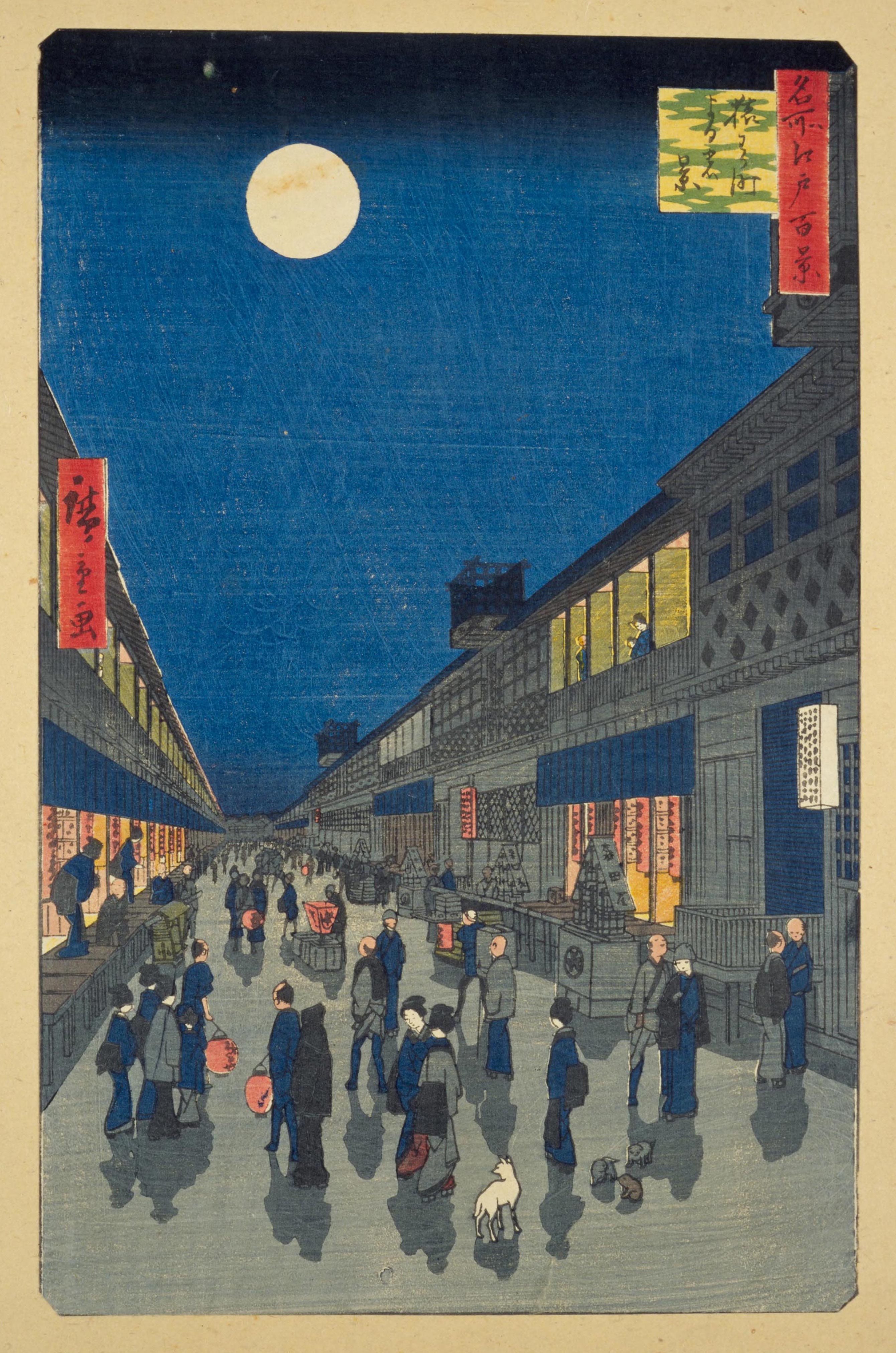
Above the winding river, a brilliant red Pagoda stands tall. This is a replica of a portion of Hiroshige's #53 design in his 100 views of Edo. I was testing out some ideas on how they created the various effects such as the dark band at the top of the sky, the green/orange mixes of the copper work, the charcoal reflections on the roof, and the brilliant red walls of the pagoda. Before doing this test I ran another set of tests to see what would work best. The dark band in the sky was Prussian blue with quinacridone red and a touch of bloodstone genuine. The copper work on top of the roof was the red used in a wash, overlayed with the green. The charcoal roof was a blue wash similar to the river, overlayed with bloodstone genuine. The red was a glaze of two reds, but I already forgot which ones! I had so many paints in my collection it was getting hard to manage, so I recently went through and took out any toxic or obsolete pigments which have modern replacements available.

Bruce MacEvoy's website called handprint.com, which contains an encyclopedia of pigment, paper and everything else related to painting was really helpful, in fact I could spend weeks reading that site to digest all the information. There were some great insights to the science of pigments and how they interact with paper. For now then, I will limit myself to the following colours which I have already, the code is the universal industry name of the pigment where P=pigment, then the colour like Y=yellow, and the number is the exact pigment.

Here is my new palette, it is actually very similar to what I had when I started in 1989*

Winsor lemon; yellow (PY175)
Burnt Sienna; brown (PR101)

French Vermilion Hue; red (PR242)
Quinacridone Scarlet; red (PR209)
French Ultramarine; blue (PB29)
Phthalo blue, yellow shade(PB15)
Winsor Green (PG7)
Genuine Bloodstone; dark grey (no code)
Lamp Black (PBk6)

I am also still testing Prussian blue (PB27, which has some suspect qualities), and Iridescent Moonstone which is mica and titanium white.

When I get to the art store I will try to buy Winsor Red (PR254) to replace French Vermilion, and Perylene Red Maroon which will replace Alizaran  (which I removed because it fades), and maybe a few others but the main thing is to get a good red. 

*In 1989 I took a watercolour course with Sonya Vernot, and my mom (who paid for the lessons) also bought the recommended paints for me which were Alizarin Crimson, Aureolin yellow, Viridian green, French Ultramarine, and I had Burnt Sienna. Thanks mom!

3 x 10" hot press watercolour, February 2020

Saturday, February 22, 2020

Hiroshige's Kasumigaseki 100 famous Views of Edo

By copying the Japanese prints I am starting to figure out how the prints were created. According to the literature, the sky and water colour was Prussian blue which became available in the mid 19th century Japan from European exporters. To recreate the effect I bought Prussian blue watercolour (Holbein) and used it for the first time here. It is definitely the right colour, in natural lighting it is exactly as the original prints. The yellow they used was probably turmeric (the spice!) diluted to varying extent, and the red may have been lead red, vermilion, or a red oxide of some type. I used Cadmium yellow medium hue (Daniel Smith; contains no actual cadmium), and Quinacridone red orange (Sennelier). With these three colours I could also produce the greens and all of the warm greys and browns found in a early version of the seen in the link.

There were two things way off... one was the bokashi technique at the top of the sky, that is where they create gentle color gradations, the other thing was the underlayers on the ground. The sky probably needed black mixed in with the Prussian blue, and the ground needed less coverage with the yellow. I'm not planning to try this one again, but I would like to keep copying these prints until I solve all of their ancient secrets!

5 x 7" cold press watercolour, February 2020

Wednesday, February 19, 2020

Hiroshige's Fudo Falls in Oji, Japan

Copying was the main way by which Japanese artists learned, a young apprentice could spend 5 years copying their master before doing their own independent work. This painting is a copy I did of a Japanese woodblock print called Fudo Falls in Oji by Hiroshige. The size is much smaller here and the dimensions are more narrow because I was using a small piece of leftover paper. I wanted to see if I could reproduce the woodblock effects using watercolour and a brush especially the orange-yellow-green-blue green fade with overprinted shadows. I was also curious to see if the ground was in fact a yellow with grey overprint. The test was mostly a success- I confirmed that the wood block printers used at least two overprints (that is where they layer two colours, in watercolour it is called a glaze). The one thing I can not get right yet is the brilliant blue water seen in the print, it uses Prussian blue but I don't have that in my palette. Here, I tried a mix of cerulean, French ultramarine, and bloodstone genuine with a bit of windsor green, but the result was a flat dull blue. There are substantially fewer characters in this version too compared to the original print.

4 x 9" hot press, watercolour, Feb. 2020

Tuesday, February 18, 2020

Beach and tree, Seychelles

Maybe I can't be on the beach right now but I can go through my old paintings and look at the beach scenes and try to remember what a sunny day looked like! This one is in quite a different location compared to the last one I posted which was Dominican Republic. The Seychelles are a small group of islands composing a country (called the Seychelles), best known for blistering white topaz sand beaches, emerald water, and lots of palm trees. The composition for this painting is very similar to one I did here on the island of Montreal recently at Oka beach. It was obviously very hot there in the Seychelles, you can tell that I was sitting under some shade when I painted this one.

Beach scenes are deceptively difficult to paint properly. I was kidding around in the last post about how much one has to practice it, but it really does make a difference. After painting beaches in Spain, Carolina, Florida, Mexico, Dominical Republic, and even Canada (Grand Bend) the Seychelles trip was a real test. One thing to capture is the blending of the sand colour with the shallow water colour. That creates the golden turquoises. Then it blends into either purples or blues depending on depth, with varying amounts of surf. You also have to remember the foot step impressions in the sand!

Beach and tree, Seychelles, 5 x 7" cold press watercolour, 2011 (No. 1273)

Punta Cana, Dominican Republic

Waiting for you two, or you too? I made a number of paintings while on a beach vacation in the Caribbean, sadly not in recent times this was over a decade ago. These paintings were a big challenge due to the horrible painting conditions- sun all day, no rain, no snow, no noise... wait, what were the problems again? Oh yeah, it was very windy and the painting kept flapping up and down, and the other challenge was the "all you can drink" policy at the resort. All you can drink, beach, painting watercolours. Now that I think about it, the pole holding up the thatches umbrella does look a little crooked! 

From a technical standpoint painting beaches is very difficult even if the conditions are ideal. The water is a blend of turquoise, yellow, emerald, ultramarine, and frothy waves not to mention blue sky reflections and dark coral underneath. There is only one solution, which is to practice more, practice painting, on location, on the beach, a lot!

5 x 7" cold press, watercolour, 2008?

Memory of Brazil

A memory can be a powerful thing, we tend to remember the important things like feelings and impressions. On a drive in Brazil we went past a community on a hillside, and I noticed a mother walking up a steep road holding hands with a child under the moonlight. Everything was illuminated with an eerie glow, pierced only by some artificial light from the windows of the small brick houses and the headlights from the nearby highway. I painted this scene either in Brazil when I was there (since I had my paints with me at the time), or shortly after I returned using some small sketches I made with pencil. Memory has it limits. Record keeping was never a strong suit for me, other than the Spain trip where I kept detailed notes of all the work. Starting around 2018 I have been putting the date somewhere inconspicuous on the painting to keep a basic record of which year the work was done. The blog helps too, about one third of my new work is mentioned on the blog. 

It is interesting to have found this painting in my collection from 2017 because I had not learned of Hiroshige yet. Hiroshige was an artist from 19th century Japan who was famous for landscapes, especially ones featuring a moon-lit night scene. One big difference is that he rarely included shadows in his designs. There is one exception, a print called Night View of Saruwaka-mach. There is a link to it if you click.


Memory of Brazil, 5 x 7 " cold press, watercolour, 2017 (No. 1618)

Monday, February 10, 2020

Hiroshige's Returning Sails at Yabase, Japan

I want to replace one of the paintings that is currently hanging in the staff lunch room, where a photographic reproduction of an old watercolour I did 20 years ago is currently hanging. In this picture, I have recreated a version of Hiroshige's Views of Omi series, the one called Returning Sails at Yabase.

The original design, which was published in 1834, was on a horizontal format, but for the brief, I needed a vertical format for a frame with a 7.5 x 9.5 opening. The phrase 'brief' is used for interior designers to describe what the client wants. In this case I am the client and the designer, so I am wearing my own briefs.

I cut an 8x10" from my normal cold press watercolour paper, then used a stencil to draw the 7 x 9"outline of the picture with pencil. With this size, there is a quarter inch around to go behind the mat, and another quarter inch so I can write the name of the print and the date at the bottom, plus it gives a little wiggle room to fit the mat opening. The 8 x 10" is standard American picture size so you can put the work in pre-cut mats and frames. The 7 x 9" picture size is very close to the Japanese size called chuban (~7.5 x 10). The original Hiroshige design was about 9 x 14".

The outline was painted with a number 4 sable brush and lamp black paint, using a large book as a guide for my wrist to keep the lines straight. The rest of the main outline was also with lamp black and the number 4 brush. Then I filled in the colours using the original picture for references. I set up my small notebook computer on the art table to have the image showing on the screen. Prior to doing the painting I had done several small pencil sketches to work out the compositions. The little semi circle shapes on the corners were inspired by the Japanese prints, I used a dime to create the semi-circles.

I wrote a longer post today because I am trying to work out this method so that I can mass produce original watercolour landscapes. My ambition is to paint one landscape painting for every country in the world, which is about 197. That will probably take several years to complete as a reasonable pace. I am also planning the provisionally titled "17-odd gas stations of Notre Dame de Grace" series. 

8 x10" cold press. Watercolour, February 2020.