Friday, July 31, 2020

Sunset in Bolton

As the month wraps up I reflect on the artwork and blog efforts, it was by far the most amount of paintings and thoughts I've had in a single month related to watercolours. Like many people I was in a funk for most of May and June, in July the pandemic seemed to abate, and my other life as a professor steadily improved in the sense of the laboratory opening partly and the students doing a great job of doing their best under the circumstances. My waking schedule is a lot earlier which facilitated more painting on location despite the oppressive heat, and my legs regained some strength allowing me to reach up to 20 km on the bike. The 27 stations of the green line metro series is all but complete, tomorrow morning the last station awaits my brush. In this Bolton sunset painting, it looks like I was working with new colours- Mom bought me some new supplies including the thick, 300lb press paper, and many new colours including antwerp blue (which was likely used to make the signature), and winsor red (pyrrol red). That signature you see was fairly new at this point, I even have a sheet of paper where I made a bunch of variations before settling on this signature which I went on to use on hundreds of paintings. I may have been looking out my bedroom window to make this painting, although I had taken several photos out my window and it may have been from photo. Those houses are no longer visible, the trees have long since overgrown and blocked the view across the valley.

6 x 10" cold press 300lb, watercolour, 1993?

Highway 20

Driving to Sutton earlier this month, I was scouting out potential locations where I could get a good view of the highway. From the vantage point of the car, I could easily see where the potential openings were to make a painting. Today I went to one of those spots, a grassy hillside situated beside the U Haul depot, near the construction project that will one day link the 138 to the 20. The hillside was alive with yellow wild flowers and magenta blossoms from the burr plants. There was no garbage on this small nook of untouched nature. The view was awesome- highway 20 under construction for as far as you could see in either direction. I fixated on this angle because of the pleasing contours of the highways, ramps and bridges, along with the rolling green hills and wooded areas that seemed to arise from the concrete and asphalt. To paint the cars I went with a 'marsh mellow on wheels' approach, and finished the painting with as many orange cones as possible. I used bismuth yellow (extremely bright and opaque) with benzimida orange (also opaque scarlet orange) to make the traffic cone colour, and overlaid it on the nearly dry painting. It started to rain shortly after I finished, what luck. 6 x 7.5" cold press, watercolour, July 2020

Thursday, July 30, 2020

Palette Cleanser #22

Instead of putting all the colours in one painting, I used the cooler colours including phthalo blue green shade, phthalo green yellow and blue shades, indothrene blue (the dark sky), and perylene green with some benzimida yellow. The names don't matter so much, the main thing is that they all look nice together. That tanned warm sandy colour is my new goethite (PY43) from Daniel Smith Company, it looks exactly like a sandy beach, and in this painting it provided the perfect splash of warm to contrast all the cold. Even though the warm/cold analogy is not accurate or factual, I still like it to describe the relative contrasts between the colours. I really like this whole colour scheme, it will be useful in the future, in real life the sky is a super rich velvety blue (the scan is a little flat). What is this scene? Kids pools in a bouncy castle? Fountains on an alien planet? A bad acid trip? Or D, all of the above. 9 x 12" watercolour paper, watercolour, July 2020

Palette Cleanser #21

After knocking out two more metro stations my palette was in need of some cleaning. This painting used many of the warmer colours including yellows, oranges, browns, and phthalo blue (red shade). You can tell Venetian red from the granular (sandy) looking pinkish brown. I used to have potters pink, a very similar colour to Venetian red, but potter's pink did not mix well with other colours and dried hard on the palette. So Venetian red is better in those respects, although it does tend to produce muddy mixes. I like it for cloud shadows with indothrene blue, but I feel like Venetian red is slightly redundant with iron oxide red brown. I like all the colours though, often I pick one and use it throughout the whole painting of possible just to see what it can do. 9 x 12" watercolour paper, watercolour, July 2020

Radisson Station, Green Line Metro, Mercier–Hochelaga-Maisonneuve

Just a quick ride down Sherbrooke brings you to Radisson Station which is named after a French explorer, not a hotel. In fact there was a hotel across from the station but ironically it was not named Radisson. At first glace this is the smallest station on the green line, one tiny rhombus with a door and a few windows. At second glance... same thing. Oh, but there are two identical structures on either side of the street. There were an impressive numbers of trees planted around the station considering it was on the edge of two busy streets and a shopping mall parking lot. 6 x 7.5" cold press, watercolour, July 2020

Seen from the side view, the support structures cut a steep angle against the design. There were lots of interesting angles and perspectives here. The road and trees on the right should have been about 2 inches lower though. The texture of the old concrete was amazing, it was full of layered browns, greys, and black pock marks. I brought along my new umber paint from ShinHan PWC company, and it was the ideal colour for this concrete. 8 x 10" cold press, watercolour, July 2020

The last painting was a neat scene I found sitting among the trees on a small hill. The shape of the tree seemed to be the inverse of the shape of the structure. Painting these overlapping motifs was very challenging because watercolour is not meant to be overlapped too much. To keep the leaves looking yellow, I put them in the concrete while it was still wet (dry-in-moist!). The sun was fading fast and I was sitting in complete shade making the execution harder. The painting finally came together when I got the bus detail in behind the station on the right, and finally the metro sign hidden behind the trees which I did not even notice until the last moment. 8 x 10" cold press, watercolour, July 2020

Here is the first thing I did on location, a sketch of the entrance on the south side of the street. The left part of the structure was actually covered by a bixi bike stand which I omitted, so I had to fill in the lines by guesswork and trying to peer around the obstacles. The way the angled supports connect is very elaborate. Combining this drawing with the first painting, and elements of the other ones would be a nice way to create a completed work. 8 x 11" sketchbook, pencil, July 2020

So I turned my bike around one more time to head home, looping through the parking lot, when I saw that there was a lot more to Radisson station than meets the eye. Set back from the street was another entrance, situated in the middle of a bus terminal. In contrast to the relatively boring concrete bunkers on the main street, this station had neutral yellow bricks in an ovoid tower lined by aluminum and turquoise decorated window panels and doors. The setting sun was casting yellow-orange and dusky blue shadows over the curved brick, and artificial orange light was illuminating the metro entrance. Sounds too good to be true... what I actually saw most of the time was a bus parked right infront of where I was sitting (safely on some grass on the other side of a short fence). I managed to look through the widows of the bus to try and paint the scene. Once the bus left, another one parked there. Anyways, I love the pastel colours here, and can visualize the scene. Maybe I can catch it again on the way back out there for the grand finale Honoré-Beaugrand station. 6 x 7.5" cold press, watercolour, July 2020


Langelier Station, Green Line Metro, Mercier–Hochelaga-Maisonneuve

Between working and rainstorms I managed to squeeze in a couple of more metro stations this week. When I arrived at Langelier station it had been raining the whole bike ride and then got worse when I arrived. Luckily I had scouted out a great location in a tiny grassy area with trees where there was a view of all three of the entrances which are on totally different corners! You can count all three of the navy blue metro signs in the painting. I tucked myself under a leafy tree to keep the rain off the painting but it still created a mottled effect on certain areas which just serves to enhance the rain illusion. Hiroshige often composed prints with rain, he would show people running around chaotically trying to cover their heads, while ribbons of rain poured down on a diagonal. 8 x 10" cold press, watercolour, July 2020

Other than slabs of boxy concrete, Langelier station is defined by large square, vertical outcroppings with empty circles cut in the middle. What a clever way to reduce weight on the structure while adding a creative touch to the architecture. It made for a challenging painting, at least the rain seemed to be passing over, I got one neat cloud in the painting, it floated behind the sign. 6 x 7.5" cold press, watercolour, July 2020

Grey skies were obscuring an otherwise brilliant blue sky. Three quarters of this design are the clouds, there were many different overlapping layers and blending colours. I used many different techniques to create the stormy clouds including wet-in-wet, and dry-over-moist. Wet-in-wet is where you keep the first layer very wet, like the yellowish clouds, then you put in some fairly wet paint, like the blue of the sky. You see the result at the top. Dry-over-moist is a term I just invented, in this case you let the paint almost (but not quite) dry, then put a fairly dense mix onto it which creates a cotton like effect. Unfortunately these things can easily happen without wanting it, like in the last painting notice the blue metro sign mixes a bit with the metal frame.  8 x 10" cold press, watercolour, July 2020

Finally I made a sketch of the concrete shape, trying to capture the angles and shapes accurately. There was a person sitting checking their phone. During the sketch some staff came out for a smoke and sat on the garden box you see in the foreground. That's always kind of awkward, when someone wanders into the painting and probably wonders if they will be in it! 8 x 11" sketchbook, pencil, July 2020

Wednesday, July 29, 2020

Auto mechanic, NDG

Easy location for once, this one is right across the street from our condo, it can be seen from the front window although I was sitting on the wall of our garden box. The weather today was verging on rain, but held off for the morning and early afternoon. At the time of writing this blog it is pouring rain. I have been eyeing this building, part of an auto mechanic, for years now tempted to try and paint it because of the unique colour. I used venetian red (PR101) at first, but when it dried it was dull and too red, so I did a thin glaze with isoindo yellow (PY110) to give it a slight orange tint. Nothing was drying fast due to the humidity and lack of sun, which made some of the detailing more difficult. The tree in the background was mostly dead due to a creeping vine that had covered its foliage and killed the tree, so the green you see on the tree is mostly the vine, not the actual tree. 6.5 x 7" cold press, watercolour, July 2020

Tuesday, July 28, 2020

New paint test, goethite, quinacridone violet, umber

These are the last new paints I will buy, promise! At least for now...
I got these delivered from Deserres the big art store in Montreal, they carry a lot of brands and the web site is easy to navigate and order things (the actual store I go to is closed, but still does the mail orders). The first paint was goethite (PY43) from Daniel Smith company, which is a kind of ochre but more brown, you see it on the pyramids on the 4 sides of the painting. It has a slight granulation, which gives it the appearance of a sandy beach. In fact, goethite is the colour and texture of a sandy beach, and it handles well. The second paint is, quinacridone violet (PV19) is a very dark rose-red, almost violet in appearance hence the name, you see it in the two shapes top left and bottom right. I had a version of this earlier in the year from Sennelier company but it was very runny. This one from Schmincke company is drying better on the palette, and it is very potent. Thirdly, is umber (PBr7) from ShinHan PWC, a Korean company that makes premium paint at a very low price. Their umber has a greyish, greenish cast and is thick, but dries with a warmpth to it, you see it in the two shapes top right and bottom left. I included some other similar colours for comparison, the names in the margin of the painting indicate the colours.

The number of brown paints I have is out of control now! Here is a comparison from left to right goethite (PY43, DS), raw sienna (PBr7, DS), yellow ochre (PY43, DV), raw umber (PBr7, DV), umber (PBr7, PWC), raw umber natural (PBr7, DV), and for comparison, isoindolone yellow (PY110, HWC). They all have slight differences in consistency and hue, with the biggest difference being the value, the umbers are noticeably darker valued. I can already sense some redundancies here, but look forward to exploring them more. I will have to do a series of toasted marsh mellows. 

DS= Daniel Smith, DV = Da Vinci, PWC = ShinHan PWC, HWC = Holbein Watercolour

Outremont Park, fountain pool

On my way to the dentist I stopped in Outremont park for a quick painting under the trees, looking at the big fountain pool. The fountain was not actually running, so the water was quite peaceful until someone's kid jumped in and ran around. Pretty sure this wasn't meant to be a kids wading pool it looked pretty dirty and the water had a pea-soup colour. Anyways, the composition features half of the wading pool in a semi-circle, and a park bench at the top to complete the design. I wanted a flat feel to the design, but with obvious depth. The Japanese masters from the 19th century were able to do those kinds of designs, I think it worked out okay here. Oh yeah, and no cavities!
6 x 7.5" cold press, watercolour, July 2020

Monday, July 27, 2020

Cathedral Mopers

Back in 2000 my 'decade resolution' was to do a lot of abstract painting. I embarked on a series of really creative, weirdo paintings that really expanded my mind and repertoire, eventually leading to the doodleism style. One nice example of the abstract style was Totems, which I just added an updated scan you can see by clicking the link, a few others come to mind such as Calling Dali, and Dark Happy Thoughts. Clearly I was going through a darker time or depression, which I do recall. This painting had no date or name to it, so I  just called it 'Cathedral Mopers' because they look like they are moping about, or perhaps mopping, or both depending on how many p's there are. I'm not sure where the fascination with cathedrals came from, in a previous blog for Escape Route, I wrote that it was the first instance of stained glass, so this one may have been the same year. Funny enough, I forgot to colour in the stained glass even though there is coloured reflections on the floor, or maybe that was the point? Let's call this the 'Stained Glass Phase' of my painting oeuvre.

This is a good example of how to create dark tones using neutralizing complements, the mixes were based on alizarin crimson and viridian hue, which can be replicated with quinacridone red or perylene maroon and viridian hue. I also made use of burnt sienna and ultramarine. I like the way the stone pillars are illuminated in the red/orange lights.

8 x 10"?, cold press, watercolour, 2003?

Redpath Sugar Plant, Toronto

Here is an old painting I did down in Toronto at the Redpath Sugar Plant which is still there and looks pretty much the same according to google maps. When I found this painting in my pile I thought that it was done in Montreal but wanted to double check, and it took no time to find the exact scene on google maps along the Queen's Quay. I made a few other paintings that day including one of Skydome, now called Rogers Centre where the Blue Jays used to play before COVID-19. Of course we are not supposed to travel between provinces without a quarantine so I haven't been to Ontario since Christmas time. The palette I used back then was very simple, I had at least four colours, french ultramarine (PB29), alizarin crimson (PR83), aureolin yellow (PY40), and viridian (the real one, PG18). I can tell from the mixes that this painting was made with those four colours, but I may have had burnt sienna and cerulean blue around then, I know I had those two very early.

My palette has indeed changed a lot, now I carry about 20 on my palette, and I totally removed ultramarine blue, alizarin crimson, aureolin yellow, real viridian, and cerulean blue. Writing this in 2020, my hope is to pare down to a smaller sized palette but for now I am having a great time experimenting with all the different options and discovering new ways to mix paint.

5 x 7" cold press, watercolour, 1996 (No. 0433)

Sunday, July 26, 2020

Milestone Blog, Palette Cleanser #20, and 700 blogs!

Since earlier this year I have been making these 'palette cleanser' paintings where I literally clean off my painting palette to get it ready for the next painting. In doing so I get to mess around with the paints and do these stream-of-consciousness paintings. Since I paint a lot, it is important to mix up the strategy and keep it interesting which is why I have developed so many series like the landscape series, abstract painting, surrealism etc. My blog has been going on since 2008 on blogspot the google product, before that, I had been blogging for a few years on HostPapa a website host which I had to discontinue to lack of funds at the time. On blogger, I just reached 700 blog posts! Since I ended last year on 500 total all time posts, that means I completed 200 blog posts this year. I don't really care about how many posts I make, but its human nature to love milestone numbers. Most of all, I feel more inspired than ever as an artist, in a large part due to a spate of depression and isolation prompted by the COVID-19 lock down. 9 x 12" watercolour paper,  watercolour, July 2020

Park La Fontaine, Bridge over Green Water

Taking the scenic route home from my long day of painting, I stopped at Park La Fontaine where I made a painting of the fountain with seagulls recently. It was convenient because I had nearly ran out of water and could use the lake water to make this painting. The water under the bridge was surprisingly green, I tried using my new perylene green (PBk31) but it was too dull, so I glazed it with phthalo green yellow shade (PG36). After having trouble with perspective on the last location I was determined to get the bridge perspective correct, which seems to have worked out. There were a lot of people in the park on Saturday but I found this little spot to sit under a tree on an embankment away from the paths. Someone was playing a psychedelic song on a harp with chanting, and I could smell cannabis in the air. Nice way to end the day!
6 x 7.5" cold press, watercolour, July 2020

Park Maisonneuve, Vanishing Trees

Located in Park Maisonneuve, this little grove of trees seems to be slated for cutting based on the abundance of orange dots spray painted on their trunks by city officials. This means the tree has parasites in them and must be destroyed to prevent further spread. The larger tree just behind it did not have any dots so hopefully it was healthier, but there were dozens of the other species with the orange dots all around me. I mixed a little dirt and pine needles into my water just to give this paintings a bit of grit. It was nice to cool off in the shade among the trees after having spent most of the day at the metro stations making paintings. The open space in the middle ground is a large field, the park is filled with them and my ultimate frisbee team used to play games here all the time. 6 x 7.5" cold press, watercolour, July 2020

Cadillac Station, Green Line Metro, Mercier–Hochelaga-Maisonneuve

For the first time in the series, I went to three stations on one trip. The only adjustments I made were to bring more water (2 L) and a larger snack including two hard boiled eggs and leftover pancakes in addition to the usual peanuts and dates. I also brought a small vial of instant coffee so I could have a cup of cold coffee. Cadillac station has two nearly identical structures on two sides of Sherbrooke street, they are concrete boxes with tinted windows and wide overhangs. I liked the contrast between the white siding of the background house which framed the angles on the metro overhang. The values and colours are right on, but I had some trouble with the perspective lines on the house and the under hang which was mind boggling. 6 x 7.5" cold press, watercolour, July 2020

By the time I was doing these paintings the heat and exhaustion was getting to me, not to mention I was wearing a mask on this location due to pedestrian traffic nearby which further compounded the heat. This scene had a garden box that had been taken over by climbing vines which  had nowhere to climb so they were spilling out into the sidewalk. The perspective on the station and the angles geometric supports were pretty cool. The window had a combination of reflections from the exterior, and elements from the interior of the station. In the far distance, right center, there is a weird building that was for the athlete's village during the Olympics and is now condos. 8 x 10" cold press, watercolour, July 2020

For the last painting I chose a simpler design, a direct view with no perspective because my body and mind were at their limits. When I finished the painting it looked fine but when I looked at it later I saw the roof line was all crooked! Anyways, the main thing was the beautiful colour and texture of the concrete, a combination of earth tones (PBr7, PR101) and indothrene blue (PB60), and the lady waiting for the bus wearing a blue mask due to COVID-19. I captured the reflection in the window which was from the building and trees behind me. My image was also in the reflection but I was struggling to finish the painting and so I decided to leave my reflection out of it. After packing up my bike I looked eastward in the direction of the next station (Langelier) but wisely headed westward to home. I got to make two 'optional' paintings on the way back, where I just stop somewhere usually in a park and make a painting. 8 x 10" cold press, watercolour, July 2020

Before the last painting, I made a sketch of the under-side of the over-hang, while sitting on the narrow concrete bench that surrounds the station walls. The door to the metro was open. Where you see the squiggles near the sidewalk (right center) there was a great place to sit and a great scene to paint, but a number of people were milling about, smoking, waiting for the bus. The spot I sat was away from the people. I had my mask on anyways to be safe. I was also at the end of my energy, which is why I skipped painting this complicated scene and saved a simpler frontal view for last.

Saturday was the first time I tried a lengthy, ambitious painting trip, which turned out to be 10 hours, 11 paintings, 3 drawings (and a palette cleanser at home). It was the most I have painted in one day, ever, including Spain where the most I did was 8 small paintings (5x7") inch on foot in an unfamiliar country. Testing my limits was interesting, I could have done more since there was still 5 hours of light or so, but my focus was waning. We also had a guest arriving at 4pm, so real life was calling. I will post the two optional paintings I made in parks on the long bike ride home.

Assomption Station, Green Line Metro, Mercier–Hochelaga-Maisonneuve

After finishing up at Viau station, I headed out to Assomption station which is on the east side of the Olympic Stadium park on a nondescript street. It was one of the smallest stations yet, a single structure in the middle of a light industrial commercial area and large parking lot. There was a great place to sit across the street with some tree coverage and good sight lines. The metro sign is near the exact center of the design, so I had to include a lot of detail in the background elements to balance it out. There is no real foreground or background in a design like this, so the details and the architecture are more important.
8 x 10" cold press, watercolour, July 2020


From the same spot, I did a second painting, featuring the blue pine tree, and the red fire hydrant and mail box. If you put this together with the first painting you get a full panorama of the station. I really enjoyed creating the abstract arrangement of the triangular window with the two red elements. There were some people standing and sitting, waiting for the bus, but I left them out as usual. Occasionally, I have included people in the paintings if it is feasible. 8 x 10" cold press, watercolour, July 2020

Circling around the back I found a great combination of colours with a maroon tree, warm concrete, orange dividers, and a cyan sign on the wall. There was also a bit of interlocking brick at the base of the wall which was a Venetian red with purplish shadows but I ran out of space on this small painting. Around me was a huge one acre parking lot completely empty. When I finished I rode my bike around it a few times just to feel some freedom. 6 x 7.5" cold press, watercolour, July 2020

The location in the back of the station was not particularly interesting, but it was a great place to sit, with some shade and no people around, so I made a sketch of the scene. Initially I wasn't going to do a painting but as I did this sketch I became more and more convinced that it would make a good painting. There were actually two trees and 4 or 5 of the orange dividers, they were all tilted on different angles. 8 x11" sketchbook, pencil, July 2020


Viau Station, Green Line Metro, Mercier–Hochelaga-Maisonneuve

Going even further east, this station is on the other side of the Olympic Stadium which you can see looming in the background. I arrived on location around 6AM on Saturday morning and actually got slightly lost at first but quickly found the station because I had looked at google maps the night before and remembered the orientation of the stadium relative to the station. I have not been bringing my smartphone on location because my bike pack is very cramped, and it is not smart to bring a smartphone on location, something I learned in São Paulo where you don't go around using a smartphone in the city to avoid unwanted attention. It was a very tricky painting to get the proportions and perspective correct. The warm concrete tone was achieved with my new raw sienna paint from Daniel Smith company. When it dried there was a surprising granular effect that mimicked the texture of the concrete. 8 x 10" cold press, watercolour, July 2020

For the next painting I really wanted to frame the Olympic Stadium with the metro station tucked away in the bottom corner. The street, Pierre-de Coubertin Avenue, is very wide so there were plenty of places to set up my camping chair and paint. The early morning sun had a characteristic warm glow which highlighted the stadium's structure. To make the stadium really 'glow' I used a very pale blue outline to do the drawing, that way it blended into the sky. The sky was a hazy overcast all day. 8 x 10" cold press, watercolour, July 2020


Looking eastward, the Maurice Richard Arena can be seen in the background. This was an intimidating structure to paint, I started out with an outline and realized midway that the whole thing was slanting. It took a lot of work to get all the lines correct, but I was determined not to give up on it. The other challenge was the rising sun rapidly changed the shadows on the arena. 6 x 7.5" cold press, watercolour, July 2020


The first thing I did on location was this sketch, it shows the front of the station looking eastwards. There were complicated concrete support beams under the overhang, and part of the building was covered up by the blue tarpaulin and plywood boards for construction purposes. Since I arrived so early on location, this was an attempt to wake up. I may have been partially asleep during all the paintings!
8 x 11" sketchbook, pencil, July 2020

Palette Cleanser #19

Painting with the stars. I did this palette cleanser after a long day of sketching and location painting that resulted in 15 artworks and 10 hours on locations. It was definitely a grind but very enjoyable to be an artist for a day! The weather cooled off a tad and it was overcast on Saturday which really made the trip possible, not to mention no work on the weekends. In this painting I used all of the so called 'warm colours' that is, yellow, orange, red, brown and magenta. Towards the top are the synthetic paints, at the bottom are the earth colours. I had a new one called raw sienna (PBr7) from Daniel Smith company purchased through Kama pigments by delivery. The four stars on the bottom right edge of the painting are raw sienna. I also used it on the metro station location paintings which I will be posting soon. 9 x12" watercolour paper, watercolour, July 2020

Friday, July 24, 2020

New paints from Kama Pigments!

As time marches on so does my paint collection. This was a belated birthday present, well, an open ended birthday present I could use as needed from Mom and Dad. Over the past few months nobody is allowed to cross the borders to another province without a good reason, so many families such as ours is separated for the time being for the sake of safety. So I spent a lot of time reading about different paints. The colours that are new to me are raw sienna (PBr7), a classic earth colour that resembles caramel or orange pekoe tea with milk, can be seen in the three brown blobs in this painting, and mixed with green in the toasty looking grass. The other new (to me) colour was perylene green a relatice newcomer on the scene it is nearly black but has a distinct yellowish green tint. Both paints were highly recommended by Jane Blundell and Bruce MacEvoy on their websites. I also got a larger size of isoindo yellow called permanent yellow deep (PY110), quinacridone purple (PV55), and phthalo green yellow shade (PG36), all of which I had in the 5mL tube now I have in the larger 15 mL tube. I was using those three a lot. 5 x 7" cold press, watercolour, B side Geraniums, July 2020

I got the paints from Kama Pigments, an incredible store that sells raw materials for making paint from scratch, using powdered pigments, and a lot of other art supplies. They carry Daniel Smith brand paints which was great because I wanted to try more of those after good experiences with their paints (except for ultramarine blue which had a problem last year). It is tempting to make my own paints, but that will be for another time, for now it is cheaper and easier to buy a few tubes here and there. I am looking forward to getting out on location and trying some of the new paints especially perylene green.

Perylene green is chemically similar to perylene maroon, a dark rusty red that resembles dried blood. These are pigments derived from petro-chemicals so they are all relatively new, as in 20th century pigments that are slowly entering the watercolour market. Perylene green is a very dark paint, and looks grey-green when diluted. It looks good for making greys with PV55 purple, and most of all for making shadow colours in trees and grass.

Here are some basic tests, the first set of dots were mixes of perylene green and benzimida yellow. Then I compared it to phthalo green blue shade (PG7) and phthalo green yellow shade (PG36), you can see how dark and dull the colour is on perylene green which is not a bad thing... those brighter colours rarely appear in nature. Finally, I had to try mixing perylene green with perylene maroon (PR179), and it produced a wonderful neutral warm brown. Like sun-faded wood or roast beef cooked in the oven!


Thursday, July 23, 2020

Geraniums, Three amigos

One of my goals this year was to change up my palette and try out a lot of new paints. Doing the 27 Stations of the Green Line Metro series was a way to push my skills to their limits and learn how to use the new paints. Today was a big work day so I just popped out to the backyard area and arranged three of the geraniums, vermilion red (left), a pink (back) and a scarlet red (right). It was a real test of capturing red and green, not to mention various shades of grey seen in the sliding door and steel panel. To get the vermilion I used benzimida orange (PO36) and pyrrole red (PR254) which worked out okay, I used have vermilion hue which is the exact colour but it is not light fast so I got rid of it. The pink was complicated, I used pyrrole red, a touch of black (PBk6), rose red (PV19), and then diluted it, but it was still a little too dark. The scarlet red was with pyrrole red, some rose red, and a bit of perylene maroon (PR179). Finally, the incredible green pots were done with venetian red (PR101 a thick earth red) with phthalo green (PG7) and some yellow to adjust.
There is also a creeping vine that is taking over the wall of the condo, you see it peeking up behind the geraniums and trying to get inside!

5 x 7" cold press, watercolour, July 2020


Pie IX Station, Green Line Metro, Mercier–Hochelaga-Maisonneuve

When I moved to Montreal in 2005 I knew about this station because it is next to Olympic stadium (seen in the background here), and the big Park Maisonneuve where the Biodome and Botanical gardens are located. Usually this is one of the busiest stations on the green line but the tourism is way down and most of the attractions and the sports are closed for now. I thought it was pronounced "pie eye ex" like apple pie, until I learned french and some history, now I know it is pronounced phonetically "pee nuff"" as in pious, and neuf the number nine in french. Its named after a pope or something to that effect.

As I rode down Holchaga street from Joliette station, turned up Pie IX station, the most glorious scene unfolded, it was better than I anticipated. The main entrance had a sweeping elliptical roof wrapped in yellow green and blue paneling. In the background was the ominous Olympic stadium, built for the 76 Olympics and falling apart ever since. I sat right away and got to the painting, instead of fussing over details like I did at Joliette, I established most of the painting using my trusty old half inch hog's hair brush.  Getting the curvature on the roof, and the downward sloping sidewalk were keys to the painting. Capturing the giant stadium without too much detail was also important to focus the viewer on the front doors of the station and staircase. 8 x 10" cold press, watercolour, July 2020

For the next scene I found a small embankment leading up to the wall of the structure, and looked sideways onto the entrance area. A lady sat staring at her smart phone, and an old fellow was walking around playing the guitar. He had seen me painting the first scene, and asked to take a picture of the painting which I obliged. Then he walked off, still playing. The side of the station had a solid wall of creeping vines (seen to the left), and was casting an elliptical shadow. The curvature of the roof line was tricky, as was the angle and perspective on the highway. 8 x 10" cold press, watercolour, July 2020

On the other side of Pie IX street is the secondary entrance to the station, a more conventional concrete box with interesting curved supports at the front. The textures of the concrete were really neat, but hard to capture at a distance. I painted this from the same vantage point as the last one, but looking to my right. It was a great place to sit and paint, up on a grassy knoll, under a tree, and away from the sidewalk. I even sat and had a snack here, enjoying the moment. 8 x 10" cold press, watercolour, July 2020

I also sketched this entrance to Pie IX station from a side angle, it may have made a good painting but there was just nowhere to sit but a narrow sidewalk and a bike path. 8 x 11" sketchbook, pencil July 2020

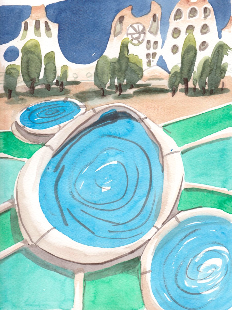
After finishing six paintings and two sketches I figured it was time to turn around and go home, I was fairly pleased with the results but there was one nagging idea, which was getting on top of the station, around the Olympic stadium  park. Just off the sidewalk, a pathway lead to a series of staircases, embankments, and park areas meant for the large crowds that visit for tourism and sports. I could easily haul my bike up to the top platform, and see down on the Pie IX station.

With very little water left, I captured the curving roof line which is the same one you see in the first painting. What looks like pool water, is actually bright green paint that they used to cover the roof. A concrete enclosure seen in the foreground held grass and white clover flowers. There were even some rolling blue mountains in the distance, similar to what I painted in Sutton. Maybe they were the same mountains since I am looking south east towards Sutton. 6 x 7.5" cold press, watercolour, July 2020

Finally I headed home, but got tempted into one more painting at Park La Fontaine, where I used some lake water to make a painting of the disused fountain and seagulls.

Joliette Station, Green Line Metro, Mercier–Hochelaga-Maisonneuve

As I approach the end of the line, literally not metaphorically, the locations are getting less cramped than the stations in the downtown core. Joliette station is located along Hochelaga street, about 5 minutes from Olympic stadium park. There was nothing too remarkable about the station other than the muted yellow (ochre) bricks and the concrete overhangs. As I painted this, a large SUV, followed by a service truck, completely blocked the view of the entrance. In the last few stations I edited out the port-o-lets, but here it played a nice contrast with the blue and yellow. I did a drawing before this one, which was a good thing since the vehicles blocked the scene for most of the time!
8 x 10" cold press, watercolour, July 2020

The next  scene was the other entrance across Hocelaga street which had a very similar design, but with a large decorative structure with grey and yellow paneling on top. The structure actually had 3 tiers but I only included 2 because I had trouble with the perspective and proportions on this painting. The building to the left is a fire station. I managed to get 2 garbage cans on the sidewalk, they are an interesting burnt sienna colour. To get the yellow brick I used vanadium yellow, a touch of black, and some yellow ochre. The gentle shadow on the yellow brick was just a touch more black, then blended in while the brick colour was still wet. 8 x 10" cold press, watercolour, July 2020

With an overcast day like this, it is harder to make paintings that rely on detailed architectural drawings; without the sun there are few shadows to describe the shapes and distract the viewer. So for the third painting I did a close cropped view of some crab apple trees (?) against that great yellow brick wall, with a bus tucked into the background. I really enjoyed doing this one, although I was sitting on my little camping chair jammed in between two bike racks to get the angle. As usual the bus left and I had to do it by memory until the next one arrived. The buses are not all exactly the same though. 6 x 7.5" cold press, watercolour, July 2020

Here is the drawing, it was the first thing I did on location...I got there quite early after leaving the house around quarter to 6 in the morning, so the drawing was like trying to wake up the artist. 8 x 11" sketchbook, pencil, July 2020

Wednesday, July 22, 2020

Palette Cleanser #18

Looking over the blog I must be over 150 paintings since January, after slowing down in 2017 to maybe 50 paintings a year this is a big increase. When 2020 came along I knew that I wanted to ramp up, in fact, I had a terrible cold from October to December 2019 that knocked me down a peg, so 2020 started out as a clean slate. Each decade I have tried to reset my art mentality a little, and this year the plan was to plan... as in, plan out some series and get my art into a more palatable format (pun intended). Then COVID-19 came along and turned everyone's life upside down, and gave us more spare time! Being under quasi house arrest made people including me stir crazy. The interesting thing is that I may stick with some of these habits, now that I know how to get up at 5am and be on location, its something I can do before work. We will see. Today I did 2 more Green Line Stations, which means I have only 6 left to reach the full 27 stations. This palette cleanser was meant to be an astrocyte (a type of brain cell) and a blood vessel, with antibodies attacking it. It could be a COVID-19 vaccine too, neutralizing the virus.

Night and Day, London Ontario

Nighttime painting is tough, Van Gogh made some epic nighttime paintings like his Café Terrace at Night, done mostly on location in Arles France. I made these paintings when I lived in Bayfield Hall in London Ontario, I would have been in the midst of the PhD back then, and doing a lot of paintings close to home. There was an artificial light here which allowed me to see the basketball hoop at night. It is interesting to see the value contrast, the backboard is much lighter during the night relative to he sky compared to the day painting. I might try some more night painting again but it is a challenge to find the right lighting, not to mention to stay safe!
5 x 7" cold press, watercolour, 2003?