Friday, December 31, 2021

Rainbow Tie, Year End Tally


This painting has a kind of festive feel to it, perfect for when you have to sit at home on new year's eve due to quarantine restrictions. At least I caught up on my catalogue of paintings. Each piece of paper I paint on gets a number, and in some cases I painted on the back of the painting, so the number has an 'a' and 'b'. For example, this painting is on the back of the World Inspired Landscapes: Cambodia painting, which is numbered 2963a.

Rainbow Tie, 9 x 12" watercolour paper, watercolour, December 2021 (No. 2963b) 

The final tally for 2021 was 567 paintings! Of course most of those were small 5 x 7 inches, I only did a few large paintings this year such as Saturation Costs. It is more than last year, even though I blogged more last year. This year I was aiming for about one blog a day, so about 30 per month. There was a time when I only painted and blogged occasionally, now since the pandemic it is a regular thing with me. Here is a chart with the number of paintings done from 2015 to 2021.


Sand in Sand, Happy New Year!


A play on the phrase 'hand in hand' this painting shows a pair of abstract hands in solidarity. The surroundings appear to be an arid desert with a few yurts. I used the Van Gogh paint set to do this painting, they are very bright and intense. 

As the year wound down I reflected on the year's paintings. Next year I would like to continue the landscape painting on locations, and work on the World Inspired Landscape series. I will probably revisit some of the metro stations that were under construction or where the paintings left a little something to be desired. Hopefully we can all travel a bit more freely next year, it would be good to visit some friends and family. Who knows, maybe I will g to Paris, they have over 300 metro stations there. I hope you all enjoyed the blog this year. It certainly helped me to feel more connected and to consolidate the new knowledge. I will keep it up next year, which literally starts tomorrow. Happy new year!

Sand in Sand, 9 x 12" watercolour paper, watercolour, December  2021 (No. 2964)

World Inspired Landscapes: Canada!

The World Inspired Landscapes series has been almost entirely based on research and observations from the internet, with the exceptions of Barbados and Brazil which I had visited before. Doing a painting of Canada was funny because I practically do one every day! To set the challenge I decided to focus on Saskatchewan, a province which I have never visited before. With google maps I looked north, really north, to the famous Athabaska Sand Dunes provincial park, next to lake Athabaska and near the border of the Northwest Territories. At first glance you may think that this painting is of Egypt or somewhere else with a desert, then you notice pine trees and a cold looking environment. The location is approximately in the center of Canada, so it represents a good variety of familiar landscape elements.  

World Inspired Landscapes: Canada!,  watercolour 8 x 10" rough press, December 2021 (No. 2960b)


This was version 1, I used more yellow ochre and emphasized the sand dunes. The colour register and style just didn't seem rugged and Canadian enough, which I fixed in the final version. To paint the sand dunes correctly, I made many sketches of sand dunes from pictures of real deserts. There are still a lot of countries starting with the letter C.

World Inspired Landscapes: Canada, version 1,  watercolour 8 x 10" rough press, December 2021 (No. 2960a)

Thursday, December 30, 2021

Winter Sundown on the St. Lawrence

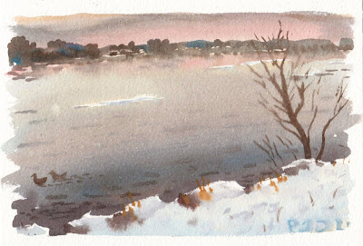
This scene is of the St. Lawrence with Kahnawake on the opposite shore. The sky was a powerful grey with peach pastels coming through. The white snow contrasted nicely against the shimmering, almost metallic colours of the river. A few bergs were drifting silently, traveling from right to left. There was a large tree tilting over on a diagonal, I painted it a few time before, but decided to leave it out when I saw how beautiful this painting was just with the river and snow. To complete the story, I just added a few brushstrokes on the left of the scene to suggest a tree, and to anchor the composition. 

St. Lawrence River, a Few Bergs, watercolour 5 x 7" cold press, December 2021 (No. 2954b)


As the sun descended the sky became a salmon-grey blend, with hints of blue. The water created a sumptuous reflection. A few chunks of snowy-white ice floated past. Just one sapling cut the horizontal, barely touching the sky. To capture the neutral pastels I relied on yellow ochre (PY43), with blends of iso blue (PB60) and burnt ochre (PR102). Some pyrol orange (PO73) and benzi yellow (PY154) provided some high chroma punch. A pair of mallard ducks floated by on the current, I wondered where they were headed to.

St. Lawrence River, Snowy Sundown (with a pair of ducks) watercolour 5 x 7" cold press, December 2021 (No. 2956)

Palette Parts


After a big year of painting I have been thinking about colour mixing and what I learned. In a previous blog I wrote about my old methods that I used for over twenty years of painting. The pandemic years have really given me time to think and work on the art hobby, one of the few silver linings in the whole thing, and I feel like my understanding of colour mixing has improved a lot. The website Handprint.com was also a big help in deciphering the mysteries of colour vision, theory, and watercolour paint attributes. In this palette cleanser the main goal was to clean my palette which was a salty, muddy mess after doing a bunch of location paintings recently. Perhaps soon I can write an update to my thoughts on colour mixing, because I don't want to keep any secrets.

Palette Parts, 9 x 12" watercolour paper, watercolour, December  2021 (No. 2893b)


Wednesday, December 29, 2021

Frozen Canal Sunset


Winter time brings cold temperatures, snow, and very subtle colour variations. Pastel tones make up the majority of this painting. The cold overcast sky was producing blue shades on the snow while the setting sun produced yellow-orange shades. The sun itself was casting a reflection on the snow, akin to what you may see when the sun sets over a lake. It is a detail I never appreciated before, the snow reflecting the setting sun.

Frozen Canal Footbridge, watercolour 5 x 7" cold press, December 2021 (No. 2953b)


The capture the complex and subtle effects of the sunset on the frozen canal, I had to apply an under painting and let it dry. There was a stiff cold wind to help it dry, but I needed some time to spare. While waiting, I started another painting standing in the exact same spot but looking just off to my right, which is looking north west towards NDG. In between is the rail depot yard, it had many colourful train cars stacked up. After applying the under painting to this one, I worked on the other painting, and did two rounds like that to allow the effects to dry. This painting strategy allowed for more details to be applied on location, like the tree branches, and even my initials hiding on one of the train cars.

Train Cars Sunset, watercolour 5 x 7" cold press, December 2021 (No. 2955b)

World Inspired Landscapes: Cameroon


Let's talk about the elephant in the room, or how about that giraffe? Cameroon is one of the largest and wealthiest countries in Africa, it has a varied landscape and lots of natural resources. It was formed by the colonial powers after many successive changes. Portugal, Germany, France and England all had an influence on forming what is now Cameroon. France in particular remained the ruling power until Cameroon's relative independence in the mid 20th century. The country remains divided along cultural lines, with English in the north and French in the south. One neat thing about Cameroon is that they have a lot of animals that live in protected areas. In the painting, you can obviously see the elephant hiding in the bushes. Just kidding. The jagged mountains in the background are called volcanic plugs, they are very prominent in the country, they form when the lava from a volcano cools off and then the surrounding portion erodes, just leaving the solidified magma. 

From reading a book and looking through the internet including wikipedia, google maps, and images, I noticed that Cameroon has a lot of iron-oxide earth colours like burnt sienna and umbers. The greenery was olive tones, with turquoise mountains in the distance. It all seemed interesting but I have painted many scenes of trees and mountains. To make the painting stand out, no pun intended, the actual landscape is seen through the legs of a giraffe. My initial idea was to show the rear-end of the giraffe, which was a composition that Hiroshige once used with a horse. The side view I chose was majestic and played well against the rugged landscape of Cameroon. 

World Inspired Landscapes: Cameroon, watercolour 8 x 10" cold press, December 2021 (No. 2959)

Tuesday, December 28, 2021

Local Parks, Winter Bike

With winter upon us the roads are covered in piles of snow and ice. It is hard on the bike for sure, so I found an old, disused bike and fixed it up. It is a medium-sized mountain bike with knobby tires and a low center of gravity. With a few days of work I got it running and could attach the bike pack to the back of it. To test out the new rig I made a tour of three different parks in NDG. In this scene, you may notice the bike trail I made in the snow as I rode under the lattice.
 

Loyola Park, Winter Bike, watercolour 5 x 7" cold press, December 2021 (No. 2953a)


I rode south to Trenholme park on Sherbrooke street and painted this scene. For simplicity I edited out the play park that was in front of the trees, and focused more on the sky, the roof line and the lively trees. This is how the park may have looked like when they first started it, I mean, not full of fences and structures. A few squirrels watched me paint, they probably just wanted peanuts though.

Trenholme Park, Winter Bike, watercolour 5 x 7" cold press, December 2021 (No. 2954a)


With waning sunlight I made it up to Confederation park. The sun was just dipping below the houses in the background. In the foreground is the old arena and some of the landscaped trees and shrubs found throughout the park. Luckily I could get the under-painting to dry which allowed for that cold blue backdrop. The sunset was a yellow-orange I made with isoindo yellow (PY110) and pyrol orange (PO73). And the bike? It worked great!

Confederation Park, Winter Bike, watercolour 5 x 7" cold press, December 2021 (No. 2955a)

Monday, December 27, 2021

Memories of World Travels


With many flights grounded and vacation dreams dashed, I decided to post some memories of my past world travels. This painting was one of the first ones I did in Amsterdam when Cilei and I visited back in 2018. There was a strong odor of cannabis. Later on we would learn that the locals in fact do not smoke much cannabis, but the tourists do. They seemed to be a rather conservative society. The Centraal station is a huge, sprawling building that is ornately decorated. I hardly did it justice in this small painting.

Centraal Station Amsterdam, watercolour 5.5 x 7.5" cold press, 2018 (No. 1302)


Afterwards I headed up to Glasgow solo to visit a friend at the University. This painting shows the famous Clyde river that cuts through Glasgow with one of the many bridges that cross it. It was very windy that day I remember my palette blowing away once. I also got to use the new colours that I bought a local art store, in this painting I used green gold (PY129) for the greenery.

Clyde River, Steel Bridge, Glasgow, watercolour 5.5 x 7.5" cold press, 2018 (No. 1319)


I went to a conference in Japan and this was one of many paintings I did there on my spare time. This statue of a horse was appealing but there was no way I could manage the detail of its rider. I settled for this composition which gives you the idea. I like the variations of grey, and how the block has one yellow side and one pale grey side. 

Statue hooves, Japan, watercolour 5 x 8" cold press, 2006 (No. 1203-1)


On yet another conference I took some time to paint the water around Denmark's Copenhagen. It was a misty blue filled with turquoise and emerald. I made great use of cerulean blue (PB35) and phthalo green (PG7). The rolling hills fade into the distance. 

Emerald Waters, Copenhagen, Denmark, watercolour 7.5 x 11" cold press, 2010 (No. 1215)


Sunday, December 26, 2021

Trip Down Memory Lane to Barabados

Since Cilei's trip to the Caribbean got cancelled I thought I would take a trip down memory lane to Barbados. When the plane got close to the island it tilted to the left and I got a great view of this little speck of green emerging from the sea. I captured that memory in a world inspired landscape. This painting was the first one I made in Barbados, the sun was just about down but I was determined to make a painting. The place I was staying was right on Rockley beach also known as Accra beach.

Barbados, Rockley Beach, Seapost and Sunset, watercolour 5 x 7" cold press, 2001 (No. 1170)

Barbados has a law that the beaches have to be accessible to all people, even if a resort is in the way. So I was able to walk right through this resort to get down on the beach. I used a seat and umbrella that was unoccupied. There was a structure and a staircase on the cliff side. The water was a brilliant turquoise that I captured with cerulean blue (PB35) and phthalo green (PG7), and the sand was a light coral colour. 

 Barbados, St. Philip, Crane Beach, watercolour 5 x 7" cold press, 2001 (No. 1166)


 This was one of the many Caribbean views along the way. The trees were fantastic, and all the colours were so intense. I wanted every painting to have the sea in it!

Barbados, Christchurch, Hastings, Sea, Tree, Lawn, watercolour 5 x 8" cold press, 2001 (No. 1171)


 The sunsets were spectacular. Almost every night there was a post card-worthy display of colour. The clouds seemed to radiate all the colours of the rainbow. A near perfect mirror-image was produced on the sea, interrupted only by some gentle waves. There were a lot of Barbados paintings, a few of them I put in a recent blog. I would love to go back one day and see what I can paint with 20 extra years of experience.

Barbados, Rockley Beach, watercolour 5 x 7" cold press, 2001 (No. 1164)


Trip Down Memory Lane to Bolton

Since the Christmas trip got cancelled I decided to take a trip down memory lane to Bolton. The original plan was to make a bunch of new winter paintings in Bolton. This painting was done at the beginning of summer, probably just before I left for Spain in 1998. The house should look familiar to some people, it is my parent's house! It was so long ago the tree was small then, but now it is cut down entirely. Otherwise it has not changed much. At least they didn't paint the window frames black!

Bolton Parent's House, watercolour 5 x 7" cold press, May 1998 (No.0140)

This is one of the historical houses on the way downtown. There is a trail running high above the highway which gave me this interesting perspective. Looking back on this painting, it was amazing that I could get the grass colour and the brick colours to look so good. I didn't know much about colour mixing, but I had discovered the power of burnt sienna (PR101). With a green paint and some yellow it makes a great dry-lawn appearance.

House on Queen Street, watercolour 5 x 7", 1997, cold press (No. 0138)

This was among the first paintings I ever did on location. I was intrigued by the juxtaposition of a house-sales structure and the old barn int he background. It was a challenging painting, lots of detail and interesting shadows. The purple colour is neat, I must have used french ultramarine (PB29) and alizarin crimson (PR83), two paints I don't use anymore. There is a paint called dioxazine violet (PV23) that I have now, it is that exact shade of purple.

 Bolton Show Room and Barn, watercolour 5 x 7" cold press, 1996, (No. 0135)


And the other shoe dropped! This was one of the barns along Columbia way that burned down. You can find two other paintings I made of the barn before and immediately after. This painting shows heaps of rubble, with the abandoned farm house in the background. None of it is there anymore, but thankfully they didn't put more house up here so there is still a bit of a view. the shadowing is really interesting on the farmhouse, I made the light grey with three paints, cerulean blue (PB35), rose madder genuine (PR NR), along with aureolin yellow (PY40), they produced a range of subtle grey mixes for concrete and shadows. I summarized my old palette strategy in a previous blog.

Bolton No More Barn, watercolour 5 x 7" cold press, 1997, (No. 0137)

Friday, December 24, 2021

World Inspired Landscapes: Cambodia


Cambodia is located in the Indochinese peninsula, neighboring Thailand and Vietnam. After the Vietnam war, Cambodia was plunged into chaos and bloodshed as their ruling regime caused the deaths of millions of the people. The regime was deposed and the United Nations helped them regain a democracy of sorts which remains to this day under a one party rule. The landscape of Cambodia was altered by these political events, over 90% of the forests have been cut down for timber and to support sustenance farming for the people. Mostly flatland with one big lake, Cambodia specializes in rice farming and sugar palms. They also experience extreme monsoon rainy seasons and are very vulnerable to climate change. 

The painting shows a sudden rainstorm over a rice field. The idea was inspired by Hiroshige's prints that sometimes showed rainy scenes with the local people running for cover. He also used the diagonal line technique to represent rain drops from the dark sky.

World Inspired Landscapes: Cambodia, watercolour, 9 x 12" watercolour paper, December  2021


This was a preliminary painting on a smaller size, it had most of the elements but I wanted the palm trees to be more prominent, and needed some more space for the people and rain effects. The charred black tree remnants are meant to represent the forest that was one there, and they are also meant to be apparition like.

World Inspired Landscapes: Cambodia version 1, watercolour 5 x 7" cold press, December 2021 (No. 2937b)


New Nature Path


After discovering a secret spot in NDG to make paintings, the city promptly razed it to build something. Thankfully that something was a restored nature trail that goes all the way along the rail line to the Decarie and St. Jacques bridge near the hospital. Today I was heading down to the canal on foot when I saw that the trail was open. The hillside now has hundreds of trees planted up on down the path, and other natural grasses and saplings. 

Secret no More (New Path) watercolour 5 x 7" cold press, December 2021 (No. 2940)


About halfway down the path I made this painting of the wooded hillside, snaking path, and a parked train to the right side. The path was obviously well used since it was textured with footprints and cross-country ski tracks. The winter sun was strong, it gave everything a warm yellow glow.

New Nature Path, watercolour 5 x 7" cold press, December 2021 (No. 2941)


At both ends of the path there is a new structure with patio stones and benches. The structure is a crazy triangle of steel on a slanting angle, you can just see a corner of it in this painting. The smoke in the distance looked like clouds. Somehow the whole painting looks like it is tilting to the left which I didn't notice until now. At least the colour on the benches is spot on, it is a nice raw sienna.

Benches on New Path, watercolour 5 x 7" cold press, December 2021 (No. 2939b)

Thursday, December 23, 2021

Snowy Panorama with Squirrel


 Today was a cold one, -10 ℃ and double that with the wind chill. But it wasn't going to stop the squirrels from foraging, the ones near our condo came by and ate peanuts and drank some warm water we left out for them. At the Benny Park, there were a dozen squirrels running about, looking for food. When I stopped to paint, one of them walked right up and looked at me expectantly. Then it wandered off, and I noticed that it ate a little bit of snow. Cilei had learned that they like to drink water, and it makes sense, where do they get water in the winter? That's why we leave out the warm water in the morning. If you look carefully you can see one of the squirrels jumping though the snow. 

The pine trees has two main colours, one was a warm orange-olive green, the second a cooler dark green. To make the first I mixed isoindo yellow (PY110) and perylene green (PBk31), to make the second I used just the perylene green. On top of that, I added the dark highlights which are perylene green, perylene maroon (PR179) and a touch of carbon black (PBk6). The snow shadows were indo blue (PB60) with cobalt blue (PB28) and magenta (PR122).  If you look into the distant trees you see that the cooler green prevails. Where the sun strikes the tree it has the orange tint. 

I was feeling like doing a horizontal format which is partly why I selected this panorama scene. I composed the bench off to the bottom right so it becomes part of the panorama without being a focal point. Temperature-wise it was mostly good, I have new woolies underneath, the moose mitts, baffin boots, and a new parka jacket that is coloured with smoked paprika! Actually it looks like burnt sienna to my eye, which is a great colour for a jacket.

Snowy Panorama with Squirrel, watercolour 5 x 7" cold press, December 2021 (No. 2949b)

Wednesday, December 22, 2021

Snowy Roof, William Hurst Park


 Out on another bread run, I made a quick stop at William Hurst park to paint this scene of the park structure with a snowy roof. The sky was done first, followed by the ground in the front. Then I worked on the face of the building, and finally the trees. When painting in winter it is wise to choose a simple scene with separate elements. The snowy roof, which is mostly the paper showing through, acted as a spacer between the top and bottom. If the scene is too complex then the paint will run together since it stays moist the whole time you are painting. Actual snow was falling onto the painting which gave an interesting texture. Tomorrow is said to be cold but sunny, I will try to make it out for some more painting since work is over now for a week or so.

Snowy Roof, William Hurst Park, watercolour 5 x 7" cold press, December 2021 (No. 2941b)

Monday, December 20, 2021

Genomics Building

Sadly today we received news of the passing of one of the senior professors at the University. One of his legacies was that of a founding member of the Genomics group which eventually raised enough capital to build the Genomics extension at Loyola campus. Justin Powlowski was also the faculty administrator at the time  who negotiated my contract when I was hired ten years ago. Today when I left the building I saw this scene of the Genomics building, which is just visible on the right edge of the painting, and the most incredible maroon sky. It seemed like a good way to remember the moment. The building in the background is actually Loyola high school. To capture the effect of the lighting on the Genomics building I made sure that it was the only part of the painting that was white. 

This is one of the first night paintings where I felt like I knew what I was doing. For example, the sky was a blend of pyrol orange (PO73) with indo blue (PB60), while the dark brick was burnt ochre (PR102) with carbon black (PBk6). Controlling the delicate greys, oranges and shades of blue in the snow was also tricky especially considering that I was wearing the moose mitts and only used one brush!

Genomics Building, watercolour 5 x 7" cold press, December 2021 (No. 2942b)

Sunday, December 19, 2021

World Inspired Landscapes: Cabo Verde

Cabo Verde is the official name of the country, it used to be referred to as Cape Verde until they decided to go with the Portuguese spelling. Portuguese is the official language there owing to its history as a territory of Portugal dating back to the colonial times. It was mainly used as a shipping stop-over in the mid Atlantic ocean, slave ships would stop there to resupply. With those dark days in the past, Cabo Verde turned to fishing for its economic growth, and an increasing reliance on tourism. The country is a collection of volcanic islands. One of the main ones is supposed to resemble the face of a person, looking up into the sky. In the painting, I tried to capture the geological cycle of land formation, with a prominent volcano spewing lava onto the beach, juxtaposed against the turquoise and emerald-coloured ocean. An elliptical horizon was composed in the background to convey the vastness and sense isolation of this far-off land.

World Inspired Landscapes: Cabo Verde, watercolour 8 x 10" cold press, December 2021 (No. 2958b)

Heavy Snowfall


Today we had the first heavy snowfall of the season, about 20 cm! The city had scraped a lot of it off the sidewalk, but as you can see the plow had to weave around the telephone poles creating a snaking path in front of the grocery store. Most of the parked cars were still covered in snow. Painting in winter is tough due to the temperature and the bulky clothes especially the moose-gauntlets that I Wear. To simplify matters, I bring no more than three paint brushes, sometimes just one, and I keep the paintings small. One odd problem is that the thumb-hole in my palette is not big enough to fit my thumb when I am wearing the the giant size gloves.

Snowy Sidewalk Somerled Av, watercolour 5 x 7" cold press, December 2021 (No. 2951b)


I have painted many pictures at the Sports complex, they did a wonderful job with the open spaces and landscaping. Usually I save this location for days like today when I don't feel like going much further. It will take some adjusting, both mentally and with the paints, to get into the spirit of winter painting. There were moments when I really enjoyed it last winter. I will never forget painting the ice floes on the St. Lawrence River.

Heavy Snow Sports Complex, watercolour 5 x 7" cold press, December 2021 (No. 2952b)

Friday, December 17, 2021

Baseball Diamond, William-Hurst Park


The baseball diamond was covered in leaves left over from fall. The snow has melted leaving everything in an earthy state. I made this painting while on the way back from picking up some bread, its the third or fourth time now I made a painting of William-Hurst Park due to its proximity to la Meunerie Urbane, our local artisanal bakery. This park will always be associated with bread! It was unusually warm today, so no salt was needed in the water.

Baseball Diamond, William-Hurst Park, watercolour 5 x 7" cold press, December 2021 (No. 2952a)

Wednesday, December 15, 2021

Overcast Overpass

On the way back from the final exam downtown, I stopped at the busy corner of Decarie and Maisonneuve Boulevards to make this painting of an overpass. It dips down under the bridge and then heads to Upper Lachine road. I was impressed by the sun struggling to get through the heavy overcast sky. The bridge also had interesting iron oxide earth colours. It was so cold today the paint was freezing up a little despite the salt in the water. The billboard said something else but as usual I replaced it with my initials, which are a lot easier to paint than all the complex text and pictures that tend to be on billboards.

Overcast Overpass, watercolour 5 x 7" cold press, December 2021 (No. 2951a)

Tuesday, December 14, 2021

Painting Year in Review: 2021

Pale Green Glass, Montmorency Station, Orange Line

After an artful and eventful 2020, this year of 2021 was just as packed with artistic endeavors. I continued my quest to paint on location at all 68 stations of the Montreal metro. I completed the series which you can find summarized on this blog page. The painting above was done at Montmorency station in Laval. It has a dynamic composition, intriguing, pale-green glass special effect, and my favorite motif, the blue garbage can!

Car Headlights in Rain Storm

Nothing was going to stop me from painting on locations this year, not a pandemic, not snow, not rain. This surprise torrential downpour almost thwarted me, but I found a ledge to stand under and somehow got most of this painting completed on location. Our friend David from Brazil made an animation with this painting, he made the sky flash like lightning and it was awesome. This painting gets the most unlikely to succeed award!


Forest Hill Overpass, near Mount Royal

As I thought about my painting year in review, this one kept coming to mind. It was an unassuming scene of a highway overpass near Mount Royal that I painted in deep snow. The technical difficulty was high, and the results were wonderful. The delicate lilac shadows curving across the embankment, the little splash of cyan blue in the sky, the delicate wisp of snow blowing across the surface... the painting recreated a tangible atmosphere. The overpass you see was leveled and reconstructed, so this is a historical view now. If you click on that link, you will also see what I think is the most entertaining blog I wrote all year, the visit to M2!

Sugar Shack, Cap Saint-Jacques Nature Park

The Sugar Shack painting, done in Cap St. Jacques in the west island was definitely the fan favorite and perhaps was the best painting of the year. Several people on facebook wanted to buy it, and it had the highest number of blog views. Now its in the collection of two of my biggest fans, Mom and Dad! I also took a bike ride out to the east island as part of my end-to-end tour of Montreal, and made a trip to Sutton once again for some more nature.

World Inspired Landscapes: Brazil (study)

This year I continued the World Inspired Landscapes series with countries starting with the letter B. You might be able to guess what country this one depicts! If not, the answer is here. This painting also exemplifies the use of earth colours, which I greatly expanded of late. In most of the paintings you can easily detect a wide range of warm yellows, oranges, browns and rusty reds. There is a blog page summarizing all of the World Inspired Landscapes to date.


Saturation Costs

If I had to pick an abstract of the year it has to be Saturation Costs. Creating this pandemic-inspired painting was an arduous process that I detailed in this blog. After decades of using the doodleism style this is perhaps the most accomplished of the lot. It is a dramatic, humorous, and creative portrayal of pandemic related themes. 


Living Wall

I did many free-form abstracts under the premise of the palette cleanser... a good example was the living wall which we literally hung on the wall for some time. 

There are still two weeks left in the year, and I plan to make some paintings in Ontario, so maybe there will be an update to my year in review.

Ho Hum bird

And why not end off with the Ho Hum bird? I am glad everyone got some enjoyment and inspiration from my blog. See you next year!

Thoughts on The 68 Stations of the Montreal Metro Series


Now I can say that I painted all 68 Stations of the Montreal Metro System. There are hundreds of paintings and some sketches all done on location through the summer, winter, fall and spring seasons. It was an epic journey on bike, mostly on weekends and early mornings that took me to all parts of the city of Montreal, its surrounding Burroughs, and the nearby cities of Longueuil and Laval. Ironically I did most of the project by bicycle, only once do I remember actually taking the metro or bus to any of the stations. The original motivation was to emulate Hiroshige's famous print series 'The fifty three stations of the Tokaido' which depicted stops along the old road between Tokyo and Kyoto. My project was fueled by the pandemic and a need to get out of the apartment. For most of the time there were very few people at the stations but it picked up this year. I wore masks most of the time as a precaution. 

What now for the series, is it done? For now perhaps. There are a few stations that were under construction making it impossible to see the main structure. A few of the construction paintings were quite good and I would leave them in the series as a statement. But I may return to a few stations where I feel that more artwork could be done. I may also recompose the works onto a standard 8 x 10" format and see about making a book or prints on demand. It becomes a business venture at that point. But then again, so was Hiroshige's original series. He would have been paid a commission to make the drawings and the publisher would turn his drawings into wood-block prints for sale on the Tokaido road. His series was essentially a collection of postcards meant to generate profit. My series was a homage to the Montreal metro system, love it or hate it, ugly or beautiful. I leave it to the viewers now.

Another consideration is that Montreal has apparently approved an extension to the blue line eastward, the proposed station are:

Pie-IX (future), Blue Line

Viau (future), Blue Line

Lacordaire (future), Blue Line

Langelier (future), Blue Line 

Anjou (future), Blue Line

I will take a break from metro stations and think about my next move. Maybe the metro station in Paris, how many stops are there?  (over 300!)


68 Stations  9 x 12" watercolour paper, watercolour, December 2021 (No. 2961b)


Sunday, December 12, 2021

Côte des Neiges Station, Blue Line Metro, FIN!


At last, the final stop on my tour of the 68 Stations of the Montreal Metro! Of course, Snowdon is the terminus but I already made a painting there early in March. Having completed two previous stations today, there was not much sun left, maybe 15 minutes. I quickly worked up the building colours and details, like the fleeting images of passer-byes. It was near to rush hour so there was a lot of foot and car traffic, but I had a grassy knoll to stand on, with my bike to hold the water. The finishing touches were the reflective car windows which showed some trees that were behind me, and the climbing vine that cut across the face of the metro entrance. This seems to be the only entrance to the station, unless I was mistaken. With that done, I packed up and headed home, feeling a sense of accomplishment after a two year journey that took me all over Montreal. It began at Angrignon station back in July 7 of 2020. If you haven't seen it already, I have page on my blog dedicated to these paintings, with links to the blogs. The page is called 68 Stations of the Montreal Metro System. Perhaps I can turn it into a book one day!

Côte des Neiges Station, Blue  Line, Rush Hour, watercolour 5 x 7" cold press, December 2021 (No. 2950)

Université-de-Montréal Station, Blue Line Metro


Last year I stopped and made a painting of west entrance of Université-de-Montréal Station with a lady walking her dog. There are several more entrances to the station at the foot of Mount Royal, heading up the University campus. It is a delightful little wooded area with good sight lines, sun, and steep rocky slopes. In this painting, I caught a view of some University buildings with their striking raw-sienna bricks. Without raw-sienna on my palette I used a combination of yellow ochre (PY43) and burnt ochre (PR102). Yellow ochre was a colour I only used sparingly, but now in the amber tinted light of the winter I am finding it incredibly useful. The tree tops for example, were done with little flecks of yellow ochre. This painting reminds me of some of the old paintings I made of the UWO campus.

Université-de-Montréal Station, Blue Line, Bottom View, watercolour 5 x 7" cold press, December 2021 (No. 2948)


Venturing up the hill I found a vantage point standing behind a chest-height wall at the top of the main entrance you see in the first painting. Looking down, there was a neat view of the walking paths which looked like tree branches to me. A little patch of snow was surviving in the shadows. With the sun at a low angle, long shadows cast across the olive-green grass.

Université-de-Montréal Station, Blue Line Metro, Top View, watercolour 5 x 7" cold press, December 2021 (No. 2949a)