Thursday, November 30, 2023

Camera Watchers

Looking through old boxes and items I found some old digital camera and thought about the brief history of cameras during my lifetime. They went from being elaborate devices only to be used by knowledgeable people, to being point and shoot albeit still using film. Then around 20+ years ago the first fully digital cameras came out and they took fairly lousy pictures until the technology caught up with film cameras. All seemed to be heading in the direction of smaller and smaller digital cameras, then along came smart phones which also had lousy cameras in the beginning but are now quite good. Part of the development in smart phone cameras is the lenses and hardware, but the software has grown to be more powerful. Cell phone cameras can stitch images together, adjust focus and depth across the field, and make all manner of adjustments. In the painting there is an older film or digital camera at the bottom right, a more modern digital camera in the middle, and a smart phone camera on the top right. Meanwhile the camera watchers look on. 

Camera Watchers, watercolour 9 x 12" watercolour paper November 2023 (No. #3198b)

Monday, November 27, 2023

Today's Zomboids

And now for something completely different. Ahem. Today's zomboids, they are a little like zombies, a little like aliens, a little lost in the neon city with a flying saucer in tow. The word is from a video game called Project Zomboid, where you get to control a hapless survivor in a zombie apocalypse. I played it for the first time and a zombie crashed through the window, so I pushed it over and stomped its head with a satisfying squish. First time taking out a zombie and not a scratch. Unlike other zombie games where you shoot a lot, this one relies on stealth and survival. The painting had little with the game, I was mostly cleaning the palette off after the weekend painting. A mix of bright and earthy colours, with some good light/dark contrasts and a funny concept can go a long way.

Today's Zomboids, watercolour 9 x 12" watercolour paper November 2023

Sunday, November 26, 2023

Jacques Cartier Bridge view De Lorimiere

With cool breezy weather today I was able to get out to the bridge and make this painting looking south on De Lorimiere. The skateboard park, unseen to my right, was making a terrible clatter of skateboarders, and there was a lot of traffic on my left, then I realized I was not wearing my earplugs which explained the noise. To tackle this painting I learned from past mistakes and completed the main structure of the bridge first, followed by the traffic, then the sky which was painted around the bridge. Of course there were pylons all up and down the street, due to the renovations they did to the park area under the bridge. The apartment on the left is under construction, and if you could see past it, there are half a dozen other massive condos under construction. Painting rows of cars is getting easier, I make a series of overlapping marshmallow shapes then fill in the green windshield, black under carriage and wheels, and leave the headlight area white until the end. Red for taillights, yellow for headlights. The bridge green was perylene green (PBk31) with phthalo green (PG7) applied a shade darker than it is after drying. Anticipating the drying shift is a hard thing to learn, it applies mostly to dark paints like PBk31, PB60 and PBk6... they dry a good shade lighter than they look when wet. 

Jacques Cartier Bridge, watercolour 8 x 10" cold press, November 2023

Saturday, November 25, 2023

Last Leaves

Looking east along the main drag, Notre Dame, I got a good view of the trees lining the walkway and all the old leaves on the ground which were an earthy orange-yellow. Headlights from the cars pierced the gloom, and a few specks of blue from the sky could be seen through the trees. The painting was so moist that it never really dried, and the paint was getting absorbed into the paper. Painting in these conditions is always a challenge, but every now and then it works out and its worth the effort. I mostly did this scene since I was waiting for the under-painting to dry on the Cartier street painting. It was so windy, the Cartier painting almost blew away while it was sitting in my bike pack. I brought along the wooden drying racks, which sandwich the paper between cardboard panels with elastics. In this way, I can pack up the paintings and take off without smearing them. I got pretty cold doing the painting but warmed up quickly on the bike ride home. Feeling cold and its only hovering around zero, I will have to get used to it if I want to paint this winter.

Last Leaves, watercolour 8 x 10" cold press, November 2023 (No. 3042b)

End of Season Old Montreal

Its the end of the tourist season in Old Montreal, just a few intrepid people milling about the main Cartier Street where all the action happens. A lone busker was doing a street show before the sun went down, causing a circle of onlookers to gather. I stood under the trees on the walkway, looking up the street to make this painting. The first pass included all the tinted areas, shaded areas, and the blue sky. As it dried, I made another painting looking to the east from the exact same spot. Luckily it dried nicely and I could get in the details on the buildings, cobblestone, and the plants and people lining the street. The sun was just catching the tops of the monument and buildings. A cold wind was blowing down the street like it was a wind tunnel, which almost blew my bike over!

End of Season, watercolour 5 x 7" cold press, November 2023 (No. 3437b)

Thursday, November 23, 2023

Westhaven Apartments with Tree

On a lunch break I made a quick painting of some apartments in Westhaven , a small neighborhood south of the train tracks. I was standing in front of Snowdon bakery on Harley street looking south. Getting the angles right was key, and the arrangement of windows, doors and decks had a repeating pattern that I started to notice as the painting progressed. Its not the kind of scene you would think of for a watercolour painting, but the contrast between the sky, tree branches, windows and doors, and the tops of the cars made for an interesting composition. I was standing in the spot where the panhandler usually sits but he wasn't here today and nobody gave me any change either. Hey, help an artist out why don't you? The panhandler by the way, I give him a few coins every now and then, he once had a few paintings on the sidewalk that he was trying to sell. But he seemed to have abandonsed the effort or maybe the art market is a little soft. Anyways, I always enjoy painting in this neighborhood, at the end of the street is the field of grass where I have made dozens of paintings.

Westhaven Apartments with Tree, watercolour 5 x 7" cold press, November 2023 (No. 3434b)

Edward Mitchell Bannister, Sur le Seekonk replica and original


Edward Mitchell Bannister was born in New Brunswick in 1828, he was an accomplished artist who spent time in the US. As a black man, his art career faced many hurdles, for example one of his paintings won a prize but when the jury found out who he was they tried to renege. Perusing his artwork on the internet and wikipedia page, he did portrait work, and painted amazing landscapes in what might be called the pastoral style. In this style, rolling hillsides are dotted with trees, lakes, and rivers, with the occasional sheep or rural worker. Later in his career his work veered towards impressionism, which may well have been due to the time frame of his career overlapping the likes of Monet and Van Gogh. In the painting you see above, I replicated his watercolour from 1892 in order to understand the style, composition, and to get a feel for what it was like to paint over 100 years ago. The original watercolour you see below, he painted in 1892 as a preliminary sketch, probably in preparation for a larger work since he was known to produce sketches and colour studies before doing a large oil painting.

From reading  Handprint.com I knew that 19th century watercolour painters had to use very hard cakes of pigment that were difficult to extract colour from. I had a few of those from Stoneground paint a Canadian company, and they were indeed hard to activate and get pigment on the brush. As a result, you can see the  general pallor of colour in the original version, as compared to the brightness of my modern replica. In fact, I had to reign in the intensity of the colours to get down to a low saturation point. Bannister's painting used a lot of yellow ochre and viridian, and what appears to be raw sienna. The sky has a faint purplish tinge which could have been dilute cobalt blue but it is hard to tell. I have much more powerful greens in the phthalo category, but those were not on the art market until the mid 20th century. He used classical compositional geometry, the left side of the painting is divided into exact 1/3 segments (sky, mid ground, foreground), and the horizon line on the right is on the exact half way mark, as if measured by a ruler. I particularly liked the sun penetrating through the hazy overcast sky, which I embellished in a more colourful manner in the replica. I enjoyed learning about his style and hope that more black artists can get the credit that they probably deserved more of at the time, even if is retrospectively. If I could find any pastoral scenes in Montreal I would go paint them, but alas all I can find around here are sidewalks, cars, and condos!

Sur le Seekonk Replica, 8 x 10 hot press watercolour, November 2023 (No. 2687b)

The original : Sur le Seekonk, watercolour by Edward Mitchell Bannister, (1892)

Tuesday, November 21, 2023

Night Mechanics

On a whim I made this night painting of the Joe and Ralph auto shop on Somerled Avenue, seen from the Metro grocery store (formerly Steinbergs Grocer) looking West. From this angle you can see the front of the shop, and the windows where a customer and two employees were standing behind a counter, maybe it was Joe and Ralph? The gas pump is on the left, it has its own two lamps each with two bulbs. To compose this scene I adjusted the perspective to be on a one point perspective, even though I was standing on an angle. That means that in the painting, you feel like you are standing right in front of the building. It was a subtle adjustment, but a difficult one to make on the spot. Since I have pyrol orange (PO73) again, I could make that sensational dark blue sky by mixing it with indothrene blue (PB60). Both of those pigments are high chroma, and the resulting mix is an intense dark blue or dark purple if you add more of the orange. In the top left corner you can see how dark the mix was, and yet it still has a sharp, purple grape juice look to it. To make the stars in the sky I dragged the brush then filled in the areas to leave small white dots of paper showing through. There were no stars in the actual scene, but I wanted the sky to look like a Van Gogh painting! At something below zero, I had to use salt in the water, and wear my mitts with deerskin gauntlet on top, so believe it or not I managed this painting while wearing the equivalent of oven mitts. Its one of those skills that a winter-painter must learn. The name by the way, was a play on Nighthawks by Edward Hopper. 

Night Mechanics,  watercolour 5 x 7" cold press, November 2023 (No. 3408b)

Monday, November 20, 2023

Yellow Tree at Sunset

On my way back from another appointment I stopped to make a quick painting of this amazing sunset sky with a yellow tree in the foreground, and the old disused train tracks. The location is beside Lasalle Park in Lachine, it would be just to my left as I painted. Getting the sky right took several colour transitions and careful control of the moisture levels. Starting with the horizon, it was phthalo blue sapphire (PB15) with quin magenta (PR122), then adding more magenta and some orange (PO73), in the transition area I applied a faint, neutral green, cyan, then blue at the top. As it dried I worked on the bottom of the painting, the buildings and finished with the tree and other details like the phone poles and train track. The yellow wash collapsed a bit, everything was so moist, and the dark highlights in the tree blurred. In some ways it works better this way, the Neapolitan coloured sky stands out, which was what caught my attention in the first place. It was only 15 minutes and the sun was down, so I wrapped it up, put on the bike lights and headed home. 

Yellow Tree at Sunset, watercolour 5 x 7" cold press, November 2023 (No. 3397b)

Sunday, November 19, 2023

Finding Flowers

I spent time sifting through old notes and documents and found some neat ideas for paintings along the way. All of the doodles from this era were turned into large abstract paintings over the years. My strategy in the past was to combine as many doodles as possible into one painting but I always thought that certain drawing would make good stand alone works. The original doodle had the foot and hands design with the words 'help' 'French' scrawled at the top (help in French... I probably needed a lot of). In the painting, I added the googly-eyes, an embellished environment, and a little pink flower being picked by the left hand of the creature. The eyes are looking down at the flower. Thematically speaking, there is an analogy between picking beautiful flowers, and finding interesting drawings in a pile of papers. The rust colour of the creature was meant to make it look like an iron sculpture similar to the ones I painted on location recently. It is sized at 10 x 11" but I painted it within the boundaries of an 8 x 10" opening which is ideal for easy framing.

Finding Flowers, watercolour 10 x 11" cold press, November 2023 (No. 3661)


Here is the original doodle !

Saturday, November 18, 2023

Tree Shadows on Hill


Despite the cold, windy weather it was possible to do this painting without any salt in the water. The small hill runs parallel to the busy Cavendish street, it blocks a bit of the sound and gives a feeling of being in a forest. I like to walk around here sometimes and make paintings, since the nearest forest is either up on the south summit Mount Royal, the escarpment, or Park Angrignon in Lasalle. The trees were a variety of colours including dark yellow, sap green, and a rusty yellow-green. The trunks were done in dark purple (PV19 + PBk6) and some yellow (PY43) and red ochre (PR102) daubed in. I applied the tree shadows when the background grass was still moist, then layered on some textural brush strokes including my initials. In other news I've reorganized my recent paintings (2021-now) into a sturdy new box that fits better in the closet, and gone through some piles of old papers and notes. Cilei calls it my archive!

Tree Shadows on Hill, watercolour 5 x 7" cold press, November 2023 (No. 3585b)

Thursday, November 16, 2023

World Inspired Landscapes: Kenya


Kenya is a vast country in the north central part of Africa with low mountainous terrain, flat savanna, and wetlands in the south of the country. Millions of birds live in Kenya including the iconic pink flamingo that feasts on shrimp in the pink lakes. I got a large picture book from the library and was impressed with the rugged landscape and the colourful clothes that the locals wear. It appears that Kenya has a large tourist industry too, for people to visit and see the wildlife and landscape. The idea behind this painting was to capture some sense of the rugged landscape in the craggy, high contrast tree, along with a veritable  wall of pink. At first glance you may not even notice there are a bunch of flamingos eating, flying, and hanging out on the shore, including one sticking its beak into the foreground. I got the flamingo shapes by randomly scrolling down an image search on my smart phone. You can kind of sit in your art chair now and get any image you want on the phone. The sunset goes from yellow to orange to tomato-red in the  sky. The painting should have been called 'pink flamingos in a pink lake at sunset.'   Who needs AI when you have a wild imagination!

World Inspired Landscapes: Kenya, watercolour 10 x 11" cold press, November 2023 (No. 3660)

Tuesday, November 14, 2023

World Inspired Landscapes: Italy

Italy has a rugged, mountainous landscape with plenty of coastal scenes and lush interiors. In the central area of the country, the climate is very similar to southern France and Spain, which of course facilitates large olive plantations mostly in the south of Italy. When studying the Italian landscape via google earth and the Duckduck go image search engine, I found a lot of mountain scenes reminiscent of  other mountainous countries, although the rocks looked old and crumbly, with prominent marble-like or granite deposits strewn about. In the end I went with a colourful agricultural scene with natural elements juxtaposed against an olive grove. To make a painting like this work, it is all about controlling the contrasts. On the right, a soft and pale olive green is set on a background of warm brown, and the dark purple olive tree trunks and branches really make it pop. On the left, you have a sharp pairing of green, beige, warm yellow, and green chartreuse going from bottom to top. The cypress trees done in perylene green (PBk31) and deep scarlet (PR175) give the light/dark contrast to simulate sun. I added a turquoise and blue swirling sky to give a nod to Van Gogh, since a lot of the technique here was adapted from his paintings of southern France. The textural overlays on each segment accentuate the composition. In the test painting, I had composed it on the landscape orientation, but I thought the portrait orientation was stronger. That strip of beige, representing a dirt access road, anchors everything together. I quite like this painting, and didn't expect it to turn out so nicely, so I hope everybody gets a kick out of it!

World Inspired Landscapes: Italy, watercolour 10 x 11" cold press, November 2023

Palette Update November


Its been awhile since the last palette update, where I paint out the current palette setup and muse over my colour choices. I actually have two palettes now, identical in most ways, which helps to always have a clean one ready to go especially after doing a night painting which really messes it up! As usual I have a range of earth colours, yellow ochre, green umber, burnt umber and red ochre. The darks include deep scarlet, dark magenta, indo blue, phthalo green blue shade, and perylene green. To mix greens I also include phthalo green yellow shade, yellow, and orange-yellow on the top row. The bottom row has 5 warms: yellow, orange, red-orange, red, magenta, and the blue which is used just for skies and making violet when needed. Black rounds out the palette choices. I tried using PO36 for awhile as the red-orange but I found that it mixes a brownish colour when combined with indo blue. Now I have a large sized tube of Winsor and Newton's red orange which is PO73 (pyrol orange), which mixes a dark neutral violet with indo blue that is perfect for night skies. The PO73 is a more versatile mixer than PO36, and it has one of the highest chromas of any paint. The slight downside is that PO73 is  little less stable in light compared to PO36 which is rated as indestructible by MacEvoy on Handprint.com. Having said that, PO73 is still pretty stable and MacEvoy had high regard for the pigment, so its good enough for me. On the top of the scan you see a portion of a test painting I did for a World Inspired Landscape painting, which is now complete. Try and guess the country just by looking at the segment!

Palette Update November 2023, watercolour 9 x 12" watercolour pad November 2023

Abstract Audition

Using a retro colour scheme, this abstract painting depicts a psychedelic almost musical pattern straight from the 1970's. The explanation for the colour scheme has to do with the fact that this is a palette cleanser and I have used a lot of fall colours lately including browns, yellows and oranges. I've always let the paint dry in blobs on my palette which can then be re-wetted the next time I want to paint. In doing so, the paint gets mixed a bit on the surface, causing notable discolourations in yellow, orange, magenta and red for the most part. I used to run the palette under the sink for a few seconds but that is rather wasteful of the paint. Other artists squeeze the paint fresh every time as if doing an oil painting, but this is not practical for location painting. The name of the painting was inspired by watching one of those audition shows where contestants do some type of entertainment and the judges buzz them on or off the show. If this were an art show, I wonder how many paintings would I get buzzed on or off the show for? 

Abstract Audition, watercolour 9 x 12" watercolour paper November 2023

World Inspired Landscapes: Japan

Doing the Japan installment of the World Inspired Landscapes was extra challenging because not only have I been studying Edo era woodblock landscape prints by the likes of Hiroshige and Hokusai for the past three years, but I also visited Japan back on 2006. I say its challenging since I try to approach each of these designs with some originality and style. Flipping through a travel book on Japan by National Geographic, I saw a picture of a raw tuna fish that was cut in half at a Japanese fish monger and the striations in the meat looked like mount Fuji. I spent some working out how to best paint raw fish, then developed the idea of combining a sushi roll with Hokusai's famous print called Under the Great Wave which depicts a giant wave crashing over several boats with mount Fuji tucked away in the distant horizon. The rice in the sushi roll was modeled after the wave, and the hunk of avocado is shaped like mount Fuji. The sky is adorned with a slab of raw smoked salmon and some chunks of mango. All wrapped in a kelp sheet. As long as the sushi looked good enough to eat, and the scene of the Great Wave did some justice to the original print, I figured what  better way to pay tribute to Japan. The Japanese print makers were also very playful with their designs. Hiroshige made a famous print where the viewpoint was low and situated beneath the rear end of the horse for example. Hokusai made a print where mount Fuji was framed by a large circle that was a barrel in construction. So they liked to play visual games with their audience, often including inside jokes. 

World Inspired Landscapes: Japan, watercolour 10 x 11" cold press, November 2023

Sunday, November 12, 2023

Nothing Surprise, catalogue update

What can be more exciting than a nothing surprise? Surprise! Nothing. It would be a surprise though, if somebody said 'surprise' but didn't have anything for you. So I'm not sure what is the meaning of the title of this painting, it reminded me about the phrase 'nothing burger'. Just make sure you order fries with your nothing burger otherwise you might be a little hungry afterwards. 

I updated the catalogue, the total number of paintings is up to 4387. Mind you, that is almost 35 years of painting. The year's tally is looking to be just over 500, maybe less than last year. The number of paintings is not really important, in fact, it is a bit of a challenge to find enough boxes and closet space to store them all. That's why I paint on the backs so often, to save space more than anything.

Nothing Surprise, watercolour 9 x 12" watercolour paper November 2023 (No. 3658)

Québec City view from Hotel Window

Earlier in the summer in Québec City I made this painting from the vantage point of the hotel window. The famous Chateau Frontenac is seen on the right. Sailboats were darting around the river on this warm and breezy day. In the background is one of the bridges that crosses the river. There was a lot of detail in this painting, and it was crucial to get the shapes and proportions of the main buildings correct. Its kind of like a hand painted postcard!

Québec City view from Hotel Window, watercolour 8 x 10" cold press, 2023  (No. 3625)

Saturday, November 11, 2023

Scenes from Old Montreal, Late Fall

With the cold and damp weather it was a challenge to paint today, I actually did four simultaneous paintings standing on the same spot. The spot was a giant open concrete platform, about an acre, where the Circus sets up their tents in the summer. Looking back towards the city, I got a good view of the skyline. The iconic dome of the Bonsecours market is off to the right, while a row of orange-yellow trees adorn the foreground. The sun was just about down, which created a peachy glow through the colouds. Step one was to do the background, then I let it sit on the ground drying while I worked on the other ones. Step two was to drop in the details, and use lifting techniques to pull the highlights on the dome and metal roof of the market. Despite the challenging conditions, I quickly adapted and used the moist surface to my advantage.

Montreal Skyline late Fall, watercolour 5 x 7" cold press, November 2023 (No. 3538b)


I applied a warm peachy background, let dry as I worked on another painting, then applied the blue and dark purple of the sky, leaving the tower as peach. Then I let dry again, and painted over the bridge, which thankfully held this time around. It was my second try of this scene, the first time the bridge just melted into the background! The rest of the painting was dabbed on with earthy orange, green and brown. It was bitterly cold out here but I held up okay, and the paint only froze over slightly. The last painting was of the ferris wheel, but it was too moist and the image disintegrated. I will try it again if I get the chance and the conditions are better. When painting in the winter there is a limit on what you can do on location. I like these two painting a lot, they really capture the mood and have a vibrant style to them. You can see I forgot to initial this one, I was pretty happy to be done and back on my bike, but I will go initial it before I forget.

Clock Tower and Bridge v2, watercolour 5 x 7" cold press, November 2023 (No. 3526b)

Views from Parc Gédéon-De Catalogne


On my way downtown I stopped at Parc Gédéon-De Catalogne in st Henri, right next to the canal. I recognized this style of sculpture immediately, it looks to be identical to a sculpture up in the Mile End that I painted a few weeks ago. The rest of the scene was very earthy and pale. Tall wispy grass with fuzzy white tops filled a trench that cuts across the park. To paint this I had to do the background and then put the painting down for awhile to let it dry. Then I applied the sculpture using mostly burnt ochre (PR102). The salt in the water and cool overcast sky made for difficult painting today.

Familiar Iron Sculpture, watercolour 8 x 10" cold press, November 2023 (No. 3659)


As I waited for the background of the other painting to dry, I turned 180° and painted this scene of the rusty turquoise water tower that defined the horizon in this hipster neighborhood. Underneath the water tower is a craft beer restaurant, which I painted earlier in the year. In the foreground is the Lachine canal, at a spot where they took down the wall of it and added some earthy slopes and planted rows of reeds. People use that point to sit in the summer, and to go down and fish or let their dog in the water, neither of which are really allowed due to the heavy metal pollution in the canal.

View of Hipster Tower, watercolour 5 x 7" cold press, November 2023 (No. 3544b)

Friday, November 10, 2023

Sports Field Sundown

What started out as an easy paint quickly turned to a cold rain. Luckily I had nearly finished when the bad weather hit, but in the rush I failed to sign the painting with the usual PJD23. I started with the blue background using a dark neutral blue made from PB60 (indo blue) PB15 (phthalo blue sapphire) and dropped in the clouds which were a mixture of indo blue, red ochre (PR102) and a touch of deep scarlet (PR175). Walking away from the scene the clouds became a distinct orange hue from the sun setting amidst the gloom so I was glad to have captured the effect in the painting as it began. The clouds went from deep purple to a kind of glowing orange which was cool. The rest of the scene was a light illusion, the field lights have a glow around them, and the field has a distinct yellowish highlight on the otherwise greenish astro turf. You can see in the right where I was painting the tree branch details, that is when the rain hit and I had to bail on the scene. Glad I did it though, its a neat looking painting. 

Sports Field Sundown, watercolour 5 x 7" cold press, November 2023 (No. 3586b)

Thursday, November 9, 2023

Wild flowers next to Path, Bolton

I don't know why this painting never made it on the blog, probably because I liked it so much I left it on the kitchen table display for a month after getting home. Cilei gave me a wire frame display rack, meant for propping up books, but I use it to display the latest favorite paintings. Speaking of which it is almost time to start preparing the 'year in review post' which is pretty fun to do. I already know the painting of the year, although there is still some time left to make something better. Its been a great year for painting and the blog got the most views ever largely due to the Brazil, Bolton, and Quebec City trips. In this painting, I stood on a walking path next to the Humber River (which is just to my right but not seen in the painting) and looked back towards the direction of highway 50 which would be just past the end of the path in the background. To paint the wild flowers I had to leave the flower areas blank and then fill them in with colour, followed by some shape adjustment. There were magenta cone flowers from clover, brown eyed Susans, daisies, Queen Anne's lace, and miscellaneous small yellow and white flowers. The idea was to pack the area with as many flowers as possible to give a sense of an overflowing, summery abundance. Actually, the mowed lawn in the top left was perhaps the most impressive lawn I've painted, and it only took a few brush strokes. Although it was just filler it is actually pretty neat. This painting reminds me of Bolton and the summer. 

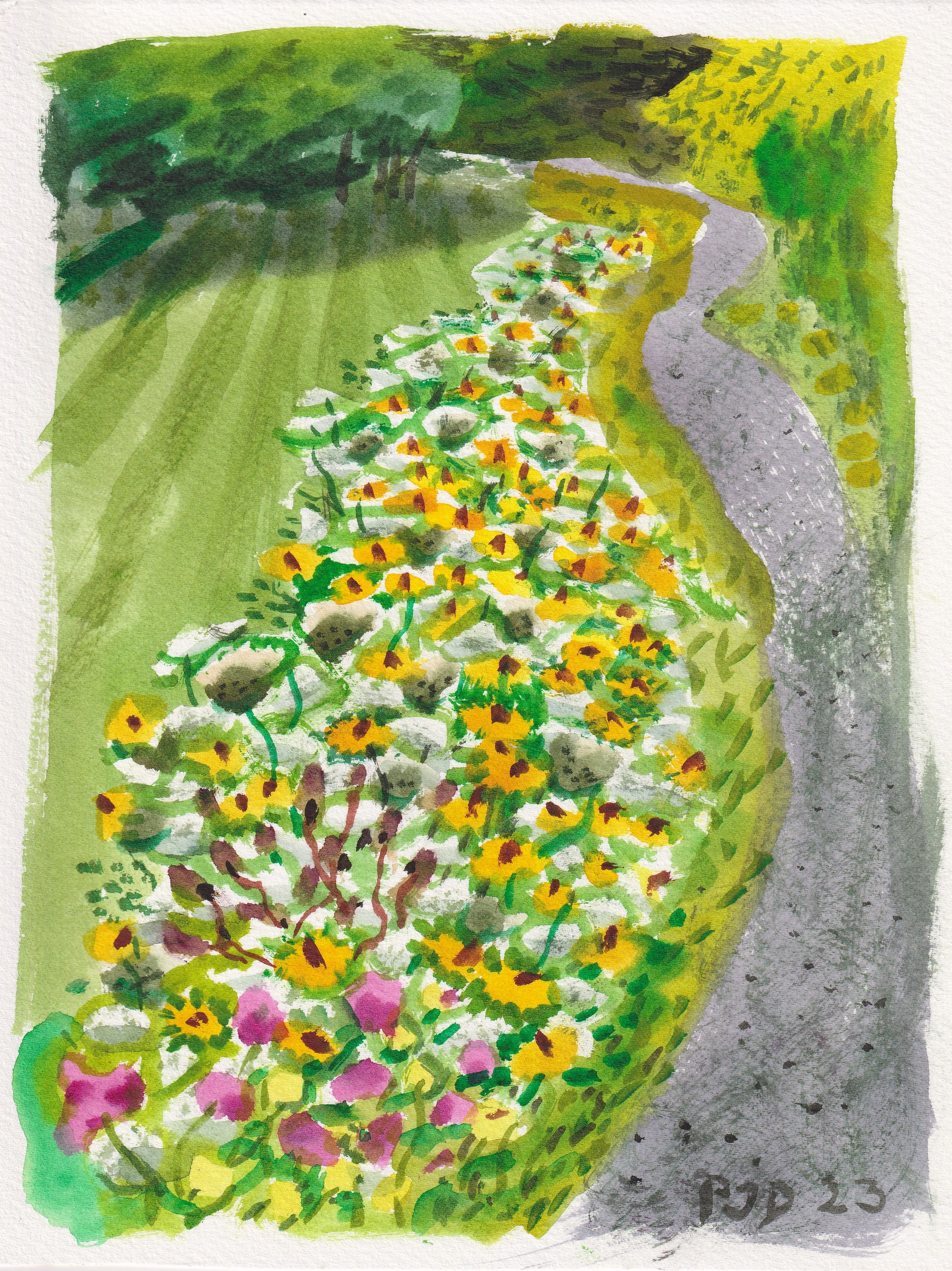
Wild flowers next to Path Bolton , watercolour 8 x 10" cold press, July 2023 (No. 3622)

First snow on the auto shop

Today we got the first real snow of the season, it accumulated on the ground and on top of cars and trees. By now it has melted with steady rain, and it seems like warmer weather is ahead. Being the first wintery painting of the season I had to make some adjustments to the setup. The clean water has salt in it, and I put the brush directly into the container as I paint. This is to avoid having to pour water into the small glass container that I usually use. Trying to do that with giant mitts on is not feasible. I have a second container for dirty water, so I try to judge when I need clean and when I can use the dirty water. Its a bit technical, but water management is crucial to getting clean colours when painting more than one on a trip. The other consideration is the subject matter. I have to pick a scene that I know I can paint in one layer more or less. That precludes overlapping one object on another, which requires that the first layer dries. If you study this painting, you can see than most of the objects are cleverly surrounded in a layer of snow, which is just the paper showing through. In doing so, it prevents the colour areas from running together. Its been so many years now that I developed an entirely different approach to painting in the summer versus the winter. In the past it took a long adjustment time to adapt to seasonal changes, so I was happy that this one turned out all right. The one thing that I need to get used to is the cold, even at barely -1 Celsius I was feeling it. I painted at -26 Celsius earlier in the year, although its not a record that I want to break!

First snow on the auto shop, watercolour 5 x 7" cold press, November 2023 (3483_1b)

Wednesday, November 8, 2023

So Why Not Try?


Here is another painting found in the file, probably from February of this year as it was on the back of another painting done that month. When I saw the title of the painting I thought, isn't that interesting, I wonder what it means. Then I realized there is no blog for this painting so I have to admit I forgot the context. But hey, its a universal message, 'So Why Not Try?". It has the look of a palette cleanser, you can see pretty much all the colours represented, and a strong earth outline using umbers. The colours really shine in real life, the brown is rich and the interior colours are radiant. At some point I plan on picking some of the best of these abstracts and doing larger versions. It would be a good winter time project when the out door painting starts to get difficult.

So Why Not Try? watercolour 9 x 12" watercolour paper, 2023 (No. 3600b)

World Inspired Landscapes: Iran versions 1 and 2

 The World Inspired Landscapes is a series I started just before the pandemic, the idea is to do one painting of each country in the world. Some countries are more problematic than others due to the complex nature of their politics and geography, not to mention human rights issues. The series is meant to depict the landscape in a meaningful way based on imagery and concepts. For Iran, there are a lot of mountains in the region, and going back as far as the Persian Empire the area was a hub of art and culture. The painting depicts a  range of brightly coloured mountains arranged in a repetitive pattern. I actually did these awhile ago and posted version 3. As I work on updating the catalogue I found version 1 and version 2 which seemed worth posting. I am starting up the series again moving on the letter J.

World Inspired Landscapes: Iran version 1, watercolour 9 x 12" watercolour paper 2023

In the second version I kept with the same theme but reduced the repetitiveness of the shapes. I rather prefer version 1 though. This one needed to be on the horizontal format which I did in version 3, and added patterns. After all that, I still prefer version 1! I just realized I already did a blog on these two, but the scans look better with the new scanner so I will just leave this blog up.

World Inspired Landscapes: Iran version 2


Tuesday, November 7, 2023

Summer Paintings from Bolton

As I updated the catalogue I found several Bolton paintings done earlier this year that did not make it to the blog yet. This one shows the walking path down by the Humber river, with a variety of flowers growing in bunches. Painting the flowers required negative space that was filled in with yellow or magenta. The brown eyed Susans also got a dot of burnt umber in the center.

Various Flowers next to Path, watercolour 5 x 7" cold press, July 2023 (No. 3522a)


Recently the city finished renovating the storm pond so that it looks exactly the same as it did before. I was standing up on the walking path looking down across thousands of Queen Anne Lace flowers. It was another difficult painting, these kind of flowers were invented to give watercolour painters a headache. In oils you would paint the green background and then paint on the white flowers, but in watercolours you paint around the shape of the flowers. I've done it enough times to get good at it, but still these Queen Anne Lace flowers were the big challenge of the trip.

Pond and Flowers, watercolour 5 x 7" cold press, July 2023 (No. 3522b)


More flowers in the background, with a complex pile of rocks and a storm drain in the bottom half foreground. This one took a long time because there were several layers of paint applied but it was drying well so I could pull it off. When winter comes I have to adjust the style because paintings like this are not possible.

Flowers and Storm Drain, watercolour 5 x 7" cold press, July 2023 (No. 3521b)


I couldn't help making a painting of the exterior of the old highschool I attended. The colourful windows at the bottom left are the windows of the art classroom where I learned lots of great stuff from the teachers. The colours were embellished, so as to give the scene a bit more life.

Highschool Art Classroom, watercolour 5 x 7" cold press, July 2023 (No. 3523a)

Monday, November 6, 2023

Bolton Path with White Flowers

My parents had this painting hanging in their house for about a year, every time I visit I change several of them to keep the art new. Since it was done in Bolton, it never seemed to have made it onto the blog so I scanned it today. I remember walking down this path which goes from the suburb into the Bolton Forest towards the derelict camp. Recently the city widened the path and tamped it down with some sort of adhesive gravel so that people can easily walk in the forest. When standing in the shade was getting attacked by mosquitos, so I had to stand in the hot sun as a deterrent and paint fast! The little white flowers were a real challenge since there had to be a complex negative shape painted around their shapes. The rest of the scene was a high contrast, textural wall of foliage that I depicted with various shades of yellow and green. The path was actually a pastel, almost grey, shade of red. I make it with pyrol red (PR254) carbon black (PBk6) and a decent amount of water.

Bolton Path with White Flowers, watercolour 5 x 7" cold press, 2022 (No. 3518)

Working Count

Its been a lot of years that I have been painting watercolours, going on 35 now. I clearly remember doing the first one, I looked at the palette and then asked the teacher if I was supposed to add water to the paint? Over 4000 paintings later and it is still just as fun and challenging as it was back then. I am working on the catalogue update, the last one was in late March, since then there are a few hundred more paintings to tally. The number of paintings never mattered to me, and it still doesn't despite the incessant cataloguing that I started during the pandemic when we all had more time on our hands. I do have a sense of progress though, over the past three years. Around 2017 I pulled all the paintings I had out and put them on the kitchen table and had a feeling of uncertainty about what to do next. It seemed as if my skills had reached a plateau. In retrospect what was holding me back was a number of things. My palette was inefficient and my mixing strategy tended to produce a lot of greyish results. I wasn't blogging actively which meant there was little to no interaction with my audience. And I was underestimating the quality of the landscapes in and around Montreal. With the knowledge I obtained during the pandemic by reading MacEvoy's Handprint.com and other sources, and a renewed sense of optimism and engagement, things really did pick up regarding my side career as a visual artist. We will see how things go, each year I tend to evaluate where things are with the art and what kind of goals I might have. In the meantime its just a matter of enjoying the ride. 

Working Count, watercolour 9 x 12" watercolour paper November 2023 (No. 3636b)

Sunday, November 5, 2023

Windmill in Lasalle

You may not believe this but Lasalle has a tourist attraction. They even built a little parking lot nearby, and a gazebo with benches lined up where they must give talks or something. I set up under the gazebo and luckily the last of the sun was coming across my left shoulder. The shape of the structure is that of a cone, with a dome on top, and a semi-cricle protrusion that houses the wheel at the top. I suppose it was hooked up to the wind, and the big wheel could be used to drive a grinding device. To paint the scene I sketched out the structure and its windows and door using paint, then established the left highlight and shadow of the main structure. The rest of the painting was done in successive layers, finishing it with the textural elements and details like the old stone wall underneath the balcony. The foliage in the foreground was important for the composition, it gave the windmill a bit of environment, and I squeezed in a bit of the river on the left. There were a lot more trees in the scene but I edited them out to not distract from the obvious star of the painting.

Windmill in Lasalle, watercolour 8 x 10" cold press, November 2023 (No. 3633)

Point of Park Late Fall

I was at the point of the park near Lachine, looking west up the st Lawrence river. A lot of people congregate here to take in the view and snap photos, and I have made many paintings here before. This scene shows the little beach with seaweed washed up, it smelled like seaweed as I painted. The trees on the shore line become paler and bluer as they recede into the distance. The brushwork is quite nice on this painting, I used a soft synthetic brush with a pointed end that I got from Kama Pigment a few months ago.

Point of Park Late Fall, watercolour 5 x 7" cold press, November 2023 (No. 3584b)

On the way back the sky turned to dark purple although the sun was still coming through the clouds in some places. One of those hybrid trees near the path, the ones where the bark is brown on the bottom but white on top, had nearly white leaves. Against the dour background it appeared to be illuminated. I actually rode past (you can see the bike path to the right of the tree) then stopped, turned around and made a go of it. Painting white on dark is not possible in traditional watercolour, so I painted the sky first and dabbed in the negative space for the tree. While the painting may not be very accurate, it does have the same shock value that the scene had.
 

Ghost Tree, watercolour 5 x 7" cold press, November 2023 (No. 3582b)

Saturday, November 4, 2023

Ride Down to Canal Nice Cool Day

Along the Maisonneuve bike path there are plenty of old light industrial buildings that used to be autoshops and warehouses. Every year there are less of them as the city converts them into condo developments. The one on the right is fire damaged, I've rode past it plenty of times and always wanted to try and capture the green shingles and interesting plaster wall with graffiti. There were several shades of green which I made with combinations of Pg36, Pg7, PY110 and PBk6. As usual I replaced the graffiti with my own tag. 

Greens on Maisonneuve, watercolour 5 x 7" cold press, November 2023 (No. 3583a)


I've tried to paint this old train bridge before without much success, this time I composed it from the other side of the canal with the interesting iron fence in the foreground. The colour of the old bridge is actually a pale green, probably a mix of chromium green and titanium white, but it came out a little too dark with the mix of PG7, PBk6 and water that I used. It was a complex scene that I navigated with zeal. It helped that the warm sun was creating a pleasant painting atmosphere on an otherwise chilly day.

Old train bridge over canal, watercolour 5 x 7" cold press, November 2023 (No. 3585a)


Lastly I turned down what was Monk street and turned west, then finding Hamilton Street on the corner of Denonville. A yellow tree set against a pale violet background caught my eye and I stopped to make a quick painting. There was a very tall chimney that I could only show a little of in the painting. The rest of it was a matter of perspective, and making sure that the yellow tree popped against the background. Adding a dark purple road in the foreground helped with the contrast.

Yellow Tree Auto Shop Verdun, watercolour 5 x 7" cold press, November 2023 (No. 3586a)

Friday, November 3, 2023

Overcast Sun Autoshop


 When the sky is partly overcast, sometimes the sun is penetrating the cloud cover. It creates a halo effect that cam be quite interesting to paint. I started with a circle of yellow, I made the circle bigger than it needed to be because I always adjust it to be perfectly circular but with each adjustment it gets smaller. When satisfied with the shape, I added a second ring of orange, with more water in the mix, then surrounded by a purplish grey. The purplish grey paint has to have less water then the yellow-orange, so that it creates the feathered-halo effect. It takes awhile to master this technique because the amount of moisture in the paint layers is difficult to judge accurately. To paint a nice sky in watercolour, it is best done in one pass without any fussing or adjustments. The rest of the scene is pretty standard by now, in fact, I have painted the autoshop dozens of times. The new paint on the autoshop is dark magenta, made with magenta (PV19), a touch of blue (PB60), carbon black (PBk6) and water.

Overcast Sun Autoshop, watercolour 5 x 7" cold press, November 2023 (No. 3583)

The Bored Room


This is an unusual painting, part palette cleanser, part memory, part real life. I was sitting in a plethora of meetings this week which made it difficult to get out and paint at all, but I made a detailed sketch of the scene in one of the board rooms up in the proverbial ivory tower where I was chairing a thesis defense. From memory I recreated the sketch and the scene and filled in some colours. On the left was the drop down screen with Zoom being projected on it, while to the right was a view out the window of campus. The desk in front is a sampling of objects people had in front of them. When you doodle at a meeting like this you have to make it look like you are taking notes. My closest colleagues have figured it out though, one of them even bought some paintings off me few years ago! In the painting I made the zoom screen into an abstract tapestry, and I warped the window frame to give it a trippy vibe.

The Bored Room, watercolour 9 x 12" watercolour paper November 2023 (No. 3657b)