Sunday, October 31, 2021

Puddle in the Parking Lot

On my way back from doing some errands I made a quick painting of the Reno Depot parking lot which is surrounded by trees. As the rain poured I could make the painting is relative dryness, I was standing outside, but the store front has this overhang that blocks the rain. It was still tricky since the paint would not completely dry. Judging the value and contrast on a rainy day is affected by how your eyes adjust. The painting appears to have more contrast than when I painted it. I've not had too much experience painting in the rain. The ultimate rain painting was one I did about a month ago in a torrential downpour at night.

With that painting, I wrap up October. It was an okay month for painting. The leaves took a long time to change colour but it was worth the wait. Let's see what November brings.
 

Puddle in the Parking Lot, NDG, watercolour 5 x 7" cold press, October 2021 (No. 2868)

Montmorency Station, Orange Line, Laval


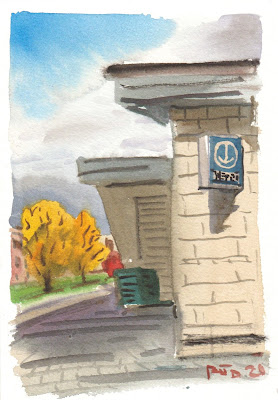
At long last I arrived at the north east terminus of the Orange line metro. It had been many painting ago that I made it up to Cote Vertu on the other side. Unfortunately the rain struck midway through the location, but then the sun came out again. The sky was partly cloudy, partly sunny which made for some difficult conditions. In this scene, a dark cloud was framing a pair of brilliant yellow-orange trees in the background. By the time I got to paint that feature the sky had changed but I remembered what it looked like and painted it from memory. I made a few other compositional adjustments to fit all of the elements onto the small vertical paper.

The Sun Arrives, Montmorency Station, Orange Line, watercolour 5 x 7" cold press, October 2021 (No. 2866)

In this scene you can see Mont Royal in the distance with some colourful trees in the middle ground. The only vantage point I could find was behind a concrete wall surrounding a parking lot, so I decided to include it in the composition. It probably took me longer to complete the cars that you hardly notice than the rest of the painting! I like the sky a lot, it really gives the feeling of a tumultuous sky. I varied the greys from yellowish to a blueish by adjusting it with umber (PBr7), indo blue (PB60), or magenta (PV19). I started the sky with a thin wash of yellow ochre (PY43) and cobalt blue highlights (PB28).

View of Mont Royal, Montmorency Station, Orange Line, watercolour 6.5 x 10" cold press, October 2021 (No. 2913)

The last stop had to be spectacular. This painting was done in a dreary Parisian-style, with punched up blue and turquoise hues. It was a lot of fun painting this one, albeit challenging. It is not often you find turquoise on a location, but this was just the way it looked! And the sign on the other side. Not to mention my favorite motif, the garbage can in a brilliant cobalt blue. The turquoise was done with phthalo green plus phtalo blue sapphire (PG36 + PB15). An old fellow started talking to me during this painting and asked like 20 questions and offered his philosophy of art. It was really interesting but made it difficult to concentrate. Anyways, he moved on and I completed the painting with the tree in the middle and details on the brick walkway. Then I wrote FIN! on it, which means the end in French. I did the same on my previous triumph of the green line last year.

Pale Green Glass, Montmorency Station, Orange Line, watercolour 8 x 10" cold press, October 2021 (No. 2914)


This was the first try of the scene but it started raining midway. It is still kind of a neat painting. You can stand there with me in the cold rain painting a metro station!

 Pale Green Glass with Rain, watercolour 5 x 7" cold press, October 2021 (No. 2867)

De la Concorde Station, Orange Line, Laval


To get to Laval I rode my bike over to Victoria Avenue then headed along Kindersley to Lucerne northwards along St Croix then O'Brien. From there I followed the river path and crossed at Ile Perry to Laval. The hard part was swimming across the river, I had to keep the paints dry. After climbing onto shore, I thought it would be a lot further but then in the corner of my eye, I spotted the tell tale metro sign after a short bike ride. If you look carefully you can see the sign somewhere in this painting. Next time I am there I have a feeling it will all be condos. 

Where is the Station? De la Concorde Station, Orange Line, watercolour 5 x 7" cold press, October 2021


The station was simple enough, a concrete structure with a large platform for the above-ground light rail train connection. A lot of people were getting on and off. You can see the double-decker train hiding behind the trees. I left that spot blank and worked on the rest of the painting until the train arrived. Luckily it stuck around long enough to get in some details. The fall colours were done by mixing a high chroma hue with its matching low chroma earth paint. For example, pyrol orange (PO73) with burnt ochre (PR102).

All aboard! De la Concorde Station, Orange Line, watercolour 5 x 7" cold press, October 2021 (No. 2864)


The station had a large glass structure similar to what I saw at St. Enoch station in Scotland, but the weather was looking rough so I chose an easier scene. There was a winding path made of pale red bricks, with burning bushes lining the way. Not literally burning, but they had that rose-red colour that only appears in the fall. It was a harder painting than I thought because the green grass was quite a contrast with the red and magenta accents. The station structure is in the background at the top. After finishing this painting I picked up the bike and ran by foot to the next station. It was a real triathlon, biking, swimming and running.

Pink brick Path, De la Concorde Station, Orange Line, 9 x 12" watercolour 5 x 7" cold press, October 2021 (No. 2865)

Thursday, October 28, 2021

World Inspired Landscapes: Burkina Faso


Burkina Faso is centrally located in the north west of Africa along the Sahara desert. It is punctuated by sandstone cliffs and flat expanses of desert and savanna.  The climate is variable. It is mostly arid but they have terrible rains that flood out the land, and epic sandstorms from the desert. Sandstone cliffs rise from the ground like a crocodile's teeth. Speaking of crocodiles, there is one lurking in the foreground, along with a wary water buffalo in the corner. This was the third version, it captures the atmospheric effect of an impending sandstorm. The sandstone cliffs create tension, as does the interplay between crocodile and water buffalo.

WIL Burkina Faso III, 9 x 6" watercolour paper, watercolour, October 2021


This was the second version. To better represent the sand storm I showed more sky than the first version (Below). The colours scheme was also restricted, there is less yellow and red. I realized afterwards that Burkina Faso has a lot less palm trees than you see in this painting. And the sand storm was not menacing enough! I had imagined a more neutral, earthy palette.

 WIL Burkina Faso II, 9 x 6" watercolour paper, watercolour, October 2021 (No. 2892a)


This started out as a palette cleanser then morphed into another installment of the world inspired landscapes. In the series, I assimilate a variety of sources into an original painting of a country. I am going roughly in alphabetical order starting with A, then B countries. The design included some sandstone rocks, swaying palm trees, rugged terrain and an imposing sky meant to be a sandstorm.

WIL Burkina Faso I, 9 x 12" watercolour paper, watercolour, October 2021 (No. 2892b)

Fall Trees with Pylon, Loyola Campus


 Maybe I should call this the lunch break series? They are quick paintings done around lunch hour in the quad, that is, a central area of Loyola Campus where people hang out. Cilei's favorite one was the indigenous statue, which we have hanging up now. After painting some dark backlit scenes up in Laval, I made some adjustments here to keep the scene fresh. Mainly, I tried to simplify the shadow mixtures and get them done with one layer. It worked out pretty good, you get a sense of a breezy cool fall day on campus. Even though it is probably almost winter the grass was still greenish. I couldn't resist putting in the pylon of course.

Fall Trees with Pylon, Loyola Campus, watercolour 5 x 7" cold press, October 2021 (No. 2862)

Wednesday, October 27, 2021

Touching the Moon


After completing two more locations on the Orange line, the palette needed a good cleaning. The moon in this painting was an accident, I may have put my thumb there and the paint didn't stick to the spot. It is an other-worldly painting indeed! Like a scene from a B-horror movie, a blob creature creeps along the ground, looking for its next victim. Or maybe it wants to have some ice cream? 

Touching the Moon, 9 x 6" watercolour paper, watercolour, October 2021
 

Monday, October 25, 2021

Plamondon Station, Orange Line Metro, Pastel Sunset


Way back in May I did a painting of Plamondon station, from the vantage point of the main entrance. On last Saturday as I rode home from the Laval station, I noticed this incredible colour contrast on an otherwise non de script apartment building. The shadow side was a dull mauve, while the sunny side was a range of yellow and coral reds. The actual red bricks were so dull that they took on the ambient colours from a pastel sunset. About to speed past on my bike, then I noticed the metro sign and immediately realized it was a hidden entrance to the Plamondon station. By now I was cold and tired and still with the headache, but I knew the opportunity for this scene was now or never. So I quickly laid down the mauve shadow (left) and sky, then worked up the front colours and balconies. The brick red of the neighboring building gave the perfect contrast element to make the main focal paint glow. I just whipped in the cars for effect. I really like this painting, its one I'll not soon forget. 

Plamondon Station, Orange Line Metro, Pastel Sunset, watercolour 8 x 10" cold press, October 2021 (No. 2912)

Cartier Station, Orange Line Metro, Laval


 Henri-Bourassa station station used to be the terminus of the orange line until they completed the connection to laval. The odd thing is that Cartier station is also called the terminus, but of the Laval line. Confused? Just try to take a trip from the Montreal to the Laval line, and you would hardly believe that they are connected, you get off one, buy new tickets, get on the other. I decided to head up there after painting the Henri-Bourassa station, it was only about ten minutes north. This scene shows some of the gleaming marble walls of the main building. Everything looked new here, but it was surprisingly desolate of people using the transit system. Mostly I just saw cars and buses.

To do the black wall I used carbon black and yellow ochre, and it dried very light. So I applied a second layer with the reflected elements. My favorite part of the scene was painting the fire hydrant, it was a rousing ferrari red (PR255) with a canary yellow cap (PY154, PY110).

Cartier Station, Orange Line, Black Wall, watercolour 8 x 10" cold press, October 2021 (No. 2911)


This is the east entrance to the station, it looked rather like a concrete layered-cake! The paint wouldn't dry and it was terribly noisy here, while I was suffering a headache the whole trip. Despite the excuses, it was a good try. The white on dark elements are difficult to do with watercolour because you can't paint white paint over top.

Cartier Station, Orange Line, Piece of Cake, watercolour 5 x 7" cold press, October 2021 (No. 2860)


A large circular boardwalk surrounded the main building. I found a great spot to stand with a view of the backlit station and an impressive shadow cast out on the lumber. While the details are lost in this painting, it does convey the exact feeling of the scene. In the background you see the simplified domes of the cars rushing by. And to think it was Saturday, where were all the cars going?

Cartier Station, Orange Line, Boardwalk, watercolour 5 x 7" cold press, October 2021 (No. 2861)

Henri-Bourassa Station, Orange Line Metro


After one painting at Henri-Bourassa Station last weekend, I decided to go back and do a few more. Last time it rained heavily cutting my trip short, but yesterday the weather was tolerable. Cold, windy and mostly overcast, but tolerable none-the-less. The station is tricky to paint because it is a long bunker-like structure with narrow sidewalks and constant buses going by, not to mention the noise of a busy road. I found a spot by the bike racks and did this painting of one of the entrances back-lit by the sun. Each shade of grey has a different hue and value. The sunlit ground has a warm neutral orange and the shadows have more of a cool indigo.

Henri-Bourassa Station, Orange Line Metro, Front Entrance with Bike Racks. Watercolour 5 x 7" cold press, October 2021 (No. 2857)


As I drank some cold coffee and snacked on chocolate muffin and banana bread, I noticed an entrance across the street. The entrance was non-de script, however it had an impressive glass wall above it, which was reflecting the park behind me, which is Ahuntsic park. The park was neat and I would have made a painting from that vantage point but unfortunately the park was under construction. Oh yeah, the pigeons I saw last week were probably the same ones I captured in the painting sitting on top of the buildings.

Henri-Bourassa Station, Orange Line Metro, Reflective Glass, watercolour 5 x 7" cold press, October 2021 (No. 2858)


After the last painting I headed up to Cartier station in Laval and made some paintings there. On the way back I saw yet another entrance to Henri-Bourassa Station on Rue Berri. I was cold and the sun was going down but the scene was compelling and I had to give it a go. A woman was sitting down, and a seagull kept trying to fly at her. She was frantically trying to swat it away with a purse, and yelling at it! Then a man tried to shoo away the persistent bird. I found it comical to watch as I made this painting. The focal point is the sign, which had a diagonal slash of sunlight illuminating the top half.

Henri-Bourassa Station, Orange Line Metro, Last Light, watercolour 5 x 7" cold press, October 2021 (No. 2859)

Saturday, October 23, 2021

Yellow, Orange and Green leaves, Coffee Park


Earlier in the week I got out for a lunch hour and made this painting at the nearby coffee park. The park has some interesting undulations and a path cutting across from the bike path over to the train track crossing. The tree had a range of fall colours spanning yellow to orange to chartreuse. The scan makes it look more red than it was, but still gives a good impression. I kept the chroma high by using pyrol and benzi pigments without much neutralization. I started mixing pyrol with earth paint, it gives a mid-chroma appearance that is quite useful for leaves after they change colour and start to fade.

Yellow, Orange and Green leaves, Coffee Park, watercolour 5 x 7.5" cold press, October 2021 (No. 2856)

Sunday, October 17, 2021

Henri-Bourassa station, Orange Line Metro

After Sauvé Station I made it up to Henri-Bourassa station by following the Rue Lajeunesse bike path. The bike path is really serious there, they built it for the electric bikes that are now available for rent, they are part of the bixi bike system. The path was basically like a small highway for bikes with complete protection from traffic. I could go full speed, on my normal human-powed bike, without worry. Henri-Bourassa station used to be the terminus before they completed the under-river connection to Laval, which now has three stations. They are talking about connecting the orange line in Laval to create a giant circle. However, the blue line east extension is the next priority. 

For the painting I had to work fast because the weather was really starting to turn. They had just thrown down a bunch of new grass seed for some reason, and the pigeons were really tucking into it. Luckily they stayed put long enough for me to capture the birds in various poses. It reminded me of the time I painted the pigeons near the Peel Station. To make the dramatic sky I established a moist base of yellow ochre (PY43) then painted in the cloud shadows wet-in-wet. I actually used the same mixture for the cloud shadows as for the pigeons. It was a dark slightly neutral blue-violet. Some of the pigeons also had shimmering magenta and green feathers on their neck, you can see that on the one at the bottom right which seems to be staring at you. 

The next week I went back and made three more paintings of the station.

Henri-Bourassa station, Pigeons, watercolour 6 x 7.5" cold press, October 2021 (No. 2930)

Sauvé Station, Orange Line Metro,


Sauvé Station is the second to last Montreal stop on the east arm of the orange line. This scene was an amazing combination of fall colours set against a rose-red corrugated metal structure next to the entrance of the station. The pink structure was a small shop that seems to sell fresh produce in the summer but it was closed up for the season. To create the leaves I established the dark maroon with perylene maroon (PR179) and perylene green (PBk31), then added pyrol reds (PR254, PR255), oranges (PO73) and benzi yellows (PY154, PY175) and a touch of phthalo green (PG36). A lot of people were watching me paint out of curiosity.

Sauvé Station, Orange Line Metro, Fall Colours, watercolour 5 x 7" cold press, October 2021 (No. 2854)


In this panorama design, the metro station is tucked away behind a bus, in fact, the station looks like it could be a vehicle driving around the bend in the highway. The horizon was filled with golden yellow and orange trees. To the right is a massive cemetery, I just showed a sliver if it, barely recognizable. Choosing this location was easy because there was a great place to stand and the sun was shining on me, but the scene was daunting. In particular the constant flow of cars and buses occupied about one quarter of the painting. I like painting signs and traffic lights, as you can see on the left. The light was red. 

Sauvé station, Orange Line Metro, Panorama, watercolour 8 x 10" cold press, October 2021 (No. 2910)


On the south side of the street Sauvé station has a small entrance building, this is the same one seen in the panorama painting but from the sunny side angle. The weather was starting to get rough, it was a three hour tour. A three hour tour. Okay not everyone will understand that particular reference to an old TV show. This painting was all about variations in orange. The condo building in the distance was a bright yellow orange I made with pyrol orange, benzi yellow, and touch of phthalo green to neutralize it a bit. The other shades were variations of burnt yellow ochre (PR102), yellow ochre (PY43 Da Vinci), umber (PBr7 Shin Han), and indo blue (PB60). Carbon black (Pbk6) was used for the dark contrast elements.

Sauvé station, Orange Line Metro, Shades of Orange, watercolour 8 x 10" cold press, October 2021 (No. 2855)

Just a personal note, today when people were looking at me painting, I really felt like a painter. I was suddenly aware of the paper, brushes, palette, and my bike/studio. I wonder what people think of the guy painting metro stations? 


Saturday, October 16, 2021

Mile End Rainy Day


 This is the view looking up Duluth street on the corner of St. Laurent Blvd. I was just at the grocery store which sells lots of great organic foods. The rain kept coming all day and got even worse on the way home. In the background you can see mount royal, but it was partially covered in grey clouds. To protect the painting from the rain I had to lean over at and kind of paint it from a hunched over position. It still got pretty wet and I had to wait under a store front for 20 minutes for it to dry before putting it back in the bike pack. The rain drops on the painting are actual rain drops!

Mile End Rainy Day, watercolour 5 x 7" cold press, October 2021 (No. 2853)

Living Wall

What does it look like on Saturn? Maybe something like this! Actually this was another palette cleanser painting, done with a quality selection of watercolours. It has a distinctive fall colour scheme, with golden yellows and earth oranges. We put this one in a frame and hung it on the wall, just to add a little spalsh of colour to the condo.
 

Palette Cleanser: Living Wall, 9 x 12" watercolour paper, watercolour, October 2021 (No. 2890b)

Monday, October 11, 2021

Thanksgiving paintings, fall leaves


Some of the trees are starting to change colour, mostly the yellow leaves. This scene was done on the garden terrace just in front of our condo, I was sitting on the brick retainer wall. Thanks to the lazy garden maintenance crew there were a lot of leaves on the grass. Normally they drop by with gas powered leaf blowers. The sun was low casting long shadows across the textured lawn.

Terrace with Yellow Leaves, watercolour 5 x 7" cold press, October 2021 (No. 2850)


Just before sunset I found this scene at the front of Benny Sports complex. I had to paint it fast because the sun was almost down. Most of the colours were made with isoindo yellow (PY110) along with benzi yellow (PY154) and various greens (PBk31 asnd PG36). Orange and green are actually a lot closer than you thing, some greens like the pine trees in the distance are almost orange. In the middle of green and orange is olive, or khaki. the brilliant red on the bush at the left is pyrol red (PR254 and PR255).

Benny Sports Trees Fall, watercolour 5 x 7" cold press, October 2021 (No. 2851)

Sunday, October 10, 2021

Alicante Spain, A Great Stroll

On the East coast of Spain lies two great cities Valencia and Alicante. I Spent time in both places on my backpacking and painting trip over 20 years ago. Most of the city is centered along the coast where there is a long beach, boardwalk, sailing club and other accoutrements. This scene shows a palm tree and some sailboats at a local Yacht club. To capture the palm tree, I created de-saturated greens greys and oranges using my convoluted painting strategy summarized here. The turquoise water would have been made with cerulean blue (PB35) and aureolin yellow (PY40).
 

Royal Regatta Yacht Club, Alicante Spain, watercolour 5 x 7" cold press, Late June 1998 (No. 0902)

This could be on any beach in the Caribbean, but the water on the Mediterranean was much rougher and had navy blue and emerald green tints. There were not many people around as I recall. Technically this was a tough painting, the five supporting poles for the roof framed a highly textured-water effect in the background. The water was done with French ultramarine (PB29) and phthalo green (PG7).

 Playa del Postiguet, Drinks, Alicante Spain, watercolour 5 x 7" cold press, Late June 1998 (No. 0901)


The boardwalk was a great place for a stroll, it was lined with benches and palm trees and great views of the beach on one side and the city on the other. Recently I used google earth to check out the location again, and it looked much the same. The interlocking brick colour is fascinating, I wonder how I mixed it? Probably alizarin crimson (PR83) with aureolin yellow and some green. It would be ten years until I started blogging regularly which is a shame. When I got back I sat down with Mom and Dad and told them all the stories. 

Paseo Explanada de Espanya, Alicante Spain, watercolour 5 x 7" cold press, Late June 1998 (No. 0903)


Hiking up the mountain, which meant walking up a path beside the road, I made it to the prominent castle where I painted a beach scene looking down. This painting was done on top in the park areas around the castle. It looked like they were using the space for gatherings and festivities. The day I was there a lot of people were setting up chairs and catering. The stonework looked old, but the graffiti looked new. I added some myself, well, I signed my name on the wall in the painting. In the background were the rolling mountains, done with neutral mixtures of blue. I used to make that colour by creating purple first (PB29+ PB35+PR83) then adding some green (PG7). In retrospect I was making dark blue. But as I look at this painting, I like the colour variations in the distant mountains it looks like a mix of rock and trees.

Castle de San Fernando, Alicante Spain, watercolour 5 x 7" cold press, Late June 1998 (No. 0900)

Saturday, October 9, 2021

Crémazie station, Orange Line Metro


After last week's rain at Jarry Station, it was great to be out on a nice day this weekend. The Crémanzie station was not very far from Jarry Station, just a few blocks north to the autoroute 40 along a quiet urban bike path. Most of Montreal has bike paths with the exception, ahem, of NDG. Perhaps the upcoming Mayoral election will change things, like attitudes towards bikes. The autoroute 40 made for an awesome backdrop to the south station entrance of Crémanzie, which, like Jarry station, has an apartment building sitting a top. The balconies had an art deco theme, it reminded me of Gaudi's building in Spain a little bit.

Crémazie station, view of Autoroute 40, watercolour 5 x 7" cold press, October 2021 (No. 2848)


Rotating around to the other angle, I could get a good look at the sunlit municipal building in the background. It was built from an attractive pale brick that cast at least 8 different hues of yellow. I wont go into all the detail on the yellows, they were made primarily from yellow ochre (PY42 Da Vinci), with tints of isoindo yellow for the orange cast, perylene green for the brownish cast, and indo blue with carbon black for the grey cast. The foreground building and station was done with earth paints including burnt yellow ochre (PR102 Daniel Smith) and umber (PBr7 Shin Han PWC). I wrote the company name because these names and pigment codes are highly variable.

Crémazie station, Orange line, with Yellow Brick Building, watercolour 5 x 7" cold press, October 2021 (No. 2849)


For this painting I was thinking of the painting I did on the Intense Island about ten years ago. It was just as intense, the wind was tunneling through the buildings and the auto route which was just at my back. Trying to hold the paper with its cardboard support, the brush, and control the flapping wind was a tough one! That explains why there is hardly a straight line in the painting. Regardless, it does convey an feeling of atmospheric intensity.

Crémazie station, Orange line, North Entrance, watercolour 6 x 7.5" cold press, October 2021 (No. 2928)

Indigenous Statue, Loyola Campus


 During the week I ate lunch out in the quad taking in the fresh air and sun. This painting shows the shadowed side of an indigenous statue that adorns the campus. It seems to represent the territorial acknowledgement that the land was once indigenous before passing hands from the French army to the church and then to Loyola college and finally Concordia University. To paint the bright blue sky, I used phthalo blue sapphire (PB15) from Holbein and cobalt blue (PB28) also from Holbein. The Holbein phthalo blue paints are much better suited for landscape painting than some other brands, because they do not stain as much and stay put when you apply them to the sky. Other brands have the problem that phthalo blue will create blue marks on the paper and run into the cloud effects. Cilei really liked this painting so I hung it up on the wall in a simple two piece frame with clips. 

Indigenous Statue, Loyola Campus, watercolour 5 x 7" cold press, October 2021 (No. 2839)

Wednesday, October 6, 2021

Loyola Campus Crosswalks


 Loyola campus has a central quad with criss-crossing paths, lawns and picnic tables for students to hang out when the weather is nice like today. I got out of the office for some fresh air and sun, and made this painting as I sat up on the concrete steps of the CJ building. The background is the main entrance to the SP building where my office is located. They had just finished a catered barbeque for some event, so the table in the painting was from that event, guess I wasn't invited!

Loyola Campus Crosswalks, watercolour 5 x 7" cold press, October 2021 (No. 2838)

Tuesday, October 5, 2021

Snowdon Bakery Fall

Snowdon bakery is located down on Harley street where I have often made paintings for example the red bike in the snow. Today at lunch I went down to pick up some bread and made a quick painting of the fall colours in the trees which contrasted nicely against the warm beige bricks of the bakery. Like a croissant colour! In fact, the brick pigment was probably the same as my paint pigment, raw sienna (PBr7). The trees were various hues of yellow, brown and maroon. I also used a lot of yellow ochre in the grey mixes and sky, to give the whole painting a warm yellow fall glow. 

Snowdon Bakery Fall, watercolour 5 x 7" cold press, October 2021 (No. 2837)

Monday, October 4, 2021

Carbon Colour Copy


Continuing with the palette cleaning, this painting was done simultaneously with the previous post's painting. I had a lot of yellow ochre (PY43) left over apparently. It is such a strong paint you don't need much of it usually. Yellow ochre is very opaque and thick so it does not mix really well, but I find it indispensable for making certain greys and muted yellows. I used to use aureolin yellow (PY40) for that, but aureolin is quite toxic and it fades in sunlight. For bright yellow, now I use PY175 which is a near exact replacement for aureolin. Colours aside, this painting features carbon black (PBk6) infused between the strands of blue and brown. It kind of reminds me of a Van Gogh painting of the black crows flying over the hayfields.

Palette Cleanser: Carbon Colour Copy, 9 x 12" watercolour paper, watercolour, October 2021 (No. 2890a)

Climb @ Change


 Climate change is causing much turbulence in the world. The heat is hotter and the cold is colder. This abstract painting depicts a lively sky inspired by Monty Python, raking through the dry grass. I saw plenty of dry grass this summer, and used a lot more yellow paint and raw sienna than usual. Most of the warm beige you see is yellow ochre, an ancient colour similar to dijon mustard in appearance and consistency. It was not a paint I was fond of, but this year I made great use of yellow ochre. This painting was also a palette cleanser, it really needed some cleaning after the rainy weekend trip, in fact there were little bits leaves and dirt embedded in some of the paints I had to scrape out!

Palette Cleanser: Climb @ Change 9 x 12" watercolour paper, watercolour, October 2021 (No. 2891)

Saturday, October 2, 2021

Jarry Park and Orange Line Station, Periods of Rain

The forecast called for rain, rain and more rain. Periods of rain is what they called it. Undaunted, I biked to Jarry Station on the other side of Mont Royal in the borough of Villeray–Saint-Michel–Parc-Extension. Atop the station is a community housing apartment called Habitat Jarry, it is a towering monolith of orange bricks and reflective windows. As I sized up the scene, a flock of pigeons filled the sky and headed across the street. The rain was just misting for this painting until the end when it picked up.
 

Jarry Station, Orange Line Metro, When Pigeons Fly, watercolour 8 x 10" cold press, October 2021 (No. 2909)


Underneath a concrete shelter, there was a colourful mural of pigs flying. The composition shows a corner of the mural juxtaposed with the actual sky. If pigeons can fly then so can pigs. I used a lot of carbon black in the outlines and the mixes to give a feeling of gloom and rain. To punch up the colours, I used burnt red ochre (PR102) and pyrol orange (PO73) in the bricks. One of the houses across the street was pink, which was done with PR122 quinacridone magenta.

Jarry Station, Orange Line Metro, When Pigs Fly, watercolour 5 x 7" cold press, October 2021 (No. 2835)
 

This was the first painting I did on the way to the station. The rain was really coming down and the only shelter was a big tree, and the umbrella. It was quite tricky to have an umbrella stuffed into the front of my jacket at the same time as painting with both hands occupied, especially with the wind. I got a lot of paint on my hands and gear. There was a baseball diamond in the scene, but you would hardly know it. At least you get the feeling of being stuck in a rain storm in Jarry Park!

 Jarry Park, Rainy Day, watercolour 5 x 7" cold press, October 2021 (No. 2836)


Friday, October 1, 2021

Mile End Clark and Fairmount Fall

This scene is just outside of the barber, I made a quick painting on my foray to the mile end to see the dentist and get a haircut finally. It was mostly overcast with glimpses of sunlight. Painting in the city is challenging due to the amount of detail. I tried to get in enough elements to give you the feeling of the area. Architecture, funky benches, bikes, cars, and shrubbery. Of course there were people walking up and down the sidewalks but it is difficult to superimpose people on a quick painting like this. I used the triangle composition, you see the diagonal created by the sidewalk, inspired by Hiroshige the great Japanese print maker.
 

Mile End Clark and Fairmount Fall, watercolour 5 x 7" cold press, October 2021 (No. 2834)