Friday, April 30, 2021

Neon Tramway and Grey Day

With several consecutive rainy days lined up, the grass and trees should be greener than ever, luckily I invested in more yellow and green paint recently. Traditional green paints were rather dull, it was not until the 19th century that viridian was invented, it is a chromium oxide emerald green that is still used to this day in fact, I had it in my palette at the beginning. Prior to viridian, artists relied on a range of minerals or green earths now known as PG23, for example green porphyry which you see in the above painting as the dull green in the background and foreground elements. To provide contrast, I added very high chroma orange (PO62), yellow (PY175) and rose-red (PV19) to create the neon tramway, and bone black (PBk9) for the inky night sky. I call this a study because I plan to make a larger version now that I have more paper to play with!

Neon Tramway Study 4 x 6" cold press, watercolour, April 2021 (No. 2628b)


The term chroma refers to how much colour is in a colour, in other words, how saturated it is. If you have ever dripped food colouring into water (or beer) then you know one drop gives a pale colour, three or more drops starts to get intensely coloured and even darkened. Same with paint pigments. Technically, chroma can be understood as how much grey there is in the colour. Recently I picked up some graphite grey (Schmincke PBk10) which is the definition of zero chroma (zero saturation). By comparison, you see in the painting above the similarity between the grey, the blue (lapis lazui), the green (green porphyry), and the yellow (lemon ochre). The three colours are all low chroma pigments. It is not a bad thing, because most of nature is roughly half-chroma. As I understand this better, it helps to create realistic looking landscapes, and to accentuate the imagery. For example, in the first painting, the reason the colours look neon is because they are set against a low chroma background. Your eye automatically compares things, so a dull background will amplify a colourful subject matter.

Grey Day 7 x 13.5" watercolour paper, watercolour, April 2021

Thursday, April 29, 2021

The Montreal Birch Tree

I ran out of paper recently so popped by the art store in westmount, Av des Arts and picked some more Winsor and Newton cold press, a new kind of paper from Strathmore that has recycled fibres, and the shop keeper threw in a free rough press piece which was nice. I also picked up a new Holbein brush, small palette, and some new paint including lemon yellow 15mL (PY175 Holbein), leaf green 5mL ( (PY154 + PG7 Holbein) and graphite grey (PBk10 Schmincke). On the way back I turned off the bike path and found a secluded spot to make this painting of a birch tree that has been struggling to survive here in the middle of an exposed patch of grass surrounded by the old bike path. In the background you see the road and the retaining wall that has a colourful mural on it. I couldn't resist trying out the new leaf green, so I opened it on location and squeezed some out. You can see the grassy area has a 'nuclear' green appearance. Intentionally I over did the effect just to see what the paint could do. Also used it in the pine tree along with benzi orange. Quite like the leaf green paint. 

Side note, all of the greys were based on venetian red with variations including bone black, indo blue, or yellow ochre and it worked great, the venetian red is a dull earth red with slight granulation. When I say perfect, the colour of the path surrounding the tree was near identical to the colour of the actual asphalt. My long quest for painting perfect asphalt may be finally over. 
 

The Montreal Birch Tree 4 x 6" cold press, watercolour, April 2021 (No. 2628a)


Above is a sample test of the graphite grey (PBk10) from Schmincke. The pigment is literally what is used in a pencil, but finely divided and prepared as a watercolour paint. It paints out opaquely and blends nicely with water for delicate graded washes. The reason I wanted to try this paint was to see if I could use it for making outlines, and also to attempt grey scale painting. When you omit colour, it forces you as an artist to appreciate value (light/dark). It should be a neat exercise to try on location if the subject matter is right, maybe an industrial scene.

Graphite Grey Test 0.5 x 5" (No. 2620a bottom )

Ice Cream Anyone?


 As a continuation of the recent palette cleaning, I did this little abstract painting inspired by ice cream cones. The earth colour raw sienna is surprisingly good at depicting the cone, and quinacridones served well for the strawberry ice cream, with pyrol red in the cherry. Technically speaking this is a still life painting even though it was from imagination, and the ice cream cones appear to be falling from the sky, so not-still not-life!

Ice Cream Anyone? 4 x 6" cold press watercolour, April 2021

Plant Builder


Last year I made an entire series of so called palette cleansers which were free form abstract paintings. This is basically the same idea, I found an extra sheet in the portfolio and filled it up with leftover paint from my old palette that I used for the last 10 years. Unfortunately the winter weather was not kind to it, many cracks had formed in the plastic. In this painting I embellished a favorite theme, that is the contrast between nature and urbanity. The plant is seemingly building the wall in a role reversal. Today I simplified my new palette a little more, will make a post about soon. The weeks just whip by these days! I hope to get out and make some more paintings but the weather has been crummy.

Plant Builder 11 x 15" watercolour paper, watercolour, April 2021

Tuesday, April 27, 2021

Dome and Dandelions

I popped over to Canadian Tire today to pick up some much needed items, I had been saving up a list of things and went when there was almost nobody there. They had just received a massive shipment of gardening products, you see some bags of dirt in the bottom left of the scene which is the edge of the Candian Tire parking lot. Dandelions were sprouting up and the grass was a wonderful lime green. In fact I used a bit of the leftover green from the third version of the Brazil painting that I just updated last night as you can see in the link. The sports dome is in the background, I painted it many times during the winter. In between I squeezed in Renaissance, Harvey's Hamburgers, more grass and trees, a bus, roads, sidewalk, and a shrubbery. In my exuberance I messed up the edging, you see on the left side my pencil mark and the elements uneven. I may go back to full pencil outline, it is just hard to erase afterwards. Got to stay inside the box!

Dome and Dandelions 5 x 8" cold press, watercolour, April 2021 (No. 2624b)

Monday, April 26, 2021

Spring Crab Apple Blossoms

As the sun began to descend to the rooftops I did a quick painting of what appears to be a crab apple tree with pink blossoms. A few days ago the snow and cold came resulting in some wilting of the blossoms, but they rebounded and looked bright pink today, well I may have embellished a little. I am better able to capture bright colours due to a lot of new paints I got last year, and a new mixing strategy. In the old days I mixed a lot of colours together, now I try to colour-match with one or two paints maximum. For example the brick wall on the left was just burnt sienna unmixed. The blossoms were yellow ochre with quinacridone magenta, then overlaid with more of the magenta (PR122). The sky, just phthalo blue sapphire (PB15:0). Thus, I pick a colour that is very close to what is needed, then just tweak it as needed. This painting is perhaps one of the first one where the method really shows its strength, the blossoms really convey the feeling of spring and the bright colours starting to emerge, even though the weather is usually more dour at this time of year.

Spring Crab Apple Blossoms 4 x 6" cold press, watercolour, April 2021 (No. 2632)

World Inspired Landscapes: Brazil


Brazil was a tough one because I have been there and it is the country Cilei and her family are from there, so it had to be profound! I ran the green options by Cilei liked the orange-greens. The Amazon river is seen here from satellite view (google earth), it is flowing from the west to the northeast. One of its major tributaries (River Madeira) flowing from the south. Upstream to the west there is another major tributary (Rio Negro, not seen) that has black-appearing water which mixes with the brownish water of the amazon to create a pekoe tea colour. The south tributary is whitish, and it further mixes at the confluence resulting in beige. I used umber and neutral tint for black water, goethite for brown water, and titanium buff for the white water. The trees are phthalo green (PG36) with yellow (PY154) and orange (PO36) done in a wash, then with brush stippling. All the cleared parts you see in the rain forest represent the farms that are taking over the region due to deforestation and agriculture. Manaus is just up stream to the west of this scene a city of over 2 million people.

 World Inspired Landscapes: Brazil version iii 8 x 10" cold press, watercolour, April 2021


Here was the second try, I used phthalo green yellow shade (PG36) and felsite which is a natural yellow sandy/ochre. I dissolved the entire felsite cube in water and used for this painting and the Brunei painting. Unfortunately the felsite was thick and greyish which made the green underwhelming. I switched to a brighter yellow in version iii. 

 World Inspired Landscapes: Brazil version ii 8 x 10" cold press, watercolour, April 2021


This was a preliminary test, the river is pure felsite here for the rivers. The trees were a different shade of green, but not earthy enough. I may do a third version on a larger piece of paper, would tweak a few things to make it perfect.

World Inspired Landscapes: Brazil version i 4 x 6" cold press, watercolour, April 2021

World Inspired Landscapes: Brunei

Brunei is a low lying island country adjacent to Malaysia and surrounded by Indonesia. Wealthy in oil, the country has preserved most of its tropical rain forest and has become a popular tourist destination. They set up pathways to walk through the pristine swampy lakes and tree canopies. It is interesting as I read about countries, the ones with wealth can preserve nature, while countries that struggle tend to plow over nature for crops and development. The next one I will post is Brazil, which finds itself in an especially troubling situation regarding nature. For the Brunei painting, I read a travel book and searched the internet including google maps and wikipedia to assemble the ideas which included tufts of grass in a shallow lake, the viewing platform, and the lush green jungle complete with little red bird. There are also mangroves on the waterfront. 

World Inspired Landscapes: Brunei, 5 x 8" cold press, watercolour, April 2021 (No. 2626a)

Saturday, April 24, 2021

Saturday Bike Ride and few Paintings of Lachine

Today I took a long ride through Ville St. Pierre to the canal and over to 54th avenue Lachine, rode by the old house (it looked the same!), and up 55th to the industrial park. Finally I hit an impassable highway that was also under construction, it was truly the end of Lachine. Actually, there is a way to ride under the highway and get to the outskirts of the airport but that will have to wait for another day. So what does the end of Lachine look like? Orange construction pylons and a stormy sky. I used prussian blue (PB27 Winsor and Newton) and venetian red (PR101) for the stormy cloud shadows, that was the combo that Winslow Homer used, as I learned via Handprint.com (MacEvoy). The industrial park was very quiet and felt abandoned, I may go back one day as there were plenty of sight lines, trees, and pockets of nature.

The End of Lachine? 4 x 6" cold press, watercolour, April 2021 (No. 2425a)


On the way back I rode down to Somerlea Park and it as very crowded with nobody wearing masks. So I stood in the middle of an open field by some trees and made this painting at a distance from the river bank. The little island which is likely called Dixie island, had some activity on it, maybe a boat was moored but I left it out. The willow trees were just making their leaves. This view was about in line with 54th or 55th avenue looking due west.

Dixie Island, St. Lawrence River 5 x 8" cold press, watercolour, April 2021 (No. 2623b)

Notes on Spring palette: after setting up my new palette and making some adjustments, I am starting to get used to some aspects of it, but finding a few things less useful. The earth paints are all good although a few of them might be a little redundant with each other. The winsor lemon (PY175) is weak in mixes, I'll probably swap it out for yellow (PY154). The range of greens is great, you can see in the painting what a variety I could create in the spring grass. The blues are working out, although the quinacridone magentas are a little redundant with each other. I like having the yellows, oranges and reds separate on the bottom left, when I need them they really sing. Finally, neutral tint is handy. Overall its working out, but when the wind blows the palette can flap about and spray paint, so that is tricky. At some point I might just go back to a smaller palette when I can figure out which paints are essential. Enjoying the full range of paints for now.


Lab Book #22: The End of 22 (Lasers)


With the lousy weather this week and 8PM curfew I decided to embark on the final doodle painting from Lab Book #22. There were about 50 doodles left in the book, none of which had much thematic cohesion. I envisioned a futuristic landscape at the top left and a psychedelic waterfront complete with a disco island and giant cannabis leaf. The theme of lasers was from one of the doodles, I incorporated colourful beams of light throughout the design including in the water. In the lab book, I wrote "the end of 22" in the margins hence the name, which also symbolizes the end of 2020. This painting seems like a fitting tribute to end 2020.

Lab Book #22: The End of 22 (Lasers) 15 x 22" cold press, watercolour, April 2021 (No. 1936b)


Lab book 22 (Lasers) was painted on the back of an old one based upon some sketches from the grad club shortly after arriving in Montreal. It had quickly become a favorite location due to the ambiance and extensive selection of beer on tap. The actual painting is even darker and richer than it appears in the photo, today the sun was strong when I took the photo. But you get the idea, a dark atmospheric hangout paneled with wood and stocked with books, board games and pints of beer. The mug in the foreground was my beer... I needed an excuse to sit there and make sketches after all. At this time I was exploring the splash technique, which is explained in the link.

McGill University Grad Club 15 x 22" cold press, watercolour, 2005 (No. 1936a)

Friday, April 23, 2021

Tree on Roof


 There are some pretty old building on Loyola Campus, this one is so old that a tree has been growing on the roof. I've noticed it there for years and wanted to make a painting, finally today I had a spare minute on my way to the office. Parts of the building were recomposed so as to feature the interesting turret structure with the saplings catching some rays. The rest of the painting I did fairly quick and used a simple two layer approach with some detailing. The aluminum chimneys and ducts were reflecting the surrounding colours. Painting all the brown brick and metal reminded me of London Ontario, I will have to scan some more of the oldies and do a blog. When I painted this one I concentrated on the subject matter, which was the plant and the turret, so hopefully it becomes the focal point.

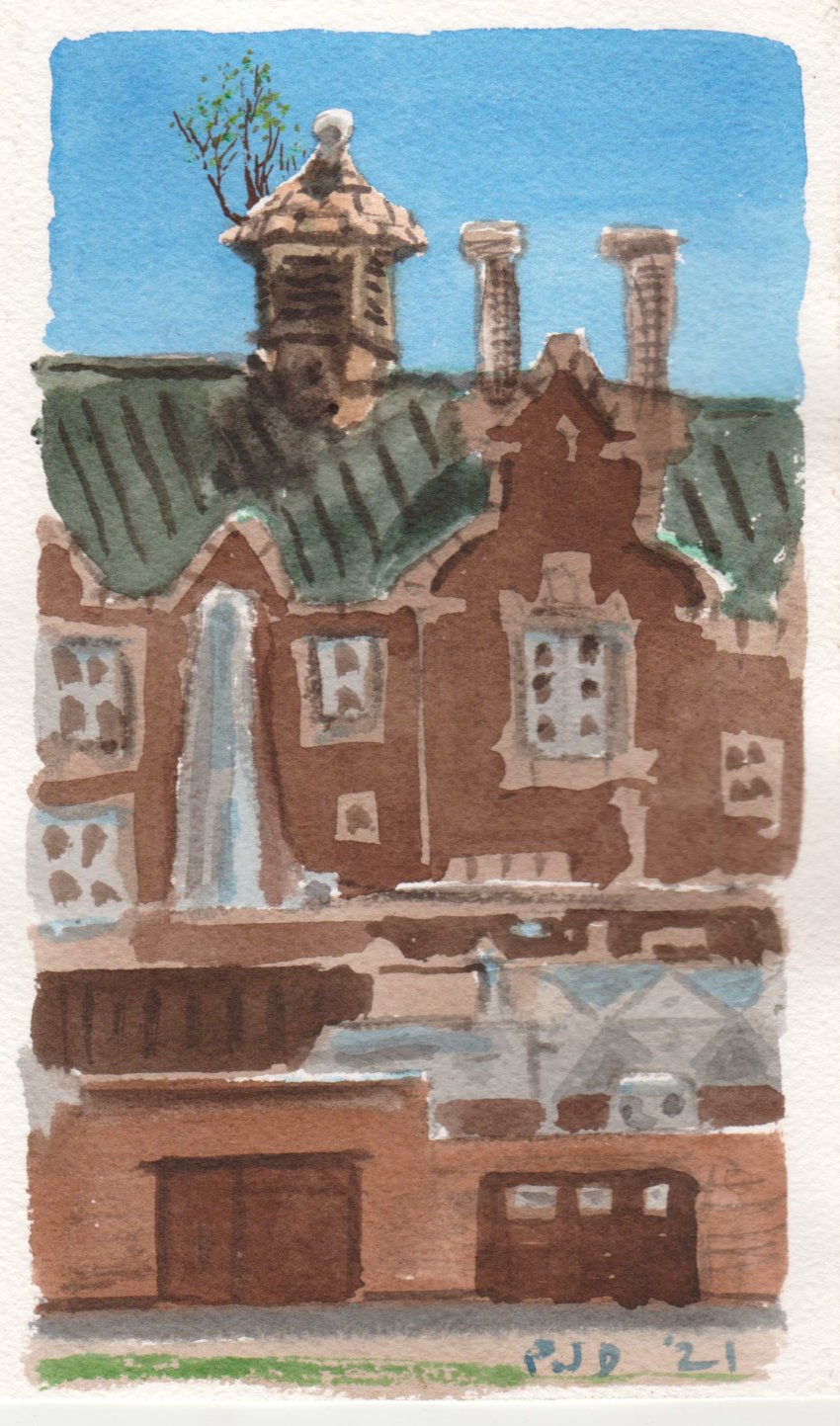
Tree on Roof, Loyola Campus 5 x 8" cold press, watercolour, April 2021 (No. 2626b)

Wednesday, April 21, 2021

Auto Shop Nocturne


With the curfew we can't leave home after 8pm so I put on the winter coat and hat and made a quick painting of a now familiar scene standing just in front of our condo. For my birthday one gift was a nice bike light which I hope to use soon, a sketch book, and an art book on Rembrandt. He was a bit of a ludite even for the 17th century, his palette consisted of all manner of earth colours from ochre to sienna to umber, and white, black, yellow and red paint. I tried it out in my other sketch book and it felt interesting for glowing interiors and murky backgrounds. In the auto shop painting I managed to use those kinds of colours to give the illusion of strong fluorescent light bulbs and a dim night sky. It was half moon tonight so there was a bit of natural light as well as the light from the subject matter. 

Auto shop Nocturne Somerled Springtime 4 x 6" cold press, watercolour, April 2021 (No. 2627a)

Sunday, April 18, 2021

Sunday Painting Trip Parc Jean Drapeau


On Ile St. Helen is a large park and concert area that used to be used for music and large crowds. They recently renovated the area to be more crowd friendly including stone walkways and an off-white gravely surface. I just enjoyed standing in the middle of it, having that much space around is a rare commodity. Behind the trees, Jacques Cartier bridge could be seen. I used yellow ochre (PY43) in most of the mixes, it was a paint I didn't like at first, but now I know how to use it in delicate washes and tints. At full strength it looks just like dijon mustard.

Concert Space Parc Jean-Drapeau, 8 x 10" cold press, watercolour, April 2021 (No. 2619a)


On the south side of the island is a small channel of the St. Lawrence called chenal le moin, which translates roughly into the smallest channel. The water takes on an emerald green and all sorts of turquoise tints. A large tree was hanging over the embankment, it had an orange dot meaning that it would be cut down soon. I felt that this tree had stood there watching over the river for perhaps a hundred years, but now its time had come to an end. That's why I composed the tree prominently on the left, and contrasted the direction of the tree bark with the direction of the river flow, which both have a similar texture. To finish I overlaid the branches, twigs, and spring buds. The chartreuse and greens of the buds made nice contrast against the emerald and turquoise of the river. I wanted to paint this scene last year but either the light wasn't right or it was too cold, but today the conditions were perfect for a moment. 

Chenal le Moin, Parc Jean-Drapeau, 8 x 10" cold press, watercolour, April 2021 (No. 2619b)


The island has several built in ponds including the so-named swan lake which only had ducks and geese in it today. The weather turned cold and overcast making it a difficult finish. You can see 'islands bridge' in the background, it connects Point St. Charles to Ile-St. Helen and holds the bike path I used to get here. I would like to come back to this scene in the future, the willow tree and reeds were a real challenge. Maybe there will even be swans next time.

Swan Lake, Parc Jean-Drapeau 4 x 6" cold press, watercolour, April 2021 (No. 2620a)


On the way back the sun came out again and I found a spot away from the path looking across the train tracks to some new condos they built in Ville St. Henri. The condos are built with red iron oxide bricks, umber bricks, and some fire engine red paneling. In the foreground I noticed little yellow flowers growing in the rocky embankment next to the tracks. In addition to the bright colours, I included several shades of grey, not 50 but quite a few. The clouds have 'Homer's grey' a mix of prussian blue (PB27) and venetian red (PR101), the gravel has grey ochre (PBk11), and the tracks and other accents have neutral tint (PBk6, PG7, PV19). I had abandoned neutral tint for awhile but found myself just having to make it every time, so it was easier to use this one from the convenience mix.

Tracks and Condos, Ville St. Henri 4 x 6" cold press, watercolour, April 2021 (No. 2620b)

You may notice paper sizes vary on my blog, the most common landscape size I use is 5 x 7" in fact I have over 1000 paintings on that format. To scale things up I have started to use 8 x 10" which is over double the surface area (35 versus 80 square inches). The 4 x 6" format is only 24 square inches, but it is a standard size. Standard size means American framing standards which are different from European or Asian. Here are the standards, 

Standard frame, picture, mat opening:

5 x 7", 4 x 6", 3.5 x 5.5"

11 x 14", 8 x 10", 7.5 x 9.5"

16 x 20", 11 x 14",  10.5 x 13.5"

20 x 24", 16 x 20", 15.5 x 19.5" 

30 x 40", 22 x 32", 21.5 x 31.5"

For example, if I paint on a paper that is 8 x 10" then I have to leave a half inch border so it fits in a standard mat and frame that you can buy at the store. Any other sizes have to be custom framed which is more expensive. 


Colour Infinity


It seems that I finally got through the paper that I over-soaked, it had turned into a potato chip both in shape and texture.  So I used the pieces to make a series of exploratory abstracts with plenty of colour. With spring here the scenes are mostly grey, green, brown and blue so it was refreshing to splash some colour on the paper.

Colour Infinity Swirl Away 5.5 x 7" cold press, watercolour, April 2021 (No. 2621a)


Purple and yellow are contrasted at the top of the web, but transform into the other around the web. In the background I used neutral tint a handy dark purple point from Winsor and Newton that contains PV19, PG7 and PBk6. The purple is PV23, magenta PV19, and the yellows are benzimida and various others.

Colour Infinity Web Crawler, 5.5 x 7" cold press, watercolour, April 2021 (No. 2622a)


Saturday, April 17, 2021

Saturday Bike Ride and a Few Paintings


Once again my plan was Park Jean Drapeau, but by the time I arrived at the canal path it was teeming with people not wearing masks. I turned right instead and found a spot well away from the bike path, secure with my fresh medical mask, and made this painting of the canal and dry reeds. In the background is an old industrial park that is being gentrified, there is a hipster craft brew restaurant underneath that rusty water tower. I painted the scene closer up, sitting on the other side of the canal last year. The water was umber plus indo blue, and the reflections the same mix but leaning to umber and darker. The reeds were similar, with raw sienna and burnt sienna.

Lachine Canal with Reeds 5 x 8" cold press, watercolour, April 2021 (No. 2623a)


Instead of forging ahead, I turned back into Ville St. Henri and found a secluded parking lot up by the highways. To my surprise there was a pile of snow remaining, covered in a sooty mess of gravel and sand. Trees in the middle ground were sprouting leaf buds, and a brick wall had been spray painted with my initials and 21 graffiti. Well, I made up the graffiti part it actually said something else but I copied the silver and black design. For the snow pile I wet the area and applied gray ochre with a dab of indo blue, then overlaid with more grey ochre and venetian red. I liked the soft crumbly appearance against the sharp background elements. Lets hope this is the last snow for awhile.

Last Snow Pile, 5 x 8" cold press, watercolour, April 2021 (No. 2624a)

Friday, April 16, 2021

Testing One Two Three Four


While prepping my palette for tomorrows hopeful painting trip, I found some tubes of paint that inspired this painting. Traditionally green, orange and purple are considered secondary colours, although this designation serves no useful purpose in art. What is the proof? Ask yourself if you would want wallpaper in your living room to look like this. The paints were dioxazine purple (PV23), phthalo turquoise (PB16), phthalo blue-green (PG7), and isoindo yellow (Py110) with a little benzi orange (PO62).

Secondary Thoughts 5.5 x 7" cold press, watercolour, April 2021 (No. 2622b)

This one used a similar colour scheme but more yellow and some white showing through. It was meant to resemble a kind of acoustic chamber, like the inside of a speaker, or ear drums. As I learn more about colour theory, it occurred to me that I do not see colour like other artists who write the books, I suppose that I rather hear the colour, or feel it perhaps.

Sounds of Colour 5.5 x 7" cold press, watercolour, April 2021 (No. 2621b)


I did this one a few days ago, partly to use up some of the ultramarine blue I had on the palette, you can see it in the snakey thing in the foreground. The name of the painting was simply a place holder I added while cataloguing, it seemed a ripe place for a painting. If it weren't called this, I would have called it colour infinity.

Not Painted Yet (Colour Infinity) 4 x 6" cold press, watercolour, April 2021 (No. 2611b)

Dear diary, I also practiced a Brazil-themed painting this week, trying to work out the best paint combination to depict the Amazon river and rain forest from a birds eye view. Google map satellite view helped me get in the ballpark, then I did the smartest thing an artist could do in this situation, ask a Brazilian! Cilei agreed that goethite (PBr7 granulating) was the best choice for the river, and the mix of phthalo green yellow shade (PG36) with benzi orange deep (PO36), and yellow highlights (PY175) was best for the rain forest canopy. Her last name translates into people by the river, so what could be better than that? I will work on the actual painting soon, planning on using a larger piece of the St. Armand paper made in Montreal. So it will be a true Brazilian-Montreal fusion.

Brazilian Test 5 x 7" cold press, watercolour, April 2021 (No. 2607b)

Tuesday, April 13, 2021

Ho Hum Bird and other abstracts

If you check out the bottom of my blog on Botswana, I posted the first version of the Botswana painting which was in my pile. I just finished catching up on the catalogue for this year's paintings and found a few other interesting ones like Ho Hum Bird. Like a humming bird, but bored!

Ho Hum Bird 3.5 x 5.5" cold press, watercolour, March 2021 (No. 2613b)


Last year I abandoned my favorite red paint alizarin crimson (PR83) because it fades in the sunlight. In this painting I recreated the memories of it using a variety of quinacridone and pyrol reds. I also threw in some ultramarine for old times sake, I have a pan of PB29 from Stoneground paint company.

Memories of Alizarin 5 x 7" cold press, watercolour, April 2021 (No. 2591b)


With ultramarine blue it is easy to paint underwater scenes. The name was inspired by the name glory of the snow, the little blue flowers. I was actually trying to work out which type of blue would be best to paint the flowers next time I get a sunny day.

Glorious Blue  5 x 7" cold press, watercolour, April 2021 (No. 2592b)

 And for dessert...

Chocolate Sparkle 1.5 x 5" cold press, watercolour, March 2021 (No. 2610b)

Somerled Apartment Stormy Sky


This painting was in the pile, it was done the same day as the paintings on the chilly day long walk in March. I didn't like this painting at first but when I was updating the catalogue, the stormy sky really caught my attention and it brought back the memory of that day. In the foreground is the wood and metal awning of a fruit store, in the background is a giant apartment and telephone wires. There is an extreme amount of telephone and electrical wires around there creating a brutalisk appearance. The windows all have slightly different colours due to the stormy sky.

Somerled Apartment Stormy Sky 5 x 7" cold press, watercolour, Macrh 2021 (No. 2566)

Benny Health Complex with Rocks

I have painted everything in this park several times now. Each tree from multiple angles, lighting, time of day, and season. And now the very rocks I sat on painting the parking lot across the street. Today the rocks had broken glass around them so I sat over on the retaining wall close to where I painted the path last December. The brick colours are a challenge to paint, there are at least 5 things to optimize. First the hue, that is the 'colour' which ranged from orange-yellow all the way to red. Second, the chroma, which is generally in the middle, that is, greyish. Third the value, which is middle value (lighter) in the sun and lower value (darker) in the shade. Fourth is the substance uncertainty, a phrase coined by Handprint.com (MacEvoy) that refers to the difficulties in mixing different paint together to achieve the correct hue, chroma and value. Fifth, the computer- somewhere between scanning and displaying on a monitor or screen the brick colours turn about 10 degrees to the red side. Lucky for me there are a lot of red brick houses to practice with!
 

Benny Health Complex with Rocks 5 x 7" cold press, watercolour, April 2021 (No. 2579b)

Sunday, April 11, 2021

NDG Secret Path, Blue Flowers


Spending most of 2020 wandering around NDG looking for places to paint away from the crowd I thought I had discovered everything. Today I turned left off Broughton, and reached a small clearing on Easton Avenue with  path leading down to Avon/St. Jacques. I had seen this clearing and trees from down below but never figured a way up there, and on google map it does not show up in any significant way. A narrow footpath led down through the small forest, and a tree was arched over the path like a gateway. The arched tree was mimicked by the curving sidewalk in the middle ground. On the distant horizon a mosque was visible. Usually I do not depict religious buildings but from time to time include them as accents. The qubba (dome) was a dark yellow ochre (PY43) with warm highlights. The path relied on venetian red (PR101) and umbers (PBr7), while the trees were umber neutralized with indo blue (PB60).

The Secret Path NDG, 5 x 7" cold press, watercolour, April 2021 (No. 2591a)


Walking down the path I came across an embankment covered with little blue star-shaped flowers and chartreuse leaves. These might be Chionodoxa Luciliae (Glory Of The Snow) a small star shaped blue flower that grows up in the spring according to the website plant-and-flower-guide.com. In the first painting I was looking down the path, in this painting I was looking up the path.The blue flowers were much brighter and higher chroma but there are several limitations in my palette and with the paper. The colour was made with phthalo blue sapphire (PB15:0) and rose red (PV19), which makes a muted lilac, and the paper was the one I over soaked so it absorbed a lot of paint. Next time I can try with ultramarine (PB29), quin magenta (PR122), and properly prepared paper. There is also a trick where you apply a white paint first, the colour pops even more. I may try that but currently do not own any white paint due to the longstanding myth that white paint is bad. In fact, the Victorian watercolour painters were known to prime their papers with white paint in order to enhance the beauty of the watercolours. I learned that on Handprint.com (MacEvoy). Turns out the internet is a great tool for an artist (and their fans!).

Glory of the Snow 5 x 7" cold press, watercolour, April 2021 (No. 2592a)


Saturday, April 10, 2021

Paint where they aint, Saturday Painting Trip


The weather was unseasonably warm today, like summer but without the green! I hoped to make it down to Ile Jean Drapeau but the Lachine Canal path was teeming with people so I veered west and found a spot to paint a few meters off the path. The scene looks north towards Mont Royal, with the dilapidated factory in the foreground, the same one with the pink house on top, which I painted before but you dont see the same angle here. I wanted to feature the nature, you see the gravely grassy growth all over as the buildings become one with the land. I used the grey ochre for the ground with raw sienna throughout. Burnt sienna was used for the bricks.

Ville St. Henri Gentrification, 5 x 7" cold press, watercolour, April 2021 (No. 2581b)


Finding green space in Montreal is always a challenge, there was a small lot planted with trees and flower boxes, some yellow flowers were growing and sparrows were hanging out. It just takes a little green space for the animals to have some habitat. I composed the scene so that what little nature was present occupied most of the painting. The background was a challenge to fit in between the trees. It was nice to paint in warm weather because the paint dries quick and I can do fancier techniques as compared to the winter.

Ville St. Henri Flower Box 5 x 7" cold press, watercolour, April 2021 (No. 2583b)


There were a few scenes but I had to find spots away from the people even though I had my medical mask on. This is done in a 'green alley' the city has reconfigured laneways throughout the city to contain planters, trees, flowers etc. I liked how the shadows were radiating on the ground. It was also irresistible to paint the yellow ochre bricks. In fact all of the earth colours came into play here, the tree bark, bricks, mortar, wood, dirt, sidewalk all used earth paints. The green was phthalo green. As I suspected, most of Montreal can be painted with brown, green, grey, blue, and orange for the pylons! 

Ville St. Henri Tree Shadows, 5 x 7" cold press, watercolour, April 2021 (No. 2590b)

Swirling Earth and other thoughts


The earth paints are composed of browns, oranges and various shades of rust which makes for some difficult colour choices. After extensive practice I created a symphony of earth I called Earth Embrace, and other small paintings like the one above. A discovery was to use value contrast, in particular the yellow ochres are considerably higher value than the umbers, and siennas in between. In the small study all shapes were outlined in ochre which gives a good visual contrast and accentuates the actual colour differences between the earth colours.

Swirling Earth, 2.5 x 5" cold press, watercolour, April 2021 (No. 2617a)


On the back I made a Botswana test, this time using synthetic colours like quinacridones, benzimidazolones, and perylenes. Visually they are similar to earth colours when mixed in the right proportions. The two orange pillars are burnt sienna which show the contrast. When I did the first Botswana painting it was not quite right so I did a second one and posted it a few days ago for the World Inspired Landscapes: Botswana.  If you click on the link or go back to that blog, I updated the painting with a new third version and added some comments about the versions. So, next stops Brazil and Brunei on the world tour. 

Sunset Test, 2.5 x 5" cold press, watercolour, April 2021 (No. 2617a)

Wednesday, April 7, 2021

April palette adjustments


After testing out the new palette setup there were a few things not quite working out. To tweak the setup, I kept the earth colours in place, re-organized the other paints, and added and removed a few. Starting on the top row, 9th slot, I included four paints for making various shades of greens, followed by four cool shadow paints. On the bottom are high chroma (saturated/bright) yellow, orange, reds, magenta, and some darks. Two paints were removed because they really stain the plastic (phthalo blue PB15:3 and phthalo blue turquoise PB16) and one because it was a little redundant (PR122), although those are all great colours indeed. I included pyrole vermillion with the extra spot because I missed it during the test runs. 


This test painting depicts the mixing areas and approximately what can be made, so you see the potential. Top left is for a variety of browns good for tree bark, dirt, wood etc, top middle is for greens like foliage and grass, top right is for cool shadows or darker greens, and to neutralize the browns. Bottom left is bright yellow and oranges, bottom middle is reds and probably brick reds, then the mixing cups bottom right are for sky blue. I surrounded the blue circles with a colour that represents cloud shadows, it was venetian red with iron blue, a combination that was used by Winslow Homer which I learned from Handprint.com (MacEvoy).  

The previous palette setup was mostly following the hue angle (rainbow colours), whereas this set-up is more functional, each part has a job to do. It is closer to my old palette set up, albeit on a larger scale. The old palette is depicted in Inner Workings. My blog becomes a record of notes and images that helps keep track of it all, I apply a 'paint test' tag to all the experimental stuff. 

Pal-ing Around 5 x 7" cold press, watercolour, April 2021

Loyola Campus Green Roof

On my way to work today I stopped to make a quick painting of Loyola Campus sitting on the new bench that they installed last year. I did a similar painting from the same spot last year of a tree and the green roof. The trees are still there but I was short on time today and had to cut some of the detail out and focus on the colours and textures. The roof was yellow ochre (PY43) with phthalo green (PG7) and some lemon yellow (PY175), while the grass was mostly indo yellow (PY110) and phthalo green (PG36). Those are light and bright paints that produce interesting saturated olive greens and cool greens. The brick was a mish mash of various colours, I mixed all the green mixes with pyrol red (PR254) to produce brown. The colours, values and textures are right on, next time if I have more time and a bigger piece of paper I could capture more detail.

Loyola Campus Green Roof, 5 x 7" cold press, watercolour, April 2021 (No. 2586b)

World Inspired Landscapes: Botswana

Here is the first version which was a little rough around the edges but had some great energy. The green splashes worked, and the animals were leaping right off the rock. The drawings were inspired by actual rock art from Botswana. Now that I see it scanned, it's kind of my favorite version! The animal in the middle with the stick legs makes me laugh.

 World Inspired Landscapes: Botswana i, 5 x 11.5" cold press, watercolour, April 2021 (No. 2606a)

World Inspired Landscapes: Botswana iii, 5 x 7.5" cold press, watercolour, April 2021 (No. 2607)

Located in East Africa, Botswana is one of the fastest growing countries due to abundant resources and tourism. It is a popular safari destination since the majority of the country is protected land teeming with zebras, elephants, elands, lions, and all sorts of birds and reptiles. It is also know for its cave and rock art done by indigenous people from thousands of years ago and in modern times. In my painting, the animals resemble living rock art, they were done in silhouette using burnt sienna (PR101) and some burnt umber for shadowing (PBr7). Those are likely to be similar pigments as the ancient rock paintings were made from, the are very durable and don't fade over time. The rock artists (painters not musicians!) probably got their paints from a trader or local paint maker, archeologists found evidence of a sophisticated paint making operation including grinders, containers, and about 4 or 5 types of pigments. By the way, did you notice the lion lurking in the painting?

World Inspired Landscapes: Botswana ii, 5 x 11.5" cold press, watercolour, April 2021

The painting at the top of the blog was the third try, this one above was the second try. The first try was a little off the mark so I didn't scan it, its on the back of this one. The main change I made was the proportion going for a taller aspect ratio, and the forest was redesigned. The animals can be endlessly rearranged but for full impact this kind of painting would need to be on a larger surface area format. The main thing is that the series is meant to capture ideas and have a little virtual adventure after all. (No. 2606b)


Tuesday, April 6, 2021

Earth Embrace


Earth paints include mineral/clay based pigments derived from artisanal mining operations, and synthetic derivatives produced from iron/ore oxide slag. These represent the oldest pigments known to art, at least, the ones that survived the longest since there are cave and rock paintings using earth pigments going back tens of thousands of years. Yellow ochre, which can be seen throughout this painting consists of a small proportion of hydrated iron oxide along with various silicates and other minerals, but its the hydrated iron oxide that gives it the distinctive yellow colour. With heating the hydration is removed and the colour becomes orange, red, brown, and even black. If more iron oxide and manganese is present, then the colour is darker and tends to be greenish, chocolate brown, chestnut brown, dark oranges, and even a dark purplish red. You may notice green, that is called green earth (PG23) made of a phosphate based mineral from Nicosia Italy or Antica (USA?). A lot of these paints have cool names, like pozzuoli red earth, mars orange, or lemon yellow ochre. 

The painting was done on the back of an old painting that I cut down to poster size so that it fits in the frame we have on the wall. It is a highly absorbent paper that further reduced the chroma (colour saturation) of the paints. The photo is okay, I took it outside with full sun, but you can imagine the colours are a bit brighter and sharper in real life. It was the best I could do with one hand on the painting, one on the camera, and a healthy bit of wind outside blowing the paper around. If you search you will see my initialing (PJD 21) and the painting title hidden amongst the patterns.

Earth Embrace, 24 x 36" 90lb, watercolour, April 2021