Wednesday, April 30, 2008

Red Hydrant, Av de L'Esplanade et Fairmount

Sometimes the best scenes are right next door. This scene was painted just down the street from where I live. You can practically smell the fresh bagels made at Fairmount bagel down the street. The building in the middle ground is College Francais, the green is actually not grass but painted concrete. I liked the contrast between red and green of the hydrant and the potted plant in the foreground. I remember somebody parked their car right in front of where I was sitting, I was rather upset and made sure to spill a little dirty water on the car before I left (the paint is water soluble, and not toxic!) The key to making a colour appear bright (like the red hydrant) not so much the colour itself, but the colours that surround it. For example, to make a colour appear bright, place less bright versions of the colour nearby. In the painting the sidewalk is a pale pink, and the bricks of the college is a red-grey, this makes the red of the hydrant appear to be brighter. A beginner mistake is to use a bright colour right out of the tube (especially in oil painting), but this will only lead to 'fake' looking colours. And placing complementary colours (green in this case) also brightens the appearance of the main colour. 


Red Hydrant, watercolour 5 x 7" cold press, 2009 (No. 1069)

Monday, April 28, 2008

Green Mossy Truck, Japan

After some technical problems with the blog I have finally returned. This painting was done in Kundai, a small town north of Kyoto, made famous for its fire-festival and the hot springs spas. I walked up a winding mountain road and saw this old truck in a clearing, just beyond the truck is a deep valley and a steep tree lined hill seen in the background. The truck is old and rusted and covered in a green moss and trees. I liked how the truck seemed to be absorbed by the environment. It is always hard to paint in humid conditions, and here there was almost no sunlight. The paint dries very slowly, you see a lot of fuzzy edges and blurred paint. One trick I did was to add small flecks of pure paint, see the yellow spot in the trees. This adds a flicker of light to an otherwise overcast scene. 


Green Mossy Truck, Japan, watercolour 5 x 7" cold press, 2006 (No. 1211)

Thursday, April 17, 2008

Lab Book # 5, Making Connections

This was the second painting done in the lab-book series, derived from doodles made in the 5th lab book I had completed during the Ph.D. in U of Western. You can see the numbers in various parts of the painting, which are the actual page numbers that the doodle came from. After the first lab book painting (Lab Book #4, Finding Space), I wanted to unify the doodles into an overall structure that tied them together. So I started with an under-painting of these ribbon-like bridges crisscrossing the picture, and followed by placing the doodles in and on and across the structures. In the next painting (Lab Book # 6; Spanky's Fantastic Cathedral), I would being the unifying-doodle concept to a new level b having a recognizable object (the cathedral), an idea that came as a development of the concepts in this painting. In Lab Book # 5 there is a harmonius colour scheme of mainly peach and salmon tones. To make a colour scheme that appears unified, I started by laying down a pink wash on the whole painting-to do so, I mix a lot of the colour in a basin on my palette, and then apply the wash to the top edge of the painting, then tilt the entire paper (which is stretched on a wood rack) to let the wash flow down as I use my brush to guide it. The technique takes some practice. After that, all of the drawing elements are put on using greyish watercolour paint mixtures. Finally, coloured washes are applied. I used a colour triad: peach, blue-green, and yellow-orange accents all through the painting. I also applied a darker wash to some of the ribbons to make them look like they were in the background. 

 Lab Book #5, Making Connections, watercolour 22 x 30" cold press, 2004 (No. 1993)

Wednesday, April 16, 2008

Lantern Festival

Lantern Festival is one of the many paintings I made when working at the gallery. I do miss the days when I could have eight hours a day to paint. This painting began as an aimless doodle, and a customer who was visiting from China sat down and helped come up with the idea that this girl in the painting was at a Lantern Festival.

The Lanterns were done by putting down a blob of yellow paint, and then dropping in some scarlet lake (a warm red) with the brush. After it was dry the dark brown paint was applied on top. The Chinese symbols were drawn by the customer, but I forgot what they say...'Lantern Festival' is a pretty good guess though. 

Lantern Festival, watercolour 5 x 8" cold press, 2003 (No. 1720)

Monday, April 14, 2008

Doodle Study: Mind Eye Growth


This is one of the smallest paintings I have done! The painting was just a doodle made up on the spot when I was working in the gallery in London Covenant Garden Market in Ontario. The gallery also held a competition for small paintings and I entered one (for which I do not have a photo) and although I did not win a prize, somebody did buy it.

This painting started with the background, working in layers from light in the center to dark in the background. When it dried I put down the outlines, and finally filled it in with the colours. The colour scheme is a bit of a triad; blue-green, yellow-orange, and a pink. 


Mind Eye Growth, watercolour 3.5 x 3.5" cold press, 2003 (No. 1543)

Thursday, April 10, 2008

Where Go the Fish?

Here is a painting done in the basement apartment in London Ontario you may recognize some of the scenery from "On Display" posted April 2. The idea for this painting came from a dream I had where my aquarium fish were swimming in the apartment. Apparently this type of dream means good fortune in Chinese culture. It may be true to some degree since I did end up selling the painting to a professor at University of Western. On the table is a puzzle I was working on, one of the fish is trying to eat a piece. Most of the fish are guppies, with a few zebra fish stuck in here and there.

The fish shapes were first painted with a liquid masking fluid which dries and protects the white paper underneath. The rest of the room was then painted over top of the masking fluid. Then, the masking fluid was removed with an eraser revealing white paper in the shape of the fish. The details of the fish were finally painted on, based on sketches I made from actual fish from my tank.

By the way, hot press means that the paper is very smooth, while cold press means that is had a rougher texture. The weight of the paper refers to the density (or heaviness) of the paper. One of the highest is 300 lb, which is like very thick cardboard. 140lb is an intermediate density. High weight paper costs more and handles differently, requiring more paint, but it does not buckle as easily as the low eight paper. This particular work was done from a 'watercolour block' which is a stack of sheets held together by a plastic wrap, which prevents buckling of the paper. Most of my work is now done on loose sheets stretched and stapled down.


Where go the Fish, watercolour 15 x 11" hot press, 2000 (No. 1872)

Tuesday, April 8, 2008

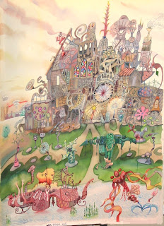
Lab Book #6, Spanky's Fantastic Cathedral

Perhaps the most fully realized work in the Lab Book series, Spanky's Fantastic Cathedral shows an elaborate cathedral structure rivaled only by Gaudi's in Spain, and a bizarre garden in front. Each part of the cathedral was a small doodle, all combined to create the illusion of a larger structure. The background is a desert with a sunset, the cathedral is also lit by numerous local sources. In the foreground the garden is decorated with wacky lawn ornaments, and in the pond a boat with a totem head in it, and a leaping sea monster.

The technique for this painting was similar as for the other Lab Book series. Note the stained glass in the upper part of the cathedral, this is a common motif in my abstract work. To paint stained glass I put down pure colours in sections, letting them dry one at a time, then I overlay the patchwork of colours with a heavy black outline (black made from viridian green and alzarian crimson with touch of ultramarine blue).

Note, I have just now stretched a new paper for another large doodle painting, to be called Lab Book #8, the End of Colour. The overall composition is in my head now, just have to get it out!


Lab Book #6, Spanky's Fantastic Cathedral, watercolour 22 x 30" cold press, 2004 (No. 1994)

Elemental Equation

This painting depicts four elements of nature. Earth, water, and fire are represented by characters, and wind is found in the blowing trees and grass and billowing clouds. The light from the fire character reflects off the water and earth people, who seem to be trying to escape or look away. The fire person looks back towards the viewer innocently.

This work was done last week in one sitting. I had recently cleaned my palette completely, and had only put back four colours back, a pale yellow, a warm red, a blue and a pink. The simple colour scheme helps bring unity to the elements, the warm salmon tones of the fire reflects off the water and the earth and the ground. I have used local complementary colour schemes in several spots, above the fire head it is a purple-yellow scheme, by the rear of the earth man there is a red-green scheme, and the water man brings in a blue-orange complement with the fire man. 

Elemental Equation, watercolour 11 x 15" cold press, 2011 (No. 1462)

Wednesday, April 2, 2008

First Original Watercolour, Two Red Flowers

This was really the first original watercolour I did, during a 2 month watercolour course my Mom enrolled me in (1989). I have not received formal training since then, although I have read books on the matter. The flowers were painted from imagination in about an hour. I remember squeezing the paint on the palette and asking the professor if I needed to add water to it? In retrospect this is the most basic thing about watercolours, you add water to them! What got me hooked was the bright colour, and the fact that you could push paint around a blank piece of paper and come up with an image that looked like something. I'll post some more early works as we go.

The early palette was very simple, I only used aureolin (pale yellow), alizarin crimson (dark red), french ultramarine (dark blue) and burnt sienna (warm brown). Working with these colours I established a lot of the mixtures I still use today. The greens in the flower painting are made by mixing the blue and the yellow, the more grey leaves in the main stem are blended with a bit of red. One flower is cool red (which contains some french ultramarine blue) and the other is a warm red, no doubt mixed with the aureolin yellow. The background contains some out-of-focus leaves which helps give depth to the picture. It is initialed PD with 89 in a circle in think black ink pen, a practice I stopped shortly after in favour of the 'scrawl' signature using light blue paint. 

 Two Red Flowers, 12 x 9", watercolour paper. 1989 (No. 0084)

On Display (Dish Soap)

This paining was made when I lived in a basement apartment in London Ontario, the windows seen in the background are at the sidewalk level. Sometimes people walking by would look in, making me feel like I was on display like a gorilla at the zoo. On the sofa there is a monkey holding fish-baloons. The cabinate to the side actually had my fish tank on it, but I replaced it with a 'doodleism' cactus plant (from a lab book). The foreground has a bottle of dish soap decorated with another doodle on the label, and a phone beside, (waiting to be answered?). You can see the desk in the front, it is the old kitchen table from my family home, I still have it today and do all my indoor abstract work on it. Also notice the birds perched on a half-coconut hanging from the ceiling, this was a decoration I bought in Barbados.

My favorite part of the painting is the yellows in the bottle. There is a layer of pale yellow overlapped with a brighter yellow accented with green and a touch of purple. the yellow was aurelian yellow, and perhaps a bit of windsor yellow, a strong pigment that needs be used in small amounts. The shadows are the same yellow but with more green and purple. I like the balloons too, they were real, so was the monkey (ok, it was stuffed). 


On Display (Dish Soap), 11 x 15" cold press, watercolour,  2000 (No  1767a)