Sunday, July 31, 2022

Park Extension Day Two


Today's goal was to go to Anatol bulk store in little Italy but it turns out they are closed on Sundays during the summer. Instead I headed back to Park Extension which is not far at all from Little Italy, they are only separated by Park Jarry. In this painting, I tried a new type of horizontal composition with one third of a building, a strong background element, and the rows of cars. The rows of cars are the hardest part but I am getting better at doing it! At least you get the feel of the neighborhood here.

Ogilvy Street, view West, Park Extension, watercolour 5 x 7" cold press, July 2022 (No. 3185)


This colourful storefront is up on Liege street, it is an Islamic-themed grocer that sells Halal meat and other products. Next door to it, there was a vegetarian grocer probably aimed at the Hindu market. It was interesting to see two such stores side-by-side, in fact the whole neigborhood had a mix of Islam and Hindu with backgrounds of India and Pakistan. To paint the store front I sketched out the shapes with watercolour paint and a small #4 brush (I never use pencil), and then proceeded to fill in the details. I could only stand on the diagonal corner so that the actual scene had a strong perspective that had to be squared out in the painting. Several people stopped to look and seemed to enjoy it.

Marche Macca, Park Extension, watercolour 8 x 10" Strathmore Gemini 400, July 2022 (No. 3052)

On the main drag, Jean Talon street, there are numerous stores and restaurants. These two stores provided another interesting contrast, on the left was a traditional Indian dress store with a chandelier, on the right was a Greek souvlaki restaurant. I was standing in the popular Athena park looking directly across the street. Aside from the subject matter, the two storefronts had contrasting bricks, shapes, and colours. To get the intricate, shimmering dress texture I applied a layer of golden yellow, which is a slightly neutral yellow-orange, applied red texturing with a number 4 brush using perylene maroon and pyrol red (PR179, PR254), then applied some neutral red shadowing. 

Indian Store, Greek Store (Neighbors) Park Extension, watercolour 5 x 7" cold press, July 2022 9No. 3186)

Saturday, July 30, 2022

Ride Around Park Extension

The neighborhood next to Park Jarry is called Park Extension because it is located just north and to the west of Avenue du Parc. It is a multi cultural area with elements of India, Pakistan, Northern Africa, Greek, and many more. Some small grocers advertised the food culture, one even had all of these cultures listed on one sign! The streets smelled of delicious chicken tandoori and onion bhajis. There are a few small parks in the neighborhood, this one is on Ball street. It had a circular path and some interesting oak trees reaching for the sky.  I used the new Strathmore Gemini cold press watercolour, it was good for texturing but absorbed a lot of colour. I had to adjust for that by adding a bit of colourful glaze like yellow in the grass.

Park De Lestre, Park Extension, watercolour 8 x 10" Strathmore Gemini 400, July 2022  (No. 3051)


I spent more time riding around and looking at potential scenes than I did painting. To paint in this neighborhood I had to adjust my expectations a little; usually I seek out natural elements, but here it was the store fronts that captured the spirit of the area. This store front was selling Pani Puri which seems to be a small stuffed pastry the size of a golf ball. Apparently it was very popular because people kept parking their car in front of the scene and pedestrians were stopping to get some of the corner eats. Beside the booth was a colourful cart with ornate decorations.

Corner Pani Puri, Park Extension, watercolour 5 x 7" cold press, July 2022 (No. 3183)

At last I painted this scene of a corner vegetarian cafe called La Place Commune. It had a nice looking patio decorated with grape vines, and many interesting adornments on the building. Behind the patio was a big window with elaborately patterned curtains. The sun came out midway through the paint, so I captured the shadow of the sign and some other highlights to create a summery glow. I think this scene really captured the spirit of the neighborhood.

Cafe La Place Commune, Park Extension, watercolour 5 x 7" cold press, July 2022 (No. 3184)

Insistent Tree, For Rent


Just down the street a bank closed some years ago, and the building is for rent (a louer). An insistent tree starting growing between the foundation and a crack in the sidewalk. Now the tree is over 3 meters tall! I painted the insistent tree before from a different angle and when it was smaller. One day they will probably chop it down so I decided to make another painting. It points to the lack of trees on Somerled street, aside from this tree there are no others. It makes the sidewalk and storefronts extremely hot in the summer without any shade. I decided to include the SUV in the foreground, which was reflecting the scene on its hood. I painted the car first knowing it would drive off (which it did), then completed the background elements.

Insistent Tree, For Rent, watercolour 5 x 7" cold press, July 2022 (No. 3182)

Chair in a Field of Yellow Buttercups


Awhile ago I painted two chairs in field, followed by two chairs in a field with aspen seeds. This painting is in the same field but with a different chair and a different look to the field which was covered in small yellow flowers called buttercups. One reason there are so many chairs in this field is that the Harley street neighborhood has no park, benches, or picnic tables anywhere, so the local residents took matters into their own hand. I saw about half a dozen chairs along the tree line in the shade. This is the third version of the painting, it was made a few days after the first two versions seen below.

Chair in a Field of Yellow Buttercups, version 3, watercolour 5 x 7" cold press, July 2022 (No. 3181)


This was the second version of the painting, the colours were bright, but the value contrast and texture work was unsatisfactory. I tried to depict shadows into the background but it turned out muddy. The wood of the chair had to be much darker than the field in the background. In the third and final version that is shown above I adjusted the colours and values to give it more luminosity, and downplayed the background shadows.

Chair in a Field of Yellow Flowers, version 2, watercolour 5 x 7" cold press, July 2022 (No. 3176b)


Here is the first attempt which captured the chair and general composition but started to unravel fast! I just tried a few things, then went straight to the second version. In the third and final version, I used my trusty hogs hair brush to apply the green grass on top of a layer of hansa yellow medium (PY97), and the green was mostly made from phthalo green (PG36) and iso yellow (PY110). The first two versions included perylene green (PBk31) but it darkened the value too much. It is not often I repeat the same scene, but this was a deceptively complex painting.

Chair in a Field of Yellow Flowers, version 1, watercolour 5 x 7" cold press, July 2022 (No. 3180b)

Thursday, July 28, 2022

Here for the Puzzle

This is an abstract puzzle done on the strathmore paper. painted on the back of another painting. The paper is meant for sketching, so I might just use it for abstracts instead of location paintings. Each one of the colour pieces has an internal colour scheme, and overall the paintings consists of 'warm' colours. That is, orange-yellow, orange, red, and brown, with just a bit of cool blue and green mixed in. The turquoise piece really pops out. I have used the puzzle theme in the past, for example with addictive puzzle, snakes and puzzles, and last year's colour puzzles. For this painting I was thinking more of science, and how we are all working on making discoveries and solving the puzzles of nature.

Here for the Puzzle, watercolour 8 x 10" Strathmore Series 400, July 2022 (No. 3044b)

Wednesday, July 27, 2022

Evening ride to St. Lawrence River


On a moonless evening I rode my bike down to the Lachine area where the canal meets the St. Lawrence river. At the end of a long park there is a great view up the river where I have made several paintings before. The view to the far shore, which is west island, was dotted with lights and a few stars were visible. Without a moon the colours were indigo and dark red violets. Amber light from the park illuminated some foreground foliage.

Evening View up St. Lawrence River, watercolour 5 x 7" cold press, July 2022 (No. 3178b)


Capturing the reflections was an interesting challenge considering that there is no white paint in typical watercolour. I started with the shore line using a mix of carbon black (PBk6) and perylene green (PBk31). The foreground shoreline was illuminated by a strong amber light that was behind me. I used variations of orange and olive, and captured the tree shadow and my shadow (with bike!) by adding a touch of purple. The purples were mostly indo blue (PB60), pyrol orange (PIO73) and quin violet (PV19)

Evening View of Lachine, watercolour 5 x 7" cold press, July 2022 (No. 3179)


On the way back I saw the concrete factory up on Patrick street, it was brightly illuminated from underneath. Trucks were filling up with product, so the whole factory was whirring and bumping and making smoke. The sketch elements went down first, then I quickly filled in the lights and darks using wet-in-wet and dry brush techniques. After a few minutes, the mosquitos found me! Next time I will remember to bring some bug spray.  

Lachine Canal Factory in Evening, watercolour 5 x 7" cold press, July 2022 (No. 3180a)

Yell Ow (Lemon Crackers)


 Dozens of paints claim to yellow but which one is the real yellow? Looking closely you may notice that some yellows are slightly orange and others slightly green, so a perfect yellow is neither orange or green. The funny thing about yellow, if there could be something funny about a colour, is that our eyes do not contain a cone that specifically sees yellow.  When the red cone and green cone are illuminated the result is yellow. This understanding explains the tenancy for yellow to be orange or green tinted. Knowing this also helps to mix yellow and determine the proper shadow colours. In this palette cleanser I explored variations of yellow in an abstract design. There is just one smiley face person hiding in the mix.

Yell Ow (Lemon Crackers) watercolour 9 x 12" watercolour paper, July 2022 (No. 3048a)

Sunday, July 24, 2022

Park Extension Storefront

Park Extension is a neighborhood located adjacent to Jarry Park and North of the Mile End area of Montreal. It is a very colourful, multicultural area with many interesting looking storefronts including this dress shop. The fabrics had really bright red, magenta, and orange with turquoise and blue accents. The rest of the scene was composed of muted pastel versions of those colours. A family passing by stopped to watch me paint for a few minutes so I tilted the paper towards them so they could get a good view of the brushwork. Most folks either ignore me, or sometimes they look at the scene trying to figure out what is so interesting. Unfortunately it started to rain, and with severe thunderstorms in the forecast I packed it in and rode home. Incidentally it did not rain very much!

Park Extension Storefront, Colourful Dresses watercolour 5 x 7" cold press, July 2022 (No. 3178a)

Saturday, July 23, 2022

Hot Plateau

It was a red hot day in the Plateau. This bus was sitting in the same spot for quite some time allowing for more detail to be captured such as the illuminated red tail lights. The surrounding buildings and trees were classic Plateau fare, along with the concrete and roads. The shop with the green awning seems to be a cafe or dépanneur.

Bus near Laurier Station, watercolour 5 x 7" cold press, July 2022 (No. 3169b)

Park La Fontaine is a classic park in the Plateau. Today it was well attended by locals trying to get some sun, or to stay cool in the shade. I found this view of the pond looking towards the footbridge. Some ducks swam by at the end of the painting and I added them over top the water.

Bridge and Waterfall Park La Fontaine, watercolour 8 x 10" Strathmore Series 400, July 2022 (No. 3050b)

The pond is surrounded by a walkway lined with benches. I was standing on the other side of the pond, looking through trees. The colours were duller than you see in the painting but I wanted it to look like a brilliant summer scene.

Benches Park La Fontaine, Turquoise Water, watercolour 5 x 7" cold press, July 2022 (No. 3176a)

On the way back I stopped in the shade to cool off a bit. This scene was of Mount Royal on the background with Rachel street going through. The smoke stack with the blue smoke was coming from a chicken rotisserie. When the wind is right you can smell barbecue chicken all down the street.

Mile End Rotisserie, watercolour 5 x 7" cold press, July 2022 (No. 3177a)

Friday, July 22, 2022

The Landscape Consumers

Time for another palette cleanser! In art history there have been a lot of famous landscape painters like the French impressionists and the Canadian group of seven for example, but landscape painting goes back for thousands of years. Asian and European artists were painting landscapes, and perhaps African artists were the first with cave art dating back tens of thousands of years. It occurred to me that landscape painters, including myself, consume the landscape with our eyes, and turn it into a painting with our brush. This abstract painting was loosely based on the concept, where the eyes are the tentacles in the sky, which are vacuuming up an abstract tree. A half-inch filbert brush was used for most of the painting, with a number 4 for detail. The yellow pond in the middle was inspired by the sulfur lakes which I featured in a 'world inspired landscapes' Ethiopia edition.
 

The Landscape Consumers, watercolour 9 x 12" watercolour paper, July 2022 (No. 3048b)

Yellow Moving Van

On the busy corner of Sherbrooke and Walkley is the sprawling Meldrum Moving company. They moved me twice, including when I arrived in NDG back in 2014. The yellow moving van was illuminated by direct sun and parked between buildings that were in shadow creating a remarkable contrast. The Sherbrooke bus kept stopping every 5 minutes to let people out but there was not enough space to include it in the painting. The yellow van was meant to be the focal point, so including a bus would take away from it. The yellow van colour was mostly hansa yellow medium (Daniel Smith company) which is pigment code PY97 and chemical name arylide yellow. A touch of benzi orange (PO62) was added to give the orange-yellow tint. It scanned out a bit redder, in the real painting the van is like a fresh banana.  

Yellow Moving Van, watercolour 5 x 7" cold press, July 2022 (No. 3174b)

Thursday, July 21, 2022

Yellow Flowers on Hill


Not far from campus, there is a thrift store that accepts donations like old textbooks for example. At least that is what I dropped off today on lunch hour. Finding some shade, this scene was looking across the parking lot towards the Renaissance thrift store with a summery hillside covered in yellow flowers. Some rare green space, it made for an interesting contrast with the parking lot and brick-red roof of the store. I painted a similar scene during the pandemic summer of 2020, you can see the big differences between the two paintings. In the 2020 painting it was deserted, and my palette was less colourful than today's painting.


Yellow Flowers on Hill, Renaissance watercolour 5 x 7" cold press, July 2022 (No. 3175)

Tuesday, July 19, 2022

Hot Hangout


 With the hot weather bearing down I was inspired to do some 'hot day' paintings. Since we don't have air conditioning (by choice) we can really feel it in the apartment, but I don't mind much. There is a massive wall ivy growing on the sunny side of the apartment which must absorb a lot of heat, essentially providing shade. The painting signifies heat and energy, with some tendril-like sun beams radiating downwards. It was also a palette cleanser, after doing a series of night paintings there was quite a mess on the palette! With even hotter weather predicted I will be location painting either early in the day or late at night. This painting is kind of neat, I will put in our frame here, which gets rotated every so often with a new painting.

 Hot Hangout, watercolour 5 x 7" cold press, July 2022 (No. 3199)

Monday, July 18, 2022

Rain on Campus with Lamp


There is a wide ledge to sit on with a bit of rain protection at the campus quad. The building in the background is the historic building, while the one with the vertical green tinted windows is the newer communications and journalism building. This lamp was shining brightly against the gloomy backdrop of overcast rain. After trying to paint car head and tail lights yesterday, this painting was another try at creating the illusion of artificial light. A few spatters of rain hit the painting completing the rain-effect. Those maroon trees were bright green in the spring, it is interesting to see how much they changed colour.

Rain on Campus with Lamp, watercolour 5 x 7" cold press, July 2022 (No. 3174a)

Sunday, July 17, 2022

Evening Paintings in NDG


The Decarie expressway is a short bike ride from where we live. For this scene, I was standing on the St. Antoine overpass which has a very wide sidewalk and little traffic, on the right is Botrel. Of course, the Decarie traffic was roaring by below, but I had my earplugs firmly in place to mute the noise. Painting cars is hard enough, but when they are moving in the evening they are even harder!

Sunset on Decarie version 1, watercolour 5 x 7" cold press, July 2022 (No. 3171a)


Here is a second try at the same scene, with more room for the underpass and less of the trees. I was mostly trying to figure out the best way to paint the cars. At night the red tail lights and white headlights really stand out, but they are impossible to paint. The surrounding elements have to be very dark to make the headlights appear to be illuminated.

Sunset on Decarie version 2, watercolour 5 x 7" cold press, July 2022 (No. 3171b)


From the exact same spot I turned to face south and saw this incredible neapolitan ice cream sky! Using a big brush I just painted this scene without too much thought. It was all about that sky, the variations of green, the lilac St. Lawrence river, and the cream coloured St. Jacques Bridge.

View South to St. Jacques Bridge and River, Pink Sky watercolour 5 x 7" cold press, July 2022 (No. 3172)


It was finally dark and I found a place to set up close to the St. Jacques Bridge, which is fully illuminated at night. This scene was very intimidating but I went for it anyways. A buildup of the shapes and the darker areas allowed the bridge to appear to be lit up. The twisted underpass highways were a red-orange hue from the street lights. On the horizon, Montreal was an inky black against an indigo sky with small dots of yellow-orange light. The cars still need a little practice but they do the trick here and help tell the story.

St. Jacques bridge with Underpass at Night, watercolour 5 x 7" cold press, July 2022 (No. 3173)

Buck Moon

A few days ago there was another moon called a buck moon, which was just a full moon at a certain time of year. As the painting shows, the moon was about 3/4 tonight, and had an eerie yellow-orange glow. I used a fairly limited palette of indo blue, pyrol orange, perylene green, iso yellow and carbon black (PB60, PO73, PBk31, PY110, PBk6).

Buck Moon 3/4 over Walkley, watercolour 5 x 7" cold press, July 2022 (No. 3168b)


It was such a cool and pleasant night that I made a few more paintings. The head lamp really helped to see the colours and see the gear in my shoulder bag. The front door of the fire station was casting a grid-like shadow, and the exterior lights were illuminating the wall and red bench. When you see lights at night they create a starburst effect which I tried to emulate in the painting. It looks surprisingly illuminated for a night painting. The palette is much the same as the first painting except for the raw sienna in the building and the accent colours of red (PR254) and green (PG36).

Red Bench NDG Fire Station at Night, watercolour 8 x 10" Strathmore Series 400, July 2022 (No. 3044a)

Certain objects are not very interesting during the day, but they look neat at night like this Bell telephone booth. The booth had an orange-red interior light that cast a salmon-glow on the surroundings. If the booth looks a little crooked that's because it was crooked! I just had to make sure everything else was straight. With more night painting experience I am finding new and interesting colours and lighting conditions. That funny green box off to the left is one of those planter units they installed to make up for a lack of places to sit in the neighborhood. 

Telephone Booth at Night, watercolour 5 x 7" cold press, July 2022 (No. 3167b)

Saturday, July 16, 2022

Piet de la Resistance

Piet Mondrian was a famous dutch abstract painter best known for red, yellow and blue boxes with black lines and white space. I was inspired by the simplicity of the idea, to just have a limited palette with geometric shapes. In this small abstract I tried a simple colour scheme of red yellow blue and green with some abstract shapes and what appears to be a warped seascape in the background. I had also saw a show about Tesla recently and read about membrane electrical force in cells, so the painting had a bit of all these influences. It is currently a very hot weekend, there may be some chance to paint outside early or later in the day.

Piet de la Resistance, watercolour 5 x 7" cold press, July 2022 (No. 3158b)

Thursday, July 14, 2022

A few after work paintings


Contrary to popular belief professors are actually supposed to work during the summer. For example I run a research lab and answer emails in my office. Doing sciency things all day makes it difficult to switch into art mode, usually it would take me a few paintings to get into the groove on a weekend. Around 5PM I wandered the desolate campus and found this sun flower in the campus vegetable garden. I was standing arms length while doing this painting. In the background is an empty student residence building.

Campus Sunflower Study, watercolour 5 x 7" cold press, July 2022 (No. 3170a)


These are large steps where people can sit and talk, study, eat, and enjoy the powerful WiFi. The two buildings were reflecting in the windows of the other one, which created some interesting perspective angles. Tomorrow I might bring some slightly larger paper and redo these paintings. That is another sciency thing, to repeat things until they are perfect. Now I just need someone to send me a rejection letter for one of my paintings and it would be the complete science experience!

Campus Steps, watercolour 5 x 7" cold press, July 2022 (No. 3170b)

Monday, July 11, 2022

Wifi on Campus

At least it works! This WiFi box supplies the campus quad with precious internet connections that keep the world going around. On my lunch break I made this quick painting looking to the top of the book store and with some trees and buildings in the background. Decorative grass grows on the rooftop, I tried to capture it with raw sienna (PBr7 Daniel Smith) and some green background. If I do this kind of scene again it needs a little more embellishment. And no wifi was used in the making of this painting.

Wifi on Campus, watercolour 5 x 7" cold press, July 2022 (No. 3169a)

Sunday, July 10, 2022

Sunday Ride to St Helen's Island


On the south side of St. Helen's island the St. Lawrence River takes on an interesting turquoise-blue hue. This bridge connects to Notre Dame island where the Casino and the dragon boat racing area are found. Foamy white caps were interspersed with sky-blue, turquoise, various browns and yellows.

Bridge from St. Helen's to Notre Dame Island, watercolour 5 x 7" cold press, July 2022 (No. 3166)

This daunting scene was underneath the curving off ramp that connect the Jacques Cartier Bridge to St. Helen's Island near the amusement park La Ronde. I liked the way the off-ramp pillars framed the Cartier Bridge. I was standing in an over-flow parking lot that was empty today. There are many great scenes in this location.

Cartier Bridge under the Off-ramp, watercolour 8 x 10" Strathmore Series 400, July 2022 (No. 3050a)

Near the parking lot a gentle hill went up to the base of the bridge structure. From the vantage point I could get a good view of the park and its massive roller coaster. Okay I may have exaggerated a bit! The cool thing was I could hear the rumble of the ride and people screaming in the distance.

Parc La Ronde Roller Coaster, watercolour 5 x 7" cold press, July 2022 (No. 3167a)

On the way back I found this view of the Lachine Rapids with a big sumac tree in the foreground. The sumac was more delicate than in the painting, I used impressionist brush strokes. There were also red-winged black birds flying around and making loud chirps.

Lachine Rapids with Sumac Trees, watercolour 5 x 7" cold press, July 2022 (No. 3167b)

Saturday Ride on Canal to Old Port

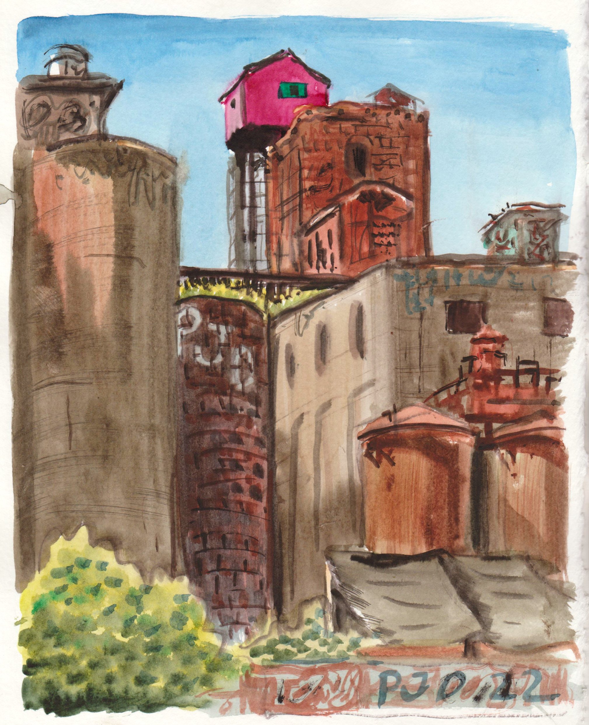
Along the Lachine Canal are dilapidated old factories destined to become condo developments. This one is a massive complex with many silos and crumbling buildings. Some clever street art people painted the house on top pink with green window dressings, and it has become somewhat of an icon. I have painted it many times from a distance, this is the closest I have got. Actually it was the third painting of my bike trip, and it came off quite well. There are numerous different shapes and textures bathed in sunlight. The pink house shadow side was mostly quinacridone violet (PV19) the sun side was quinacridone magenta (PR122).
Pink House on Old Factory, watercolour 8 x 10" Strathmore Series 400, July 2022 (No. 3043b)

This was the the first try with a new brand of paper called Strathmore series 400, it is rather like sketch paper very smooth and not easy to paint watercolour. I chose this scene due to its complexity, I wanted to practice with the new brush and paper. There are lots of good scenes around here I would go back one day.

Two Bridges with PJD Truck, watercolour 8 x 10" Strathmore Series 400, July 2022 (No. 3043a)

A train-crane towers over the Lachine Canal. Long idle, it is boxed in by a chain link fence with train tracks still running underneath. They must have loaded cargo on and off of barges in the old days. From a distance it looks nearly black but up close the iron is showing signs of rust. The vines looked like they were desperately trying to get a hold of it!

Rusted Train Crane, watercolour 5 x 7" cold press, July 2022 (No. 3165b)


I found a view of the iconic green-topped building as seen from the Old Port. Usually I avoid architectural paintings because they are hard to do, for example the building looks like it is leaning over, and there were fewer windows in the painting. I will try to do more like this and get better. Let's call it the 'tourist style'.  

Green Topped Building Downtown, watercolour 5 x 7" cold press, July 2022 (No. 3163b)


On the way back, I noticed that this yellow umbrella was casting a glow onto the wall behind. People underneath were also illuminated in orange. This patio was the same one I painted about a month or so ago, but from a different angle. There was a lot to do for a small painting. The crowd of people is actually a bunch of random squiggles and textures but it ended up looking fairly realistic. You can probably feel the energy of the scene. 

Yellow Umbrellas Old Port, watercolour 5 x 7" cold press, July 2022 (No. 3162b)

Friday, July 8, 2022

Cycle of the Cell


I just finished a quick palette cleanser based loosely upon the Harley auto mechanic location painting. The green interior of this painting was an abstraction of the garage interior, and the rest was just me doodleing! Recently I added more earth and more orange to the palette, and you can really see the palette's colours unleashed in this painting. On location, the chroma (colour intensity) is typically about 50% or less. Except for the blue sky and some highlights, landscapes are mostly grey. Abstract paintings have no such restrictions, but it is still wise to keep the chroma down a little, since a full intensity colour scheme can be hard to look at. Placing bright colours against duller colours can really make things pop, like in this painting the reds really pop against the backdrop of earth oranges.

Cycle of the Cell, watercolour 9 x 12" watercolour paper, July 2022 (No. 3049b)

Auto Shop, Harley Street, Interior View


 On lunch hour sometimes I drop by the bakery on Harley street for some sandwiches on their great onion buns. Today was Cajun chicken and smoked meat. To eat I found a concrete block nearby the field where I painted the chairs this Spring. I saw another chair in the field... there seems to be a demand for a park here where one could sit. Instead, the scene of the auto shop with its interior garage visible made the subject of this painting. There were many layers of objects including parked cars, dumpster, the interior with its track lights, and a large tree and apartment building in the background. The bricks were not this dark, they were a mix of PY43 + PB60 + PR179 but needed more water and more yellow tint. The owner of the car in the foreground came out of the garage to get something out of the trunk and glanced at me, probably wondering why this guy was making of a painting of an auto shop.

Auto Shop, Harley Street, Interior View, watercolour 5 x 7" cold press, July 2022 (No. 3165a)

Thursday, July 7, 2022

Hipster Corner with Half Moon

Riding down Terrebonne on a breezy summer day I came upon an enclave of hipster stores including an artisan gallery, a cafe, and a frippery (second hand store). Circling the area several times I settled on this view of the curb-side community garden and half moon prominent in the sky. One of the cars was an interesting turquoise I made with phthalo blue (PB15) and  phthalo green (PG7). The colours of the road and sidewalk were spot on- the road was a mix of perylene maroon (PR179), indo blue (PB60) and yellow ochre (PY43), while the sidewalk was the same mix but heavier on the yellow ochre and with a bit more water. To create the half moon effect I painted around the area and then blurred the edges a bit once it was dry. I was using the new 16 size brush which is hard to use for skies, I may use my trusty old filbert for skies next time. The painting has lots of cool summer vibes. 

Hipster Corner with Half Moon, watercolour 5 x 7" cold press, July 2022 (No. 3164b)

Tree with Shadows, Bread Park


In the middle of campus, our home, and the Meunerie Urbane (a local bakery) lies William-Hurst Park. I am starting to think of it as Bread Park since I am always on my way back from buying bread and stop there to make a quick painting. The painting was done with a number 16 synthetic brush (Princeton, Neptune), part of a set I bought from Kama Pigment to replace my old beat up collection of brushes. It produces interesting brush strokes and can hold a lot of paint, but still has a sharp point for detail. I like the light, airy feel to this painting, it conveys a sense of a breezy cool summer's day. A fellow practicing his golf putting took notice and asked if it was a watercolour? Yup I replied. 

Tree with Shadows, Bread Park, watercolour 5 x 7" cold press, July 2022 (No. 3164a)

Tuesday, July 5, 2022

Broken Line


Staying inspired can be a challenge for any creative endeavor. Around 2017 I made a rough inventory of all the paintings and felt less inspired to continue with certain styles such as doodleism. I hadn't painted much on location either so it felt like a bit of a dead end. However, experience told me that these times would pass and I kept on painting throughout 2017 and 2018. Rediscovering Van Gogh, discovering for the first time Hiroshige and Hokusai, and the viral pandemic caused a resurgence of my art hobby with well over a thousand recent paintings. In the midst of this burst of productivity I just want to enjoy it while it lasts! The recent set of paintings I made were the Jazz Fest night paintings, which left my palette in need of some cleansing. The broken line paintings has a broken line (representing fleeting inspiration?) winding through colourful, earthy shapes.

Broken Line, watercolour 9 x 12" watercolour paper, July2022 (No. 3049a)