Tuesday, November 30, 2021

Night Rules


At night the sun goes down leaving an inky blue sky. In the city, all kinds of lights create interesting shadows and reflections. Colours darken. Traffic lights glow with green-yellow-red flashes. I found a spot to stand just in front of the dollar store which has strong white lights. Across the Cavendish and Somerled intersection I could see the fire station tower and one of the new stores with its lights on. Cars zipped by on an icy slick road. 

To paint the sky I used a combination that I discovered earlier this year while painting Pizza Welat, and further refined down at Marche Atwater. In the Cavendish intersection painting, I adjusted down the amount of pyrol orange (PO73) and let the indo blue (PB60) do most of the work. Near the top, I brought in some perylene green (PBk31) a new idea, to create the inky black part of the sky. For the dark yellow bricks I combined the inky sky colour I used for the sky with yellow ochre, and for the red bricks I used burnt ochre (PR102) with carbon black (PBk6).

One key to painting at night is the composition. I must find a scene where the sky plays a prominent role. In this composition the sky frames the buildings, and gives me enough space to show off the incredible colour transition going from horizon blue to inky black. I like the action in this painting it really captures the moment.

Night Rules, watercolour 5 x 7" cold press, November 2021 (No. 2937a)

Sunday, November 28, 2021

Parc Sation, Blue Line Metro

A short walk from De Castelnau, is Parc Station which used to be a the grand old train station. In the 1950's it was abandoned, then assimilated into the metro system as another stop along the blue line. There is a large open space in front of the station that provided a nice place to sit and great sight lines. I also had the full winter sun beaming down on me which provided some extra warmth. With the daunting structure I opted for an impressionism style, to capture a moment in time if you will. The sheer number of pigeons was what really impressed me. A few times, they all took off and flew around in a roar, then landed back atop the building. I let the ochre paint bleed a bit into the sky to remember the roar of the pigeons as they launched off the building. Once before, pigeons at Jarry station, took off as I was painting. 

Parc Sation Blue Line, Pigeon Roost, watercolour 6 x 7.5" cold press, November 2021 (No. 2957)


There was a stark contrast in the sunlit upper portions of the building and the shadowed ground floor elements. I chose this scene because it had a bit of nature remaining in the snow-covered garden. All the plants were dried out or hibernating, but they still provided some colour and contrast. At Parc station there were quite a few interesting characters hanging about, and a lot of people going to and fro the buses. By the way, the shadowed wall was yellow ochre (PY43) a touch of burnt ochre (PR102) and carbon black (PBk6). I was using my winter palette v1 today.

Parc Sation Blue Line, Side View, watercolour 5 x 7" cold press, November 2021 (No. 2935)


In the back of the station they built a dull green pyramid which is actually a skylight for the station below, but the windows are on the south face of the pyramid you can't see. There were more details on the pyramid but I left it like this for two reasons, one, the paint would not dry fast enough, two, it looked like some kind of monolith like from the movie called 2001: a Space Odyssey. One of the interesting people at the station was walking around yelling something about space trucking in the cosmos, he seemed adamant about the idea. At the same time a plane flew over the scene, and I figured, why not?

Parc Sation Blue Line, Space Trucking, watercolour 5 x 7" cold press, November 2021 (No. 2936)

De Castelnau Station, Blue Line Metro

De Castelnau Station is one that we are very familiar with, it is located in Little Italy near Jarry park, and within walking distance of Anatol a great store for bulk food and spices. Inside the station is a labyrinth of staircases, causeways, corridors and yellow-ochre brick walls carved with intricate scenes of the market. At first glance this painting is like an Escher print, then you see the windows at the top with the bright sunny day, and the little people at the bottom on the metro platform. I had a good little corner where I could stand an paint this scene, wearing my mask of course. A lot of people went by, one person said it was great!

De Castelnau Station, Blue Line, Interior, watercolour 5 x 7" cold press, November 2021 (No. 2932)


This is the north entrance, which is built into a giant condo complex. Inspired by the colliseum, the facade of the condo is a shining steel and glass edifice that I did not do justice to. There were some delicate greys, and a complex perspective curve in this scene. It definitely taxed my drawing skills today.

De Castelnau Station, Blue Line, North Entrance, watercolour 5 x 7" cold press, November 2021 (No. 2933)


These are the same windows you see in the first interior painting, but from outside. Almost the whole scene was in shadow, the sun was just striking the top of the sign and roof. Just under the sign there was a prominent tree with creepy looking branches that I left out, the painting didn't need more to be complete. It is very hard to make tree overlays in the winter because the paint dries so slowly.


De Castelnau Station, Blue Line, South Entrance, watercolour 5 x 7" cold press, November 2021 (No. 2934)

Winter Palette


For the winter palette I decided to mostly replicate my fall palette. I squeezed out fresh paint on the old palette that I used last winter, It had developed cracks in the freezing temperature last year, and part of it is held together with duct tape and aluminum wire, but I think it has another winter left in it. Squeezing out fresh paint is the most fun thing to do. It took a few days to fully dry though. The only subtle change was raw umber from M. Graham which is a honey-based paint that does not freeze solid like the other brand of raw umber from Da Vinci. The green area on the top right may not be too useful in the winter but we will see how it goes. Looking forward to some more winter painting!

Winter Palette V1,  sketch book, November 2021

correction: the red paint is PR254, not PR255 as labelled. 

Saturday, November 27, 2021

Hot Night Painting


After the hot day painting, I made a similarly themed palette cleanser of a melting landscape at sunset. It looks like all the colours are in this one, especially iron oxide red (PR101) and yellow (PY154/PY175). There seems to be water and a grassy mountain on the shore line, with a turtle somewhere. Maybe perch? At any rate I do enjoy these paintings. I found this one in the pile as I was updating the catalogue today, I guess I just didn't scan it back then. Nowadays I am scanning them almost right away and making regular blogs.

Palette Cleanser: Hot Night Painting, watercolour, 9 x 12" watercolour paper, August 2021 (No. 2888b)

Impressionist Flower Pot


 In the mid 90's I was experimenting with many different styles, including impressionism. Monet was a big influence on me at the time, but it was very difficult to copy a style meant to be done in oil paints. In this painting, I used watercolour to mimic the oil painting style. There are visible brush strokes, with the typical directional textures throughout the work. By aligning the brushstrokes one can create a sense of flow to the scene. Van Gogh also used that style a lot in his paintings. It is kind of neat, maybe I will do a bit more still life this winter.

This painting was done with lots of alizarin crimson (PR83) and its cousin rose madder genuine, both of which can unfortunately fade in the light. Since I kept it in my portfolio all these years it still looks as good as the day I painted it, but this painting could not be hung in the direct sunlight. I phased out alizarin crimson and rose madder starting about 2016, and completely stopped using them at the beginning of 2020. Quinacridones (PV19, PR122), pyroles (PR254, PR255), deep scarlet (PR175), and perylene maroon (PR179) are suitable replacements. 

Impressionist Flowerpot, watercolour 10 x 11" cold press 1995, (No. 0008)


Ready for Winter

Ready or not, here it comes! They installed the skating rink supports at William-Hurst park in anticipation of winter skating. I was returning from buying bread and stopped to make this painting of the scene. I was also test driving my winter set-up. For water I use two plastic square bottles of salty water, one for clean, one for dirty. For paper, I use the rack that I wrote about last winter, it allows the painting to dry without getting smeared. Paint dries very slowly in the winter due to less sun, low temperature and the salt in the water. My clothing was good for today, just the leather gloves a little light, next time I will bring the moose-mitts. 

Ready for Winter, watercolour 5 x 7" cold press, November 2021 (No. 2931)

Enchanted Goatee


Here is a fun one from the archives.  I came with the name after the fact, when I was cataloguing in 2020. The character in the middle is supposed to be a kind of self portrait. The rest of it is pure surrealism, probably derived from doodles. It has a psychedelic enchanted forest feeling to it. Perhaps this winter, when it is harder to paint outdoors, I can make more doodle paintings. There was a long stretch of time when I almost exclusively painted abstracts, but since about 2018 I have been focused more on location painting.

Enchanted Goatee, watercolour 6 x 14.5" cold press, 2007

Terrebonne Trees Fall


Catching up on the cataloguing, I found this painting done last month when the leaves were changing colour. This tree always looks spectacular in the fall, it is on my walk to work and I see it every year. To capture the brilliant red (PR254), I surrounded it with olive greens, and created a dark red shadow for added depth. It was a tricky painting, the cars in particular had different colours reflecting off their side doors. The building in the background is part of the campus.

Terrebonne Trees Fall, watercolour 5 x 7" cold press, October 2021 (No. 2852)

Wednesday, November 24, 2021

World Inspired Landscapes: Burundi

The last country alphabetically to begin with the letter B is Burundi, located in the great rift valley of Central Africa. Rolling hills and extensive agriculture creates a patchwork of farms and grassland interspersed with winding roads, sequoia and palm trees. What impressed me was the atmospheric effects. Bright foreground elements were contrasted by grey-blue hills in the distance. Small houses also dotted the landscape. Most of the African countries have very flat landscapes, but Burundi offered a varied geography.

World Inspired Landscapes: Burundi watercolour 8 x 10" cold press, November 2021 (No. 2915b)

After some digital analysis I knew what the colours were, but had no idea how to achieve the effect with paint.The distance colours all represent shades of indigo (dark neutral blue). I finally had the idea of creating an underpainting that would set the atmospheric tone. After a quick outline, I filled it in from yellow at the bottom to indigo at the top. Here is a scan of the underpainting I made before over-laying it ... 


And here are some paint-sketches I made to figure out the intensity of yellow and blue...


Brushes Away


 The weekend painting with salt water left a right mess on my palette. I used a variety of brushes, including the smallest rigger and the largest hogs hair. A rigger has longer hairs on the brush which creates a spontaneous line as you see with the burnt sienna highlights. The hogs hair brush looks like the end of a pigs tail, and is mostly used for cleaning but occasionally I use it to produce an effect. Like in the Water Lily Pond painting, which was one of the technical achievements of the year, I used the hogs hair to create the delicate algae effect on the pond surface. In this painting, which is a palette cleanser, I just dabbed colours all over.

Brushes Away, 9 x 12" watercolour paper, watercolour, November 2021 (No. 2961a)

Sunday, November 21, 2021

Fabre Station, Orange Line Metro

I rode back to Fabre station to complete the location today. My legs were still feeling tired from yesterday's ride. Undeterred, I made it out with a few hours of good light left. This is the last painting I made, the station had just a bit of sun catching the top parts of the odd concrete facade. To covey the feeling of how odd the structure was, I exaggerated the architecture and infused the painting with splashes of colour. The people, apparition like, give the work a sense of normalcy against a backdrop of absurdity. 

Fabre Station, Blue Line, Last Light, watercolour 8 x 10" cold press, November 2021 (No. 2919)

This was the first painting I made upon arriving. The condition was surprisingly humid which prevented the paint from drying properly. I had to really fight to get the structures to hold together, you can see where the building colour bled into the sky. A neon green ambulance went by and its reflection was caught in the window for a moment. Too bad I couldn't catch that detail. The idea here is to really feel the sun setting just by looking at the buildings.

Fabre Station, Blue Line, West Entrance, watercolour 5 x 7" cold press, November 2021 (No. 2885)


This was actually from Sunday evening after I completed the dIberville location. It was just minutes from darkness. I liked the blue paneling and odd lines of the roof. It is a real concrete bunker, this station. Just the same I was glad to complete the Fabre Location, the next stop will be de Castelnau Station since I already did Jean Talon when working on the orange line. 

Fabre Station, Blue Line, Rear View, watercolour 5 x 7" cold press, November 2021 (No. 2886)

Saturday, November 20, 2021

d'Iberville Station, Blue Line Metro

The sun was low and cast an amber glow on the d'Iberville Station. I started at the back of the station because someone was making a ruckus at the front. Not to mention the front of the station is flush with Jean Talon street, while the back entrance had a nice interlocking brick and gardens. All the leaves were off the tree, which gave me a good look at the strangely shaped roof structure. It was maroon, but the sun was reflecting off the surface creating a greyish shine. It was a difficult painting, I just had to stick with it. Today I brought salt water for the first time, I used 75 grams of salt in 500mL of water, precisely measured, which should be good for down to -10℃.

d'Iberville Station, Blue Line Metro, back Entrance, watercolour 5 x 7" cold press, November 2021 (No. 2882)


This scene was impressive, and another technical challenge. When I was in Sutton I painted a sunset scene looking directly into the sun, and had to stand behind a tree and peek out to see the scene without blinding myself. Today was similar, I stood behind a telephone pole and painted the station in complete back-lighting. The sun was reflecting off the cars on Jean Talon street, and creating silhouettes of the people. The pole itself was an interesting colour and texture, it has hundreds of staples in it from people posting signs over the years. A black graffiti marred the post, but I converted it into my signature. The beige in the post was umber (PBr7 PWC) with some perylene green (PBK31) and streaks of orange (PY110). I recently made a study on orange, green and yellow, which helped me to better understand how to paint telephone poles.

d'Iberville Station, Blue Line Metro, behind the post, watercolour 5 x 7" cold press, November 2021 (No. 2883)


The station has two oddly shaped roof elements, at different angles and with different cladding. It is kind of hideous, but beautiful in a baroque kind of way. I set up across the street almost flush with the vee shape between the two roof elements. I was also wearing my moose mitts, which are like thick oven mitts. It was mostly for practice, since in the winter that was the only way to paint last year without loosing fingers! When painting in very cold temperatures, I have to change my style a bit to be more simple. On the way back I made one painting of the Fabre station, but the sun was rapidly going down and I had to pack it in. If the forecast holds up I may head back there tomorrow.

d'Iberville Station, Blue Line Metro, Vee, watercolour 5 x 7" cold press, November 2021 (No. 2884)


Beaubien Station Orange Line, Red Cup


I painted the Beaubien Station last year, a bit earlier in the season. Today the trees had no more leaves, and it was close to zero centigrade. Actually I was on my way to the d'Iberville station when I took a wrong turn and got going down Beaubien, then saw the familiar blue metro sign marking the front entrance of the Beaubien station. The sun was low but probably at its peak for the season. I completed almost the entire painting and then overlaid the prominent tree, which had been the main inspiration for choosing this angle. A lot of people were walking by since the bus stop was just behind me. This painting took a long time, but I am glad I did it. As usual, I spent a lot of the time painting the garbage can. But it was the people really, they at a good 30% to the paint time.

Beaubien Station, Orange Line, Red Cup, Front Entrance watercolour 8 x 10" cold press, November 2021 (No. 2918)

Thoughts on Colour mixing Orange Green Yellow


Orange and green are not normally put together, or thought of as a colour scheme per say. One of the interesting things about orange and green is that they share yellow. Yellow plus blue is green, yellow plus red is orange. Since orange and green both have yellow, the mixture of the two colours produces a dark yellowish brown. There is nothing special about that colour, it resembles coffee with milk, or the top of a toasted marshmallow. You can even get the same colour using an umber pigment. Its also possible to darken a yellow paint with a black paint, which produces a similar colour as the combination of orange and green. 

To summarize, orange plus green equals dark yellow! It was not something I appreciated until recently, after I digested the tome of knowledge on Handprint.com. In a practical sense, I have used dark yellow a lot more in my paintings, it helps to create shadows on yellow objects and some kinds of foliage.


Tuesday, November 16, 2021

Maroon Baloons


 After quite a few location paintings this weekend the palette was in need of some cleansing! I started with the balloon shapes in yellow ochre (PY43) and filled in the rest of the sky with maroon (PR179) and some rose (PV19). As the shapes emerged I saw a landscape, with a bird-like rock structure. It was fun to do some free form painting after the rigorous exercise of painting metro stations. With the cold weather approaching I will do more abstract and get back to work on the World Inspired Landscape series.

Palette Cleanser: Maroon Baloons, 9 x 12" watercolour paper, watercolour, November 2021 (No. 2893)

Sunday, November 14, 2021

St. Michel Station, Orange Line Metro


At the East terminus of the blue line is St. Michel Station. It was about a 45 minute bike ride mostly along Bellechase which has a great bike path cutting across the entire Plateau. There was a lot of traffic on Boulevard St. Michel, it was noisy and smelled like car exhaust. I set up on the corner with a view of the east entrance, it was mostly backlit, but the sun caught the top of the metro sign and the brick building in the background.

St. Michel Station 1, Blue Line, watercolour 5 x 7" cold press, November 2021 (No. 2778)


Wanting to get as far away from the boulevard as possible, I walked my bike to the far end of Park Sandro Pertini with a view of the west entrance to the station. Most of the painting shows the shadow-streaked park strewn with leaves which I painted with variations of light and dark chartreuse, red ochre and yellow ochre. The sun was catching the cars and distant buildings, with the station in shadow.

St. Michel Station 2, Blue line, watercolour 5 x 7" cold press, November 2021 (No. 2779)

There were nice benches to sit on, one with a view of the side entrance. It was adorned with a half circle overhang and turquoise framing. Just to the left of the doors you can see the glass-brick wall. There was not very much direct light in this scene so I emphasized the top and right side of the structure. To create the shadow streaks on the concrete, I made sure the shadow was a cool neutral indigo, while the sun light parts were a warm neutral red.

St. Michel Station 3, Blue line, watercolour 8 x 10" cold press, November 2021 (No. 2917)

The other entrance on the west side hardly has a straight line in it. I copied the zig-zag pattern and filled the background in with the east side entrance with that bright red brick wall. Painting in shadows is tricky but I am getting better at judging the values. You have to paint a little darker than you think since it dries a few shades lighter.

St. Michel Station 4, Blue line, watercolour 5 x 7" cold press, November 2021 (No. 2780)

I walked my bike back to the east entrance and sat in a bench with full sun. The sun was low and had an amber glow. This scene was a real 'artist's choice', I mean, a painting that only an artist could love! I liked the way the stacked glass brick wall reflected the sky, and how the edge of the bench played against the concrete post. The trees and cars were fun to paint too. After this painting I headed home and got there just before the sun went down.

St. Michel Station 5, Blue line, watercolour 4.5 x 7.5" cold press, November 2021 (No. 2781)

Saturday, November 13, 2021

Gust of Earth

Today I embarked on more cataloguing, that is when I name and number all the paintings and enter the information into the spreadsheet. The number refers to the piece of paper, which sometimes has a painting on the back which I label with a letter b. For example, Gust of Earth is about the 2682nd piece of paper I painted on the b side, so it is No. 2682b. When considering all the front and backs together,the spreadsheet says this is the 2999th painting in total! There are a lot more between then and now. Perfect rainy day task.

Gust of Earth watercolour 5 x 7" cold press, June 2021 (No. 2682b)

Burkina Faso Preliminary Sketch


 This is a page from my sketchbook showing some preliminary sketches and colour ideas for the Burkina Faso World Inspired Landscapes painting. The finished product was more ominous, whereas the sketch shows an idealized version of the landscape inspired by a travel guide I borrowed from the library. Underneath is the Earth Max palette which consists of an absurd number of earthy paints! I used most of them to colour in the sketch. On the bottom row are some high chroma paints to provide accents. Perhaps the Burkina Faso WIL can be somewhere in between this one, and the other more ominous version. 

Burkina Faso Preliminary Sketch 2021

Thursday, November 11, 2021

Plant vs Fungus


 I picked up a leaf the other day and brought it to the laboratory to see what the black spots looked like under a microscope. The leaf was placed between two glass plates held taut with elastics, at perhaps 20X magnification? The leaf has light pink veins running through yellowish compartments of cells. The black spots appeared brown, and each one was contained within the compartments. Some areas had brown blobs surrounded by yellow, with hints of green. I think the yellow and pink areas are healthy leaf tissue, while the brown areas are the fungus (or virus?) infected areas. In the intermediate zones, the leaf is trying to protect itself by closing in around the infection as it tries to spread to the healthy areas. In the evening, I made a watercolour painting based on my memory of the image.

Plant vs. Fungus,  watercolour 5 x 7" cold press, November 2021

Tuesday, November 9, 2021

NDG night

It seems that the pursuit of food was today's theme. I went to pick up the Lufa farms vegetables off the delivery truck that stops near Trenholme park. With paints in my shoulder bag I decided to take on this challenging scene. I painted under a strong amber lamp in the park. I liked the way the tree branches seemed to be embracing the eerie crescent moon. After painting sunflowers at night, I learned a lot about how you think the colours look versus how they actually look. Blue seems grey, yellow seems brighter than it is, and all the paint on your palette looks brown or black. It is helpful to memorize the order of your palette colours. It turned out quite good, the sky was a complex gradation of dark blue, warm brown, and purplish hues.

Trenholme park with Crescent moon Night, watercolour 5 x 7" cold press, November 2021 (No. 2877)

NDG day

On my lunch hour I headed down to Harley street to get some bread and food at the shops. There was a sunny corner to stand next to the empty fruit bins and make this interesting perspective painting. It seemed an impossible mission but it seemed to work out in the end. I like the texture effect on the wood paneling, and the metallic reflections on the overhang. To get the angles correct I hold my brush up to the scene and then move the brush to the paper to judge the perspective.

Marché Fruiterie Cité on Harley Street Day, watercolour 5 x 7" cold press, November 2021 (No. 2876)

Sunday, November 7, 2021

Côte-Vertu Station, Orange Line Metro


The terminus of the Orange line on the west branch is Côte-Vertu station, where I made one painting back in May of this year. The more I thought about that painting, the more I felt that the most important element of the scene was missing, people! So I took advantage of the great weather today and biked up to the terminus using much the same route as last weekend but turning west on St. Croix to the station. The early morning sun was a golden hue, it illuminated a busy scene of people, cars, and the station.

Côte-Vertu Station, Orange Line, Main Entrance, watercolour 5 x 7" cold press, November 2021 (No. 2872)


Crossing the street, I found a place to park my bike near a post and went about painting this scene of the metro riders exiting the station. When the metro car stops underground, a great throng of people emerge all at once. The station is relatively new, it has bright orange bricks, cyan coloured panels and decorations on the front. To paint the people I made sketches with my paint brush incredibly fast, and committed the rest to memory. The characters are essentially composites from many people to get the light, shadow, and perspective correct.

Côte-Vertu Station, Orange Line, Front Perspective, watercolour 5 x 7" cold press, November 2021 (No. 2873)


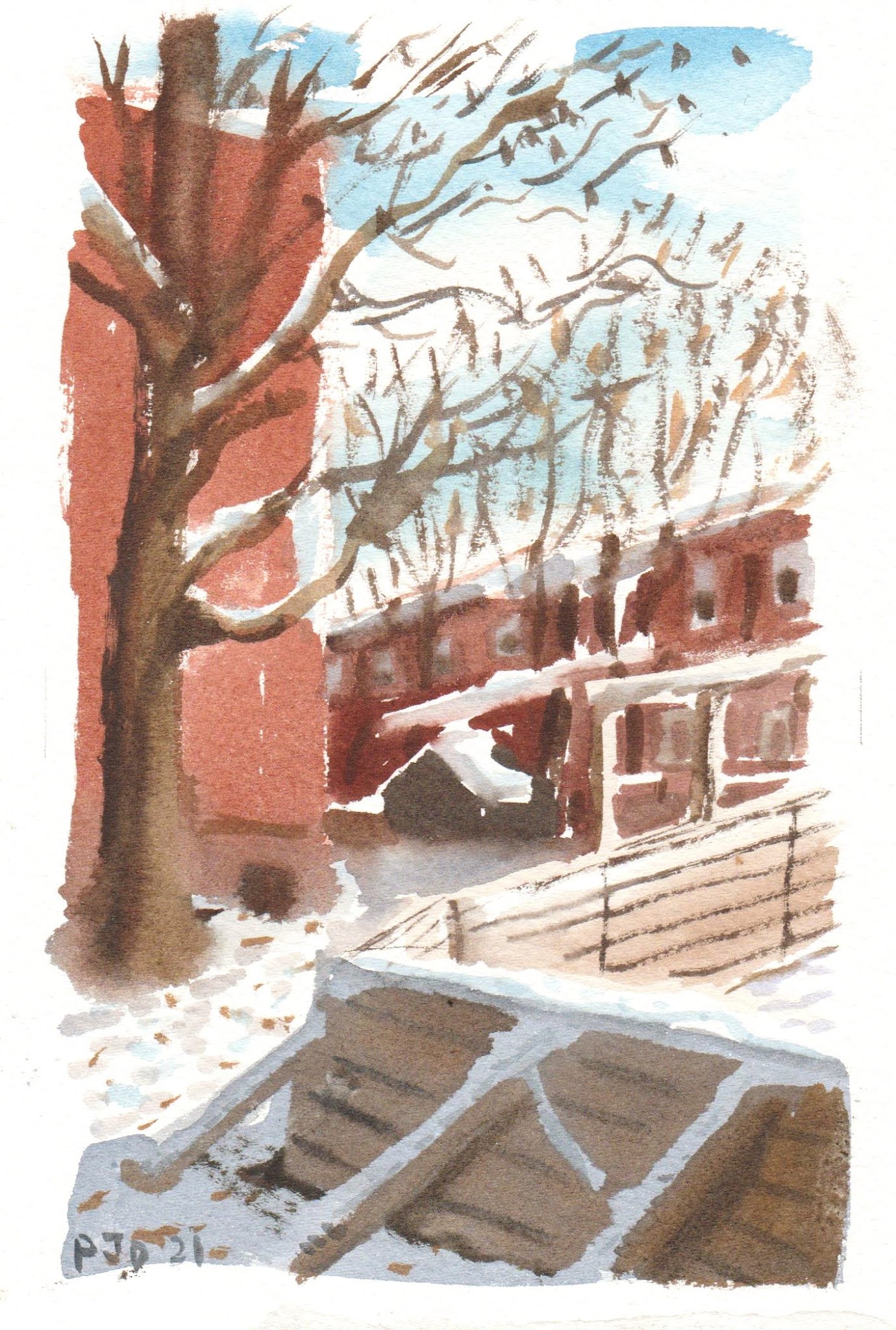
Turning towards the north entrance which was backlit, I saw an intricate jumble of roof tops. One of the mega buses stopped, it had an accordion-like connection between two full size bus cars, but you can only see the central portion here. The A frame behind the sign is the awning for the metro entrance. I sketched a few people inside the bus. This was a hard painting, it always is more difficult when everything is backlit and greyish.

Côte-Vertu Station, Orange Line, Rooftops, watercolour 5 x 7" cold press, November 2021 (No. 2874)


From the google map I saw a narrow strip of a park near the station. It had winding pathways and concentric circles made of concrete. They sure loved concrete when they built things in Montreal. In the background you can see a mega-bus waiting at the stop, and the station peeking through. Just off to the rightm unseen in the painting, there were two huge fast food restaurants with surrounding parking lots. The whole park reeked of greasy fries and burgers, and garbage was piled up in and around the waste bin. In the painting those are leaves on the ground, but they could have been hamburger wrappers too.

Côte-Vertu Station, Parc Bélanger, watercolour 6.5 x 10" cold press, November 2021 (No. 2916)


It was time to head down to make some more paintings of du College station. As I rode past the chaos of a busy Côte-Vertu Boulevard with all its cars, people and fast food, it occurred to me that the real scene had not been painted yet. I pondered this over some cold instant coffee for awhile, then found a good spot to set up my bike-studio among the action. Using four different vantage points I created a montage of motifs from the location. It was an awesome blend of fast cars and fast food.

Côte-Vertu Station, Fast Cars and Food, watercolour 5 x 7" cold press, November 2021 (No. 2875)


Du College Station Orange Line Metro

Back in May I made a few painting of the final three stations on the Orange Line west branch including one painting of du College. With the great weather today it was a joy to paint, clear blue sky and warm sun despite some chilly winds. Later in the afternoon it got colder but I got off to an early start so had a good 4 or 5 hours of painting. I went to the terminus first, then painted du College on the way back. In this painting I am standing behind the station in a little alcove, it has some bike racks, flower boxes and stained glass windows which you can just see partially towards the right. In the background is the large Beaudet Park.

Du College Station Orange Line Metro, view from back, watercolour 8 x 10" cold press, November 2021 (No. 2915a)

Riding south I came across another entrance to du College, judging by the architecture and patina on the concrete it looked to be from the 1960's era. They used a lot of umber coloured concrete, glass, metal, and bunker-like shapes. I looked into these windows but they were to foggy to see through, they must be a giant skylight for the station below. The gradation of colour on the windows was fascinating, a desaturated yellowish that transformed into a turquoise and then cyan. It contrasted nicely with the warm concrete and bright yellow tree in the background.

Du College Station Orange Line Metro, old entrance, watercolour 5 x 7" cold press, November 2021 (No. 2871)

Saturday, November 6, 2021

Fall on the Lachine Canal


 The Lachine Canal is picturesque this time of year, it is lined with tall trees that have changed into golden yellows and olive greens. The colour combinations are unusual this year because the grass is still green, and the leaves never really went to orange and red. It was chilly today but the sun was warm. To capture the bird on the railing I painted fast to establish an outline, then filed in the colour areas. The railing is black but it reflects the blue sky from above and the yellow leaves from below.

Seagull on Railing Lachine Canal, watercolour 5 x 7" cold press, November 2021 (No. 2871)

Earlier this year I made a winter painting close to here in the freezing cold. Today was fantastic, I just made two painting though. To capture the leafy field I put down a wash of yellow ochre (PY43) and other yellows (PY110, PY154). When it was about half dry I put in the pale olive green (PG36 + PY110 + PBk31). As it continued to dry I put on the textural effects to simulate leaves using darker reds and browns. The concrete support under the table was burnt ochre (PR102) and perylene green (PBk31) and a touch of indo (PB60) and magenta (PV19). I have really started to see the greys recently. Grey can have all the colours of the rainbow but it is hard to see the variations and paint them.

Bench in Field of Leaves, Lachine Canal watercolour 8 x 10" cold press, November 2021 (No. 2914)


Friday, November 5, 2021

Twisted Branch


On my way to work there is an interesting branch looming high above the street. After years of finding it interesting, I stopped early this morning to make a quick painting of the scene. It was cold this morning I could see my own breath, but luckily the paint was not freezing yet. The sky changed from sunny to grey overcast, so I tried to capture the streaks of morning light across Terrebonne. Loyola campus is at the end of the street.

Twisted Branch, watercolour 5 x 7" cold press, November 2021 (No. 2870)

Wednesday, November 3, 2021

Two Chairs in Field


On  brief lunch break I walked to the end of Harley street and found this grouping of furniture discarded in a field. With fall upon us the field was filled with yellow and rusty-red leaves. I thought about Van Gogh when I painted the chairs, he made several portraits of chairs. In the background, behind the trees you may see the top part of the Concordia sports dome. It was fun to paint this one, especially the leaves.

 Two Chairs in Field, watercolour 5 x 7" cold press, November 2021 (No. 2869)