Saturday, April 30, 2022

Island Bridge Island Bridge


 With some fantastic albeit cool weather today I was able to do a good long bike ride. This scene is in Ville St. Henri at a popular restaurant appropriately named the Green Restaurant after its striking blue-green roof. I must have arrived in the midst of some chaos, there were a lot of people milling about and an ambulance parked nearby. To make the green roof I used phthalo green blue shade (PG7) with a touch of phthalo blue red sapphire (PB15). The ambulance was dark yellow, and the spire in the background was perylene green (PBk31) with some red brown (PR101/PBr7).

Green Restaurant, Ville St. Henri, watercolour 5 x 7" cold press, April  2022 (No. 3099)


Continuing east and then veering south I made my way to the old port, and found this typical scene of a busy patio cafe with the old port in the background. The main interest was the landscape, so the people were done in a very fast and representative style. In the distance you can see part of the Jacques Cartier bridge. The dome is the Bonsecour Market. I used the new Strathmore paper for the second time, it continues to amaze me, the paper held up quite well.

 Cafe Time, Old Port watercolour 8 x 10" strathmore aquarius II, April  2022 (No. 3015)


I managed to find a great spot to set up adjacent to the Cartier bridge, looking south across the river. To get the complex curves and angles correct I held the brush up to the scene and then transferred the angle to the paper. Holding you brush up to a scene really makes me look like an artist. The only audience here was a steady flow of traffic going past, although I omitted the cars from the painting.

 Jacques Cartier Bridge Close-up, watercolour 5 x 7" cold press, April  2022 (No. 3095b)


High atop the bridge I stopped at the little viewing nook and made a quick painting. The bridge closest is connecting Ile St. Helen to the port, it is called Concorde Bridge. The bridge in the distance is Victoria bridge that crosses from the Montreal island to the south shore. To capture the scale of it all, my palette, hands, brush, and painting were included in the foreground. I omitted the safety fence which is about 3 meters high, so it looks like I am floating over the river! To get the distinctive colour of the St. Lawrence River I used combinations of phthalo blue, greenish umber (PBr7), indo blue (PB60), and perylene green (PBk31). 

View West from Jacques Cartier Bridge, watercolour 5 x 7" cold press, April  2022 (No. 3100)


I stopped for a little snack and some cold instant coffee in Parc Jean Drapeau, St. Helen's Island. The bridge in the scene connects to Notre Dame island which has the casino, and the racetrack where I painted the bikes under an overpass a few weeks ago. The PJD was actually there, so I did not have to put my initials on it this time! By now I was pretty tired so I headed back over Concorde Bridge to the port and made my way along the canal path and back home, completing a giant circle from island to bridge to island to bridge, and back to island.

PJD at PJD with Tree, watercolour 5 x 7" cold press, April  2022 (No. 3098b)

Friday, April 29, 2022

Compost as Seen by a Worm


 If you have ever seen compost you know that it can be pretty disgusting, the sights the smell the textures. Actually I kind of like it. But imagine to a worm, what all that tasty rotting vegetable matter looks like? This painting is basically the happy dream that a worm has, waiting for spring to arrive. Our composter is right full at the moment, and if the weather can warm up a bit it should start composting quite vigorously. The composter is home to worms, ants, millipedes, centipedes, potato bugs, moths, a large creeper vine which attracts bees, and who knows how many micro-organisms that digest all that good stuff.

Compost as Seen by a Worm, watercolour 5 x 7" cold press, April 2022 (No. 3103b)

Finally cleansed the palette??


Paint by numbers, stay in the lines, sign your name. Art is so full of... rules! And yet we tend to only follow our own. In this painting I was continuing the efforts to use up all the paint from my winter palette, now working on the large blobs of black (PBk6) and blue (PB15 red shade). I was pleasantly surprised with how the black lines worked out, the paint was more lively than expected, and the little blue dash marks complement the design.

Stay in Line, watercolour 9 x 12" watercolour paper, April 2022 (No. 3010b)

With just some green umber (PBr7), yellows (PY43, PY175), and the blue and black left, it was time to lay it on thick. In this multi-layered- multi-texture extravaganza the design definitely went pear-shaped, whatever that means.

Going Pear-Shaped, watercolour 9 x 12" watercolour paper, April 2022 (No. 3010a)

Thursday, April 28, 2022

Seeing Seagulls at the Super C


 Try saying that five times fast! I detoured along St. Jacques Street on the way home hoping to find a good view of downtown Montreal through the trees. Unfortunately the brush was very dense as you can see on the left side of the painting. So I turned to face the Super C grocery store, with a good angle on the sun and a few seagulls mulling about. They were obviously expecting that I had something for them to eat but alas it was not to be!

The brick silhouette mixture in the back was red brown (PR101/PBr7) with perylene maroon (PR179) and a touch of raw umber (PBr7). Lately I have been adding carbon black (PBk6) but this time I left it out and trusted the perylene maroon and raw umber to carry the darkness through. It worked great, and I can see a deep maroon that is quite nice. The parking lot basic formula is indothrene blue (PB60) with perylene maroon which gives a neutral red-purple, to which I add yellow ochre (PY43) to give it the yellow tint. The yellow ochre is important because it has a low chroma and can really hold its colour in tints. By varying the amounts of those three paints, and the amount of water, I can reproduce almost any form of asphalt whether it be new, old, sun-bleached, daytime, night time, or sunset. 

Seeing Seagulls at the Super C, watercolour 5 x 7" cold press, April  2022 (No. 3098a)

A few palette cleansing abstracts


You have heard of reality T.V. but what about surreality T.V. ? In this abstract painting I explored the concept with a faux wood T.V. frame and a 1960's style surreal landscape straight out of a Star-trek episode. For those of you who weren't around back then, T.V's were often encased in elaborate wood cabinets rather like furniture. My family even converted one into a fish tank.

Surreality T.V. watercolour 8 x 10" cold press, April 2022 (No. 3007b)


As I continue to use up the last of the paint on my winter palette, it was time for the brown and yellow paint to go. This small abstract had some organic elements along with what seemed to be an explosion in the background. It could also be a horses tail, or a paintbrush. I used yellow ochre to over-paint my initials and some other details. You are not 'supposed to' over-paint with heavy layers, but after years of painting and breaking rules, the watercolour police have never come to knock on my door.

Ochre Explosion, watercolour 5 x 7" cold press, April 2022 (No. 3106b)

Wednesday, April 27, 2022

No Time for Tech


 How many screens does it take? We are surrounded by them, screens on our phones, tablets, computers, TVs, car, even the bank ATM has a screen now. At least my toaster doesn't have a screen...  yet. In the painting a little fellow in a hazmat suit is resting on the beach taking some time away from the screens. But there they are, lurking in the background. To paint this scene I was cleaning the winter palette, so there was quite a bit of red brown (PR101/PBr7) and ochre (PY43) left over. The blue on the screens and reflecting on the person is phthalo blue red shade (PB15), made by Holbein they call it phthalo sapphire.

No Time for Tech, watercolour 9 x 12" watercolour paper, April 2022 (No.3009b)

Tuesday, April 26, 2022

Corner Sherbrooke and Cavendish

After work I wandered a bit along Sherbrooke and found this noisy scene on the corner of Sherbrooke and Cavendish looking to the south. The apartment building is getting a facelift, so the sidewalk is covered in a red and green protection for pedestrians. Many cars were going past and I heard lots of honking and yelling. As usual I had earplugs in so it wasn't too bad. 

Lately I noticed that if I add perylene maroon (PR179) to my dark mixtures they really get dark, and stay dark. If I just mix indo blue and carbon black it tends to dry as a dark grey. I used the perylene maroon here, and the darks stayed more dark than I expected, as seen in the light standard, and the apartment building. It gives kind of a neat atmosphere and makes the red and green pop even more, so I kind of like it.

Corner Sherbrooke and Cavendish (red and green), watercolour 5 x 7" cold press, April  2022 (No. 3097b)

Monday, April 25, 2022

Metro Grocery at Night


 Bright lights from inside the Metro Grocery illuminate the sidewalk. A green glow is cast off the street from a nearby traffic light. The sky is a dark indigo with maroon clouds and a few stars shining. Today the weather was fantastic and I could get out to do this quick painting of the scene across the street without even a touque!  I wrote a special page on night painting, which you can find on the dropdown menu, or if you have the menu showing it is on the page options.

Metro Grocery at Night, watercolour 5 x 7" cold press, April  2022 (No. 3096b)

Sunday, April 24, 2022

Ride to Lachine, Cool Day


Lachine used to be a major trading point due to its proximity to the Lachine rapids. The traders would have to stop here before making a portage. Nowadays the river is dredged and wide open for ships, but most of the goods go by train and truck not by boat anymore. The building in the painting is the old fur trading post that was preserved and now acts as a museum. It wasn't open today, we visited it a few years ago and saw all the examples of furs, and the story behind the industry. There is a well used bike and walking path that goes along the river bank and offers spectacular views of St. Lawrence river. I used a new kind of watercolour paper by Stathmore called Aquarius II. It seemed extremely thin but handled the paint well, in fact it was fantastic. Instead of rag pulp (cotton) it uses some kind of synthetic alternative.

View from Fur Trading Post, Lachine, watercolour 8 x 10", aquarius II, April  2022


This building used to be a church or a town hall or something, but now it is a retail store. Cars were winding up and down the main drag, St. Joseph Blvd, and the beginnings of the canal can be seen at the bottom of the painting. It was supposed to be warm and sunny today but it was cool and overcast.

Main Drag, Lachine, watercolour 5 x 7" cold press, April  2022 (No. 3096a)


I found a very small park located just off the main drag with a view of the canal. There is actually a smaller part of the canal that effectively acts as a water access for some houses. I suppose it used to be for waiting on the locks or something. The walking train is seen through the trees, and then the boat docks in the background.

View through Trees, Lachine, watercolour 5 x 7" cold press, April  2022 (No. 3097a)

Saturday, April 23, 2022

Saturday painting, Ville St. Henri and Downtown


St. Ambroise street is most famous for its namesake, St. Ambroise brewery that makes a variety of classic Quebec beers. It used to be a purely industrial area but with the Atwater market and constant condo developments along the canal, it has quickly gentrified. You are more likely to see people walking little dogs and drinking coffee than you will see a factory worker. The scene shows some of the old buildings and a few parked cars. The thing that looks like a van was an Amazon prime delivery vehicle.

St. Ambroise Street, Ville St. Henri, watercolour 5 x 7" cold press, April  2022 (No. 3106a)


I've no idea what these giant green silos were used for, maybe plastic polymers since the building in the background used to make Calico toys. Now the building is office space and condos and the silos are a palette for graffiti artists. Wanting to get in on the action, I replaced the foreground graffiti with my initials. No vandalism here. 

Green Silos and Condos, Ville St. Henri, watercolour 8 x 10" cold press, April  2022 (No. 3008a)


I continued down Notre Dame avenue for awhile until the traffic got too heavy and then turned back. This scene was neat, a veritable fortress of windows. I was thinking to myself, what would have Monet or Van Gogh made of this scene? I managed to squeeze in a lot of detail, and captured some of the light and shadow patterns on the road. The tallest building is the Habs Condo, the Montreal Canadiens awhile back developed some of their land into a condo project, complete with logo on top.

Habs Condos Downtown, watercolour 5 x 7" cold press, April  2022 (No. 3092b)


On the way back I got stopped at the train crossing. From experience I knew it could last ten or even twenty minutes so I busted out the paint kit and got to work. The fellow in the blue jacket arrived and looked at the painting, he was amazed that I could paint so fast, and I told him that I'm a human camera. Its funny how some of the best paintings can capture a moment.

Train Crossing, Ville Henri, watercolour 5 x 7" cold press, April  2022 (No. 3107)

Bus on West Broadway

You might wonder where I was standing for this painting. It was the corner of west broadway street near my office, just around rush hour when there are a lot of buses coming from the nearby depot. They went by every seven minutes so I got to see them about three times, but still it was a challenge to get all the details, I wanted to catch the bus in the middle of its turn. The rest of the composition is a surreal mix of triplex, apartment building, and rush hour traffic. Close cropping the composition like this gives an extreme sense of immersion.
 

Bus on West Broadway, watercolour 5 x 7" cold press, April  2022 (No. 3103a)

Thursday, April 21, 2022

Creature Cavern in Orange

Upon rearranging my spring/summer palette I included an orange paint called PO62 from Schmincke called chromium orange hue. The word 'hue' in a paint name usually means that it is a chemical alternative for an obsolete or toxic pigment. In this case, the pigment PO62 is benzimidazalone orange, a non-toxic, very stable mono azo pigment that is replacing the obsolete pigment called chromium orange. Azo dyes make up a wide range of yellow and orange paints, with a few maroon and brown options. To really test the paint, I made this abstract painting and tried to use the orange in all sorts of situations. It makes interesting olive greens, browns, and dark reds when mixed with other paints. On its own it is the colour of a fresh tangerine.

Creature Cavern in Orange, watercolour 9 x 12" watercolour paper, April 2022 (No. 3020b)

Chromacopia

Chromacopia sounds like some new Cirque du Soleil show, maybe it will be one day! The word I made up, it is a variation on pharmacopia, which means to be taking a lot of prescription drugs. Chroma means colour, so the word means 'lots of colours' or, 'I bought too many paints' would be apropos. Actually this was yet another abstract palette cleanser I made the other day while rearranging my spring/summer palette. Its always a pleasure to paint something.

Chromacopia, watercolour 9 x 12" watercolour paper, April 2022 (No. 3020a)

Wednesday, April 20, 2022

Spring Palette Adjustments

With the weather apparently getting better (who could tell?) I opted for some palette adjustments. The main additions were raw sienna (PBr7 from Daniel Smith Co.), and my old favorite phthalo green blue shade (PG7 from Holbein). Raw sienna is like the colour of toasted marshmallow, or warm caramel. It is good for certain types of bricks, and for when the sun is shining on a tree or the sidewalk. Phthalo green blue shade is a blue-green paint that does not appear in nature but can be used to make convincing turquoise with a blue paint, and a neat metallic grey when mixed with magenta paints. It is one of the only paints I have been using for almost the whole 35 years of watercolour painting. 

To make room for the two colours I removed my extra blobs of yellow paint and shifted the rest of them around in a kind of musical chairs. The other change was to remove pyrol orange red shade (PO73) and replace it with benzimidazolone orange (PO62). The new orange is a perfect middle orange without the red tint. I liked pyrol orange for night painting but it was not as useful during the day. When I go night painting next time I will bring a different palette that is optimized for night. 

This palette has eleven warm colours, eight cool colours, and black. It is a decidedly warm palette with plenty of earth paints. In my recent stroll down to Monkland Village I tested out the new setup and found it to be very flexible and easy to use. The phthalo green blue shade came in handy for the bus and car windshields, and I was able to make a scarlet red by mixing the benzi orange with the pyrol red for the fire hydrant. 

Stroll down to Monkland Village

The Monkland village is a short strip of coffee shops and other boutique stores located in the southeast part of NDG. I took a walk today to get some of that nice sun, although the wind was bitter and chilly. This painting was focused on some interesting old houses converted into retail space. As I painted the bus stopped just long enough to sketch it out, and colour it in by memory.

Bus Stopping, Monkland Village, watercolour 5 x 7" cold press, April  2022 (No. 3095)

This scene was looking west towards the monolithic green apartment building that dominates the skyline. I liked how the habs flag was overlapping the apartment building in silhouette. Despite being whipped with the strong icy wind, I hung in there and completed a lot of detail for a small painting. My favorite part aside from the waving flag, is that red car near the right. It looks like it is driving the wrong way on the sidewalk. It was a mistake to paint it that way, it just adds to the chaos! 

Waving Habs Flag, Monkland Village, watercolour 5 x 7" cold press, April  2022 (No. 3094a)

Monday, April 18, 2022

Paintings from Old Port

The Old Port is a touristy part of Montreal that has brick roads and plenty of fancy architecture, not to mention t shirt stores. It is not too busy yet with tourists due to the cool weather and the ongoing effects of the pandemic. Local shop and artisans have struggled in the past few years, even the pigeons have less to eat! In the painting you see the Bonsecours market dome at the end of the curve, and of course parked cars and pigeons. I think with a bit more practice I can tighten up the drawing elements and make a decent painting from this vantage point. 

View down St. Paul Street, watercolour 8 x 10" cold press, April 2022 (No. 3007)


Molson is in the midst of moving their brewery to the south shore, in the painting you see their original factory near the Cartier bridge. Under the bridge is a portion of a giant roller coaster at park la Ronde, the Quebec equivalent of Canada's Wonderland. When I counted the letters in the word Molson there were five, but as I finally went to spell it out there were most definitely six letters! To be fair I also lopped off a letter from my initials.

Molso Factory, with Cartier Bridge, watercolour 5 x 7" cold press, April 2022 (No. 3092a)

Here is a typical scene from the Place Jacques Cartier where the vendors, performers and tourists mingle. After I finished the painting I checked out the art on that stand and found one I liked. It turns out that these are photographs the artist took and developed in a dark room with silver bromide technique. He mentioned that he had been doing it for over 50 years and it showed in the quality of the work. Apparently my purchase was the first he sold this season, and I said to him that I hope it picks up with the tourist season.

Silver Photos, Old Port, watercolour 5 x 7" cold press, April 2022 (No. 3093)


Finally I stopped for one more on the way back to do this scene of Habitat 67 and the nose of ship in port, which coincidentally was named PJD 22. Actually it was called Jeanna or something like that. To paint the weird structure of Habitat 67 I used almost pure Umber (PBr7 from PWC Shin Han), followed by raw umber (PBr7) plus perylene green (PBk31) shadows, and then carbon black/umber for the deep shadows. I knew from the other day that the water would look grey, so I amped up the indo blue (PB60) using it almost pure, and after drying it looked bang on. Habitat 67 is actually a livable, private condo complex after having served as a pavilion during Expo 67.  Today I stopped off at Deserres and picked up a fresh tube of perylene green (Daniel Smith company) and more of the excellent 5 x 7" cold press paper blocks by Fabriano.

Habitat 67 with ship, watercolour 8 x 10" cold press, April 2022 (No.3008b)


Sunday, April 17, 2022

Quest for Colour


Today I went on a quest for colour in NDG. There must be some, somewhere out there? Across the street, artists completed a new mural on Walkley street last summer. The painting only shows a corner of the mural and some of the parked cars that were reflecting on the colours.

Mural on Walkley Street, watercolour 6 x 8" cold press, April  2022 (No. 2993b)


Down the street is the famous Meldrum movers, with their gaudy neon night sign. During the day it looks comparatively dull, but the red, yellow and green popped against the brick and cream colours.

Meldrum Movers Sign, watercolour 6 x 8" cold press, April  2022 (No. 2991a)


A little further down Sherbrooke street is the Persian supermarket called Akhavan where we sometimes buy nuts, tea and dairy. The awning , a brilliant red contrasted with the blue-green winterized entrance. When the weather warms up they will remove the structure.

Akhavan Supermarket, watercolour 5 x 7" cold press, April  2022 (No. 3091b)


This scene was a celebration of yellow and orange. They were redoing the bricks on this building, and the walls were right down to the foam insulation layer. To create the yellow insulation, yellow ochre (PY43) was darkened slightly with perylene green (PBk31). It started to snow/rain midway so I had to get it done in a hurry and head home.

New Bricks, watercolour 6 x 8" cold press, April  2022 (No. 2992b)

Saturday, April 16, 2022

Counting on Colours


 This painting served two purposes, one, it was a good way to clean my palette after a very grey-and-brown day of painting. Second, the painting I did today were overwhelmingly grey and brown! Save for a red guard rail here, and a pop of blue in the sky over there, there were very few colours today and I felt like painting something light and bright. Luckily the forecast calls for a blue sky on Sunday and Monday, and some of the foliage and grass is starting to turn a tiny bit green.

Counting on Colours, watercolour 9 x 12" watercolour paper, April 2022 (No. 2990b)

PJD goes to PJD


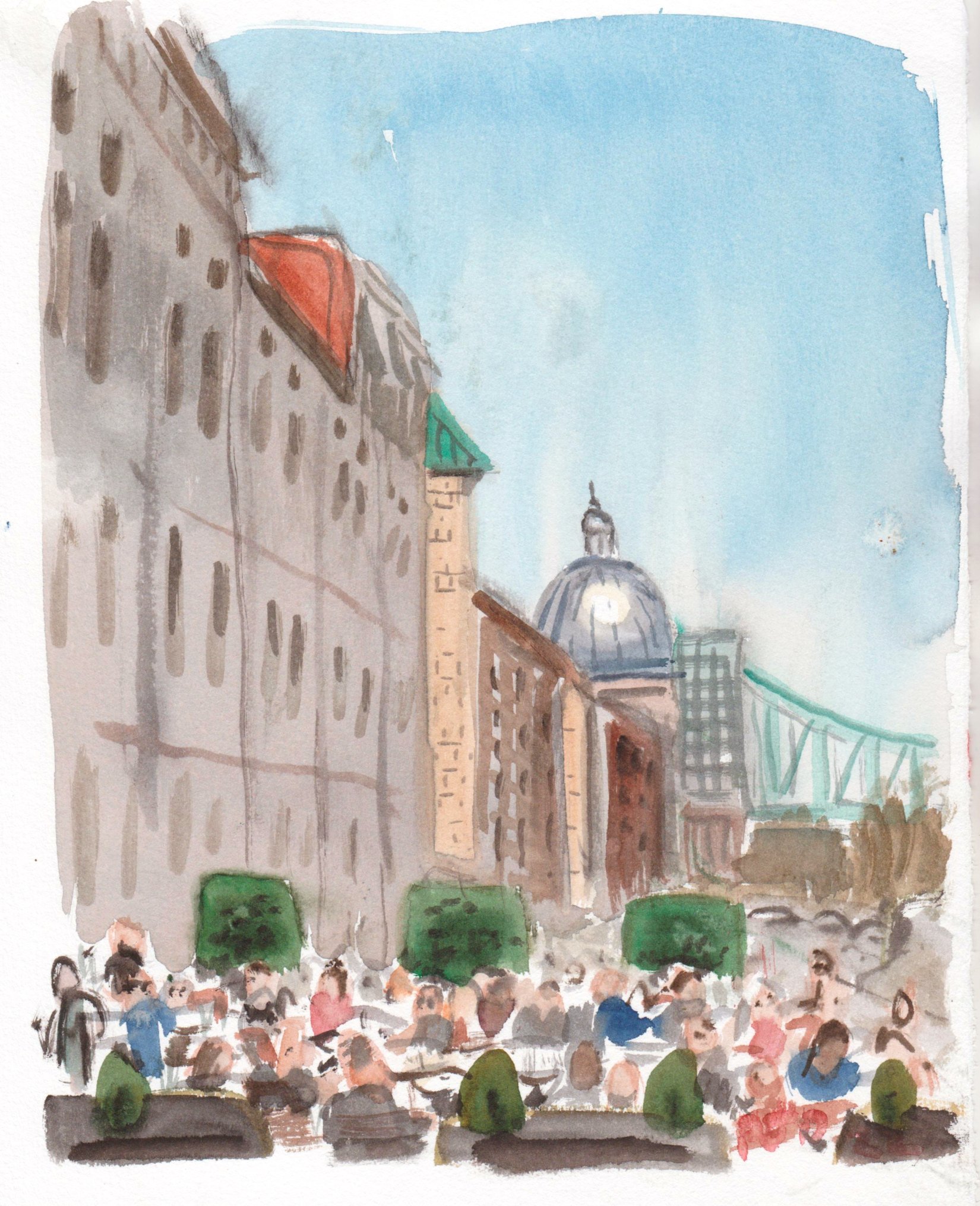
Park Jean-Drapeau was created from landfill for EXPO67, it sits under the Cartier bridge and hold the amusement park, a concert venue, and winding paths through trees. Throughout the park you can see PJD stamped on the surface of concrete dividers, picnic benches, bins and other objects which of course denotes the initials of the park. It also happens to be my initials which I put on every painting, so I could have done a painting here and have PJD in it. This scene was a real challenger, usually on a painting trip I try to do something easy to start off with, but this was maximum. I started with the sky then worked on the grass, the structure inside the dome, the tree, the steel framed dome, then the details. It seemed to work our reasonably well.

Tree and Dome, Park Jean-Drapeau, watercolour 6 x 8" cold press, April  2022 (No. 2991a)


The overcast sky was casting a grey shade onto the river, with various highlights. If you look at the shore, there is the famous apartment complex called Habitat 67, like a giant pile of brown lego blocks with windows. There were more colours in the river when I was painting it,but it dried near exact grey. I will have to exaggerate the blue next time, indothrene tends to loose a lot of its chroma and value when it dries. 

 City Skyline, Park Jean-Drapeau, watercolour 6 x 8" cold press, April  2022 (No. 2992a)


I really just wanted to paint this rusty bridge to try the colours. The green was mostly just perylene green (PBk31) with a touch of yellow, then the rust layers in while moist, included yellow ochre (PY43), red brown (PR101/ PBr7), and raw umber (PBr7).

 Rust Bridge, Park Jean-Drapeau, watercolour 6 x 8" cold press, April  2022 (No. 2993a)


In an empty overflow parking lot next to Park La Ronde, there were these massive heaps of wood chips. In the background you see the Cartier bridge with one of the pale yellow structures that holds up the off ramps. To make the texture on the wood chip piles I used the hog's hair brush normally reserved for cleaning my palette, it gives a great stippling effect. There were still a few puddles from the earlier rain. I quite like this painting.

Wood Chip Piles, Park Jean-Drapeau, watercolour 6 x 8" cold press, April  2022 (No. 2994)


There is a race track on the island used for the annual car race, in the meantime it is open to cyclists, walkers and rollerbladers.  A lot of the cyclists were wearing Lycra and riding track bikes, they would whip around usually in groups of two or three. I found a strip of grass with an interesting view of the overpass bridge which is an off-ramp from Victoria bridge. I painted in the cyclists last with just a few expressive lines and colours. After I did the painting, I hopped on my bike and did a lap!

Bikes Under Bridge, Park Jean-Drapeau, watercolour 6 x 8" cold press, April  2022 (No. 2995)


On my way back I noticed that a new bike path extended beyond the hospital along the auto-route and under the turcot west interchange that I painted the other day. At the very top left of the painting is the fancy white bridge, and probably near the exact spot I was standing for the previous painting. I liked the interplay of all the angles, they create a visual puzzle. The bike path and sidewalk are set back from the road, so they did a great job with it. I was worried that this painting would turn out drab and muddy, but now that I see the scan it seems to cover the abundance of grey neutrals and still remain lively.

Under the Underpass, Turcot West, watercolour 5 x 7" cold press, April  2022 (No. 3091a)


Friday, April 15, 2022

Views from St-Jacques Escarpment


At the southern edge of NDG you find the St. Jacques Escarpment which is visible on your left from the main highway when driving into the city. These paintings were done from atop the escarpment which is easily accessible due to a prominent road called St.-Jacques street. Midway along the street is a small park  with some good views of the downtown. Here, I painted the view looking east towards the city. The old house in the background is one of the focal points, along with the tree, park bench, and interlocking brick visible to the bottom right.

Park St.-Jacques Escarpment, watercolour 5 x 7" cold press, April  2022 (No. 3090)


The old house has a Victorian style roof and windows on the side, although the front has a modern brick facade. It had an eerie vibe, magnified by the leafless tree and ominous sky. You can see a piece of the highway in the background.

Old House on St-Jacques Street, watercolour 6 x 8" cold press, April  2022 (No. 3004a)


Continuing along the street you come upon the new St.-Jacques Bridge, gee, you think they would be a little more creative when naming things around here! A few weeks ago I made a painting from this position looking towards the bridge. This time I turned southwards and painted the spaghetti of highways that makes up the massive A15 (Decarie) and highway A20 (downtown) interchange. When I compared the painting to the real scene it was surprisingly accurate. The focal point is the old industrial area in Ville St.-Henri where you see the pink houses sitting high a top a dilapidated factory. The pink house are an art installation that have become something of a landmark here in Montreal. They are visible from the canal bike path, right next to the Atwater brewery and patio where I did a painting trip back in 2020.

View of Pink Houses from Escarpment, watercolour 6 x 8" cold press, April  2022 (No. 3003)

Surfing Hippos


The initial sketches I made for the Gabon painting were a little wild. Here is a painting of the scene, some hippos are having fun on the beach splashing in the waves. The actual landscape element was a chocolaty brown river flowing into the turquoise sea which is suggested up to the right. But I found the idea of surfing hippos to be very amusing.

World Inspired Landscapes: Gabon, Surfing Hippos, watercolour 9 x 12" watercolour paper, April 2022 (No.3009a)

Wednesday, April 13, 2022

World Inspired Landscapes: Gabon

Gabon is a prosperous little country in West Africa located along the jungle basin. Most of the economy is driven by oil and gas with abundant trees and other natural resources. A few decades ago the government decided to invest in nature reserves to conserve the animals and to attract tourists. It worked well, and Gabon is a popular destination for eco tourists who want to see gorillas in the wild or walk across the jungle canopy on rope bridges. It is good to know that some countries can find ways to conserve their nature without exploiting it too much. One thing that struck me while researching Gabon is the hippopotami seem to enjoy hanging out at the beach, and even body surfing in the waves. I couldn't believe it but there are enough pictures of it, just google surfing hippopotamus and you are probably looking at Gabon. They also have bat caves with crocodiles that live there, eating bats and turning orange due to the chemical reactions with the guano. Wonders of the world. 

The coast of Gabon is a very long stretch of white sand beach, with a fresh water river emptying into the salt water ocean. The river water is a dark coffee brown due to sediment, so when it mixes with the ocean it created some interesting colours with the turquoise water. In the painting, the dark river water mixes with the ocean, which also reflects the sky and trees. At first the composition appears to be a complete abstraction until you notice the hippopotami lurking, waiting to catch a good wave.

World Inspired Landscapes: Gabon version 2, watercolour 6 x 8" cold press, April  2022 (No. 2998b)

Tuesday, April 12, 2022

Signs of Spring, Squirrels


 On the way to pick up the Lufa Farms groceries I made a quick painting at Trenholme park. The squirrels would not sit still for a second so it was a challenge to get them right in the painting. In the background at the left you see the back side of the Lufa Farms delivery truck. You just pick up your 'basket' which is a grey plastic box with folding lid, and then transfer your stuff into a bag to bring home. The painting doesn't have too much colour in it because of the weather conditions, and because I am using up the last of the paint on my winter palette so that I can give it a good cleaning. The plastic palette gets stained with the pigments especially the phthalo blue and quinacridone magenta, which can be removed by scrubbing with a scouring powder like Vim.

Squirrels and Trees, Trenholme Park, watercolour 6 x 8" cold press, April  2022 (No. 2998a)

Sunday, April 10, 2022

Ride to Ville St. Henri, hail storm


The trip started off well enough, it was partly cloudy with some ominous looking clouds off in the distance. This scene is at the beginning of the new bike path that heads straight down from behind the new hospital to Ville St. Henri, although here I am looking west back towards NDG. I made a similar painting but from the opposite side a few weeks ago.

New growth, St. Jacques Bridge, watercolour 5 x 7" cold press, April  2022 (No. 3083)


You would think with a scene like this I would have turned back and headed home. I almost did, but the wind seemed to be blowing strongly from Northwest to southeast so that storm should have passed by (spoiler: it didn't pass by). To get the sky I used indo blue (PB60) and pyrol orange (PO73) with some yellow ochre (PY43). Unfortunately I added some carbon black (PBk6) and it dried flat and dull, next time I will skip the carbon black and add burnt sienna perhaps. I like the billboard in the middle right, it seems to glow because the sky behind me was still a mostly blue sky.

Dark Sky, City Skyline, watercolour 5 x 7" cold press, April  2022 (No. 3084)


By now little hail pellets were coming down making it very uncomfortable for me, and also disturbing the painting. You can see little dots on the painting. The yellow ochre building in the center is the fire hall building although I think it is a shopping center or market now. Hidden off to the right is the front of the metro station and a large sidewalk in front. It had been quite some time since I painted the metro sign, brought back some good memories. There are a few stations I plan to revisit this year that were under construction, or in some cases the location had more to offer.

Place St. Henri Station, hail storm, watercolour 5 x 7" cold press, April  2022 (No. 3002)


I made it as far as Atwater market when the hail started to pick up. This scene was too tempting to pass up, the backlit sky had an inky black cloud hanging low, and the light was reflecting off the old train tracks. The buildings off in the distance are old factories along Atwater street that were converted into luxury condos. If the people who used to work at those factories could somehow know what became of them, it would probably be unbelievable. There were a lot of people walking around with lattes and small dogs.

Canal and Old Train Track, watercolour 5 x 7" cold press, April  2022 (No. 3085a)