Monday, January 31, 2022

World Inspired Landscapes: Colombia, Rainbow River


In Colombia they have a remarkable river called Caño Cristales or Rainbow River where the interesting mosses, clays, and reflections create natural abstract art. You can look it up on the internet and see plenty of touristy photos. In the world inspired landscapes I try to avoid the cliches, but after some thought, this river just seemed like the right design for Colombia. Colourful and a little surprising. It is very hard to get to, deep in the south, so not that many tourists have ever laid eyes on it. The small waterfalls are almost blood red with moss, and the depths of the crystal clear water contain fluorescent yellows and greens. I did another Colombia painting, which was neat but the new version seems to capture a bit more of the obvious verve of the country. When I did the library research on Colombia I also read a Colombia cooking book, it was full of recipes, wine suggestions, and music lists. Clearly Colombians like to entertain!

World Inspired Landscapes: Colombia, Rainbow River, watercolour 5 x 7" cold press, January 2022 (No. 3055b)

Sunday, January 30, 2022

Windy Winter With Snow Drifts

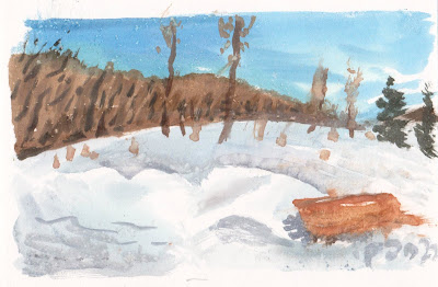
The new hiking path has been open since for quite some time now, people are using it for walking, snow shoeing, skiing, and for at least one person, biking and painting! This was done from the vantage point of a bridge that goes over the train tracks, the bridge also has a bike path. The colours in the train dried a bit faded due to the high salt content in the water. There was a stiff wind blowing straight down the valley into my face. I had to paint fast so as not to freeze.

Train in Winter, watercolour 5 x 7" hot press, January 2022 (No. 3056b)


This is one of the many benches they installed along the path. Today it was partly buried in the snow drift. The front of the drift was very bright since the sun was at my back. As you can see the paint was freezing a bit and very difficult to control, at one point the wind caught the painting and it fell into the deep snow. I bring a lot of rags with me these days, actually old T shirts that are cut up. So I brushed the painting off the best I could so the snow wouldn't ruin it. Just in case you wanted to know, the rags are mostly there to catch spills in my paint bag, blot my brushes off to keep the water clean, and in the winter I even have one for my runny nose.

Bench in Snow Drift, watercolour 5 x 7" hot press, January 2022 (No. 3057a)

Saturday, January 29, 2022

Sunset Reflection CLSC

On the way back from the library I stopped to  make this quick painting of a sunset reflecting in the windows of the CLSC health building. The rest of the sky was overcast, it was a pastel blue with slight hints of sunset orange and yellow. The big pine tree on the right is part of the Benny park and sports complex where I often paint pictures. The key to painting the sunset reflection was actually the bricks that are over and under it. To mix the dark brick orange I used earth red (PR102) with a touch of carbon black (PBk6). The rest of the painting was done in a middle value, so that the highlight on the windows really pops. Today I cut the salt concentration a bit, so the paint was freezing on my palette. Luckily I could get the painting finished before everything froze solid! 

Sunset Reflection CLSC, watercolour 5 x 7" cold press, January 2022 (No. 3058b)

What Gives the Earth


 A golden vine twists and turns its way into sunlight. Small red and purple flowers bloom. To create the atmospheric effect I surrounded the object with a mix of purple magenta (PV19) and indo blue (PB60) and streaks of maroon (PR179). Over the top I put the tree line which blended with the sky colour. For the ground I applied burnt ochre (PR102) with brush strokes of dark green (PB31) and magenta (PR122). The colour codes specify what the pigment was in the paint. This information helps because paint names are not very informative all the time. The name name of paint can have different pigments depending on the company. It is something I started to pay more attention to starting around 2017 and then in 2020 I redid my whole palette to have mostly single pigment paints.

What Gives the Earth, watercolour 4.5 x 12" cold press, January 2022 (No. 2969b)

Snow Field, Sunny Day


 The sun was shining on a snowy field just outside of the building where my research laboratory is located. I stopped to make this painting real quick, just a simple field with one set of brave footprints crossing the deep snow. To create the appearance of glowing snow I made a three tone wash with pale yellow, yellow-orange, and blue. The footprints were added when the paint was still slightly wet. To provide the contrast, I included the gymnasium building in silhouette using a potent mix of red ochre (PR102), carbon black (PBk6) and some indo blue (PB60). Some of my students walked past on their way to the lab but they didn't notice that I was making a painting! 

Snow Field, Sunny Day, watercolour 5 x 7" cold press, January 2022 (No. 3062b)

Wednesday, January 26, 2022

World Inspired Landscapes: Croatia


Located on the Adriatic sea opposite to Italy, Croatia is a mountainous coastal country with a large inland region. Beaches run up and down the sea side interspersed by rocky cliffs and steep rocky hills dotted with trees. Where possible, villages have been built near the water and around the old fortifications. Croatia historically has been conquered many times which lead to a very diverse people and culture. In recent decades it grew to be a prosperous and unified country partly due to the effort to create a common 'Croatian' language that all their people could speak together. 

The painting was all about colour, value and composition. The rocky hills were a neutral red made with pyrol red (PR254), carbon black (PBk6), and just enough water to bring it to a warm neutral gray. The trees were a very dark olive green I made with perylene green (PBk31), a touch of indo yellow (PY110) and a touch of carbon black (PBk6). The beach-to-sea transition was made with a raw sienna for the sand (PY43 and PR102), greenish yellow ochre (PY43 and a touch of PG36), emerald green (PG36 some PBk31), then turquoise (PB60, PG36, PB28), and navy blue (PB60, PV19, PB28). I painted the sea colours fast so they blended together, but still maintained some clear depth lines, and a slight sparkle-effect near the top where the sun might be reflecting. 

With respect to composition, the painting is based on a meandering line that bisects the painting into land/sea. In the preliminary sketches I included a sky, but felt the composition was stronger if the whole picture area was just land and sea, as if you were flying over the scene looking down. The paper is 9 x 12", however the painting itself is confined to a 7.5 x 9.5" area since I am planning to put this one in an 8 x 10" mat opening. I am sharing a lot of technical details today, just to document my notes on the format and in case I want to repeat the neat sea colours (or if any other water painters want to try!).

World Inspired Landscapes: Croatia, watercolour 9 x 12" cold press, January 2022 (No. 2985)

Tuesday, January 25, 2022

Granulation Infatuation


Granulation is one of the properties unique to watercolour paints. It means that the pigments will form small clumps resulting in a textured appearance. Using rough press or cold press paper accentuates the effect due to the undulating surface of the paper. In the painting, you can see the granulation clearly in the sky and some of the shadowed-areas due to the use of cerulean blue. Water-painters tend to be infatuated with granulation due its magical appearance during the painting process. By the way, I am calling the act of painting with watercolour paints, 'water painting' as part of my effort to rebrand the name. Thus, a painter who uses watercolour paint, is a water-painter. I am sure this will catch on eventually! If there is oil painting, and acrylic painting, then it stands to reason there should be water painting.

Flying Kites, watercolour 8 x 10" cold press, 2017 (No. 1499a)


This was on the back of the other painting. It is a totemic collage of doodles with a cool colour scheme. This painting contains many pigments that I recently stopped using including phthalo blue shade (PG7) french ultramarine (PB29), cerulean blue (PB35), and alizarin crimson (PR83). It is a window into somewhere.

Hilt Structure and Baloon, watercolour 8 x 10" cold press, 2017 (No. 1499b)