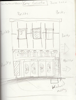
Hot off the press, these paintings and sketch were completed today in before the rain. In fact it was sunny hot and partly cloudy when I got to location. I captured the first scene with a sketch, followed by a painting. Unfortunately the scale of the doors were slightly off making this feel like Alice in wonderland, but the doors were indeed dwarfed by the massive windows and sea of yellow bricks. In this kind of design there is nowhere to hide, every line, every detail, every colour needs to work together. I would have passed on this, but there was a perfect little nook with shade to sit, and I knew that these down-town Montreal Stations were all going to be similar, like, walls with doors. Luckily, the mortar on the brick wall was a dark grey which made it easier, the trick is to do enough brick pattern to give the feel without over doing it.7 x 10" cold press (block), watercolour, June 2020.
Here is the sketch, the doors are better proportioned but a window was missing. If I combined the sketch and the painting it would be perfect. I don't really care about perfect though, the work stands on its own as a journey, an adventure. One day when I leave the city, I will look back on these and think... what the heck was I thinking? 8 x 11"sketch book, pencil, June 2020

Keeping up with my goal of three paintings and one sketch per station, this one is looking northwards towards the mountain, sitting under the overhang of the EV building which is part of Concordia University's down town campus. It was all about perspective here, I started with the outline of the overhang, then got the reflective shadowed wash down. I went for burnt sienna and indothrene blue with a touch of yellow ochre to get the glow (which is the sidewalk reflecting on the underside of the structure). I also painted the mirror-image of everything in the glass windows on the right. The rest of the painting was filled in briefly, I didn't want to spend much time on the bike racks so omitted a lot of bikes, not to mention the throngs of people walking. I was so focused on the technical things I forgot the actual metro sign! With a few blue brush strokes I tried to overlay it, but the background was already green (its at the end of the wall center right). 7 x 10" cold press (block), watercolour, June 2020.

This time I remembered to put the metro sign in, its the same scene as the last painting but sitting on the opposite corner. To avoid boring frontal-views, I was searching for perspectives and angles that were more interesting. I also wanted nature to be present, but that goal is increasingly difficult down town. In this painting, I got the reflection of some trees on the left windows. It was a tricky scene to do, lots of overlapping and integrated elements with rich greys, blacks and earth tones. The orange feature at the top was nearly pure iron oxide red... good choice Concordia University!
6.0 x 7.5 " (cold press 140lb arches, new size*) watercolour, June 2020
*Since I ran out of block paper I am switching over to 22 x30" arches cold press 140lb press, which I cut into 6 pieces of 8x10", and 4 pieces of 6 x 7.5". This way, both sizes have the same aspect ratio of 1.25, and there is no left over wasted paper.


No comments:
Post a Comment