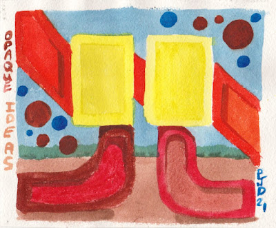
I did a little more reading on this 'controversy' between transparent colour and body colour. As expected Handprint.com (MacEvoy) had an extensive explanation debunking the whole theory that light can bounce off the paper and travel through a layer of watercolour pigments on its way back to your eye. Watercolour pigments are like any pigment, they absorb light and reflect light, but they do not transmit light. Boring science aside, I think everyone is talking about the same thing- you definitely don't want watercolours to get thick and muddy. In the test painting above, I really tried to be a bad artist and use my opaque pigments at full strength including bismuth vanadate (PY184), venetian red (PR101), benzi orange (PO36) and burnt sienna (PBr7). The only difference really was how much water I added- the opaque paints looked fine when diluted, but they looked a little 'over cooked' when applied full strength. But then again, so did the prussian blue one of the most 'transparent' pigments there is, it also looked bad at full strength. As MacEvoy pointed out it is all a matter of finding the right dilution.
5.5 x 7" cold press, watercolour, March 2021 (No. 2601b)
This painting also used the opaques venetian red and bismuth yellow, along with the prussian blue. I've been researching one of the next World Inspired paintings, this time Brazil! The book I read described the Amazon river and rain forest destruction which was saddening and maddening especially for Cilei who is from Brazil. In the painting, the water is drying up and the mountains are scorched, while the plant is literally walking around and trying to catch the last rain. The World Inspired Brazil will not look anything like this because I try to avoid politicizing the series, but it will be on the theme of the Amazon River and rain forest.
Last Rain, 5.5 x 7" cold press, watercolour, March 2021 (No. 2602a)


No comments:
Post a Comment